
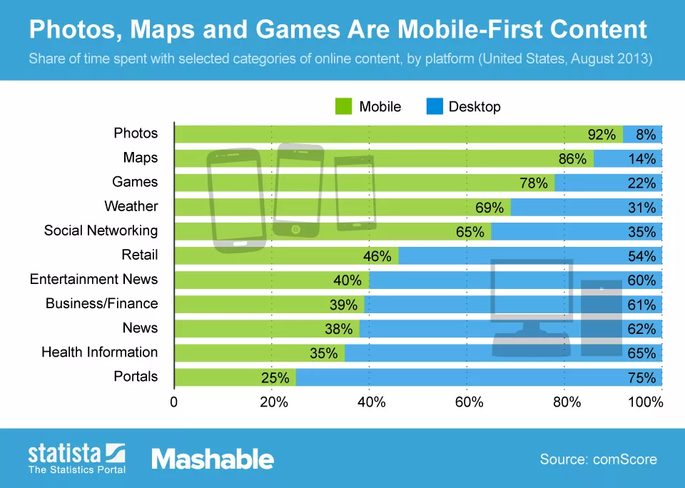
The dominance of mobile devices as the primary access point to the internet has reshaped the digital landscape dramatically. The shift towards mobile isn’t just a trend; it’s a fundamental change in user behavior and expectations.
Today, a significant majority of users access the internet through their smartphones and tablets. The convenience, portability, and constant connectivity offered by these devices have made them the go-to choice for browsing, shopping, socializing, and accessing information.
For website owners and businesses, this shift to mobile as the primary gateway to the online world has pivotal implications. Initially considered a competitive advantage, having a mobile-friendly website has now transformed into an absolute necessity. The ability of a website to adapt seamlessly to various screen sizes and devices isn’t just about catering to a niche audience—it’s about engaging with the mainstream audience.
“A mobile-friendly website isn’t a luxury; it’s a necessity. It’s the portal to your business that fits in the palm of their hand.
A mobile-friendly website isn’t just an added bonus; it’s an expectation. Users demand a smooth and responsive experience irrespective of the device they use. Whether it’s reading articles, making purchases, or interacting with content, users expect consistent quality and functionality across all screens.
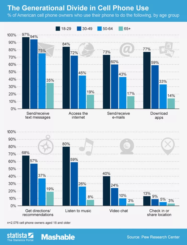
Failure to embrace mobile-friendly themes and optimization means risking losing a substantial portion of potential traffic, engagement, and conversions. Additionally, search engines like Google have incorporated mobile-friendliness as a crucial factor in determining search rankings. Sites that are mobile-responsive are more likely to rank higher in search results, making mobile optimization not just user-centric but also pivotal for visibility and reach.
Benefits of Using Mobile Friendly WordPress Theme:
- Enhanced User Experience: A mobile-friendly theme ensures that visitors accessing your site via smartphones or tablets have a seamless and enjoyable browsing experience. It optimizes the layout, content, and navigation for smaller screens, reducing the need for excessive scrolling or zooming.
- Improved Accessibility: Mobile-friendly themes make your website accessible to a wider audience. They cater to users on the go, those who predominantly use mobile devices, and individuals with limited access to desktops or laptops.
- Better SEO Performance: Search engines, like Google, prioritize mobile-friendly websites in their rankings. Using a mobile-responsive theme positively impacts your site’s SEO, potentially leading to higher rankings and increased visibility in search results.
- Higher Conversion Rates: An optimized mobile experience leads to higher conversion rates. When users find it easy to navigate and interact with your site on their mobile devices, they are more likely to stay longer, engage with your content, and complete desired actions, such as making purchases or signing up for newsletters.
- Consistent Branding and Messaging: Mobile-friendly themes maintain consistency in your brand’s presentation across devices. Your site will look and feel the same, regardless of the device used, reinforcing your brand identity and messaging.
- Faster Loading Speeds: Well-optimized mobile-friendly themes prioritize performance, leading to faster loading times. Speedy page loads contribute significantly to a positive user experience, reducing bounce rates and retaining visitors.
- Adaptability to Changing Technologies: As technology evolves, mobile-friendly themes are better equipped to adapt to new devices, screen sizes, and browsing trends. They ensure your website remains relevant and functional across a range of current and future devices.
- Competitive Edge: In a digital landscape where mobile usage continues to grow, having a mobile-friendly site is no longer a luxury but a necessity. By ensuring your site is mobile-responsive, you stay competitive and meet the expectations of modern users.
1. Soledad
Soledad stands out as a leading choice for blog and magazine websites, boasting a remarkable track record with over 43,000 sales and an almost perfect 5-star rating. This versatile WordPress theme offers extensive flexibility, featuring an impressive array of over 6,000 homepage demos and more than 200 pre-built websites.
Its mobile-friendliness stems from a 100% responsive design, dynamically adjusting image sizes, ads, and all other page elements to seamlessly fit and enhance the visual appeal on smartphones and tablets. Furthermore, it prioritizes loading speed optimization and fully supports AMP (Accelerated Mobile Pages), ensuring an exceptional browsing experience for your mobile site visitors.
2. Avada
Avada stands as one of the premier WordPress themes available, serving a vast user base that spans beginners, professionals, agencies, businesses, marketers, and creatives. It is the go-to choice for creating both desktop and mobile websites. Avada prides itself on being mobile-friendly and fully responsive across all devices. Regular updates are part of its commitment to ensuring your website maintains its visual appeal and top-notch performance consistently.
For those seeking customizable options, whether basic or advanced, without the need for coding expertise, Avada is a solid option to explore. Its user-friendly drag-and-drop visual content editor simplifies the process of designing, maintaining, and updating websites. Moreover, the Global Styling feature allows swift previews of designs across various screen sizes, ensuring a cohesive look across devices.
3. Porto
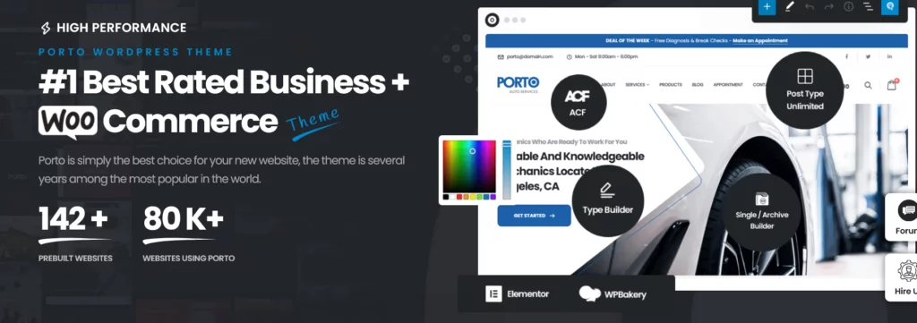
Porto stands as a versatile WordPress theme catering to both multipurpose use and e-commerce needs, earning the trust of over 73,000 customers. It’s a feature-rich theme, equipped with essential tools like a page builder, header builder, footer builder, and product page builder.
For those aiming to craft stunning and personalized websites, Porto simplifies the process, ensuring seamless functionality across all device categories, including mobile.
4. Uncode
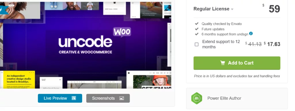
Uncode stands out as another visually captivating theme, boasting exceptional responsiveness tailored to mobile devices. Packed with a myriad of robust features, it offers over 40 pre-built layouts, each easily imported with a single click. Its developers have prioritized lightweight programming, ensuring swift page loading even on slower devices.
This theme seamlessly integrates with various contemporary WordPress plugins such as WooCommerce, Slider Revolution, and Custom Lightboxes, among others. Moreover, its content block section empowers users to craft stunning headers, footers, and replicate sections of content with ease.
5. Sydney

Sydney offers an elegant design coupled with top-notch mobile performance. This responsive business theme comes highly recommended by the Elementor team and has garnered over 100,000 downloads on WordPress.org.
Select from three well-crafted Starter templates with Sydney, or upgrade to Sydney Pro for access to an additional 15 designs, including Agency, Cafe, and SaaS.
Beyond its aesthetic appeal, Sydney incorporates mobile-friendly features such as a customizable scroll-to-top button for easy navigation, Google AMP support, and responsive typefaces, catering to users seeking a seamless mobile experience.
6. Betheme
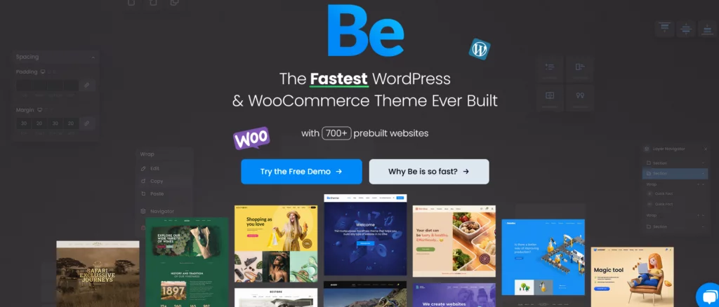
Betheme is a premium WordPress theme boasting a sleek design, powerful functionalities, and an intuitive, extensive interface. It seamlessly integrates with major drag-and-drop page builders like Elementor, empowering users to craft unique and visually striking websites effortlessly.
With full responsiveness, Betheme ensures flawless adaptation to all devices—laptops, smartphones, and tablets. Moreover, it allows the creation of distinct versions tailored for specific device types, enabling the showcase of specialized content for different screens. Whether you’re a web developer or a business owner, Betheme offers an ideal starting point to build your website, eliminating the need for any coding experience.
7. Woodmart
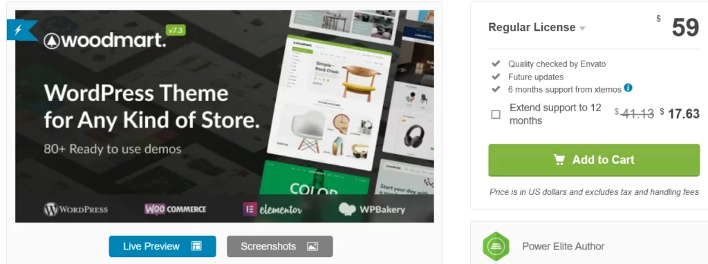
Woodmart stands as a contemporary and chic WordPress theme ideal for diverse website types. Offering three distinct header layouts for mobile devices, advanced mobile side navigation choices, and a user-friendly mobile interface, it caters to seamless mobile browsing. Its advanced mobile side navigation feature enables the placement of essential links like cart, checkout, search box, or account on the left side of your page for quick visitor access while navigating.
Loaded with custom widgets, a convenient mega menu, unlimited color options, and various other impressive features, Woodmart ensures a fully responsive design, guaranteeing your store looks impeccable on every device.
8. Qi Theme

Qi Theme stands out as a swift, lightweight, multipurpose WordPress theme adaptable to any purpose or niche. What distinguishes it are its premium design, numerous pre-built demos, and extensive customization capabilities.
With Qi Theme, you have manual control over your website’s behavior across different responsive states. For instance, if you manage a portfolio, the theme allows you to select column options based on the screen resolution of the device viewing the website. This level of customization extends to blogs and typography choices as well.
Engineered for small file sizes and rapid page speed, this theme prioritizes performance while offering abundant customization options. For those seeking mobile-friendliness as a priority, Qi Theme stands as an excellent choice worth exploring.
9. uDesign
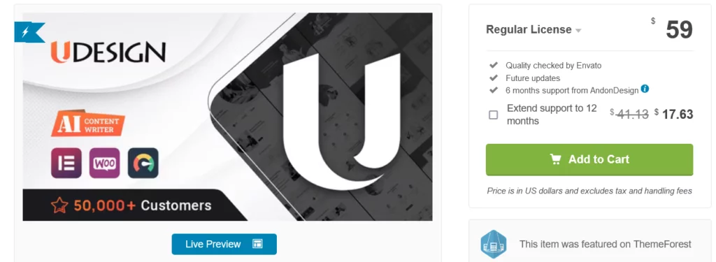
Renowned for its popularity and adaptability, uDesign is a responsive WordPress theme tailored especially for ecommerce endeavors. Even if you lack coding expertise, uDesign offers seamless assistance in crafting a professional-grade business website.
Ensuring mobile-friendliness is hassle-free with uDesign’s array of responsive page layouts, guaranteeing seamless adaptation across tablet, smartphone, and desktop screens. Complemented by two mobile menu options and SEO optimization, this responsiveness aims to bolster your site’s visibility in organic search rankings.
10. Astra

Astra stands out as one of today’s premier free WordPress themes, boasting a user base exceeding one million active users. Loaded with a plethora of features and ready-to-use mobile templates, Astra streamlines the process of launching a responsive website quickly and cost-effectively.
Astra offers multiple avenues to customize your WordPress site for mobile devices. Adjust typography based on devices, set breakpoints triggering layout changes, and tailor headers specifically for mobile devices. Paired with its acclaimed loading speeds, lightweight framework, and compatibility with leading page builders, Astra ensures your site functions flawlessly on any screen.
11. Ultra
Flexible and adaptable, Ultra serves as a versatile WordPress theme suitable for both personal and business websites. Featuring diverse preset layouts and user-friendly section scrolling for enhanced navigation and readability, Ultra’s smart layouts provide complete control from header to footer. Its inherent mobile-friendly design ensures seamless customization without worrying about discrepancies between mobile and desktop appearances.
12. Divi

Divi stands as both a versatile WordPress theme and a responsive page builder bundled into one powerful tool. Its Divi Builder simplifies customization of module placement, fonts, and colors. Within the builder, toggling between various screen widths allows you to witness real-time adaptations of your designs.
Featuring hundreds of website packs, Divi offers premade, mobile-friendly layouts for entire websites, ready to be populated with your content. Once installed, these packs reduce the need for extensive manual mobile optimization.
13. Enfold
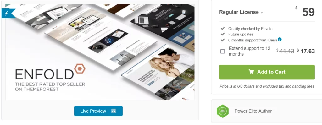
Enfold, a highly popular ThemeForest marketplace theme, streamlines the creation of both desktop and mobile websites. Prioritizing user convenience, Enfold offers a native builder along with extensive documentation and narrated tutorials. Additionally, it provides numerous responsive pre-built website templates for swift application to your site, ensuring mobile optimization and responsiveness across slider displays.
14. JustBlue
JustBlue emerges as a quality free WordPress theme catering to bloggers. With its responsive, speed and SEO optimization, this theme grants comprehensive control over the look and feel of your site, all managed through the theme options panel. Notably, it features a related posts widget, enhancing visitor engagement by showcasing more content.
15. Hestia
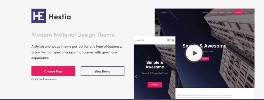
Hestia stands as a sleek and contemporary one-page WordPress theme ideal for modern online businesses and startups prioritizing navigational simplicity. Its one-page layouts are responsive to mobile screens, allowing swift site creation without starting from scratch. Compatible with major page builders and the WooCommerce plugin, Hestia’s templates include pre-built sections for contact info, bio, client testimonials, shop, and more.
Factors to Consider Before Choosing a Mobile Friendly Theme:
- Responsiveness: A responsive theme ensures your site looks great on any device. It seamlessly adjusts elements like layout, images, and fonts to suit various screen sizes while maintaining usability and design integrity. Testing the theme on different devices can confirm its responsiveness.
- Performance: Opting for a theme that prioritizes speed and performance is crucial. A fast-loading site not only improves user experience but also positively impacts SEO rankings. Look for themes with optimized code and minimal bloat to ensure swift page loading times.
- Cross-Browser Compatibility: Ensure the theme functions consistently across different web browsers (Chrome, Firefox, Safari, etc.). A theme that works well across browsers guarantees a uniform experience for all users, regardless of their browser preferences.
- Mobile-Friendly Design Elements: Seek themes that offer specific design elements catering to mobile devices. This includes touch-friendly navigation, well-optimized typography for readability on smaller screens, and easily accessible menus that enhance user interaction on mobile devices.
- Customization Options: Evaluate the theme’s customization capabilities while ensuring it remains mobile-responsive. A good theme strikes a balance between offering flexibility for customization and maintaining responsiveness across devices.
- SEO Readiness: Check if the theme is optimized for search engines. Look for themes with clean code, SEO-friendly features, schema markup support, and compatibility with SEO plugins to ensure better visibility in search engine results.
- Plugin Compatibility: Ensure the theme is compatible with popular WordPress plugins you may need, such as WooCommerce for e-commerce functionalities or SEO plugins for optimizing your site’s search engine performance.
- Support and Updates: Consider themes that come with reliable support channels and receive regular updates. Regular updates ensure compatibility with the latest WordPress versions, security patches, and bug fixes, enhancing the theme’s reliability and security.
- User Reviews and Ratings: Research user reviews and ratings to gauge the theme’s performance and reliability, specifically focusing on its mobile performance. Real user experiences provide valuable insights into how the theme functions on mobile devices.
- Demo and Preview: Explore the theme’s demos and previews across various devices to assess its responsiveness, layout, and overall aesthetics on mobile screens. This firsthand exploration allows you to visualize how your site might appear on different devices.
- Page Builder Compatibility: If you plan to use a page builder for custom layouts or pages, ensure the theme is compatible with popular page builders. Compatibility with page builders enhances your ability to create unique and responsive layouts seamlessly.
Conclusion:
In conclusion, ensuring your WordPress site is responsive and mobile-ready is imperative in today’s digital landscape. Opting for a mobile-friendly theme not only streamlines your site’s appearance across various screens but also saves considerable time that would otherwise be spent adjusting pages to multiple dimensions. The themes mentioned here offer seamless solutions to guarantee visitors enjoy a consistently positive experience, regardless of their preferred browsing device.
FAQs on Mobile-Friendly WordPress Themes:
Why is a mobile-friendly WordPress theme important?
A mobile-friendly theme ensures your website looks and functions well on smartphones, tablets, and desktops, catering to diverse user preferences and enhancing user experience.
How can I determine if a theme is mobile-friendly?
Look for responsive design, which adapts seamlessly to different screen sizes, and features like mobile menu options, optimized layouts, and support for mobile-specific features like AMP (Accelerated Mobile Pages).
Do all WordPress themes support mobile devices?
No, not all themes are inherently mobile-friendly. It’s crucial to choose themes explicitly designed or optimized for mobile responsiveness.
Can I make my existing WordPress site mobile-friendly?
Yes, you can use plugins or CSS media queries to optimize your site for mobile devices. However, choosing a mobile-friendly theme from the start is often more efficient.
Are mobile-friendly themes SEO-friendly?
Generally, yes. Mobile-friendly themes with responsive design and fast loading times often contribute positively to SEO, as search engines prioritize mobile-friendly websites.
