
In the age of smartphones and tablets, it has become important to optimize your website for mobile devices to enhance user engagement and improve search engine rankings. Mobile optimization not only improvises user experience but also increases your website’s visibility in search results. In this detailed guide, we will shed light on the significance of mobile optimization and explore practical tools, plugins, and strategies for optimizing a WordPress website for mobile users.
Why Mobile Optimization Matters?
Mobile optimization matters for several reasons, all of which revolve around the fundamental shift in how people access information, make purchases, and interact with the online world:
- Proliferation of Mobile Devices: The usage of mobile devices, including smartphones and tablets, has surpassed traditional desktop computers. People use their smartphones for browsing, shopping, social media, and more. If your website is optimized for these devices, it lets you tap into a vast audience.
- Improved User Experience: Mobile-friendly websites provide a seamless experience. Content and images are resized to fit smaller screens, and navigation menus are designed for touch. When users have a positive experience on your site, they are more likely to stay longer, get involved with your content, and convert into customers or subscribers.
- Search Engine Rankings Impact: Search engines like Google or Bing prioritize mobile-friendly websites in their rankings. Mobile optimization is a significant factor in Google’s algorithms. If your site isn’t mobile-friendly, it might rank lower in search results, resulting in decreased visibility and organic traffic.
- Faster Loading Speed: Mobile-optimized websites are designed with speed in mind. They load faster on mobile devices, which is crucial because mobile users expect quick access to information. Slow-loading websites can cause high bounce rates, where visitors leave your site before it fully loads.
- Increased Conversions and Sales: A mobile-friendly website can directly impact your bottom line. If users can easily browse products, read content, and make purchases on their mobile devices, they are more likely to convert into customers. Complex or non-responsive websites may discourage users from completing transactions.
- Social Media and Mobile Traffic: Social media platforms are predominantly accessed via mobile devices. If your website isn’t optimized for mobile, users who click on links shared on social media might have a poor experience, leading to missed opportunities for engagement and conversions.
- Competitive Advantage: In many industries, having a mobile-optimized website is now the standard. If your competitors have mobile-friendly sites and you don’t, potential customers are more likely to choose competitors over your business simply because of the ease of use and accessibility of their websites.
- Global Accessibility: Mobile devices have opened up the internet to regions where traditional computers are scarce. Many users in developing countries primarily access the internet via smartphones. Mobile optimization ensures your content is accessible to a global audience, expanding your reach and impact.
Tools for Mobile Optimization
1. Google’s Mobile-Friendly Test
This tool by Google analyzes your website’s mobile-friendliness. It specifically focuses on how well your site performs on smartphones and tablets, providing insights and suggestions for improvements tailored to mobile devices.

2. PageSpeed Insights (Mobile Version)
Google’s PageSpeed Insights offers a mobile-specific analysis of your website’s performance. It provides recommendations to improve loading times and user experience on mobile devices. This mobile version of PageSpeed Insights focuses on optimizing for smartphones and provides actionable insights.

3. TestMySite by Google
TestMySite is a tool that assesses your website’s mobile performance. It provides a detailed report on your site’s mobile speed, benchmarks it against competitors, and estimates the potential revenue impact of improving site speed. It’s designed to help businesses understand the importance of mobile optimization.

4. BrowserStack
BrowserStack offers a range of real mobile devices for testing your website. You can interact with your site on various smartphones and tablets, ensuring it functions correctly and looks appealing on different mobile platforms. It’s a valuable tool for comprehensive mobile testing.

5. MobileTest.me
MobileTest.me is an online tool that permits you to test your website on different mobile devices and operating systems. It provides a simulated environment to see how your site appears and behaves on specific smartphones and tablets, helping you identify and fix mobile-specific issues.
Responsinator displays your website on different devices, including smartphones and tablets. It’s a quick way to visualize how your site responds to various screen sizes. While not an in-depth testing tool, it provides a useful overview of your site’s mobile responsiveness.
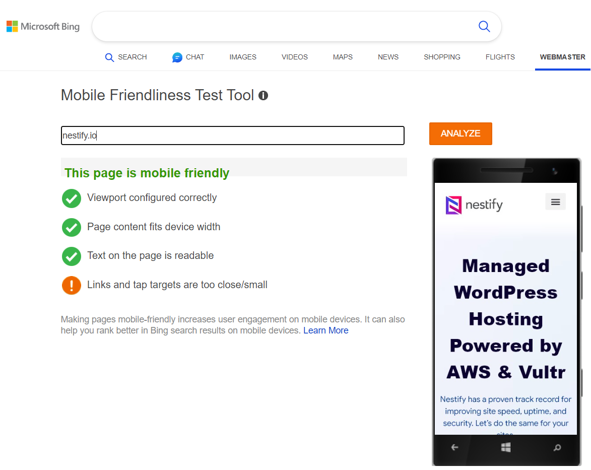
7. Mobile-Friendly Test by Bing
Bing offers a mobile-friendly test tool similar to Google’s. It evaluates your website’s mobile compatibility and provides suggestions for improvement. This tool specifically focuses on ensuring your site is optimized for Bing’s mobile search results.
8. WPtouch
WPtouch automatically adds a simple and elegant mobile theme for mobile visitors. It ensures your website’s design is responsive and user-friendly on various devices.

9. AMP (Accelerated Mobile Pages)
AMP is a Google-backed project that enables faster loading of web pages on mobile devices. The AMP plugin for WordPress automatically generates AMP versions of your pages, enhancing mobile performance significantly.

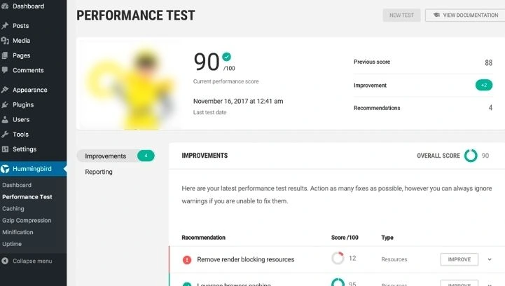
10. Hummingbird
Hummingbird encourages mobile visitors to save a cached copy of your site’s files on their phones, reducing loading times for subsequent visits. This plugin actively identifies speed bottlenecks by scanning your website, providing recommendations, and resolving issues with a single click. Ideal for new website owners, Hummingbird offers valuable suggestions, tips, and ideas for optimizing your site and ensuring mobile-friendliness. Plus, it permits you to monitor your progress after implementing the suggested changes.
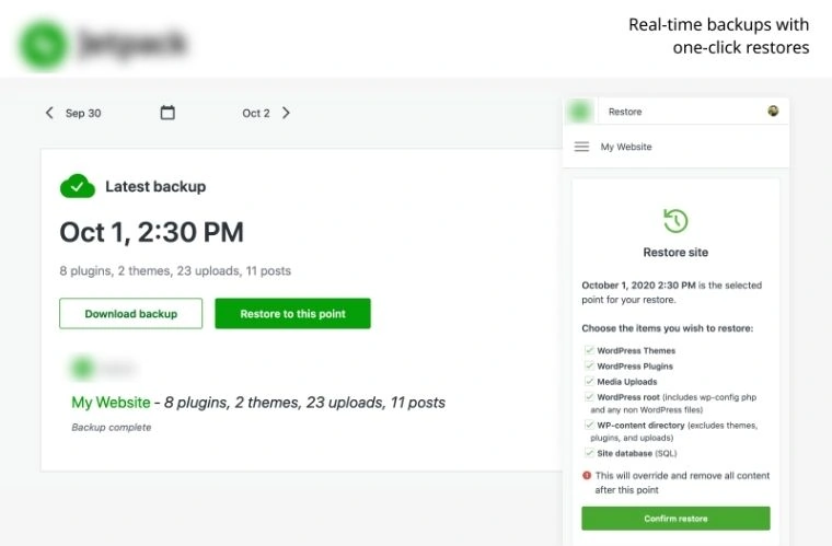
11. Jetpack by WordPress.com
Jetpack is a powerful plugin that includes a mobile theme feature. It involuntarily optimizes your website for mobile devices, ensuring responsive design and fast loading times. Jetpack also offers additional features like site statistics, downtime monitoring, and security enhancements.
12. Autoptimize
While not solely a mobile optimization plugin, Autoptimize helps optimize your website’s performance, including mobile devices. It minifies and caches scripts, stylesheets, and HTML, reducing the overall page size and improving loading times on mobile devices.
Strategies for Mobile Optimization
- Responsive Design: Apply a responsive design that adapts your website’s layout and content in accordance with the user’s device. A responsive website ensures a consistent and optimal user experience across different screen sizes.
- Optimize Images and Media: Compress images and videos to lessen their file sizes without compromising quality. Use lazy loading techniques to defer offscreen images and videos, ensuring faster initial loading times.
- Minimize HTTP Requests: Lessen the number of elements on your web pages, such as scripts and stylesheets. Minimizing HTTP requests decreases loading times, enhancing the user experience. Merge multiple JavaScript and CSS files into a consolidated single file to minimize requests.
- Prioritize Content: Identify essential content and display gated content prominently on your mobile pages. Users should quickly access crucial information without excessive scrolling. Prioritize content hierarchy, ensuring that the most important elements are visible at the top of the page.
- Optimize Typography: Use legible font sizes and styles that are readable on smaller screens. Avoid tiny fonts that strain the eyes and maintain proper spacing between lines and paragraphs. Clear, readable typography enhances user engagement.
- Reduce Pop-Ups and Interstitials: Limit the use of pop-ups, especially those that cover the entire screen on mobile devices. Google penalizes intrusive interstitials, so use them judiciously or employ user-friendly alternatives like slide-ins or bottom banners.
- Optimize Forms and Input Fields: Streamline forms and input fields for mobile users. Use large, tappable buttons and minimize the number of required fields. Implement auto-correction and auto-capitalization features for a smoother user experience.
- Improve Server Response Time: Optimize your server configuration, use efficient hosting, and leverage caching mechanisms to improve server response time. A faster server response ensures quicker loading of your website’s mobile version.
- Regular Testing and Optimization: Continuously test your website across various mobile devices and screen sizes using A/B testing tools. Regularly update and optimize your site based on user behavior data and feedback. Stay informed about the latest mobile optimization trends and technologies to implement the best practices.
Conclusion
Mobile optimization is not just an option; it’s a necessity for any website aiming to succeed in the digital landscape. By employing responsive design, optimizing images, minimizing HTTP requests, prioritizing content, and using appropriate tools and plugins like WPtouch and AMP, you can create a seamless and enjoyable mobile experience for your WordPress website visitors. Prioritizing mobile users not only enhances user satisfaction but also contributes significantly to your website’s overall performance and success. Stay proactive, keep testing, and embrace the evolving mobile technologies to ensure your website remains user-friendly and competitive in the mobile-driven world.
FAQs
How can I know if my WordPress website is mobile-friendly?
To know this, you can use tools like Google’s Mobile-Friendly Test, PageSpeed Insights, or plugins like WPtouch to assess your website’s mobile-friendliness. These tools analyze your site and provide insights into its responsiveness and performance on mobile devices.
What is responsive design, and why is it essential for mobile optimization?
Responsive design is an approach where your website layout and content automatically adjust based on the user’s device screen size. It ensures a consistent and user-friendly experience across various devices, including smartphones and tablets, making it a fundamental aspect of mobile optimization.
Are there any SEO benefits to mobile optimization?
Yes, mobile optimization positively impacts SEO. Search engines like Google prioritize mobile-friendly websites in their rankings. Mobile-optimized sites often experience higher visibility and better search engine rankings, resulting in organic traffic.
