
Mobile devices are used for more than 50% of Google searches. For many advertisers, most of their visitors come from mobile users. Since mobile devices are always with their owners, it’s essential to have a mobile-friendly website to engage, delight, and keep your visitors.
Mobile-friendly WordPress sites are now the standard. However, creating a beautiful and responsive site for mobile devices may still require some effort.
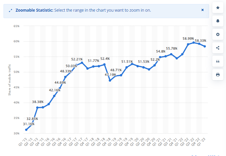
Mobile devices have become essential tools for communication, information, and entertainment worldwide. In 2022, there were five billion unique mobile internet users, which is more than 60% of the global internet user population who use mobile devices to go online.
The ownership of mobile devices and internet usage is expected to continue growing, as mobile technologies become more affordable and accessible. This trend is particularly evident in developing digital markets where mobile networks are the main way people access the internet.
Currently, nearly 60% of all web traffic comes from mobile devices, and in mobile-first regions like Asia and Africa, mobile connections contribute to an even larger portion of webpage views.
There is a lot more to cover in mobile friendliness in WordPress, so let’s get right into it.
Why Are Mobile-friendly Websites Important?
61% of Google searches occurred on mobile devices. That means more than half of people now use phones and tablets instead of traditional desktops. To keep up with this trend, your website must be able to adapt to various screen sizes. A design that’s mobile-friendly creates a positive experience for users and assists them in finding what they need while on the move.
Apart from providing a good user experience, there’s another significant reason to make your site mobile-friendly: Google. Since 2015, Google has been rewarding websites that are considered “mobile-friendly” in its search algorithm. The main criterion for this change is whether your website is responsive to mobile devices.
This means that websites that display well on mobiles will rank higher in search results compared to those that don’t. It’s a nice benefit if you’ve put in the effort to make your site mobile-friendly. However, not being mobile-ready can negatively impact your site’s traffic.
If your WordPress website isn’t mobile-friendly yet, there are various tools available to help you catch up and create a fully functional, responsive site. Assessing your present design is the first step.
- Test your WordPress website for Mobile Friendliness
To assess the mobile-friendliness of your WordPress site, you can utilize this tools:
This initial tool is provided by Google and is quite user-friendly. Follow these steps:
- Open your web browser and navigate to the Google Mobile-Friendly Test.
- Enter your website’s URL.
- Click on “Test URL.”

The test results will inform you whether your website is mobile-friendly or not. If it isn’t, the tool will highlight the specific errors that need attention and guide you toward helpful resources for making your site mobile-friendly.
For all you developers, Google has also introduced a Mobile-Friendly Test API. This handy tool lets you automatically check URLs. The advantage is that you can test numerous pages swiftly, and it allows you to keep an eye on your site’s crucial pages without constantly switching to the browser tool. Great, right?
After using Google’s mobile-friendly tool to assess your site, it’s time to begin enhancing it.
- Think about integrating WordPress with Google AMP
AMP stands for Accelerated Mobile Pages, and it’s a Google-supported effort to reduce the amount of data needed to load a web page on a mobile device. When you use Google’s mobile search, you can spot websites marked with the AMP label.
One significant advantage of Google AMP for WordPress is its simplified code, which results in incredibly fast and responsive AMP pages. This makes AMP an excellent choice if you want to quickly make your WordPress site mobile-friendly.
Setting up Google AMP for WordPress is straightforward, and you can achieve it with the help of the Official AMP plugin. This plugin is a collaborative effort involving Google, Automattic, and XWP.
The essential steps involve installing and activating the AMP plugin. Once done, Google will start delivering AMP content to mobile users via your website.
If you’re looking for more control over how your WordPress AMP content appears, the AMP for WP plugin is an excellent option. It offers new styling choices, options for incorporating ads, and social sharing buttons, which enhance the official AMP plugin.
When it comes to SEO concerns for your Google AMP WordPress pages, here are two crucial points to consider:
- You won’t face duplicate content penalties because the AMP plugin automatically adds rel=”canonical” tags to your AMP content.
- Yoast SEO is well integrated with the Official AMP Plugin, making SEO optimization more manageable.
- Install a responsive theme
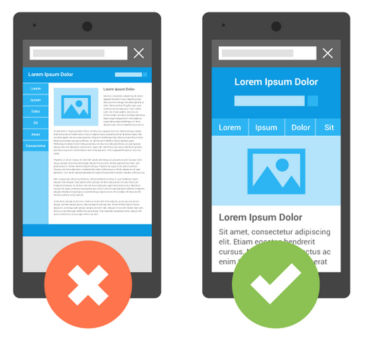
Creating a responsive theme in WordPress is crucial. Such themes ensure that your WordPress content and images automatically adjust to fit the device and screen size in use. Without responsive design, your websites won’t adapt to mobile devices, resulting in a poor user experience.
It’s vital to regularly check that you are using the most current version of any WordPress theme to ensure your website design remains responsive to mobile users. Additionally, you can swiftly enhance your site’s responsiveness by using WordPress software plugins.
The majority of WordPress themes are already responsive by default. However, it’s a good practice to verify that the responsive features work correctly on your specific websites. Here’s a simple way to do it:
- Start by opening the landing page of the website you want to test.
- In your Google Chrome browser, open a new tab.
- Hover your mouse pointer over the landing page of the website you wish to test and right-click.
- A drop-down menu will appear, select “Inspect Element.” This action will open the Chrome Dev Tools Window.
- Within the Dev Tools Window, locate and click on “Toggle device toolbar.”
- This will activate the Device Mode’s screen emulator.
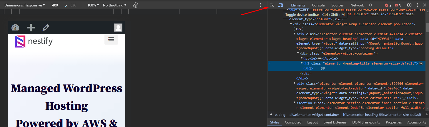
Using the screen emulator, you can test how the website appears in various responsive and device-specific viewports.
- Continually use the same Content on desktop and mobile websites
To maintain consistency between your mobile and desktop sites, heed Google’s advice. If your mobile site lacks information compared to your desktop site, you risk losing traffic due to Google’s mobile-first indexing. Therefore, it’s essential to ensure that the titles, metadata, and structured data on both your desktop and mobile sites are similar. Google recommends employing the same text, file names, captions, and descriptive alt text for mobile and desktop versions.
However, what if your desktop site boasts a wealth of content that can’t fit on a small mobile screen? In this case, the solution isn’t to remove content but to get creative with mobile-friendly design. You can use features like accordions, drop-down menus, or tabs to present your content more effectively on mobile devices. Don’t forget to test your site to ensure it meets these standards. Utilizing a mobile-friendly website tester to confirm responsiveness should be your next step.
Conclusion
Making your WordPress website mobile friendly is not merely a trend; it’s a fundamental requirement for online success. By selecting a responsive theme, optimizing images and media, streamlining your content, thorough testing, and implementing mobile-friendly navigation, you can create a user experience that caters to mobile users effectively. Additionally, using mobile plugins and optimizing loading speed will further enhance your website’s mobile-friendliness.
Investing in mobile-friendliness is a smart move, not only for improved user experience but also for better search engine rankings and overall website performance. Remember that mobile-friendliness is an ongoing commitment, so make it a part of your long-term web development strategy to stay ahead in the ever-evolving digital landscape.
FAQs on WordPress Website Mobile Friendly
1. What does “mobile-friendly” mean for a website?
A mobile-friendly website is designed and optimized to provide a seamless user experience on smartphones, tablets, and other mobile devices. It includes responsive design, fast loading times, and easy navigation, ensuring that visitors can access and interact with the content without frustration.
2. Will a mobile-friendly website improve my SEO?
Yes, a mobile-friendly website can significantly improve your SEO. Search engines like Google prioritize mobile-friendly sites in their rankings. When your site is optimized for mobile devices, you’re more likely to appear higher in search results, increasing your visibility and attracting more organic traffic.
3. Do I need to hire a developer to make my WordPress site mobile-friendly?
While hiring a developer is an option, many WordPress themes and plugins make it possible to create a mobile-friendly site without extensive coding. With the right theme and some customization, you can achieve mobile-friendliness on your own. However, for more complex websites, professional assistance may be beneficial.
