Graphic design plays a pivotal role in creating visually compelling and engaging websites. It involves the craft of combining aesthetics, branding, and user experience into a seamless digital narrative. In today’s dynamic digital landscape, the partnership between graphic designers and web designers forms the bedrock of a successful web presence. It’s not merely about crafting an attractive website; it’s about creating a digital experience that captures the essence of a brand, resonates with users, and transforms casual visitors into loyal customers.
Statistics Highlighting the Importance of Collaboration:
- 93% of First Impressions Are Design-Related: According to a study conducted by the Missouri University of Science and Technology, it takes users less than two-tenths of a second to form a first impression of your website. This first impression is primarily design-related, underlining the significance of aesthetics in web design.
- Conversion Rates Increase with High-Quality Visuals: E-commerce platforms that employ high-quality images and design have reported a conversion rate increase of up to 30%. This data, provided by Adobe, demonstrates the direct correlation between visual aesthetics and business success.
- 77% of Agencies Collaborate on Design Projects: A survey by InVision indicates that 77% of design agencies collaborate with other designers, illustrators, and other creative professionals. It showcases the growing trend of recognizing the value of combined creative efforts in design.
- 75% of Users Judge a Company’s Credibility Based on Website Design: Stanford University conducted a study revealing that three-quarters of users judge a company’s credibility based on their website’s design quality. A well-designed website can significantly impact how a brand is perceived.
Elements of Web Design:

Web design is a multidimensional field that relies on several fundamental elements to create visually appealing and effective websites. These elements encompass layout, color, typography, and imagery, and they play a crucial role in shaping the user experience. In this section, we will delve into each of these elements, understanding how they impact the overall design and, in turn, influence the way users interact with and perceive a website.
1. Layout: The Blueprint of User Experience
The layout of a website serves as its architectural framework, guiding users through the content and functionality. A well-structured layout ensures that information is presented in a logical and visually pleasing manner. Here are some key aspects of layout:
- Grid Systems: Grid systems help maintain visual consistency, align elements, and create balance on a webpage. They enable designers to organize content systematically and make it easier for users to navigate.
- Whitespace: Whitespace, or negative space, is crucial for enhancing readability and reducing visual clutter. It allows for the separation of different elements and provides a more enjoyable and less overwhelming user experience.
- Responsive Design: In today’s multi-device landscape, responsive design is essential. It ensures that the layout adapts seamlessly to various screen sizes, from large desktop monitors to smartphones, preserving the user experience across devices.
2. Color: Eliciting Emotions and Signifying Meaning
Color is a powerful tool in web design, capable of evoking emotions, conveying brand identity, and providing visual hierarchy. The choice of color scheme can significantly impact how users perceive and interact with a website:
- Psychology of Color: Different colors have distinct psychological effects. For instance, warm colors like red and orange can create a sense of urgency or excitement, while cooler colors like blue and green may convey calm and trust. Designers use this knowledge to match color choices with the website’s purpose and target audience.
- Brand Identity: The color palette of a website should align with the brand’s identity and message. Consistency in color usage across the site reinforces the brand and fosters trust among users.
- Visual Hierarchy: Color can be used to establish visual hierarchy, highlighting important elements such as call-to-action buttons or headlines. This makes it easier for users to find and engage with key content.
3. Typography: Readability and Personality
Typography involves selecting fonts, font sizes, spacing, and formatting to enhance the readability and aesthetic appeal of a website. It plays a significant role in the user experience:
- Font Selection: Choosing the right fonts for headings, body text, and other elements is crucial. Readable and accessible fonts ensure that users can easily consume the content.
- Font Styling: Designers use font weights, styles, and variations to add character and personality to the website. Bold, italic, or underlined text can convey emphasis, while font sizes create hierarchy.
- Line Spacing and Line Length: Adequate line spacing and line length affect readability. Proper spacing makes text more legible, and a balanced line length prevents readers from getting lost in overly wide or narrow columns.
4. Imagery: Visual Storytelling and Engagement
Imagery is a powerful medium for communication, storytelling, and emotional engagement. It includes photographs, illustrations, icons, and other visual elements:
- Relevance: Images should be relevant to the content and context of the website. They should enhance the user’s understanding of the information presented.
- Quality: High-quality images are essential to maintain a professional and appealing look. Blurry or pixelated images can detract from the user experience.
- Optimization: Properly optimized images help maintain fast loading times, which is critical for user satisfaction. Compressing images while preserving quality is a common practice.
5. Navigation: Guiding Users Seamlessly
Navigation is a fundamental aspect of user experience. It encompasses the design and functionality of menus, buttons, and links that help users move around a website:
- Intuitive Menus: Clear and well-organized menus are essential for helping users find their way. Dropdown menus, hamburger menus for mobile devices, and navigation bars play a pivotal role in ensuring easy navigation.
- Breadcrumbs: Breadcrumbs provide users with a trail of links that helps them understand where they are within a website’s hierarchy. They contribute to a smooth user journey, particularly on complex sites.
- Call-to-Action Buttons: Designing effective call-to-action buttons with clear text and contrasting colors encourages users to take specific actions, such as signing up, making a purchase, or subscribing.
6. Interactive Elements: Engaging User Interaction
Interactivity is a crucial element in modern web design. It involves elements like forms, sliders, carousels, and other dynamic components:
- Forms: Forms are a vital means of collecting user data, feedback, or facilitating transactions. Designing user-friendly forms with clear labels and error messages is essential for a positive experience.
- Sliders and Carousels: These dynamic elements are often used to showcase multiple pieces of content, such as images or promotions. They should be intuitive and not distract users from the main content.
- Hover Effects: Interactive elements like hover effects can provide visual feedback to users, making navigation more intuitive. For example, buttons that change color when hovered over can indicate interactivity.
7. Consistency: Creating a Unified Experience
Consistency in web design involves maintaining a cohesive look and feel across the entire website. It enhances the user experience by creating familiarity and predictability:
- Branding Consistency: Consistent use of logos, colors, and typography reinforces the brand identity, making users feel they’re in a familiar environment.
- Navigation Consistency: Keeping the layout and navigation structure consistent across all pages ensures that users don’t get lost or confused as they explore the site.
- Content Consistency: Uniformity in the presentation of content, including headings, subheadings, and paragraphs, aids readability and helps users understand the information flow.
8. Microinteractions: Enhancing User Engagement
Microinteractions are small, subtle animations or interactive elements that enhance the user experience. They can include features like button animations, loading spinners, or subtle transitions:
- Feedback: Microinteractions provide feedback to users when they perform actions. For example, a button changing color when clicked confirms that the action was registered.
- Engagement: These small animations add an element of delight to the user experience. For instance, a heart animation on a “like” button can be visually engaging.
- User Guidance: Microinteractions can guide users through processes, such as filling out forms or submitting feedback, by providing visual cues.
Strategies Used to Improve User Experience in Web Design:
1. Visual Design: Tools and Plugins for Aesthetics

Web designers are the artists of the digital realm, and they employ various tools and plugins to create visually stunning and aesthetically pleasing websites. These platforms offer features that simplify the design process, such as real-time collaboration and responsive design preview.
- Adobe XD: Adobe XD is a powerful design tool that allows web designers to create user interfaces with ease. It offers features like prototyping, collaboration, and a range of design assets.
- Sketch: Sketch is a popular macOS application that’s known for its simplicity and efficiency. Designers use it to create vector graphics, user interfaces, and interactive prototypes.
- Figma: Figma is a cloud-based design tool that facilitates collaboration among designers. It allows real-time collaboration, making it easy to work together on web design projects.
Real-life Example: Aurora Studios employs visually striking graphics and a harmonious color scheme to create an immersive user experience for its gaming community.
2. Layout and Information Architecture: Navigating with Ease

Creating an intuitive layout and information architecture is crucial for a positive user experience. Web designers leverage plugins and tools to streamline this process.
- Divi Builder: Divi Builder is a WordPress plugin that enables drag-and-drop design, making it simple for designers to create complex page layouts and structures.
- Elementor for WordPress: Elementor is another WordPress plugin that offers a user-friendly drag-and-drop interface, allowing designers to design web pages with ease.
Real-life Example: Medium is a prime example of seamless navigation and information architecture, making it effortless for readers to find and engage with content.
3. Responsive Design: Ensuring a Consistent UX
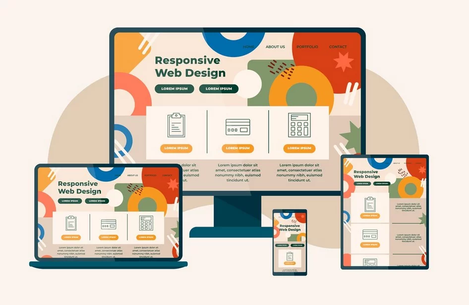
In a multi-device world, responsive design is paramount. Web designers employ frameworks and plugins to ensure that websites adapt gracefully to various screen sizes and devices.
- Bootstrap: Bootstrap is a popular front-end framework that provides a responsive grid system and components, simplifying the process of creating mobile-friendly websites.
- WP Touch: WP Touch is a WordPress plugin that focuses on making websites mobile-friendly, ensuring a consistent user experience on smartphones and tablets.
Real-life Example: Nike embraces responsive design to deliver an optimal user experience, whether users access the site on a laptop, tablet, or smartphone.
4. Accessibility: Inclusive UX for All
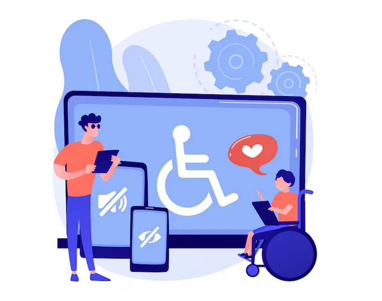
Accessibility is a fundamental aspect of UX. Web designers use tools and plugins to ensure compliance with accessibility standards, allowing users with disabilities to access and navigate websites.
- Axe: Axe is a tool for automated accessibility testing. It helps designers identify and resolve accessibility issues on their websites.
- WP Accessibility: WP Accessibility is a WordPress plugin that focuses on making WordPress websites more accessible by providing various features and enhancements.
Real-life Example: Apple sets the gold standard for accessibility, making its products and website usable for individuals with disabilities.
5. Performance and Loading Speed: Tools to Optimize
A slow website can drive users away. Web designers use tools and plugins to optimize images, code, and server performance, delivering lightning-fast loading times for an exceptional user experience.
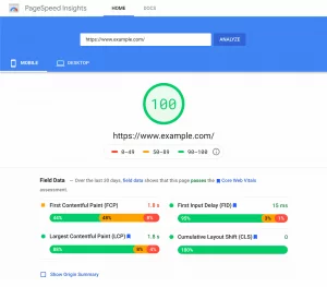
- Google PageSpeed Insights: Google PageSpeed Insights is a tool that analyzes website performance and provides suggestions for improvement, including optimizing images and scripts.
- WP Super Cache: WP Super Cache is a popular WordPress plugin that generates static HTML files to speed up website loading times.
Real-life Example: Amazon prioritizes performance optimization to provide an efficient shopping experience, ensuring quick page loads even during peak traffic.
6. User Feedback and Testing: Refining the UX

Web designers collaborate with UX researchers to gather valuable user feedback. Tools and plugins enable the collection of real-time data and insights for continual UX improvement.
- UserTesting: UserTesting is a platform that allows designers to create tests and gather feedback from real users, helping to uncover usability issues.
- Hotjar: Hotjar is a suite of tools that includes heatmaps, session recordings, and surveys to understand user behavior and collect feedback.
Real-life Example: Airbnb conducts rigorous user testing and feedback analysis to refine its website continually, resulting in a highly user-centric platform.
7. Consistency: Design Systems for Cohesion

Maintaining a consistent design is essential for a cohesive user experience. Designers create design systems and use plugins to ensure that every element on a website adheres to a unified style, enhancing the user experience.
- Design Systems: Design Systems are a set of guidelines, components, and patterns that ensure a consistent look and feel across a website or application.
- Storybook: Storybook is a development environment for UI components. It allows designers and developers to build and test components in isolation to ensure consistency.
Real-life Example: IBM maintains a consistent design system across its various digital platforms, reinforcing its brand and providing a seamless user experience.
8. Aesthetics and Branding: Reinforcing Identity

Web designers incorporate a brand’s identity into the website’s aesthetics. Tools and plugins assist in aligning design elements with a brand’s personality and message, enhancing brand recognition and trust.
- Adobe Creative Cloud: Adobe Creative Cloud offers a suite of design tools that help designers create visual assets, such as logos, graphics, and promotional materials, that align with a brand’s identity.
- Brandfolder: Brandfolder is a digital asset management platform that helps organizations store, organize, and share brand assets to maintain brand consistency.
Real-life Example: The Coca-Cola website exudes the brand’s vibrant, joyful personality through its design, reinforcing the brand’s identity.
9. Adaptation to Trends: Staying Ahead

Staying up-to-date with design trends is vital. Web designers use inspiration websites and plugins to adapt to current design trends and incorporate them thoughtfully to keep a website looking modern and engaging.
- Awwwards: Awwwards is a website that showcases award-winning website designs, providing inspiration and insights into current design trends.
- CSS Hero: CSS Hero is a WordPress plugin that allows designers to easily customize the design of their WordPress websites without coding.
Real-life Example: Tesla consistently adopts cutting-edge design elements, reflecting innovation in both their electric vehicles and website design.
10. Animation and Interactivity: Delighting Users

Web designers use animation libraries like GreenSock (GSAP) and interactivity plugins such as ScrollMagic to add engaging animations and interactions to a website. These elements not only capture users’ attention but also guide them through the content for a more immersive UX.
Real-life Example: The “Stripe” website employs subtle animations that help users understand complex concepts, making the UX more enjoyable.
11. Typography and Readability: Tools for Clarity
Choosing the right fonts and optimizing readability are crucial for a positive UX. Web designers utilize tools like Google Fonts and Adobe Typekit to access a wide range of fonts, while plugins like Typekit Fonts for WordPress make integrating custom typography a breeze.
Real-life Example: The “New York Times” website prioritizes typography to deliver a clean, easy-to-read experience for its readers.
12. Personalization: Tailoring the UX
Web designers can use data-driven personalization tools like OptinMonster and personalized content plugins to customize the user experience based on user behavior and preferences. Personalized experiences can significantly enhance user engagement.
Real-life Example: “Netflix” excels at personalization by recommending content based on a user’s viewing history, creating a highly individualized UX.

13. Social Integration: Sharing and Connectivity

Integrating social media elements and sharing plugins like AddThis or ShareThis allows web designers to enhance the social aspect of a website. Users can easily share content, fostering community and connectivity for a richer UX.
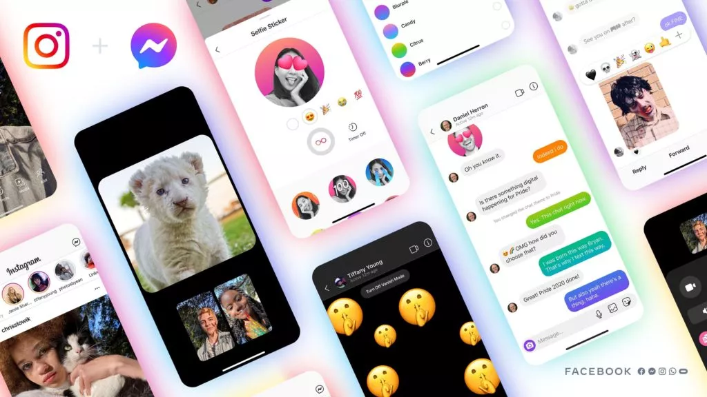
Real-life Example: “Instagram” seamlessly integrates with various social networks, facilitating content sharing and interaction, which is fundamental to its success.
14. E-commerce Optimization: Streamlining Transactions
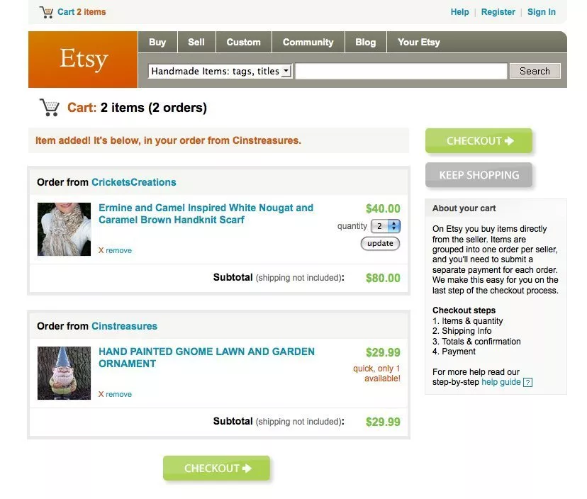
For e-commerce websites, web designers use tools like WooCommerce and Shopify, along with various payment gateway plugins, to create user-friendly shopping experiences. This includes designing intuitive product pages, secure checkout processes, and trust-building elements.
Real-life Example: “Etsy” combines a visually appealing storefront with a user-friendly shopping cart to provide a smooth buying experience for its customers.
15. Security and Trust: Tools for User Confidence

Web designers collaborate with security experts to ensure websites are secure and trustworthy. Implementing security plugins like Wordfence for WordPress and SSL certificates, designers help users feel safe when interacting with the site, enhancing the overall UX.
Real-life Example: “PayPal” prioritizes security to instill confidence in users when making online payments, contributing to a positive UX.
16. Multilingual Support: Expanding Accessibility

For global audiences, web designers use translation plugins like WPML to make websites accessible in multiple languages. This expansion of accessibility caters to a broader user base, improving the UX for non-native English speakers.
Real-life Example: “IKEA” offers its website in multiple languages, creating a user-friendly experience for customers worldwide.
17. Content Management: Empowering Non-Tech Users

Content management tools like WordPress and content editor plugins allow non-technical users to update and maintain websites easily. This empowers businesses to keep content fresh and relevant, contributing to an improved user experience.
Real-life Example: “BBC” uses a content management system to keep its news and articles up to date, ensuring a valuable UX for readers.
Conclusion:
From the layout and color scheme to the typography and imagery, web designers have a profound impact on how we perceive and navigate websites. They work in harmony with graphic designers, accessibility experts, and a myriad of tools and plugins to create cohesive and visually striking online experiences. Collaboration, usability, and aesthetics converge to ensure that web design is not just a profession but an art form.
FAQs on Graphic Designers and User Experience:
How can web designers contribute to the success of e-commerce websites?
Web designers contribute to e-commerce success by using tools like WooCommerce and Shopify, along with payment gateway plugins, to design user-friendly shopping experiences, intuitive product pages, secure checkout processes, and trust-building elements.
What are some emerging trends in web design that web designers should be aware of in today’s digital landscape?
Emerging trends in web design include dark mode, micro-interactions, 3D elements, augmented reality (AR) integration, and voice user interfaces (VUI). Staying aware of these trends helps web designers keep their designs modern and engaging.
What are the key elements of a well-designed landing page, and how can web designers create effective landing pages for marketing purposes?
Key elements of a well-designed landing page include a compelling headline, clear call to action, relevant content, and trust-building elements like testimonials and security badges. Web designers create effective landing pages by emphasizing these elements, using contrasting colors for call to action buttons, and ensuring a clear and straightforward user journey.


