
Are you searching for the latest and most impactful website design trends? The world of web design is constantly evolving, adapting to the ever-changing digital landscape. It’s crucial to stay updated on what’s currently in demand.
Instead of spending your valuable time researching, we have done the work for you. Over the past month and a half, we have meticulously investigated the most influential web design trends and carefully curated them into this collection. This collection covers a wide range of trends, from simplicity and boldness to special effects and animations, ensuring there is something for everyone. Whether you are a designer seeking inspiration or a business owner looking to give your online presence a fresh look, this article will provide you with invaluable insights into the direction of modern web design.
Feel free to explore the trends that catch your interest and apply them to your own projects. We hope this collection will serve as a source of inspiration and help you achieve a visually refreshing and engaging online presence.
Top 11 Website Design Trends of 2023:
1. White Space
White space, also known as negative space, holds incredible power in web design. Its ability to bring content to the forefront without distractions makes it a valuable technique applicable to any website, regardless of its niche.
The utilization of white space has numerous benefits. It enhances readability, creates a more enjoyable navigation experience, and emphasizes key elements, resulting in an improved user experience (UX). Moreover, incorporating white space into your website design automatically lends a professional and modern look to your online presence, requiring minimal effort for a better outcome.
Example: Apple
Apple was one of the pioneers in utilizing white space to showcase products, setting the benchmark for incorporating breathing room into design. They skillfully employ active white space throughout their website by strategically placing imagery to draw the user’s attention to specific elements as they scroll down the page. Additionally, the company utilizes passive white space to effortlessly guide users through the content, ensuring a seamless browsing experience.
By leveraging the power of white space, you can create a visually appealing and user-friendly website that captivates your audience, allowing your content to shine and leaving a lasting impression.
2. Micro-interactions
Micro-animations are a delightful addition to any website, bringing an element of fun and entertainment while also serving as powerful tools for evoking emotions and expressing feelings that may be challenging to convey through text alone.
Example: Spire Global
A remarkable example of effective micro-interactions can be found on the website of Spire Global, a company specializing in aviation, weather, and maritime analytics and tracking. Their website, crafted by the renowned creative agency Locomotive, showcases their mastery of integrating micro-interactions to create engaging user experiences.
Throughout the site, micro-interactions are skillfully implemented, evident in the text link hovers, the sticky “Reach Us” section, and the fast-loading dropdown menus. As you scroll down the page and arrive at the “Meet the Data” section, a captivating micro-animation takes place. The mouse cursor transforms into a large circle with a message, encouraging you to drag the cursor left and right. By following this instruction, you unlock the opportunity to delve deeper into the company’s projects and download sample data, providing an interactive and immersive experience.
3. Parallax
Parallax scrolling is a captivating technique that enhances the visual appeal of a website by adding depth and dimension. It creates an immersive and engaging browsing experience that leaves a lasting impression on visitors. One of the key advantages of parallax scrolling is its ability to boost storytelling, captivating the audience and encouraging them to explore the website further.
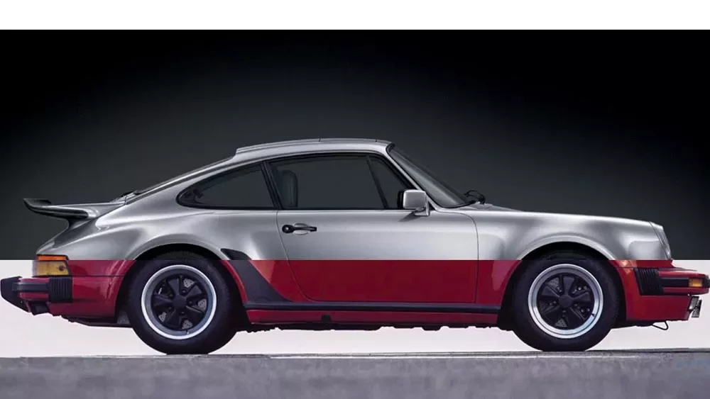
Example: PorschEvolution
An excellent example of the parallax scrolling effect can be seen on the PORSCHEvolution website. This site takes viewers on a journey through the decades, showcasing the evolution of Porsche cars from the 1930s to the present day. Created by UX designer Ondrej Homola, the website seamlessly integrates parallax scrolling with a super smooth transition between different car models. What makes the experience even more captivating is the accompanying soundtrack—a reimagined version of Daft Punk’s music tailored to each decade represented.
The PORSCHEvolution website demonstrates how parallax scrolling can be effectively utilized to tell a compelling story that spans several decades. By incorporating this technique, the website creates a visually stunning and engaging experience that captures the essence of Porsche’s evolution over time.
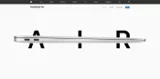
4. Bold & Large Typography
Bold and large typography has become a prominent trend in website design, offering a visually striking and impactful way to convey messages. This approach works well when you want to minimize excessive white space on your page or make a strong first impression on your visitors.
Implementing enhanced typography not only enhances clarity and focus but also guides the attention of visitors through improved hierarchy. It allows for better readability and impactful communication, especially on smaller screens of mobile devices where tiny fonts may not be effective. By enlarging the typography, you maintain excellent readability and ensure your message has a lasting impact.
Example: UpScale
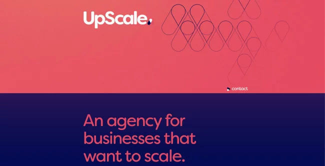
A great example of a website design that effectively utilizes bold fonts is this website, designed by Mums The Word Creative. This design exudes style and branding, relying on simple elements to captivate users. The homepage features a captivating transition from a red screen to a gradient that shifts from violet to purple as you scroll. The brand’s logo takes center stage on the left side of the screen, accompanied by circular outlines that form a symbol within the logo. Throughout the design, these large geometric patterns are prominently featured, changing in colors and positions while retaining visibility due to their size. As you navigate through this engaging one-page website, you’ll encounter shifting background colors and these patterns that reinforce the appeal of the brand’s emblem.
5. Gradients & Colors
Gradients and color transitions have the power to add a new dimension to website design, much like the parallax effect enhances depth and immersion. These techniques enable smooth and seamless transitions between different sections and elements of a website, whether it’s large blocks of text, white space, or other design elements.
In addition to their visual appeal, gradients and transitions offer designers the opportunity to create custom colors that can intensify branding and add a personal touch. However, it’s important to exercise caution when incorporating animations and effects alongside gradients and color transitions, as overdoing it can result in a cluttered and overwhelming design.
Example: Spotify
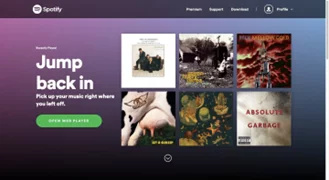
A great example of the effective use of gradients can be seen in Spotify’s website. Instead of using a solid background color, the designer employs a gradient effect that blends various hues together. This not only adds visual interest but also contributes to a dynamic and engaging user experience.
The use of gradients extends beyond the website design itself for Spotify. In their “Loud & Clear” report, they incorporate gradient backgrounds and animations throughout the content. This strategic use of gradients creates a cohesive and visually appealing presentation that captures the audience’s attention.
By carefully implementing gradients and color transitions, designers can enhance the visual appeal of a website, create a sense of depth, and amplify the overall user experience.
6. Minimalism
Minimalism is a tried-and-true approach that consistently delivers in website design. When in doubt, opting for a minimalist design can save you time and effort while ensuring a highly effective outcome. By stripping away unnecessary elements, you can create a streamlined and purposeful design that prioritizes the user experience with minimal distractions. It provides a personalized experience through clean and uncluttered design, resulting in improved engagement and enhanced readability. By focusing on essential elements, this design creates a timeless aesthetic that can adapt to any business or industry.
Example: Uber
A prime example of the power of minimalism can be seen in Uber’s Sign Language website design. In alignment with their commitment to accessibility, Uber created this website specifically to teach customers basic sign language, enabling them to communicate with hearing-impaired drivers.
It showcases exceptional design restraint, utilizing simple and concise videos to demonstrate common phrases and names in sign language. With minimal copy and explanation, the content speaks for itself, effectively conveying an important brand message without the need for elaborate wording.
7. Asymmetric Layouts
Embracing asymmetrical layouts in website design can be a refreshing departure from the norm of symmetrical shapes. While not as commonly used, asymmetry is gaining popularity and can add a unique touch to your website’s visual presentation.
The allure of asymmetrical layouts lies in their ability to inject energy and create visually captivating designs that instantly catch the viewer’s attention. By deliberately breaking away from symmetry, you can effectively highlight specific areas or elements on your site, making them stand out in a memorable way. This technique works particularly well for showcasing products and services, drawing the visitor’s focus to key offerings.
Example: Adjuvant Capital
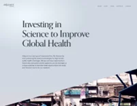
The website provides a notable example of an asymmetric layout. By employing a diagonal balance, the website achieves a dynamic and engaging aesthetic, especially on smaller screens. A video displayed as a triangle on the right side beautifully balances out the block of text positioned in the top left corner, creating a visually pleasing composition.
8. 3-D Effects
If you’re seeking to break away from the monotony of flat design and add a sense of excitement and depth to your website design, incorporating 3D elements is the way to go. Not only do 3D elements capture immediate attention, but they also enhance customer engagement by providing a visually captivating experience.
By integrating 3D elements into your website, you can create a unique and individualized online presence that stands out from the competition. The versatility of 3D elements allows them to be used effectively across industries, regardless of whether your field is traditionally considered “boring” or “fun.”
Example: Flux Academy
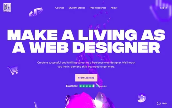
Flux Academy offers web design courses to help designers refine their skills and knowledge. The homepage of the site features an impressive array of 3D graphics, with one in particular stealing the spotlight. As visitors scroll down the page, design-related icons gracefully descend, settling into the head of a statue. This clever visual metaphor effectively conveys the purpose of the company.
What sets this example apart is the simplicity of the 3D graphics. By using flat icons, a statue, and illustrated orbs and faces, Flux Academy demonstrates how shading and motion effects can be employed to create an engaging 3D experience. It serves as a reminder that sometimes, the most impactful designs are those that embrace simplicity. At Flux Academy, even the most basic elements can be transformed into something truly captivating.
9. Full Screen Headers
A full-screen header, or even a significantly large header/hero section, is a must-have for individuals seeking to make a powerful visual statement. It serves as a gateway to creating an unforgettable first impression in the website design, leaving visitors craving more. To enhance the dynamic nature of the header, consider incorporating a slideshow feature. By swapping out a static full-screen header with a captivating slideshow, you can ensure that multiple crucial pieces of information are effortlessly noticed and absorbed.
Moreover, the expansive nature of a large header guarantees that your website maintains its visual impact and functionality across all devices. Regardless of the screen size or device type, users can enjoy a consistent and seamless user experience. This approach reinforces the professionalism and credibility of your website, ultimately fostering positive user engagement.
Example: Starbucks
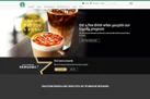
The captivating visuals employed by Starbucks on their homepage website design evoke an irresistible desire for coffee, despite the potential lack of necessity. The warm and inviting atmosphere presented highlights the primary emphasis of the website: Starbucks’ loyalty program and customer app. Upon beholding the exquisite header of the homepage, everything else on the site assumes a secondary role, providing supplementary details about Starbucks and its array of services.
Moreover, for users already logged into their accounts, the homepage presents an informative info bar that indicates the remaining points required to attain the next reward. This feature is concise yet valuable, delivering essential information directly to the user.
10. Scroll-Triggered Animations:
When it comes to browsing websites, one element that never fails to captivate my attention is scroll-triggered animations. These delightful effects, often small in nature, come to life, move, or respond as you scroll, injecting dynamism and intrigue into the website.
However, designers don’t merely use these animations for decorative purposes. Scroll-triggered animations also serve the purpose of directing users’ attention, making specific sections and elements more engaging and actionable.
Example: Gucci
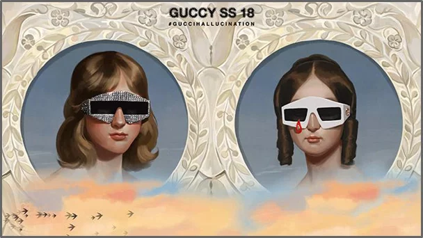
The Spring/Summer 2018 campaign, “A Gucci Hallucination,” directed by Alessandro Michele, the creative director of Gucci, and illustrated by Spanish artist Ignasi Monreal, takes center stage on this website.
It immerses visitors in a digital realm of surreal scenes and illustrations, inspired by classical artworks with a touch of pop culture infusion. The entire campaign serves as an ironic portrayal of reality, presenting a utopian fantasy with surreal twists.
The illustrations feature an array of diverse characters. Some are adorned in garments from Gucci’s 2018 collection, fishing for planes amidst the clouds. Further down, mermaids await, reclining on rocks while promoting the free Gucci-fi area (free WiFi) and attempting to capture the perfect selfie. Another scene pays homage to Disney’s Snow White, with a model asleep donning a sweater adorned with the beloved Disney character’s image. The project also incorporates famous artworks like Van Eyck’s “Arnolfini Portrait” and John Everett Millais’ “Ophelia.”
11. Chatbots And Virtual Assistants
Incorporating a chatbot or virtual assistant into your business website design brings numerous advantages that enhance user satisfaction and contribute to increased (potential) customers and sales.
Although chatbots may not fit neatly into the same category as other website design trends mentioned in this list, their significance cannot be overlooked. By implementing an intelligent chatbot, you can provide round-the-clock support, automate processes, realize cost and time efficiencies, and foster increased interactions and conversions. By delivering an enhanced experience and adding value to users’ purchasing journeys, chatbots or virtual assistants establish credibility and trust, ultimately contributing to a seamless buying experience.
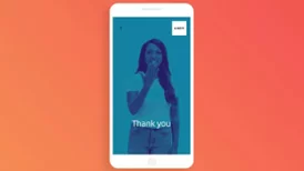
Example: Amtrak
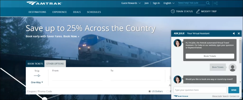
Amtrak is a passenger rail service that operates in the USA, Colombia, and certain parts of Canada. Their website design showcases a chatbot example that offers a simple and enjoyable alternative to the traditional ticket booking process. By engaging in a conversation with ‘Julie,’ the chatbot, users can easily gather information and book tickets.
The results speak for themselves. Amtrak’s Julie has been incredibly popular among users. Equipped with comprehensive answers to all Amtrak-related inquiries, Julie stands as an exemplary instance of effective chatbot conversations. But wait, there’s more. Amtrak provides a ‘contact us’ button as well—a crucial element in any chatbot. You’ll notice this feature in several other chatbot examples throughout this blog. Sometimes people prefer speaking to a human being, and if your chatbot offers that option, it’s simply perfect!
Conclusion:
We hope this blog guided you through the website design and its uncharted territory, showcasing awe-inspiring case studies, and equipping you with the tools and wisdom to forge your own unique path. Feel free to embrace the art of crafting pixel-perfect masterpieces, harness the power of intuitive interfaces, and breathe life into your digital creations.
Learn about top web design tools here.
FAQs on Website Design Trends of 2023:
Are there any emerging typography trends in website design for 2023?
Typography is poised to play a significant role in website design trends for 2023. We can expect to see a rise in custom and unique fonts, as well as experimental typography that breaks traditional rules. Oversized and bold typography will continue to make a statement, while variable fonts and dynamic text effects may also gain popularity.
How will the use of AI and machine learning impact website design trends in 2023?
AI and machine learning will continue to shape website design trends in 2023. These technologies can enhance personalization, automate tasks, and provide intelligent recommendations. Expect to see more AI-powered chatbots, smart content curation, and dynamic user experiences that adapt based on individual preferences and behavior patterns.
How can I leverage voice user interfaces (VUI) in my website design?
Voice user interfaces offer a hands-free and convenient way for users to interact with websites. To leverage VUI, you can integrate voice search functionalities, voice-controlled navigation, or even voice-guided tutorials. However, it’s crucial to provide clear instructions and fallback options for users who prefer traditional interaction methods.
