Landing pages serve as virtual welcome mats, welcoming visitors to your website. They play a crucial role in turning visitors into buyers because they are the first impression that potential customers get of the company. It’s for this reason that having well-designed landing pages is crucial.
An interesting and engaging first impression is essential if you want your visitors to return. Make sure they recognize what you’re selling and why it’s valuable by combining eye-catching imagery with convincing language and a clear value proposition.
What is a high converting landing page?
Simply put, a landing page with a high conversion rate results in more visitors taking the desired action. It has an appealing value proposition, a well-designed and structured layout with strategically placed images, and the generous help of social proof, all convincing site visitors to take action.
Converting visitors into customers is tricky, and there is no foolproof method. Gorgeous, engaging pages that don’t convert are nothing new to us. Landing pages that look like a toddler made them have been seen to convert 50 percent of their visitors.
The standard of the flow of traffic is another issue. Thanks to irrelevant advertising, your conversion rate will be lower than it would be if many people visited your site. Be gentle with yourself when evaluating your pages until you consider these factors.
What Is the Difference Between a Website and a Landing Page?
A group of interlinked web pages that can be accessed online constitutes a website. It’s meant to tell people about a company, group, or person and has multiple pages. Details about products and services, as well as points of contact, may also be included.
In contrast, a landing page is a standalone web page developed especially for the needs of an advertising or promotional effort. Its purpose is to encourage the reader to do something, like buy something or submit a form. Links to landing pages can be found in social media posts, email newsletters, or paid search ads, and each page serves a specific purpose.
The primary distinction between a website and a landing page is that the latter targets a single objective, such as increasing newsletter signups or sales.
Best Practices For High Converting Landing Pages
- Connect through a strong headline
The success of any piece of content can be directly attributed to its headline. It should feature content that piques the interest of your target audience, provide a preview of what they can expect to find on the landing page, and exhibit the tone and voice of your brand. The language should be accurate, interesting, and likely to capture the reader’s attention.
The headline’s intended readership should be of paramount importance. Why should you listen to them, anyway? Where do they feel the most discomfort? Create a catchy headline that relates to their situation by using this data.
First and foremost, make sure that your message is understandable and written in simple language. The best headlines will typically center on one or more of the following:
- Stimulating an existing pain point: People in your target demographic are typically submerged in their problems. Make a headline that addresses their issues to connect with your audience immediately.
- Promise a remedy: Provide details about the benefits customers can anticipate after using the CTA button. Customers will be able to imagine better how working with your company will benefit their lives if you give them a sneak peek at your solution in the headline.
- Trap your readers: Engage the reader with a quote, statistic, case study, or pun.
- For maximum effect, use more than one of the highlighted areas. Subheadings can be short and sweet. Use visual aids like images and graphics to bolster your headline’s message instead of making it too wordy.
- Lead with a story
People have an innate need to hear and tell tales. It stands to reason that telling a compelling story would boost sales. Set the stage first so your audience can get invested in your story. The narrative can be studied from various perspectives, and your narrative could center on the difficulties consumers encounter.
Put some tension into the story. One way in which this can occur is through the customer’s personal history. As an example of a conflict starter, pointing out that most customers’ previous attempts at other solutions have been unsuccessful is one technique.
Try to add some feeling to the story. Give the impression to the customers that you are describing their situation. Convince them that they’d be better off joining forces with your company.
- Motivate and enable
A company must have a website users enjoy visiting so much that they return to it frequently. However, you can start from scratch to develop a website people can’t stop visiting.
The Hook Model, created by Nir Eyal of Stanford University, should be used instead. User engagement can skyrocket when the Hook Model is applied correctly, outperforming more conventional forms of digital marketing. Although Eyal’s model contains four stages (trigger, action, reward, and investment), you will only be concerned with the first.
What motivates your customers to look for a solution when they have a problem? External or internal factors may serve as triggers. Motives from the outside can include helping the company outperform the competition or giving the employees a hand. An internal motivator could be the realization of a personal objective or the acquisition of a new skill. Incorporate these signals into your website’s copy to give visitors the impression that you grasp the problem for which they’re looking for a solution.
- Personalization
Since each of your customers has had a unique experience, the factors that ultimately convince them to purchase will also vary. For example, customers who learn about your company via email marketing will only need additional convincing. Hot and warm leads are much easier to persuade than those who arrive at the landing page via paid advertising.
To better understand your customers, develop buyer personas. You can divide your audience into subgroups based on demographic information such as age, gender, profession, and the medium they employed to reach your landing page. Using the Connector in Leadfeeder, you can easily import demographic and firmographic data from other platforms like Facebook and Zendesk to generate targeted landing pages.
Since the segments’ triggers vary, the landing page copy must be used for each. For optimal results, split your content into pages and tell stories that appeal to different demographics.
- Optimize whenever possible
Make sure the page’s SEO settings are all in order. Begin by using appropriate keywords in every part of your text. Doing so will improve your page’s search engine rankings. Seek out the best keywords for your landing page by searching.
Since search engine optimization targets website visitors’ on-page experience, adjusting to boost SEO will also boost the quality of the visitor’s overall time spent on the site. It would help if you used a straightforward layout that doesn’t complicate things for the readers.
Make your content look cleaner by inserting appropriate amounts of whitespace. Paragraphs should be short and simple to read for the best results. Include visual aids like images, graphics, and charts to make the material more digestible.
- Keep in mind the user’s mobile experience
Maximizing your site’s performance on mobile devices benefits search engine optimization and user satisfaction. When ranking content, Google already gives more weight to mobile versions of websites, so a mobile-friendly landing page is crucial.
One of the first things to do is to increase the site’s speed, as visitors become increasingly impatient with pages that take too long to load. Make sure your text and images can be viewed quickly. PageSpeed Insights is a great tool to check how quickly your landing pages load.
In a similar vein, make sure your landing page is free of unnecessary clutter. When possible, pop-up windows should be avoided. Be sure your call-to-action buttons are mobile-friendly. Finally, test your landing page on various devices and screen resolutions to ensure it displays correctly.
A good hosting provider makes sure your web pages and landing pages have the maximum speed to avoid any glitches in opening of the pages.
- Use products-specific imagery
Good pictures of the product can sway potential buyers into making a purchase. They help make long text passages easier to read and add visual interest to the narrative. Photos are one of many valid forms of imagery, and they may also be an image, videos, or charts. Select appropriate visuals to boost conversion rates. As stock photos may not convey the genuine tone of your business, you must use original graphics.
If you use an image, ensure it’s clean and simple so it doesn’t distract your readers. As an additional precaution, you should avoid auto-playing videos and carousels. Ensure adequate contrast between the image and the text to make it easy to read.
Choosing an image that fits the tone and subject of your narrative. For instance, a graph can be a valuable tool for demonstrating how much a client’s company grew due to employing your service.
- Add credibility elements
As a buyer, why should I put my faith in you? Put in place elements all over the landing page that demonstrate your authenticity. You can utilize a variety of tools, such as:
- Case studies: Include links to customer case studies that detail how your product improved their lives. Simply summarizing the case study and providing a link will do the trick.
- Testimonials: Incorporate heartfelt testimonials, and they need to explain the difficulty the client encountered and how your company solved it. In addition, you can use this space to demonstrate how your USPs make your business the clear winner among competitors.
- Honors and Awards Mention any honors and awards you may have received on your homepage.
- Customer Logos: By displaying your extensive list of satisfied B2B clients, you can gain the trust of new business partners.
- Trust badges: You can show your customers that you care by including trust badges like compliance certifications on your site.
- Try product videos
The use of product videos can have a significant effect on sales. They captivate viewers and get the point across clearly and effectively. Everything comes down to the quality of the videos you provide:
- Video Testimonial: Video testimonials are a great way to increase consumer confidence in your company. To make the video, you need only interview single or multiple customers.
- Demonstrations: Create an “explainer video” to better communicate with your target audience about a topic. Companies selling intricate goods or services will find them indispensable. Use demonstration videos to show potential buyers how your product works in practice. Make use of the video medium to promote your product’s usefulness.
- Animations: Animated videos are fantastic for bringing attention to otherwise dull subjects. Using animation can benefit product demonstrations, explainers, and even video testimonials. Take care to employ an animation style that gels with your company’s ethos.
- Product Videos: Product videos can significantly impact your conversion rates. They are engaging and can easily communicate a message to the target audience. It all trickles down to the kind of video you offer your audience.
- What people say about you matters more than what you tell them
The credibility of your company is crucial. Your landing page conversion rates are dependent on it. Customers will only be willing to do business with you if your reputation is good. Take care of the criticism early on before it becomes a significant issue.
Positively and promptly responding to negative feedback is essential. When your company causes a customer harm, you should apologize and do what’s right to make things right again. A landing page with lots of positive feedback is more likely to convert visitors into buyers. Place testimonials from satisfied customers on your landing page to sway potential clients in your favor.
Choose testimonials that reinforce the message of your website copy. If you want your landing page to make you stand out from the competition in a crowded industry, use testimonials that highlight your unique selling propositions and draw comparisons to similar businesses.
- Share competitive insights
One of the best ways to make a case for your company is to contrast it to the alternatives. Battle cards are a useful tool for drawing parallels between two situations. Battle cards are visual aids that compare your business’s offerings to those of one or more direct competitors. The purpose of a battle card is not to insult your opponent but rather to de-position them objectively.
Conduct a SWOT analysis (strength, weakness, opportunity, and threat) of your company and the industry. You must compare your two most important customer bases to see how they vary. This knowledge will make it simple for you to make effective battle cards.
Be objective in your evaluations of the alternatives. You can spend more time discussing your advantages, but you should still consider the competition’s strong points. Check out the competition and see how they stack up in cost, features, and how quickly they deliver service. The comparisons you make must include details that are important to the customer.
- Create (and follow) a CRO plan
Have a solid conversion rate optimization (CRO) plan to help create a stronger landing page. You could build a strong CRO plan by assessing three aspects:
- Drivers: Customers’ “drivers”: Figure out what makes people visit your page. Is it your website or social media that’s bringing them in? Do they have mutual friends who tell them about you? It’s crucial to have compelling brand messaging on channels that direct traffic to the landing page.
- Barriers: Examine all the potential roadblocks on your landing page and see if any of them prevent visitors from making a purchase. Some customers won’t convert because of ineffective messaging, and others will leave because of a shoddy user experience. Don’t stop comparing the two halves of the page. For instance, improving the landing page’s load time can significantly affect UX and time on the page, resulting in more conversions.
- Hooks: Look into what “hooks” your customers. Your company’s ability to convert customers into buyers hinges on your ability to identify and capitalize on its unique selling proposition. You could use a differentiating quality of your product or service that the competition doesn’t offer as your hook. You can attract more customers by highlighting this feature. One way to discover your business’s hook is to poll paying customers about what attracted them to your company in the first place.
Top Landing Page Examples
-
Netflix – Email Marketing Landing Page Examples
This Netflix signup page design is a prime example of a highly effective landing page. In this sample landing page, you are promptly presented with the service or product offered and encouraged to enter the site. This reduces the time and effort required to make decisions, enabling rapid action.
WHAT MAKES IT UNIQUE
- A benefit-driven headline is a surefire way to get people interested in what you have to say.
- Having the ability to cancel anytime builds trust and mitigates risk.
- One Form Field Makes It Simpler For Users To Sign Up The lead capture form has only one form field.
- You can quickly get the information you need because it’s all right at the top of the page.
- The copy on the page is persuasive because it emphasizes the advantages rather than the features.
- The frequently asked questions section makes signing up easier to understand.
- A second signup form at the page’s footer serves as a call to action (CTA) and reminds visitors to register.
- Zoom – Industry Report: Good Landing Page Examples
Many businesses use Zoom, making it one of the most popular video conferencing tools. Consequently, it is reasonable to assume that they will strive to impress upon prospective clients that they are the industry leaders.
One method they’ve tried is giving away a free report that touts them as an industry leader in meeting solutions. The report is available for free download and reading once users have registered.
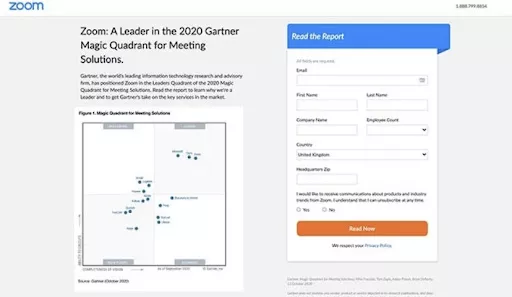
WHAT MAKES IT UNIQUE
- Free Download: Accessible information is made available through the report’s free availability for download.
- Simple Form Fields: Having only the fields necessary for the company’s use keeps the signup form simple and helps prevent people from leaving without providing any information.
- Copy that convinces readers to take action. The report’s copy is an absolute must-read, promising to reveal why Zoom is a market leader. Curiosity is piqued, and users are enticed to sign up and get the file.
- Call to Action Button – The CTA button’s high contrast color scheme increases its likelihood of being clicked.
-
Constant Contact – Free PDF Landing Page Examples
Constant Contact’s email marketing platform, like Zoom, is used by businesses of all sizes and sectors. To be clear, this particular landing page is aimed squarely at the real estate industry.
The homepage is easy on the eyes and gets right to the point. It gives real estate marketers a free download with useful tips and case studies to improve their marketing strategies. It also has a call to action (CTA) that promotes Constant Contact’s free trial.
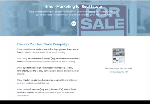
WHAT MAKES IT UNIQUE
- Powerful The headline and description both do an excellent job of outlining what the user can expect to gain from the download.
- The copywriting is persuasive because it gets right to the point and shows why the reader should follow the guide’s advice.
- Images – A high-quality PDF preview is available so that users can get a feel for the file’s contents before downloading it.
- To show that email marketing is effective, you should provide proof through customer testimonials.
- Call-to-Action – This button encourages site visitors to sign up for the demo. Due to the lack of risk associated with trying out the service, more users will sign up for the free demo.
-
Lyft – Website Landing Page Example
Landing pages for signup forms don’t need to be complicated; Lyft’s driver application landing page is one such great example. The signup form just requires a mobile number, and the headline clarifies what the user must do next, so it’s a breeze to get started.
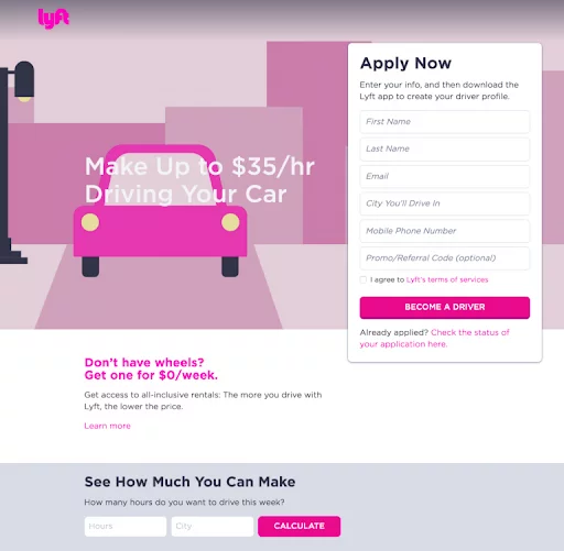
WHAT MAKES IT UNIQUE
- Minimal Design: The design is minimal, so there aren’t any extraneous elements to remove from the page’s primary purpose.
- Easy Signup – There is only one required field on the registration page.
- Visuals – Even a single image can evoke a strong emotional reaction in users, reiterating the importance of the motivation behind a user’s current course of action.
- CTA- This button emphasizes what Lyft wants you to do. When one does what is least desired, it becomes less noticeable.
-
OptinMonster – Sales Landing Page Examples
OptinMonster’s example landing page design is an excellent choice if you’re looking for a SaaS company’s take on the format. The sales page for their agency solutions contains all the features necessary for an effective landing page. Although they use appropriate brand colors, we will also examine several other strategies they employ to increase sales.
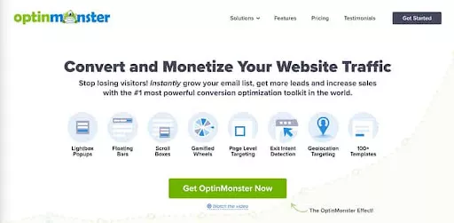
WHAT MAKES IT UNIQUE
- Page Sections: Distinct sections of a page make locating the data you need simpler. The promise made in the header draws readers in and encourages them to continue.
- Features Section: The advantages of the software are highlighted in the features section.
- Testimonial: Slide through real-life user reviews of the software.
- Visuals: Screenshots, animated GIFs, and other visuals show how the program works.
- Social Proof: This page provides evidence of the software’s success by displaying recent sales alerts and a live count of the number of people it serves.
- Calls to action: CTA is strategically placed throughout the site to encourage users to purchase.
- Live chat allows users to receive instantaneous responses to any questions.
-
Dadz – Google Ad Landing Page Examples
This homepage differs from the norm in a few fundamentals. Ads in the Google search results leads here. This strategy is highly effective for attracting targeted visitors to the site because it allows the businesses to speak directly to those visitors by addressing their specific interests and concerns.
WHAT MAKES IT UNIQUE
- Audience Match – This landing page is well-suited to members of the intended audience, addressing issues that are important to them.
- Case Studies – These provide social proof that can be read before purchasing.
- Video- Dadz also provides an exciting video demonstrating how good their product makes you feel.
- Reviews-Customer reviews on an online store prove the product is good.
- Social Media-The full Instagram gallery is evidence of the brand’s active online following.
- CTAs – Calls to Action (CTAs) are strategically placed throughout the page to highlight various purchase options.
-
Codecademy – Membership Landing Page Examples
Codecademy’s landing page is an excellent example of how strategically placing white space can highlight essential elements. Codecademy’s membership landing page is minimalist and straightforward, with only a few splashes of bright color to catch the eye instead of busy images, gradients, and full-screen backgrounds.
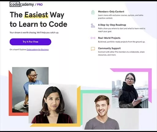
WHAT MAKES IT UNIQUE
- Use of Color- A color is a powerful tool for drawing attention and leading readers’ eyes where you want it to go.
- Images- The images on the page depict cheerful professionals, which elicits a favorable emotional response from site visitors.
- Testimonials – Opinions expressed by actual purchasers demonstrate the validity of the product and the satisfaction it has brought to the reviewers.
- Pricing – Quickly identify the best package for your needs by comparing prices across all available options.
- Call to Action – The CTA area stands out from the rest of the page thanks to its contrasting background.
-
Airbnb
Airbnb facilitates the search for lodgings and provides hosts with an income opportunity. Their landing page for hosting signups is an excellent illustration of how to let the page’s content do the talking without resorting to gimmicks.
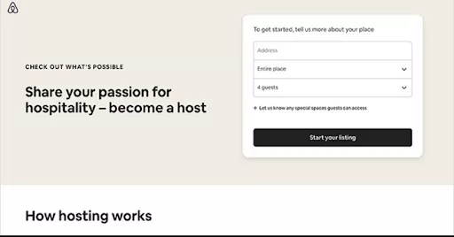
WHAT MAKES IT UNIQUE
- Signup Forms: There are only three required fields on the form, with the remaining fields hidden behind a tab. This reduces the stress level while allowing them to gather the necessary data.
- Resources- Everything a host might want to know about using Airbnb can be found in this section.
- Community-Having access to other users’ experiences with the service can be helpful for prospective buyers.
- Support-Multiple opportunities to sign up for the newsletter are provided via the numerous call-to-action (CTA) buttons sprinkled throughout.
9. Dropbox – App Landing Page Example
Making access to your product simple is crucial if you want people to use it. That’s precisely what Dropbox did with the home page for their Android app.
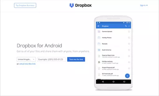
The site is simple and to the point, making it ideal for Android users. Because of the clarity this provides, your leads will be more specific.
WHAT MAKES IT UNIQUE
- Description- The headline and description provide only the essentials for users to get going.
- Picture – A screenshot of the app is displayed so the user can envision how it will appear on their mobile device.
- Forms – Distributing the app is a breeze. Enter your number below to have the link texted to your phone. There is no further action needed.
10. Taboola – Free Ebook Landing Page Example
One standard method of getting contact information is to offer a free ebook in exchange. Taboola is an easy-to-follow case of a landing page that emphasizes the book’s positive aspects. Users are encouraged to check out the brands and add their email addresses to the mailing list because the book’s content is relevant to their field. Taboola backs up its claims about native advertising’s ability to boost conversions for brands with data from its research published in an accompanying ebook. This establishes the author’s authority and piques interest in the book’s subject matter.
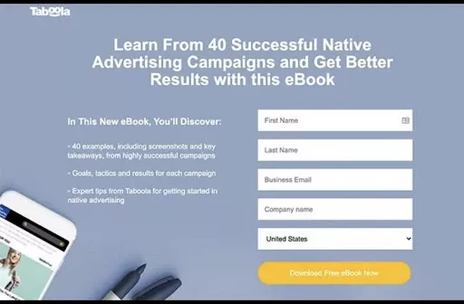
WHAT MAKES IT UNIQUE
- Numbers-It is an example of credible and persuasive writing that includes numbers in the headline.
- Bullet List-Use a bulleted list if you want the text to be easily scannable.
- Signup Form – They have their signup form brief and simple.
- Calls to action (CTAs) are prominently displayed at strategic locations on a web page, including at the top, center, and bottom.
Conclusion
Your landing page is often the first impression that potential customers have of your company. You can create a landing page that does more than just attract visitors; it can also persuade them to make a purchase.
Conduct regular tests and optimizations on your landing page as you continue to refine it. Examine the data, tweak the approach, and keep trying new things out until you find what helps your company the most. Keep your landing page consistent with your brand, and use high-quality visuals and persuasive copy to engage your audience. And most imperatively, don’t forget to test and optimize your landing page over time to ensure that it is performing as effectively as possible.
FAQs
What makes a high converting landing page?
A landing page that converts effectively should have a clear and concise message, a visually appealing design, and a strong call-to-action that entices the visitor to take action. It should also be easy to navigate and load quickly.
How do I create a highly effective converting landing page?
To create a high converting landing page, you should start by defining your goals and target audience. Then, focus on creating a visually appealing design, a clear and concise message, and a strong call-to-action. Use persuasive language and include social proof, such as customer testimonials or trust badges, to build trust with your audience.
What are some examples of effective calls-to-action?
Effective calls-to-action should be action-oriented and clearly communicate what the visitor should do next. Examples include “Buy Now,” “Download Our eBook,” “Sign Up Today,” or “Get Your Free Trial.”
What are some common mistakes to avoid when creating a landing page?
Common mistakes include having a cluttered design, a confusing message, or a weak call-to-action. It’s also important to avoid using jargon or industry-specific terms that may be unfamiliar to your target audience.
How can I measure the effectiveness of my landing page?
You can measure the effectiveness of your landing page by tracking metrics such as conversion rate, bounce rate, and time on page. You can also use A/B testing to test different variations of your landing page to see which performs best.
