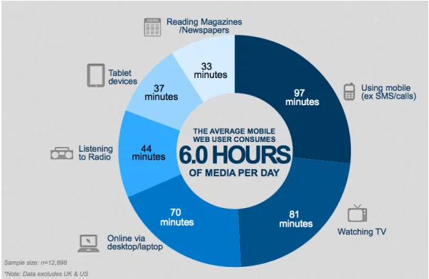
Crafting content that captivates and engages users on mobile devices isn’t just a trend—it’s a strategic necessity in today’s digital realm. As the world pivots towards handheld devices for information consumption, the need to create high-quality, mobile-friendly content has never been more critical.

Source: Adlift
Imagine a digital landscape where your content effortlessly captures attention, resonates with clarity, and seamlessly adapts to various screen sizes. This isn’t merely a wish—it’s an achievable reality with the right approach.Crafting content isn’t just about conveying information; it’s about creating an immersive experience that users appreciate and engage with effortlessly. Embrace these strategies, and watch as your content not only shines on mobile devices but also propels your digital presence to new heights.
Strategies to Creat Mobile-Friendly Content:
1. Sentence Structure Simplification

Simplifying sentence structure is fundamental for enhancing readability and comprehension. Shorter, concise sentences reduce cognitive load on readers, making content more accessible and engaging. They facilitate smoother flow and understanding, particularly for diverse audiences or those seeking quick information. Eliminating convoluted sentence structures also aids in achieving higher scores on readability tests like the Flesch Reading Ease scale, making content more user-friendly.
Examples of Redundant Phrases and How to Condense Them:
Before: “Due to the fact that it is raining, we will postpone the event until next week.” After: “As it’s raining, we’ll postpone the event until next week.
Before: “At this moment in time, we are not in a position to offer a discount.” After: “Currently, we cannot offer a discount.”
Tools and Techniques to Identify and Eliminate Redundancy:
Employing writing tools such as Grammarly, ProWritingAid, or Hemingway Editor can significantly aid in refining your content. These tools serve as invaluable aids by pinpointing complex sentences, highlighting redundant phrases, and suggesting alternatives for simplification. They act as virtual writing assistants, guiding authors to streamline text and enhance overall readability.
Moreover, combining automated assistance with manual proofreading and revisions enables a comprehensive assessment of the content. This approach helps identify and rectify unnecessary wordiness or repetitive phrases, contributing to a polished and more reader-friendly final draft.
2. Embrace Simpler Language

Employing simple and clear language is pivotal for effective communication across diverse audiences. It ensures that information is easily understood by readers from various backgrounds or levels of expertise. Avoiding overly technical jargon or complex vocabulary prevents confusion and facilitates engagement. By employing straightforward language, content creators enhance accessibility, inviting a wider readership to engage with their material.
Strategies for Employing Simpler Language:
When crafting content:
- Replace Complex Terms: Substitute intricate words like “utilize” with simpler alternatives such as “use” or “employ.”
- Trim Wordiness: Avoid verbose phrases or convoluted expressions. For instance, opt for “start” instead of “commence.”
- Use Familiar Analogies: Analogies and relatable examples help convey complex concepts in more accessible ways.
Real-life Example Showcasing Word Replacement:
Original: “The utilization of contemporary technological advancements has drastically revolutionized our operations.”
Revised: “Using new technology has completely changed how we work.”
Tools and Resources to Enhance Clarity:
Tools such as Readable and Hemingway Editor are excellent aids in evaluating text readability. They analyze content and flag complex phrases or words that might hinder comprehension. These tools not only pinpoint areas for improvement but also suggest simpler alternatives to enhance overall clarity and understanding.
Moreover, these platforms provide readability scores, offering a comprehensive overview of the text’s complexity. By utilizing these scores as a guide, writers can refine their content to cater to a wider audience, ensuring the material is easily digestible and engaging.
3. Trim Redundancies and Excess

Verbose text often hampers reader engagement and comprehension. It dilutes the essence of the message by inundating it with unnecessary details, making it challenging for readers to extract the core information. Redundancies, such as “added bonus,” “final outcome,” or “end result,” clutter the text, obstructing clarity and flow. Precise language is pivotal in ensuring that the message is conveyed efficiently, resonating effectively with the audience.
Tools and Techniques to Identify and Eliminate Redundancy:
Tools such as Readable and Hemingway Editor are excellent aids in evaluating text readability. They analyze content and flag complex phrases or words that might hinder comprehension. These tools not only pinpoint areas for improvement but also suggest simpler alternatives to enhance overall clarity and understanding.
Moreover, these platforms provide readability scores, offering a comprehensive overview of the text’s complexity. By utilizing these scores as a guide, writers can refine their content to cater to a wider audience, ensuring the material is easily digestible and engaging.
Real-life Examples of Before-and-After Revisions:
Before: “The current situation has given rise to an increased number of new challenges that need immediate attention from our team.”
After: “The current situation presents new urgent challenges for our team.”
4. Conciseness over Elaboration

Conciseness in communication is essential for capturing and retaining audience attention in today’s fast-paced digital landscape. It ensures that the message is easily digestible and doesn’t overwhelm the reader. By eliminating unnecessary details and getting straight to the point, concise messaging respects the audience’s time while delivering the intended information effectively. It fosters engagement and encourages readers to consume and retain the content.
Strategies to Streamline Messaging without Losing Substance:
Crafting concise messages doesn’t imply sacrificing depth or substance. The key lies in distilling complex ideas into straightforward language. Start by outlining the core message and supporting points, then trim extraneous information. Utilize active voice, prioritize essential details, and avoid tangential explanations. Bullet points, lists, or infographics can further condense information into easily digestible formats. While brevity is crucial, it should not compromise the clarity of the message. Use clear and direct language, avoid ambiguity, and ensure that the essence of the message remains intact. Simplify complex terms or concepts without oversimplifying them, striking the balance between brevity and comprehensibility.
Case Studies or Anecdotes Illustrating Effective Conciseness:
Before: “It is important for businesses to understand that in the current economic scenario, adopting cost-effective strategies is highly advisable.” After: “Businesses should adopt cost-effective strategies in the current economic scenario.
5. Limit Excessive Details

In content creation, striking a balance between providing adequate information and overwhelming the reader is crucial. Excessive details can dilute the core message, causing distraction or disengagement. By focusing on key points and maintaining brevity, content remains concise and easily digestible.
Strategies to Avoid Over-Elaboration:
- Prioritize Key Information: Identify the essential elements required to convey your message effectively.
- Trim Unnecessary Data: Eliminate redundant or tangential information that doesn’t contribute directly to the core message.
- Use Precise Language: Opt for concise, impactful language that conveys information effectively without unnecessary elaboration.
Real-life Example of Simplifying Excessive Details:
Original: “The intricacies of the novel’s plot, including the multifaceted character backgrounds and extensive historical context, were exhaustively explored.” Revised: “The novel thoroughly explored its plot intricacies, character backgrounds, and historical context.
6. Enhancing Content with Visual Elements:

Incorporating visual aids such as images, infographics, or videos amplifies content engagement and comprehension. Research confirms that visuals significantly expedite information processing, leading to better retention and understanding among audiences.
Tools to Elevate Visual Content:
Canva is an excellent platform offering a user-friendly interface and a plethora of tools for creating visually appealing graphics and designs. It provides various templates and customization options that cater to diverse design needs.
Similarly, Adobe Spark is another powerful tool that simplifies the creation of impactful visuals, including graphics, web pages, and short videos. With its intuitive interface and extensive library of design elements, Adobe Spark assists users in crafting professional and engaging visual content.
7. Prioritize High Contrast Colors

Employing high-contrast colors significantly impacts readability and accessibility. They enhance text visibility, making it easier for users to consume content across various devices. Proper color contrast ensures readability for individuals with visual impairments, contributing to a more inclusive browsing experience.
Tools for Color Contrast:
- WebAIM Contrast Checker: This tool enables users to test and adjust color combinations to ensure optimal contrast, aligning with accessibility standards. It helps in creating designs that are accessible to a wider audience by meeting contrast requirements.
- Contrast Checker: This tool offers visual comparisons of foreground and background colors, assisting in determining the readability and accessibility of the chosen color combinations. It aids designers and content creators in ensuring that the contrast between colors meets necessary standards for better visibility and comprehension.
Real-life Example:
Using high contrast (e.g., black text on a white background) on websites significantly improves readability, especially for individuals with visual impairments. Contrast Checker tools help identify and rectify low-contrast issues, ensuring content accessibility.
8. Optimize Title Length and Structure

Titles serve as the initial impression of content, influencing user engagement and search engine visibility. Concise titles, typically around 70 characters, succinctly convey content essence while boosting readability and SEO performance. Including primary keywords in titles enhances search engine visibility and enables users to comprehend content topics swiftly.
Strategies for Effective Title Structure:
- Limit Length: Aim for titles under 70 characters for clear and concise representation.
- Keyword Integration: Incorporate primary keywords at the start of titles for improved search engine ranking and user comprehension.
Example of Optimized Title:
Original Title: “Advanced Techniques for Implementing SEO Strategies and Enhancing Website Performance” Optimized Title: “Enhance Website Performance: Advanced SEO Implementation Techniques
9. Strategic Placement of CTAs

Strategically positioning compelling Call-to-Action (CTA) buttons plays a pivotal role in driving user engagement and navigating them through content effectively. Placing CTAs at key points within content enhances the likelihood of user interaction and conversion, guiding users seamlessly through the sales funnel.
Effective CTA Placement Strategies:
- Prominence: Position CTAs where they are highly visible and easily accessible to users.
- Relevance: Align CTAs with content context to ensure they address user needs and interests effectively.
Real-life Example:
A website placed its “Subscribe Now” CTA prominently at the end of an engaging blog post. This resulted in a 20% increase in newsletter sign-ups, highlighting the impact of strategic CTA placement.
10. Mobile Preview and Proofing

Conducting mobile previews before publishing content ensures consistent readability and design coherence across diverse devices. This proactive approach safeguards against potential layout or functionality issues, contributing to a seamless and user-friendly experience.
Tools for Mobile Preview:
- Google Mobile-Friendly Test: This tool from Google helps in assessing the mobile-friendliness of a webpage and offers suggestions for optimization.
- Responsinator: Responsinator provides previews of websites on various devices, aiding in evaluating mobile responsiveness across different screen sizes.
Example of Mobile Proofing:
Using the Google Mobile-Friendly Test, a website detected issues with page loading speed on mobile devices. Addressing these concerns led to a 30% increase in mobile traffic and improved user experience.
11. Content Readability Metrics

Utilize readability metrics like Flesch Reading Ease and Gunning Fog Index to quantify the ease of comprehension in your content. These metrics provide quantitative assessments, aiding in refining content for broader audience engagement.
Example of Readability Improvement:
By analyzing content through Readable.io, a blog identified areas for improvement. After optimizing content for better readability, the Flesch Reading Ease score increased by 15 points, resulting in increased user engagement.
13. Accessibility Compliance

Ensuring content accessibility accommodates diverse user needs, including those with disabilities. Adhering to accessibility standards enhances user experience and inclusivity.
Accessibility Testing Tools:
- WAVE Web Accessibility Evaluation Tool: This tool assists in identifying and addressing web accessibility issues, providing guidance to improve web content accessibility.
- axe Accessibility Checker: This checker is an essential tool for developers, offering insights into accessibility issues during content creation, ensuring adherence to accessibility standards.
Real-life Accessibility Implementation:
A website enhanced its accessibility by using alt text for images, improving screen reader compatibility. This adaptation increased website traffic by 25% from users who benefited from these accessibility features.
14. Engage in User Feedback Loops

Establish feedback mechanisms like surveys, comment sections, or contact forms to solicit user opinions. Regularly incorporate user feedback into content optimization strategies.
Utilizing Feedback for Improvement:
Analyze user comments and suggestions to understand pain points and preferences. Iteratively update content based on this feedback to meet user needs effectively.
Conclusion:
Crafting high-quality mobile-friendly content is pivotal in today’s digital landscape. Prioritizing readability, simplicity, and mobile responsiveness ensures that your content engages a wider audience, positively impacting user experience and search engine visibility. By utilizing various tools and adhering to best practices, you can enhance your content’s effectiveness and accessibility across devices, ultimately elevating your digital presence.
FAQs on Mobile Friendly Content:
What steps can I take to reduce load times on mobile devices?
Optimizing images, minimizing HTTP requests, leveraging browser caching, and using content delivery networks (CDNs) are effective ways to enhance mobile loading speed.
Should I prioritize text or visuals for mobile-friendly content?
Balance is key. While concise, well-structured text is essential, visuals like images and videos can significantly enhance engagement and convey information more effectively in a mobile-friendly format.
How often should I update my mobile-friendly content?
Regular updates are crucial to keep your content fresh and relevant. Depending on your industry or content type, updating every few months or when new information emerges is beneficial.
What are some common mistakes to avoid in mobile-friendly content creation?
Avoiding non-responsive design, neglecting readability, using intrusive pop-ups, and ignoring mobile-specific SEO practices are some common mistakes. It’s crucial to stay updated with the latest mobile content trends and best practices.


