You spend extra time selecting an excellent layout and publishing high-quality, outstanding content, but despite these efforts, you’re still unable to push the sales funnel.
Hold on! Have you examined the color scheme? Color psychology for web design can deliver a powerful effect on conversions. Did you know that individuals make purchasing decisions in only 90 seconds, and 90% of the decision-making is influenced by colors?
When a user signs up for a newsletter, completes a form, or presses the “Buy Now” button on your site, it shows that your site delivers a superb user experience. Ultimately, your main objective is to make users take desired actions on your site, and the colors can play a critical function in this.
Whether you’re creating a new website or editing an existing one, selecting the proper color scheme is essential. Let’s examine each point in detail.
Where Should You Use Colors?
The color schemes you utilize may not be obvious, but they do create a distinction. The essential places that you must be cautious about are:
- Fonts
- Images
- Borders
- Pop-ups
- Headlines
- Menu Links
- Links
- Hero graphics or primary web banners
- Background hues
- Buttons, specifically call for action
The selection of colors in these significant regions relies on the type of users your website aims for. Let’s examine this further now.
Color and Conversions
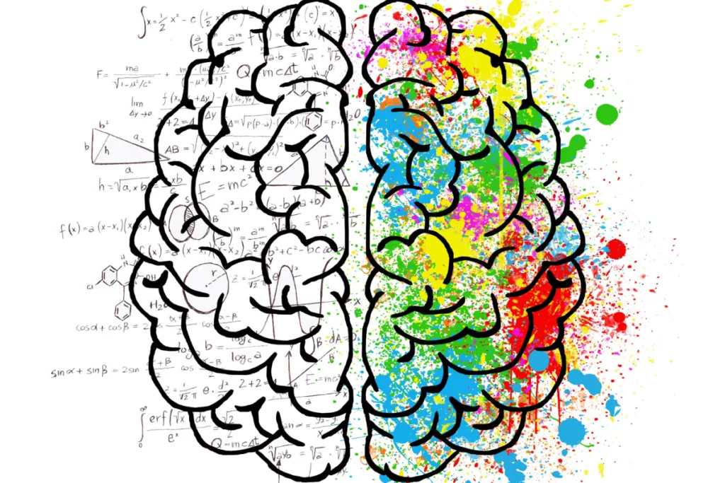
There has been a confirmed scientific relationship between the desire to buy and the product’s color. Each time you witness a color, a series of reactions occur within your brain’s hypothalamus.
Hormones are discharged to your thyroid, activating emotions that influence your demeanor. 63% to 90% of buying decisions are based on colors! So, delving further into the psychology of color can significantly enhance evasive conversions for your site.
Colors From the Internet Marketer’s View
We have made the list below of colors and the emotions they uplift according to the psychology of color. When utilized appropriately, these colors can make an excellent way to offer your site the correct qualities for enhancing conversion rates.
The Color Pink
Let’s begin with pink. If your aimed market is mostly women, then pink is a suitable color for you. The color is recognized to boost feelings of romance and fun. Pink is attached quite firmly to youthful womanhood.
It’s active and brings to mind innocence and bubble gum. It is perfect for sites that harken to the past or aim at a specifically feminine audience.
Blue
Blue represents reliability and delivers an atmosphere of serenity. This color would sufficiently serve any website that implies monetary transactions, online prescriptions, or any other place that requires trustworthiness.
Red
Nothing grabs individuals’s attention like red. It’s believed to be the most influential color for a call to action. Red is your color if you’re preparing that “get now” button. Red is a refreshing, stimulating color. It’s linked with power, passion, and sometimes anger.
It can be employed to show danger or for warnings, but it can also symbolize determination, strength, and boldness.
Green
Green is the color of serenity, peace, and nature. It can give users rejuvenation, calm, prosperity, and positiveness. Darker hues are more connected to money, so areas that desire to present growth, affluence, and tranquility usually utilize those shades.
Lighter shades are more linked with growth and spring, so sites that desire to evoke feelings of freshness, relaxation, and honesty frequently employ lighter shades.
Yellow
In marketing, yellow is believed to convey a healthy sense without depressing thoughts or worries. It is excellently suited for online stores that offer things like kids’ toys and apparel. This color is also linked with a warning.
Yellow is usually regarded as the most energizing color. In earlier eras, individuals learned to associate yellow with the sun, so it became associated with happiness and warmth.
Purple
Purple exudes sophistication and elegance. This color is perfect for a site that offers niche luxury goods. According to color psychology, purple encourages mental and emotional harmony, mental stability and balance, mental tranquility, and a connection between the physical and spiritual realms as well as between thinking and action.
Orange
Orange can also represent complexity but is also eye-catching. It is less overwhelming and quite balanced than red. Vibrant, friendly, active, and inviting, orange is perfect for plans that require energy and movement.
Websites that desire to exhibit their creativity frequently prefer orange because it’s exciting and unique, but it even has the convenience of a friendly color. This color is appropriate as a backdrop for tech firms or websites that deal with devices.
Gold
As a metallic color, gold represents prestige and power. It functions nicely with other colors representing dignity, such as purple and green.
Gold is the color of triumph, achievement, and success. The psychology of this color suggests prosperity and abundance, extravagance and material richness, prestige and sophistication, luxury and quality, value and elegance.
Black
Black is universal and goes nicely with every color. It is excellently utilized to create a contrast with the remainder of the colors employed in the website. Black is associated with authority and control in color psychology, as well as holding onto items and information rather than sharing them with others. Because of its power, black is scary, unapproachable, and hostile.
Its intimidating nature may make two-way communication difficult. The all-black salesperson will close lots of deals, but he won’t have any friends! It exudes power, but in the process it instills terror.
Black suggests independence, self-discipline, a strong will, and projecting an air of dominance and strength.
Brown
Brown is a bland color that gives calmness and relaxation. This color is ideal for businesses that deal with wellness and health. Creams are elegant, calm, and pristine, creating a fantastic backdrop color for a site that desires to suggest a feel of tradition.
Tans are conventional and get to mind purity. They can be tedious, but they can also be bright, which makes them perfect for a place that doesn’t desire to be overly outrageous or bold.
Dark brown senses are reliable and wholesome, similar to a loaf of bread. It’s linked with comfort and warmth. Websites that desire to show experience and comfort frequently utilize brown.
Conclusion
Colors can make a particular mood or appearance on a site. If a website’s color offers an incorrect impression, it can increase bounce rates, as the website will indicate unprofessionalism, inexperience, or even untrustworthiness.
If the image is correct, it allows visitors to understand that the website is reliable and that it ‘calls’ its niche. Little wonder, then, that web designers will continue to prioritize the psychology of color.
Also Read: Know How to Find the Best Colors for Your Blog Design Using HTML Color Charts
FAQS
Which colors evoke feelings of loneliness?
Gray is commonly associated with boredom, isolation, and emptiness in Europe and America. It is often related to gloomy weather and winter. Silver, meanwhile, is symbolic of tranquility.
What are the emotional connotations of different colors?
Various colors are stereotypically linked with specific emotions: red signifies anger, orange evokes excitement, yellow represents happiness, green conveys serenity, blue suggests sadness, and purple denotes importance.
How does color influence the brain?
Three primary colors notably impact human emotions: red elicits intense emotions, blue induces a sense of calmness, and yellow evokes happiness, often likened to the sun’s warmth.
Why is color psychology significant?
Each color is tied to distinct emotions. Incorporating color strategically in design can profoundly influence the feelings and attitudes of viewers. Thoughtful use of color can enhance user experience and prompt desired behaviors, such as increased conversion rates, in meaningful ways.


