
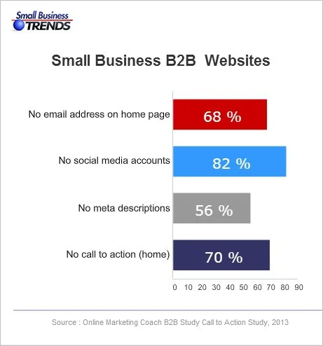
Call-to-action (CTA) pages are the unsung heroes of digital marketing, playing a vital role in converting website visitors into engaged customers. A well-designed CTA page can make all the difference in capturing user interest and driving desired actions. In this blog post, we’ll explore the key elements of creating effective CTA pages and highlight real-life examples that have mastered the art of compelling calls to action.
Understanding the Basics
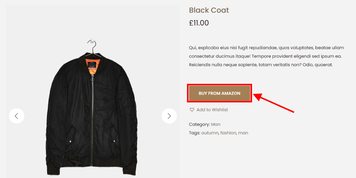
CTA Button
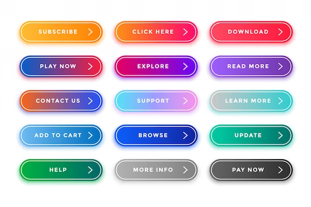
A CTA button is typically a clickable element that simplifies the conversion process. For instance, a straightforward “Click here to sign up” efficiently guides users through the marketing funnel, turning them into valuable conversions.
The primary goal of CTA buttons is to capture attention and entice users to take the desired action. When designing your landing page, consider emphasizing the button, even if it involves toning down competing elements to ensure its prominence.
Design Tip: Keep your CTA buttons simple and effective. Ensure they have a defined shape or border, use a contrasting color from the background, incorporate intentional, action-oriented copy, and, most importantly, verify that the link functions correctly.
Crafting an Ideal CTA Copy
Crafting the ideal call to action requires intentional writing. Though it may seem simple, every word must contribute to your conversion goal. Avoid ambiguity; ensure clarity so that your audience, when encountering your CTA, is on the verge of converting without lingering questions. Questions like “Get started with what?” should be eliminated for a seamless transition to conversion.
Consider key factors such as:
- Reflecting on your value proposition
- Specifying the action required
- Aligning with your conversion goal
Incorporating first and second-person pronouns adds excitement, helping the audience envision themselves benefiting from your product or service.
The Role of a Call to Action in Achieving Your Conversion Objectives
Whether your aim is to boost sales, attract quality leads, gain new members, secure subscriptions, book consultations, or increase registrants, the essence of a Call to Action (CTA) is to facilitate the conversion process.
However, it’s not as simple as placing a flashy button on your landing page and hoping for the best. The effectiveness of CTAs varies across campaigns, making it crucial to tailor them to your specific goals. To enhance conversion rates consistently, start by clearly defining your objective.
Defining Your Conversion Objective
Your conversion goal should be a measurable objective aligned with the desired user action on your landing page. Depending on your campaign and industry, common conversion goals include increasing sales, attracting high-quality leads, acquiring new members, gaining subscriptions, booking consultations, and increasing registrants.
Now, armed with a clear objective, the next step is to craft compelling copy and design a button that seamlessly supports your goal. For inspiration and insights on what works, consider exploring these CTA examples. They offer a valuable peek into the strategies that can effectively prompt user actions and drive successful conversions.
Real-Life Examples
HubSpot

HubSpot‘s CTA pages are a masterclass in simplicity and clarity. Their CTAs stand out with bold colors, concise copy, and a sense of urgency. Whether it’s a free trial or a downloadable resource, HubSpot’s CTAs guide users seamlessly.
Netflix

Netflix excels in creating personalized CTAs that resonate with users. Their “Join Free for a Month” button is strategically placed, accompanied by compelling visuals and a guarantee of no commitments, making it irresistible for potential subscribers.
Mailchimp
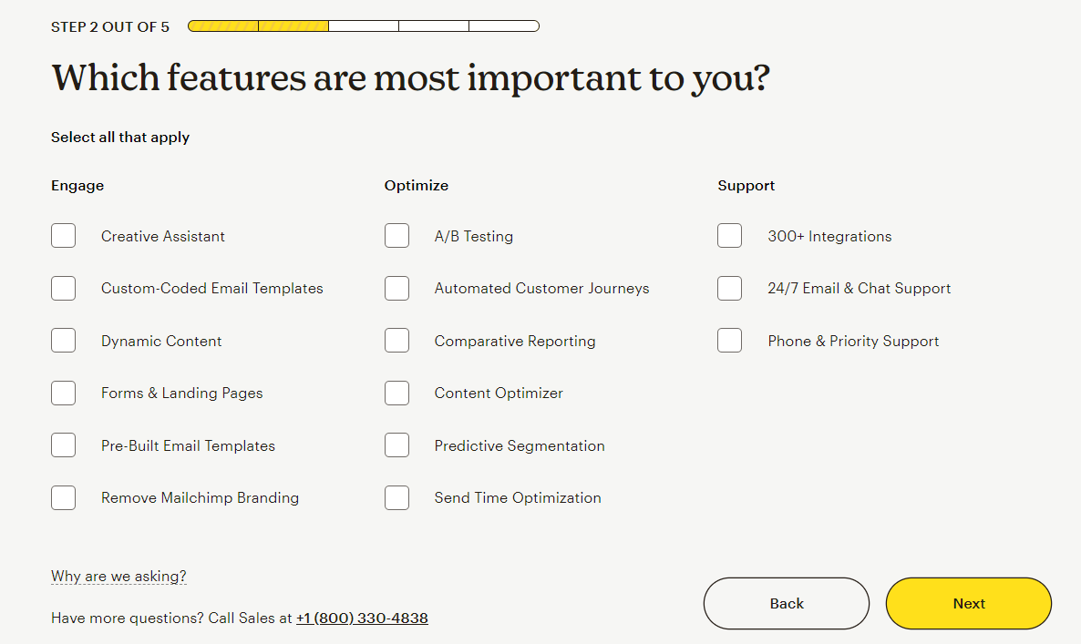
Mailchimp‘s CTA pages excel in guiding users through a step-by-step process. From signing up for a free account to creating a campaign, each CTA is strategically placed, accompanied by clear instructions, making the user journey seamless.
Shopify

Shopify utilizes CTAs for actions such as starting a free trial, creating an online store, or learning more about their e-commerce solutions.
Amazon
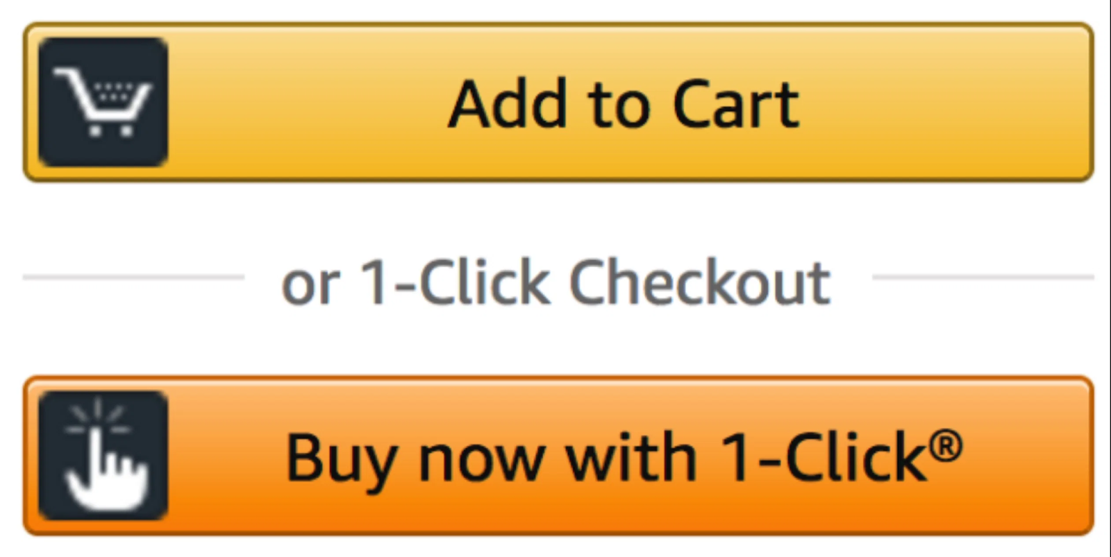
Amazon employs CTAs throughout its site, urging shoppers to “Add to Cart” or “Buy Now.” Their CTAs are strategically placed, driving users to make a purchase with clear, concise instructions.
Best Practices for Crafting CTA Pages
Clear and Concise Copy:
Ensure your CTA copy is straightforward and compelling. Use language that resonates with your audience and clearly conveys the action you want them to take.
Contrasting Colors:
Make your CTA button stand out by using colors that contrast with the background. This draws attention and encourages users to click.
Strategic Placement:
Position your CTA where it’s easily visible, preferably above the fold. Consider the natural flow of the page and guide users seamlessly toward the action you want them to take.
Compelling Visuals:
Incorporate relevant and eye-catching visuals that complement your CTA. Images or icons can reinforce the message and make the page more engaging.
Urgency and Scarcity:
Create a sense of scarcity or urgency to motivate immediate action. Phrases like “Limited Time Offer” or “Exclusive Deal” can inculcate a fear of missing out (FOMO) and drive conversions.
Mobile Optimization:
Ensure your CTA pages are fully responsive and optimized for mobile devices. With an alarming number of users accessing websites on smartphones, a seamless mobile experience is crucial.
A/B Testing:
Continuously test different variations of your CTA elements to identify what resonates best with your visitors. Experiment with copy, colors, and placement to optimize for higher conversions.
Minimal Form Fields:
If your CTA involves a form, keep it simple. Asking for too much information can deter web users. Only request essential details, minimizing friction in the conversion process.
Trust Indicators:
Include trust-building elements such as testimonials, reviews, or security badges near your CTA. This instills confidence in users and reduces hesitation before taking action.
Analytical Insights:
Leverage analytics to analyze the performance of your CTA pages. Understand user behavior, identify drop-off points, and use data-driven insights to continually optimize your CTAs.
Conclusion
Creating effective CTA pages involves a combination of strategic design, persuasive messaging, and continuous optimization. By incorporating these best practices and taking inspiration from successful examples, you can elevate your CTA pages to conversion-driving powerhouses. Remember, the key lies in understanding your audience and providing them with a seamless, compelling experience that motivates them to act.
FAQs
How frequently should I update or refresh my CTA pages?
Regularly review and update your CTA pages to stay relevant and aligned with your marketing goals. Changes can be based on performance data, shifts in audience behavior, or updates to your products/services.
Can CTA pages be used for different goals, such as newsletter sign-ups or product purchases?
Absolutely. CTA pages are versatile and can be tailored to various goals, whether it’s encouraging newsletter subscriptions, promoting product purchases, or driving event registrations. Customize your CTA pages based on specific objectives.
Should CTA pages differ for different audience segments?
Yes, consider creating targeted CTA pages for different audience segments. Tailor the messaging, design, and offers to resonate with the niche needs and preferences of each segment.
How can I balance creativity and simplicity in CTA page design?
Strive for a balance by keeping the design visually appealing but not overly complex. Use creative elements that enhance the user experience and align with your brand while ensuring clarity and ease of navigation.
