There’s a particular type of marketing email that your subscribers eagerly anticipate and welcome promptly in their inboxes. It’s not the typical abandoned cart or back-in-stock email; it’s the order confirmation email.
Your customers seek assurance that their payment has been successfully processed and their order details are accurate. Yet, when strategically employed, an order confirmation can transcend its role as a mere transactional email.
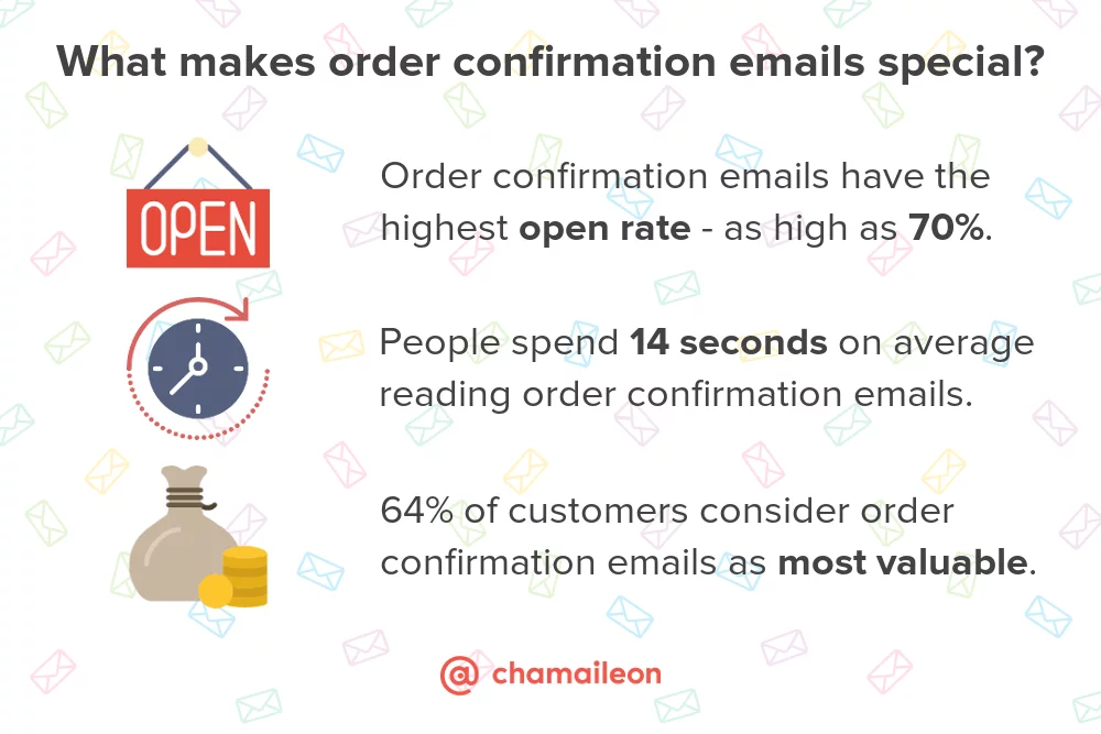
With the potential to generate eight times more opens compared to regular marketing emails, order confirmation emails offer a prime opportunity to:
– Capture the excitement of buyers;
– Seamlessly engage in cross-selling and upselling without adopting a pushy sales tone;
– Encourage referrals;
– Foster customer loyalty;
– And achieve various other marketing objectives.
What Constitutes an Order Confirmation Email?
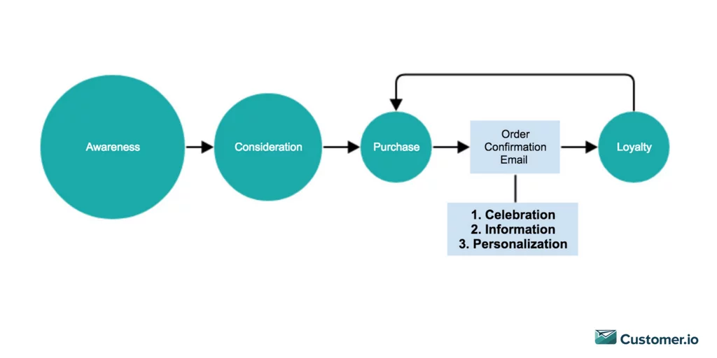
An order confirmation email serves as a transactional message dispatched by e-commerce entities to notify purchasers about their order’s successful receipt or processing.
While it typically includes crucial transaction particulars such as delivery address, purchased items, and the sum paid, it transcends a mere receipt.
An adept order confirmation email functions as the initial stride in converting one-time buyers into recurring customers and, eventually, brand advocates. It goes beyond relaying transaction data. It seizes the buyer’s enthusiasm, dispels any potential confusion, and, most significantly, lays the groundwork for a mutually beneficial relationship with your clientele.
In fact, overlooking this seemingly straightforward transactional email can be a detrimental e-commerce blunder, undermining your customers’ trust in your brand.
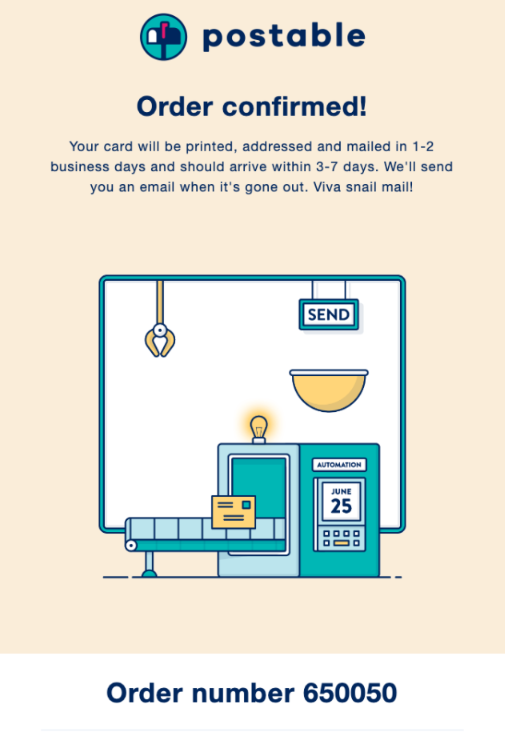
The order confirmation page is a critical component of the e-commerce experience, providing customers with essential information and assuring them that their purchase was successful. Here are the main elements typically found on an order confirmation page:
- Success Message: A clear and prominent success message reassures the customer that their order has been successfully processed. This message is usually accompanied by positive language, expressing gratitude for the purchase.
- Order Number: An order number is a unique identifier assigned to each transaction. Including the order number in the confirmation ensures clarity and provides customers with a reference point for future inquiries or tracking.
- Purchased Products/Services: A detailed list of purchased items or services allows customers to review their orders. Each product/service is typically accompanied by its name, quantity, and any relevant details such as size, color, or variant.
- Order Summary: The order summary provides a comprehensive overview of the financial aspects of the transaction. It includes the order’s total cost, applicable taxes, delivery costs, and other charges. This breakdown ensures transparency and helps customers verify the accuracy of the payments.
- Payment Method: Displaying the chosen payment method reinforces the customer’s awareness of how the transaction was processed. It might include the credit card used, the digital wallet, or any other payment option selected during checkout.
- Billing and Delivery Address: Presenting the billing and delivery addresses allows customers to confirm that their orders will be shipped to the correct location. This information is crucial for order accuracy and delivery fulfillment.
- Estimated Delivery Time: Providing an estimated delivery time sets expectations for when the customer can anticipate receiving their order. This information helps manage customer expectations and adds an element of anticipation.
- Shipping Method: Details about the chosen shipping method, whether standard, express or any other option, inform customers how their order will be delivered. This includes the carrier, expected delivery duration, and any tracking details, if applicable.
- Return Policy: An optional element, including a brief overview of the return policy, is recommended. This serves as a reminder to customers about the terms and conditions for returns, exchanges, and refunds. Clear communication about the return process contributes to a positive post-purchase experience.
- Additional Information or Upselling Opportunities: Some order confirmation pages include information such as upcoming promotions, loyalty program details, or product recommendations. This is an opportunity for businesses to engage customers further and encourage repeat purchases.
Examples of Order Confirmation Emails:
1. Excitement-Infused Order Confirmation Email by Fitbit
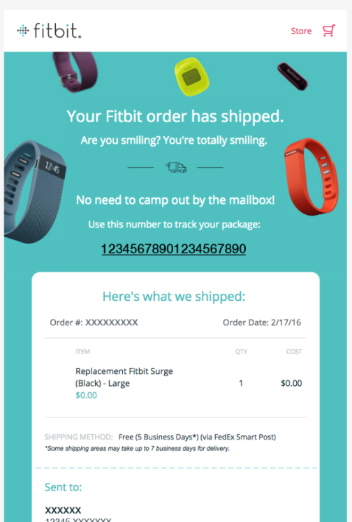
Fitbit, renowned for its adept marketing strategies, exemplifies excellence in its order confirmation email. Not only is the design visually appealing, but the cleverly crafted line, “Are you smiling? You’re smiling,” is bound to evoke joy in the reader. This strategic move builds anticipation for the new fitness tracker and reinforces Fitbit’s brand identity as fun and youthful. The subsequent line, “No need to camp out by the mailbox,” further enhances this playful brand positioning.
Moreover, the email impeccably fulfills the expectations of someone seeking order confirmation details. Fitbit covers everything from order number and specifics to estimated delivery time, tracking link, and delivery address. This holistic approach ensures a seamless post-purchase experience for the customer.
2. Incentive-Driven Purchase with Gilt’s Order Confirmation Email
Gilt demonstrates a keen understanding of consumer behavior by capitalizing on the order confirmation email to drive additional sales. In a swift move, Gilt includes a free shipping offer within moments of a purchase. Targeting a highly receptive audience who has just completed an online transaction, this approach is poised to boost conversion rates for the campaign.
The time-bound nature of the offer, limited to one hour, not only adds urgency but also allows Gilt to conveniently bundle the additional purchases with the original order, minimizing the impact on shipping costs. For businesses already offering free shipping or those opting for different incentives, the order confirmation email emerges as a prime opportunity to leverage customer engagement.
3. Up-Sell & Cross-Sell Mastery by Dollar Shave Club
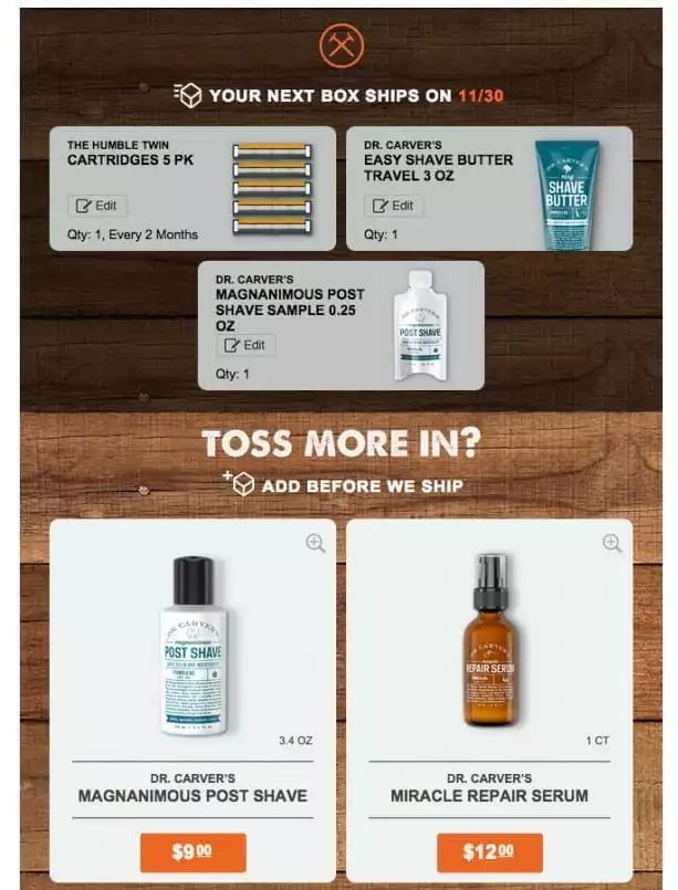
Recognizing the immense potential of order confirmation emails, Dollar Shave Club strategically incorporates product recommendations to foster additional sales. Positioned beneath the order details, these product suggestions are tailored to complement the customer’s recent purchase. Dollar Shave Club encourages customers to expand their shopping cart by leveraging the correlation between the purchased item and the recommended products.
4. Strategic Brand Alignment by Toms
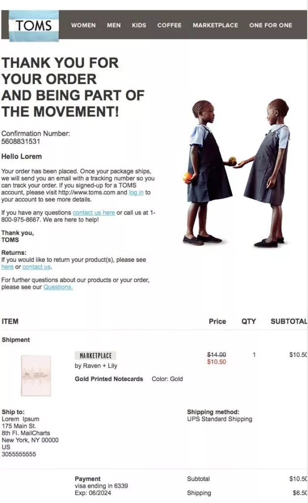
In a departure from conventional promotional offers, Toms sets a notable example of infusing meaning into order confirmation emails. Recognized for its philanthropic endeavors, Toms strategically incorporates charitable reminders within their order confirmation email. Beyond reinforcing their brand identity, this approach aims to evoke positive emotions in customers, transforming the purchase into a feel-good experience.
They acknowledge the reality of buyer’s remorse—Toms endeavors to make customers feel their purchase contributes to a greater cause. By subtly weaving their charitable work into the confirmation email, Toms successfully taps into the psychological aspect of consumer satisfaction. This preemptive effort gives customers a sense of fulfillment before their ordered items arrive, effectively minimizing post-purchase regret.
Learn about newsletter marketing here.
5. Streamlining Shipment Tracking with Zulily
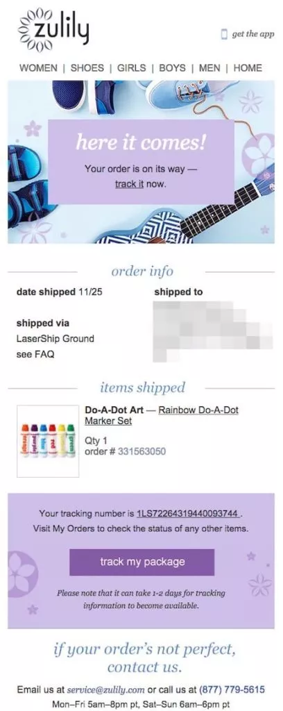
An indispensable aspect of order confirmation emails is the inclusion of shipping information. Zulily takes this a step further by recognizing the post-purchase eagerness to track shipments. The email design seamlessly integrates a clear and prominent “Track My Package” call-to-action (CTA) button, simplifying the tracking process for customers.
This user-friendly design eliminates the hassle of copying and pasting tracking or order confirmation codes into external websites. The intuitive CTA button provides a direct pathway for customers to check the status of their package with a simple click. While the functionality is commendable, an enhancement in CTA button visibility through contrasting colors or design elements could further optimize user experience.
6. Elevating Design Standards: Boden and Fat Brain Toys
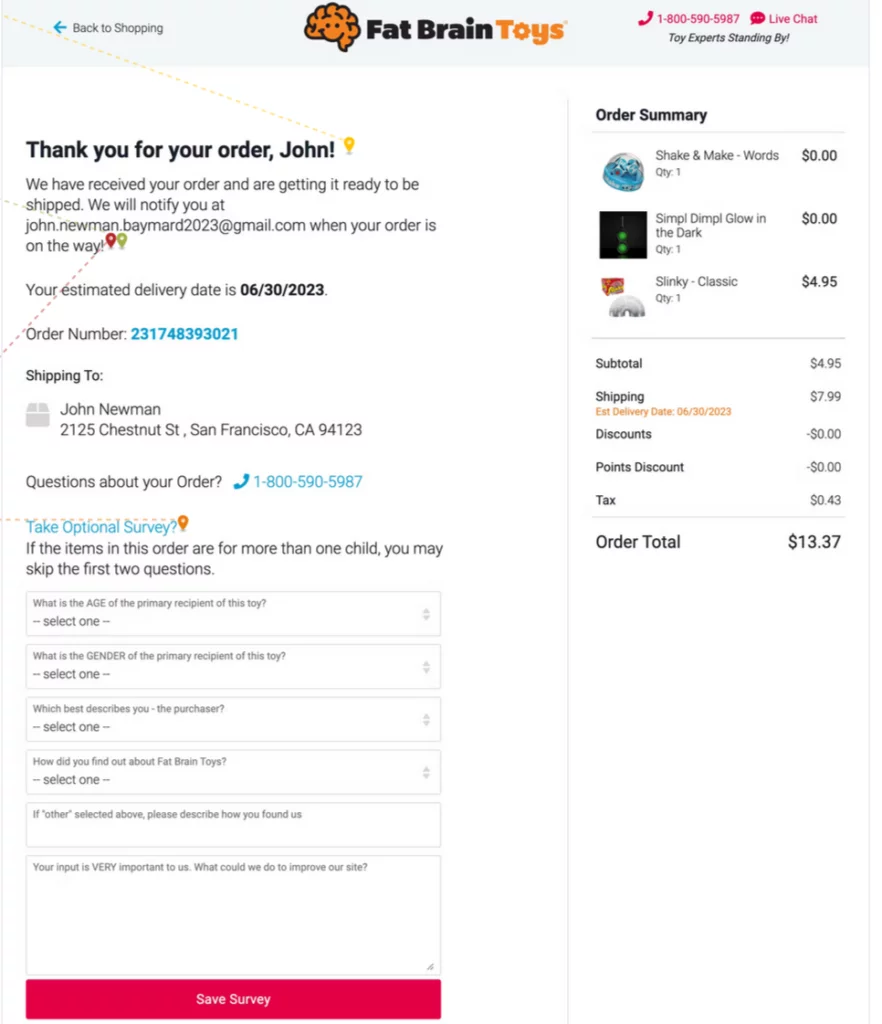
In a landscape cluttered with mundane order confirmation emails, the opportunity to stand out becomes evident through thoughtful design. Boden’s email exemplifies this with a visually captivating design that aligns seamlessly with its brand as a traditional British clothing line. The imagery and typography capture attention and reinforce the brand’s image, setting it apart in customers’ inboxes.
While lacking the visual finesse of Boden’s email, Fat Brain Toys compensates with creative flair tailored to its target audience of children and teens. The email’s overall appearance may not match the sophistication of Boden’s design, but its creativity proves compelling for its intended demographic.
7. Multiple benefits: Asos

Similarly, Asos presents a comparable example with its order confirmation email, incorporating diverse information. Notably, Asos employs distinctive elements, setting it apart and meriting its inclusion in this discussion.
8. Reward program: IHerb

IHerb takes a different approach by emphasizing its reward program and loyalty points in its order confirmation email and featuring more recommended products. This strategic move by IHerb serves as a brief reminder of the associated benefits, contributing to the overall appeal of purchasing from this ecommerce store.
9. Order Timeline: SportsDirect
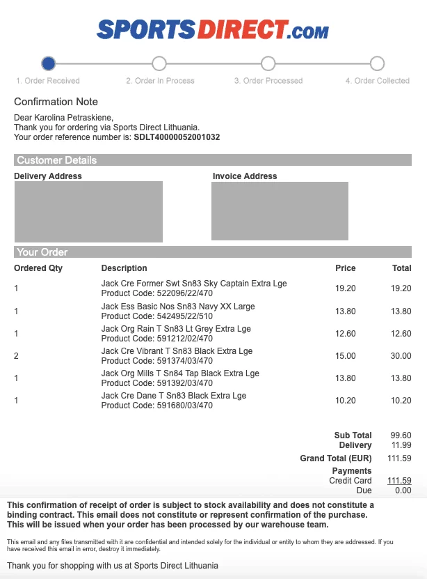
SportsDirect.com introduces a unique element in its order confirmation email by prominently featuring a visual order timeline at the top of the message. This timeline serves as an informative guide for customers, detailing the stages of their order fulfillment. Notably, SportsDirect.com takes an unconventional approach by placing the thank-you message towards the conclusion of the email. While some may find this departure from the traditional order confirmation structure unexpected, it aligns with certain brand strategies seeking to balance automation with a distinct brand voice.
10. Multiple benefits: Zalando

Zalando elevates its transactional order confirmation email with several noteworthy enhancements:
- A concise yet impactful thank-you note.
- Integration of an upsell link within the receipt, prompting customers to “Complete the look.”
- Quick order cancellation functionality, facilitating additional item additions to the cart.
- Display of more related products with accompanying images.
- A dedicated content block containing crucial order placement, returns, and modification information.
- Concise yet comprehensive return details, additional benefits, and convenient social media and app store links.
11. Lush: Elevating Practicality with Personal Touch
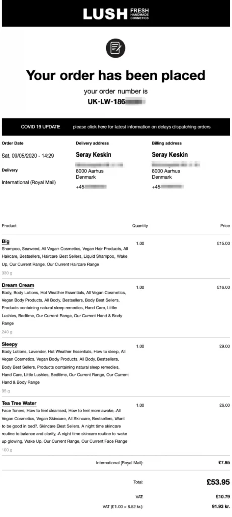
Lush, renowned for its ethical practices and animal welfare values, takes a practical yet considerate approach to its order confirmation emails. The subject line, although not particularly creative, serves its purpose effectively by including the order number, aiding customers in easily locating essential information.
Upon opening the confirmation email, customers are greeted with a Covid19 update, a thoughtful touch considering the uncertainties surrounding delivery timelines, especially for international parcels. The email proceeds to meticulously recap crucial details such as order date, delivery method, and both billing and delivery addresses.
The heart of the email lies in the product summary section, where each ordered item is detailed with quantity, price, and weight information. Lush goes a step further by providing keywords that explain each product’s composition and ingredients, ensuring customers are well-informed about their purchases.
Towards the bottom of the email, six icons reiterate Lush’s core values, emphasizing principles such as animal welfare and ethical consumption. These badges not only serve as a reminder of the customer’s alignment with the brand but also inject personality into an otherwise routine transactional email.
In essence, Lush’s order confirmation email transcends mere practicality. It serves as an extension of the brand’s identity, fostering a sense of connection and reassurance for the customer throughout their purchasing journey.
12. Estrid: Fostering Feel-Good Vibes and Community Connection
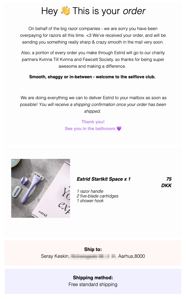
Estrid, the Swedish razor subscription company, opts for a holistic approach in its order confirmation emails, crafting an experience that goes beyond mere transactional information.
The confirmation email begins with a straightforward headline, immediately followed by two paragraphs aiming to validate the customer’s decision. The copy cleverly hints at the financial benefits and philanthropic aspects of the purchase, instilling a sense of accomplishment in the buyer.
Emphasizing body positivity and community, Estrid welcomes customers to the “self-love club,” making them feel like valued members of a larger community. The confirmation email features a visual representation of the purchased product along with the customer’s address and selected shipping method, allowing for a final review before dispatch.
In the subsequent shipping confirmation email, Estrid takes a reassuring tone, informing customers that their goods are on the way and encouraging them to “just sit back and relax.” This not only eases any remaining concerns but also builds anticipation for the impending arrival of the order.
For brands looking to enhance the post-purchase experience, Estrid’s approach demonstrates the power of weaving brand values, community connection, and anticipation into the confirmation and shipping processes.
13. Glossier: Adding Humor and Building Post-Purchase Excitement
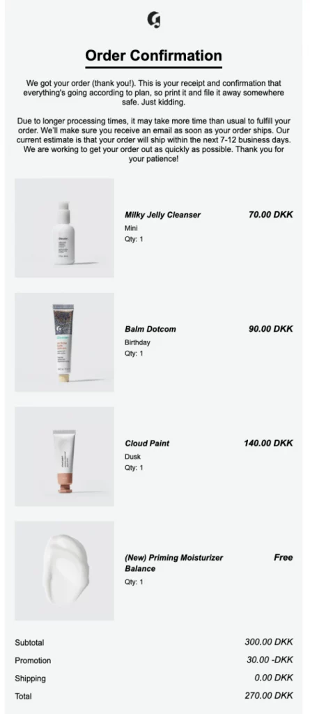
Glossier, a beauty and skincare brand, injects humor and excitement into its order confirmation emails, transforming what is often considered a mundane receipt into a delightful post-purchase experience.
The confirmation email begins with lighthearted copy, assuring customers that “everything is going according to plan.” Setting clear expectations about processing times and order arrival, Glossier keeps the tone light while providing necessary information.
Visual representation of the ordered products with large images allows customers to spot potential mistakes and reignites their excitement for the upcoming purchase. Cleverly placed at the bottom of the email is an invitation to the referral program, presented in a way that sparks curiosity and entices customers with potential savings on future purchases.
Glossier’s shipping confirmation email maintains a similar tone, encouraging customers to “clear off some shelf space” in anticipation of their soon-to-arrive products. This blend of humor, transparency, and strategic engagement exemplifies how brands can turn transactional emails into opportunities for customer retention and brand loyalty.
14. Monki: Simplicity with Strategic Engagement
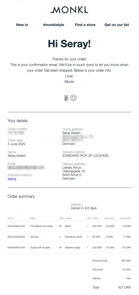
Monki, recognizing the effectiveness of simplicity and clarity, crafts order confirmation emails that serve as a reminder of savings and strategically engage customers for potential future interactions.
The email includes a straightforward presentation of order details, summarizing each product’s size, quantity, and applicable discounts. Notably, Monki highlights the amount saved, reinforcing the value proposition and prompting positive feelings about the purchase.
The header of Monki’s email cleverly incorporates links to new arrivals, customer photos, store locator, and an opportunity to join the email list. This subtle strategy aims to entice customers back to the website for additional purchases or engagement with the brand.
The inclusion of #monkistyle in the header leads to a user-generated content landing page, showcasing customer photos. Each photo, when clicked, opens in a modal, allowing customers to explore the product further and even make a purchase directly through the customer’s Instagram. This strategic use of user-generated content adds authenticity and social proof to the brand without requiring additional effort.
15. Dynamic Design with Animated Elements by Chewy
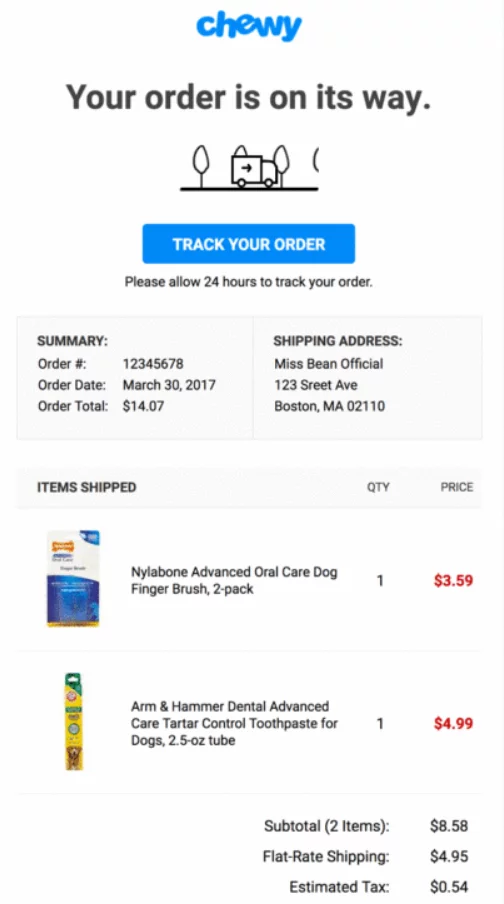
Chewy’s order confirmation email exemplifies the impact of incorporating dynamic design elements, specifically a GIF featuring a delivery van. Demonstrating that a well-designed email doesn’t necessitate hiring graphic designers or photographers, Chewy captures attention effortlessly. The simplicity of the GIF, complemented by the email’s overall clean design, renders it both eye-catching and engaging.
This example underscores the notion that even modest design enhancements, such as subtle animation, can elevate the visual appeal of order confirmation emails. By choosing a creative approach, brands can set their emails apart in crowded inboxes and leave a lasting impression on recipients.
16. Efficient Customer Support Integration by Backcountry
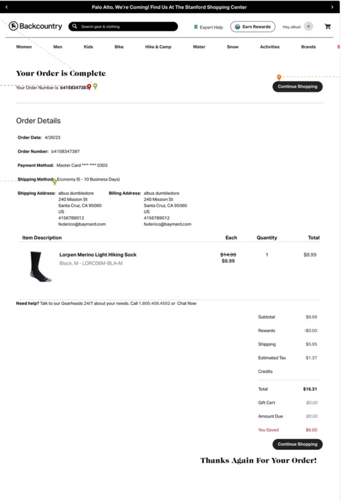
Recognizing the inevitability of human errors in online transactions, Backcountry prioritizes seamless customer support integration within its order confirmation email. Acknowledging that customers may discover mistakes post-purchase, Backcountry strategically positions a large, clear link to their customer support team at the bottom of the email.
Furthermore, Backcountry includes a phone number, albeit in a smaller font. While the phone number may not be immediately noticeable, the accessible link provides a user-friendly channel for customers to rectify errors or seek assistance. This proactive approach to customer support within transactional emails demonstrates a commitment to addressing customer concerns promptly and efficiently.
Conclusion:
The post-purchase phase is a crucial opportunity for brands to reinforce their values, build customer loyalty, and enhance the overall experience. The order confirmation email, often seen as a routine transactional message, can be transformed into a powerful tool for engagement and brand reinforcement. The examples discussed, from Lush’s practicality to Monki’s strategic simplicity, showcase the diverse approaches brands can take to elevate the post-purchase experience. From practicality to fostering a sense of community, injecting humor, and strategic engagement, these brands have turned order confirmation emails into an extension of their brand identity and a tool for customer retention.
FAQs on Order Confrimation Emails:
What role does user-generated content play in order confirmation emails?
User-generated content, as seen in Monki’s example, adds authenticity and social proof to the brand. By incorporating customer photos and allowing customers to explore products directly through social media, brands can leverage the power of their community to enhance credibility and engage customers beyond the initial purchase.
How can order confirmation emails contribute to brand loyalty?
Order confirmation emails contribute to brand loyalty by incorporating brand values, showcasing personality, and inviting customers to participate in loyalty programs or referral initiatives. Brands like Lush and Glossier use these emails to remind customers of shared values and encourage further engagement.
Are there any privacy concerns associated with including personal details in order confirmation emails?
While including personal details like addresses in order confirmation emails is common practice, brands must prioritize customer privacy and adhere to data protection regulations. Ensuring secure transmission of sensitive information and obtaining customer consent for any additional communications is crucial to address privacy concerns.

