
Imagine a scenario where someone lands on your website, browsing through its various sections. Suddenly, a popup appears at just the right moment, offering them something they can’t resist. It’s not just any popup; it’s a perfectly timed invitation that caters to their specific desires and needs.
For instance, picture a visitor engrossed in one of your blog posts, devouring the captivating content you’ve created. Just as they reach the climax of their reading experience, a popup emerges, presenting them with an exclusive e-book or a downloadable guide that relates directly to the topic they’re so intrigued by. It’s an offer they simply can’t turn down—a treasure trove of knowledge and practical insights.
What is a pop-up?
Pop-ups are a versatile tool that can be used creatively on websites to enhance user engagement, capture leads, promote offers, and deliver important information. When implemented thoughtfully and strategically, pop-ups can be effective in grabbing users’ attention and increasing conversions.
Types of Pop-ups:
- Welcome Pop-up: A well-designed welcome pop-up can greet visitors and provide them with a warm introduction to your website. It can offer a discount, invite users to subscribe to a newsletter, or showcase your most popular products. Make sure the pop-up is visually appealing, easy to dismiss, and does not disrupt the browsing experience.
- Exit Intent Pop-up: Exit intent pop-ups are triggered when a user shows intent to leave the website. These pop-ups can present an enticing offer, encourage users to complete a purchase with a discount code, or provide a last-minute incentive to capture their attention and prevent them from leaving. Ensure the exit pop-up is well-timed and provides genuine value to the user.
- Content Upgrade Pop-up: To provide additional value to your visitors, offer them a content upgrade within a pop-up. For example, if you have a blog post about a specific topic, you can create a pop-up offering a downloadable PDF version of the post in exchange for the user’s email address. This not only increases engagement but also helps grow your email list.
- Social Proof Pop-up: Leverage the power of social proof by using pop-ups to showcase testimonials, reviews, or user-generated content. Positive feedback from satisfied customers can instill trust in new visitors and encourage them to take desired actions such as making a purchase or signing up for a service.
- Progress Indicator Pop-up: For websites with lengthy processes, such as multi-step forms or registration flows, consider using progress indicator pop-ups. These pop-ups can display the user’s progress visually, keeping them informed about the steps involved and reducing abandonment rates. Make sure the pop-up is unobtrusive and offers clear navigation options.
- Limited-time Offers: Create a sense of urgency and exclusivity with pop-ups that promote limited-time offers or flash sales. Highlight the time remaining, showcase the discounted price, and clearly communicate the value proposition. This can entice users to take immediate action and increase conversions.
Real Examples of Successful Pop-up Use:
1. Invesp-Address Customer Issues
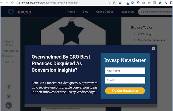
Tired of disguised CRO best practices that masquerade as conversion insights?
Become part of our community of 365K+ marketers, designers, and optimizers who receive thought-provoking conversion ideas directly to their inboxes, absolutely free. Every Wednesday.
An example of Invesp’s popup
Why it’s effective:
- Straightforward approach: Invesp guarantees that you will receive genuinely valuable insights in your inbox every week, without any superficial best practices or fluff content.
- Social proof: Join over 35K individuals who have already signed up. Don’t miss out on this opportunity!
- Qualifying leads: By mentioning that 35K+ marketers, designers, and optimizers have already joined, the popup ensures that it attracts the right audience while assuring potential leads that their specific needs will be met.
2. Survey Sparrow-Utilize Facial Expressions
This popup by Survey Sparrow features a man pointing to a headline that says “Build surveys that work.”
The description emphasizes beautifully designed conversational surveys that are highly engaging, resulting in 40% more responses. The call-to-action (CTA) prompts users to sign up for free.
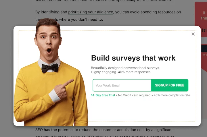
Why it is effective:
- Visual appeal: The popup captures attention with a visually striking image of a man wearing a bright yellow sweater, pointing towards the headline. His enthusiastic facial expression adds to the overall impact, making the popup more eye-catching.
- Value proposition: The description clearly communicates the benefits for users, highlighting the opportunity to create aesthetically pleasing surveys that generate 40% more responses.
- Trustworthiness: While the popup mentions a free signup, it also provides transparent information that it’s a 14-day free trial, reassuring users that no credit card is required.
3. Tully Training-Addressing Dog-Related Challenges
Check out this unique popup example by Tully’s Training. It starts with a friendly introduction: “Hi, My name is Mary Tully.” Then it asks a question: “Does your dog struggle with any of the following?” You can choose from four options: Puppy mayhem, destructive behavior, aggressive dogs, and potty training.
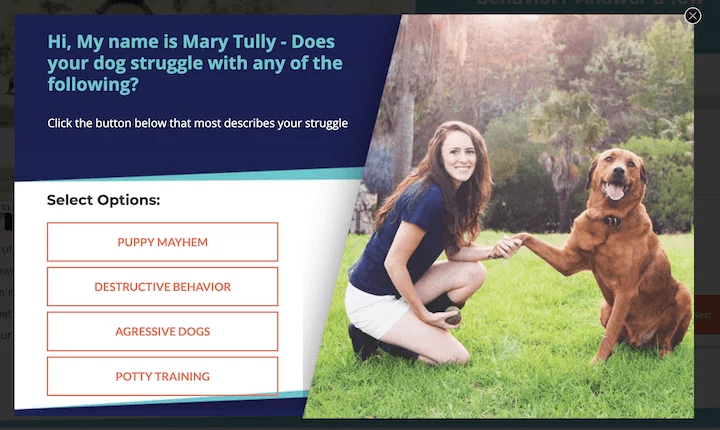
Why it is effective:
- Visual appeal: The popup features a high-quality image of Mary with a dog, creating an attractive and trustworthy impression. The font and design colors are carefully chosen to align with the hues in the photo, maintaining visual consistency.
- Enhanced clickability: Instead of using the typical Yes/No buttons or an email field, the popup provides four specific options to choose from. If you are facing any of these challenges with your dog, it’s difficult to resist clicking on the relevant option.
4. Pop Chart
This Pop Chart popup is an excellent example of a conversational tone. It states, “Our emails are off the chart. Get un-spammy updates from Pop Chart.”
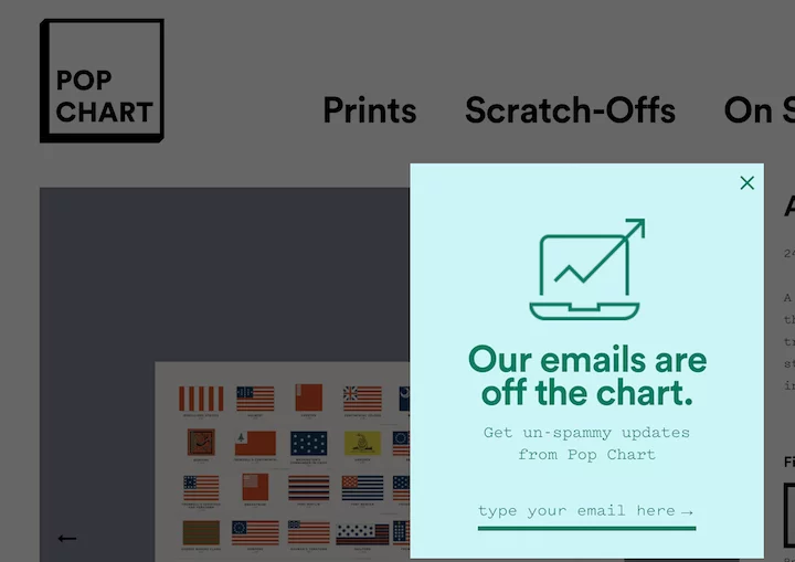
Why it is effective:
- Reassuring the reader: The popup addresses users’ concerns about being bombarded by unwanted emails. It acknowledges their hesitation and promises un-spammy updates.
- Simple and concise: With just two colors, an icon, and minimal copy consisting of a headline, subtitle, and an email field, the popup maintains a clean and straightforward design.
- Subtle disruption: The narrower size of the popup compared to traditional ones makes it feel less intrusive.
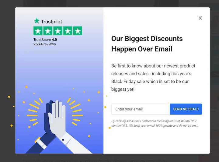
5. WPMUDev-Including Ratings
This popup by WPMU Dev states, “Our biggest discounts happen over email.” The description emphasizes, “Be the first to know about our newest product releases and sales, including this year’s Black Friday sale, which is set to be our biggest yet!”
It provides a field to enter your email and a CTA button that says, “SEND ME DEALS.”
Reasons why it is effective:
- Specificity: The popup clearly communicates the benefits of subscribing to the newsletter, highlighting the potential gains for the reader.
- Social proof: The mention of 2,274 Trustpilot reviews and a 4.9 average star score instills confidence in the reliability of WPMU Dev as a trusted WordPress plugin provider, which is crucial in the website and plugin landscape.
- Strategic copy: The headline generates excitement about the upcoming Black Friday sale, effectively boosting engagement with marketing campaigns and promotions.
6. Canva-Inform and Showcase
The provided example from Canva is a popup displayed on the web interface to promote their app. On the right side, there is a visual representation of the editor, featuring multiple people working, accompanied by three statements highlighting the app’s features and benefits.
Why it is effective:
- Visual appeal: The visual representation is crucial as it gives users an idea of what to expect from the app version. It also serves to illustrate the features mentioned on the left, such as real-time collaboration and the absence of browser tabs.
- Placement: Although the popup contains a substantial amount of text, it appears in the web interface, targeting existing users who are more likely to be interested in the app and willing to read the content.
- Engaging tone and headline: The use of creative headlines and a friendly, easy tone, such as “Let’s get out of here!”, “no pesky tabs,” and “all that browser background noise,” adds a sense of excitement and encourages users to take action.
7. Tessemae – Utilize a Memorable Slogan
The popup from Tessemae’s offers a 15% discount and features the slogan:
“Simplify food, amplify life
Enjoy 15% off!!”
By joining Tessemae’s email list, users receive new recipes, product announcements, sales, and a 15% discount on their first order.
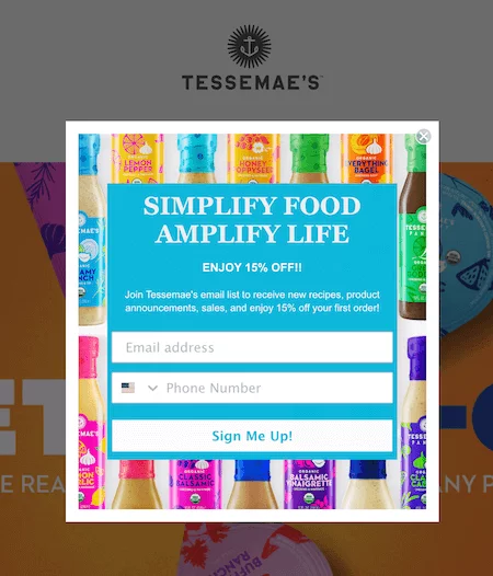
Why it is effective:
- Catchy tagline: A memorable slogan can leave a lasting impression on website visitors and create a connection with the brand’s voice.
- Vibrant colors: The background showcasing the dressings creates a visually appealing experience that aligns with the brand’s identity without being distracting.
- Clarity: The popup provides a clear understanding of the benefits users will receive by signing up for the newsletter. Effective copywriting ensures that users know what to expect, enhancing their willingness to provide their information.
8. PCMag – Keep it Simple
This PCMag popup presents various offers that users can access by entering their email. It includes the PCMag logo at the top, a headline stating “Enter your email to unlock,” a checklist outlining the benefits, and a single email address field.
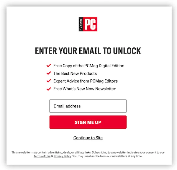
Why it is effective:
- Clean design: The popup has a minimalist design, and the red CTA button stands out, drawing attention to the checkmarks and logo, which are also in red.
- Clarity: Users are provided with a clear understanding of the rewards they’ll eceive by providing their email, like a free copy of the digital edition, information about the best new products, expert advice, and newsletters.
9. Getty Stewart – Maintain a Friendly and Focused Approach
The popup example from Gettystewart.com promotes a downloadable guide. It includes a logo and tagline at the top, followed by the title “Guide to Super Soups” and the statement “FREE 5-day email guide to inspired, flavorful soups.” The call to action says, “Yes, I want it!”
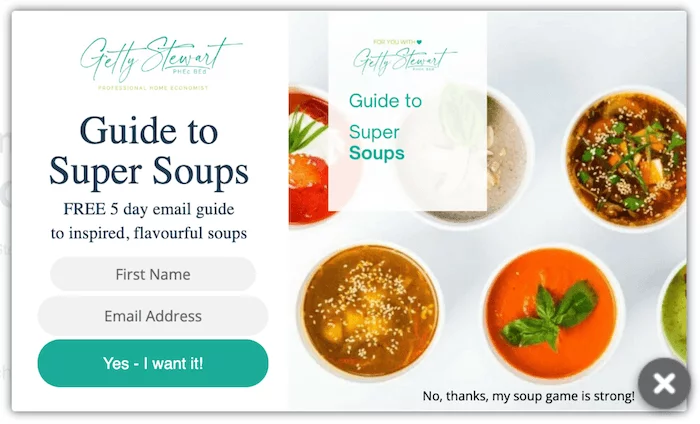
Why it is effective:
- Gated content: Utilizing popups to promote gated content is an effective method to generate leads.
- Effective copywriting: The offer is specific, and the enthusiastic “Yes – I want it!” button, along with the friendly “No, thanks, my soup game is strong!” button, adds a personal touch and encourages user engagement.
- Attractive visuals: Since the popup promotes a guide to super soups, having visually appealing images to support the claim enhances its perceived value.
10. Allbirds– Run a Giveaway
The Allbirds popup example announces the chance to “Win the Ultimate Trip” for two to New Zealand, the source of their Super Natural wool. Users are invited to sign up for a chance to win.
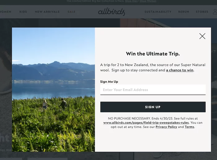
Why it is effective:
- Balanced approach: While popups often use excitement and exclamation points to capture attention, Allbirds’ brand style is more subdued. The bold statement, “Win the Ultimate Trip,” with a period at the end creates intrigue and aligns with their brand image.
- Lead generation: Hosting a giveaway through a popup is an effective way to generate leads. Additionally, the destination being the source of their Super Natural wool makes the giveaway relevant and appealing to their target audience.
Conclusion:
Website pop-ups have become a prevalent tool for online businesses to engage with website visitors, capture leads, and drive conversions. By striking a balance between user experience and business goals, website pop-ups can contribute to an enhanced online journey, increased conversions, and improved customer satisfaction.
Need website design inspiration? Learn here.
FAQs On Website Pop-ups:
Are website pop-ups annoying?
Website pop-ups can be perceived as annoying if they disrupt the user experience or appear too frequently. However, with proper implementation and consideration for user preferences, such as displaying them at appropriate times and providing an easy way to dismiss or opt-out, pop-ups can be less intrusive and more effective.
Can website pop-ups be personalized?
Yes, website pop-ups can be personalized based on factors such as user behavior, demographics, or previous interactions. Personalized pop-ups can help deliver more relevant messages or offers to specific segments of website visitors, increasing their effectiveness.
Can pop-up blockers affect the display of website pop-ups?
Yes, pop-up blockers, which are browser settings or extensions designed to prevent unwanted pop-ups, can affect the display of website pop-ups. It’s important for businesses to consider this and ensure that their pop-ups comply with browser settings or provide alternative ways for users to access the content or offer.
