
Ensuring your web pages are both appealing and informative is crucial, yet without proper organization, your efforts may go to waste. Disorderly layouts can hinder user experience, leading to increased bounce rates and potential drops in search engine rankings.
Luckily, crafting an effective navigation menu can mitigate these issues by aiding users in swiftly locating desired content. With a plethora of styles and formats available, you have the flexibility to design menus that captivate visitors and enhance overall UX.
In this guide, we’ll delve into the significance of navigation menus and provide twelve valuable tips for their design, accompanied by inspiring examples. Are you ready to embark on this journey? Let’s dive in!
10 Essential Navigation Menu Design Tips
The navigation menu is crucial because it serves as a roadmap for users to navigate through the website. A well-designed navigation menu improves user experience by making it easy for visitors to find the information they need quickly and efficiently. Here is the list of tips you should follow to give your visitors an exceptional experience.
1. Keep it Simple and Intuitive:
Simplify your navigation menu by keeping the number of menu items to a minimum. Aim for clarity and intuitiveness, ensuring that visitors can easily perceive and navigate through the menu options. Avoid overwhelming users with too many choices, as it can result in decision fatigue and frustration.
2. Prioritize Important Pages:
Arrange your navigation menu items based on their priority and relevance to the user. Place essential pages, such as the homepage, products/services, and contact information, prominently in the menu hierarchy. Make use of clear labels that accurately represent the content of each page.
3. Opt for Clear Labels and Descriptions:
Use concise and descriptive labels for menu items to convey their purpose effectively. Avoid using vague or ambiguous terms that may confuse users. Provide additional context or descriptions where necessary to guide users to the right destination.
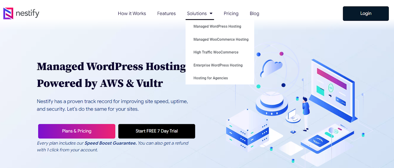
4. Utilize Visual Cues and Icons:
Source: Noun Project
Incorporate visual cues and icons to enhance the clarity and visual appeal of your navigation menu. Icons can help users quickly identify menu items and understand their functionality. However, ensure that the icons are universally recognizable and complement the overall design aesthetic.
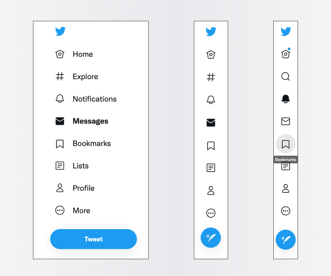
5. Implement Responsive Design:
Let your navigation menu be properly optimized for various devices and screen sizes on gadgets like desktops, tablets, and smartphones. Adopt responsive design principles to adapt the menu layout and structure based on the user’s device, providing a consistent experience across different platforms.
6. Include Search Functionality:
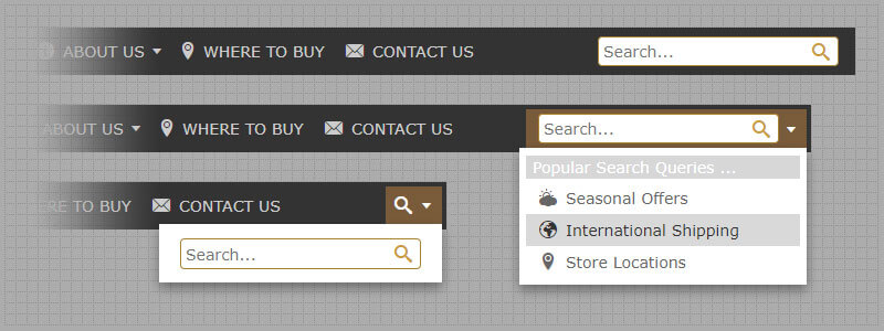
Source: Dropdown Menu Generator
Integrate a search bar or search icon within the navigation menu to let users instantaneously search for specific content or pages. This element is particularly useful for websites with extensive content or complex navigation structures, enabling users to find what they need with minimal effort.
Also Read: WordPress Search Plugin: An Exclusive Guide
7. Stick to Consistent Design Patterns:
Let the design aspects be consistent throughout your website, like typography, color schemes, and navigation styles. Consistent design patterns create a cohesive user experience and help visitors navigate the site more efficiently. Avoid abrupt changes in design that may confuse or disorient users.
8. Provide Feedback and Visual Indicators:
Offer visual feedback, such as hover effects or color changes, to indicate interactive elements within the navigation menu. This helps users understand the navigational hierarchy and provides reassurance that their actions are recognized. Feedback mechanisms enhance the overall usability and responsiveness of the menu.
9. Test and Iterate:
Implement usability testing and acknowledge feedback from real users to recognize any usability issues or shortcomings with your navigation menu. Incorporate changes to the design based on user feedback, making adjustments to improve usability and accessibility. Regular testing ensures that your navigation menu remains user-friendly and effective.
10. Monitor Performance and Analytics:
Track user interactions and behavior within the navigation menu using analytics tools. Assess metrics such as click-through rates, bounce rates, and user engagement to gain an in-depth analysis of how users are interacting with the menu. Use this data to optimize the menu design and make informed decisions for future enhancements.
Steps to Create a Navigation Menu on WordPress
Creating a navigation menu on WordPress is a straightforward process. Mentioned below are the steps to create and customize a navigation menu for your website:
Step 1: Access the WordPress Dashboard:
Type your username and password to access the dashboard on the link, e.g., yourwebsite.com/wp-admin.
Step 2: Navigate to the Menu Settings:
Once logged in, go to the “Appearance” section on the left sidebar of the dashboard and click on “Menus.” This will take you to the menu management page.
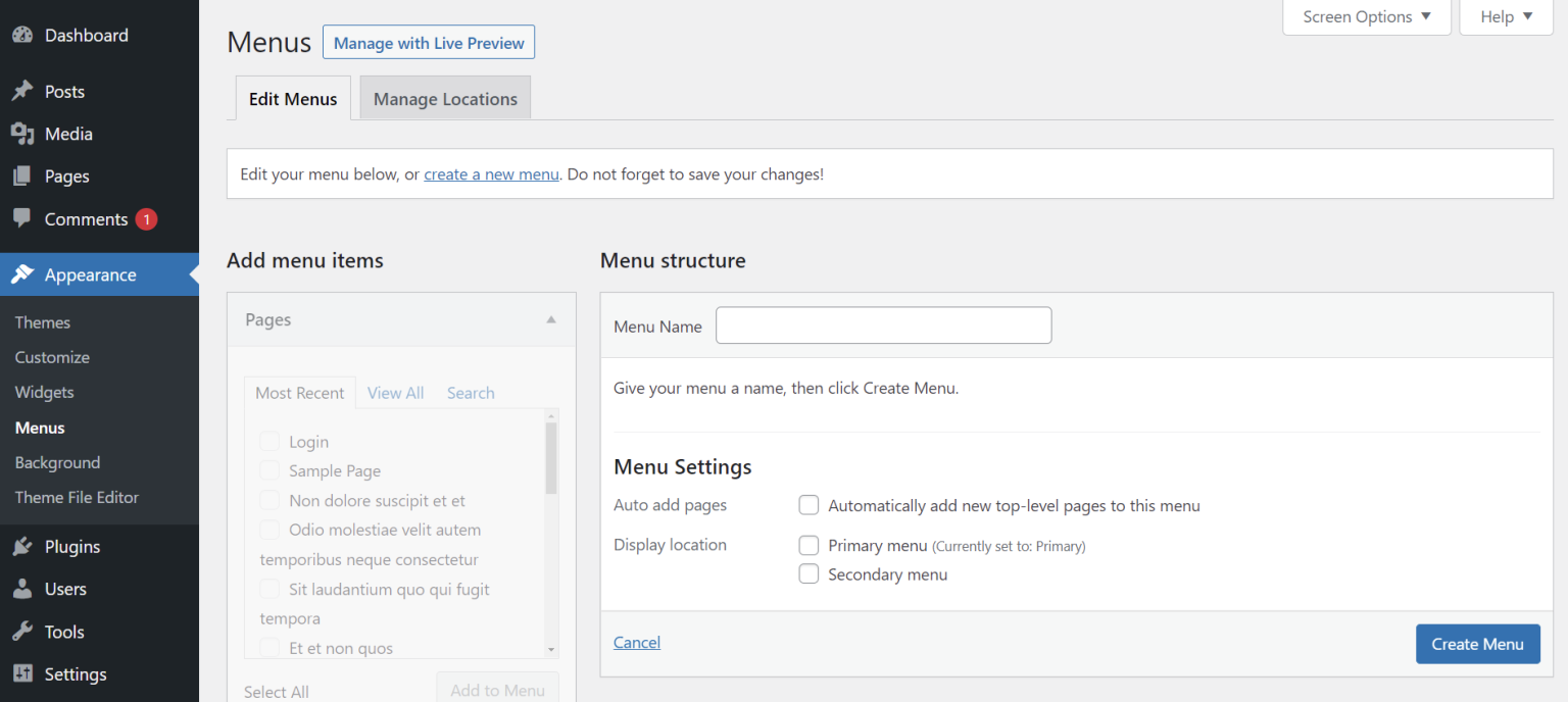
Step 3: Create a New Menu:
If you haven’t created any menus yet, you’ll see an option to create a new menu. Enter a name for your menu (e.g., “Primary Menu,” “Main Menu,” etc.) and click the “Create Menu” button.
Step 4: Add Menu Items:
After creating your menu, you can start adding menu items to it. On the left side of the menu editor, you’ll observe a list of available menu items, including pages, posts, custom links, and categories. Check the items you want to add to your newly created menu and click the “Add to Menu” button.
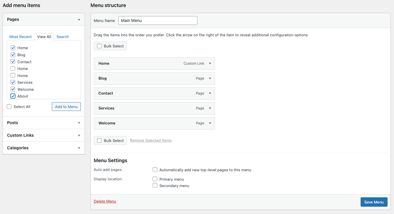
Step 5: Organize Menu Items:
Drag and drop menu items to organize their order within the menu. You can create submenus by dragging items below and slightly to the right of parent menu items. This creates a hierarchical structure in your navigation menu.
Step 6: Customize Menu Settings:
Expand the menu items to reveal additional customization options. You can alter the navigation label (the text that appears in the menu), add title attributes (tooltip text), and specify CSS classes for styling purposes.
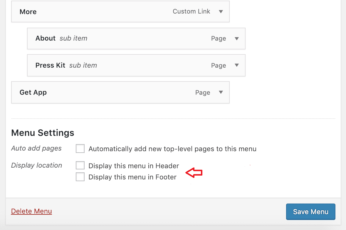
Step 7: Configure Menu Locations:
Depending on your WordPress theme, you may have multiple menu locations available, such as a primary menu, footer menu, or sidebar menu. Scroll down to the “Menu Settings” section to select where you want to display your menu. Check the appropriate box(es) next to the menu location(s) you wish to assign your menu to.
Step 8: Save Your Menu:
Once you’ve finished customizing your menu, click the “Save Menu” button to save your changes.
Also Read: How to Make a Scrolling Menu in WordPress
Plugins to Create and Customize Navigation Menu
Here are some popular WordPress plugins that can help you create and customize navigation menus:
- Max Mega Menu: This plugin lets you create complex, multi-level navigation menus with ease. It offers a drag-and-drop interface for menu customization and supports various customization options, including animations and custom styling.
- UberMenu: UberMenu is a highly customizable mega menu plugin that permits you to create beautiful and responsive navigation menus. It offers advanced features such as tabbed submenus, images, icons, and dynamic content integration.
- Responsive Menu: This plugin helps you create mobile-friendly navigation menus that adapt to various screen sizes. It presents an expansive range of customization options and supports touch gestures for seamless navigation on touchscreen devices.
- WP Floating Menu: WP Floating Menu allows you to create stylish floating menus that remain visible as users scroll down the page. It offers customizable templates, animation effects, and support for multiple menu locations.
- WP Mega Menu: WP Mega Menu is another plugin for creating feature-rich mega menus with advanced customization options. It offers support for custom widgets, icons, and multiple menu layouts to suit your website’s design.
Conclusion
A well-designed navigation menu is essential for providing an easy and intuitive browsing experience for website visitors. By following these ten navigation menu design tips, you can create an engaging and user-friendly navigation system that enhances usability, promotes exploration, and ultimately drives conversions on your website.
FAQs
How can I create a navigation menu responsive to different devices?
Implement responsive design principles by using a mobile-friendly layout. Ensure that your navigation menu adapts to different screen sizes. This offers a user-friendly experience across gadgets like desktops, tablets, and smartphones.
How do I test the usability of my navigation menu?
Implement usability testing with real users to identify any usability issues or pain points with your navigation menu. Gather feedback on navigation flow, clarity of labels, and overall user experience to make informed design decisions.
What are the benefits of regularly updating and optimizing the navigation menu?
Regularly updating and optimizing the navigation menu ensures that it remains aligned with the rising needs of your audience and the content structure of your website. By continuously refining the menu design based on user feedback and performance metrics, you can enhance user experience and drive better engagement and conversions on your website.
