Creating a homepage poses significant challenges due to its crucial role as the most prominent page on your website. Since it attracts the highest traffic, designing and crafting content for it is complex, primarily because it represents the first interaction with visitors, who remain largely unknown. Navigating diverse traffic sources and the enigma of “direct” traffic intensify the difficulty.
Crafting an effective homepage involves achieving key goals, including promptly conveying the site’s identity, swiftly guiding visitors to deeper pages, and meeting various criteria like search ranking, quick loading, mobile-friendliness, integration with analytics tools, legal compliance, accessibility, consistent brand messaging, and easy updates. Balancing these aspects makes homepage design a multifaceted challenge, and adhering to best practices can significantly enhance its effectiveness.
Key Guidelines for Homepage Design:
1. Company Logo

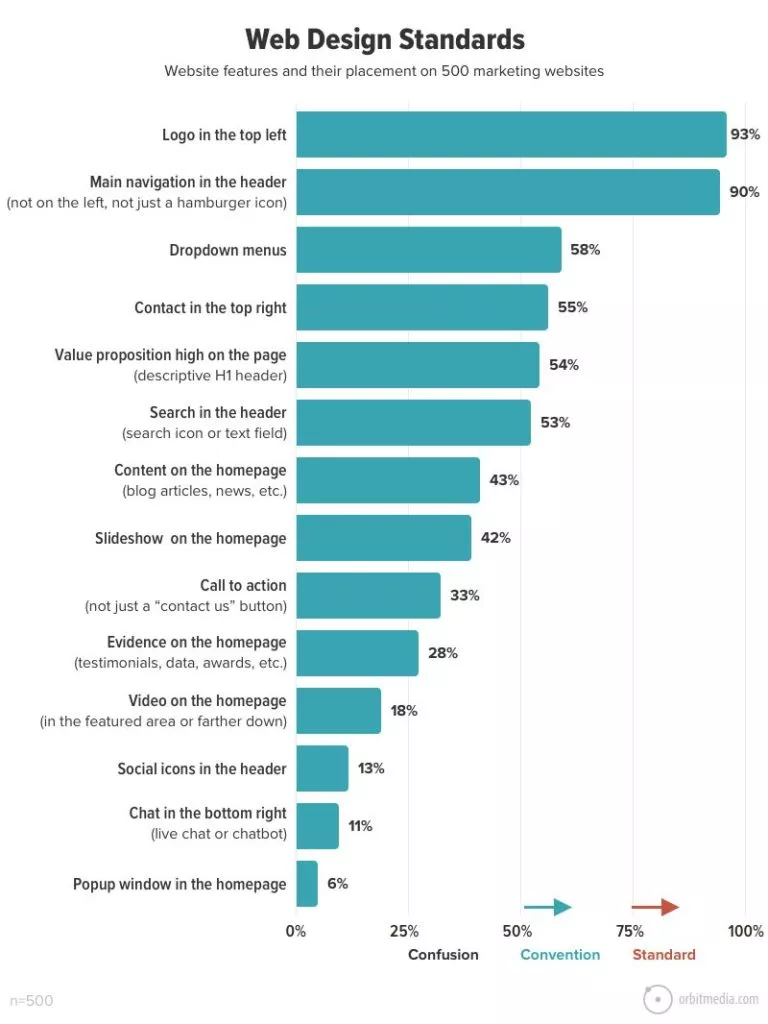
Let’s begin with the company logo placement—a common practice is the top left (used by 93% of websites) or the top center. Here are key considerations for logo treatment:
- Size Matters: Avoid oversized logos, as they contribute visual noise without necessarily strengthening the brand. The logo’s impact comes from its strategic position in the top left, not its sheer size—no need to be overly prominent.
- Mind the Tagline: In a “lock-up logo” combining logomark, business name, and tagline, be cautious about tagline legibility. Often, the tagline within the logo image becomes too small, especially on mobile devices, compromising readability.
- Single Logo Suffices: Resist the temptation to redundantly feature the logo, especially in hero areas, images, or video thumbnails. Overusing the logo in such instances wastes valuable space that could be better utilized for conveying essential information about your business.
2. Homepage Headline

The homepage headline holds the top spot in the visual hierarchy, condensed to a 6-10 word description of the company’s essence and formatted with the header tag. Its primary role is to swiftly inform both visitors and search engines about the website’s purpose, addressing the fundamental query every visitor has:
“Am I in the right place?” Emphasize clarity over cleverness—avoid vague or promotional taglines. For most, the homepage header serves as an 8-10 word encapsulation of the company’s core function. Consider the Backyard BBQ Test: If shared at a casual gathering, would someone easily understand your profession based on your homepage headline, or would it leave them perplexed? The best headlines effortlessly pass this test. Moreover, integrate the primary target keyphrase into the headline for SEO relevance. Alongside the tag, the <h1> header is a vital piece of SEO real estate, emphasizing the importance of naturally incorporating the target keyphrase to enhance search engine visibility.</p>
3. Brief Headline
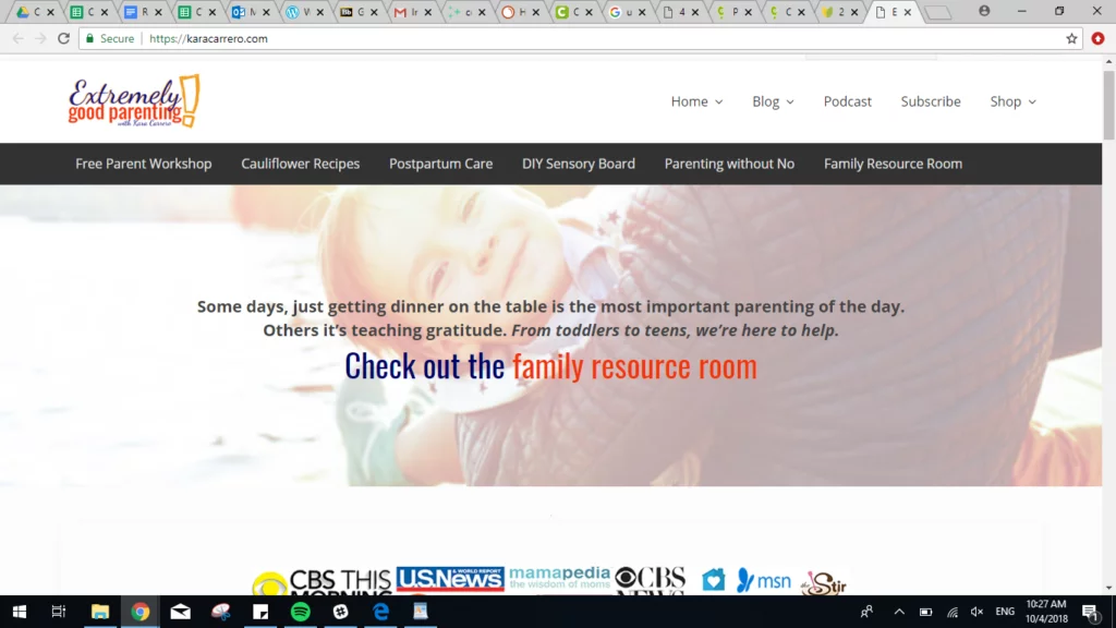
The brief introduction, positioned prominently on the page, sits just below the header, succinctly encapsulating the business’s value proposition. It skillfully defines the business within a category (positioning) while highlighting its distinctiveness (differentiation).
The challenge lies in conveying this essence within a few lines—too lengthy, and it risks becoming an overlooked, blocky paragraph.
If you’ve crafted a clever headline, this is the perfect space for those concise gems. Consider swapping the order if you have both a clever headline and a descriptive intro paragraph, as optimal results often emerge when headlines are crystal clear, while the introductory copy adds a touch of cleverness.
4. CTA

Source; W3lab
A Call to Action (CTA) serves as a crucial element to guide visitors who are prepared to engage, possibly after multiple visits. To effectively prompt action, several key principles should be considered:
- Prominence through Contrast: Make your CTA visually striking by utilizing a contrasting color. This often involves employing color temperature, introducing a warm color in a cool context, ensuring the CTA stands out prominently.
- Strategic Placement: Position your CTA prominently on the page, often integrating it into the main navigation as a global element. Placing it high ensures visibility, facilitating a clear and direct pathway for visitors to take action.
- Whitespace Embrace: Surround the CTA with whitespace to minimize visual noise. This helps draw attention to the CTA itself, making it more noticeable and inviting for users to click.
- Header CTA Best Practices: Commonly, “Contact Us” is used for header CTAs, with around 55% of B2B lead generation websites featuring “contact” in the top right corner. However, consider opting for a stronger and more specific verb when space allows, as it can enhance the clarity and appeal of the call to action. For instance, using verbs like “Connect,” “Inquire,” or “Explore” can be more compelling and action-oriented.
5. Navigation menu
Moving on to the navigation menu—a critical component that typically features horizontal menus, collapsing into a hamburger icon on mobile devices, a standard approach adopted by 90% of marketing websites. Like the headline, the menu resides at the top of the visual hierarchy, making it one of the first elements visitors scan.
Consider the following insights from website navigation best practices:
- Specific Navigation Labels: Opt for specific and descriptive navigation labels instead of vague ones like “services,” “products,” or “solutions.” Precision in labeling not only aids visitors in understanding where they are but also assists search engines in comprehending your website’s purpose and content.
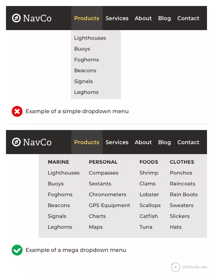
- Embrace Big Dropdowns (Mega Menus): If you incorporate dropdown menus, consider going big. Small dropdowns can create visual friction without substantial benefit for the visitor. On the other hand, substantial dropdowns, often referred to as mega menus, introduce a bit of friction but provide a wealth of options. The enhanced user experience benefits outweigh the minimal friction, offering visitors a comprehensive array of choices.
6. Site Search
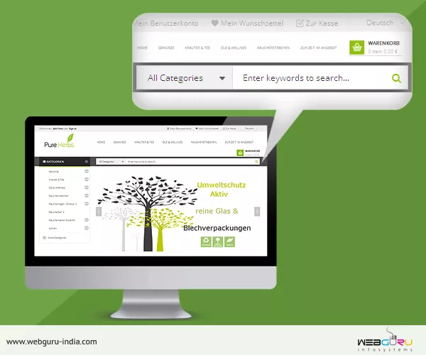
Discussing site search, this aspect isn’t necessarily a homepage best practice, as not all websites require a search tool. Our research indicates that 53% of websites incorporate a site search tool.
Determining the need for an internal search tool depends on the scale of your site. It becomes worthwhile for larger websites with 500+ pages, products, articles, resources, or jobs. If your navigation labels are descriptive and clear, visitors often prefer clicking or tapping over using a search tool.
To assess the usefulness of your site’s search tool, analytics, particularly GA4, can provide insights. The “view_search_results” event in GA4 helps identify if visitors are utilizing the search functionality.
If your site warrants a search tool, consider its placement in the header—a “global element” present on every page. Two common implementations are:
- Magnifying Glass Icon: Subtle and less visually intrusive, this option adds minimal noise and is suitable for sites where search is not a primary need.
- Open Text Field with Search Button: More conspicuous, occupying additional space, this option often yields higher engagement levels. It’s appropriate when searching is a primary way visitors interact with the website.
Opt for the first option unless there is substantial confidence or evidence that visitors actively seek a search function on your site.
7. Hero Image
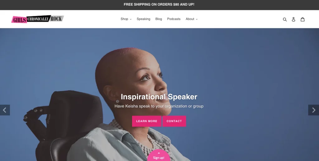
In the prime real estate of a homepage, a hero image or video often takes center stage, making it a pivotal visual element that significantly influences visitors’ impressions of the website and brand.
Consider the following recommendations:
- Relevance is Key: Ensure the hero image or video is specific to your company rather than generic visuals that could apply to countless others.
- Product Showcase in Action: If featuring products, go beyond basic shots and show them in action. Demonstrating the product’s use provides context and communicates the ‘why’ rather than just the ‘what.’
- Leverage “Line of Sight” for Faces: Utilize the psychological concept of “line of sight” in images with people. Guide visitors’ attention toward the headline or call to action by positioning the gaze of individuals in that direction.
- Simplicity in Looping Background Videos: While looping background videos add dynamism, ensure they remain simple and don’t distract from the core message or divert attention from essential elements. If needed, use overlays to maintain text and call-to-action (CTA) legibility.
Avoid these hero area pitfalls:
- Slider or Carousel:
Research indicates that sliders obscure information, resulting in low engagement for slides beyond the first. Instead of attempting multiple messages in a slider, opt for a decisive focus on one. Exception: Image galleries work for visually-oriented brands, like architects, where each slide showcases different examples rather than disparate topics. - No Current Promotions:
Resist using the hero area for announcements, product launches, or promotions. Such content can diminish clarity for visitors and adversely impact search engine rankings. Consider it as a place for conveying your core identity, not for transient promotions.
8. Visual Credibility Info

Beneath the hero area but within the initial view of the page, there exists a valuable space to instill trust and credibility through visual evidence. Consider incorporating the following elements to convey legitimacy:
- Client Logos: Showcase logos of clients you’ve collaborated with, establishing credibility and demonstrating a track record of successful partnerships.
- Partnership Logos: Display logos of companies you have partnered with, reinforcing your network and alliances within the industry.
- Awards, Badges, Certifications, and Memberships: Highlight any accolades, certifications, or memberships your brand has earned, underscoring achievements and industry recognition.
- Press Mentions/As-Seen-In: Feature logos or snippets from press mentions or notable publications where your brand has been featured, leveraging the positive associations created by media visibility.
These elements, often referred to as “trust seals,” tap into the halo effect—an inherent cognitive bias in visitors’ minds. Positive impressions from the showcased brands effortlessly transfer to your brand.
Beyond building trust, these visual elements serve to differentiate your brand. The logos become unique trust seals that set you apart from competitors. Consider this differentiation factor when evaluating your homepage and ask: Can a startup, just emerging, replicate this same visual evidence above the fold? The inclusion of these logos not only establishes trust but also marks your brand as distinct and differentiated in the competitive landscape.
9. Sensible subheadings
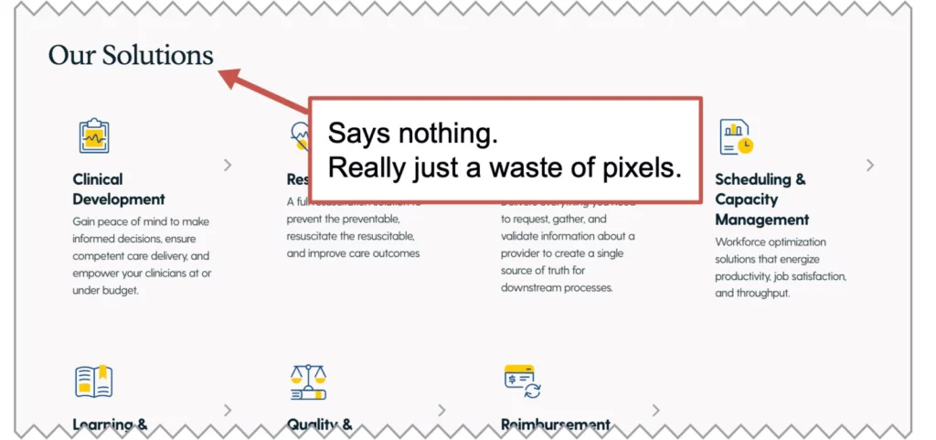
As the visitor progresses down the page, meaningful subheads serve as guideposts, directing their attention. However, these guideposts are only effective if they convey substantive information.
Many websites squander space with generic and evident words presented prominently. Yet, crafting valuable subheads doesn’t demand additional resources; it simply requires a focus on utility.
Not only do meaningful subheads aid in navigating the page for the visitor, but they also signal relevance to search engines. Each vague subhead represents a lost opportunity for incorporating keywords. Given that the homepage occupies crucial SEO real estate, further insights into search engine optimization will be discussed below.
10. Copy
The tenth homepage best practice, focusing on copy, is arguably the most pivotal element among our 20 recommendations for any marketing webpage.
Your visitor arrives with questions, seeking to assess whether your offering aligns with their needs. The page’s primary duty is to foresee these inquiries and furnish optimal answers, strategically organized based on their priorities. Think of the copy as guiding them through a conversation, mirroring the experience of engaging with a top-notch sales representative.

The most effective homepages emulate a dialogue with a skilled sales representative. It’s not just about what you want to convey; it’s about addressing what they need to hear, even if it means acknowledging that your offering might not be the best fit. After all, unqualified leads are not the goal, right?
This approach is at the heart of conversion copywriting. The visual hierarchy mirrors the messaging priority, aligning with the visitor’s probable questions and providing the clearest, most direct responses.
Empathy is the linchpin, rooted in thorough research often gleaned through interviews. Understanding the visitor’s narrative is essential:
- What triggered their search for help?
- What problem are they seeking to solve? (motivation)
- What are their concerns and potential hesitations? (objections)
- What alternatives have they explored, and what were the outcomes?
- What factors weigh most heavily in their decision-making? (priorities)
This depth of information is indispensable for crafting a high-converting page. Armed with this knowledge, copywriting unfolds naturally, rendering the website more intuitive. While brand voice and storytelling hold importance, they are optional; clarity is paramount.
11. Homepage Video
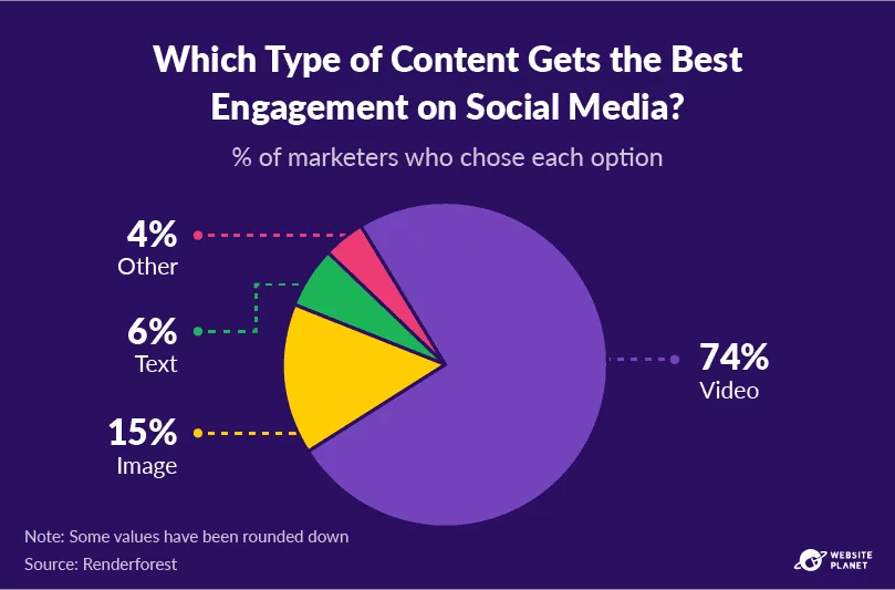
Moving past the hero area, there lies a prime opportunity to elevate content from text to video on your homepage.
Currently, only 18% of homepages incorporate videos, and with good reason. Videos efficiently convey complex concepts, foster trust, and sustain visitor engagement.
Consider the impact on average session duration when a URL features a video—visitors who watch spend four times as much time on the page. That’s a significant difference, emphasizing the potency of video content in retaining audience attention.
The following are fundamental types of videos that prove effective on homepages:
- “About Us” Videos: Introduce the brand and showcase its values, providing a personalized insight.
- Explainer Videos: Walk through your offerings, elucidating how and why they benefit the audienceTestimonial Videos: Leverage social proof through real testimonials, fostering credibility.
While creating these videos may require a substantial investment, the returns can be substantial. If you possess a video asset, strategically place it on the homepage where it’s most likely to capture attention. This aligns with a fundamental principle of digital marketing: Position your strongest assets in the most visible locations for maximum impact.
Leanr about optimizing SEO with youtube here.
12. Semantic SEO and Keywords
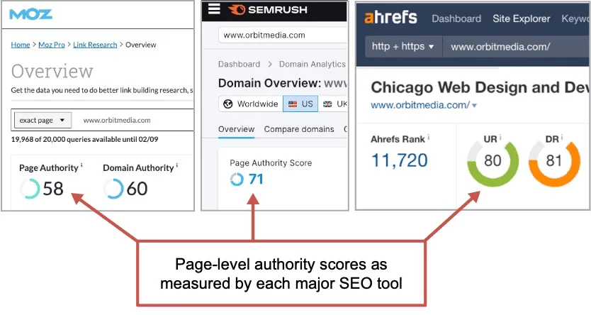
The homepage stands as the URL with the highest potential for ranking, boasting superior authority due to its abundance of inbound links. Verification of this can be done through various SEO tools, each presenting its metric for page-level ranking potential—such as Moz’s “Page Authority,” SEMrush’s “Page Authority Score,” and Ahrefs’ “URL Rating.”
Although these tools employ distinct formulas (their interpretations of Google’s Page Rank), the consensus remains: the homepage consistently secures the highest score on nearly every website. The significance lies in this revelation:
The homepage wields the capability to target the most competitive keyphrases.
In alignment with best practice #2, where the primary target keyphrase should be incorporated into the header and the title tag, we can further enhance relevance and bolster our chances of ranking as we craft the rest of the page’s copy.
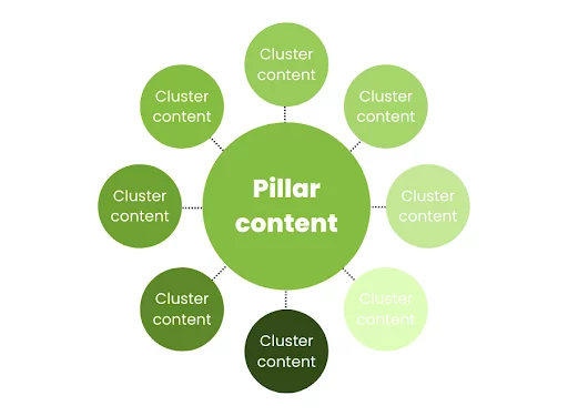
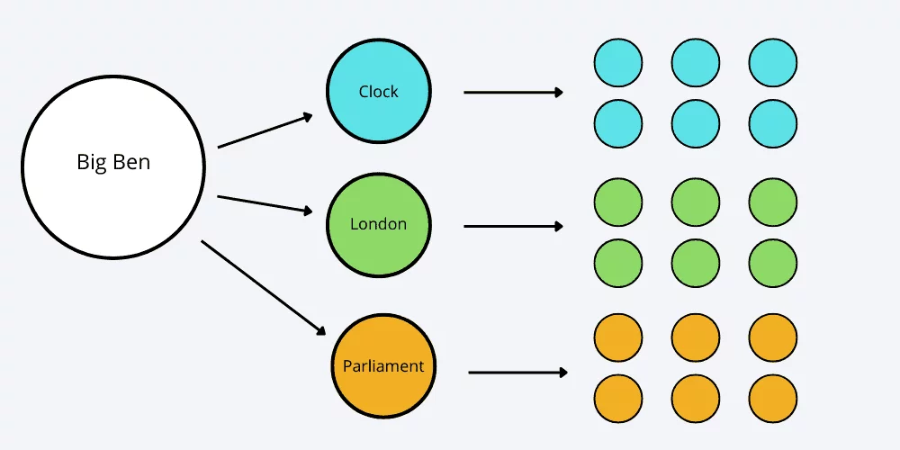
However, the approach is not to repetitively insert the target phrase—such actions would amount to keyword stuffing, detrimental to both rankings and the quality of writing. Instead, the goal is to develop a detailed, comprehensive page that explores topics related to the target keyphrase.
This strategy, known as semantic SEO, proves beneficial for both rankings and reader engagement. Identifying semantically related phrases can be achieved through SEO tools like MarketMuse or SEMrush SEO Writing Assistant. Alternatively, exploring search results for the target phrase can reveal: Suggested searches (displayed before query completion) People Also Ask box (questions and answers deemed relevant by Google) Related Searches (at the bottom of the page) Bolded text in the search results themselves.
13. Photos of Real People:
An often overlooked yet effective way to distinguish your brand from competitors is by showcasing the faces of your team—after all, your people are unique to your company.

In an ideal website visit, fostering a connection with the visitor is paramount, and this connection is less likely without a human face associated with your brand.
While many brands flood social media with images of their team, the homepage sometimes resembles an abandoned ship, lacking the human touch. Seize numerous opportunities to infuse humanity into your website—every page block at various scroll depths presents a chance to humanize your brand.
Consider these touchpoints:
- Homepage Hero: Swap stock photos with images of actual employees, accompanied by their names, titles, and tenure.
- Videos: Feature real team members in video thumbnails and within the video content itself.
- Team Section: Create a dedicated section showcasing a row of faces with corresponding names, tenure, and titles. Embrace diversity in all its forms.
- Testimonials: If possible, include images of individuals providing testimonials. Consider upgrading to video testimonials, leveraging them to address potential visitor concerns.
- Personal Statements: Similar to testimonials but with a personal touch, these statements feature a team member speaking on behalf of your company. Express mission, values, or transform mundane copy into something authentic. Presenting the message in quotes adds credibility—quotes are the most powerful key on your keyboard.
15. Supportive Data:
Incorporating quantitative evidence, often presented in a “stats block,” has become a prevalent feature on website homepages. These statistics offer a tangible and convincing demonstration of your brand’s achievements and capabilities. Relevant data might include:
- Years in business
- Projects completed
- Number of happy clients
- Number of locations
- Number of team members
- Return on investment metrics (e.g., revenue generated, hours saved)
Tailor your statistics to align with what’s most impactful for your brand. For instance, an innovator might showcase the number of patents, while a test preparation service could highlight their college placement rate. Consult with the sales team to identify data that proves effective in sales conversations and prominently display these on your homepage.
16. Blog/Resources:
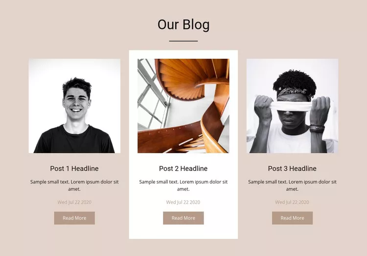
Your homepage serves as a central hub, aside from your blog, to showcase your content marketing efforts. Given that homepage visitors are often less familiar with your brand, providing comprehensive content, including articles, is crucial. Approximately 43% of lead generation websites feature articles on their homepages.
However, exercise caution when incorporating blog posts into deeper service pages. If visitors transition from a page designed for selling to one focused on teaching, they may move backward up the funnel. Position blog posts lower down the homepage, closer to the bottom.
Case Studies vs. Articles:
- Case Studies:
These directly support lead generation by presenting real stories that make your services tangible. The format (problem, solution, result) requires minimal imagination from the visitor. - Blog Posts:
Be selective and avoid adding posts from an inactive blog, particularly if dates are visible. Outdated posts can create a negative impression. Only include blog posts on the homepage if your content marketing program is active.
Considerations for SEO:
- Shift in Keyphrase Relevance:
Automatic display of the latest articles can cause keyphrases on the homepage to change frequently. To maintain relevance for the target phrase, use a page block or module that allows you to feature specific blog posts, avoiding automatic updates. While curation demands more effort, it ensures better control and consistency.
17. Chatbot:
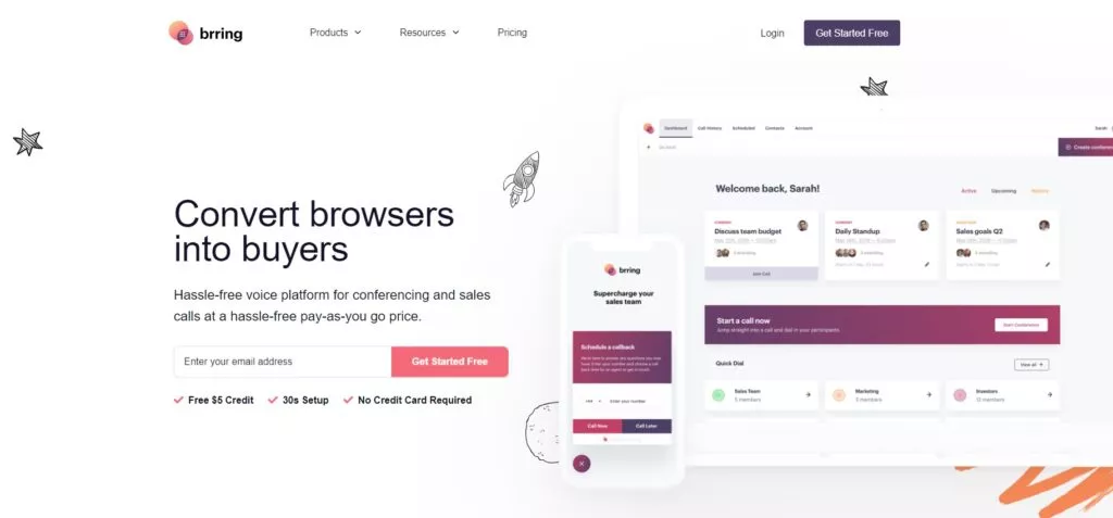
Chatbots are a ubiquitous presence on numerous homepages, with approximately 11% of websites incorporating them, and this number continues to grow daily. This trend is particularly notable within the realm of marketing automation software, where chatbots are becoming a standard feature.
The fundamental concept behind chatbots is to offer visitors an alternative avenue for interacting with the website, creating an additional pathway toward conversion. By providing multiple ways for visitors to convert, there is potential to elevate the overall conversion rate.
Digital marketing veteran Alex Birkett shared insights from his experiences implementing chatbots across major digital marketing brands. These automated chat systems not only facilitate real-time engagement but also contribute to a dynamic and interactive user experience, aligning with the evolving landscape of online interactions and customer expectations.
18. Footer:
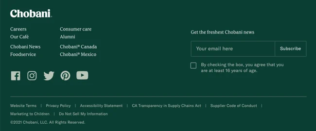
The conclusion of every webpage, including the homepage, is marked by the footer—a user experience safety net designed to capture those visitors who have reached the bottom without finding what they sought. It serves as a final opportunity to guide and assist them effectively.
An exemplary website footer functions as a condensed page in itself, encompassing several key elements discussed earlier:
- Navigation:
Include links to top pages, along with additional items such as privacy policies, sitemaps, and social media icons. - Evidence:
Integrate trust-building elements, such as awards and certifications, to reinforce credibility. - Calls to Action:
Implement strategic calls to action, such as email sign-up CTAs, to further engage visitors.
While the basic structure of a footer is essential, it can extend beyond the conventional, evolving into a “mega footer” that accommodates up to 27 diverse design and content elements, providing a comprehensive resource for users.
Things to Exclude from Your Homepage:
Several elements were intentionally omitted from the recommendations. Here’s a brief list of items to avoid on your website’s homepage:
- Slideshows:
Despite their prevalence (used by 43% of websites), slideshows often perform poorly in usability studies. - Social Media Icons in the Header:
Placing social media icons in the header may divert visitors away to platforms filled with distractions, notifications, and ads, potentially diminishing their return to your site. - Pop-Ups:
While 6% of homepages incorporate pop-up windows, they are generally not recommended due to their intrusive nature, particularly for mobile users. Multiple pop-ups can create visual noise and hinder the user experience. - Stock Photos:
While acceptable as a last resort, utilizing original visuals is far more preferable than relying on generic stock photos. - Vague Copy:
Avoid generic language in headers, subheads, body text, and calls to action. Ensure that the language used is specific to your brand, avoiding common phrases shared by millions.
Conclusion:
In conclusion, adhering to best practices for homepage design is essential for creating a compelling and user-friendly online presence. By focusing on clear navigation, engaging visuals, concise content, and responsive design, businesses can effectively capture the attention of their target audience and encourage meaningful interactions. Continuously monitoring and adapting to evolving trends and user preferences ensures that your homepage remains a dynamic and effective tool for conveying your brand message and driving desired actions.
FAQs on Homepage Guidelines:
How can social media integration benefit a homepage?
Integrating social media links or feeds on the homepage can enhance brand visibility, foster community engagement, and provide an additional avenue for users to connect with the brand. It also allows visitors to share content easily, extending the reach of your brand across different platforms.
What role does loading speed play in homepage design?
Loading speed significantly impacts user experience, and a slow-loading homepage can lead to high bounce rates. Optimizing images, minimizing code, and leveraging content delivery networks (CDNs) are among the strategies used to improve loading times and ensure a smooth browsing experience.
How often should a homepage be updated?
The frequency of homepage updates depends on various factors, including industry trends, changes in the business, and evolving user preferences. Regularly reviewing and updating content, visuals, and features keeps the homepage fresh and relevant, demonstrating that the business is active and responsive.
What role does accessibility play in homepage design?
Accessibility is crucial for ensuring that all users, including those with disabilities, can easily navigate and engage with the homepage. Prioritizing features such as alt text for images, clear headings, and keyboard navigation contributes to a more inclusive and user-friendly website experience.


