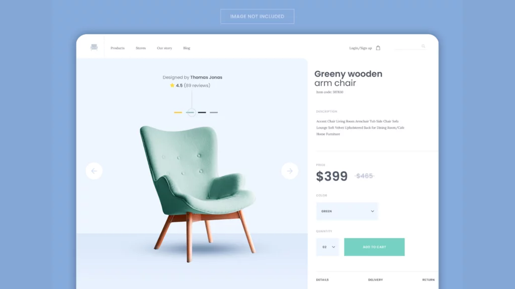
Product pages, aka webpages, are essentially designed to sell products online. A picture, a description, a price, and an “Add to Cart” button are usually included.
The best product pages involve much more strategic thinking. When a customer is ready to purchase, they land on this website.
A well-designed product page is more than just a layout of pictures and text; it’s an experience thoughtfully planned to educate, convince, and eventually turn a visitor into a buyer.
Best Practices To Follow To Create Better Product Pages
1. Make it Engaging
Nobody enjoys seeing a dull or pointless landing page. Likely, you have personally encountered this. This is why holding the interest of your visitors long enough to encourage them to stay on your website and finish the purchase process is the ultimate goal of your product pages.
Let’s say you just saw a captivating Instagram story advertisement. Excited to learn more, you swipe up to click the link. However, as soon as the landing page loads, you are met with a dull and uninteresting product detail page, so you quickly navigate away from it and go back to looking at pictures of your friends’ pets and dinner entrees.
Do you want to stop your guests from acting in the same way? Make a fantastic product detail page to attract the interest of your intended market quickly.
2. Make Use of Captivating and Clear Images
Product photos can enhance your website by showcasing the features that differentiate your product. High-quality images are essential to creating a product page layout that increases revenue.
An e-commerce site in any industry will profit from using high-quality and compelling images, whether for showcasing physical goods through spectacular product photography, gathering user-generated content and product photos for social proof, or enhancing the mood of your product pages with gorgeous stock photography.
Read Also: Leveraging the Best Royalty Free Images: Enhancing Your Visual Content Strategy in 2024
3. Balance Information and Branding in Your Copy
Some brands choose titles for their products that are more akin to paint swatches than the colors most people are familiar with, exhibiting hypercreativity. Rather than offering a light blue product, they refer to the color as “early morning mist.”
Although these descriptions are interesting and consistent with how you market your goods, your customers anticipate you to explain the items in plain terms that are easy to understand for anyone.
Because of the targeted keywords and educational language, this will not only increase the effectiveness of your product descriptions and titles (thereby increasing customer knowledge and interest), but it will also improve your search engine ranking.
4. Social Proof Elements
Regarding product pages, the most crucial elements for customers are the ratings and reviews—greater significance than the cost. In contrast to 88% of consumers who consider price when perusing a product page, 92% of shoppers take into account ratings and reviews, according to a Power Reviews survey.
Positive customer reviews contribute to the social proof phenomenon in marketing. A well-known marketing and psychology professor is credited with coining the phrase “social proof,” which means that people are more likely to act if they believe others are acting the same way.
Including client endorsements and favorable reviews on your product pages increases the social proof that prospective buyers will feel more comfortable purchasing from you.
5. Feature a FAQ Section on Your Product Pages
Collecting questions and insights from your customer service team—who probably answer them all day—is one of the advantages of involving them in creating the product page. You can incorporate these queries into your product pages by adding a frequently asked questions section or using them to enhance your product descriptions.
Customers feel more confident after reading FAQs. They demonstrate how you foresee and resolve issues that previous customers have raised. A FAQ section also relieves your CSRs of some of the work. They can spend more time helping customers solve their problems if they receive fewer calls with inquiries.
6. Make product descriptions informative
68% of internet shoppers take into account written product details when they arrive at a product page, according to Power Reviews. Including pertinent content in your product descriptions is another crucial step in building conversion-focused product pages.
Provide as much information as possible in your product descriptions to concentrate on improving the customer experience.
Have you ever clicked on an online advertisement for a lovely t-shirt only to be taken to a product page that provided no information about the shirt’s sizing or whether it was intended for children or adults? It’s an annoying situation. And when it comes to selling products, mistakes like that can change the game in a good or bad way.
After price and reviews, product descriptions rank third among the most significant factors influencing a buyer’s decision on a product page. Ensure your product notes are simple and quick for customers to find the required information.
6 Best Product Pages To Take Inspiration From
Amazon
Amazon is the top-most visited ecommerce site in the US. Though kind of boring, the product page design is functional.
In this instance, a product name emphasizing important features is descriptive—making the page more visually appealing and clickable in search results.
The number of ratings and average star ratings are displayed prominently. Amazon is aware of how important these metrics are in establishing credibility. Pictures demonstrate the uses of the products. The overlay text provides context.
Additional helpful features that are available on this product page are as follows:
- “#1 Best Seller” label to make customers feel FOMO (fear of missing out).
- Information on sustainability to comfort environmentally conscious customers
- Examine videos produced by independent producers, like Pocket Lint
- concise summary of the main features of the product
- Detailed description of the product’s requirements
- Questions and responses from customers
- Table of comparisons with additional models
- Links to correlated goods
REI
According to research firm Baymard Institute, REI has the best product pages for mobile user experience.
Here’s why:
- Sections that collapse avoid needless scrolling.
- At the conclusion are cross-sold (also known as “People also viewed”) sections.
- Variations in products are related.
- Product videos are displayed within the picture gallery.
- Product costs are undeniable.
- The main lesson is that a lot of customers shop online using smartphones. Your product pages must, therefore, function and look fantastic on mobile devices.
The Ordinary
The Ordinary’s product page design reflects their scientific approach to skin care. The roomy, white arrangement makes me think of a lab. However, focusing on the ingredients gives it more authority.
A clinical study referenced later in the text lends credibility, which is essential in the skincare sector.
The Ordinary’s “How to build a skin regimen” section informs customers how to use the product. Additionally, it enables the brand to advertise related goods.
The main lesson from this is that you can present information in an exciting and readable way using creative design.
Apple
Apple is famous for its simple, elegant design. The designs of its product pages are the same.
Examine the product page for the iPhone 14. The product photo is the focal point of the simple design. And gives customers instructions on what to choose.
Instead of having different pages for every model, color, and storage configuration, Apple centralizes all the options. To simplify shopping and enhance the user experience (UX).
Take note of the emphasis on price; Apple has other landing pages that highlight the features and advantages of the product. This one is intended for those who are prepared to purchase.
The top “New” label benefits people’s desire to own the newest model. The business can respond to inquiries promptly, thanks to live chat. They are lowering the possibility that clients will depart at this critical juncture.
The best illustration of how to gently draw users’ attention to the following action is found on the Apple website, whether it’s choosing a color or putting an item in their basket.
Ikea
Ikea is one of the global furniture retailer giants, and most people know it very well. Even with their enormous size, small business owners can learn much from the Ikea product page design when trying to enhance their online stores.
Ikea’s primary selling point is that its furniture can upgrade the appearance of your house without breaking the bank. Ikea emphasizes that value addition on every page of their products. How does Ikea manage to do that? Usually, by showcasing excellent product photos with an inspiring, lovely, and genuine vibe.
Look for stunning photos your ideal clients could easily picture themselves in, then include them on your product page. The best thing about Ikea’s product pages is that you can easily find an estimated delivery date for peace of mind as a customer, and the photographs clearly show how interested customers could use the product in their day-to-day lives.
Kombu
The daring design of Kombu, a beverage company, shows you can do away with the typical product page layout.
Visitors to Kombu have probably tried the drink and want to place large orders. Therefore, there’s no need to use in-depth descriptions and lifestyle photos to “sell” the product. As a result, the business can concentrate on providing a distinctive UX that keeps customers returning and enhances the brand’s reputation.
The most important lesson from this is to dare to be audacious and do something unique if your brand permits it.
Conclusion
Implementing best practices for creating unique product pages is vital for enhancing the overall success of an online business. By adhering to principles such as explicit product imagery, compelling product descriptions, user-friendly navigation, and strategic use of calls-to-action, companies can significantly improve the user experience and drive higher conversion rates.
Leveraging real-world examples and case studies can provide valuable insights into successful product page optimization strategies. Ultimately, a well-crafted product page showcases the product effectively and instills confidence in potential customers, encouraging them to make informed purchasing decisions.
FAQs
How can I optimize product images for my pages?
Optimize images using high-resolution photos, showcase the product from multiple angles, and provide zoom functionality. Ensure images are appropriately sized and compressed to maintain fast page loading times.
What makes a compelling product description?
A detailed, practical product description highlights vital features, addresses customer pain points, and communicates the product’s value. Use persuasive language and consider incorporating storytelling to engage customers.
What role does mobile responsiveness play in product page design?
Mobile responsiveness is crucial as many users shop on mobile devices. Ensure your product pages are optimized for various screen sizes, with easy navigation and a seamless user experience on smartphones and tablets.
What is the role of storytelling in product page creation?
Storytelling aids in establishing an emotional connection with your audience. Use narratives highlighting the product’s journey, benefits, and how it solves a problem for the customer. This approach can make the product more memorable and engaging.
What does a product page aim to achieve?
Every product page’s ultimate objective is to move potential customers closer to making a purchase. This holds irrespective of the specific product or industry one works in, regardless of the product you’re offering—coaching sessions, ebooks, or candles—each product page should be designed to guide buyers through the last stages of your sales funnel.


