
A well-crafted UX can lead to a staggering 400% increase in conversion rates, as supported by a study conducted by Forrester Research. This underscores the significant impact of UX design on user engagement and, ultimately, business success.
UX navigation stands as a cornerstone of the user experience, facilitating seamless interaction and efficient access to desired content. It plays a key role in guiding users to their intended destinations while maintaining a user-friendly and intuitive interface. Effective UX design prioritizes simplicity, consistency, and alignment with user objectives.
The design of UX navigation is paramount, considering that your website serves as a platform to showcase products, services, and brand stories. Among all website elements, the primary navigation bar reigns supreme in importance, serving as the gateway for users to explore and navigate your digital space.
Importance of Navigational UX:
The importance of UX navigation cannot be overstated, as it significantly impacts user experience, search engine rankings, and ultimately, the success of your eCommerce platform. Here are three compelling reasons why prioritizing UX navigation is crucial:
- Enhanced Search Engine Optimization (SEO):
In today’s digital landscape, the convergence of user experience (UX) and search engine optimization (SEO) is undeniable. While they were once viewed as separate entities, they now work synergistically to deliver the best possible user experience and ensure website visibility.
Effective UX design not only improves user satisfaction but also influences search engine rankings. Search engines prioritize websites with excellent UX, as they are more likely to provide valuable and relevant content to users. Therefore, investing in UX navigation is integral to the success of your SEO efforts, driving traffic and ultimately conversions.
- Reduced Bounce Rate
Imagine navigating through a cluttered and disorganized store while shopping. Chances are, you would quickly become frustrated and leave without making a purchase. Similarly, on a website, intuitive navigation is integral to retaining visitors and encouraging them to explore further.
Well-structured and user-friendly navigation design captivates visitors, keeping them engaged and immersed in your eCommerce platform. Conversely, poor navigation leads to confusion and frustration, resulting in higher bounce rates as users quickly exit the site. By prioritizing UX, you can effectively decrease bounce rates and increase user engagement.
- Mobile-Friendly Design
With nearly 59% of website traffic originating from mobile devices, optimizing your website for mobile users is essential. A mobile-friendly website seamlessly adapts to various screen sizes, providing a consistent user experience across devices.
Central to mobile-friendly design is intuitive, often facilitated by the “hamburger” menu icon—a ubiquitous symbol denoting hidden menus. Incorporating mobile-friendly navigation ensures that users can easily navigate your website on the smartphones and tablets, enhancing accessibility and user satisfaction.
Types Of Website Navigation:
Designing an easily navigable website is paramount for any site owner aiming to enhance visitor engagement and accessibility across various devices. Whether accessed from a desktop, mobile screen, or tablet, creating a responsive website ensures a seamless user experience. From hierarchical navigation links to footer menus, selecting the appropriate elements is crucial for a user-friendly website structure.
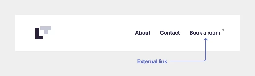
- Dropdown Navigation Bar

Dropdown navigation is ideal for websites with abundant information to share without overwhelming the landing page. This structure allows site owners to include numerous text links in the primary menu without cluttering the interface. By listing main elements in the top level and additional options in dropdown menus, users can easily navigate to specific pages by hovering over the top-level option.
2. Horizontal Navigation Bar

The horizontal navigation bar, typically located in the website’s header section, features links to important pages aligned from left to right. This format ensures that users can easily access key pages such as “About Us,” “Pricing,” “Products,” and “Contact Us” with a single click, minimizing the chances of overlooking essential information.
3. Vertical Sidebar Navigation Menu
Similar to horizontal navigation, the vertical sidebar menu offers a side-oriented navigation structure. Positioned vertically on either side of the page, this menu style allows designers to incorporate numerous links while maintaining a clean and organized layout. Despite its versatility, many websites prefer the traditional horizontal bar for its widespread familiarity.
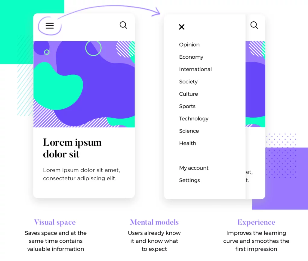
4. Hamburger Navigation Menu

The hamburger menu is commonly utilized in mobile website design to optimize space and streamline navigation on smaller screens. On larger devices like laptops or desktops, navigational elements are displayed horizontally. However, on smaller devices such as smartphones, these elements are hidden behind a collapsible hamburger menu, ensuring a clutter-free user interface.
5. Breadcrumb Navigation Menu

Derived from the tale of Hansel and Gretel, breadcrumbs provides users with a secondary navigation tool to track their location within a website. By displaying the path users have traveled, breadcrumbs facilitate easy navigation between pages and subpages, enhancing the overall user experience.
6. Footer Navigation Menu
Positioned at the bottom of web pages, the footer menu complements the primary navigation bar by featuring functional links such as “Terms & Conditions” or social media profiles. Featuring larger menu items compared to the header navigation, the footer menu ensures that essential information is easily accessible, even if not included in the main navigation bar.
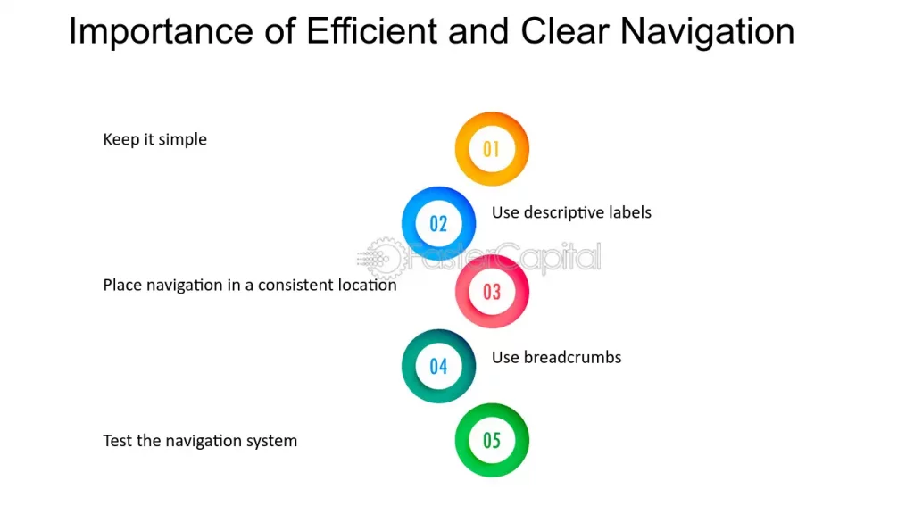
Best Practices to Embrace UX Navigation:
- Embrace Simplicity

A common pitfall among business owners is the temptation to embellish their websites with unnecessary elements, thinking it will enhance appeal. However, this approach often backfires.
In website design, we adhere to the principle that “simplicity is the ultimate sophistication.” Simplicity doesn’t mean stark minimalism; rather, it entails eliminating extraneous elements that clutter web pages.
The primary function of website navigation is to guide visitors to their desired destinations efficiently, minimizing unnecessary clicks. Tools like Google Analytics can be invaluable for identifying high-traffic pages and prioritizing important links.
Rather than inundating your landing page with an abundance of links, it’s best to restrict the main navigation menu to no more than seven links. Additionally, avoid overly complex dropdown menus, as search engine bots may struggle to crawl them.
However, for websites catering to large organizations, such as universities or eCommerce stores with numerous product categories, a mega menu may be appropriate. Mega menus present a categorized array of links, either as flyouts from the global navigation bar or dropdowns, providing a comprehensive overview of available content.
Remember, concise navigation enhances search engine visibility. Your navigation structure should empower users to locate desired information with ease, minimizing unnecessary clicks and optimizing user experience.
Learn about above the fold design here.
2. Clear and Concise Descriptions Enhance Navigation
When visitors arrive at your website, clarity is key to keeping them engaged. Confusion often leads to frustration and, ultimately, premature exits. To mitigate this risk, it’s imperative to maintain clear and concise navigation menus.
One effective strategy for achieving this clarity is to utilize descriptive labels for each menu item. While creativity has its place in web design, overly obscure or generic labels can detract from usability and hinder the user experience.
Instead, opt for descriptive labels that succinctly convey the purpose of each menu item. These labels should offer users with a clear understanding of what to expect when they click on a particular link. Incorporating relevant SEO keywords into these labels can also bolster your website’s search engine ranking, further enhancing visibility and discoverability.
To identify the most effective keywords for your labels, leverage tools like Google Analytics to analyze the search terms that drive traffic to your eCommerce site. By aligning your labels with commonly used search terms, you can ensure that your menu resonates with your target audience and facilitates seamless navigation.
Additionally, prioritize user-friendly language to ensure accessibility for all visitors. Avoid jargon or overly technical terminology that may alienate users and opt instead for language that is intuitive and easy to understand across diverse demographics.
3. Optimize Link Organization for User Engagement
The arrangement of links within your navigation menu plays a key role in guiding user behavior and engagement. Strategic placement can influence user attention and encourage desired actions, such as exploring product offerings or initiating contact.
Studies have shown that users tend to focus on the first and last items in a menu, with less attention paid to items in the middle. Capitalize on this tendency by strategically positioning key pages or actions at the beginning and end of your menu.
For eCommerce websites, consider placing essential pages, such as the shop or services page, at the forefront of the menu. This ensures that visitors can easily access core offerings and initiate their browsing experience without unnecessary barriers.
Conversely, reserve the final slot in your menu for impactful calls-to-action, such as “Checkout” or “Contact Us.” By placing these action-oriented links at the end of the menu, you prompt users to take the next steps in their journey, whether it’s completing a purchase or reaching out for assistance.
Overall, thoughtful organization of links within your menu can enhance user engagement and streamline the browsing experience, ultimately driving conversions and fostering positive interactions with your website.
4. Prioritize Visibility Without Compromising Creativity

Visibility is a cornerstone of effective website navigation design, yet it’s a facet that is sometimes overlooked in pursuit of creative innovation. While a unique layout can certainly make a website stand out, it should never come at the expense of usability.
As an eCommerce site owner, it’s crucial to ensure that your website’s navigation remains highly visible to visitors. Here are some key considerations to ensure optimal visibility:
A. Placement: The placement of your navigation bar is paramount to its visibility. Most visitors expect to find the main menu prominently displayed at the top of the page, typically positioned on the right-hand side. Similarly, the footer menu is typically located towards the bottom of the page, encouraging users to scroll down for additional options.
B. Contrast: In addition to placement, contrast plays a significant role in enhancing the visibility of your site’s elements. It’s essential to assess the contrast of not only the navigation bar itself but also the links embedded within the site’s content. Insufficient contrast can render embedded links virtually invisible to visitors, detracting from the overall user experience. To address this issue, consider using a color contrast checker tool to evaluate the accessibility and visibility of your website’s elements. By ensuring adequate contrast, you can improve navigation clarity and facilitate seamless user interaction.
By prioritizing visibility without compromising on creativity, you can strike the ideal balance between innovative design and user-friendly navigation, ultimately enhancing the overall effectiveness of your eCommerce website.
5. Reserve Buttons Exclusively for Calls to Action
Buttons serve as powerful tools for directing user actions and highlighting essential links on your website. Whether you’re aiming to draw attention to critical calls to action (CTAs) or emphasize specific links, buttons can effectively capture your visitor’s attention. This is because buttons are inherently associated with actions, making them stand out amidst other website content.
When incorporating buttons into your navigation design, it’s essential to use them selectively and exclusively for the most crucial CTAs and links. Whether you opt for a dropdown or sticky menu design, reserve buttons for actions that require immediate user interaction, such as “Book a Call” or “Contact Us.”
By limiting the use of buttons to calls to action, you can enhance their visibility and effectiveness, guiding users toward meaningful interactions and conversions.
6. Prioritize Mobile-Friendly Navigation
In today’s mobile-driven world, optimizing your website navigation for mobile devices is paramount to ensuring a seamless user experience. With a significant portion of website traffic originating from mobile phones, it’s essential to prioritize mobile usability to cater to the needs of on-the-go users.
Mobile optimization encompasses various elements, but one of the most critical aspects is the menu. The ubiquitous hamburger icon has become synonymous with mobile navigation, serving as a universally recognized symbol for accessing menu options on mobile-friendly websites. While you may be tempted to explore alternative menu designs to differentiate your site, sticking to the traditional hamburger menu ensures intuitive navigation for users.
Additionally, it’s essential to ensure that links are sufficiently large and easy to tap on mobile screens. Small, cramped links can frustrate users and impede navigation, leading to a subpar mobile experience. By prioritizing legibility and accessibility, you can facilitate effortless navigation and enhance user satisfaction on mobile devices.
Things to Avoid When Designing Website Navigation:
- Avoid Overcrowding the Navigation Bar
A cluttered bar can detract from your website’s visual appeal and hinder user-friendliness. It’s crucial to prioritize essential links on the header navigation bar to ensure visitors can easily access the information they need without unnecessary clicks.
When the navigation bar is overloaded with links, visitors may struggle to locate specific items, leading to frustration and a negative user experience. To maintain a clean and organized appearance, reserve the header bar for high-priority links while relegating less relevant ones to the footer of the page.
- Steer Clear of Generic Anchor Text
Descriptive anchor text is essential for guiding users and improving search engine optimization (SEO). Using generic or vague anchor text can hinder both user comprehension and search engine ranking.
Avoid generic phrases like “More information,” “Find out more,” “Click here,” or simply “Link.” Instead, strive to create informative anchor text that accurately describes the linked content. By providing descriptive context, users can anticipate the content they’ll encounter upon clicking, enhancing the overall user experience.
- Minimize the Use of Sprawling Dropdown Menus
While dropdown menus offer versatility and flexibility in organizing navigation links, excessive use can lead to user frustration and increased bounce rates. Visitors often find sprawling dropdown menus overwhelming and challenging to navigate.
To streamline the user experience, keep dropdown menus concise and focused by including only essential links. Avoid overcrowding dropdown menus with unnecessary items, as this can confuse visitors and deter them from exploring further. Additionally, the use of sub-menus should be reserved for situations where hierarchical organization is necessary, rather than incorporating them indiscriminately.
- Ensure Consistency
Consistency is paramount in website navigation design. Visitors should be able to understand and navigate your website effortlessly within minutes of landing on any page.
Maintaining consistency across your website layout, especially in the navigation menu, is essential for providing a seamless user experience. Whether users access your site from different pages or devices, they should encounter a uniform navigation structure that remains consistent throughout their browsing session.
To achieve this, establish clear guidelines for your website’s navigation layout and ensure adherence across all pages and devices. Consistency instills confidence in users and enhances their ability to navigate your site efficiently.
- Avoid Broken or Mislabeled Links
Encountering broken or mislabeled links can be frustrating for website visitors and may prompt them to leave your site altogether. These issues often arise when designers overlook the importance of maintaining functional and accurately labeled links.
To prevent broken or mislabeled links from detracting from the user experience on your website, follow these tips:
-Regularly review and update your website’s internal linking structure to remove links associated with deleted pages.
-Utilize link checker tools to identify and rectify broken links promptly.
-When adding new links, double-check that they direct users to the intended destination, ensuring accuracy and functionality.
By proactively managing your website’s links, you can minimize user frustration and maintain a seamless browsing experience.
- Maintain Tone Consistency
Every website has its unique tone, whether it’s professional, friendly, or casual. It’s crucial to ensure that the language used in your website’s navigation aligns with its overall tone and brand identity.
For example, if your website adopts a friendly tone, consider using inviting language such as “How we can help” instead of a more formal term like “Services.” Similarly, if your website adopts a professional or informal tone, tailor the navigation language accordingly to maintain consistency throughout the user experience.
Communicate your website’s tone and brand identity clearly to your designers to ensure that the navigation language reflects the desired messaging and resonates with your target audience. Consistency in tone enhances brand cohesion and reinforces the user’s perception of your website’s identity.
Unlock the Power of UX Navigation: Elevate Your Site to the Next Level!
Crafting effective website navigation is paramount for success. Tailor navigation design to align with your business objectives and cater to the needs of your target audience. Strive for a navigation system that is intuitive for both human users and search engines, ensuring easy access to information for all visitors.
FAQs on UX Navigation:
What are the important elements of web design that ensure a smooth user experience?
Several essential elements contribute to a seamless user experience in web design:
- Clear and intuitive navigation: This helps users easily locate desired information and navigate the website.
- Clean and uncluttered layout: Reduces distractions and allows users to focus on content.
- Responsive design: Ensures optimal viewing and interaction across various devices.
- Fast loading times: Prevents user frustration and maintains engagement.
- Accessibility: Ensures usability for users with disabilities.
- Search functionality: Allows quick access to specific content.
- Effective use of color and typography: Enhances visual appeal and readability.
Are search bar functions important in website design?
Yes, search bar functions play a significant role in website design. They enable users to efficiently find specific information or content, particularly on websites with extensive content. Search functionality enhances user experience by simplifying information retrieval, potentially leading to increased user satisfaction and retention. Incorporating a search bar can significantly improve a website’s usability and user experience.
