In the fast-evolving realm of digital design, where every pixel plays a critical role in shaping the overall user experience, Call-to-Action (CTA) buttons emerge as the subtle yet impactful catalysts of online engagement. These buttons are not merely functional components of a webpage; they are the driving forces that spark interaction and guide users toward making key decisions. In a landscape filled with endless design choices, the color of a CTA button holds a special place, standing out as a carefully considered strategic decision with the power to direct user behavior and significantly influence outcomes.
The selection of color is far from being a mere aesthetic choice—it’s a deliberate tactic that can seize attention, evoke specific emotions, and compel users to take action. By tapping into the psychological and emotional triggers associated with color palette, the right hue can transform a CTA button from a simple visual element into a powerful tool that shapes user decisions.
As such, the color of a CTA button becomes an indispensable aspect in crafting a smooth, engaging, and ultimately successful digital experience, guiding users seamlessly toward their next steps.
Understanding the Psychological Impact of Colors
1. Psychological Impact:
Colors are deeply embedded in our psychological responses, making them a powerful tool for digital designers. Every color palette carries distinct emotional associations and psychological triggers. For example, red often signifies urgency, prompting action, while blue instills trust and reliability, and green is linked to growth and positivity. A designer who understands these emotional cues can strategically choose CTA button colors to encourage specific user behaviors, subtly nudging individuals toward taking action on a site or platform.
2. Visual Hierarchy and Attention:
In the digital world, where content is often overwhelming and attention spans are limited, CTA buttons act as essential focal points. The right color can elevate a button’s prominence, helping to establish a clear visual hierarchy in web design that directs users to the most important actions. By selecting vibrant and contrasting colors, designers ensure that CTA buttons stand out, drawing the user’s attention and minimizing distractions. This color-based emphasis makes it easier for users to navigate the decision-making process without confusion, thus improving the overall user experience.
3. Brand Identity and Recognition:
CTA button colors are more than just design elements; they are integral to a brand’s identity. Consistency in color usage across various platforms and touchpoints reinforces brand recognition, allowing users to quickly identify a brand and feel familiar with its offerings. The use of specific color palettes in CTA buttons ties these actions to the brand itself, enhancing the sense of trust and continuity for the user. This strategic alignment between color and brand image plays a crucial role in creating a cohesive and memorable experience for the user.
4. Cultural and Contextual Considerations:
The meanings of colors are not universal—they can vary significantly across different cultures and contexts. For instance, while white is often associated with purity and peace in Western cultures, it may symbolize mourning or death in certain Eastern cultures. Designers must be aware of these cultural variations to ensure that the chosen CTA button colors have a positive impact on diverse user groups.
Additionally, understanding the context of the user interaction—such as the nature of a campaign or a special event—enables designers to select colors that align with the situation, thereby enhancing the relevance and emotional resonance of the design.
5. Accessibility and Inclusivity:
An often-overlooked yet essential consideration when choosing call to action button colors is accessibility. It’s vital for designers to select color palettes that offer high contrast and readability to accommodate users with visual impairments or color blindness for the target audience. By adhering to accessibility guidelines, businesses ensure that their digital content is inclusive, allowing a wider range of users to engage with the site or platform. This commitment to accessibility not only broadens a brand’s audience but also reflects a dedication to providing an equitable user experience.
6. A/B Testing and Iterative Design:
The significance of CTA button colors is best understood through iterative design and the brand colors, where A/B testing plays a crucial role. By testing different color variations and assessing user responses, designers can gather data to refine their choices and improve performance. This evidence-based approach ensures that the selection of color is not arbitrary but rather grounded in user behavior and preference, leading to continuous enhancement and more effective design.
7. Emotional Engagement and Trust Building:
Colors don’t just prompt actions—they also evoke emotions, which can play a crucial role in building trust with users. For example, a CTA button in a calming blue can help foster a sense of security, while a vibrant orange might create excitement or urgency. By crafting a well-thought-out color palette, designers can emotionally engage users, fostering positive feelings and a stronger sense of reliability, which in turn enhances trust and encourages ongoing interaction with the brand.
8. Mobile Responsiveness:
With mobile devices becoming the primary platform for digital interactions, the choice of call to action button colors must also consider responsiveness. Colors should be selected to maintain their visual impact across different screen sizes and resolutions, ensuring consistency and clarity regardless of device. Mobile-friendly color choices help optimize user experiences on smartphones and tablets, making sure that CTA buttons remain effective across all user touchpoints.
9. Seasonal and Campaign Adaptability:
Colors for CTA buttons also have the flexibility to adapt to changing seasons or specific campaigns, adding an extra layer of dynamism to the digital design. By adjusting button colors to reflect holidays, promotional events, or seasonal trends, brands can create a sense of relevance and timeliness, keeping their user interfaces fresh and engaging. This adaptability shows that a brand is responsive to its users’ needs and current trends, which can increase user participation during key marketing moments.
10. Feedback and Affordance:
Finally, call to action button colors serve as a form of feedback, signaling interactivity and guiding the user experience. Changes in color when a user hovers over or clicks a button provide immediate visual cues that enhance the user’s sense of control and engagement. These dynamic feedback mechanisms not only make the interface more intuitive but also contribute to a more satisfying and enjoyable user experience.
By combining the right color choices with clear affordances, designers can create an interactive, user-friendly environment that encourages action and reinforces positive behavior.
Learn about CTAs in email marketing here.
Exploring the Psychology of CTA Button Colors: What Works and Why
1. Red: The Assertive Power of Passion
The color red, revered as the most assertive hue, holds an unmatched influence both in the marketing realm and the broader canvas of Earth itself. It possesses the innate ability to attract attention, captivate the viewer, and evoke powerful emotions.
Brands, recognizing the practicality and potency of red, often incorporate it strategically into their visual identities. When red takes center stage as the primary color of a brand, an indelible mark is left on the consumer’s memory. This intentional use is not a mere coincidence; rather, it’s a purposeful choice by brands to etch themselves into the consciousness of their audience.
Consider this: if you were to survey your friends about the most popular brands, chances are, a significant portion would feature red in their color palette. This deliberate trend is a testament to the efficacy of red in preventing brands from fading into obscurity.
Example: Netflix – Igniting Action with Red

Take, for instance, the homepage of Netflix, a renowned streaming platform offering a plethora of TV shows, movies, documentaries, and entertainment content. Netflix strategically employs red as a dominant color, creating a visually arresting and action-oriented interface.
In the above-the-fold section of Netflix’s homepage, amidst a backdrop showcasing various shows, an email input field is prominently displayed. The call to action buttons, both boasting the power of red, urge visitors to subscribe, fostering a seamless user journey. The use of consistent red throughout these elements aligns with Netflix’s goal of increasing its subscription rate, illustrating a successful application of the color’s captivating prowess.
2. Blue: The Tranquil Embrace of Trust
Blue, a color that resonates with trustworthiness, security, loyalty, and coolness, serves as a stalwart supporter for numerous brands. While it may lack the bold allure of red, blue’s representation unveils a penchant for communication and reliability.
In various industries, particularly banking, and business, blue is harnessed to instill a sense of safety and trust in customers. The cool and calming nature of blue makes it effortlessly conducive to interactions, fostering an environment where users feel secure and at ease.
Example: Facebook – Navigating Trust with Blue
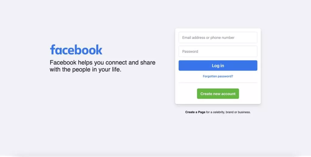
Examining the login page of Facebook, one of the most universally recognized websites, emphasizes the deliberate use of blue in strategic positioning. As users embark on the journey of logging into their accounts, the predominant CTA button, featuring the calming hue of blue, stands out prominently.
Beyond the practical act of providing login functionality, the blue button on Facebook’s login page exudes a sense of trust and dependability. Positioned strategically at the top among various other elements, the blue button becomes the natural focal point, guiding users seamlessly through the login process.
Understand the impact of CTA pages here.
3. Yellow: Radiant Optimism Illuminated
Yellow, the color of optimism, joy, and youth, possesses a unique ability to catch the eye and spread positivity. Its radiant hue is like a beacon that shines and demands attention wherever it appears. This color, often associated with clarification, has the innate quality of drawing people in.
When brands adopt yellow as a central part of their identity, it signals a desire to convey a message of positivity and warmth. The very essence of yellow is to uplift and create an atmosphere of optimism.
Example: IKEA – Guiding the Shopping Odyssey with Yellow

A prominent illustration of the use of yellow is found in the iconic brand IKEA. The homepage of IKEA serves as a testament to the deliberate and effective use of yellow. The most direct and visible Call-to-Action (CTA) button on this list belongs to IKEA, and for good reason.
The color’s vibrancy is more than sufficient to capture attention, and the coherence of font and font colors enhances the clarity of the message. The sizable yet clear yellow CTA button aligns seamlessly with the objective of IKEA’s visitors: to shop. The strategic placement of this button encourages users to embark on their shopping journey promptly.
4. Green: A Symbol of Refreshment and Sustainability
Green, a color representing refreshment, rebirth, and restoration, holds a deeper significance as a badge of sustainability. Brands that emphasize green aim to convey a commitment to being environmentally friendly, healthy, and sustainable.
While green might be considered a rare choice, its appropriateness depends on the industry and the values a brand wishes to embody.
Example: The Plant Based Treaty – Advocating Green Living

A notable example showcasing the use of green is The Plant-Based Treaty. This non-profit organization campaigns to create a greener and better world. When aiming to collect signings and donations for such a noble cause, the brand’s identity needs to strike a balance between modesty and directness.
The homepage of The Plant Based Treaty features multiple green call to action buttons, particularly at the top left, which draw immediate attention. Scrolling down, additional green buttons encourage visitors to sign the treaty. The color green, in this context, aligns harmoniously with the brand’s mission, creating a visual narrative of sustainable living and environmental advocacy.
5. Orange: Energizing Fun and Passion
Orange, a color synonymous with fun, energy, and passion, exudes a sense of positivity and action. Individuals drawn to the color orange often share a love for vibrancy and seek energetic experiences.
Example: Zapier – Infusing Energy with Orange

Zapier, a platform synonymous with efficiency and connectivity, serves as an apt example of the effective use of orange. The call to action buttons on Zapier’s homepage, adorned with the energetic hue of orange, are strategically positioned.
The alignment of Zapier’s mission – seamless automation and integration – with the vibrant orange buttons creates a synergy that resonates with users. The careful placement ensures that these buttons not only stand out but also captivate attention as users first land on the page, embodying the brand’s energetic and dynamic identity.
6. Pink: The Perfect Balance of Warmth
Pink, considered a risky choice for CTA buttons, can be perfect when used judiciously. This color, symbolizing warmth, love, tranquility, and nurture, requires careful handling to avoid overwhelming users.
Example: Dunkin Donuts – Tempting with Pink
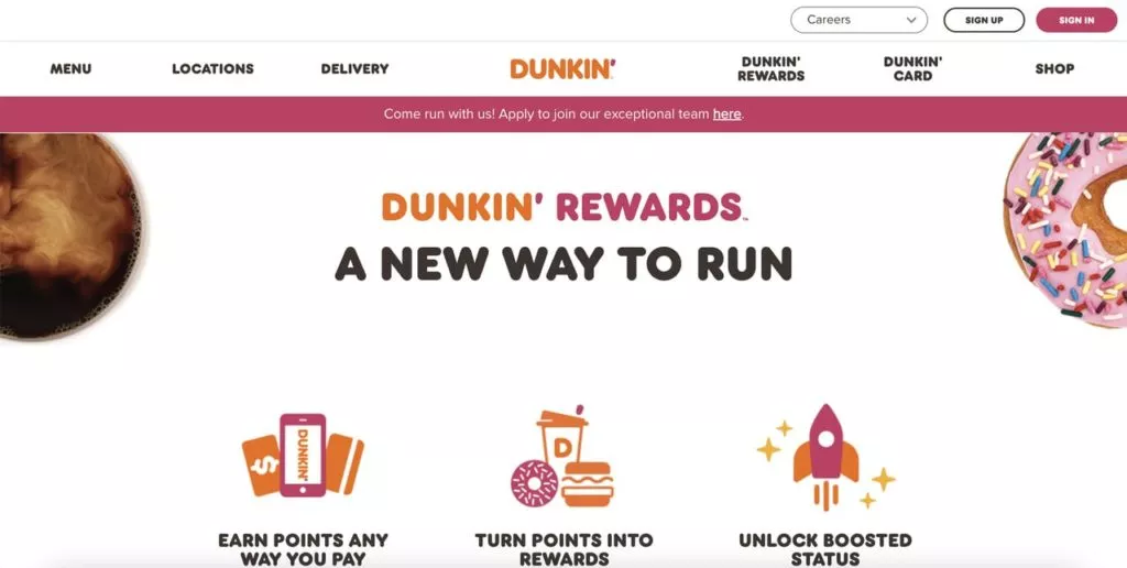
Dunkin Donuts, known for its appetizing offerings, employs pink strategically on its homepage. The CTA buttons, though not oversized, are precisely positioned and colored to enhance visibility without causing saturation. The color pink, when used in moderation, complements Dunkin Donuts’ brand identity, creating a warm and inviting atmosphere that resonates with the themes of love and nurture.
7. Black: The Understated Powerhouse
Often perceived as a neutral backdrop, black is a color that exudes seriousness, strength, and directness. Brands opting for black in their identity aim to convey the precise essence of their sector and industry.
Example: Brevo – Contrasting with Black

Brevo, with a general brand outlook dominated by green, employs black strategically for its call to action button. This deliberate choice creates a striking contrast, ensuring the button stands out prominently against the background.
The Science of CTA Button Colors: Factors to Consider
1. Understand Your Brand’s Identity
The first step in designing an effective CTA button is to gain a deep understanding of your brand’s core identity and its established color palette. This knowledge ensures that every design choice you make, including the color of your CTA buttons, remains consistent with your brand’s overall visual language.
Consistency is crucial for creating a cohesive user experience, where your color choices reflect the tone, personality, and values of your brand. By aligning your call to action button colors with your established guidelines, you reinforce brand recognition, foster trust, and create a unified visual identity across all touchpoints, making the interaction feel authentic and seamless for users.
2. Define Your CTA’s Purpose
Before selecting a color for your CTA button, it is vital to clearly define its specific goal. Whether your objective is to encourage sign-ups, drive purchases, or prompt another desired user action, the color of the button should complement and support this goal. For instance, a color that evokes urgency might be ideal for a limited-time offer, while a calming hue might be more appropriate for a subscription or informational call to action.
By aligning the color with the intended action, you can subtly guide the user’s decision-making process, enhancing the likelihood of achieving your business objectives efficiently and effectively.
3. Consider the Psychological Effect of Colors
Colors have a profound psychological impact, and understanding the emotional associations tied to different hues is essential when designing your call to action buttons. Each color carries unique connotations—red can evoke urgency or excitement, blue conveys trust and stability, green is associated with growth or success, and yellow may invoke optimism.
By choosing colors that resonate with the feelings you want to elicit, you strengthen the emotional connection with your audience. Carefully consider how the color of your CTA button aligns with the brand’s message and values, ensuring that it complements the broader narrative you are trying to communicate.
4. Ensure Sufficient Contrast for Visibility
To make sure your CTA button catches the user’s eye, it’s crucial to incorporate sufficient contrast into its design. Select a color that stands out against the background and surrounding elements, making the button visually prominent. High contrast ensures that the button is easy to find, grabs attention, and doesn’t get lost in the design.
When users can easily identify your CTA button, they are more likely to engage with it. This contrast not only enhances the visual appeal but also improves usability by guiding users’ attention directly to where action is needed, boosting the chances of conversion.
5. Integrate Other Design Elements Thoughtfully
While color is an important factor, the overall effectiveness of a call to action button also depends on other web design elements, such as its shape, size, font, and placement. All these components work in tandem to create an intuitive and user-friendly experience. For instance, a larger button or one with rounded edges may be more inviting and approachable, while a bold, clear font ensures readability.
Proper placement—such as positioning the button where the user naturally looks next—also plays a role in driving interaction. By thoughtfully combining color with these design elements, you enhance the button’s visibility, ease of interaction, and ultimately its effectiveness in prompting user actions. The result is a more cohesive and persuasive user experience that encourages conversions.
Color Your Way to Success: The Impact of CTA Button Colors on User Actions
To wrap it up, the call to action button color is more than just a design choice—it’s a powerful catalyst for user action and brand engagement. By thoughtfully aligning your button color with your brand, goals, and audience psychology, you can create an experience that guides users seamlessly toward their next step. Ready to experience it for yourself? Kickstart your journey with a Nestify Hosting Trial today, and watch your digital presence thrive!
FAQs on CTA Button Colors to Boost Engagement
Is Choosing the Best Color Enough for a CTA Button?
It’s not only about color; factors like button size, shape, and text also contribute to its effectiveness. The more attention-grabbing the entire CTA button, the better.
Should a CTA Button Change Color Frequently?
While a CTA button should primarily fit your brand, occasional color changes for special campaigns or occasions are acceptable if they align with your brand’s general design.
What to Avoid When Choosing CTA Button Colors?
Avoid using different colors for your CTA button; a direct color representing your brand is preferable. Contemplate your industry, brand goals, and target audience. Additionally, seek user feedback through testing to make well-informed decisions.
