Portfolio design trends are constantly evolving, serving as a dynamic canvas for individuals and businesses to showcase their creativity, professionalism, and unique identities in the digital sphere. These trends, shaped by technological advancements and changing user preferences, encompass a myriad of innovative techniques and aesthetics that redefine how portfolios are presented and experienced.
From minimalist layouts to interactive elements, striking color schemes to immersive visuals, each trend offers a distinct avenue for storytellers, artists, developers, and businesses to captivate audiences, convey their brand message, and leave a lasting impression. These trends not only emphasize visual appeal but also prioritize user experience, ensuring seamless navigation, engaging interactions, and efficient content delivery.
Top Portfolio Design Trends in 2024:
1. Curated Homepage
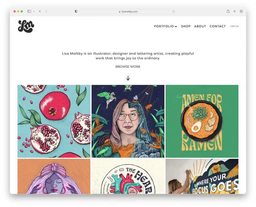
Crafting a Curated Portfolio Home Page streamlines the visitor experience, sparing them the hassle of excessive clicking to access your finest projects. Take, for instance, Lisa Maltby‘s personal website, where this approach shines.
Imagine landing on Lisa’s homepage to find a tastefully arranged showcase of her standout client commissions and passion projects. The added flair of subtle animations, while optional, elevates the visual appeal without overwhelming the user.
This curated display offers a swift glimpse into Lisa’s creative style within a few scrolls. It’s a user-friendly gateway that unveils the essence of her work—a focused, captivating representation that captivates potential clients effortlessly.
2. Personalization
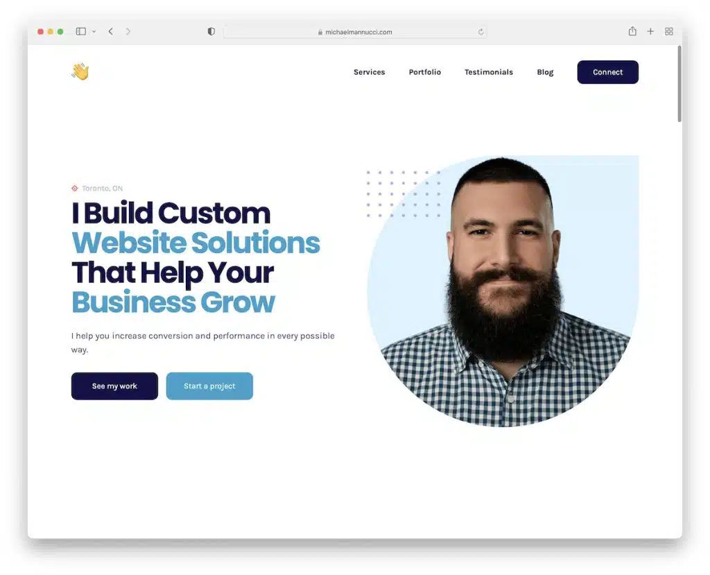
Injecting Personalization into your online portfolio transforms it into an authentic representation of yourself. Consider Michael Mannucci‘s personal website as a prime example.
Michael’s portfolio greets visitors with a prominent headshot right at the top, immediately establishing a personal connection. The choice of colors and typography throughout the site reflects his distinct personality, setting the tone for the visitor’s experience.
What’s impressive is how Michael’s design choices harmonize with his character. For someone who embraces minimalism, his portfolio exudes simplicity and clarity. Conversely, if you’re greeted by vibrant colors and playful animations, it perfectly mirrors a lively and bubbly persona.
In essence, personalization becomes the canvas for expressing individuality and creativity. It’s all about crafting your portfolio to mirror your unique identity, exactly as YOU envision it!
3. Minimalism
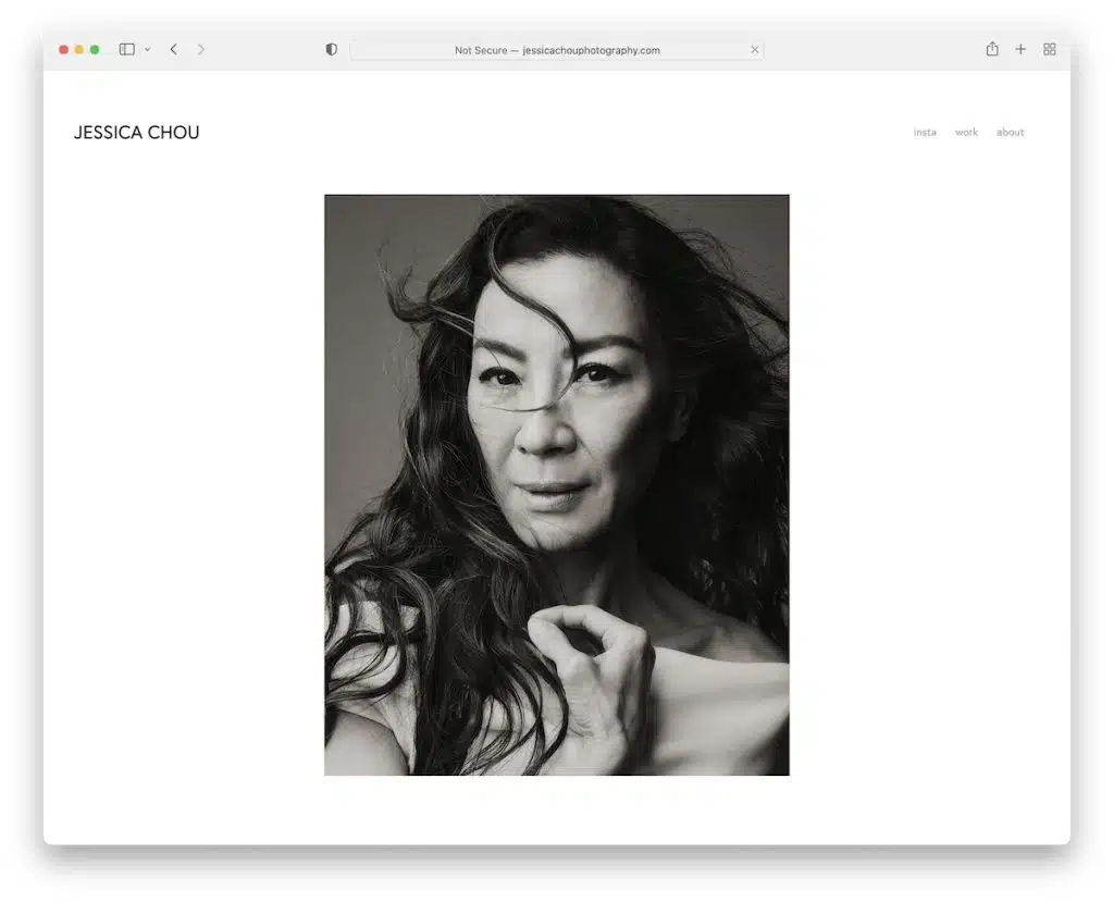
The enduring appeal of minimalism remains a constant in portfolio design, epitomizing simplicity at its finest.
Why is it a perennial favorite? Its adaptability transcends professions and industries, catering seamlessly to painters, web designers, photographers, developers, and writers alike. The minimalist portfolio’s universal allure lies in its versatility—a canvas for showcasing work in an uncluttered, focused manner.
Jessica Chou‘s art portfolio exemplifies this ethos, placing her creations front and center in a clean, streamlined layout. Moreover, the beauty of minimalism extends to its impeccable user experience across desktop and mobile platforms.
Learn about web deisgners here.
4. Layered Elements
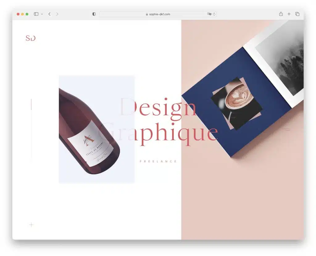
For those seeking an alternative to minimalism, layered elements offer an avenue for visual richness and dynamism. Layering images, fonts, and graphics adds depth, elevating the portfolio’s visual appeal. This technique, coupled with the parallax effect, creates an immersive viewing experience, enticing the audience with a sense of depth and movement.
The strategic arrangement of layered elements also facilitates a visual hierarchy, directing attention to key content. By stacking elements, you can accentuate focal points and guide the viewer through a deliberate narrative flow.
The charm of a portfolio adorned with layered elements lies in its ability to craft compelling narratives, guiding viewers on an engaging journey through a thoughtfully curated sequence of content. Consider Sophie for this.
5. GIFs And Emojis
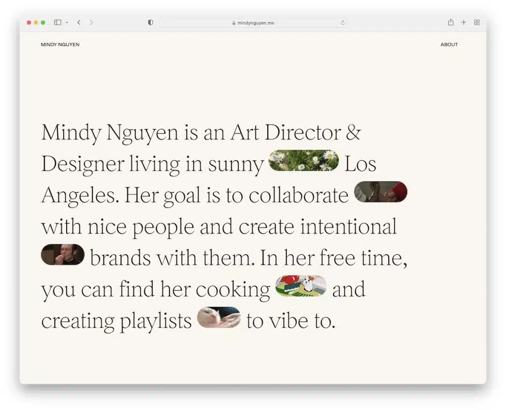
In today’s conversational landscape, emojis and GIFs have become an integral part of communication for their quick, expressive nature. Mindy Nguyen infuses this conversational flair into her portfolio, leveraging emojis and GIFs to inject playfulness and creativity.
Rather than substituting text with graphics, these elements enhance expressiveness and emotional resonance within Mindy‘s online presence. They provide additional context and convey sentiments that might be challenging to articulate through text alone. Especially for those aiming to engage younger audiences or maintain a strong social media presence, these additions can enhance shareability and relatability.
However, striking a balance is crucial—ensuring that these elements align harmoniously with the overall branding and professionalism of the portfolio.
6. Interactive Grid
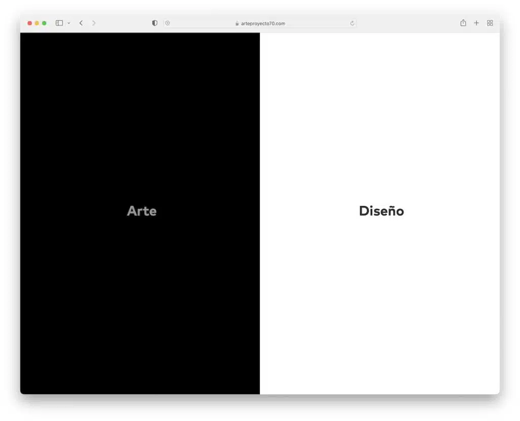
Arte Proyecto 70 showcases an innovative approach to grid-based portfolio design by integrating interactivity. Their three-part home page grid reacts upon hover, leading visitors to specific pages distinguished by corresponding background colors—an efficient and engaging exploration journey.
Introducing animation and interaction to a portfolio grid can dynamically elevate user experience, adding a layer of engagement beyond static layouts.
7. Interactive And Animated
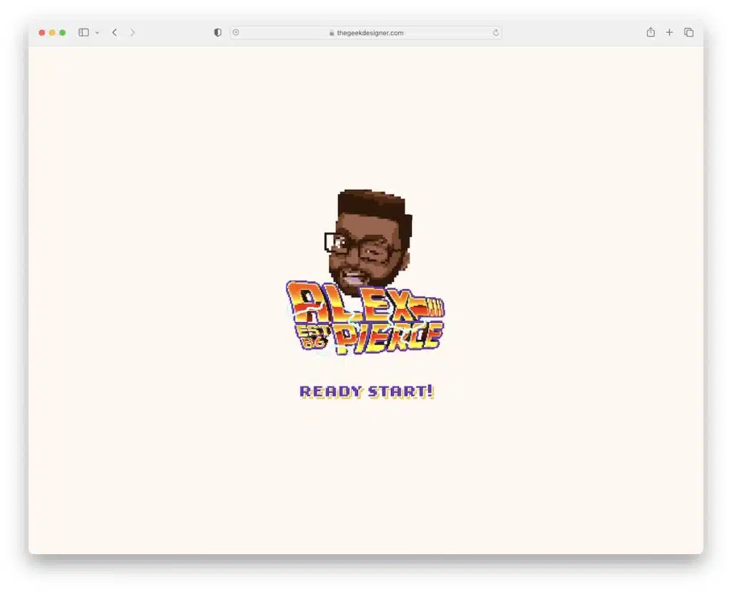
Alex‘s portfolio design breaks away from conventional trends, embracing an abundance of interactivity and animation. This approach might appear “flashy” and exudes a non-serious, creatively expressive persona.
While this style enhances visual engagement and storytelling, there’s a fine line between captivation and chaos. Managing the level of animation and effects becomes crucial—starting gradually rather than overwhelming visitors immediately.
8. Unique Endless Scrolling
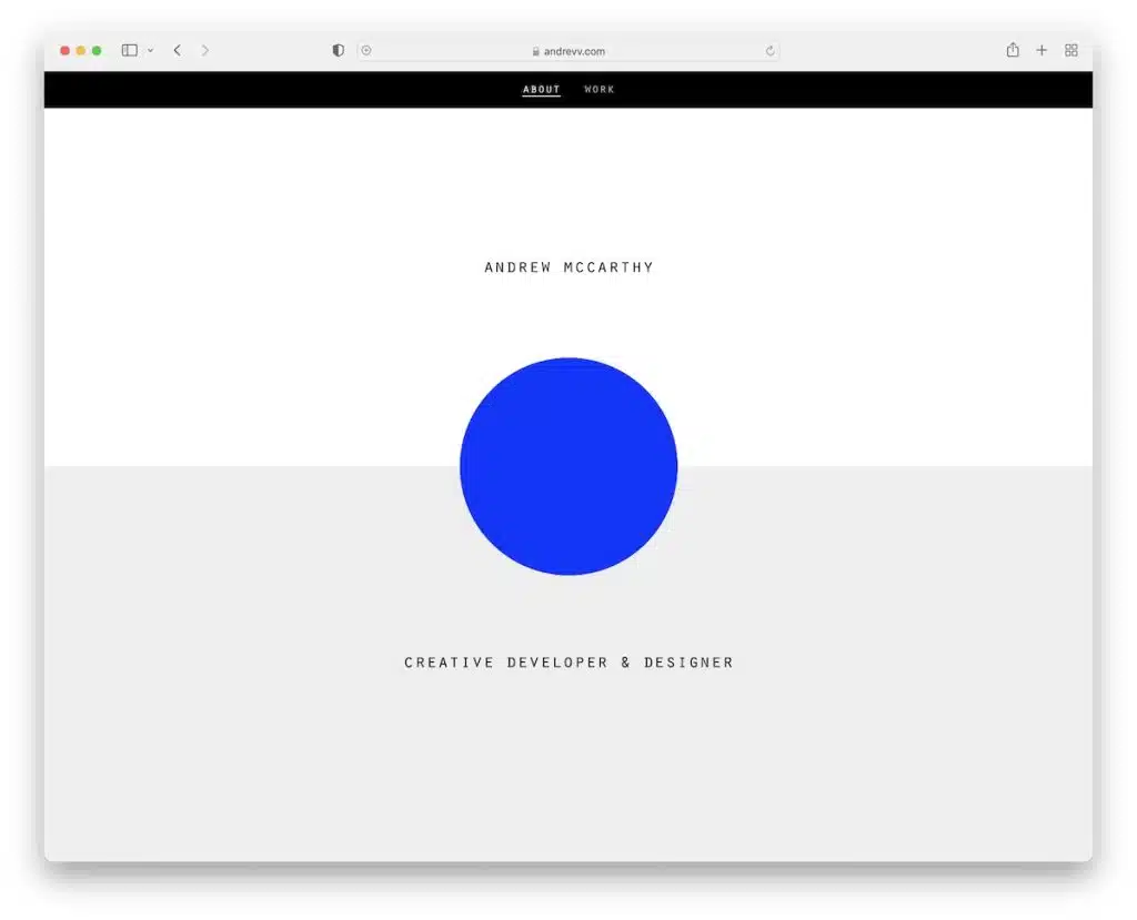
Andrew McCarthy takes the concept of infinite scrolling to new heights by creating a continuous loop through seven sections, each subtly changing with overlaid elements. This unconventional technique maintains visitor interest by subtly blurring the line between multiple pages.
Infinite scrolling can captivate visitors longer, as the seamless transition between sections keeps them engaged with compelling content.
9. CV/Resume Style Layout
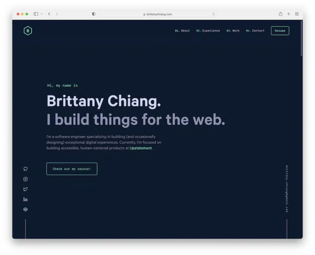
Imagine having your career history and expertise presented front and center as soon as someone lands on your portfolio. Brittany Chiang‘s developer portfolio does just that—integrating a CV/resume style layout right on the home page.
Recognizing that visitors are most engaged within the initial moments of arrival, this approach provides immediate access to key information. By offering a visually captivating and well-structured professional history, visitors can grasp your experience and skills within seconds. This seamless connection between your past achievements and current portfolio enhances the chances of impressing potential clients or employers.
What makes this strategy even more powerful is its adaptability. Tailoring the home page content to highlight specific skills, experiences, and accomplishments relevant to a particular opportunity ensures a personalized touch for each visitor.
10. Dark Look
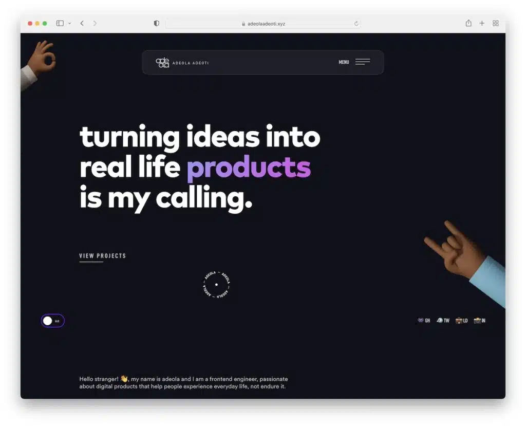
In a landscape where light-themed websites dominate, the rise of dark-themed portfolios stands out as a symbol of differentiation and uniqueness. Adeola Adeoti‘s portfolio embraces the dark look trend to create a visually impactful and sophisticated experience.
The dark color scheme intensifies the presentation of all content—text, images, and multimedia—adding a layer of elegance. This aesthetic not only captivates attention but also immerses visitors in an atmospheric experience, offering a unique visual journey.
Additionally, implementing a dark/light mode switcher ensures visitors can view content based on their preferences, enhancing accessibility and user experience.
11. Large Slider
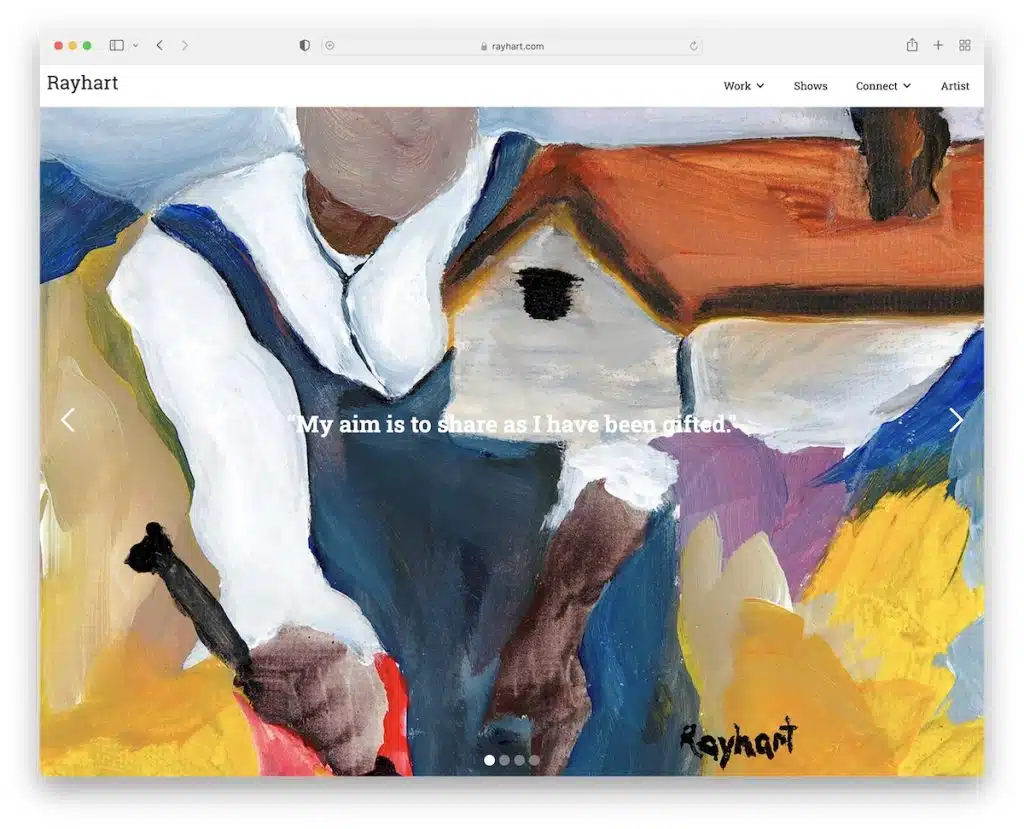
Utilizing a large slider or slideshow on your portfolio instantly grips visitors with a powerful visual punch. Ray Hart’s artist portfolio leverages this technique to showcase multiple projects seamlessly.
This design choice allows for a cohesive display of work without requiring visitors to navigate different pages or scroll extensively. With minimal clicks and zero page loads, visitors can quickly skim through a range of projects, each presented in high-quality, full-screen imagery that accentuates intricate details.
The key here lies in moderation—avoiding an overload of slides while ensuring image optimization for optimal portfolio performance.
12. Video Background
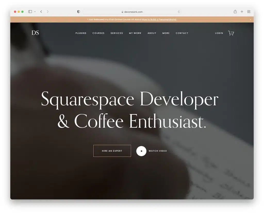
The rising trend of incorporating video backgrounds in portfolios, exemplified by Devon Stank‘s personal website, aims to heighten visitor engagement.
Strategically placed, videos offer glimpses into your work processes, evoke emotions, and enable storytelling opportunities. Even without specializing in video creation, you can craft behind-the-scenes footage, short documentaries, or project collages to deepen visitors’ connection with your work.
However, a balance is crucial—too many video backgrounds can overwhelm and prompt visitors to leave prematurely. Tastefully integrating videos enriches the portfolio experience, fostering a deeper level of engagement.
Conclusion:
Exploring and implementing these design trends not only reflects a commitment to staying current but also enables individuals and businesses to stand out in a competitive digital landscape. The versatility and adaptability of these trends offer endless possibilities for expressing individuality, fostering engagement, and making a profound impact on the audience.
As technology continues to evolve and design sensibilities shift, embracing these portfolio design trends becomes an exciting opportunity to push boundaries, inspire, and create immersive digital experiences that resonate with audiences across diverse industries and disciplines.
FAQs on Portfolio Design Trends:
What should I include in my portfolio?
Your portfolio should feature your best work, organized in a clear and easily navigable manner. Include a variety of projects that highlight your skills, expertise, and range. It’s also beneficial to add a brief bio, contact information, and any relevant achievements or testimonials.
Should I tailor my portfolio for specific audiences or industries?
Absolutely. Tailoring your portfolio to align with the preferences and needs of your target audience or industry can significantly impact its effectiveness. Highlighting relevant skills and projects can increase your chances of resonating with potential clients or employers.
What role does user experience (UX) play in portfolio design?
UX is paramount in portfolio design. A well-thought-out user experience ensures easy navigation, intuitive interfaces, and engaging interactions. A positive user experience encourages visitors to explore more and increases the likelihood of them engaging with your work or services.
How do I ensure my portfolio is accessible on different devices?
Opt for a responsive design that adapts to various screen sizes and devices. Test your portfolio on desktops, tablets, and mobile devices to ensure it maintains functionality and visual appeal across platforms.


