
The product page for your business creates the initial impression. It decides what potential consumers see initially, whether they click around to see more or buy anything. It may determine whether they join your email list to get regular updates.
For online stores, the product pages frequently provide customers with their first impression of your brand. Your product page must make an excellent first impression, as with other first impressions, especially in today’s saturated eCommerce industry.
What precisely goes into some of the most effective product sites online? We will thus concentrate on the top product page examples we’ve seen from major businesses in 2023, even though there are many excellent eCommerce tools and publications about optimizing a product page.
Product Page Description
A product detail page (PDP) is a web page on an online store that features information about a single item for sale. Customers can find details like sizing charts, color breakdowns, prices, shipping details, and user reviews here.
To put it poetically, PDPs are blood circulating through an online store. For example, think of Amazon to grasp them fully: When you first search for a product on Amazon, relevant results are presented. If you see one that interests you, you click on it to learn more about it.
Any Amazon product you click on will take you to a new page. Information about that item, such as its dimensions, ingredients, and assembly directions, is provided on this page. It provides exhaustive information about the product to help the buyer make an informed decision. The information about this product can be found on this page.
On this product page, you’ll typically find several photographs of the product and a breakdown of the various dimensions and hues it’s offered in. Lastly, a purchase button will be accessible from this page’s immediate vicinity.
Why Is A Product Page Detail So Important?
Because it is the last stop before purchasing, a product detail page is crucial to your marketing efforts. Giving customers more details about the product they’re considering is vital; otherwise, they have no way of knowing, for example, its size or what it can be used for.
Customers’ trust in your products will decrease, and they may only abandon their online shopping carts if you provide a product detail page for them to peruse.
If there is insufficient or false information about a product, 98% of shoppers abandon their cart, says Shiprocket. Further, honest and thorough product descriptions lessen the likelihood of customer complaints and returns.
Components Of A Product Page In Ecommerce Store
1. Menu
If you want your customers to explore your site, it’s imperative that you provide them with an easy-to-use menu. You’ll be able to access the site’s homepage, various product categories, and the customer’s shopping cart with the click of a button thanks to the menu. Another intelligent decision is to add high-converting landing pages to trigger sales.
2. Breadcrumb
In the context of the internet, a breadcrumb is a trail of clickable links that shows the user how they got to the current page. A customer’s entire web browsing history leading up to a purchase of a specific item will be displayed. If you go to Amazon.com in search of an air conditioner, for instance, you might notice a directional arrow at the very top of the page. Perhaps something like this is displayed: “Home > Shopping > Home & Kitchen > Air and Heating > Portable Units.”
3. Product title
This needs to be the boldest, most noticeable text on the page. Your customers will know exactly what they’re buying after reading a descriptive title. You should be as specific as you can without getting too complicated.
4. Product descriptions
Product descriptions, while it need not be lengthy, should be detailed enough to define the product’s features, benefits, functions, and limitations. Knowing your target audience and how to speak their language makes for compelling copy, which increases the likelihood that they will buy more from your online store. Even better would be if you sprinkling in some keywords that would help with SEO. Any major concerns or objections to the product should be addressed in the product description. When marketing air conditioners, for instance, mentioning the product’s Energy star rating can help allay customer concerns about the product’s impact on the environment. Want to know how to generate these product descriptions? Learn more about product description generators here.
5. Product images
Good, high-quality product photos are essential for giving buyers an accurate impression of your wares. In order to make the viewer feel as though they are looking at the product in person, it is important to display images of the product from a variety of perspectives. When working with others to share product descriptions, it is important to give credit to the image’s original creator. Finally, make sure the images you use are of high quality.
6. Price
This is the most crucial information for your potential customers to know about this page. Your product’s price must be clearly and conspicuously displayed. Displaying price drops here can also boost conversions (this is called “price anchoring”). $29.99 $39.99. There should be a “Buy” or “add to cart” button with the price right next to it. Seeing the price before deciding whether or not to buy is a natural progression, and this will hopefully encourage more people to take that route.
7. Call-To-Action
As far as this page goes, this is where all the action is. Get ready to tell your customers to “add to cart” now! A call-to-action is an immediate request for customers to take some sort of action. Usually, this means buying something and checking out.
8. Product availability
Customers are more likely to make a purchase if they believe they will be able to get their hands on the product quickly, so highlighting the fact that the product is in stock or has a limited quantity available can be a powerful sales tool. Most online shops display this information; if you can, include it on your product page.
9. Social proof
Including social proof on your website is a must if you want to increase conversion rates. Positive reviews from other buyers are the single most effective method of convincing potential buyers to make a purchase. There are a variety of forms of social proof, such as rating averages, awards, and trust badges. Evaluate your options and, if possible, base your decisions on the recommendations of others.
10. Scarcity and urgency signals
One easy way to show customers they need to act fast is to display stock levels or the number of concurrent viewers for a given product.
11. Cross-selling
It’s safe to assume that a user who has navigated to your product detail page is considering making a purchase. You need to take advantage of this interest by employing ingenious cross-selling or upselling strategies.
12. Trust badges and trust seals
Adding trust badges to your site is another simple yet effective strategy for reducing customers’ reluctance to buy from you. Customers will feel more at ease making purchases from you if you emphasize the safety of your website. Econsultancy found that nearly half of respondents (48%) find trust badges to be an indicator of a reliable and safe website.
13. Policies
Each product page could also benefit from a list of policies and disclaimers. This makes it crystal clear how responsible your company is for problems that arise from using your products and whether or not you offer refunds. Customers are more likely to make a purchase from you if they know they can return the item if they change their mind later. Also, a privacy statement and a statement about the site’s terms and conditions wouldn’t hurt. By doing so, you can avoid legal trouble in the event that a defective or incorrectly shipped product causes harm. In addition, please detail all guarantees and warranties.
14. Shipping information
Shipping costs aren’t as easy to manipulate as product prices in general. Likewise, state sales taxes are the same. The exact shipping costs will be determined after consultation with the customer and will vary by location and preferred mail service. Expenses related to shipping and handling have a sizable impact on consumer spending. Over half of cart abandoners cite high shipping costs as the reason for their decision to not complete their purchase. It’s preferable to make this clear right away and before users even start exploring the page.
Criteria Important For A Product Page To Run Successfully
As we think they have a bigger influence on an e-total shop’s eCommerce conversion rate, we utilized the following factors to guide our decisions:
- Attractiveness: What sort of graphics and copy are used? Are they comfortable? Do they have aesthetic appeal?
- UI/ UX: How user-friendly is the page on both desktop and mobile browsers?
- Page Load Speed: How rapidly does the page load, including any associated graphics or videos? GTmetrix was used to test this.
- Innovation: Does this website employ any novel or intriguing techniques to convey the offering in an intriguing and compelling manner?
Best Product Page Examples of 2023
- Aesthetics: With lots of white space, plain typefaces, and clear product photos as an offset.
- This online seller of bags and wallets gives their page a contemporary and whimsical atmosphere by combining video, photography, and sketch art.
- UI/UX: The product video starts after the website has loaded. Extremely creative and powerful.
- Usability is simple and intuitive, and they have a wonderful, huge image of their product at the top of the page with the slogan “Considered carry items to enrich your every day” directly above a link to their store. The client notices it right away.
- Innovation: Video and animations keep visitors on the website longer. With some of the top product detail pages we saw, it was a no-brainer to include this one on our list of the best product pages.
- Speed: A grade of A (81%) on the GTmetrix scale for page speed is considered above average.
- Size of page: 1.27 MB.
- Aesthetics: Vivid colors and writing immediately inform clients about specials and deals. Motion graphics, more of the same bright colors and fonts, as well as links to well-liked items and discounts, are used below the fold to move the attention from one thing to the next.
- UI/UX: Forever 21’s UI is created to make browsing and shopping easier for customers. By garment type, categories are organized in a straightforward, linear manner.Visitors may save a ton of time by using additional filtering options by size, color, and price range to focus on specific goods from the extensive collection.on There is no need to scroll on the product page because all the important details, including the product photographs and descriptions, are presented on a single page.
- Innovation: Due to the variety of products F21 offers, the website makes excellent use of product suggestions based on items a customer may enjoy based on browsing history and pairing products frequently bought together.
- Speed: GTmetrix score C (77%). Page size: 5.4MB.
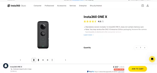
- Aesthetics: Aesthetics: This site keeps it simple, with Amazon-like product listings and large images. The white background and yellow highlights serve as a visually popping contrast to the black products and text. Overall design offers a sleek and clean appeal.
- UI/UX: The top navigation menu drops down into consumer and pro categories for their line of 360-degree cameras. Banner images are action-oriented, marketing to athletes and adrenaline junkies to film their adventures.
- Innovation: This website employs a number of cutting-edge technologies, including the ContactPigeon eCommerce package for marketing automation, Inspectlet for tracking usage statistics, and Google’s Viewport Meta for tracking mobile traffic.
- Speed: GTmetrix score F (41%). Page size: 5.2MB.
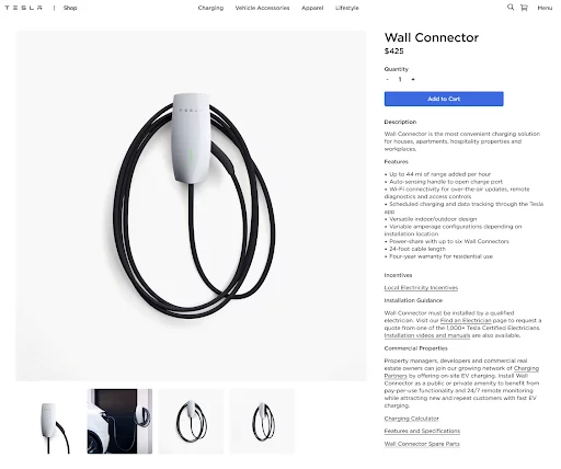
- Aesthetics: From the jump, this page captures attention with large, dynamic photographs of Tesla’s products. Each section of the easily-scrollable page is dedicated to a separate Tesla vehicle, with the last slice reserved for Tesla’s Powerwall products.
- UI/UX: There is only one liner product description. The navigation menu includes a newsletter sign up form.“Model 3: The automobile of the future.”
- Innovation: The ability to see the finished product and personalize to their hearts content is a terrific feature.
- Speed: GTmetrix score: D (67%), below average. Page size: 2.47MB.
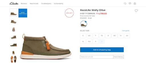
- Aesthetics: Clark offers a seamless user experience, using a lot of white space, clean layout and serene Color scheme.They produced, by far, one of the greatest product pages in the world right now by using the concepts of branding with style.
- UI/UX: To provide the best mobile experience for the visitor, the text is concealed in tabs, the (many) product photos are excellent, and the main CTA button has a clear blue hue that is eye-catching but not distracting.
- The helpful user evaluations on Clark’s product pages, which provide insightful information about the performance of the products and improve organic performance as well, elevate the quality of those pages even more.
- Innovation: Since they are aware that the user must select the Size and Width, they employ a second sticky CTA button as you scroll down the product page to entice you to complete the funnel’s first step.Wonderful, current, and effective strategy!
- Speed: GTmetrix score: E (57%) on page speed, which is not good enough. Page size: 2.10MB.
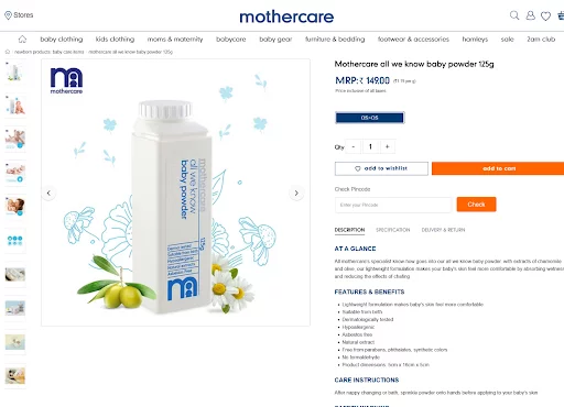
- Aesthetics: MotherCare’s website and product pages all have a similar aesthetic presence and feel. The dominant hue in this area is navy blue, which is followed by white.
- UI/UX: The site is simple to use with easy navigation. Also, it offers some pretty helpful advice that can be used to find new product categories and successfully upsell.
- Innovation: To increase conversions, mothercare includes a unique layer directly below the top navigation bar that highlights and rotates the 4 incentives.
- Thoughtful design and execution; nonetheless, we would just use a larger font size on mobile devices because they are hardly readable.
- Speed: GTmetrix score: E (50%) on page speed, ranked below the average score. Page size: 2.52MB.
Conclusion
Spending the time and energy necessary to make your product pages as compelling and persuasive as possible can make or break your online business. It’s important to keep in mind that customer retention depends on more than sales, it is also a carefully crafted experience. Invest in making a page that presents your product favourably.
The difference between a customer just skimming over your product and clicking “Add to Cart” could be as simple as a well-written product page. It can give them all the details they need to make a well-informed choice and address any questions or worries they might have.
Don’t dismiss the significance of a well-designed product page. Don’t be afraid to let your imagination run wild when designing product pages; your efforts will be greatly appreciated by your customers.
FAQs
What components make up a high-quality product page?
A quality product page will have high-resolution images or videos of the product, a clear and concise description of the product’s features and benefits, pricing information, and the option to add the product to the customer’s shopping cart or wish list. Other information that could be useful to the customer is customer reviews and ratings, shipping and return policies, and so on.
How can I improve the search engine rankings of product pages?
Use keywords and phrases from the product’s description and title to improve your product page’s search engine optimization. Add more information for search engines with meta tags and descriptions, and make sure the page is well-structured with header tags and logically organized. If you want to boost your page’s SEO even further, use high-quality images with descriptive filenames and alt tags.
How can I make my product pages more accessible on mobile devices?
A responsive design that adapts to a user’s device’s screen size and resolution is the best way to make your product pages mobile-friendly. A mobile-friendly interface includes optimizing images and videos for mobile devices, as well as making sure the page loads quickly. To cap it all off, think about enhancing the user experience by implementing mobile-specific features like click-to-call buttons and mobile payment options.
How do I improve the search engine rankings of individual product pages?
To begin optimizing your product pages for search engines, you should first conduct keyword research to identify applicable and high-traffic keywords and phrases. Include these search terms in your product’s headline, body copy, and meta tags. Also, make sure your website is easy to navigate and mobile-friendly by providing alt text for all product images.
What metrics can I use to evaluate the success of my product pages?
Use web analytics tools like Google Analytics to monitor metrics like bounce rate, time on page, and conversion rate to track and analyze the performance of your product pages. Make adjustments to your product pages based on this information.
