In the bustling world of e-commerce, the shopping cart plays a pivotal role in the customer journey. It’s where potential sales either thrive or falter. In this blog post, we’ll embark on a journey into the intricacies of shopping cart design, uncovering essential elements and best practices that pave the way for a seamless and user-friendly checkout process. Armed with statistics and insights, we’ll explore strategies that businesses can employ to optimize their shopping cart designs and elevate the overall customer experience.
- Understanding the Importance of Shopping Cart Design:
- Stat: According to Baymard Institute, the average cart abandonment rate across industries is a staggering 69.57%.
- Insight: This statistic underscores the critical role of shopping cart design in the conversion process. A well-designed shopping cart can significantly impact abandonment rates and ultimately drive sales.
- Minimalist Layouts: Less is More:
- Stat: Research by Crazy Egg reveals that 38% of visitors will stop engaging with a website if the content/layout is unattractive.
- Insight: A cluttered and overwhelming shopping cart layout can deter users from completing their purchase. Embracing a minimalist design approach can streamline the checkout process and enhance user engagement.
- Dynamic Features for Real-Time Engagement:
- Stat: According to Salesforce, 74% of customers are likely to switch brands if they find the purchasing process too complicated.
- Insight: Dynamic features such as real-time updates on item quantities and prices can provide transparency and clarity, reducing friction in the checkout process and boosting customer satisfaction.
- Mobile Optimization: Capturing the Mobile Audience:
- Stat: Statista reports that mobile e-commerce sales accounted for 53.9% of total e-commerce sales in 2020.
- Insight: With the majority of online traffic coming from mobile devices, optimizing shopping cart design for mobile users is essential for capturing a significant portion of the market and maximizing sales potential.
- Personalization for Enhanced User Experience:
- Stat: According to Accenture, 91% of consumers are more likely to shop with brands that provide relevant offers and recommendations.
- Insight: Personalizing the shopping cart experience based on user preferences and behavior can foster a deeper connection with customers, leading to increased loyalty and higher conversion rates.
Importance of a Well-Designed Shopping Cart in E-commerce:
A well-designed shopping cart serves as a critical component in transforming the entire customer journey, from browsing to checkout. Here’s why it holds such immense importance:
- Enhanced User Experience: Aesthetically pleasing and functioning seamlessly, a well-designed shopping cart bridges the gap between browsing and checkout, providing customers with a smooth and intuitive experience.
- Trust and Reliability: A visually appealing and well-functioning shopping cart instills trust and confidence in customers, assuring them that their transactions will be processed securely and efficiently.
- Reduced Abandoned Carts: By simplifying the process of adding items to the cart and facilitating easy checkout, a well-designed shopping cart significantly reduces the rate of abandoned carts, thereby maximizing sales opportunities.
- Customer Satisfaction: Ensuring an efficient checkout process with features like progress indicators, clear instructions, and accessible payment options enhances customer satisfaction, leading to positive brand experiences.
Achieving High Levels of Customer Satisfaction:

To achieve high levels of customer satisfaction, e-commerce businesses must prioritize the design and functionality of their shopping carts. Here’s how a well-designed shopping cart contributes to customer satisfaction:
- Intuitive Design: Visually striking and easy to navigate, a well-designed shopping cart simplifies the purchasing process for customers, making it convenient and hassle-free.
- Reinforced Trust: Providing relevant product details and ensuring a secure checkout process reinforces trust among customers, encouraging them to complete their purchases with confidence.
- Streamlined Efficiency: A streamlined shopping cart design not only improves user experience but also enhances overall efficiency, leading to higher levels of customer joy and loyalty towards the brand.
Top Examples of Effective Shopping Cart Designs:
1. Crossnet Game
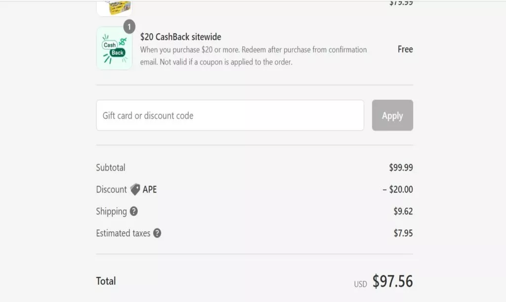
Crossnet Game’s shopping cart interface is meticulously designed to prioritize an effortless and distraction-free checkout process. Every element on the page is tailored to ensure a smooth transition from product selection to final purchase, minimizing any potential barriers that could deter customers from completing their transactions.
Key Features:
- Effortless Checkout Priority: The primary focus is on delivering a seamless and frictionless checkout process to enhance user satisfaction.
- Elimination of Distractions: Unnecessary features such as email pop-ups, Google AdSense, or banner ads are removed to maintain a clean and distraction-free shopping environment.
- Heatmap Analysis: Utilization of heatmap tools allows for the evaluation of how different elements impact customer engagement rates, enabling data-driven optimization.
- Streamlined Experience: By prioritizing simplicity and efficiency, Crossnet Game ensures a straightforward shopping cart experience, ultimately boosting transaction success rates.
2. Answear
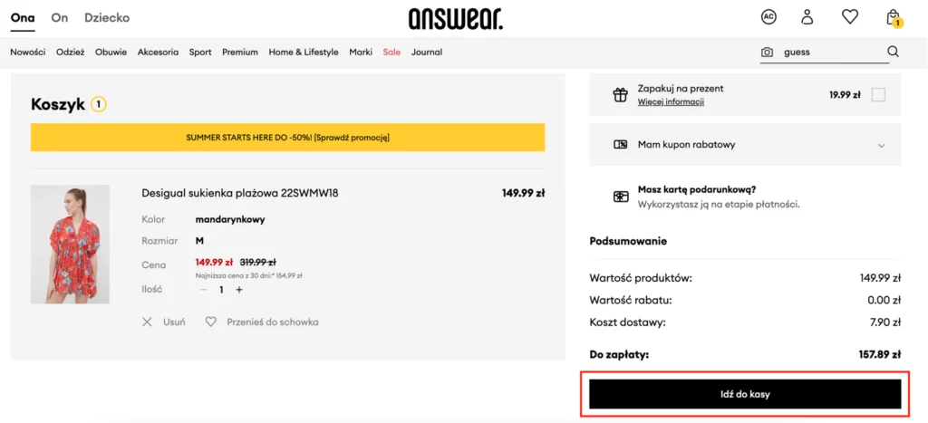
Answear’s shopping cart design is characterized by its emphasis on visual prominence and accessibility. The interface is crafted to guide users seamlessly through the checkout process, making it effortless for them to complete their purchases without unnecessary hurdles.
Key Features:
- Prominent Checkout Button: The checkout button is strategically placed and visually distinct, making it instantly noticeable to users.
- Visual Distinction: Larger font sizes and contrasting colors are employed to ensure that the checkout button stands out above the fold, eliminating the need for users to search for it.
- Enhanced Accessibility: Multiple checkout buttons are provided—one above and one below the cart—to cater to users with varying preferences and streamline the checkout process.
- Prompt Purchase Encouragement: Answear’s design choices are geared towards facilitating prompt purchases by offering an accessible and visually appealing checkout experience.
3. Asos
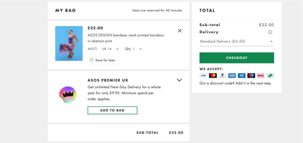
Asos, a prominent online fashion retailer, prioritizes a seamless shopping experience for its customers. One of the notable aspects of Asos’s shopping cart design is the integration of brief product descriptions to enhance the checkout process. These descriptions provide essential details about selected items, eliminating the need for customers to navigate back to the product page. Asos aims to streamline the shopping journey by minimizing delays and frustrations commonly associated with slow-loading pages.
Key Notable Features:
- Product Descriptions Enhancement: Brief product descriptions are strategically integrated into the shopping cart, offering essential details about selected items.
- Concise Descriptions: Descriptions are kept concise, typically limited to one or two sentences, ensuring clarity and minimizing the need for additional navigation.
- Visual Appeal: The integration of thumbnail images alongside descriptions enhances visual appeal, providing customers with a comprehensive overview of their selected items.
4. Adidas
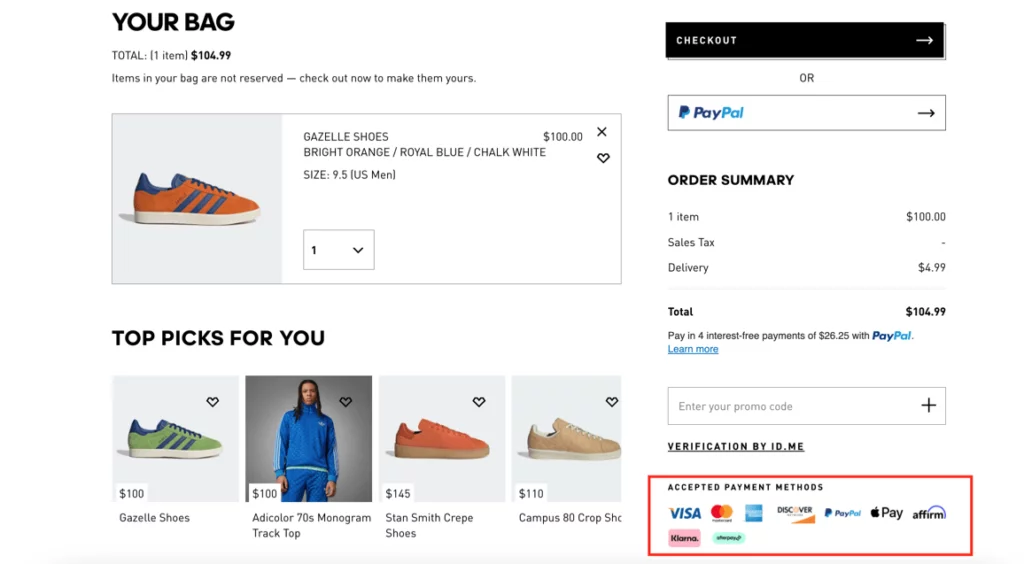
Adidas, a leading sportswear brand, focuses on optimizing the payment process within its shopping cart to ensure a seamless checkout experience. The brand acknowledges the importance of providing diverse payment options to cater to various customer preferences. By prioritizing convenience and flexibility, Adidas aims to reduce cart abandonment rates and enhance overall customer satisfaction.
Key Notable Features:
- Diverse Payment Options: Adidas offers a range of payment methods, including debit/credit cards, bank transfers, and digital wallets, to accommodate different customer preferences.
- Consideration of Business Size and Customer Preferences: The selection of payment options takes into account both the business’s size and the preferences of its customer base, ensuring inclusivity and accessibility.
- Integration of Express Checkout: Adidas integrates an express checkout option, such as Amazon Pay, to streamline the payment process and eliminate unnecessary steps, further enhancing convenience for customers.
5. Dyson
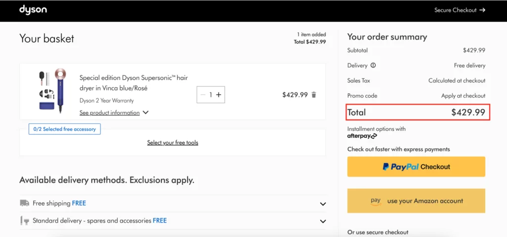
Dyson, a renowned manufacturer of household appliances, emphasizes transparency in pricing to prevent cart abandonment and instill trust in its customers. The brand ensures that customers have access to accurate pricing information, including shipping fees and taxes, at the shopping cart stage. By providing upfront disclosure, Dyson aims to empower customers to make informed purchasing decisions and minimize any surprises during checkout.
Key Notable Features:
- Transparent Pricing Information: Dyson prominently displays the estimated total cost, including shipping fees and taxes, on the shopping cart page, fostering transparency and trust.
- Zip Code Entry Feature: Dyson includes a zip code entry feature, allowing customers to input their location and view estimated taxes, fees, and shipping options before proceeding with their purchase.
- Informed Decision-Making: By enabling customers to make informed decisions from the outset, Dyson reduces the likelihood of cart abandonment and enhances confidence in its brand.
6. Amazon
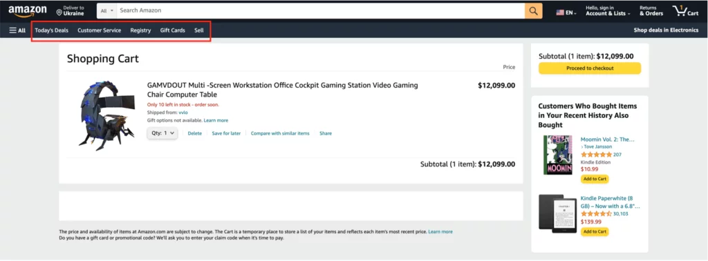
Amazon, a global e-commerce giant, prioritizes enhancing the shopping experience by optimizing navigation within its shopping cart and across various sections of the website. Recognizing the importance of seamless transitions between pages, Amazon focuses on making the shopping journey effortless for customers. By streamlining navigation, Amazon aims to increase user satisfaction and prevent cart abandonment, ultimately driving higher conversion rates.
Key Notable Features:
- Efficient Navigation: Amazon ensures smooth transitions between the shopping cart page, product pages, and other sections of the website, minimizing disruptions in the shopping journey.
- Optimized User Experience: By prioritizing easy navigation, Amazon enhances user satisfaction, encouraging customers to explore products and complete their purchases with ease.
7. Nike
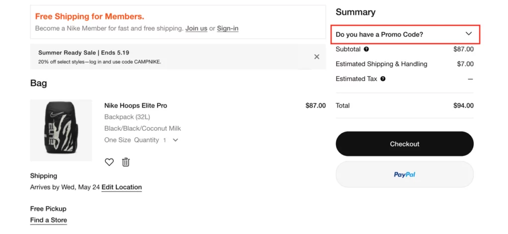
Nike, a leading sportswear brand, strategically considers the placement of coupon codes on its shopping cart page to prevent potential distractions and cart abandonment. Recognizing the risk associated with prominently displayed coupon codes, Nike adopts a thoughtful approach to balance visibility and user experience. By optimizing the coupon code field, Nike aims to maintain customer focus and increase the likelihood of successful conversions.
Key Notable Features:
- Strategic Coupon Code Placement: Nike ensures that coupon codes are presented in a less prominent location on the shopping cart page, minimizing the risk of distracting customers and prompting them to search for additional discounts.
- Balanced Visibility: By optimizing the placement and size of the coupon code field, Nike encourages customers to proceed with the checkout process while still allowing those with valid coupons to utilize them effectively.
Learn about ecommerce landing pages here.
8. Black Wells
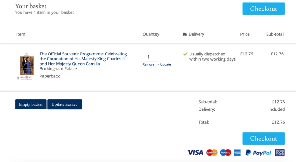
Black Wells, an online shopping website, places a strong emphasis on building trust and credibility through strategic design elements in its shopping cart. By incorporating features such as security logos, prominent calls-to-action, and testimonials, Black Wells aims to reassure customers and encourage them to complete their purchases. These elements work synergistically to establish confidence and enhance overall customer satisfaction.
Key Notable Features:
- Trust-Building Design Elements: Black Wells integrates security logos and prominent calls-to-action, such as “Proceed to secure checkout,” to instill confidence in customers and alleviate any doubts about the shopping experience.
- Testimonials and Product Reviews: By showcasing testimonials and product review scores, Black Wells provides social proof of the quality and popularity of its products, further enhancing trust and credibility.
9. Vans
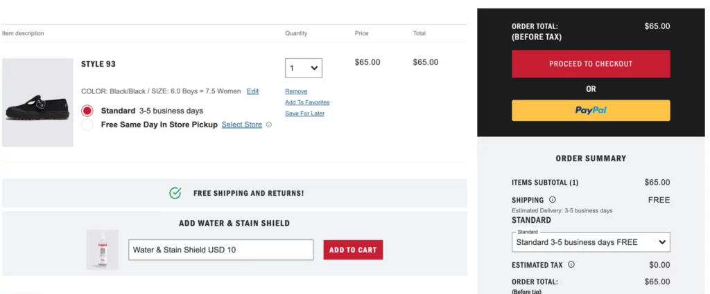
Vans, a renowned footwear and apparel brand, leverages its shopping cart as an opportunity to implement upselling and cross-selling techniques effectively. Recognizing the potential to enhance the functionality of customers’ purchases with complementary products, Vans adopts a thoughtful approach to upselling and cross-selling. By striking a balance and avoiding overwhelming customers with excessive suggestions, Vans aims to maximize sales while maintaining a positive shopping experience.
Key Notable Features:
- Strategic Upselling and Cross-Selling: Vans implements upselling and cross-selling techniques within its shopping cart, offering complementary products to enhance the functionality of customers’ purchases.
- Thoughtful Presentation: By setting reasonable limits and avoiding overwhelming customers, Vans ensures a seamless shopping experience while maximizing sales opportunities.
Shopping Cart Page Best Practices:
- Simplicity and Clarity in Design: Embracing simplicity and clarity in design is paramount for an effective shopping cart page. By minimizing clutter and distractions, users can effortlessly navigate through the interface, enhancing their overall shopping experience. A clean layout prioritizes essential elements such as product summaries and checkout options, ensuring that users can quickly locate and review their selected items. Strategic utilization of white space not only enhances readability but also maintains visual balance, guiding users seamlessly through the checkout process.
- Mobile-First Approach: Adopting a mobile-first approach acknowledges the prevalence of mobile devices in online shopping. With the majority of users accessing websites via smartphones and tablets, it’s imperative to optimize the shopping cart page for smaller screens. This entails incorporating larger buttons that are easy to tap, simplifying forms and data entry to accommodate touchscreen interactions, and implementing streamlined navigation menus or icons for effortless browsing. By prioritizing mobile usability, businesses can cater to the needs of their mobile audience and deliver a seamless shopping experience across all devices.
- Interactive and Dynamic Elements: Interactive and dynamic elements breathe life into the shopping cart page, engaging users and providing real-time updates. By offering instant feedback on product availability, quantities, and pricing, these features instill confidence in users and encourage them to proceed with their purchase. The ability to add or remove items from the cart without the need for page reloads adds to the fluidity of the shopping experience, while personalized product recommendations based on browsing history or previous purchases enhance relevance and convenience for the shopper.
- Visual and Image-Focused Design: A visually appealing and image-centric design captivates users’ attention and facilitates informed decision-making. High-quality product images with zoom-in capabilities allow users to inspect details and visualize the items more closely, contributing to a more immersive shopping experience. Additionally, incorporating color variations or product thumbnails provides users with additional information, helping them make confident purchase decisions. Visual cues strategically placed throughout the page assist users in evaluating their selected items, promoting a more intuitive and visually engaging shopping journey.
- Streamlined Checkout Process: A streamlined checkout process is essential for reducing friction and minimizing cart abandonment rates. Clear instructions and progress indicators guide users through each step of the checkout process, ensuring transparency and ease of navigation. Providing a comprehensive summary of the total order, shipping information, and available payment options empowers users to make informed decisions without unnecessary delays. Features such as guest checkout and saved payment information streamline the process further, catering to users who prioritize speed and convenience in their online transactions.
Conclusion
Designing a well-crafted shopping cart is essential for e-commerce success in 2023. By implementing best practices such as minimalistic design, mobile-first approach, interactive features, visual elements, seamless checkout process, personalization, social media integration, and innovation, businesses can optimize their shopping cart design to enhance user experience and drive conversions. As e-commerce evolves, prioritizing the design and functionality of shopping cart pages remains crucial for delivering exceptional online shopping experiences.
FAQs on Shopping Cart Designs:
How can I optimize my shopping cart page for mobile users?
Prioritize larger buttons, simplified forms, and streamlined navigation menus to enhance usability on smaller screens.
How can personalized shopping cart designs improve customer engagement?
Personalized recommendations, customized offers, and targeted messaging cater to individual preferences, fostering engagement and loyalty.
Why is social media integration important for shopping cart pages?
Social media integration expands brand reach, encourages social interactions, and facilitates sharing, ultimately driving customer engagement and brand awareness.


