
Are you feeling disoriented in your search for e-commerce landing page ideas? Look no further.
Effective e-commerce landing pages are crucial to any online store’s marketing plan. In this article, we’ve gathered a collection of top-notch e-commerce landing page examples to fuel your inspiration.
In e-commerce, success hinges on optimizing speed and conversion rates. By delving into these showcased examples from renowned brands—analyzing why they succeed and identifying areas for improvement—you’ll gain valuable insights to craft your own compelling and efficient landing pages.
What constitutes an E-commerce Landing Page?
An individual is depicted using a laptop, exploring a Zyro e-commerce website. An e-commerce landing page serves as a dedicated web page where an online store proprietor aims to transform a visitor into a customer. These pages are often tailored to be product or service-specific, honing in on particular geographic regions or customer demographics.
Unlike a website’s home page, which typically introduces the company and its offerings, an e-commerce landing page is crafted with a singular focus. It is specifically designed to promote one product or service, offering more detailed and targeted information.
This specialization allows the landing page to deliver precise details about the featured product or service. Moreover, these pages often employ persuasive copywriting techniques to influence visitors to purchase, even if they hadn’t initially sought those products or services upon entering the site.
Learn about landing page builders here.
Companies with Excellent E-commerce Landing Pages:
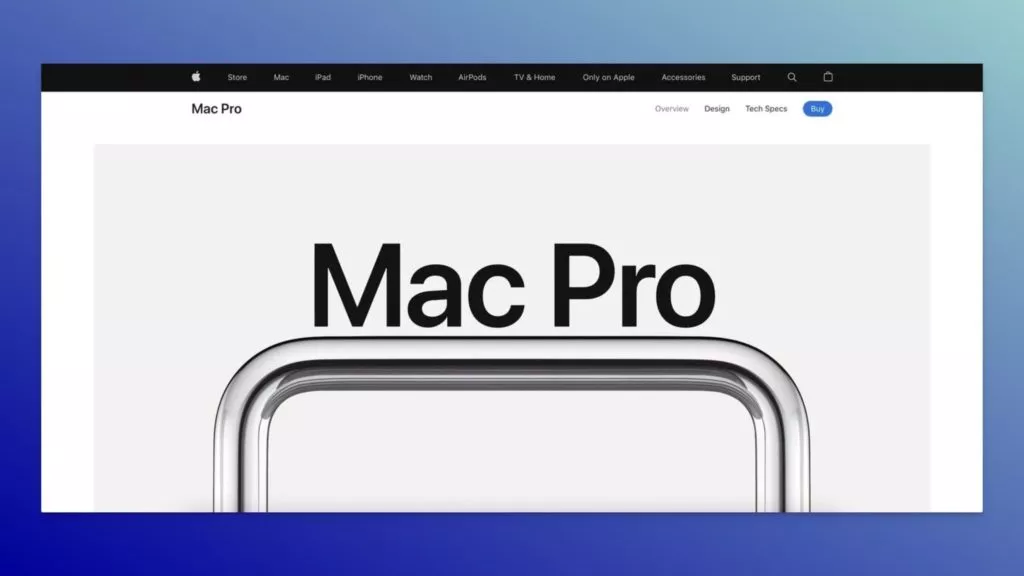
1. Apple Mac Pro: Redefining Technology with Sleek Design
Industry: Technology
Goals: Selling a specific product
What Works Well:
- Engaging Scroll Effects: Captivating scroll effects encourage users to explore the Mac Pro in-depth.
- Compelling Hero Copy: The hero copy not only prompts action but also introduces the product in an artistic and appealing manner.
- High-Quality Images: Expansive, high-quality images enrich the user experience by showcasing individual product parts and the complete product.
- Articulate Product Features: Clear articulation of product features with linked CTAs provides users with additional information, complemented by supporting images.
- Option Comparisons: Simplifying the product variety comparison process within the landing page enhances user decision-making.
Areas for Improvement:
- CTA Button Visibility: The top-right CTA button is relatively small; considering a more prominent CTA near the hero copy could improve visibility and user interaction.
2. Packlane: Elevating Packaging Experience
Industry: Packaging
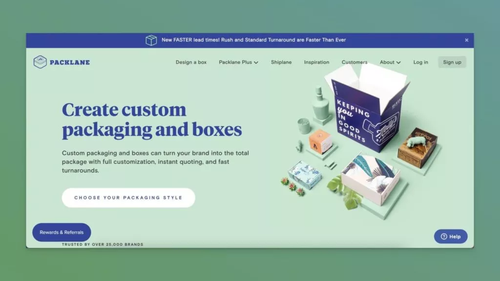
What Works Well:
- The headline effectively communicates the value proposition, complemented by a detailed description outlining the brand’s offerings.
- Placement of the primary CTA button above the fold with proper color contrast enhances visibility and encourages user engagement.
- The Rewards & Referrals button triggers a popup, inviting shoppers to join and participate in loyalty programs.
- An informative “How it works” video guides users in creating custom packaging orders, simplifying the process.
- The inclusion of a testimonial video adds social proof, enhancing the credibility of Packlane.
- The FAQ section addresses potential customer doubts, providing transparency and information.
- Payment methods icons at the bottom of the page offer multiple options for customer convenience.
Areas for Improvement:
- Packlane has effectively covered critical elements of a successful e-commerce landing page; no significant areas for improvement identified.
3. Blue Apron: Transforming Mealtime with Subscription Convenience
Industry: Food & Beverage/Subscription-Based E-commerce
Goal: Encourage subscriptions to meal kit plans
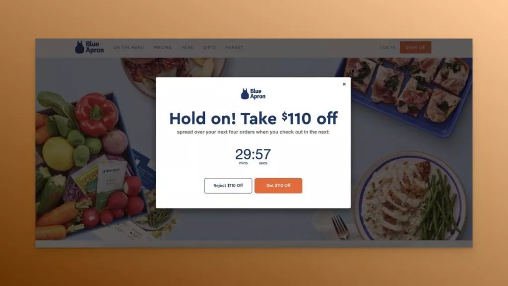
What Works Well:
- Exit-intent triggered popup offering a $110 discount creates an enticing incentive for potential customers.
- Countdown timer popup generates urgency, prompting visitors to take immediate action.
- Focused CTA and hero text simplify the service explanation, ensuring clarity for users.
- Subscription advantages strategically guide users towards the subscription option, facilitating the decision-making process.
- Plan pricing, positioned with a decisive CTA, streamlines the conversion funnel for potential subscribers.
Areas for Improvement:
- Incorporating more visual elements, such as detailed product images, photographs, and videos of people using the meal kits, could enhance persuasion and leave a lasting impact on potential subscribers.
4. Tattly: Elevating Fake Tattoos with Engaging Landing Page Design
Industry: Fake Tattoos
Goal: Product/Service Promotion

What Tautly’s Landing Page Does Well:
- Realistic Presentation: Incorporates a real human photograph adorned with fake tattoos, creating a positive first impression and showcasing the product in a relatable context.
- Social Proof: Utilizes case studies to provide social proof, instilling confidence in visitors and nudging them toward conversion.
- FAQ Section: Strategically places a Frequently Asked Questions (FAQ) section near the bottom, addressing potential customer doubts and enhancing transparency.
Areas for Improvement:
- CTA Button Visibility: Lacks a prominent Call-to-Action (CTA) button prompting users to order custom fake tattoos, both above the fold and throughout the page.
- Visual Variety: Could benefit from incorporating more real-life example photographs to diversify and enrich the user experience.
Pro Tip: Utilize Popupsmart’s Conversion Rate Optimization Checker tool to identify and enhance your landing page for increased conversions.
5. Burger Queen: Amplifying Awareness Through Thoughtful Design
Industry: Organization/Retail
Goal: Raising Donations, Driving Awareness

What Burger Queen’s Landing Page Does Well:
- Assertive Slogan: Features an assertive slogan encouraging users to scroll down for more information, effectively guiding them through the page.
- Cause Explanation: Clearly explains the cause behind the landing page, detailing the purpose of selling merchandise to raise donations for the Girls Empowerment Network.
Key Considerations:
- Emphasizing CTA Buttons: While the page primarily focuses on awareness, adding Call-to-Action (CTA) buttons in each section could capture visitors interested in supporting the cause.
- User Testimonials: Incorporating testimonials from real supporters could enhance credibility and resonate with potential donors.
6. Alltrue: Showcasing Membership Perks Through Engaging Elements
Industry: Membership/Beauty Products
Goal: Introducing Membership Perks
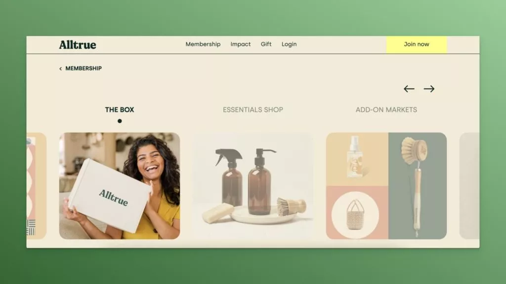
What Alltrue’s Landing Page Does Well:
- Interactive Slides: Utilizes on-click slides, maximizing engagement while leaving room for other essential page elements.
- Sustainability Promotion: Effectively promotes the magazine and membership, emphasizing the sustainability of all featured goods.
- Unsubscription Ease: Highlights the ease of unsubscription on the embedded newsletter signup form, promoting transparency and user control.
Areas for Improvement:
- CTA Buttons on Sliders: Adding clear CTA buttons on each slider section could enhance user interaction and facilitate conversions.
- User Testimonials: Incorporating testimonials from actual members could provide valuable insights and build trust.
Pro Tip: Experiment with the balance of popups to avoid overwhelming users, and consider using testimonials for added credibility.
Conclusion:
When crafting an e-commerce landing page, several essential factors deserve careful consideration. Clear product presentation, well-structured main navigation, and distinct call-to-actions are indispensable, while including high-quality images further enhances the overall user experience.
For each showcased store example, we aimed to delineate practical elements and areas open for improvement. The key takeaways provided aim to serve as valuable insights, offering guidance on enhancing your store or landing page.
Drawing inspiration from the examples and implementing best practices highlighted in this post can significantly elevate the quality of your e-commerce landing pages, leading to increased sales for your company.
Best of luck!
FAQs on Ecommerce Landing Pages:
What Should Be on An E-Commerce Landing Page?
Successful e-commerce landing pages encompass various elements such as social proof, trust indicators, clear call-to-action buttons, impactful product images, strategically placed popups, compelling headlines, and concise product descriptions.
How Do I Create An E-commerce Landing Page?
The creation of an e-commerce landing page depends on your specific business needs. Various platforms offer diverse approaches, including Shopify and other CMS, CRM, and website builders. Utilizing dedicated landing page builder tools like Unbounce, Instapage, or LeadPages is also viable.
What is The Difference Between A Landing Page And A Website?
A landing page functions as a standalone web page with a singular purpose, leading to no other pages or information. In contrast, a website typically consists of multiple pages, each serving different purposes and providing diverse information.
What are Some Tips for Designing An E-Commerce Landing Page?
- Ensure the incorporation of relevant keywords and search terms.
- Craft powerful headlines that capture immediate attention.
- Prioritize the use of images over text for a visually engaging experience.
- Keep the design and content simple for optimal user comprehension and engagement.
