In the digital ecosystem, where user attention is a prized commodity, the design and implementation of popups play a pivotal role in engaging website visitors and driving desired actions. Popup user experience (UX) design focuses on creating interactions that are seamless, non-intrusive, and conducive to achieving both user satisfaction and conversion goals. To grasp the significance of popup UX design, let’s delve into some compelling statistics that underscore its impact and effectiveness.
Statistics:
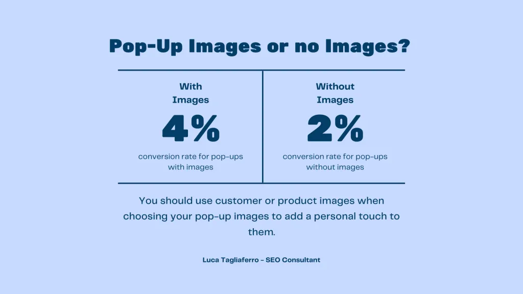
- Conversion Rates: According to Sumo, the average conversion rate for popups across all industries is 3.09%. However, top-performing popups can achieve conversion rates as high as 9.28%, highlighting the potential impact of effective UX design.
- User Engagement: Research by OptinMonster reveals that popups with a clear call-to-action (CTA) can achieve an average click-through rate (CTR) of 2.6%. Moreover, popups triggered by exit-intent technology can recover up to 53% of abandoning visitors.
- Mobile Responsiveness: With the proliferation of mobile devices, it’s crucial for popups to be mobile-responsive. According to Statista, mobile devices accounted for 56.16% of website traffic worldwide in 2021, emphasizing the importance of optimizing popup UX for mobile users.
- User Preferences: A survey by HubSpot found that 48% of consumers prefer popups that offer discounts or promotions, while 31% prefer popups that provide valuable content such as ebooks or guides. Understanding user preferences is key to designing popups that resonate with target audiences.
- Exit-Intent Technology: Exit-intent popups, triggered when users are about to leave a website, can be highly effective in retaining visitors. Sleeknote reports that exit-intent popups have an average conversion rate of 4%, making them a valuable tool for reducing bounce rates and increasing engagement.
- Personalization: Personalized popups can significantly impact user behavior and engagement. According to Barilliance, personalized popups have a conversion rate of 5.2%, compared to 3% for generic popups. Incorporating user data and preferences into popup design can enhance relevance and effectiveness.
Every marketer aims to drive more conversions, whether it’s boosting sales, expanding subscriber lists, or increasing website traffic. However, achieving optimal conversion rates is often easier said than done.
But fear not. By recognizing the significance of UX and aligning your strategies accordingly, you can effectively prompt more visitors to take the necessary actions on the website.
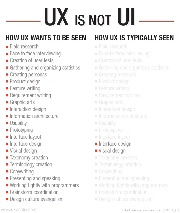
Your website is the primary conduit for communicating your message to potential customers. Therefore, adhering to the best UX practices is imperative to ensure that your site aligns with your business objectives. This principle applies to the popups you incorporate into your site as well.
Popup Practices to Avoid for Optimizing UX:
1. Showing Entry Popups As a Visitor Opens Your Website
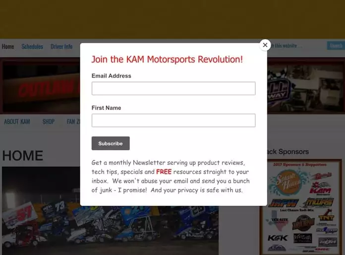
Entry popups, those pesky popups that greet users as soon as they land on a website, are often more of a nuisance than a user experience (UX) benefit. Here’s why:
- Annoyance Factor: Entry popups can be downright annoying for visitors, interrupting their browsing experience and preventing them from having immediate access to the content they came for.
- Disruption: These popups disrupt the flow of browsing and reading, causing frustration and impeding users from quickly finding what they need.
- Distraction and Frustration: Rather than engaging users, entry popups can distract and frustrate them, potentially driving them to leave the site altogether.
So, what’s the alternative? Here’s what you should do instead of bombarding visitors with entry popups:
- Show Popups After X Seconds: Instead of hitting users with a popup the moment they arrive, consider setting a delay so that the popup appears after a certain number of seconds. This approach allows visitors to familiarize themselves with your site before encountering the popup.
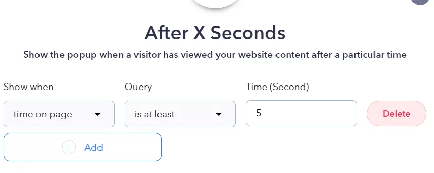
- Display Popups After Scrolling: Another effective tactic is to trigger popups after users have scrolled down a certain percentage of the page. This indicates they’re engaged with your content and may be more receptive to your message.
- Convert Abandoning Visitors with Exit Intent: Use exit-intent popups to target users about to leave your site. These pop-ups can help recover abandoning visitors or encourage them to complete their purchase by offering a compelling incentive or message.
2. Avoid Interrupting Visitors During Tasks
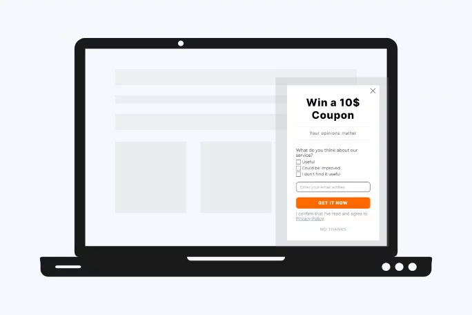
Interrupting visitors while they’re completing a task on your website, such as making a purchase or filling out a form, can be counterproductive and frustrating.
Reasons to Avoid Interruptions:
- Confusion and Frustration: Interrupting users with a popup while engaged in a task can disrupt their flow and lead to confusion and frustration.
- Risk of Losing Customers: Annoyed users may simply abandon the task or even leave your site altogether, resulting in lost conversion opportunities.
What To Do Instead:
- Wait For Users To Complete Their Tasks: Optimize the timing of your popups by waiting for users to finish their tasks before displaying them. Once they’ve completed their action, such as making a purchase or submitting a form, you can ask for feedback, providing valuable insights for improving the user experience.
3. Ensure Content Accessibility
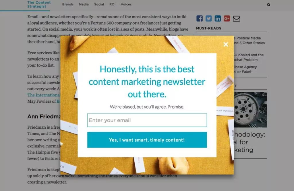
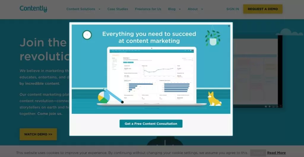
Some modal or full-screen popups can obstruct users’ access to the content they came for, leading to frustration and decreased engagement.
Common Issue:
- Blocking Content Access with Popups: Some modal or full-screen popups can obstruct users’ access to the content they came for, leading to frustration and decreased engagement.
What To Do Instead:
- Use Sidebar or Floating Bar Popups: Opt for less intrusive popup options, such as sidebar or floating bar popups, which don’t interfere with the main content users are trying to access.
- Set Targeting Rules for Full-Screen Popups: If you must use full-screen popups, be strategic about when they appear. Set targeting rules, such as after-scrolling targeting, to ensure that popups are displayed at appropriate times without obstructing the content.
4. Customize Popups for Targeted Audience
Displaying the same popup to all users simultaneously may be ineffective as each user has different preferences and needs.
Why Customization Matters:
- Appeal to Diverse Audience: Not all users will find the same popup equally appealing or relevant.
- Enhance User Engagement: Tailoring popups to specific segments of your audience increases the likelihood of engagement and conversions.
What To Do Instead:
- Segment Your Audience: Utilize various display rules to segment your audience effectively.
- Segment users by language or browser language.
- Target users based on their geographical location.
- Distinguish between new and returning visitors.
- Segment users according to their traffic sources.
Learn about popup UX and customer connection here.
5. Simplify Form Fields to Enhance UX

Excessive form fields in popups can hinder the user experience and discourage users from completing the desired action.
Issue:
- Asking for Too Much Information: Requesting excessive information in popup form fields can overwhelm users and lead to abandonment.
What To Do Instead:
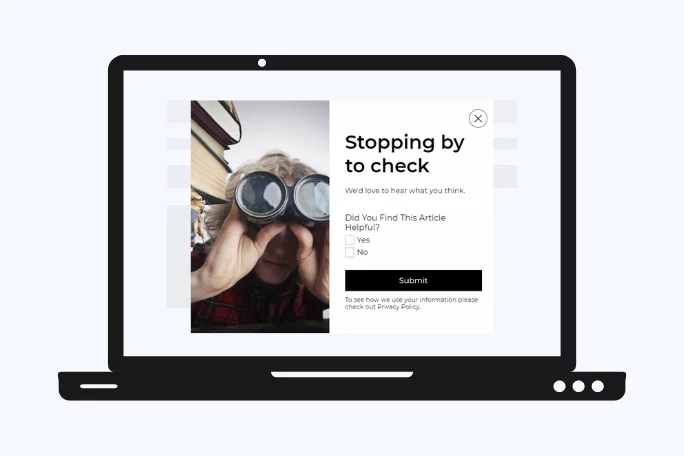
- Streamline Form Fields: Simplify popup forms by omitting unnecessary fields to create a smoother user experience.
- Avoid Overloading Users: Too many form fields detract from the popup’s design and may deter users from engaging.
6. Opt for Less Intrusive Notification Methods
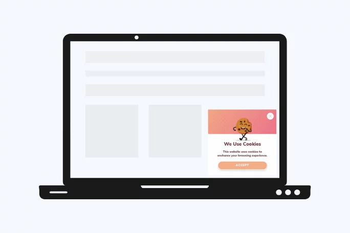
Users can perceive modal overlay popups for cookie and GDPR notifications as intrusive and irrelevant, leading to immediate dismissal.
Problem:
- Negative Perception of Modal Overlay Popups: Users often associate modal overlay popups with ads and scams, leading to quick dismissal.
What To Do Instead:
- Use Alternative Notification Methods: Employ less intrusive notification methods like floating bar or sidebar popups to convey essential messages like cookie and GDPR notifications.
- Enhance User Experience: Opting for less intrusive notification methods ensures a smoother user experience and reduces the likelihood of immediate dismissal.
7. Avoid Cluttering the Page with Multiple Popups

Displaying multiple popups simultaneously on the same page can overwhelm users and detract from the over-all user experience.
Issue:
- Cluttered User Interface: Multiple popups overlapping each other create a cluttered and chaotic user interface.
What To Do Instead:
- Stick to a Single Popup: Maintain a clean and focused user experience by limiting the number of popups on a single page to one with a clear and specific goal.
- Utilize URL Browsing Feature: Popupsmart’s URL Browsing feature allows you to include or exclude popups from specific URLs, ensuring a targeted approach to popup display.
8. Customize Popups for Targeted Audience
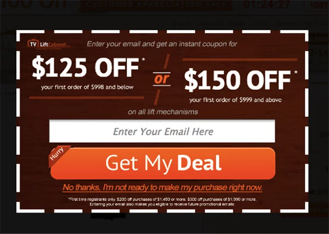
When displaying popups on your website, one size only fits some. You must tailor your popups to suit the preferences and needs of your diverse audience.
Importance of Audience Segmentation:
- Enhanced Relevance: A popup that resonates with one segment of your audience may not appeal to another. Customizing popups ensures relevance and resonance.
- Improved Engagement: By targeting specific audience segments, you increase the likelihood of engagement and conversions.
What To Do Instead:
- Segment Your Audience: Utilize advanced targeting and display rules to segment your audience effectively.
- Language Segmentation: Tailor popups to your visitors’ language preferences or their browser language settings.
- Geographical Targeting: Target users to deliver localized messages and offers based on their geographical location.
- Visitor Type Segmentation: Distinguish between new and returning visitors to deliver personalized experiences.
- Traffic Source Segmentation: Segment users according to their traffic sources, like organic search, social media, or referral traffic.
9. Simplify Form Fields to Enhance UX
When designing popups, it’s crucial to balance gathering necessary information and overwhelming users with too many form fields.
Common Pitfall:
- Asking for Excessive Information: Overloading users with too many form fields can lead to frustration and abandonment.
What To Do Instead:
- Streamline Form Fields: Keep your popup forms concise and focused by asking for only essential information.
- Reduce Friction: Simplifying form fields reduces friction in the user journey, encouraging users to complete the desired action.
- Prioritize Information: Identify the key information you need from users and prioritize those form fields while eliminating unnecessary ones.
- Opt for Less Intrusive Notification Methods
Modal overlay popups, often used for cookie and GDPR notifications, can be perceived as intrusive and disruptive to the user experience.
Issue with Modal Overlay Popups:
- Negative User Perception: Users associate modal overlay popups with irrelevant ads and scams, leading to immediate dismissal.
What To Do Instead:
- Choose Alternative Notification Methods: Utilize less intrusive notification methods, such as floating bar or sidebar popups, to convey essential messages like cookie and GDPR notifications.
- Respect User Experience: Opting for less intrusive notification methods demonstrates respect for the user’s browsing experience and reduces the likelihood of immediate dismissal.
Conclusion:
Optimize your popup UX design, avoid common mistakes, and adopt best practices prioritizing user engagement and satisfaction. You can effectively capture leads, drive conversions, and enhance overall website performance by leveraging contemporary and visually appealing popup designs. We welcome your feedback and ideas on further improving popup design and usability. Feel free to share your thoughts in the comments section below.
FAQs on UX for Popups:
Are There Any Negative Effects of Poorly Designed Popup UX?
Yes, poorly designed popup UX can have negative effects on user experience and website performance. It can lead to increased bounce rates, decreased time spent on the website, and even damage to brand reputation if users perceive the popups as intrusive or irrelevant.
How Can Websites Measure the Effectiveness of Popup UX?
Websites can measure the effectiveness of popup UX through various metrics such as conversion rates, click-through rates, bounce rates, and user feedback. A/B testing different popup designs and strategies can also provide valuable insights into what resonates best with users.
What Role Does User Feedback Play in Optimizing Popup UX?
User feedback plays a crucial role in optimizing popup UX as it provides direct insights into user preferences, pain points, and frustrations. Collecting feedback through surveys, user testing sessions, or monitoring social media mentions can help identify areas for improvement and inform future popup design decisions.
What Trends Are Emerging in Popup UX Design?
Emerging trends in popup UX design include the use of interactive elements such as quizzes or surveys, gamification techniques to incentivize user engagement, and integration with artificial intelligence (AI) to deliver more personalized and contextually relevant popups based on user behavior and preferences.


