AMP helps you speed up your page by optimizing website code down to the core and clearing all the “fluff” so that when a user loads the website, AMP does its job and the user experience is seamless.
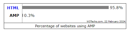
But did you know AMP is used by only 0.3% of all the websites in the world, shocking isn’t it?
This figure shows that AMP is used by 4 billion AMP pages, whose domain is 24 million.
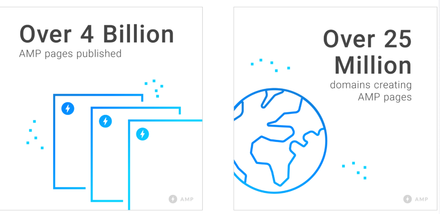
This might seem like a big number, but when you compare it with global, this number is nothing. awareness of this technology can benefit both website owners and users, and on top of that, it’s free.
Moreover, Accelerated Mobile Pages (AMP) and Responsive Web Design (RWD) have improved the user experience and pushed web sites up the SERPs.
Both of these features have a significant impact on your SEO rating and can fast move you up the SEO-meter if you work with the proper innovative technology partner.
Let’s take a look at how these two differ and when to use each.
What is AMP(Accelerated Mobile Pages)?
AMP, short for Accelerated Mobile Pages, is an initiative launched by Google to optimize the performance of mobile webpages.
The primary goal of the AMP project is to collaboratively shape the future of the web, ensuring that web pages and advertisements deliver consistently fast, visually appealing, and high-performing experiences across various devices and distribution platforms.
Developed in partnership with thousands of developers, publishers, websites, distribution companies, and technology firms, AMP has facilitated the creation of over 4 billion AMP pages. Furthermore, more than 100 leading analytics, advertising technology, and content management system providers endorse the AMP format.
Creating mobile pages in the AMP format offers numerous benefits:
- Enhanced Performance and Engagement: AMP pages load almost instantaneously, providing users with a seamless and engaging browsing experience on both mobile and desktop devices.
- Flexibility and Results: Businesses retain the flexibility to customize content presentation and select technology vendors while simultaneously maintaining and improving key performance indicators (KPIs).
Chances are, you’ve encountered an AMP page without realizing it, characterized by its lightning bolt indicator in search results, signifying rapid loading times.
Here’s how you can identify AMP in search results, here is a comparison of AMP page vs. normal web page.
AMP pages load swiftly due to their streamlined HTML/CSS and JavaScript restrictions, enabling accelerated rendering of mobile web pages. Additionally, Google AMP Cache automatically caches AMP pages for expedited load times on Google search.
Given users’ expectations for meaningful, relevant, and swift experiences on their mobile devices, leveraging AMP is a strategic approach to meeting these demands.
What Is RWD (Responsive Web Design)?
Responsive web design is an approach that emphasizes adapting design and development elements to suit the user’s behavior and environment, including screen size, platform, and orientation.
This practice involves utilizing a combination of flexible grids and layouts, along with images and CSS media queries, to ensure that the website responds seamlessly as users switch between different devices, such as laptops, tablets, and smartphones. For instance, when a user transitions from browsing on a laptop to using an iPad, the website should automatically adjust its layout, resolution, image sizes, and scripting capabilities to provide an optimized viewing experience.
Moreover, responsive web design considers factors like device settings, such as VPN configurations, ensuring uninterrupted access to the website regardless of user preferences. By incorporating these adaptive technologies, responsive web design eliminates the need for separate design and development phases for each new device introduced to the market.
What is the difference between responsive web design and AMP?
AMP and Responsive Web Design (RWD) both aim to enhance the mobile user experience, yet they employ different strategies and cater to distinct requirements. Here’s a breakdown of their key disparities:
- Focus
RWD: Emphasizes flexibility and adaptability, ensuring a seamless user experience across various devices by adjusting website layout and content accordingly.
AMP: Prioritizes speed and performance, focusing on lightning-fast loading times for mobile users by simplifying website features and functionalities.
- Technology
RWD: Implemented through media queries within CSS codes, which adapt the presentation of website elements based on device characteristics.
AMP: Utilizes a specialized HTML framework that limits certain elements and functionalities to optimize speed. AMP pages are often served from a Google AMP Cache for accelerated loading.
- Content and Functionality
RWD: Supports diverse website content and functionalities, including forms, animations, and interactive elements.
AMP: Limited to specific content types such as news articles, blog posts, and product pages. Complex functionalities like comments and forms are restricted.
- SEO
RWD: Generally considered highly SEO-friendly as Google can easily crawl and index all content on a single URL.
AMP: May offer SEO benefits due to faster loading times, but potential duplicate content issues can arise if not implemented correctly.
- Development and Maintenance
RWD: May require more initial development effort but is typically easier to maintain as it involves managing a single website version.
AMP: Involves creating separate AMP pages, potentially doubling maintenance efforts if maintaining both versions.
- Choosing the Right Approach
RWD: Ideal for websites seeking flexibility, complete control over user experience, and support for diverse content and functionalities.
AMP: Best suited for prioritizing speed, particularly for content-heavy websites like news platforms or blogs where users prioritize quick loading times.
What Impact Do RWD And AMP Have on User Experience?
Practically speaking, businesses benefit from positive user experiences. If users have a positive experience using your website, they are more inclined to interact with it, trust you, and tell their friends about it.
Google’s search algorithm is built to give preference to user-friendly websites. In light of this, Google has determined that two key components of a positive mobile user experience are speed and the so-called “mobile-friendly” test (recall Mobilegeddon?).
Although responsive web design (RWD) frequently performs horribly in terms of speed, it may assist produce a mobile-friendly website. This failure results from a lack of effort rather than design.
However, AMP was created from the ground up with speed and the mobile user experience in mind. Google developed the AMP Project, which provides us with a very clear definition of what constitutes a quick, mobile-friendly experience. Be aware if you depend on Google to drive visitors to your website.
Conclusion
The comparison between Responsive Design and Accelerated Mobile Pages (AMP) highlights the complementary roles they play in mobile optimization. Responsive Design ensures that websites adapt seamlessly across various devices, providing a consistent user experience regardless of screen size or orientation.
On the other hand, AMP prioritizes speed and performance, delivering lightning-fast loading times and enhancing mobile user experience. While Responsive Design focuses on adaptability, AMP emphasizes speed optimization, both of which are essential factors in satisfying user expectations and meeting Google’s mobile-friendly criteria.
By understanding the strengths and limitations of each approach, website owners can leverage Responsive Design and AMP to create mobile-optimized experiences that engage users and drive success.
FAQs on AMP and WED
What is the difference between Responsive Design and Accelerated Mobile Pages (AMP)?
Responsive Design focuses on ensuring websites adapt seamlessly across various devices, utilizing flexible layouts and grids. In contrast, AMP prioritizes speed and performance optimization, streamlining web pages for rapid loading times on mobile devices.
Which approach is more suitable for my website, Responsive Design or AMP?
The choice between Responsive Design and AMP depends on your website’s specific needs and goals. If adaptability across devices is a priority and you want to maintain a consistent user experience, Responsive Design may be preferable. However, if you aim to prioritize speed and enhance mobile user experience, AMP could be the right choice.
Does using AMP impact search engine rankings?
While AMP pages may benefit from improved loading times and mobile user experience, using AMP alone does not guarantee higher search rankings. Search engine rankings are influenced by various factors, including relevance, content quality, and user engagement, of which AMP is just one component.
Can I implement both Responsive Design and AMP on my website?
Yes, it is possible to integrate both Responsive Design and AMP on your website. By combining Responsive Design for adaptability across devices with AMP for speed optimization, you can create a highly optimized mobile experience that aligns with user expectations and search engine standards.
Are there any drawbacks to using AMP?
While AMP can improve mobile performance, it may require additional development effort and restrict certain design and functionality options compared to traditional web pages. Additionally, AMP pages are cached and served from Google’s servers, potentially limiting control over website content and analytics tracking. Consider these factors carefully when deciding whether to implement AMP on your website.
