
Mobile devices have become an integral part of our daily lives, influencing how we communicate, work, and access information on the go. With a notable portion of internet users relying on mobile devices, marketers and Google developers alike recognize the importance of catering to this audience.
In July 2019, Google introduced mobile-first indexing, sparking discussions and concerns within the SEO community. Despite efforts by Google developers to clarify its impact on search rankings, misunderstandings and myths surrounding mobile-first indexing persist.
In this article, we’ll debunk common myths surrounding mobile-first indexing and provide insights into how you can prepare for this transition. By understanding the implications and taking proactive measures, you may improve your website’s search engine exposure and make it mobile-first indexable.
What is Mobile-First Indexing?
Google proposed the idea of “mobile-first indexing,” in which its web crawler prioritizes indexing a website’s content on mobile devices before doing so on desktop computers.
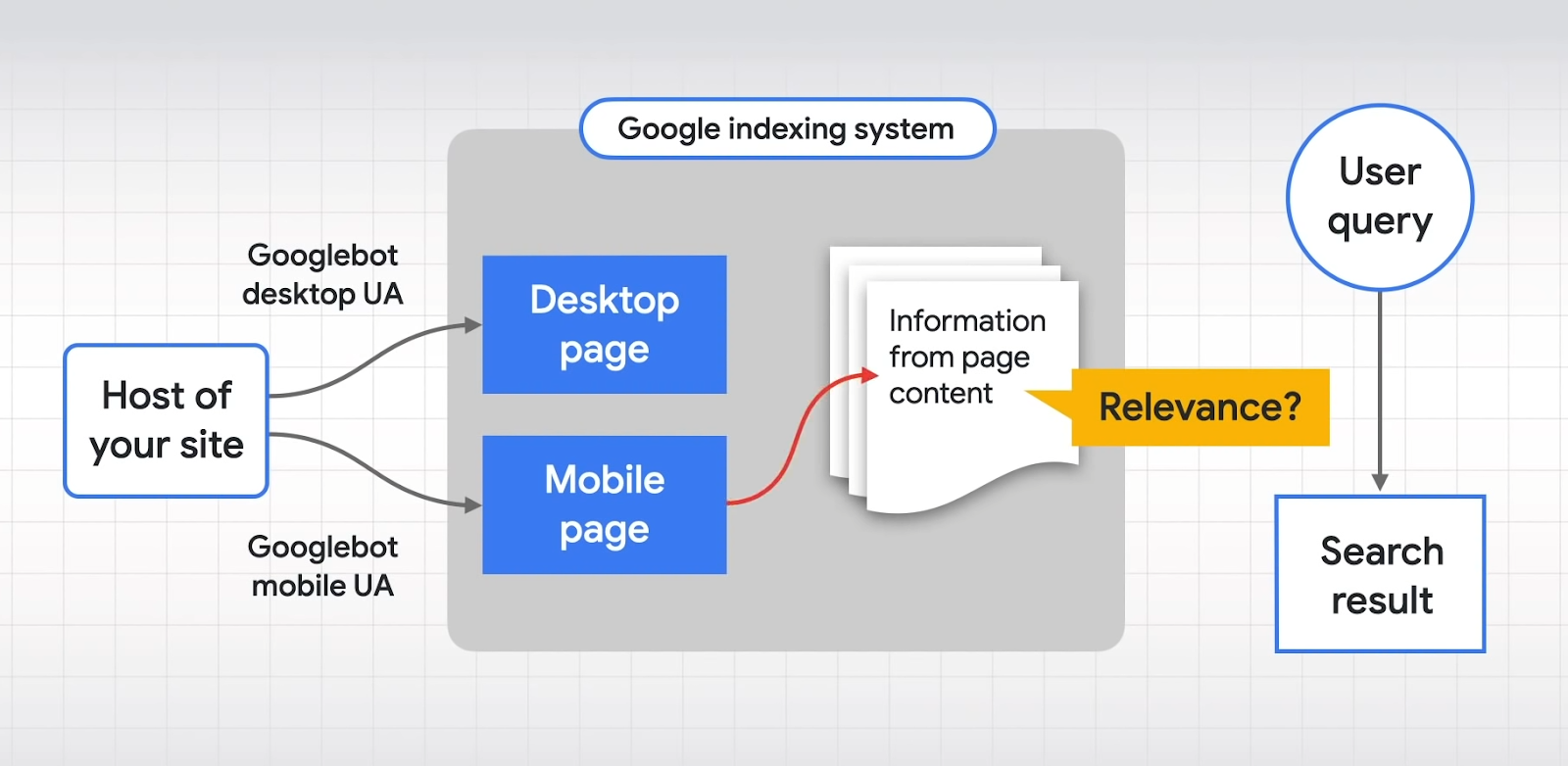
This indexing method informs search engine rankings, meaning that Google gives priority to content and signals from mobile pages when determining search result rankings.
In the past, Google’s indexing system primarily relied on the desktop version of a website. Both the desktop and mobile versions were crawled by Google’s web crawlers, and information from the desktop page’s content was used to determine relevance to user queries.
However, with mobile-first indexing, Google now prioritizes the mobile performance of the website for indexing and uses its content to evaluate relevance to user queries.
Mobile-first indexing signifies a shift in Google’s approach to indexing and ranking websites, emphasizing the importance of mobile-friendly content and signaling its significance in determining search result rankings.
Here is an awesome video by Google explaining how Mobile-First Indexing works –
So What does mobile-first indexing mean for SEO?
Websites designed for mobile devices are given priority in mobile-first indexing. As such, the quality of your mobile website has to be on par with or better than that of its desktop version.
The effect of mobile-first indexing on your search ranking hinges on the mobile optimization of your site. Websites employing responsive design, where mobile and desktop pages are identical, remain unaffected. Such sites seamlessly adjust to various screen sizes.
However, websites with separate mobile and desktop pages face the most impact. With mobile-first indexing, Google’s crawlers prioritize the mobile version, considering factors such as:
- Content presentation on mobile and desktop versions
- Structured data
- Metadata
- Mobile version verification in Google Search Console
- Link profiles directing to mobile pages
To maintain or improve search rankings, it’s imperative to prioritize mobile optimization in line with mobile-first indexing trends.
Common Myth Around Mobile-First Indexing
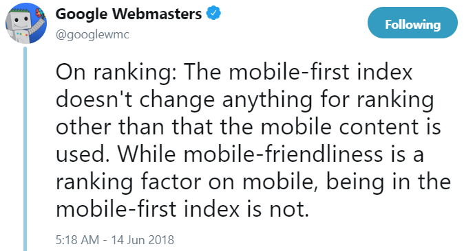
Myth 1: Mobile-first indexing directly impacts rankings
Contrary to popular belief, mobile-first indexing does not directly affect a website’s rankings. Even after transitioning to mobile-first indexing, there is no negative impact on a site’s position in Google search results.
Myth 2: Expandable content is not prioritized on mobile
While expandable content like hamburger menus and tabs may receive little weight during indexing of desktop sites, this differs for mobile websites. Google’s Gary Illyes states that mobile crawlers assign full weight to such content as it is primarily relevant for mobile users.

Myth 3: Mobile-friendliness and mobile-first indexing are synonymous
These two concepts are distinct and unrelated. While mobile-friendliness is indeed a crucial ranking factor for mobile searches, it is not synonymous with mobile-first indexing. Additionally, even sites lacking mobile-friendliness have been subjected to mobile-first indexing.
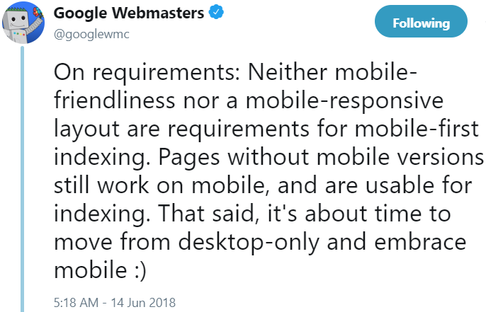
Therefore, receiving notification from Google about the completion of the transition to mobile-first indexing does not guarantee that the site is mobile-friendly.
Best Strategies To Raise Your Website’s Rating In The Age Of Mobile First
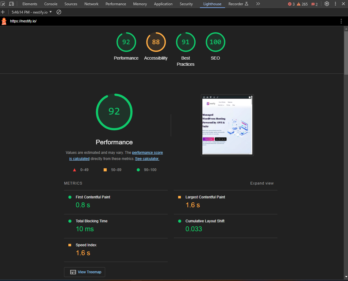
A responsive website with a healthy site speed, no interstitial pop-ups, and ease of use characterizes the perfect mobile-friendly website. The mobile-friendliness of your website can be initially assessed using the mobile-friendly testing tool – Lighthouse.

This will display if your page is actually mobile-friendly.
The pages that fail Google Search Console’s mobile-friendly test may then be verified by obtaining the mobile usability report.
In the event that there are problems with the site’s pages, this is how the mobile usability report will look.
Following your assessment of your website’s mobile friendliness, next step is to optimize it to be mobile-friendly.
Get ready for Google’s mobile-first indexing with these simple recommendations listed below for making your website mobile-friendly.
Make content mobile-friendly
Ensure that the information on your website is consistent between its desktop and mobile versions. Responsive web design (RWD) is the best method for achieving this. Media queries are used by RWD to switch between different devices’ content automatically.
Additionally, consider how long your postings are. On your site, a 3000-word post might work fine on the desktop version. However, lengthier postings might be rather daunting on mobile devices. To make it easier for your consumers to obtain your material, think about utilizing short-form content or other interesting content formats, such as audio or video. Since iPhones do not support Flash, avoid using it. Use HTML5 videos instead to provide a better watching experience.
In order to improve the readability of your long-form material on mobile devices and other platforms, utilize brief paragraphs when posting it.
Also read: Craft High-Quality Mobile-Friendly Content: Elevate Your Digital Presence
Use structured data
The structured data from Schema.org, commonly referred to as Schema, enhances how search engines interpret and display your page in SERPs. This semantic tag vocabulary is the product of a joint effort by Yandex, Google, Bing, and Yahoo!
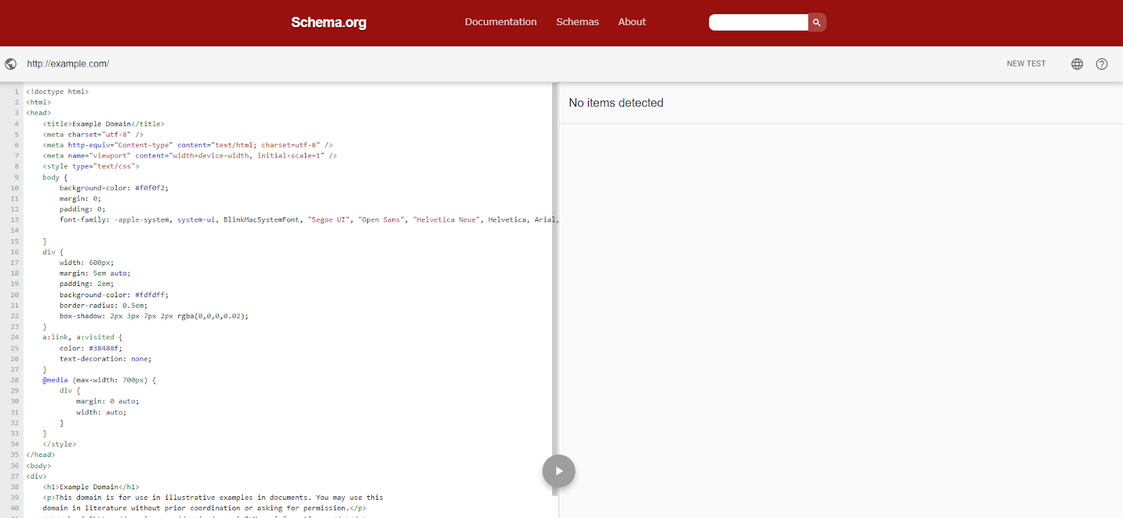
Your page will look better in SERPs and display rich snippets in mobile search results if you include Schema.org into your HTML. Use Google’s Structured Data Markup Helper to develop your own code and improve your website’s visibility in Google’s mobile search results.
Wrapping Up
Mobile-first indexing represents a significant shift in Google’s approach to indexing websites, prioritizing the mobile version over the desktop version. Contrary to common misconceptions, mobile-first indexing does not directly influence search rankings. Instead, it underscores the importance of mobile optimization for websites to remain competitive in mobile-centric.
Website owners may proactively modify their strategy to meet the changing demands of mobile users and improve their presence in search results by busting myths and comprehending the subtleties of mobile-first indexing.
FAQs on Mobile-First Indexing
How does mobile-first indexing impact search rankings?
Contrary to popular belief, mobile-first indexing does not directly impact search rankings. Instead, it emphasizes the importance of mobile optimization for websites to remain competitive in search results. While mobile-friendly websites may benefit from improved visibility, mobile first indexing itself does not cause changes in search rankings.
What should website owners do to prepare for mobile-first indexing?
Website owners should make sure that their mobile version is well-optimized for performance, usability, and content relevancy in order to get ready for mobile first indexing. This involves making sure that all material is easily accessible and navigable on mobile devices, putting responsive design into practice, and improving page performance.
How can I verify if my website is ready for mobile-first indexing?
Website owners can use Google’s Mobile-Friendly Test tool to check if their website meets the mobile optimization standards set by Google. Additionally, monitoring website performance metrics, such as mobile traffic and engagement, can provide insights into the effectiveness of mobile optimization efforts.
