
A heatmap is an essential tool for tracking user behavior on your website, which shows where users click, how far they scroll, and what they notice or ignore.
Everything you need to know about heatmaps, from their fundamentals to their more sophisticated applications, is covered in this simple guide.
I will walk you through making, interpreting, and analyzing various heatmap kinds. Additionally, you can learn about their advantages and typical applications.
Let’s dive in!
What is a heatmap?
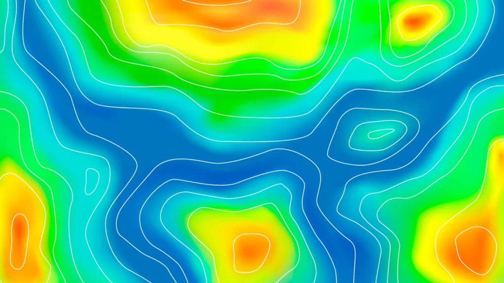
A heatmap, is a method for data visualization that uses different colors that change based on the intensity of the data to display it in two dimensions (2D).
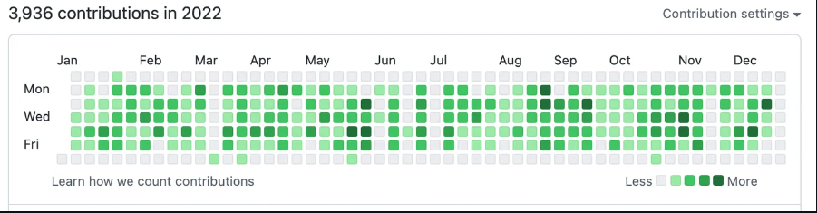
A general legend is used in the GitHub contributions calendar to display the volume of contributions by day. (Source: GitHub)
With the help of these clear visual clues, readers can easily comprehend and process the information. Financial, business, weather analysis, and geographical data visualization are the most common uses of heatmaps.
Therefore, it’s simpler to rearrange the elements on your website when you use heatmaps. When vital information is placed in the “hot” colored area, it is easily visible. Conversely, the “cold” sites work well for advertisements or design elements.

Source: Hotjar
What is a website heatmap used for?
A valuable tool for examining user behavior on a website and increasing conversion is heatmaps. They can be applied in the following ways:
Measure performance: The primary purpose of heatmaps is to gauge website visitors’ awareness and behavior. They assist you in identifying a webpage’s top and bottom-performing sections. It keeps an eye on how visitors behave based on their interactions.
Identify UX issues: Heatmaps can highlight issues with user experience that you may not have previously noticed. Users may, for instance, be clicking on elements that are not clickable or ignoring crucial calls to action.
Enhance user experience: You can use heatmap data to reorganize website elements, such as buttons, text, and images, based on the findings of the heatmap study. Using heatmaps to guide your website design, you can incorporate a more user-friendly experience that will make users happier because they can locate the information they need more quickly and easily. Heatmaps highlight user experience issues you were unaware of before the analysis.
Boost conversion rate: A low conversion rate is standard for e-commerce sites. Perhaps they have a lot of traffic but very few conversions; perhaps they recently opened their store and are having some success but are unsure of their next move. Heatmaps are also used for A/B testing and to optimize your website’s conversion rate.
Validating marketing campaigns: Heatmaps can be used to verify the success of your landing pages or marketing campaigns. You can assess whether your audience understands your message by monitoring user behavior and changing your strategy as necessary.
How do I read a heatmap?
Everything on a heatmap is color-marked, making it simple to read. Based on the quantity and density of clicks, a spot is deemed more attractive the “hotter” the color.
Orange, red, and yellow are typically regarded as “hot.”
Most users engaged with the “hot” spots in some fashion. Call-to-action buttons should be placed in “hot” spots since visitors are likelier to read the information there.
“Cold” colors indicate that most users were not drawn to these spots. Most “cold” colors are blue, purple, and green. Don’t put any important information there because these spots aren’t as appealing as the “hot” ones.
Instead, create design components that work in these areas to fill the empty spaces.
How to use heatmaps?
Heatmaps provide a broad picture of webpage performance by displaying user activity in a general way, including what draws users’ attention, where they click, and how they interact with design elements.
Try to begin with how you want an app or website to function. This is frequently referred to as a hypothesis-led approach in UX design.
After you’ve sketched out your “perfect” user flow, you can contrast it with the actual user data compiled using heatmaps.
Heatmaps are an effective tool for hypothesis testing and experimentation to validate or refute presumptions.
The most important thing to learn from heatmap analysis is whether people notice and click on the things you want them to.
User segmentation
Data from heatmaps is only helpful in context. When data is compiled without a specific goal in mind, it may be deceptive or even useless. Users visit websites, for instance, using a variety of devices. On a 4K panel compared to a 1080p laptop screen, the experience is different.
This is particularly important because scroll maps track which segment of your user base viewed a specific page section. Larger screens yield a higher number of false positives. Heatmaps, however, can provide you with rapid and valuable insights if you give them a little definition.
Using filters, you can make heatmaps that only show the actions of a specific set of users. Heatmaps are an excellent tool for identifying which version of your product needs to be improved when filtered by device.
Lastly, accurate segmentation lets you comprehend how different user groups interact with your website. You can see what different customer groups prioritize when interacting with your website or application, for instance, if you use CRM integration to identify your customers.
Let’s say you offer a SaaS product with a range of pricing tiers, such as Enterprise, Unlimited, and Free. To better serve the needs of each customer in this situation, it makes sense to divide them up.
For instance, customers on the Free tier might prefer the most basic features. Still, users on the Enterprise tier might use the interface entirely differently because they have more complicated issues to solve.
A/B testing
Heatmaps allow you to quickly see how user behavior has changed, making them an excellent visualization tool for A/B testing.
Heatmaps show when a variable has no effect on performance or when one option performs noticeably better than the other when compared side by side.
Scroll maps indicate whether one version is more worthy of a visitor’s time to scroll through than another, and move-and-click maps can assist in locating elements that are confusing or distracting.
Real also: Top A/B Testing Tools of 2023
UI enhancement

When users have many options, it appears to be a good thing. I mean, who doesn’t like options? However, in reality, excessive menus, pop-ups, buttons, and settings can paralyze users and leave them unable to process the barrage of information. The standard term for the phenomenon is “analysis-paralysis.”
Heatmaps can assist you in quickly sorting through registration and sign-up forms to find out which fields cause users to pause or which menu buttons are rarely if ever, clicked.
An e-shop page or an in-game purchases menu in a mobile game are examples of interfaces for browsing physical or digital goods. A heatmap can tell you if specific options perform better than anticipated.
Mobile heatmaps
Web browsing on mobile devices is starting to become the norm. Mobile devices account for over half of all web traffic, with desktop usage trailing behind.
Therefore, even for businesses that previously mainly relied on their website, creating an application for customer engagement makes more financial sense. The mobile experience is, and has long been, a top priority in many industries.
Mobile app heatmaps present a far more significant technological challenge than website heatmaps. Every website has the same general structure, consisting of HTML and a small amount of JavaScript.
Android and iOS apps are two very different kinds of things. Implementing analytics is challenging and time-consuming because they can be constructed using various technologies.
Although native app rendering is similar to web apps, developers can create user interfaces (UI) much more easily thanks to technologies like SwiftUI and Jetpack Compose.
Unfortunately, they complicate the tracking of user actions by heatmap tools. The fundamental issue is the same, despite the existence of numerous alternative technologies like React Native and Flutter: analytics software struggles to comprehend what it is looking at because application user interfaces are constructed and rendered in a variety of ways.
While endless scrolling is a common feature in social media apps, heatmaps are limited by this feature. Heatmaps lose significant accuracy over time when a page undergoes constant changes.
Mobile device interaction is far more tactile than PCs; gestures such as swipes, rage taps, zoom-ins, long presses, and fast taps are common. Heatmaps can help you see where users are tapping, but you need context to understand the action.
When users tap on non-interactive elements, do they anticipate a specific outcome? Are they continuously opening and closing the same menu in an attempt to figure out how to go forward? Do they quickly switch between portrait and landscape mode to better position themselves to interact with a button or menu?
Mobile heatmaps can assist you in making quick and efficient UX decisions and guiding your product toward perfection when paired with gesture information.
Data privacy and security

These days, disregarding the privacy of your users can have significant consequences, ranging from millions of dollars in fines to potential criminal and civil penalties. User privacy must, therefore, be considered in all tracking and analysis procedures.
Businesses that deal with EU citizens’ data or conduct business in Europe must abide by the General Data Protection Regulation (GDPR). This effectively means that users must inform themselves that they are being tracked and give their express consent to access their data. In many nations (including Brazil), local regulations are modeled after GDPR.
When compliance is considered, a certain percentage of user activity won’t be represented on a typical heat map, which visualizes clicks and other user actions.
Conclusion
You must integrate an analytics tool with heatmap features into your website or application to begin using heatmaps. Usually, this means including a little bit of code in your website’s HTML or mobile app.
You can create multiple heat maps depending on the specific heat mapping software and subscription plan. Free plans frequently only allow a certain amount of user sessions.
While various paid options record and process more data, allowing for increased accuracy and extended data retention periods, they are best suited for personal use.
Prices vary, but most website tracking tools that are SaaS or subscription-based come with heatmaps.
FAQs
What is the difference between heatmap and eye tracking?
Heatmaps track users’ clicks and scrolling actions to gather information about their behavior. All you need to do is register for an online service; no additional equipment is required. Eye tracking, however, tracks the user’s eye movements. It tells you about their clicks, fixations, and eye gaze. It’s a more complex analytics solution, so an eye tracker device is required. It tracks every eye movement you make when browsing.
How are heat maps beneficial for website optimization?
Heat maps help identify hotspots on your website, showing areas that attract the most user attention. This information is invaluable for optimizing page layout, improving navigation, and enhancing user experience based on user behavior.
How can I create a heat map for my website?
To create a heat map, use specialized tools like Hotjar, Crazy Egg, or Google Analytics. These tools provide easy integration and generate comprehensive heat maps based on user interactions.
Are there any privacy concerns with using heat maps?
While heat maps aggregate data anonymously, reviewing and adhering to the privacy policies of your tools is crucial. Most reputable heatmap tools prioritize user privacy and allow you to exclude sensitive information from recordings.
How often should I analyze heat maps for my website?
Regular analysis is vital to leveraging heat maps effectively. Aim to review heat maps after significant changes to your website or at consistent, regular intervals to stay informed about user behavior trends and continuously refine your site’s design and functionality.
