
Given the vast array of devices featuring various resolutions, screen sizes, and operating systems, it has become crucial for brands to adopt responsive websites and applications to maintain a strong online presence. It is no wonder that more and more devs realize that responsive theme websites are a must for online success, and with the help of Bootstrap-based WordPress responsive themes, devs can go even further in developing their themes.
According to the reports predicted for the year 2023, the majority of internet traffic from mobile devices will make up over 55% of all website traffic. Not only that, but 92.3% of internet users use a mobile phone to access the internet. This prediction tells a lot about the users, where they are coming from, and where you should focus on.
Responsive themes, an innovative web design approach, automatically adapt website elements to fit different screen sizes and browsers, enhancing readability, user experience, and loading speed. Developers and theme designers are capitalizing on this concept, while many brands are hiring WordPress Developers to ensure their websites are responsive and mobile-friendly.
In today’s article, I will guide you through the process of developing a top-notch WordPress responsive theme using Bootstrap. Our objective is to furnish you with a comprehensive, step-by-step methodology that guarantees exceptional outcomes and sets your website apart from competitors.
What is Bootstrap?
A front-end programming framework for developing websites and online apps, Bootstrap is open-source and free. By offering a set of syntax for template designs, it primarily aims to make it easier to create responsive, mobile-first websites.
As a framework, Bootstrap has crucial components for creating responsive websites and enables programmers to easily incorporate code into a preset grid structure. The foundation of Bootstrap rests on HTML, CSS, and JavaScript. By utilizing Bootstrap, web developers can expedite the website development process, as they are relieved from dealing with fundamental commands and functions, thus enabling them to build websites more efficiently.
Building a Bootstrap-Based WordPress Responsive Theme
Developing a WordPress Bootstrap theme involves an 8-step process that makes it easy to create a responsive theme powered by Bootstrap. Below are the steps explained:
Step 1: Bootstrap Setup
- To start, download and extract Bootstrap.
- Use an FTP software like FileZilla to connect to your WordPress website.
- Navigate to “wp-content > themes.”
- Create a new folder named “BootSTheme” in the themes directory and upload the unzipped Bootstrap files into it.
In the BootSTheme folder, create four empty files with the names
- footer.php
- header.php
- Index.php
- style.css
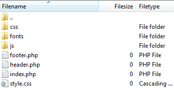
Which are standard files found in most WordPress installations.
Step 2: Configuring the Theme
Open the “style.css” file within the BootSTheme folder and add the following code:
/*

Theme Name: MydemoTheme

Theme URI: https://nestify.io

Description: Building Mydemotheme on Bootstrap

Version: 2.1

Author: Nestify

Author URI: https://nestify.io

*/
These comments provide descriptive information about the theme. Customize these comments to reflect your theme’s details.
Step 3: Copying CSS Code
For this tutorial, only a subset of the CSS and JS files from Bootstrap will be used. Copy the code from the “bootstrap.min.css” file and paste it into the “style.css” file. The “style.css” file should now include the copied CSS code.
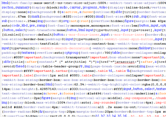
Note: You can find the complete minified CSS code on the Bootstrap website.
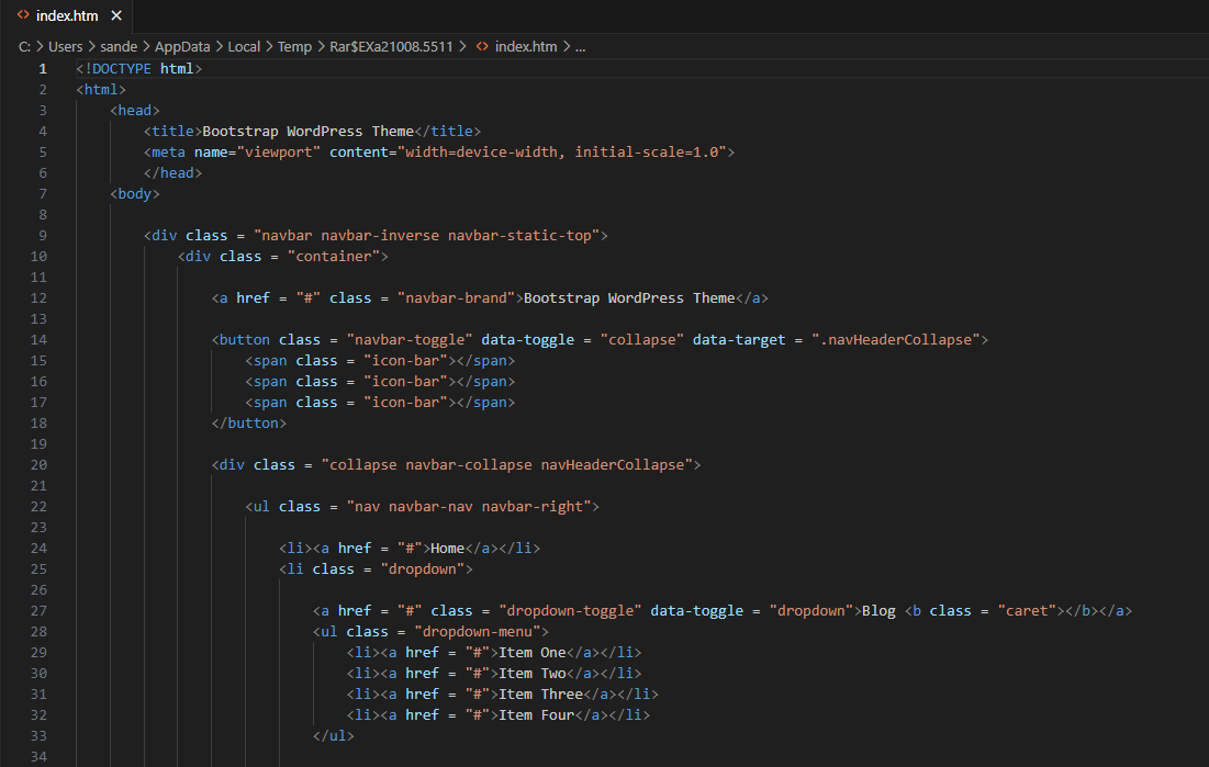
Step 4: HTML Template Setup
To have a basic HTML template, you can use an existing HTML theme or download one for this tutorial. WordPress has built-in functions “get_header()” and “get_footer()” that can spontaneously call the “header.php” and “footer.php” files, respectively.
Copy the above HTML code until the first container div of the chosen HTML theme and paste it into the “header.php” file. The file should now contain the HTML code.
The remaining code will be in the footer.php file:

However, when you upload and activate the Bootstrap WordPress theme, nothing will be visible because the “index.php” file does not have any content. To fill this gap, load the header and footer on the website by adding the following code to the “index.php” file:
<?php get_header(); ?><?php get_footer(); ?>Now, the header and footer elements will load, but the page will have a basic appearance without any styling.

Step 5: Styling the Header and Footer
To import the Bootstrap stylesheet into the header.php file, we can use the WordPress function echo get_stylesheet_uri() to add the style.css, which will enable a top menu bar on the website.
You can also add the style.css by directly inserting the following code at the top of the header.php file:
<link rel="stylesheet" type="text/css" href="<?php echo get_stylesheet_directory_uri() . '/style.css' ?>">However, merely adding the CSS won’t enable JavaScript features, and drop-down menus won’t work either. To address this, we need to import the necessary JavaScript files directly into the footer.php file. Add the following code just before the closing </body> tag:
<script src="../wp-content/themes/MyBSTheme/js/bootstrap.min.js"></script>To properly set up hooks for WordPress plugins, insert <?php wp_head(); ?> in the header.php file and <?php wp_footer(); ?> in the footer.php file.
Additionally, to set dynamic titles for the website, use the wp_title(); function between the <title> tags in the header.php file:
<title><?php wp_title(' | ', true, 'right'); ?></title>This code will display the post title separated by ‘|’ followed by the site name. The true boolean will display the title; setting it to false will return the value without displaying it. The ‘right’ parameter specifies that the post title will appear on the right side of the separator.
Step 6: Displaying the Featured Posts
To dynamically call and display posts on the homepage (similar to featured posts on many WordPress sites), add the following code to your index.php:
<?php

query_posts('posts_per_page=1');

while (have_posts()) : the_post(); ?>

<div>

    <h2><a href="<?php the_permalink(); ?>"><?php the_title(); ?></a></h2>

    <p><?php the_excerpt(); ?></p>

</div>

<?php endwhile;

wp_reset_query();

?>
This code uses a while loop with the posts_per_page=1 parameter to display the latest blog post at the top of the page. The the_title(); and the_excerpt(); functions are used to display the post’s title and an excerpt, respectively.
Step 7: Listing Your Categories
To list the categories on the left side of the homepage with Bootstrap styling, use the wp_list_categories(); WordPress function in the index.php file:
<div class="panel panel-default panel-body">

    <div>

        <div>

            <ul>

                <?php wp_list_categories('orderby=name&title_li='); ?>

            </ul>

        </div>

    </div>

</div>
This code will list the categories by name and add a nice hover effect.
Step 8: Show the Most Recent Posts and Authors Profile
To show the latest blog posts on the homepage along with the authors, use another while loop in the index.php file:
<div>

    <?php while (have_posts()) : the_post(); ?>

    <h3><a href="<?php the_permalink(); ?>"><?php the_title(); ?></a></h3>

    <p><?php the_excerpt(); ?></p>

    <p>Posted by <?php the_author(); ?></p>

    <?php endwhile;

    wp_reset_query();

    ?>

</div>
The the_author(); function will display the name of the post author dynamically for each post.
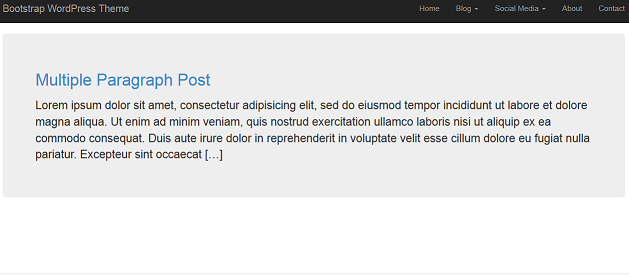
Once you have successfully completed these steps, your page should resemble the image shown above.
Adding Bootstrap to an Existing WordPress Theme
If your WordPress theme is not responsive, you can make it mobile-friendly by adding Bootstrap. There are two ways to use Bootstrap with WordPress:
- Adding Bootstrap Using a CDN
You can add Bootstrap elements by adding its CDN to your header.php file. However, this method may cause compatibility issues, so it’s advisable to take a full backup before proceeding.
<!-- Latest compiled and minified CSS --><link rel="stylesheet" href="https://maxcdn.bootstrapcdn.com/bootstrap/4.4.1/css/bootstrap.min.css"><!-- Latest compiled and minified JavaScript --><script src="https://maxcdn.bootstrapcdn.com/bootstrap/4.4.1/js/bootstrap.min.js"></script>- Adding Bootstrap In functions.php file:
In this method, download the Bootstrap library and upload the “Bootstrap.min.css” file and “Bootstrap-theme.min.css” file to your theme’s CSS folder. Also, upload the “Bootstrap.js” file to the “js” folder of your WordPress theme.
Then, access your functions.php file to enqueue these scripts:
function reg_scripts() {

    wp_enqueue_style('bootstrap style', get_template_directory_uri() . '/css/bootstrap.min.css');

    wp_enqueue_style('bootstrap theme style', get_template_directory_uri() . '/css/bootstrap-theme.min.css');

    wp_enqueue_script('bootstrap-script', get_template_directory_uri() . '/js/bootstrap.min.js', array(), true);

}

add_action('wp_enqueue_scripts', 'reg_scripts');

Alternatively, you can directly enqueue the Bootstrap CDN:

function my_scripts_enqueue() {

    wp_register_script('bootstrap-js', '://maxcdn.bootstrapcdn.com/bootstrap/4.4.1/js/bootstrap.min.js', array('jquery'), NULL, true);

    wp_register_style('bootstrap-css', '://maxcdn.bootstrapcdn.com/bootstrap/4.4.1/css/bootstrap.min.css', false, NULL, 'all');

    wp_enqueue_script('bootstrap-js');

    wp_enqueue_style('bootstrap-css');

}

add_action('wp_enqueue_scripts', 'my_scripts_enqueue');
Remember to save the file and upload it back to the server.
Conclusion
Creating a WordPress responsive theme with Bootstrap offers a powerful combination of WordPress’s CMS capabilities and Bootstrap’s flexible front-end framework. By following the steps outlined in this guide, you can develop a visually stunning, user-friendly, and highly responsive theme that adapts seamlessly to different devices.
Remember to plan your responsive theme’s structure carefully, leverage Bootstrap’s components wisely, and thoroughly test its responsiveness. With these skills, you can build exceptional websites that engage users and provide a delightful browsing experience. Happy coding!
FAQs on Bootstrap WordPress Responsive Theme
Can I use Bootstrap with any WordPress theme?
Yes, Bootstrap can be integrated into any WordPress theme, but it’s easier to work with a starter theme like Underscores.
Is Bootstrap a mobile-first framework?
Yes, Bootstrap follows a mobile-first approach, which means it prioritizes designing for mobile devices first and then scaling up for larger screens.
Are there any free resources for learning Bootstrap?
Yes, you can find plenty of free tutorials and documentation on the official Bootstrap website and other online platforms.
Can I customize Bootstrap components to match my theme’s design?
Absolutely! Bootstrap components are highly customizable, allowing you to adjust colors, styles, and layouts to suit your theme’s aesthetics and make it a responsive theme.
What are the benefits of using a responsive theme?
A responsive theme ensures that your website looks great and functions well on all devices, leading to improved user experience and better search engine rankings.
