The significance of website forms lies in their transformative ability to convert a website into an interactive tool. Whether it’s a user’s request, inquiry, feedback, booking, appointment scheduling, or any other form of communication with clients, forms stand as the primary instrument for these interactions. Consequently, they should never be underestimated.
Web forms play a pivotal role in turning casual website visitors into active and engaged consumers. Despite this, many websites tend to overlook the importance of forms, often prioritizing other page sections and functionalities.
A poorly designed form can be a deterrent to consumers, potentially discouraging them from subscribing to newsletters or making purchases. This, in turn, can result in the loss of leads, sales, and overall profitability.
UX Tips and Principles for Enhancing Website Forms

Before delving into inspiring examples, let’s focus on the fundamental principles that underpin effective website forms. Understanding these principles is crucial, as it provides a foundation for creating impactful designs. Here are seven essential principles, followed by real-life examples to inspire your form design:
- Know Your Target Audience:
Tailor your form to your specific audience. Recognize that there’s no one-size-fits-all formula for the perfect form. Understanding your audience allows you to speak their language, shaping both design and content to attract and engage them effectively. Example: If your target audience consists of tech-savvy professionals, ensure your form uses industry-specific terminology and addresses their unique needs. For a less tech-oriented audience, simplify language and focus on user-friendly design elements. - Form as Two-way Communication:
View your website’s form as a platform for two-way communication, not just another avenue for advertising or gathering email addresses. It serves as an interactive tool, fostering meaningful engagement rather than an intrusive newsletter sign-up situation. Example: Implement live chat options within your form to facilitate real-time communication with users. This not only gathers information but also allows users to seek immediate assistance or clarification. A live chat feature on a B2B service provider’s contact form enables users to inquire about specific services or request tailored solutions. - Simplicity is Key:
Keep forms simple and straightforward. Imagine a casual conversation in a cafe; similarly, your form should be easy to understand and complete. Avoid overwhelming users with complex questions, ensuring a seamless and efficient interaction. Example: Airbnb’s signup form is a great illustration of simplicity. It asks for essential information in a step-by-step process, avoiding unnecessary fields and providing a clear path for users. - Client Input on Forms:
Recognize that clients, especially freelancers and studios, may overlook form functionality when discussing website creation. Emphasize the importance of two-way communication and integrate forms as integral instruments for client engagement. Example: Include a consultation request form on your website, prompting clients to express their specific needs and expectations. This ensures a collaborative approach to project discussions. - Clearly Mark Mandatory and Optional Fields:
Ensure users immediately understand which fields are mandatory and optional. Clear distinctions prevent confusion, enhancing the user experience. Mark optional fields if most are mandatory, and vice versa, to guide users effectively. Example: LinkedIn’s registration form effectively uses asterisks to denote mandatory fields, providing users with a clear indication of the information required for sign-up. - Implement Inline Validation:
Enhance user experience by using inline validation. Instead of presenting a single error message after submission, provide immediate feedback by displaying error messages as users fill in specific inputs. This reduces confusion and streamlines the correction process. Example: Google’s search bar dynamically provides suggestions as users type, guiding them in real-time and minimizing errors in the search query. - Use Help Texts for Clarity:
Include help texts for complex or potentially confusing form elements. Provide explanations for questions that may raise concerns about privacy or require additional context. Clarifying why certain information is requested fosters transparency and user trust. Example: The United States Census Bureau’s online survey form includes clear explanations for questions that may be unfamiliar to respondents, ensuring a smooth and informed completion process. - Utilize Multi-step Forms for Lengthy Processes:
If your form is lengthy and can’t be condensed, consider implementing multi-step forms. Particularly effective for booking, content submission, surveys, and similar lengthy forms, this approach ensures a smoother user experience, even on mobile devices. Example: HubSpot’s contact form for requesting a demo uses a step-by-step approach, breaking down the process into manageable sections and maintaining user engagement throughout.
Top 7 Website Design Examples:
1. PAXAFE
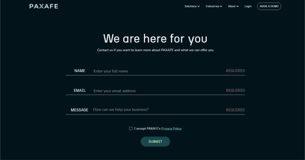
PAXAFE is a provider of technological solutions for supply chain management, a sector associated with significant financial risks if errors occur. Companies in this space must instill confidence in their customers due to the immense financial stakes involved—millions of dollars per day could be at risk if a system fails, products spoil, or essential components are not delivered on time and intact.
The simple contact form employed by PAXAFE receives a perfect score of 10 out of 10.
Why? The form’s overall design harmoniously aligns with the services offered by the company, showcasing a minimalistic yet approachable style. Upon first glance, users can easily grasp the company’s focus on technology. Despite featuring only three fields, the form effectively conveys to clients that the company is dedicated to their needs and prepared to deliver a personalized solution.
Furthermore, the form’s excellence lies in its simplicity. PAXAFE avoids burdening clients with unnecessary questions, such as inquiries about their industry. The decision to occupy the entire screen without attempting to insert additional offers or promotions adds to the user-friendly experience, earning the form extra commendations.
2. Networkx
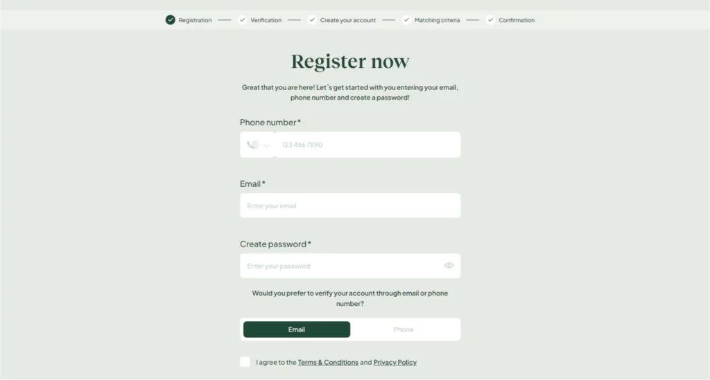
Networkx operates as a platform connecting individuals with business clubs globally, emphasizing the use of artificial intelligence to facilitate matches between candidates and clubs without involving emotions or prejudice. The unique nature of this service requires comprehensive information about clients willing to use the product, necessitating a lengthy registration form.
The multi-step contact form implemented by Networkx earns a commendable score of 8 out of 10.
Why? Networkx successfully transforms a potentially overwhelming long form into a user-friendly multi-step format. Each step of the form is thoughtfully explained, ensuring that clients understand the process and know what information to provide. Additionally, a warm greeting message is incorporated to enhance the user’s sense of value and engagement.
However, two points were deducted from the score due to a notable shortfall: the overall process of how the service functions and why specific information is crucial is not adequately explained on the form page or elsewhere on their website. A clearer articulation of the service’s workings would enhance user comprehension and contribute to an even more effective registration process.
3. Metropolis Moving
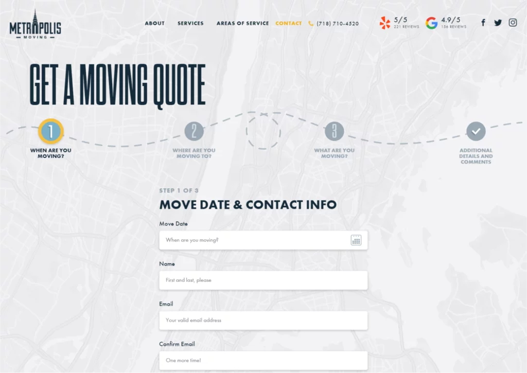
Metropolis Moving, a company specializing in relocation services, distinctly caters to the New York market, evident from the Request a Quote form and page design. The well-executed step indicators contribute to a visually appealing and informative user experience. Recognizing the inherent stress associated with moving, the designer has skillfully infused a playful and adventurous ambiance into the form.
The animated contact form presented by Metropolis Moving receives an impressive score of 9 out of 10.
Why? The form boasts a stellar design that seamlessly aligns with the nature of the moving service, incorporating an enjoyable touch of gamification. The user is led through a process that feels engaging and relevant to the service being offered.
However, a deduction of one point is made due to the initial screen’s form fields appearing somewhat overwhelming and vertically stretched, with both labels and placeholders present. Additionally, there is a query about the necessity of an email confirmation when clients already provide a phone number, raising considerations about potential redundancy in the information collection process.
4. Hexens
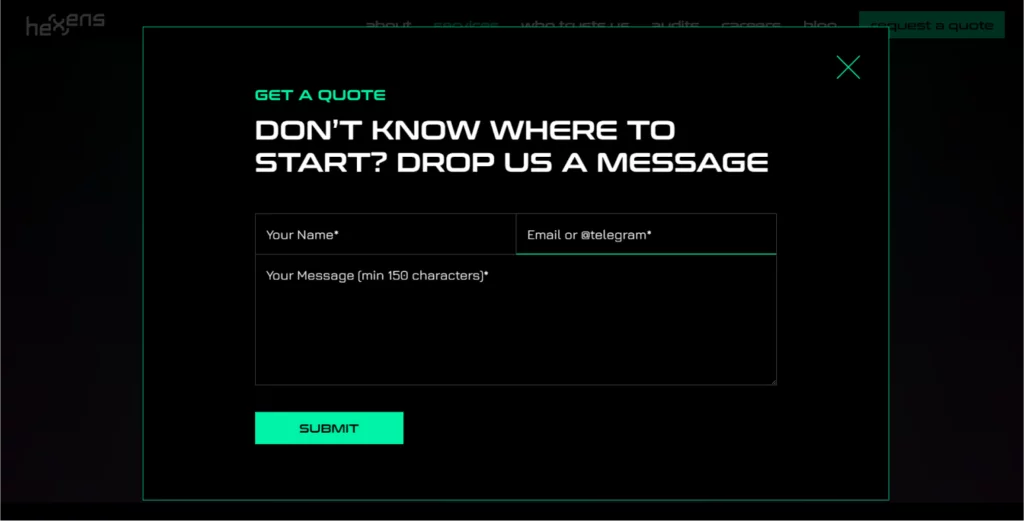
Hexens, a company immersed in the cybersecurity field, strategically leverages stereotypical imagery associated with cybersecurity, including hackers, dark screens, and Matrix-inspired glowing green lines of text. The website’s design makes optimal use of these visuals to create a distinct and immersive experience for visitors. Notably, the cybersecurity-themed pop-up form is implemented in a way that maximizes efficiency without occupying unnecessary space on the page.
The popup contact form presented by Hexens earns a perfect score of 10 out of 10.
Why? The form stands out with its bold and meticulously crafted design, incorporating pop-culture images synonymous with the cybersecurity industry. The use of stereotypical imagery is a testament to the thoughtful integration of industry aesthetics into the user interface. Furthermore, the form’s placeholders, such as “Email or @telegram,” are exceptionally clear and concise.
An exceptional feature of the form lies in its communication strategy. It forgoes unnecessary field labels, fostering a clean and uncluttered design. A notable example is the use of the placeholder “Email or @telegram,” which signifies a level of sophistication in design. Despite the potential ambiguity, the user is directed to use a Telegram nickname without the need for additional labels or explanatory text.
5. Media.Monks
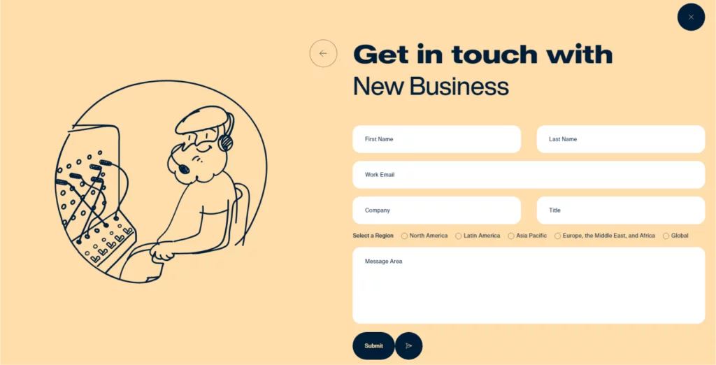
Media.Monks, an agency with a robust background in digital marketing and advertising, showcases its adeptness in website design. Their website is a dynamic canvas filled with whimsical animations that converge into aesthetically pleasing interfaces, complemented by seamlessly integrated and user-friendly web forms.
One notable example is their “Get in Touch” page, where they employ a strategic approach to form design.
The presented form not only receives a perfect score of 10 out of 10 but also stands out for its seamless alignment with the overarching website design philosophy. Media.Monks goes beyond conventional form structures by introducing a preliminary choice of departments, allowing users to specify the nature of their request before delving into the form-filling process. This innovative approach adds a layer of user engagement and navigation efficiency.
The form’s excellence is further enhanced by its integration of animated illustrations, serving as both functional and aesthetic elements. The animated components not only align with the overall website design but also contribute to a dynamic and visually engaging user experience.
6. Robby Leonardi
Robby Leonardi, a highly skilled coder and animator with a multidisciplinary design background, ingeniously crafted an interactive virtual resume to distinguish himself in a competitive landscape—and it succeeded brilliantly. Navigating his website becomes an immersive experience for visitors as they scroll down and witness his avatar engaging in dynamic activities like running, jumping, and swimming, guiding them through different “sections” that cover his skills, hobbies, and work experience.
The culmination of this creative journey is reached in the last stage of his Super Mario-inspired animation, where visitors encounter a contact form. This final section, which seamlessly integrates with the overall site, serves as the pinnacle of engagement. The contact form is not merely a static element but, instead, an attractive and cohesive part of the vibrant website.
The creative contact form exemplified by Robby Leonardi earns a perfect score of 10 out of 10.
Why? This form is not just a conventional means of contact; it is the logical conclusion of the animated odyssey that the website invites users to embark upon. As a final step, it encapsulates the engaging and joyful journey offered by Leonardi’s website, harmoniously integrating creativity, functionality, and user experience. This strategic design approach earns the form full points, making it an integral and captivating component of the overall interactive narrative.
7. Rose Family
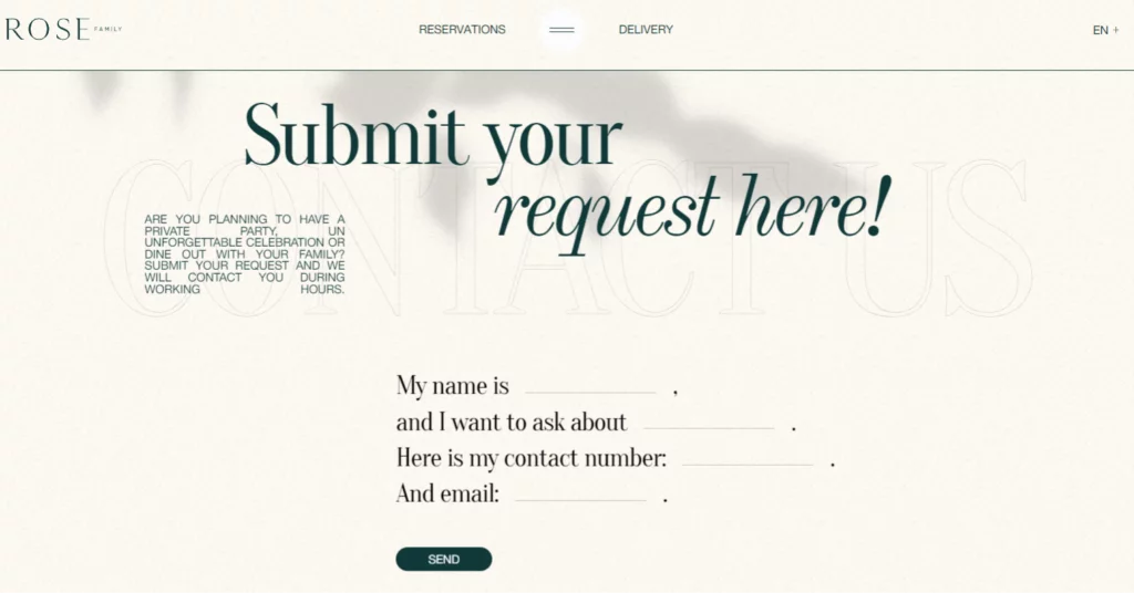
The Rose Family, distinguished restaurateurs with a legacy spanning over four decades, have consistently delivered fine-dining experiences of unparalleled quality. The sophistication and class that define their culinary expertise are artfully mirrored in their website, a testament to over forty years of excellence. This commitment to high standards is particularly evident in their reservation form, a key component of their online presence.
The creative restaurant form implemented by the Rose Family receives a perfect score of 10 out of 10.
Why? The form stands out for its ingenious use of a natural-language approach, deviating from the conventional table-like layout often found in reservation forms. This departure from the norm not only contributes to a more visually appealing and user-friendly design but also aligns seamlessly with the overall message and ambiance conveyed by the site. The designer’s choice of a natural-language format enhances the form’s elegance, ensuring that the reservation process reflects the same level of sophistication that defines the Rose Family’s fine-dining experiences. This thoughtful and creative approach to form design solidifies its perfect score, making it an integral and harmonious part of the overall website experience.
Conclusion:
Website forms play a pivotal role as an interactive bridge between businesses and users. They serve as a communication interface, facilitating the exchange of valuable information. In many instances, the act of a potential client completing a web form is regarded as a conversion, marking the initial step towards building a lasting customer relationship.
Recognizing the transformative potential of these interactions, it becomes imperative to accord due attention to forms. Incorporating best practices in user experience (UX) and user interface (UI) design is essential for creating seamless and engaging form experiences. Additionally, for websites operating on the WordPress platform, the integration of efficient plugins, such as Crocoblock’s JetFormBuilder, can enhance the form-building process, providing flexibility and dynamic content capabilities through the Block Editor (Gutenberg) UI.
FAQs on Website Form Examples:
Why should web forms be given special attention in UX/UI design?
Web forms are instrumental in converting casual visitors into loyal customers. Neglecting their design and functionality can result in a poor user experience, potentially leading to lost leads, sales, and profit.
How can businesses optimize the user experience of their web forms?
Businesses can optimize web form user experience by knowing their target audience, prioritizing two-way communication, keeping forms simple and straightforward, clearly marking mandatory and optional fields, using inline validation, providing help texts for complex questions, and employing multi-step forms for longer processes.
What role do web forms play in the conversion journey?
The completion of a web form by a potential client is often considered a conversion event. Web forms act as the initial point of interaction, paving the way for building a lasting relationship with customers.
