
When creating a website, font selection is a critical element that significantly influences the site’s overall visual appeal and user experience. Fonts serve as the vehicle through which your content is communicated to your audience, and striking the right balance between readability and aesthetics is paramount.
The consequences of choosing the wrong font can be far-reaching. It can potentially disrupt the user’s experience and, ironically, render your content difficult to read. Text that is hard to decipher can frustrate users and deter them from engaging with your site, leading to higher bounce rates and decreased user satisfaction.
Google Fonts 101: Why Fonts Matter in Web Design
Visual Hierarchy & User Experience
Fonts play a crucial role in guiding the user’s eye across a webpage, impacting both readability and the overall flow of the design. The right font choices help establish a clear visual hierarchy, making it easier for users to navigate content and absorb information without feeling overwhelmed.
Branding
Typography is an essential element of your brand identity. The font you choose can communicate your brand’s personality, tone, and values. Whether you opt for a modern sans-serif or an elegant serif, the right font can help reinforce your brand’s message and create a cohesive experience across all touchpoints.
Responsive Design
With users accessing websites across various devices, it’s essential to select fonts that maintain clarity and legibility on both desktop and mobile screens. A responsive font ensures your design adapts seamlessly to different screen sizes, providing a consistent and enjoyable user experience no matter how it’s viewed.
Top Google Fonts to Strengthen Your Brand’s Visual Identity
1. Roboto
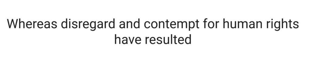
The Roboto Font, a widely acclaimed typeface, holds a unique dual-purpose distinction and is one of the most popular fonts in Google’s expansive font library. This geometrically inspired font possesses a harmonious blend of clean, angular lines and graceful curves, making it aesthetically pleasing and exceptionally legible.
One of its most notable achievements is its adoption as the primary typeface for Google’s Android operating system, a role it has played with distinction since 2014. This choice is significant, as it reflects the font’s versatility and ability to adapt seamlessly to various digital interfaces, from smartphones to tablets.
Roboto’s geometric precision imparts a sense of modernity and order, making it suitable for a wide array of design applications in print and on the web. Its crisp letterforms ensure clarity in small and large text sizes, enhancing readability across a diverse range of content.
As the face of Google’s Android OS, Roboto has become synonymous with user interfaces on millions of devices worldwide, underlining its status as a font that combines aesthetics, functionality, and widespread recognition. Its enduring popularity continues to cement its place as a quintessential choice for designers and developers looking to strike the perfect balance between contemporary style and readability in their projects.
2. Open Sans
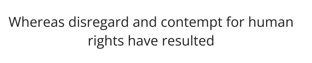
Open Sans stands out as a font renowned for its user-friendly and exceptionally readable design. This versatile typeface is a preferred choice for a wide range of applications, excelling not only in headline text but also in the crucial role of body text. Its universal appeal is rooted in its capacity to deliver a seamless reading experience, making it a top choice for many designers and developers.
One notable testament to Open Sans’s readability is its adoption as the default font within the Divi theme. This recognition is significant, showcasing the font’s exceptional clarity and adaptability, making it an ideal companion for crafting visually appealing and easily digestible content.
The font’s legibility results from its well-balanced letterforms, which strike a harmonious equilibrium between a modern, sans-serif aesthetic and the fundamental principles of readability. This makes it an excellent choice for conveying information effectively in both digital and print media.
Whether used in headlines to grab the reader’s attention or in the body text to provide comprehensive information, Open Sans consistently proves itself a reliable and user-friendly font choice. Its widespread adoption in various design contexts underscores its enduring appeal and enduring status as a go-to option for those seeking a blend of readability and visual sophistication in their typography.
3. Montserrat
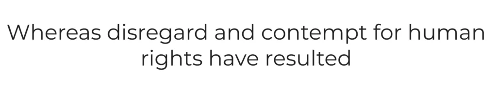
Montserrat, a font with an impressive repertoire of over 30 unique styles, is a testament to its remarkable versatility. Its genesis lies in the rich artistic heritage of the Montserrat neighborhood in Buenos Aires, Argentina, during the early 20th century, from which it draws its name and creative inspiration.
The diverse range of styles within the Montserrat font family allows it to adapt seamlessly to many design applications. From bold and attention-grabbing variants to more understated and elegant styles, this font caters to a wide spectrum of typographic needs, making it a valuable asset for designers and typographers.
The font’s origin story adds a layer of cultural and historical significance to its design. Montserrat captures the essence of that era by drawing inspiration from the visual tapestry of a vibrant neighborhood known for its artistic vibrancy and architectural diversity. This infusion of history and artistry imbues the font with a unique character, adding depth to its visual appeal.
Whether conveying a sense of classic elegance or contemporary flair, Montserrat’s extensive style options ensure it can be effectively employed in various creative projects, from web design to branding. Its ability to bridge the gap between the past and the present, drawing from the artistic heritage of Montserrat while meeting modern typographic demands, makes it a versatile and enduring choice for designers seeking a touch of historical charm in their work.
4. Lato
As described by Google, Lato embodies a unique duality, being both “serious and friendly” in its character. Originating from Poland, its name, which translates to “summer” in Polish, aptly encapsulates its essence – a versatile typeface that evokes a sense of warm-weather playfulness and exuberance.
This multi-purpose font boasts a design that balances readability with a touch of personality. Its well-crafted letterforms strike a harmonious chord, making it effortlessly legible across various applications, from digital screens to printed materials. Lato’s clarity and ease of reading contribute to its widespread appeal among designers and typographers.
Lato’s ability to convey a “serious but friendly” tone makes it a chameleon in the world of typography. It adapts gracefully to diverse design contexts, from professional documents to creative projects that require a touch of informality. This adaptability is a testament to its thoughtful design, ensuring it can effectively communicate various messages.
Moreover, the font’s summertime connotations infuse it with a carefree charm and lightheartedness. This playful undertone makes Lato particularly suitable for projects that aim to convey a sense of optimism, energy, or the spirit of summer itself.
5. Poppins
Poppins is a widely embraced font known for its distinctive, rounded style, making it an excellent choice for various typographic purposes, including headings and body text. This font, developed in 2014 and released as open-source, stands out as a harmonious fusion of the Devanagari and Latin writing systems, reflecting its versatility and cross-cultural appeal.
One of Poppins’ key strengths is its ability to adapt to different design contexts seamlessly. Its rounded letterforms exude a modern and friendly aesthetic, making it equally suitable for grabbing attention in bold headlines or ensuring readability in extensive blocks of text. This adaptability is a testament to the thoughtful design considerations that went into crafting the font.
The font’s foundation in the Devanagari and Latin scripts signifies its commitment to inclusivity and global usability. By drawing inspiration from these diverse writing systems, Poppins becomes a bridge between cultures and languages, offering a harmonious visual language that transcends borders.
6. Raleway
Raleway, characterized by its slender and graceful appearance, finds its niche as a display font typeface ideally suited for headlines and subheadings. Its origin traces back to 2012, when it was initially introduced as a single, thin font. Since then, Raleway has evolved and expanded its offerings, now encompassing a family of nine distinct variations.
The font’s inherent thinness imparts a sense of elegance and sophistication, making it an excellent choice for conveying a refined aesthetic in design projects. Its primary strength lies in its ability to command attention while maintaining a sense of subtlety, making it particularly well-suited for capturing the essence of a message in headings and subheadings.
Raleway’s journey from a single thin font to a family of nine variants showcases its adaptability and growing popularity among designers. This expansion caters to a broader range of design requirements, allowing for more creativity and customization in typographic choices.
Whether used in digital or print media, Raleway’s slender forms lend a touch of modernity and style to any project. Its availability in various weights and styles provides designers with a toolkit to explore different visual expressions, from the delicate finesse of the thin version to bolder, more impactful styles within the family.
7. Noto Sans
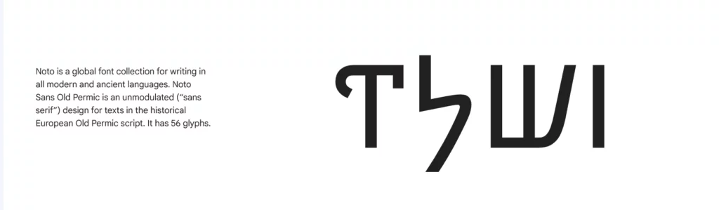
Noto Sans is an impressively robust typeface, offering an extensive selection of 18 font variants. What sets this font apart is its staggering collection of over 3,700 glyphs, adding extraordinary versatility to this remarkable typeface.
Within the Noto Sans family, you’ll find a comprehensive array of 18 variants encompassing various weights, widths, and italics. This diversity ensures that Noto Sans is well-suited for a wide spectrum of design applications. Whether your project calls for a bold and impactful statement or a more understated and refined touch, Noto Sans provides the tools necessary to convey your message effectively.
The abundance of glyphs available with Noto Sans underscores its commitment to supporting many languages and characters. This makes it an invaluable resource for designers and typographers working on projects that require global accessibility and inclusivity, as it can seamlessly accommodate an extensive range of writing systems and special characters.
8. Inter
Inter, a font meticulously tailored for optimal performance on computer screens, takes its place as the newest addition to our font library. Unveiled in 2017 under the name “Interface,” this font has swiftly become a noteworthy contender in the world of typography.
What sets Inter apart is its remarkable ability to strike a balance between the classic elegance of Helvetica and the modern sophistication of San Francisco Pro. This amalgamation of styles positions Inter as a versatile choice for designers seeking a contemporary yet timeless aesthetic in their projects.
Its primary design focus on computer screens translates into excellent legibility at various sizes and resolutions. It is particularly well-suited for digital interfaces, web design, and any context where clarity and readability are paramount.
Inter’s swift ascent in popularity reflects its adaptability and its ability to cater to the demands of modern design while retaining a touch of typographic nostalgia. As a result, it has earned its place as a font of choice for those seeking a harmonious blend of aesthetics and practicality in their typographic endeavors.
9. Roboto Slab
Derived from the widely acclaimed Roboto typeface, the Roboto Slab variation is a distinguished addition to the typographic family. This specific variant of Roboto boasts a unique design that departs from the sans-serif elegance of its parent font to introduce a touch of classic charm and increased versatility. Here, we delve into the details of Roboto Slab’s attributes.
Roboto Slab maintains the same foundational principles of clarity and readability that made the original Roboto font so popular. However, it takes a departure by incorporating serifs – those small, decorative strokes at the ends of characters – which imbue it with a more traditional and timeless appearance. This design choice allows Roboto Slab to excel in various typographic contexts, requiring a touch of sophistication and gravitas.
10. Merriweather
Merriweather, a distinctive serif typeface featured among our font selections, brings a captivating blend of playfulness and gravitas to the typographic landscape. Its design, characterized by tall and condensed letterforms, strikes a harmonious balance between these seemingly contrasting qualities, creating a versatile and engaging font choice.
Despite its condensed nature, Merriweather remains remarkably legible on screens of all sizes, demonstrating its practicality and usability in digital contexts. This trait makes it an excellent option for a wide range of design projects, ensuring that your content is visually appealing and readily accessible to your audience.
Furthermore, the versatility of Merriweather extends to its font family, which includes a companion typeface known as Merriweather Sans. This sans-serif variant complements its serif counterpart seamlessly, allowing designers to create harmonious typographic compositions by pairing the two fonts. This pairing enriches the designer’s toolkit, allowing for creative typographic expressions that cater to both readability and aesthetic appeal.
11. Playfair Display
Playfair Display effortlessly channels the elegance of a bygone era while infusing a contemporary charm, creating a captivating juxtaposition of old-world style and modern flair. This unique typeface finds its ideal role in commanding attention as a heading font, thanks to its dignified and visually arresting presence.
When opting for Playfair Display in your design, it’s essential to consider the art of pairing. To maximize its impact and maintain readability, it is highly recommended to accompany Playfair Display with a complementary sans-serif font. Roboto, Open Sans, Work Sans, and Lato, known for their clean and easily readable characteristics, serve as ideal companions.
This harmonious pairing of Playfair Display with a sans-serif font strikes a delicate balance between the ornate and the straightforward, enhancing visual appeal and legibility. The result is a typography arrangement that commands attention and ensures a seamless reading experience, making it suitable for a broad range of design applications, from elegant invitations to sophisticated digital interfaces.
So, these were the most popular Google fonts. You can browse all the Google Fonts here. Browse through the vast library of carefully selected fonts and choose the one that best suits your needs.
Enhance Your Site’s Aesthetic: Implementing Google Fonts Like a Pro
1. Select Fonts Judiciously
While Google Fonts offer a wealth of choices, it’s crucial for the speed and efficiency of your site to exercise restraint. Typically, limit yourself to using two or three font families. Remember that a single font family may encompass multiple variations, including different weights (regular, medium, semi-bold, bold) and italics. For example, installing Montserrat could potentially entail the inclusion of eight fonts. By being discerning in your font selection, you maintain a nimble and swift website.
2. Leverage Typography Plugins
To streamline font management on your website, consider employing typography plugins. Many themes, like Divi, integrate typography management into their framework. These plugins go beyond fonts; they allow you to oversee typefaces, icons, drop caps, and more. Such tools simplify the process, ensuring your fonts are used optimally without unnecessary overhead.
3. Harmonize Font Pairings
Achieving visual harmony through font pairings is an art. Seek fonts that complement each other. For readability, pair serif fonts with sans-serif for headings and body text. Mixing two serif fonts can compromise legibility. Alternatively, you can utilize two sans-serif fonts or explore different weights within the same font family. Tools like Fontpair browser extension can assist you in discovering well-suited font combinations.
4. Self-Host Google Fonts
If you opt not to use a typography plugin, you have the option to host Google Fonts on your server. This approach involves downloading the font and placing it within your project’s directory. Remember to abide by Google’s terms of service when downloading fonts from their repository. Self-hosting offers more control over font delivery and can contribute to site speed.
5. Limit Font Weights
Similar to font families, keep the number of font weights in check. If you’re only using regular, medium, and bold variants, there’s no need to include all 18 variations a font family may offer. Reducing the number of font weights you call upon from Google can improve loading times and enhance site performance.
Font Weights and Styles: Getting the Most Out of Google Fonts
Step-by-Step Guide: Implementing Google Fonts on your website is a straightforward process. There are two common methods for adding fonts: the CSS method and the @import method.
- CSS Method:
- Go to Google Fonts and choose the font you want to use.
- Click on the “+” sign next to the font to add it to your collection.
- Once added, a pop-up will appear with an embed code. Copy the link provided under the “Embed” section.
- Paste this link into the
<head>section of your HTML document. - In your CSS file, apply the font to your elements using the
font-familyproperty.
body
{ font-family: 'Roboto', sans-serif; }
- @import Method:
- In Google Fonts, select your desired font and copy the
@importcode from the “Embed” section. - Paste the
@importcode at the top of your CSS file.
- In Google Fonts, select your desired font and copy the
@import url('https://fonts.googleapis.com/css2?family=Roboto&display=swap');
- Use the
font-familyproperty in your CSS to apply the font to your website’s text.
body { font-family: 'Roboto', sans-serif; }
Tips for Font Optimization
While Google Fonts offer a wide variety of options, it’s essential to optimize how fonts are loaded to prevent slow page loading times, which can negatively impact user experience and SEO rankings.
1. Limit Font Variants:
Only select the font weights and styles you truly need. For example, if you only need the regular and bold versions, don’t include unnecessary italic or other variations.
2. Use Font Display Swap
Adding font-display: swap; to your CSS ensures that text is visible during the font loading process. This prevents users from seeing a blank or unstyled page while the font is loading.
@import url('https://fonts.googleapis.com/css2?family=Roboto&display=swap');
3. Preload Fonts:
Use the <link rel="preload"> method to preload key font files, which speeds up their loading. Add this in the <head> section of your HTML:
<link rel="preload" href="https://fonts.googleapis.com/css2?family=Roboto&display=swap" as="style">
4. Minimize HTTP Requests:
Avoid adding too many fonts or font variants, as each font requires an additional HTTP request. Keep your font selection minimal and focused on what is necessary for the design.
Creating a Consistent Typography System with Google Fonts
Google Fonts has emerged as a transformative resource for web designers and developers, offering a diverse and extensive library of fonts that elevate the aesthetics and readability of websites. Since its inception in 2010, Google Fonts has evolved from a modest selection to a vast repository of thousands of font styles and variations.
This valuable resource not only democratizes typography but also ensures that designers, regardless of their budget, can access high-quality fonts. With a focus on both aesthetics and readability, Google Fonts provides a harmonious balance that caters to a wide range of design preferences and needs.
FAQs on Google Fonts:
Can Google Fonts be used for print?
Yes, you can! Google Fonts are open source and you can use them for any project; online or offline, personal or commercial. However, note that Google fonts are web-optimized fonts, meaning they are designed look great on screens. They are not necessarily print-optimized like desktop fonts. So you might need to make certain adjustments to the Google font you are using if you want to print it. The issue is not one of licence but whether it will look good on print or not.
Can I use Google Fonts for Commercial Use?
Yes, you can. All Google Fonts are released under open source licenses. This allows you to use Google Fonts for any commercial purposes and projects. However, some search results may show fonts developed by external foundries. These may not be free for commercial purposes. Make sure the font you are using is in the Google Fonts Catalogue and not from an external foundry.
Will Google Fonts slow down my website?
Yes and No. Google fonts are loaded from Google’s own CDN which is a lot faster and the fonts are compressed to decrease the load times. Plus, Google Fonts are stored in browser cache of users. Since Google fonts are hugely popular, it is likely that the users may already have Google font used in your website. This will save the loading from Google CDN and in turn, increase your page load time.
There is another side to it. If your website is using lots of fonts with varied styles and weights, this will obviously slow down your website. It is thus recommended that you use selective fonts and fewer font weights.
What are the best Google Fonts?
The best Google fonts are subjective, they differ for each one. Plus, there are more than 900 to choose from. This makes the selection of the best a bit difficult. We have covered Best Google fonts here. You can consult your UI/UX expert to select a Google font for your particular business.
