In the realm of digital experiences, every interaction serves as a pivotal moment in shaping the user’s perception of a brand. One such often-overlooked yet crucial touchpoint is the “Thank You” page – the digital handshake that follows a completed action, be it a purchase, a subscription, or any other significant conversion.
The “Thank You” page holds immense potential beyond a mere confirmation receipt. It is a canvas where brands can express genuine appreciation, foster a sense of belonging, and strategically introduce promotional elements. The challenge, however, lies in navigating the fine line between gratitude and promotion to create an experience that resonates profoundly with users.
Understanding the Thank You Page:
A thank you page is the subsequent page that automatically appears once a visitor has successfully opted into an offer, be it through a contact form or a checkout page. This page serves as an opportune moment to engage further with the individual who has just converted, expressing gratitude and encouraging continued interaction.
The thank you page is not merely a confirmation but a strategic tool to propel towards more significant objectives, such as cultivating recurring revenue from loyal and long-term customers. It is worth noting that the appearance and content of thank you pages may vary based on the nature of the conversion.
Benefits of Having a Thank You Page:
- Express Gratitude for Specific Actions: Extend a genuine “thank you” tailored to the specific action taken by the individual, whether it’s signing up for a webinar, downloading a content asset, or making a purchase on your website. Personalizing this acknowledgment enhances the connection with the user.
- Consistent Brand Reinforcement: Maintain brand consistency across all touchpoints, including thank you pages. Ensure that your brand colors and design elements are seamlessly integrated into the page, contributing to a cohesive and recognizable customer journey.
- Compelling Call-to-Action (CTA): Despite being a thank you page, consider incorporating a strong call-to-action. This doesn’t necessarily mean a hard sell; rather, it can involve inviting users to complete a survey, explore more of your website, register for an event (virtual or in-person), or any other action relevant to your audience.
- Social Proof for Confidence Building: Acknowledge that while the user has taken one action, they may not yet be a fully engaged customer. Boost their confidence by featuring customer testimonials and reviews on the thank you page. This provides reassurance and encourages users to delve deeper into your brand.
- Facilitate Social Sharing: Seize the opportunity to promote social sharing on the thank you page. Encourage leads to share your content with their network by including easy-to-use social share icons. This extends the reach of your brand and fosters a sense of community around your offerings.
Examples of Thank You Pages:
1. Expressing Gratitude for Opting into a Lead Magnet:
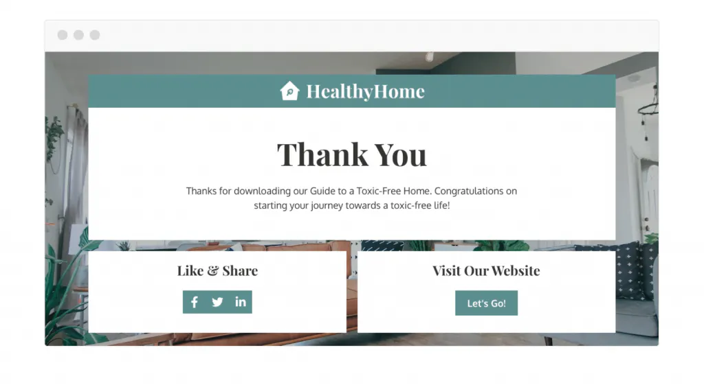
When a visitor opts in to download a lead magnet, it signals a significant step in your marketing funnel. While their interest is piqued, they might not be fully ready to make a purchase. Crafting a thank you page in this scenario is about guiding them further into your sales funnel without immediately launching into a sales pitch. Instead, it’s an opportunity to encourage them to explore your brand and contemplate the value you offer. As you design the thank you page, consider it a confirmation and validation of their decision to download your content asset. This acknowledgment reinforces the importance you place on the time they invested. If your goal is to foster exploration, consider refraining from a singular call to action. Instead, guide visitors toward various valuable resources, allowing them to engage with your brand at their own pace.
2. Expressing Gratitude for Downloading “Next Step” Content:
When a new contact opts in for a straightforward lead magnet, such as a concise one-page PDF, the thank you page becomes a valuable canvas to offer them a more profound insight into your area of expertise.
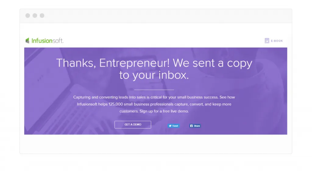
To achieve this, consider introducing a “next step” offer on the thank you page—whether it’s a complimentary course, an extensive informational resource, or even a free phone consultation, tailored to your specific industry. Enhance this introduction with a simple yet compelling “You might also enjoy…” message, leveraging the heightened engagement of your new lead.
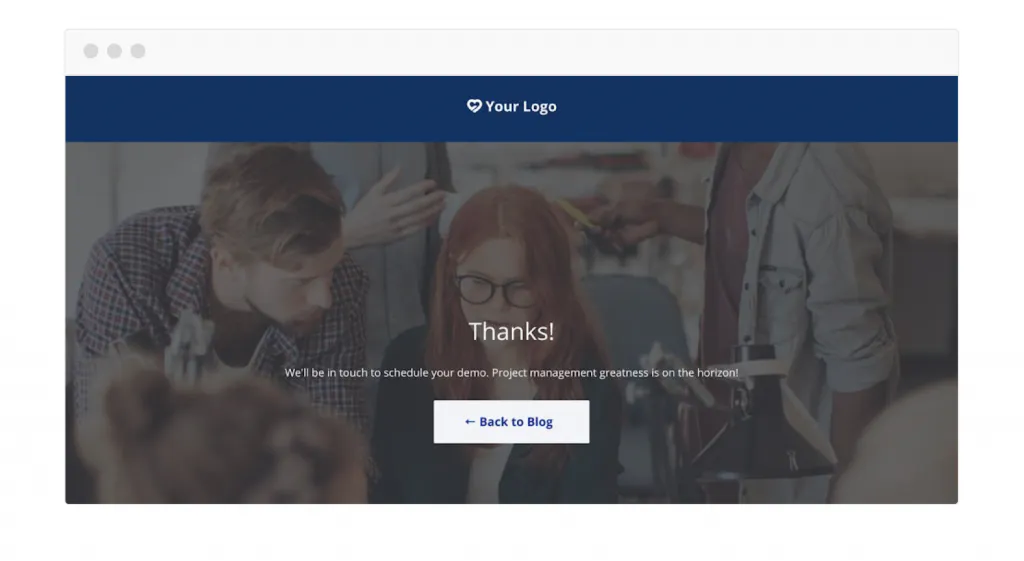
An exemplary thank you page, like the one illustrated by Infusionsoft, effectively takes this approach. Here, the call to action (CTA) encourages readers to book a demo, guiding them toward the next phase of engagement. Additionally, you can prompt readers to download the initial asset directly on the thank you page while enticing them with additional resources that drive exploration across various sections of your website.
3. Expressing Gratitude for Registering for Free Training:
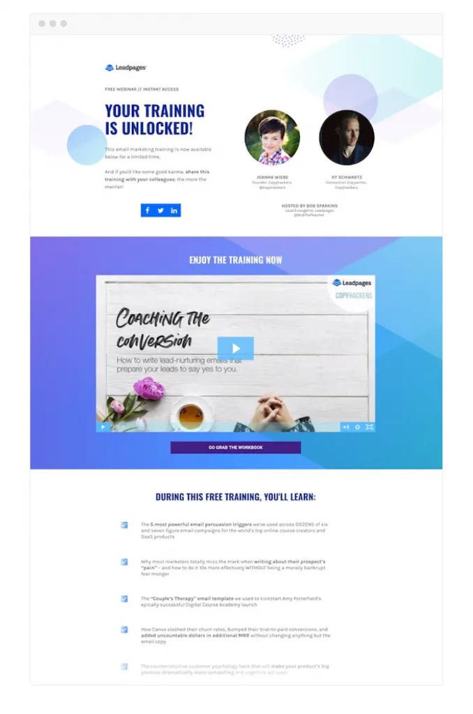
When your audience registers for free training, it’s crucial not to merely redirect them to the training itself. Instead, the thank you page should serve as both a confirmation of their successful action and an expression of gratitude for their participation.
In a thank you page example from Leadpages, the approach begins with encouraging users to share the training, fostering a sense of community engagement. Simultaneously, the page provides a preview of the valuable information participants can expect to learn, ensuring they are enticed to click on the video and actively participate in the training.
4. Expressing Gratitude for Subscribing to an Email List:
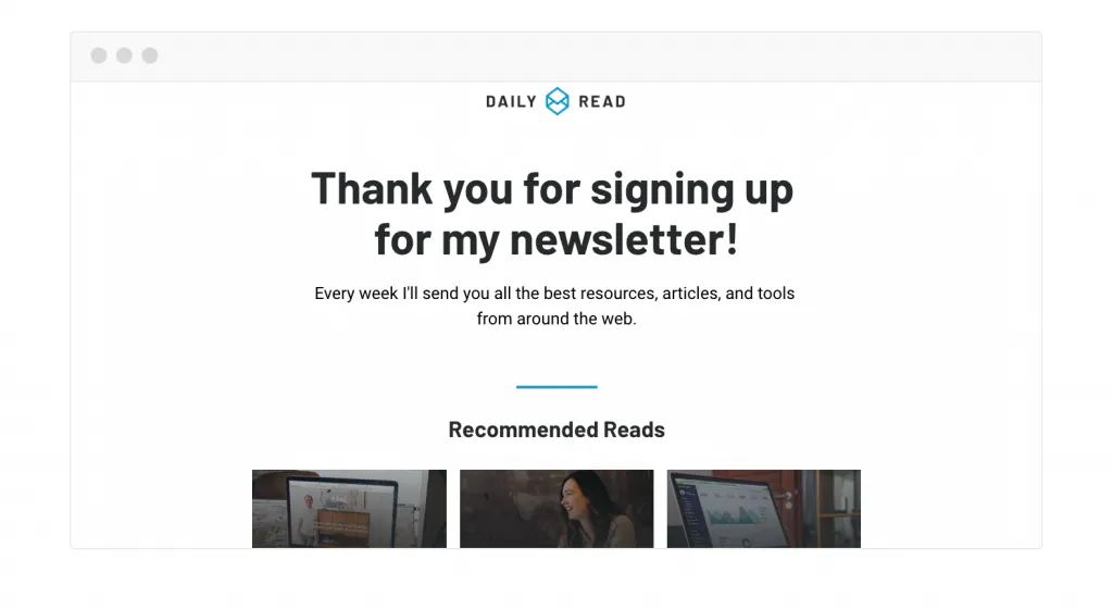
When someone actively subscribes to your email list, it signifies a significant level of trust in your business. Their decision reflects genuine interest in your offerings, and they believe you will deliver value to their inbox.
To maintain and enhance this positive connection, it’s crucial not to disrupt the warm, fuzzy feeling with a robotic confirmation page or an overly aggressive sales pitch. Instead, leverage the thank you page as an opportunity to recommend other relevant content on your site. This strategic approach not only acknowledges their subscription but also encourages further exploration, ensuring a seamless and engaging user experience.
5. Expressing Gratitude for Signing up for a Live Event:
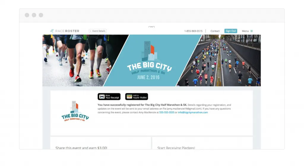
When individuals sign up for your live events, where physical gathering is possible, capitalize on the opportunity to reinforce connections through a warm welcome or invitation displayed on your thank you page.
Transform your thank you page into a dynamic marketing tool, as exemplified by Race Roster. This example showcases the potential of utilizing the thank you page not only for appreciation but also for extending invitations and fostering post-event engagement. Consider sending a post-event “thank you” to maintain attendee engagement and guide them on next steps to make the most of their newfound knowledge and connections.
6. Expressing Gratitude for Joining a Webinar:
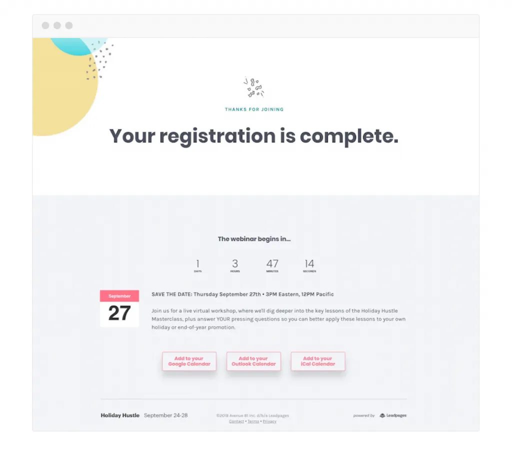
Securing webinar sign-ups is a noteworthy achievement, but ensuring registrants actually attend is another challenge. To address this, make it effortlessly convenient for webinar registrants to remember the event by incorporating a direct calendar reminder.
On the thank you page, provide links to three popular calendars—Microsoft Outlook, Google Calendar, and iCal—inviting registrants to a one-click process to add the event to their calendars. This simple yet effective strategy significantly increases the likelihood of registrants attending your webinar, maximizing the impact of your webinar marketing efforts.
7. Expressing Gratitude for Entering a Contest:
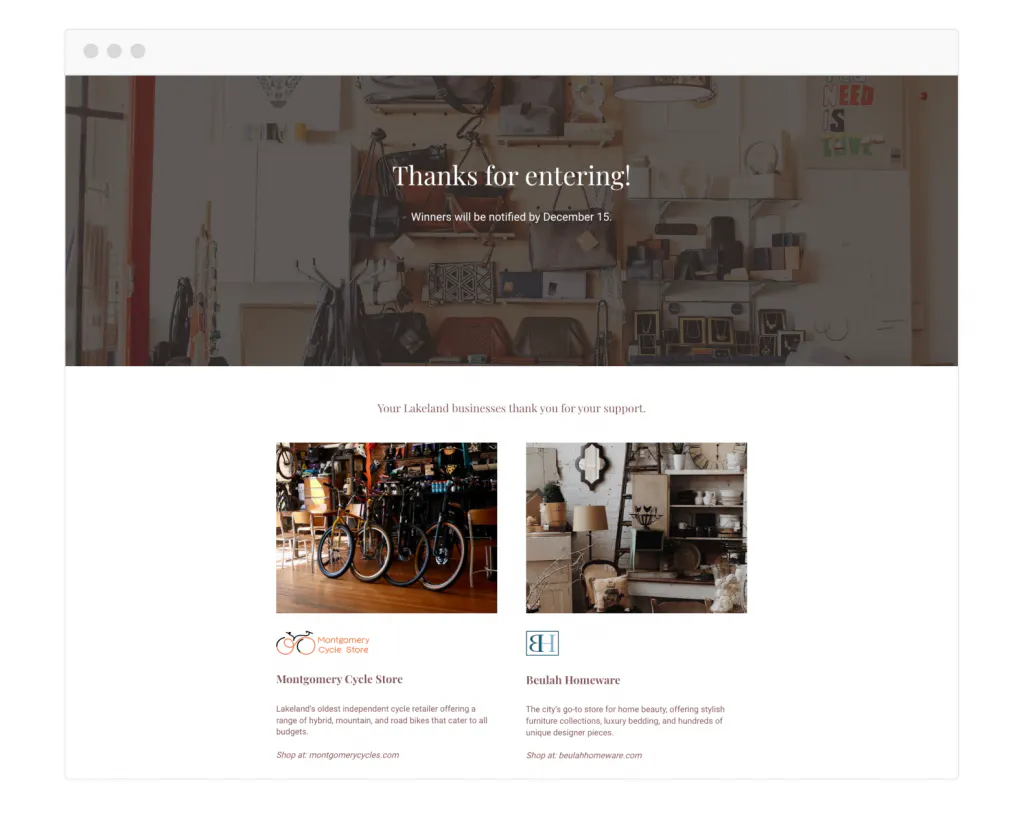
Contests serve as a powerful lead generation strategy, yet businesses often miss the opportunity to engage contest entrants beyond the initial entry. After capturing attention with a giveaway, leverage the thank you page to encourage entrants to explore further.
In the example of a Small Business Saturday giveaway, the thank you page offers entrants the chance to check out sponsoring businesses. This strategic move not only expresses gratitude for contest participation but also actively encourages continued exploration, turning a one-time engagement into a potentially lasting connection.
8. Expressing Gratitude for Grabbing a Coupon:
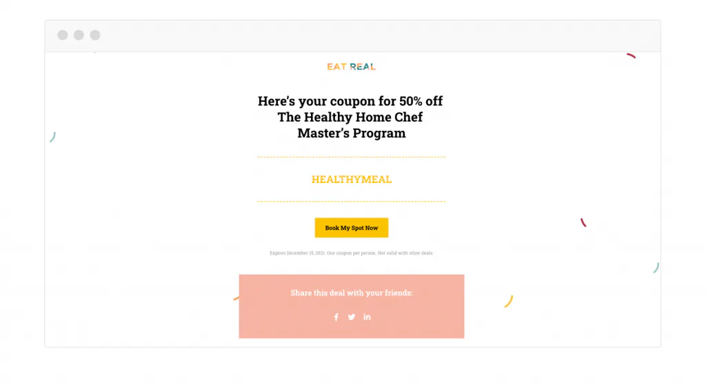
Coupons serve as effective incentives to encourage visitors to share their email addresses, creating an opportunity for potential purchases. To ensure a seamless experience, the thank you page plays a crucial role in making it easy for users to utilize their coupons.
On the thank you page, it’s essential to include a direct link back to your store or incorporate a prominent “Buy now” button for the specific product you want them to purchase using the coupon. This strategic design not only facilitates a smooth transition from coupon acquisition to purchase but also enhances user engagement.
Recognizing the universal appeal of sharing good deals, integrate social share buttons on the thank you page. Empower users to spread the word about your special offer, expanding its reach and potentially attracting new customers.
9. Expressing Gratitude for Making a Purchase:
Even after a customer completes a purchase, the confirmation page remains a valuable touchpoint for further engagement. Consider employing various tactics to maximize the impact of this pivotal moment:
Upsell/Cross-Sell Page:
- Large retail websites often display related products on the purchase confirmation page. Smaller businesses can adopt a personalized approach on custom thank you pages, offering a focused display of related products. Instead of treating the upsell as an afterthought, provide compelling reasons for customers to consider additional items and how they complement their recent purchase. Studies indicate that a well-executed upsell on the thank you page can boost revenue by 10%-15%, making it a worthwhile strategy to explore.
Discount Page:
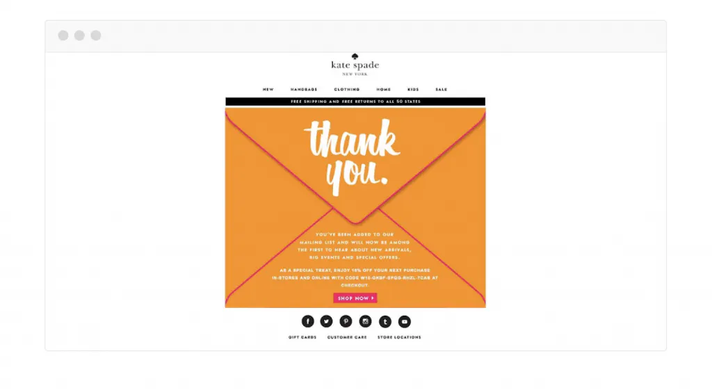
- Offering an exclusive discount as a token of appreciation is an effective way to hook customers for future engagements. Brands like Kate Spade, for instance, extend a 10% discount as the ultimate “thank you.”
Redirect Users:
- In some cases, the best course of action after a purchase is to encourage customers to continue exploring your site. A simple and informative page can redirect them back to catalog or category pages, providing clarity on the next steps. This approach ensures a seamless transition from the purchase confirmation to ongoing engagement with your brand.
Learn about chat plugins for superior relationship management here.
10. Expressing Gratitude for Live Event Registration:
Capitalizing on the opportunity to express gratitude is crucial when visitors sign up for a live event. Craft a heartfelt and genuine thank you page that not only appreciates their registration but also leaves a lasting impression. Including a summary of frequently asked questions (FAQs) on the thank you page addresses any immediate queries, instilling confidence and removing doubts about the upcoming event.
Take inspiration from Ocho, which effectively thanked participants for registering for its live event and provided a link to the next steps for attending the show. This thoughtful approach enhances participant motivation and sets a positive tone for the event day.
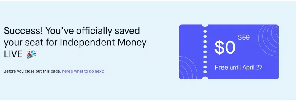
Incorporate an audience survey into the thank you page to gain valuable insights into your audience. This data aids event organizers and speakers in planning their approach, ultimately elevating the overall quality of the attendee experience.
11. Expressing Gratitude for 1:1 Appointment Scheduling:
When someone schedules a 1:1 appointment, a well-crafted thank you note can significantly impact the overall experience. Whether offering personal coaching or consultation, use the thank you page to express eagerness to speak with them and set a positive tone for the upcoming appointment.
Leverage the thank you page to build confidence by incorporating testimonials from individuals who have previously taken a 1:1 appointment. Highlight the value and positive experiences others have had, creating anticipation and excitement for the upcoming conversation.
12. Expressing Gratitude for Donations:
Thank you pages play a crucial role when supporters make donations. Craft thank-you notes that not only express gratitude but also reiterate the mission statement behind the donation drive. Provide additional details on how their donation will be utilized and include links to relevant sources showcasing the progress made so far.
Avoid bland and generic thank-you notes. Infuse personality and enthusiasm into your thank you page to create a positive and memorable experience. Spark positivity with uniquely designed pages, such as the Nature Conservancy’s envelope-styled thank you page, which not only expresses gratitude but also makes donors feel they are making a significant difference in supporting the organization’s mission.

Best Practices for Creating Thank You Pages:
- Primary Focus on Gratitude: At the heart of your “Thank You” page strategy should be a sincere expression of gratitude. Make your users feel valued and appreciated for choosing your product or service. Let the thank-you message take center stage, resonating with authenticity and warmth.
- Subtle and Relevant Promotional Elements: While gratitude is paramount, judiciously weave in subtle promotional elements that align with the user experience. This could include showcasing related products, exclusive offers, or inviting users to explore other valuable resources on your site. The key is relevance – ensure that promotions seamlessly complement the user’s journey.
- Avoiding Overwhelm: The cardinal rule is to prevent promotional content from overshadowing the core thank-you message. Users have just completed a desired action, and bombarding them with aggressive promotions can diminish the genuine appreciation they should feel. Keep promotional elements tasteful, non-intrusive, and in harmony with the overall tone of gratitude.
- Strategic Placement: Consider the strategic placement of promotional content on your “Thank You” page. Integrate it thoughtfully within the layout, ensuring it doesn’t overshadow or distract from the thank-you message. Strategic placement enhances visibility without compromising the user’s sense of being genuinely acknowledged.
- Maintaining Consistency: The tone and design of promotional elements should align seamlessly with the overall branding and messaging strategy. Consistency in branding reinforces your identity and helps users transition smoothly from the initial action to any additional steps or offerings you present.
- Testing and Iteration: Like any aspect of your digital strategy, finding the ideal balance between gratitude and promotion requires testing and iteration. Monitor user responses, analyze engagement metrics, and gather feedback to refine your approach continually. A/B testing can be a valuable tool in understanding what resonates best with your audience.
Conclusion:
By embracing moderation, relevance, and a user-centric approach, you can craft a “Thank You” page that not only expresses gratitude genuinely but also introduces promotional elements harmoniously. This delicate equilibrium ensures that every interaction leaves a positive and lasting impression, fostering a strong connection between your brand and your audience.
FAQs on Thank You Page Examples:
Can I use my “Thank You” page to promote additional offers?
Absolutely! Your “Thank You” page is an excellent space to showcase related products, services, or even exclusive deals. By capitalizing on the engagement momentum, you can increase conversion opportunities.
Can I incorporate multimedia elements on my “Thank You” page?
Yes, you can! Adding engaging elements like videos or interactive graphics can enhance user interest and make your “Thank You” page more memorable. Ensure that multimedia elements align with your brand and the overall user experience.
How can I strike a balance between gratitude and promotion on my “Thank You” page?
The key is moderation. While expressing gratitude is primary, subtle and relevant promotional elements can complement the user experience. Ensure that promotional content doesn’t overshadow the thank-you message.

