When it comes to email marketing, creating campaigns that not only capture attention but also convert readers into loyal advocates is essential. Your email newsletters serve as a powerful tool for nurturing your audience and keeping them engaged with your brand. However, we understand that sometimes your creative well may run dry, leaving you in need of some fresh inspiration. That’s why we’ve curated a collection of beautiful newsletter examples to help you elevate your email marketing game!
Key Elements of a Newsletter:
- The Storyteller: Take your subscribers on a journey with a storytelling approach. Craft a narrative that connects with their emotions and immerses them in your brand’s world. Blend captivating visuals, compelling copy, and a call to action that leaves them wanting more.
- The Personal Touch: Build a personal connection with your audience by tailoring your newsletter to their interests and preferences. Segment your subscriber list and deliver personalized content that resonates with each individual. Remember, a little personalization goes a long way!
- The Visual Delight: Capture attention with stunning visuals and eye-catching design elements. Use high-quality images, vibrant colors, and an intuitive layout that guides readers through your newsletter effortlessly. Let your visuals speak volumes and leave a lasting impression.
- The Curator’s Corner: Showcase your expertise and add value by curating relevant and valuable content from various sources. Share industry news, helpful tips, and engaging articles that your subscribers will appreciate. Position yourself as a trusted source of information and insights.
- The Exclusive Offer: Create a sense of exclusivity and urgency by offering special promotions, discounts, or limited-time deals exclusively to your newsletter subscribers. Encourage them to take action and make a purchase by highlighting the benefits and time-sensitive nature of the offer.
- The Interactive Experience: Engage your subscribers with interactive elements that encourage them to interact and participate. Incorporate quizzes, polls, or surveys to gather valuable feedback and insights. Make your newsletters a two-way conversation and foster a sense of community.
Top Newsletter Examples from Real Life
1. ECommerce Newsletter Examples
What does it take to create a standout eCommerce newsletter? It’s not just about making it visually appealing; it’s about delivering value to your online customers. A great eCommerce email newsletter establishes a line of communication, promotes special deals, and keeps customers engaged. Let’s explore some eye-catching examples to inspire you:
A. Serumize:
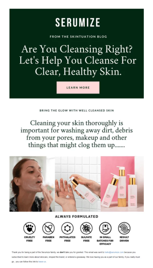
Serumize has nailed the art of creating beautiful weekly newsletters. They focus not only on promotions and special offers but also on providing valuable tips to educate their target audience. Their email example features a clean and straightforward design, utilizing white space to enhance readability. The actionable copy grabs attention by posing a question, and the supporting visuals entice subscribers to click on the call-to-action.
Subject line: Are You Cleansing Correctly?
B. Sephora:
Sephora leverages email marketing to nurture its audience with promotions, educational content, events, and special deals. Their newsletter design is clean and minimalist, resonating with their young target audience. The copy is clear and offers value from the first glance, supported by visually appealing fonts and color choices. Sephora strategically places the call-to-action after the value proposition, using actionable language to drive potential customers to their product or landing pages.
Subject line: Spend $50 now and get 15% off later!

2. Product Newsletter Examples
Newsletters are perfect for updates and news but they can also help you promote your new products! Such campaigns need to:
- Highlight the product and its features
- Showcase how it can solve customer pain points
- Use high-quality images of the product
Now it’s time to see some great examples of product-oriented newsletters to get you inspired.
The Body Shop creates beautiful email marketing campaigns that are meant to excite, nurture, and convert its email subscribers. Below, you can see what makes the following email work and how to replicate it.
Subject line: Say YES to some self-love.

From its welcome email to its weekly newsletter promotions, The Body Shop has a very consistent email design that charms its audience. Some common elements include bold product images, descriptive copy, and eye-catching CTAs.
More specifically, the brand makes its product copy as valuable as possible showcasing the benefits of interacting with the email. For example, the second product block highlights the moisturizing effects of the new ingredient.
Along with the high-quality product images, the brand creates a beautiful experience for its audience. Now what’s left is a converting CTA button to capture it. Here, the brand uses its trademark color and a large email CTA button size to attract the reader’s attention.
B. Box
The Box Team makes sure to inform its email list about new product features through its monthly newsletters. The SaaS company has created a very short yet informative campaign to provide its audience with an integration roundup. Let’s take a look.
Subject line: Box Product Newsletter: September 2021
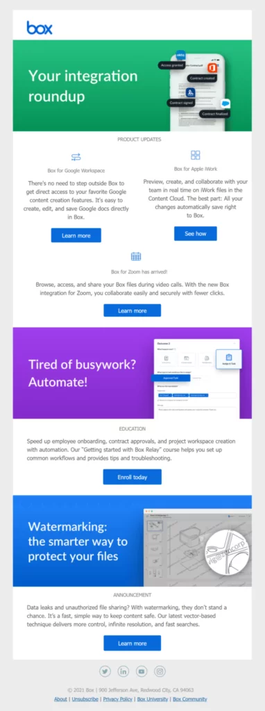
Design-wise, this newsletter example is very simple, using separate content blocks to showcase different updates. To make it more engaging, the product news is placed after the header in a clear manner and with different CTAs. When it comes to the email copy, the short descriptions work effectively in informing the reader about the features. Moreover, the business uses bold headlines and short chunks of text to provide additional information to the email subscriber.
The CTA buttons have a vibrant blue color (Box’s trademark color) to stand out. The design and the use of white space amplify their effectiveness, while the brand uses actionable copy to increase its click-through rate and conversions.
3. Blog Newsletter Examples
Email marketing and blogging are a match made in heaven. By combining the two, you can promote your content marketing and build better relationships with your audience. To make your messages work, you have to:
- Provide regular updates through RSS feeds
- Create dedicated posts for specific pieces of content
- Be conversational and friendly
With these in mind, let’s see a couple of great email examples that check all the right boxes.
Email marketing for bloggers is all about promoting your amazing content to your audience. To do so, Julie Blanner creates and sends valuable newsletters to nurture and help her email subscribers. Let’s see how she does it.
Subject line: The Ultimate Guide
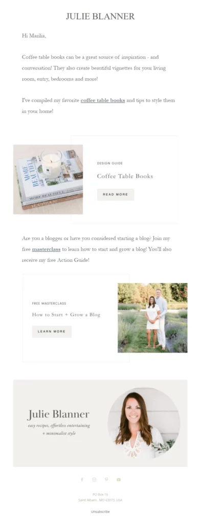
When it comes to the newsletter design, Julie Blanner uses a plain-text-looking email to make her campaigns more personal. As you can see, the blogger uses white space to improve readability, while the use of the Garamond serif font makes the message more aesthetically pleasing.
The copy here maintains a friendly tone, taking advantage of personalization to address the recipient with their first name. This way, the newsletter looks like it has been specifically created for the email subscriber, making it more unique and relatable.
To increase her click-through rates, she has also inserted two content blocks with dedicated CTAs featuring her hyperlinked resources. Apart from that, the blogger also includes a photo of herself to put a face on her brand and has a clear unsubscribe button at the end for those who want a way out of her mailing list.
B. Torque
Torque Setting RSS feed newsletters is one of the most important email marketing campaigns for bloggers. Not only will you automate your content promotion efforts, but you will be able to engage your audience with your content the moment it gets published on your website. Let’s see how Torque does it.
Subject line: Develop safely with these tips
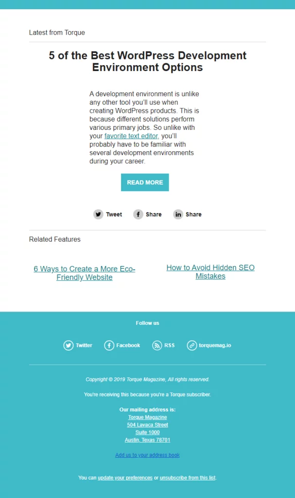
First of all, RSS newsletters are a special type of email you can set up through your email marketing service. These emails need an RSS URL, i.e., the website from where they will draw your content.
Torque has used a single content block email template to promote a specific piece of content. The design is very minimalist, having only the necessary elements. It automatically draws a snippet of its blog content and displays it in the newsletter. Here, the chunk of text is meant to provide more information about the blog post. Last but not least, the brand adds social media buttons to cross-promote between email and social to boost engagement.
4. Non-Profit Email Example
NPOs use a variety of email marketing campaigns to inform their audiences about new actions and provide them with weekly updates and highlights. To rock your newsletters for your non-profit organization, make sure to:
- Use straightforward copy to showcase your cause
- Use high-quality visuals to complement your text
Below, you’ll find a great email example that educates the email subscribers and gets them to take action.
WWF’s email marketing strategy consists of a series of newsletters that inform its subscribers about a variety of topics and environmental actions. To do that, the NPO sends weekly round-ups to keep its audience up-to-date. Here’s a recent example.
Subject line: Great news for our shared home
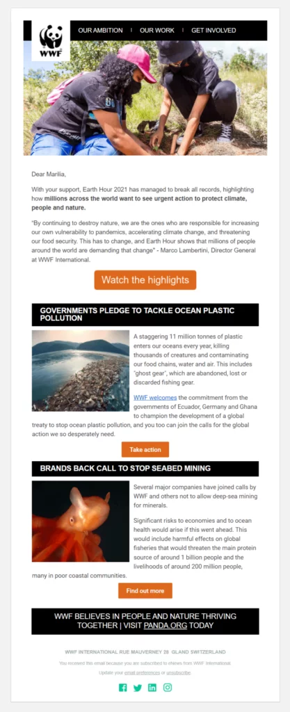
WWF maintains “design consistency” through its newsletters. More specifically, the NPO uses an image-infused header with the logo and a relevant visual to make the message more engaging. In the above example, where the topic was “Earth Hour,” the organization uses an image of two people planting trees to introduce the reader to this week’s topic.
The rest of the design is simple, favoring white space to make each individual element stand out. Moreover, while the email copy is quite extensive, the structure of the newsletter and the choice of fonts make it easy to read. The first orange call-to-action is deliberately bigger than the second one in an attempt to draw the reader’s attention and improve WWF’s click-through rate (CTR).
5. Banking Newsletter Example
Email marketing isn’t just a valuable tool for eCommerce brands, startups, and small businesses. In the right hands, it can be a powerful weapon for building better customer connections. Banks, too, can leverage its power to create newsletters that:
- Provide monthly statements for their customers
- Give updates about new features
- Promote various incentives for programs, cards, etc.
Now let’s take a look at a real-life example of a banking email newsletter and what makes it work.
A. Revolut
Creating readable and easy-to-navigate emails is important for improving engagement. To achieve this, Revolut has adopted a specific newsletter design that emphasizes white space, crisp visuals, and valuable copy. Here’s an example of their newsletter:
Subject line: More currencies, and make it speedy
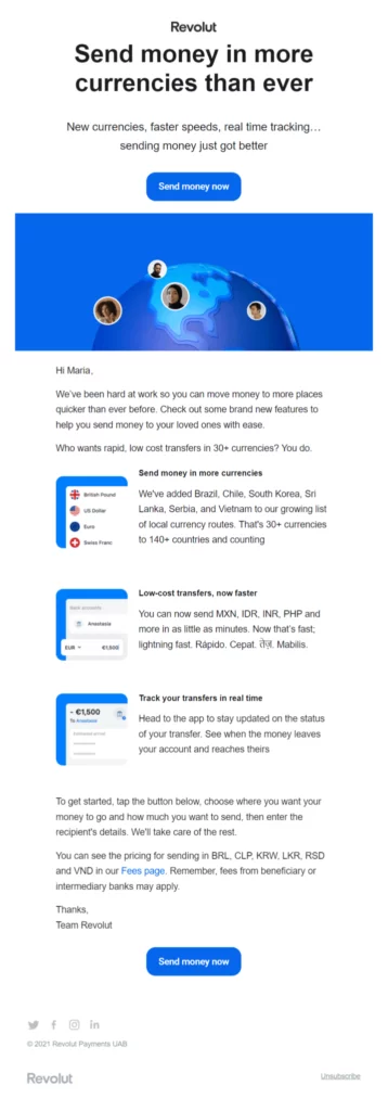
In terms of the email copy, Revolut maximizes the above-the-fold space by including a clear heading that highlights the benefits subscribers will receive. This allows recipients to quickly understand the newsletter’s purpose. The bank employs actionable language to inform customers about new features and capabilities.
The call-to-action (CTA) is strategically placed above the fold to increase click-throughs and conversions. To optimize results, Revolut includes a duplicate button at the end of the newsletter. Lastly, the use of the attention-grabbing blue color is well-suited for this example, ensuring it stands out and catches the reader’s eye.
6. Hospitality
Hospitality businesses have used email marketing to promote their reservations and offer special deals to their customers. To create the best email newsletter for your restaurant, make sure to:
- Showcase the value of your email message
- Provide extra incentives to place an order
With these in mind, let’s take a look at one of our favorite email newsletter designs.
A. Dominos
To promote its daily or weekly deals, Domino’s creates visually appealing newsletter designs to capture the interest of its customers and encourage them to visit the website and place an order. The company’s secret lies in drawing inspiration from events to create captivating campaigns that resonate with its audience. Below is an example inspired by the Formula 1 Grand Prix.
Subject line: Do you want a Deal that will send you to pole position? See what came in Domino’s!
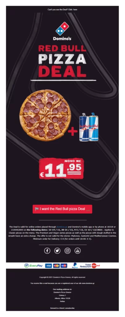
Domino’s newsletters follow a visual-centric approach that highlights the product at the center of the design. Taking inspiration from Formula 1 races, this particular email employs darker colors and a race track background to create an immersive experience.
In terms of the copy, the focus is on providing essential information to entice customers to place an order. This includes a concise description of the deal and its price.
The call-to-action (CTA) stands out with its attention-grabbing red color, creating a connection to the “Red Bull” deal being offered. Furthermore, the button uses compelling copy to generate excitement among the audience and guide them one step closer to making a conversion.
7. Webinar Marketing
Webinar marketing is a powerful tool for nurturing your target audience, building stronger relationships, and providing immediate solutions to their problems. If you’re planning monthly webinars (or weekly podcasts), you can effortlessly promote your registrations using email. To ensure they perform well, consider the following:
- Include a summary of your event with all the relevant information.
- Add a call-to-action (CTA) or a link to your landing page/website.
- Enhance credibility by featuring speaker images, among other elements.
Now, let’s take a look at an excellent example of a webinar newsletter.
A. Fluent
Fluent’s email marketing campaign incorporates all the essential elements to inform its subscribers about an upcoming webinar. Let’s explore what makes this newsletter great.
Subject line: [WEBINAR] Register to kickstart your call marketing strategy with ActiveProspect and Fluent!
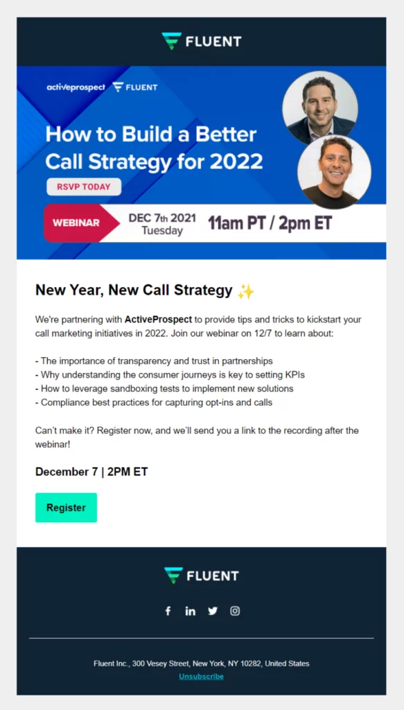
Starting with the design, this example is concise yet includes all the essential elements that potential participants need to see in order to click on the register button. The brand has included a visually appealing summary of the event, featuring the event name, date, and time.
The email copy is informative, using dashes to introduce what participants will learn in a clear and concise manner. Lastly, the vibrant call-to-action (CTA) button incorporates one of Fluent’s distinctive colors, making the campaign more distinctive and increasing the click-through rate.
Conclusion:
Now that you have a range of newsletter ideas to explore, it’s time to put them into action and create a newsletter that stands out. Remember, consistency, quality, and value are the keys to building a successful newsletter that resonates with your audience and helps you achieve your goals.
Remember to consistently analyze the performance of your newsletters through metrics such as open rates, click-through rates, and subscriber feedback. This will help you gauge the effectiveness of your strategies and make data-driven improvements.
Learn about WooCommerce Marketing plugins here.
FAQs on Newsletters:
How can I increase newsletter open rates?
To increase open rates, focus on crafting compelling subject lines that grab attention and create curiosity. Keep the content concise, relevant, and engaging. Segment your subscribers to deliver targeted content, and consider A/B testing different approaches to identify what resonates best with your audience. Additionally, ensure your newsletters are mobile-friendly and optimize send times based on your audience’s habits.
How do I build an email subscriber list for my newsletter?
To build an email subscriber list, you can implement various strategies, including:
- Placing opt-in forms on your website or blog.
- Offering incentives such as free e-books, guides, or exclusive content in exchange for email addresses.
- Promoting your newsletter through social media channels and encouraging followers to subscribe.
- Running targeted advertising campaigns to reach your ideal audience.
- Networking and attending industry events to collect email addresses.
How can I improve the effectiveness of my newsletters?
To improve the effectiveness of your newsletters, consider personalizing your content based on subscriber preferences and behavior, optimizing your email design and layout for readability and mobile devices, segmenting your subscriber list to deliver targeted content, testing different subject lines and email formats, and regularly seeking feedback from your subscribers to understand their needs and preferences better.

