
If you’ve ever stumbled upon a website characterized by bold elements, vibrant colors, and striking typography, chances are you’ve encountered neo brutalism design. In my experience, neo brutalism evokes a sense of nostalgia and playfulness that few other design styles can match — when executed effectively, that is. However, due to its unique nature, mastering neo brutalism UI (user interface) can be quite challenging.
The stakes are high — a poorly executed neo brutalist design can result in a dizzying, overwhelming, or downright unusable website. Conversely, getting it right can lead to an unforgettable user experience that keeps visitors coming back for more. If you’re interested in learning more about designing for user experience, I highly recommend checking out this comprehensive HubSpot Academy course.
I’ve found that the best way to determine if neo brutalism is suitable for your website is through education. I’m here to guide you through the intricacies of neo brutalism UI design so you can decide whether transforming your website into a neo brutalist masterpiece is the right move for you. We’ll start by exploring what neo brutalism entails, followed by an examination of its popularity and its impact on user experience. Finally, we’ll discuss when it’s appropriate to incorporate neo brutalism into your website design.
What is Neo Brutalism?
If you’re familiar with the neo brutalist architectural movement, then you already have some insight into this emerging design trend. In essence, neo brutalism is a prevalent trend in web design characterized by sharp contrasts, raw design elements, asymmetry, bold typography, and vibrant colors. Similar to its architectural counterpart, neo brutalist web design prioritizes geometric shapes and functionality.
Rooted in the brutalist design era of the 1950s and 1960s, neo brutalism draws inspiration from its focus on utility and rawness, offering a modern twist on a historical aesthetic.
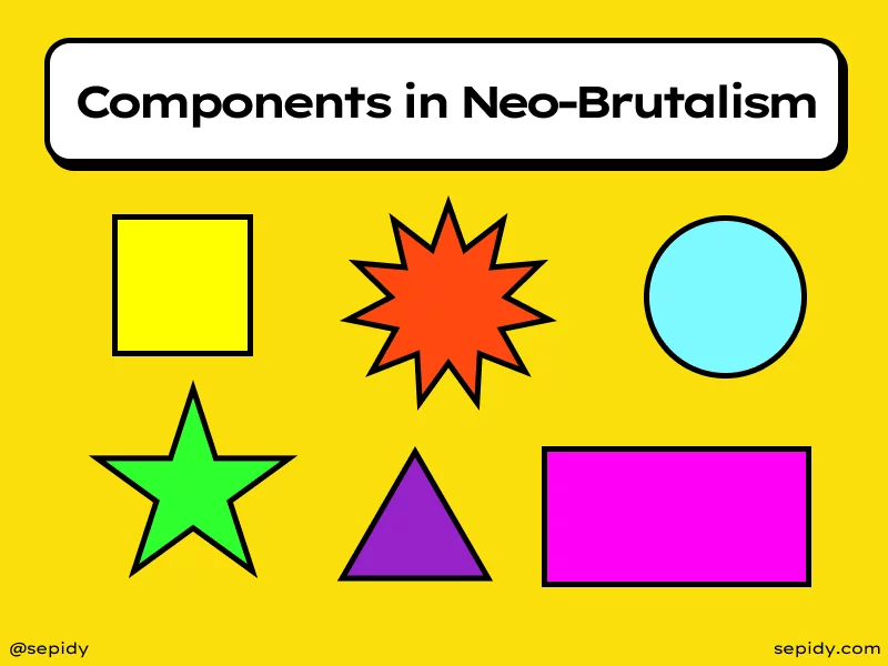
Elements of Neo Brutalism:
1. Loud Colors
Neo brutalist design often employs colors that are bold and impactful, though not necessarily abundant. The colors used are chosen for their ability to make a statement and grab attention. While some brutalist websites feature a multitude of colors, others opt for a more minimalist color palette to avoid overwhelming users.
2. Typography
Typography serves as a fundamental element of neo brutalist design, often standing out as its own distinct design feature. Display fonts with graphic and experimental qualities are commonly utilized, adding a dynamic and eye-catching dimension to the overall aesthetic. However, readability remains paramount, emphasizing the importance of selecting fonts that strike a balance between visual appeal and legibility.
3. Shadows
The strategic use of shadows is another hallmark of neo brutalist websites, adding depth and dimension to the visual composition. Shadows, when paired with unique shapes or elements, create a visually engaging experience that draws users in.
4. Eye-Catching Shapes
Neo brutalist design embraces experimentation and playfulness, often incorporating unconventional shapes and forms to create visually striking compositions. These eye-catching shapes contribute to the distinctiveness of the design and reinforce its bold and dynamic nature.
5. Asymmetry or Inconsistent Page Layout
Asymmetry is a prominent feature of neo brutalist design, with layouts often eschewing traditional notions of symmetry in favor of uniqueness and individuality. Pages may feature irregular arrangements of elements, contributing to a sense of visual interest and dynamism.
Real Life Examples of Neo Brutalism in Design:
1. Personal Branding by Vladimir Gruev
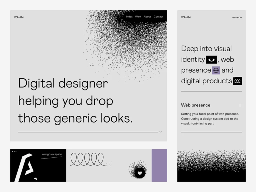
Vladimir Gruev’s personal branding designs epitomize the essence of Neobrutalism style. With a keen eye for inspired hero sections, Gruev’s work stands out as a testament to his admiration for this design approach. His portfolio is a treasure trove of stunning web design pieces that captivate and inspire.
Key Features:
- Neobrutalism Influence: Gruev’s designs are heavily influenced by Neobrutalist principles, characterized by bold typography, striking contrasts, and unconventional layouts.
- Stunning Hero Sections: Gruev’s hero sections are particularly noteworthy, often featuring bold visuals and engaging content that immediately draws the viewer’s attention.
- Innovative Design Elements: From dynamic color schemes to avant-garde typography, Gruev incorporates innovative design elements that push the boundaries of traditional web design.
2. Look Beyond Limits by Halo Lab
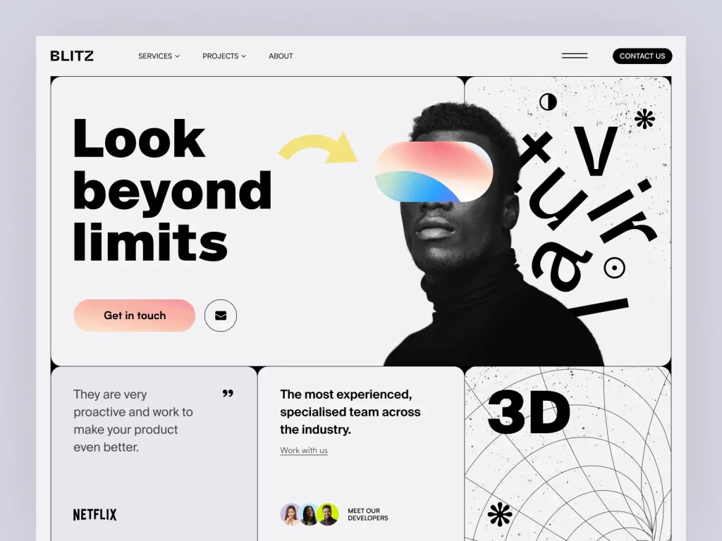
Halo Lab’s “Look Beyond Limits” website showcases the Ukrainian design squad’s mastery of creative expression. With oversized typography, prominent separators, and unique angles, this artwork is a testament to Halo Lab’s ingenuity and design prowess.
Key Features:
- Bold Typography: The use of oversized typography commands attention and reinforces the website’s message of breaking barriers and pushing boundaries.
- Prominent Separators: Halo Lab employs prominent separators to create visual interest and guide the viewer’s eye through the content.
- Unique Angles: By incorporating unconventional angles, Halo Lab adds a sense of dynamism and energy to the design, further enhancing its visual appeal.
3. Asato by Agum Satria
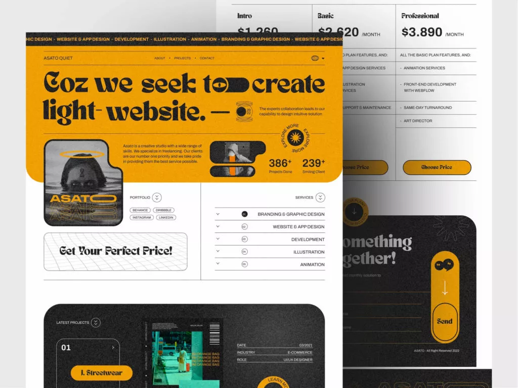
Agum Satria’s “Asato” website boasts a distinctive design characterized by its vintage background pattern and impeccable contrast. The juxtaposition of elements, including shapes, outlines, and headline fonts, creates a visually arresting composition that captivates the viewer’s attention.
Key Features:
- Vintage Background Pattern: The vintage background pattern adds a touch of nostalgia and authenticity to the design, setting it apart from conventional websites.
- Impeccable Contrast: Satria masterfully utilizes contrast to highlight key elements and draw attention to critical content, ensuring optimal readability and visual impact.
- Eye-Catching Typography: The use of unique fonts for headlines adds a layer of sophistication and visual interest, making the website truly memorable.
4. Gumroad
Gumroad’s website stands out for its innovative approach to e-commerce design. With a focus on simplicity and user experience, Gumroad offers a platform that empowers creators to sell their products directly to their audience.
Key Features:
- User-Friendly Interface: Gumroad prioritizes usability, with a clean and intuitive interface that makes it easy for users to navigate and purchase products.
- Creator Empowerment: Gumroad provides creators with the tools they need to sell their products effectively, including customizable storefronts, payment processing, and marketing features.
- Community Engagement: Gumroad fosters a sense of community among creators and buyers, encouraging collaboration and interaction through forums, workshops, and events.
5. Figma
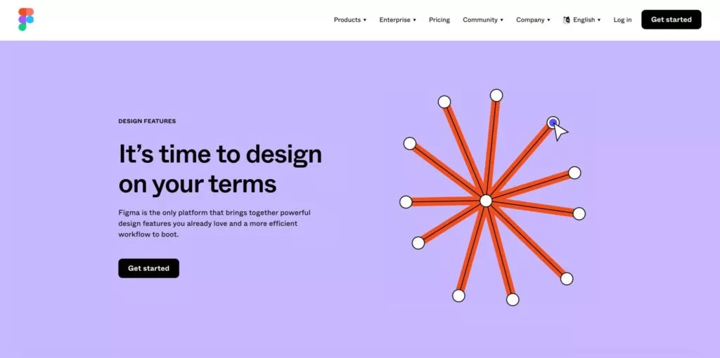
Figma’s presentation website embodies the essence of Neo-brutalism with its bold design choices. The use of oversized typography immediately captures attention and conveys a sense of confidence and innovation. Playful shapes and creative ornamentals add a touch of whimsy, while the overall layout remains clean and modern. Figma’s website effectively showcases its design tool’s capabilities while providing an engaging user experience.
Key Features:
- Big Typography: Figma’s use of oversized typography immediately grabs attention and emphasizes key messaging, making it easy for visitors to understand the platform’s offerings.
- Playful Shapes and Ornamentals: The incorporation of playful shapes and creative ornamentals adds visual interest and reinforces Figma’s innovative and dynamic brand image.
- Clean and Modern Layout: Despite the bold design choices, Figma’s website maintains a clean and modern layout, ensuring that information is presented in a clear and organized manner for optimal user experience.
Learn about CTA button colors in webdesign here.
6. CodeAcademy
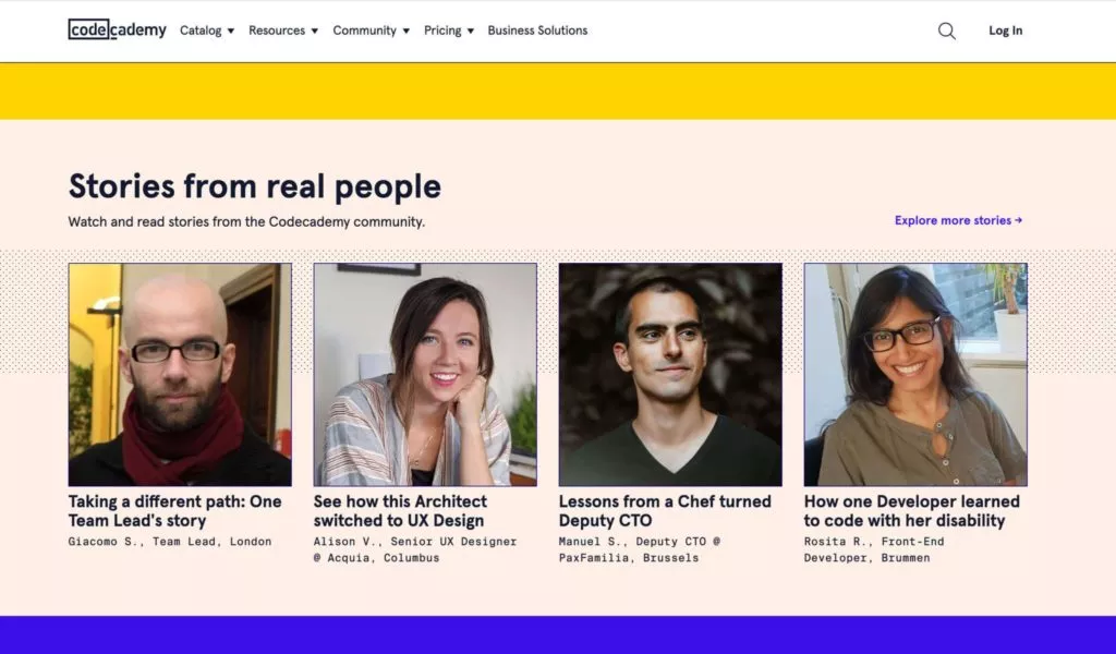
CodeAcademy’s website bursts with vibrant colors and cheerful expressions, creating a visually appealing and inviting atmosphere. The typography is playful yet legible, contributing to the website’s energetic vibe. Humorous elements add personality and charm, making the overall design memorable and engaging. The seamless integration of design elements reflects CodeAcademy’s commitment to providing a fun and accessible learning experience.
Key Features:
- Vibrant Colors: CodeAcademy’s website utilizes vibrant colors to create a lively and inviting atmosphere, reflecting the platform’s energetic and engaging approach to learning.
- Cheerful Typography: The use of cheerful typography adds personality and warmth to the website, fostering a sense of positivity and encouragement among visitors.
- Humorous Elements: Incorporating humorous elements throughout the website adds a playful touch and helps to humanize the brand, making it more relatable and memorable to users.
7. HotBuro
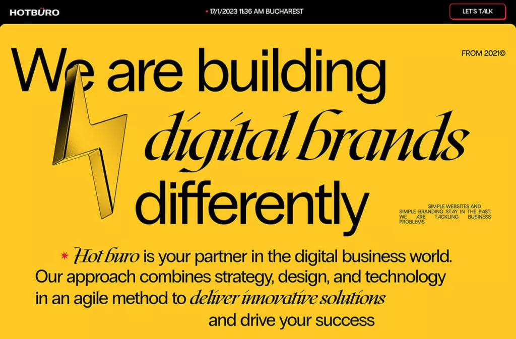
HotBuro’s website showcases a bold and trendsetting design aesthetic. The use of a striking red shadow and outline border immediately draws attention to key elements of the page. The cartoonish illustrations and unconventional typeface arrangements add a playful and creative touch. The lighting design further enhances the website’s visual appeal, creating a dynamic and engaging user experience.
Key Features:
- Striking Red Shadow and Outline Border: HotBuro’s website features a trendsetting red shadow and outline border that immediately draw attention to key elements, creating a bold and impactful visual statement.
- Cartoonish Illustrations: The use of cartoonish illustrations adds a playful and whimsical vibe to the website, making it visually appealing and engaging for visitors.
- Unconventional Typeface Arrangements: HotBuro’s unconventional arrangement of typefaces adds an element of creativity and originality to the design, setting it apart from more traditional websites.
8. DRCA
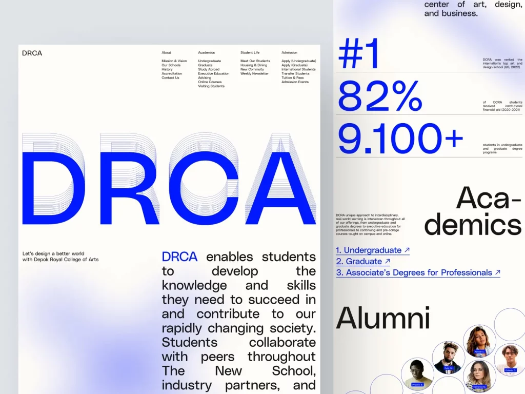
DRCA’s design exploration on Dribbble is characterized by its simplicity and elegance. The use of a blue headline and three-dimensional shadow creates depth and visual interest. The delicate radial gradient adds a touch of sophistication, elevating the overall design aesthetic. Despite its minimalistic approach, DRCA’s design stands out for its attention to detail and refined visual elements.
Key Features:
- Blue Headline with Three-Dimensional Shadow: DRCA’s use of a blue headline with a three-dimensional shadow adds depth and visual interest to the design, making it more dynamic and eye-catching.
- Delicate Radial Gradient: The incorporation of a delicate radial gradient enhances the overall aesthetic of the design, adding a subtle touch of sophistication and elegance.
- Minimalistic Yet Refined Design: Despite its simplicity, DRCA’s design exudes refinement and attention to detail, creating a polished and professional look that resonates with users.
9. Brutal Layout by Nanuka Mandaria
Nanuka Mandaria’s Brutal Layout captivates with its bold typography and clear visual hierarchy. The absence of extra spacing along the sides of the main image enhances the impact of the design. The straightforward layout and well-defined elements create a cohesive and engaging user experience. Nanuka Mandaria’s design exemplifies the essence of Neo-brutalism with its bold yet functional approach.
Key Features:
- Bold Typography: Nanuka Mandaria’s use of bold typography creates a strong visual impact and reinforces the hierarchy of information, making it easy for users to navigate the layout.
- Clear Visual Hierarchy: The layout’s clear visual hierarchy ensures that important content stands out and grabs attention, guiding users through the website with ease.
- Straightforward Layout: The straightforward layout eliminates unnecessary clutter and distractions, allowing users to focus on the core content and message of the website.
10. Us by Night
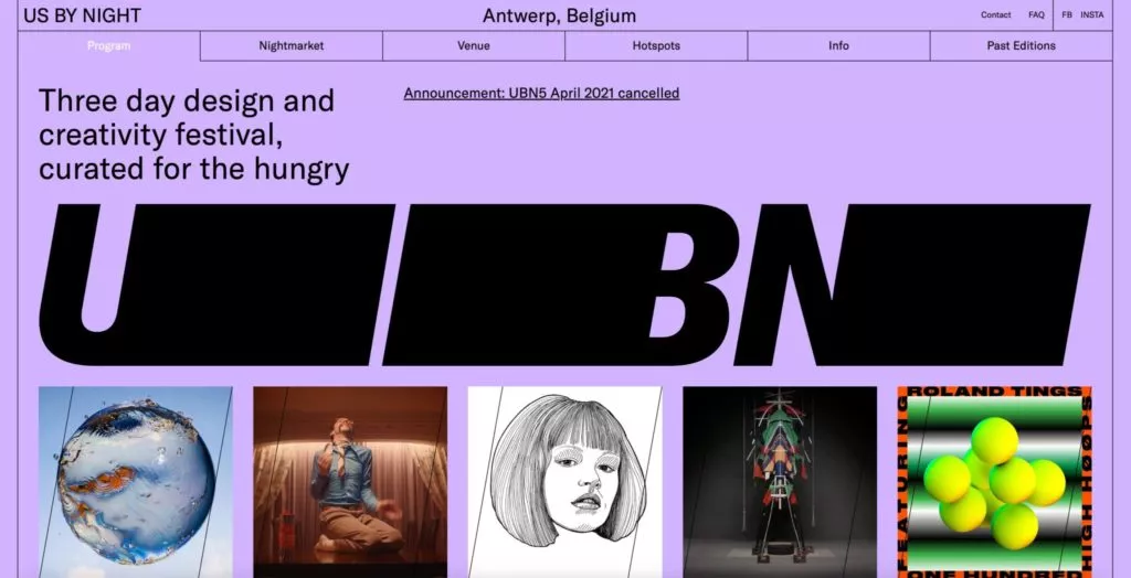
Us by Night’s website is a testament to creativity and innovation. The distinctive dividers and stylish font styling create a visually striking and memorable design. The use of illustrations adds depth and personality, while the playful mouse-over effects enhance interactivity. Despite its complexity, the website remains intuitive and user-friendly, offering a seamless browsing experience.
Key Features:
- Distinctive Dividers: Us by Night’s use of distinctive dividers adds visual interest and helps to break up content into digestible sections, improving readability and navigation.
- Stylish Font Styling: The stylish font styling enhances the overall aesthetic of the website, adding personality and character to the design.
- Playful Mouse-Over Effects: Incorporating playful mouse-over effects adds an interactive element to the website, creating a fun and engaging user experience that encourages exploration and interaction.
Best Practices for Neo Brutalism Website Design:
- Embrace Bold Typography: Use large, expressive fonts to make a statement and create visual impact. Experiment with unique typefaces and styles to convey personality and brand identity.
- Play with Vibrant Colors: Incorporate bold and contrasting color palettes to add energy and excitement to your design. Utilize color strategically to highlight important elements and create visual hierarchy.
- Experiment with Asymmetry: Embrace asymmetrical layouts and compositions to create a sense of dynamism and movement. Avoid rigid grid structures and explore unconventional arrangements for a more visually interesting design.
- Utilize Geometric Shapes: Integrate geometric shapes and patterns to add visual interest and depth to your design. Experiment with various shapes and arrangements to create a sense of rhythm and balance.
- Emphasize Contrast: Use contrast to draw attention to key elements and create visual focal points. Contrast can be achieved through differences in color, size, typography, and texture.
- Incorporate Texture and Depth: Add texture and depth to your design through the use of shadows, overlays, and layering. This can help create a more tactile and immersive experience for users.
- Keep it Simple: While Neo-Brutalism is known for its bold and expressive elements, it’s important to maintain simplicity and clarity in your design. Avoid clutter and unnecessary embellishments that can overwhelm the user.
- Prioritize Readability: Despite the bold typography and unconventional layouts, readability should remain a top priority. Ensure that text is legible and easy to read, even at larger sizes or against busy backgrounds.
- Create a Consistent Visual Language: Establish a consistent visual language throughout your design to maintain cohesion and reinforce your brand identity. Use consistent colors, fonts, and imagery to create a unified experience.
- Optimize for Mobile: With an increasing number of users accessing websites on mobile devices, it’s essential to ensure that your design is responsive and mobile-friendly. Test your design across various devices and screen sizes to ensure a seamless experience for all users.
Conclusion:
In conclusion, exploring the world of Neo brutalism in web design unveils a realm of creativity and innovation that challenges traditional design norms. The showcased websites exemplify the power of bold typography, vibrant colors, and playful elements to create captivating user experiences. By embracing Neo-brutalism, designers can push boundaries, break free from conventions, and unleash their creative potential to craft unforgettable digital experiences.
FAQs on Neo brutalism Web Designs:
Is Neo brutalism suitable for all types of websites?
While Neo-brutalism can be visually striking, it may not be suitable for all types of websites. Consider the audience, purpose, and branding of your website before incorporating Neo-brutalist elements. It may be more suitable for creative or experimental projects rather than corporate or minimalist designs.
How can I learn more about Neo-brutalism in web design?
To learn more about Neo-brutalism in web design, explore online resources, articles, and case studies showcasing examples of Neo-brutalist websites. Experiment with design tools and techniques to incorporate Neo-brutalist elements into your own projects and stay updated on current design trends and developments.
Are there any accessibility considerations when using Neo-brutalism in web design?
Accessibility should always be a priority when designing websites, including those with Neo-brutalist elements. Pay attention to contrast ratios between text and background colors to ensure readability for all users, including those with visual impairments. Additionally, consider providing alternative text for images and using semantic HTML to enhance screen reader compatibility.
