Dear fellow online shopper,
Have you ever landed on an ecommerce website that made you feel lost in a digital maze? One where you couldn’t find the “add to cart” button to save your life? Well, fear not because today I want to discuss the importance of human-centered ecommerce website design.
Websites that facilitate online commerce (or ecommerce) are now crucial to the success of any company. Businesses shifted their focus from brick-and-mortar locations to digital solutions for selling online, resulting in a 55 percent increase in online sales during the pandemic.
Whether you’re just getting started or have already run a traditional storefront, when designing an online store, you need to think about the user experience from every angle, including the visuals, the navigation, and the accessibility. These details are essential to leave a long-lasting impression and guarantee a trouble-free buying trip.
Ecommerce Website Design Checklist for Pages
It is a fact that even the most brilliantly designed website will only succeed with the right pages. Your users will need different information from your site when they land. Not everyone will just be impressed by your flashy high-res pictures and place their orders.
Many visitors will take a deeper dig before handing over their hard-earned dollars to you. But, with the right pages, you can ensure it happens smoothly.
Here’s a must-follow page checklist when building up your ecommerce store:
- Homepage
There’s no way around it; your homepage needs your best work. In many cases, this will be the first time you interact with a customer. Visitors will quickly bounce off the homepage if they are unsatisfied with what they see.
If you keep things exciting and positive, your visitors will continue to explore your site and eventually make a purchase.
- Category pages
A cluttered website will never result in a sale. Ensure your products are properly organized on the site so customers can quickly find what they want.
- Product Landing Pages
Ensure complete information about each product on its page—dimensions, colors, brands, versions, etc.
More information on your pages means more help for your readers in choosing.
- Checkout
Create the most user-friendly purchasing pages you can. Sales are lost when customers find completing purchases on an online shop’s checkout page challenging. Simple is best. Accept a wide variety of payment methods. Guests should be able to check out as well. People are less likely to finish shopping with carts if required to create accounts.
- About Us
The “About Us” section is perfect for introducing your company. Many people have questions about businesses, and be sure your About Us page gives potential customers a positive first impression.
You can introduce your organization’s values, team members, and other pertinent information here. Many customers become dedicated to a company simply because their beliefs coincide.
- Shipping and Return Policy
Once again, this is of paramount significance. People have the most concerns about shipping and returns when making purchases online.
Specify all the details of your shipping and return policies. Buyer confidence is increased when return policies are made clear. Customers can make an informed decision about whether or not to buy from you if they clearly understand your shipping policies.
- Contact Form
You can rest assured that some subset of the population will always be eager to make contact with you. To get an answer to a question, find out about deals or discounts, or provide some feedback. Having a contact form available will allow customers to contact you quickly.
Top Ecommerce Website Design Examples From Real Life
1. Zulu Longines

This online store is a tribute to the aviation pioneers who wore Longines watches during their missions and the company’s long history as a luxury watchmaker. Its innovative features and robust construction help pilots of all ages deal with jet lag and hazardous weather, as demonstrated by the site’s interactive homepage.
Best Design Elements:
- Scroll-triggered animations: Moving backgrounds that start when you scroll. As site visitors scroll the homepage, they’ll see dynamic elements like flying planes and a global map.
- Serif fonts: The use of this font family in the article’s headings and quotations is consistent with the high-class reputation that Longines has earned.
- Interactive timeline: This unique feature on the company’s history page employs a parallax scrolling effect to depict key moments in the organization’s development.
Key Takeaways:
Serif fonts are an excellent choice for luxury and classic brands looking to project an air of sophistication and elegance. Add a dynamic timeline to chart your company’s course or project.
2. Black Star Pastry
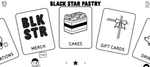
Everything about the online shop for Black Star Pastry looks like it was made with kids in mind, from the logo to the typography and icons. Most UI components have rounded corners, and simple illustrations are next to each menu item as it slides in.
Best Design Elements:
- Card menu items: Instead of a traditional navigation bar or grid layout, this online store’s homepage features several cards that serve as the menu. Customers can use the arrows at the bottom of the page or a mouse scroll function to browse the cards.
- Movable elements: Playing around with the website’s text and images is fun by dragging them around on the Locations and About pages.
- Illustration-like product images. The product images on this online shop’s website are highly contrasted and saturated, making them look like digital illustrations.
Key Takeaways:
Gamify your e-store to add interest and interactivity.
3. Allbirds
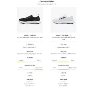
The headline, copy, and warm-toned editorial shots in Allbirds’ online clothing and shoe store effectively reflect the brand’s values of simplicity and sustainability. The company’s sustainable practices and primary product categories, including recent collections and collaborations, are easily accessible via a few homepage scrolls.
Best Design Elements:
- Informative product pages: Allbirds gives in-depth product descriptions, outlining key features and materials and providing in-depth images and videos to help customers visualize the products.
- Advanced review system: Allbirds displays customer reviews under the item descriptions. It’s a terrific method of assisting site visitors in purchasing and gaining patron confidence.
- Suggestions for related products: To entice customers and boost conversions, Allbirds displays related item recommendations on the checkout, development, and product category pages.
Key Takeaways:
Optimizing your product pages to convert eCommerce site visitors into buyers requires you to provide as much helpful information as possible in an appealing format. If you want to boost your site’s organic search engine rankings, use descriptive language and relevant keywords (SEO).
4. Nike
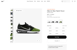
This retailer’s online storefront is a shining example of the “less is more” philosophy, from the site’s navigation to its filtering features. The products are given the attention they deserve thanks to the liberal use of white space and image blocks against a stark background.
Best Design Elements:
- Minimalist look: Nike’s online store is deceptively simple and brilliant because of this. This online shop features large, black-and-white product images and sticks to a monochromatic color scheme.
- Guest checkout: Approximately 23 percent of customers will not complete a purchase because they cannot proceed without creating an account. Luckily, Nike’s online store has a guest checkout feature that lets customers buy stuff without creating an account.
- Comprehensive helpdesk: This improves efficiency by making it easier for customers to find the information they need without contacting customer service.
Key Takeaway:
Allowing customers to check out as “guests” rather than requiring registration can help you reach more customers and increase conversions from your online store.
5. Notebook Therapy

You can purchase Korean and Japanese stationery from Notebook Therapy, an online store. This website, built on Shopify, primarily uses pastel images and illustrations to match the company’s trademark style, as the company is known for its cute designs.
Best Design Elements:
- On-brand visuals: Notebook Therapy’s online store maintains brand integrity from the hand-drawn illustrations to the sticker-like thumbnails.
- Emojis: Emojis can be found all over the website of this online store, from the banner ad to the menu labels. This shows the brand is approachable and lighthearted, just like its core customers.
- User-generated content (UGC): Photo albums from Notebook Therapy’s Instagram fans are on display. This content acts as social proof and can boost a brand’s credibility by a factor of 2.4 compared to content created by the brand itself.
Key Takeaways:
Learn about your brand’s values and who it’s meant to serve, then incorporate those ideas into your online store. Experiment with emojis and designs that evoke feelings to help customers connect with your eCommerce site.
6. AYO

AYO is a cutting-edge example of what a successful ecommerce health and technology store should look like. The modern layout of this company’s website emphasizes the value of its science-based products.
Best Design Elements:
- Gradient: AYO’s website uses the now-standard practice of incorporating color gradients into various design elements, such as the background, icons, and fonts. Web pages benefit from this design style because it makes them more engaging and helps readers focus on what’s most important.
- Background changes: The goal of AYO’s offerings is to improve the circadian health of its consumers. The designer uses both bright and dark backgrounds to show how the product can improve people’s lives during the day and night.
- Effective CTAs: AYO uses copy like “Discover AYO Science” to entice customers to explore different sections of its online shop.
Key Takeaways:
Enhance website browsing time using copy customized to the brand’s value proposition.
7. Farm To People
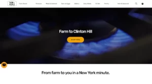
Farm To People is a node.js website with a captivating hero video that grabs the audience’s attention (with text animation and a CTA button). A floating header allows users to navigate the site and perform actions like searching or viewing products without constantly navigating back to the homepage.
Best Design Elements:
- Sticky header: Use a floating header/menu to improve site navigation and eliminate the need to scroll back to the top constantly.
- The video above the fold: A hero video can be a great way to grab people’s attention as soon as your website loads (and use a CTA button).
- Subscription form: To increase the number of emails you receive from your subscription form, add a global search bar to the footer.
Key Takeaways:
Use an eye-catching element (like a video) above the fold; the first few seconds are critical.
8. UpNature

Before scrolling, UpNature’s header is transparent to blend in more with the background image. To facilitate browsing, the navigation bar combines a mega menu and a drop-down menu.
Best Design Elements:
- Product page with a gallery: Add multiple images of your product to the product page rather than just one.
- The sticky bottom bar for “add to cart”: Adding a floating bar to product pages increases the likelihood that site visitors will hit the “add to cart” button.
- Simple footer: A simple footer can be made by employing a floating header/menu that always remains at the user’s disposal, making all links and the search bar readily available.
Key Takeaways:
Add more information and images to your product pages to make them more exciting and engaging. Provide potential customers with as much information and justification to purchase as possible.
9. Fred Perry
While the Fred Perry homepage covers a lot of ground, it is designed so that navigating it and finding what you’re looking for doesn’t feel like a chore. However, if you start scrolling back up toward the top, the menu and search bar will appear.
Fred Perry’s newsletter opt-in is not a popup but a bottom bar that floats when the page loads (but only appears below the fold). This online shop’s typewriter-style shipping, return, and payment alerts were a particular highlight during our evaluation.
Best Design Elements:
- Sticky newsletter bar: With a floating bar at the bottom of the screen, you can persistently prompt site visitors to sign up for your newsletter.
- Typewriter effect: The stunning effect will bring your website’s product pages to life.
- Multi-column drop-down menu: If you have many product categories and would like to present them hierarchically, it is for you.
Key Takeaways:
Your site’s navigation (including adding a search bar) should be designed with the user in mind, making it quick and easy to locate specific categories and items.
10. Bremont
When it comes to attracting visitors, many websites opt to start with a video before adding an image banner below it. Bremont, however, does the opposite.
Among the page’s many features are a sophisticated mega menu, a search bar (complete with frequently used terms highlighted), a top-of-page notification bar with animated text, and a rotating display of available products.
To get to know you and your tastes in timepieces on a more “personal” level, many product pages feature in-depth presentations with text, images, and even videos.
Finally, before signing up for their newsletter, you can see examples of the kinds of messages you can expect to receive.
Best Design Elements:
- Product presentations: It’s essential to create in-depth product presentations demonstrating your expertise in the field, especially in high ticket items.
- Search recommendations: Recommendations during the search process can help you find what you’re looking for much more quickly.
- Educational pages: Write informative content about your company’s background, technologies, etc., for your “about” page.
Key Takeaways:
Bremont excels at giving site visitors a compelling reason to buy their luxury goods by providing in-depth product descriptions and visuals.
What Makes A Great Ecommerce Website?
- Excellent Mobile Shopping Experience
“Mobile isn’t just a subset of the web anymore; it’s the future of the web.”
Nowadays, a mobile shopping experience that is both fast and simple is necessary. Why? Nearly 80% of online shoppers have used mobile devices to complete their purchases. In addition, mobile commerce accounts for over 67 percent of all online sales.
Google, too, loves mobile-optimized sites. Successful eCommerce websites today necessitate a responsive web design that improves user experience and search engine optimization.
- Using a mobile-friendly website builder or a mobile-friendly WordPress theme, you can quickly and easily create a website with excellent mobile performance.
- Google’s Mobile-Friendly Test is a quick and easy way to check for responsiveness.
- If you want people to be able to tap your phone number and make a call easily, you should display it as a number rather than an image.
- To make filling out forms on mobile devices less chore, field sizes should be more prominent.
- They will leave immediately if your website is not optimized for mobile devices. This will result in a decline in sales.
All elements, no matter how small, must respond to touches and swipes.
- Easy Online Store Navigation & Searching
“The first rule of usability: Don’t make me think.”
Your navigation bar must be neat and obvious, and you should make it sticky so it’s always visible. Even more, if you use many different categories, you should make a mega menu to arrange them into columns, complete with links, images, etc.
In addition, some customers will be looking for something very specific that may not be listed in your menu; therefore, you must provide a search field. Improve the speed of your searches by incorporating real-time results and suggestions. Besides the usual header area, a helpful footer can be made with features like quick links, company info, contact information, and more.
In a nutshell, provide a top-notch menu and search bar to make it as easy as possible to locate specific items and sections.
- Branded Color Scheme/Design
“Design is not just what it looks and feels like; design is how it works.”
Share your identity and messaging with a unified color scheme and consistent design throughout (down to the tiniest of details).
This rule applies everywhere, whether it’s your website, a social media profile, a newsletter, a blog, or any other form of online or offline presence. So, ensure your visitors are reminded of your brand at every turn.
Make an impression that lasts by addressing your target audience with powerful messages, eye-catching visuals, and text that sets you apart from the crowd.
- Clean the Shopping Cart & Checkout
“Simplicity is the ultimate sophistication.”
If you want to see more success with online sales, these are the two most important factors.
Many ecommerce website owners still need to figure out shopping carts and checkouts, although doing so is incredibly easy if you follow one simple rule: keep it simple.
Potential buyers may need to change their ecommerce website due to a complicated checkout process. As a result, you will reap many benefits from streamlining (try a one-page checkout) and maintaining a minimalistic aesthetic. In addition, the best place for the shopping cart is in the upper right corner (simply because that’s where most of us naturally look).
The number of items in the cart can be displayed on the icon, and a drop-down menu containing a link to the checkout page can be activated with a single click.
- Simple Is Better
We’ve emphasized it several times since we can’t exaggerate how important clear and simple design is.
Several ecommerce website owners use strange color schemes, animations, and special effects that add unnecessary complexity to their products.
Despite the possibility of improving the user experience, many web administrators err by going overboard. Also, the page’s increased complexity may result in a slower loading time, which is undesirable.
To make your ecommerce website and items simpler to scan, experiment with white space and simple font (which doesn’t have to be significant but is worth investigating).
- Integrate Social Proof
Eighty-plus percent of buyers say they put as much stock in other people’s opinions as they do in the advice of friends and family when making a purchase decision.
In other words, if you want more sales, you must let customers rate and review your product. Sending a customer an email survey or embedding a review system from a service like Trustpilot or Google Reviews onto your site are viable options for gathering customer feedback. Using a unique hashtag on Instagram to collect user-generated content and then incorporating that feed into your online store is another way to boost your social proof.
You can increase your chances of success by convincing them to record a video for you. As a helpful hint, you can offer a discount on their next purchase in exchange for a review.
7. Focus On User-Friendly Navigation
A website that is hard to understand is a bad sign for an online store. A 10-year-old should be able to navigate your business from the very first point of contact through the checkout process. Users will leave a site that has a difficult-to-navigate layout. Most places we’ve looked at have an organized and straightforward design.
KISS stands for “Keep it simple, silly,” and it’s a rule that advises people to do just that.
To succeed with your ecommerce website, you must adhere to it at every stage of development.
The following elements may require adjustments to ensure a proper response:
- Buttons: The size and margin should be adapted to prevent errors.
- Menu Navigation: It may be necessary to create separate menu navigation to ensure adequate sizing and padding.
- Phone Numbers: They should be displayed as numbers, not images, to allow users to tap to call quickly.
- Form Fields: The size of fields should be increased for easy completion and submission on smaller screens.
- Think Like the Customer
Go to your rivals’ sites and see if you can spot any design flaws. Please find out the possible issues their customers are having and then address them on your website. Voila! You can have a user-friendly website without incurring any unnecessary costs.
Build customer personas better to understand their wants, needs, and preferences. Then you need to design a site that is tailored to their interests.
Before making your website public, have potential customers try it out. Incorporate their feedback to provide a more personalized experience for site visitors. Does the test run from potential customers on your site before taking it to live? Integrate their responses to offer a more tailored site to your visitors.
- Use High-Res Product Images
All online shops must have high-quality images. Online purchases need more tactile satisfaction than in-store purchases. High-resolution images, on the other hand, allow site visitors to form the clearest mental picture possible of your product, simplifying their purchasing process.
- Social Proof/Trust Signals
Most consumers (99.99%) read reviews before purchasing, with 96% actively seeking negative feedback.
Consequently, not displaying testimonials on your site may be a mistake. Positivity bias is also indicative of something more profound.
It would help if you painted an accurate picture for your clients. Sharing ratings from credible third-party sites like G2 or Trustpilot would be great.
Conclusive Thoughts
Web design for online stores is crucial. Showing off your company’s unique character in the ecommerce website’s layout is critical.
While it’s great that you’re thinking outside the box, your ecommerce website design and color palette should still accurately represent your brand and your preferred aesthetic. It would help if you ran some A/B tests on your website to see how well it performs and keep making adjustments until you find what works best.
Remember that it will be complex to identify the optimal layout for your ecommerce website, but once you do, you’ll be rewarded with a deluge of buyers!
FAQs On Ecommerce Website Design
What is an ecommerce website, and how does it work?
“ecommerce” means electronic commerce—selling and accepting payment online. The concept is often broken down based on who the participants are: business to consumer (B2C), business to business (B2B), consumer to business (C2B), consumer to consumer (C2C), business to government (B2G), and government to business (G2B).
One of the biggest benefits of having an ecommerce website for your products and services is the ability to develop a bigger customer base. Because you aren’t selling exclusively from a physical location, you can sell your products globally. There are several other benefits to having an e-commerce website, including:
- Around-the-clock sales: Your ecommerce website always stays open, so potential customers can shop for what they need, no matter the time of day.
- Reduced inventory costs: A brick-and-mortar store must always stay stocked. You can keep your inventory low using drop shipping with an online store, meaning you ship straight from the manufacturer to your customer.
- Additional cost savings: An online store saves money on overhead costs, like rent. Online businesses also require fewer employees.
- Scalability: When you start an ecommerce business, you can start small and grow as you need. Finding a new location can be more challenging if you outgrow your brick-and-mortar store, which may incur higher costs.
What is responsive design of ecommerce website?
Responsive design aims to create an ecommerce website that looks and works well on various devices and screen sizes, like desktop computers, tablets, and smartphones.
What is user experience (UX) design?
User experience (UX) design is designing an ecommerce website or digital product with the user’s experience in mind as ease of use, accessibility, and user satisfaction.
What is user interface (UI) design?
User interface (UI) design designs the visual elements and layout of an ecommerce website or other digital product, including the placement of buttons, menus, and other interactive elements.
What is a prototype?
A prototype is a working model of a website or app created to test its functionality and usability before it is launched. It includes interactive elements and some design elements but is not a fully polished product.
What is a content management system (CMS)?
A content management system (CMS) is a software platform allowing website owners to easily create and manage content without requiring coding or web development knowledge. Popular examples of CMS platforms include WordPress, Drupal, and Joomla.
