The idea in your head—that one big picture—takes its sharpest turn from dream to reality once it becomes something tangible. Whether you’re turning a hobby into a business or filling a gap in the market, that’s the moment your brand is born.
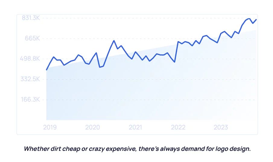
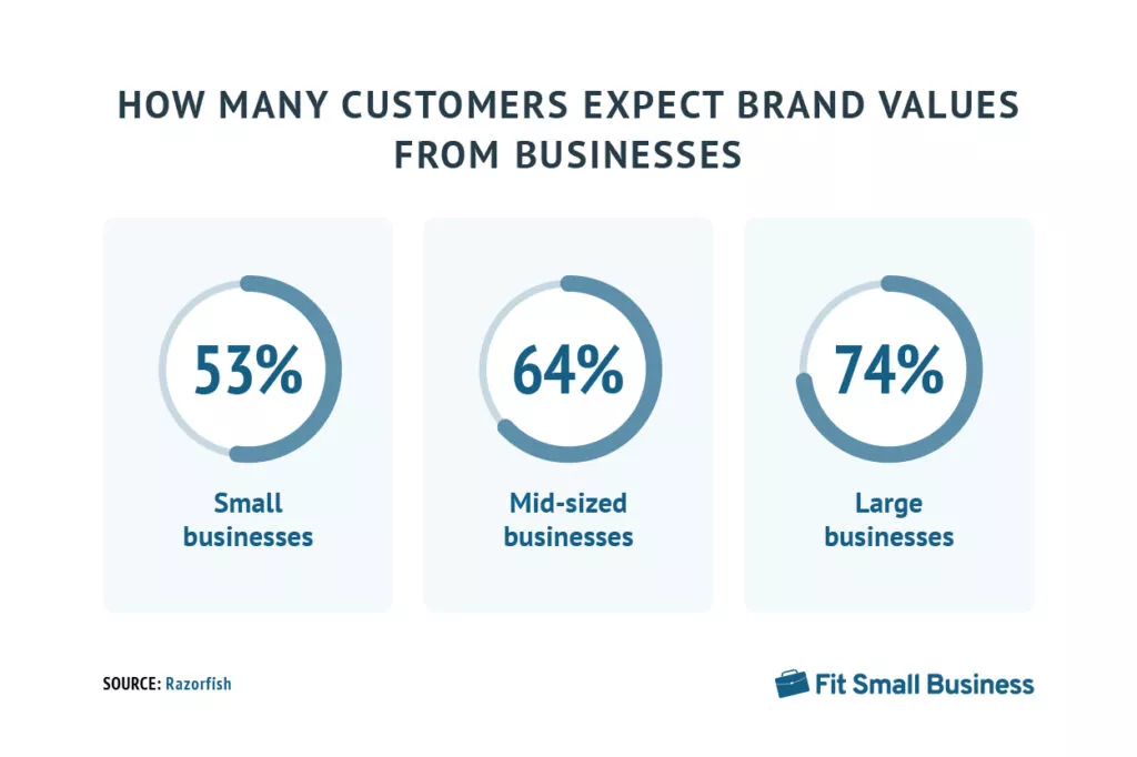
Your brand is a guide to what you stand for, how you want to make people feel, and the value you bring to the world. Within it lives brand identity—a visual representation of your brand from logo design to typography choices to color palette. It is a system of rules and visual assets that guide the creative direction of your brand at every step.
What is branding design?

Brand identity design is the act of creating your brand’s visual identity, from your logo to your photographic style to your color scheme. It is a system of rules and visual assets that guide decisions across your website, social media, packaging, and more. It is just one aspect of a brand’s complete picture—your brand is so much more than a symbol or wordmark. Branding answers questions like: What do I want people to feel when they engage with my business? Why should people care about my mission? What are my company values? A branding exercise will culminate in a clear picture of your brand, ultimately setting the tone for design.
Elements of Excellent Branding Design:
- Logo
Your logo is a graphic representation or symbol that identifies your brand. It can be a wordmark (sometimes called a logotype), meaning that it is primarily text, or an icon (or logomark), which is an image or graphic with no type.
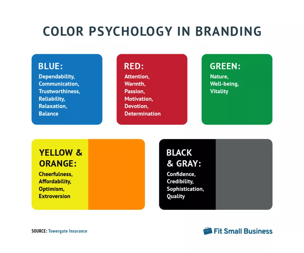
- Color
Deciding on a color scheme (or palette) helps you maintain brand consistency across every surface on which your brand appears, from packaging to social media marketing.
- Typography
Typography encompasses fonts (or typefaces) and how the type is spaced, arranged, and designed. Your brand guidelines will include a suite of fonts and typography rules that you will use consistently to represent your brand.
Top Branding Design Examples of 2024:
1. Omsom
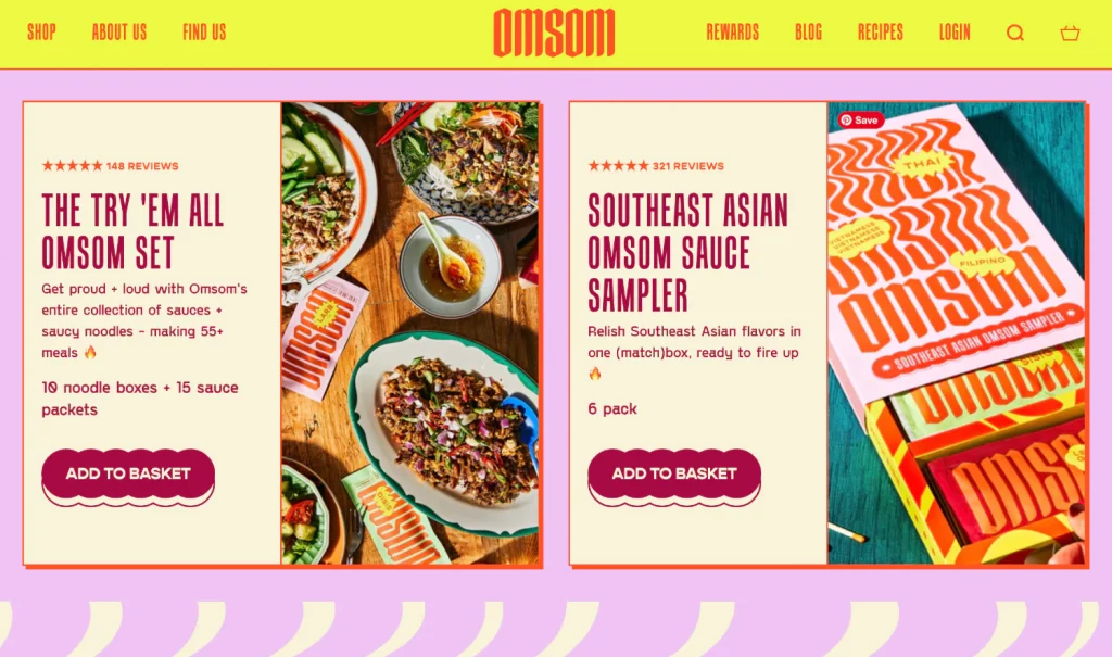
Omsom, a culinary trailblazer founded on a spirited “rowdy” philosophy, has redefined the food landscape with its innovative approach to Southeast and East Asian flavors. Specializing in pre-mixed flavor packs, Omsom empowers home cooks to recreate authentic and bold dishes in their kitchens effortlessly. The brand’s ethos revolves around authenticity, respecting traditional recipes while making them accessible to a diverse, contemporary audience.
Beyond products, Omsom fosters a sense of community, encouraging connections among individuals with a passion for adventurous cooking. Cultural storytelling is integral to the brand, enriching the customer experience by highlighting the heritage and significance behind each dish.
2. Mount Lai
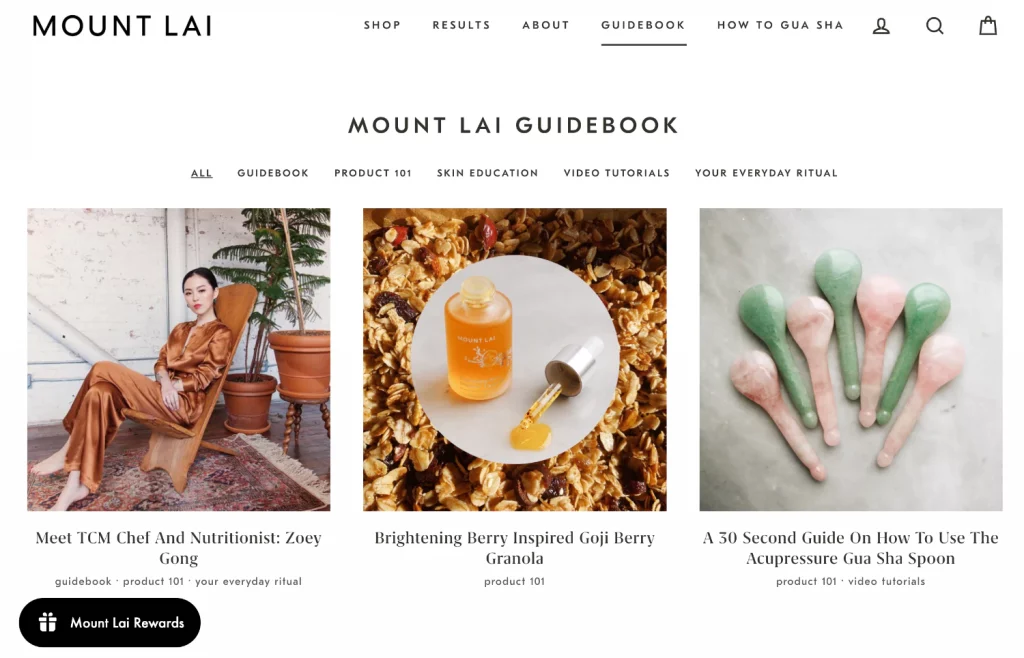
Mount Lai, a beauty brand deeply anchored in the principles of traditional Chinese medicine, embodies simplicity and versatility. The brand is distinguished by a straightforward yet adaptable wordmark, designed to seamlessly integrate into various mediums such as packaging, websites, or even embroidered onto spa headbands. With a commitment to minimalism, Mount Lai’s identity is further enriched by meticulously crafted illustrated elements, a curated suite of fonts, and a deliberately limited color palette. The brand’s philosophy aligns with the belief that the most straightforward and modern logos resonate exceptionally well with customers, as expressed by designer Skyler Hestnes.
3. Atacz
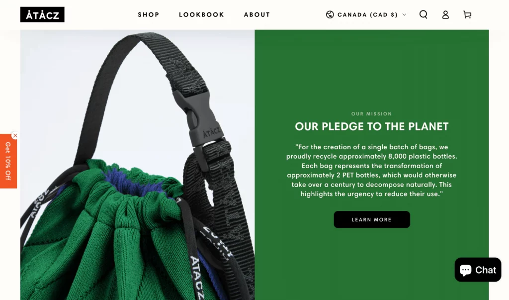
Mount Atacz is an audacious brand driven by a profound mission: crafting artistic accessories while championing sustainable business practices and compassionate processes. Mount Atacz employs a design strategy characterized by striking photography and a modern aesthetic in aligning its brand with the stylish consumers it aspires to attract. The juxtaposition of this visual style is complemented by articulate copywriting and website content that unequivocally communicates the brand’s commitment to sustainability and ethical practices. Mount Atacz’s ecommerce homepage serves as a visual and narrative gateway, inviting visitors into a world where bold design meets conscientious consumerism.
Deep dive into SMM panels here.
4. Glossier
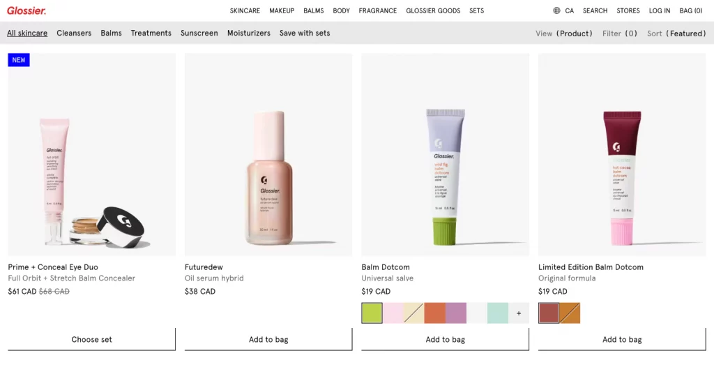
Glossier, an iconic beauty brand born from the acclaimed blog Into the Gloss, epitomizes simplicity in its brand design. Taking a minimalistic approach, Glossier’s brand identity is epitomized by two distinctive versions of its logo: a straightforward wordmark and a stylized capital G. The iconic presence is emphasized by its restraint from flashy and colorful elements. The ecommerce homepage for Glossier reflects this minimalistic charm, creating a clean and inviting space for beauty enthusiasts.
5. Big Bud Press
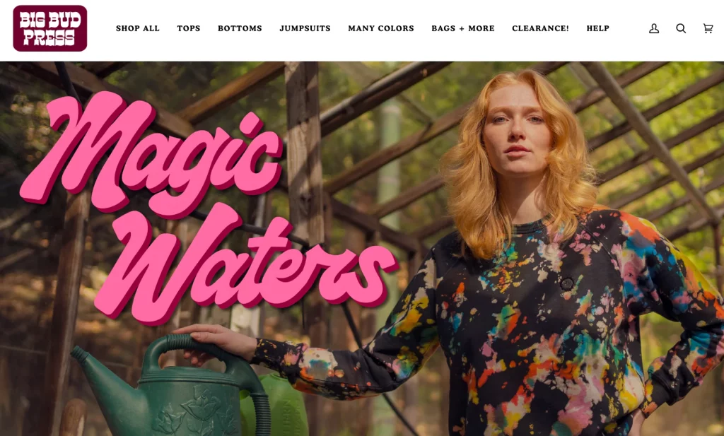
Big Bud Press, an ethical clothing brand from the vibrant Los Angeles, has positioned itself as a beacon of diversity and sustainability in the fashion industry. Specializing in the production of a kaleidoscope of vibrant jumpsuits, overalls, tote bags, and knit basics, Big Bud Press has become synonymous with a bold and eclectic aesthetic. The product range boasts an extensive array of colors, presenting a seemingly boundless spectrum that might initially give the impression of an absence of a defined color scheme. However, upon closer inspection, the discerning eye will recognize the cohesive thread woven through the vibrant tapestry of Big Bud Press’s offerings. The signature vintage oranges, golds, and ochres act as anchoring elements, subtly yet consistently weaving through its website, Instagram grid, storefront design, and sunshine logo.
6. Brand Noted
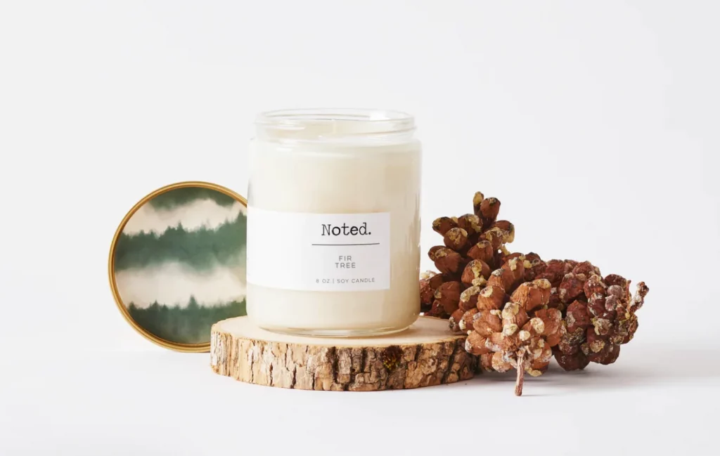
Noted, a brand specializing in glass container candles styled with natural elements adopts a neutral branding palette to complement its simple yet evocative products. The brand’s deliberate choice of neutral tones, punctuated by colors inspired by nature, extends consistently across its website and social media posts. This strategic design choice is intended to evoke a specific emotional response from customers, as expressed on Noted’s About page. The neutral yet nature-inspired palette is intricately woven into the fabric of Noted’s branding, from the logo design to the layout of its online presence. This effective design serves a dual purpose – visually telling the story of simplicity and complementing the intimate and personal emotions of lighting a candle, creating a cohesive and resonant design experience.
7. Schoolhouse:
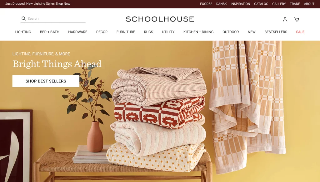
Schoolhouse, an ethically manufactured lighting and home design brand, aims to provide a new generation of heirlooms that inspire people to create unique, meaningful spaces to live and work. This mission is visually communicated through the modern fonts, clean layouts, and a vintage-inspired color scheme. Schoolhouse’s design reflects a harmonious blend of modernity and nostalgia, creating a visual identity that resonates with its mission to offer enduring and meaningful design elements. The intentional use of vintage-inspired colors contributes to the timeless aesthetic, allowing it to stand as a beacon for those seeking ethically crafted and visually captivating home design solutions.
8. Wild One:
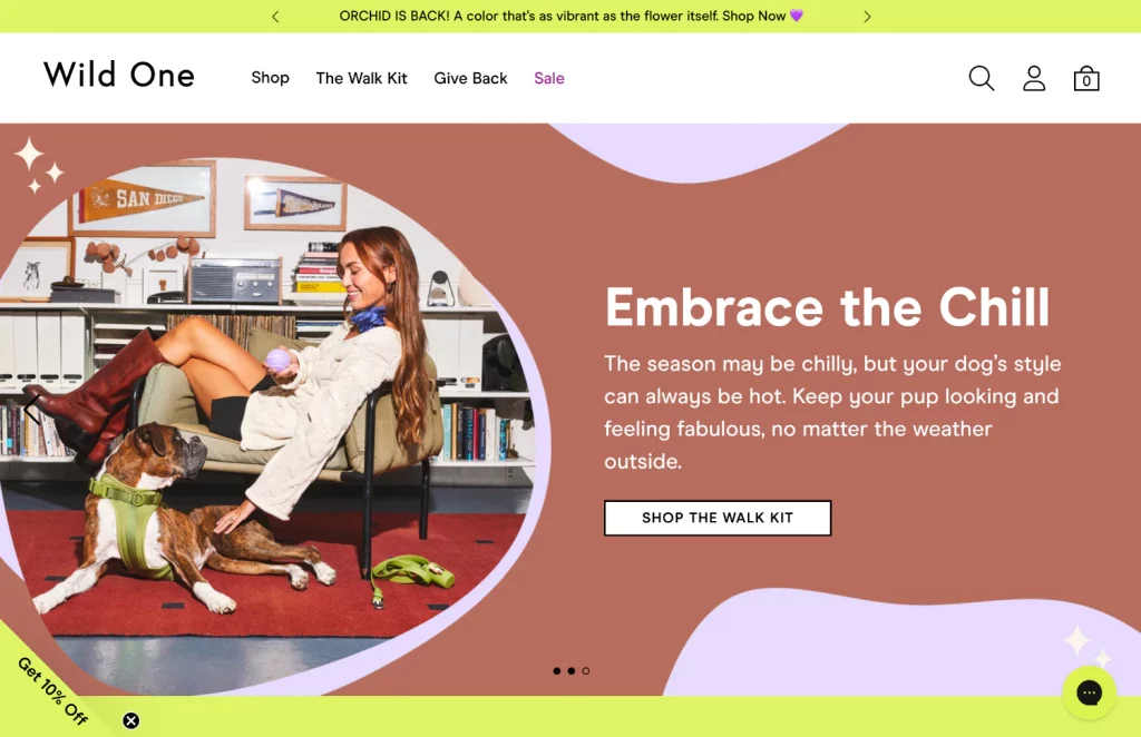
Wild One, a pet accessories brand, eloquently communicates its mission on its website: “We’re on a mission to make life with your dog look as good as it feels.” This dedication is not merely a statement; it permeates the entire user experience when visitors land on the homepage. Wild One employs an array of strategic design elements to captivate its audience, including the use of Gen Z and millennial models in photography, presenting an aspirational lifestyle that resonates with its target demographic. The brand’s fresh color palette, simple fonts, and bold layout are carefully chosen to appeal to the aesthetic sensibilities of its audience. Wild One ensures that its essence is not confined to a mission statement but is vividly and intuitively felt by every visitor exploring its visually compelling ecommerce homepage.
9. Hero Bread:
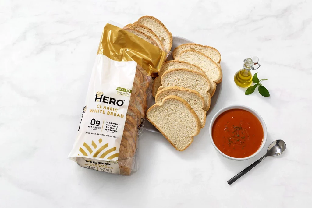
Hero Bread, a low-carb bread with health benefits, tailors its branding to cater to a health-conscious audience. The brand strategically utilizes a light and natural color palette, coupled with exceptional product photography, allowing site visitors to virtually taste the product and comprehend the brand’s essence without taking a bite. Hero Bread’s minimal packaging design spotlights the bread’s nutritional advantages. The commitment to health and simplicity is effectively communicated through its branding, creating a cohesive and enticing identity for those seeking a nutritious bread alternative.
10. Bombas:
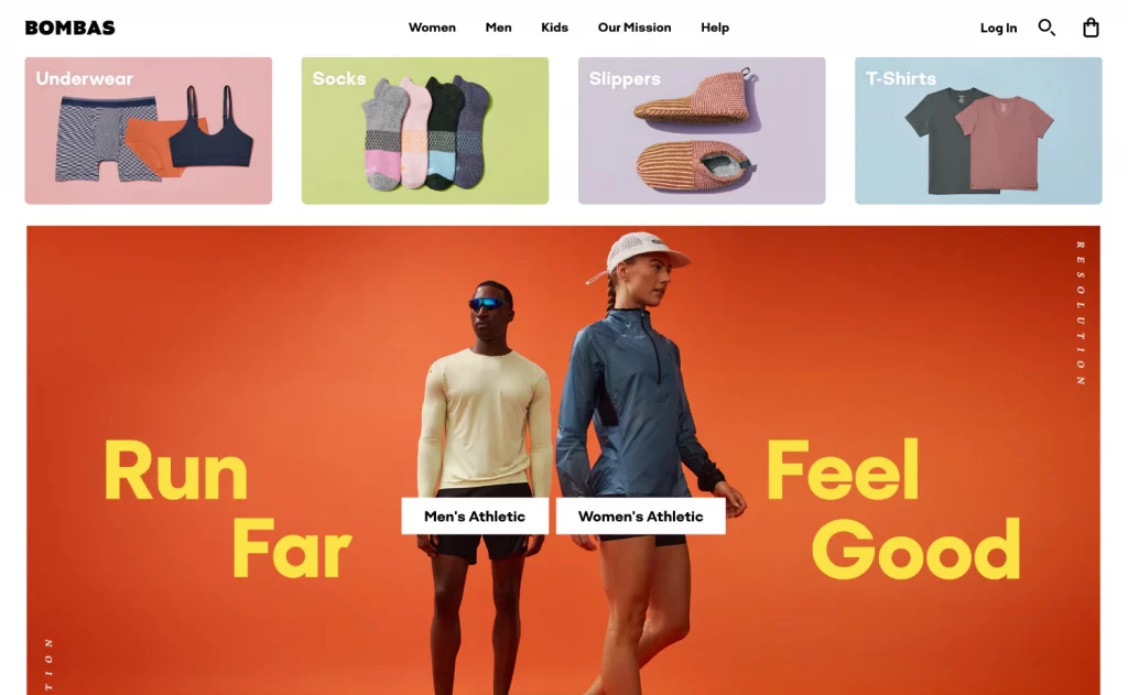
Bombas, a brand emphasizing quality and innovation in its products, combines these elements seamlessly with a vital mission. The ecommerce homepage is strategically designed, with product photos taking center stage, while “Our Mission” prominently appears in the main top navigation. Bombas employs a vibrant color palette, both in website accents and its products’ diverse spectrum of colors. Notably, a single blue accent hue threads through the entire site, demonstrating the importance of maintaining consistency in design for a bold and colorful brand. Bombas collaborated with a branding agency to craft its image and establish comprehensive brand guidelines, ensuring a cohesive and impactful representation across its online presence.
11. Parks Project:
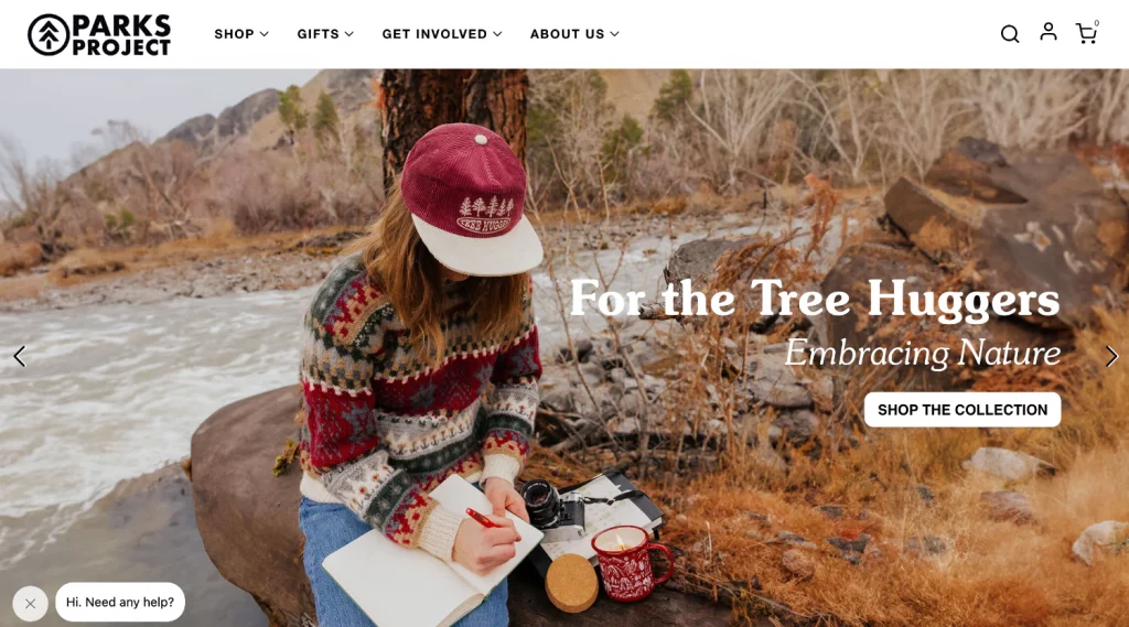
Parks Project, an official partner of the National Park Service in the US, is more than just a merch brand; it is a mission-driven entity aiming to raise funds for their preservation and spread awareness about climate change’s impact on national parks. The brand’s e-commerce homepage exemplifies a meticulous approach to brand design, catering to a young, environmentally-conscious audience. By seamlessly blending modern fonts, retro graphics, and vintage-inspired photography, Parks Project creates a visual language that resonates with its target demographic. The company’s commitment to sustainability and its advocacy for national parks are communicated through its products and embedded in every visual element of its ecommerce homepage, forging a connection with like-minded consumers.
12. KimChi Chic
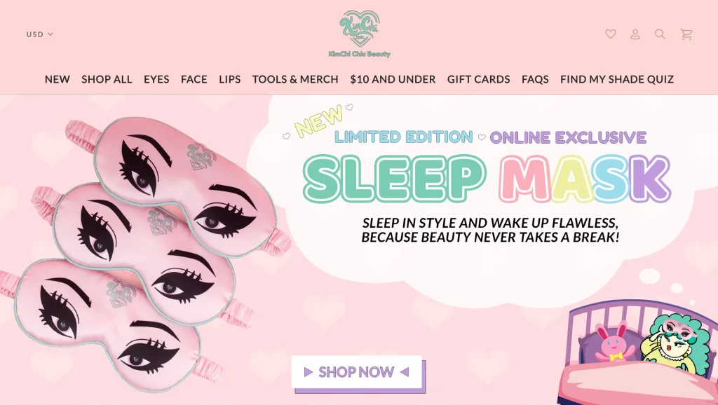
KimChi Chic Beauty, the brainchild of the vibrant drag queen KimChi, is a celebration of individuality and a fusion of artistry and beauty. In an interview with Vice, KimChi described her aesthetic as “bionic doily,” envisioning her aura as an array of ultra-violet colors that spew glitter, celebrating all things cute, fun, weird, and exotic. This distinct and vivid character is impeccably translated into the brand’s design philosophy, evident from the moment visitors land on the ecommerce homepage.
The color and font choices on the homepage are not mere design elements; they are a visual representation of KimChi’s personal brand. The seamless integration of these choices with KimChi’s vibrant and eclectic Instagram presence creates a cohesive and immersive experience for visitors.
Best Practices for Branding Design:
1. Keep it Simple: Emphasizing the impact of simplicity in visual identity, the advice underscores the effectiveness of a straightforward wordmark over a complex logo. Pairing a well-chosen font with the name and adhering to a simple color palette is a pragmatic option, especially for those with limited creative resources.
2. Consider Versatility: Beyond simplicity, the importance of a versatile logo is highlighted. A logo should seamlessly adapt to different backgrounds, sizes, and surfaces, ensuring consistency across various platforms, both digital and tangible.
3. Avoid Brand Dilution: The caution is against diluting the brand with inconsistent fonts or logo variations. Consistency in visual patterns is critical for brand recognition, regardless of multiple logo versions or a diverse color palette.
4. Research Competitors and Inspirations: Underlining the significance of market research and seeking inspiration, the advice encourages businesses to examine competitors and admired brands. This ensures alignment with industry expectations and prevents tonal mismatches in brand design.
5. Hone in on a Color Palette: Choosing a consistent color scheme is pivotal for brand coherence across business decisions. Whether for the website, product development, or social media posts, a well-defined color palette provides a visual anchor, with a suggested emphasis on a distinct pop color as the brand’s identity.
6. Balance Logo Usage in Social Marketing: While logos are crucial, the guidance recommends moderation in their usage on social media. In ecommerce, where the first customer touchpoint often occurs on social platforms, the visual aesthetic is conveyed through image choices, colors, subject matter, and overall presentation.
7. Stay Consistent: Ensuring recognition is paramount, emphasizing the importance of consistency, a design expert underscores the value of training your audience to recognize and understand your brand’s aesthetic. Consistency extends not only to the overall brand image but also to the alignment between the brand and the products offered.
8. Branding Design Inspiration is Everywhere:
Embracing the creative process is crucial, with the acknowledgment that businesses evolve over time, leading to the refinement of brand design. Despite this evolution, the advice is to stay inspired by observing them in the surroundings, actively listening to customer feedback, and staying abreast of emerging graphic design trends.
Conclusion:
The culmination of various components forms a visual identity that goes beyond aesthetics – it becomes the essence of a brand. From the iconic logo to a carefully curated color scheme, typography choices, and the use of design elements, each aspect plays a crucial role in conveying the brand’s message and establishing a connection with the audience. This process is not merely a creative endeavor; it’s a strategic choice that shapes how a brand is perceived, recognized, and remembered.
FAQs on Brand Designs:
What do design elements and assets entail in brand design?
Design elements and assets, such as imagery, are integral for conveying the brand’s message and fostering an emotional connection with the audience. They contribute to the overall visual narrative of the brand.
How can brand design create differentiation in the market?
Brand design is essential for standing out in the market. It helps differentiate a brand from competitors, establishes a unique identity, and contributes to creating a lasting impression on consumers.
Can brand design evolve over time?
Yes, brand design is dynamic and can evolve as a business grows and adapts to changing trends. Regular refinement ensures that the brand design remains relevant and resonant with the target audience.


