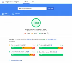
In the fleeting 3 seconds it takes for visitors to decide whether to stay on your landing page or leave, the crucial space known as “above the fold” plays a pivotal role. Analogous to the critical 30 to 60 seconds in an elevator pitch, this initial segment demands meticulous attention.
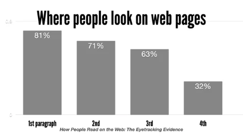
Above the fold encompasses the first visible part of a website or screen before any scrolling occurs. This section serves as the virtual storefront, offering a snapshot of your brand to visitors. Its paramount importance lies in being the initial point of interaction, setting the tone for the user experience.
As we transition from historical mediums to digital landscapes, the concept of above the fold evolves, with websites taking center stage. This evolution prompts careful consideration of layout and content, factoring in the limited time visitors allocate to browsing.
Benefits of Above the Fold Website Designs:
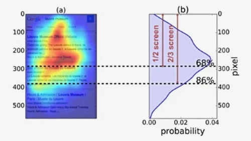
- Immediate Impact: Users see the most important information right away, increasing the chances of capturing their attention and encouraging them to explore further.
- Reduced Bounce Rates: A compelling above-the-fold section can help reduce bounce rates, as users are more likely to engage with content that is immediately relevant and interesting.
- Better User Experience: Prioritizing key information at the top of the page enhances the overall user experience by quickly delivering what users are looking for without the need to scroll.
- Mobile-Friendly Design: With the increasing use of mobile devices, designing for above-the-fold content is crucial for smaller screens, ensuring that users get essential information without having to scroll extensively.
- Call to Action (CTA) Placement: Important calls to action, such as buttons or forms, are often placed above the fold to encourage user interaction and conversions.
- Loading Time Optimization: Since content above the fold is loaded first, optimizing this section can contribute to faster loading times, enhancing overall website performance.
- Search Engine Optimization (SEO): Search engines often give more weight to content placed higher on a page. Prioritizing important keywords and content above the fold can positively impact SEO.
Real Life Examples of Above the Fold Websites:
1. Ahrefs: Elevating SEO Solutions

Ahrefs positions itself as an all-encompassing SEO tool, offering a suite of highly advanced features in both its free tools and premium plans.
Key Features:
- Striking Blue Design: The above-the-fold example features a visually striking blue background, creating an aesthetically pleasing and memorable interface.
- Clear Header Elements: Essential aspects are thoughtfully placed in the header, ensuring a seamless user experience.
- Compelling CTA Button: A prominent call-to-action (CTA) button encourages visitors to sign up, strategically positioned at the bottom for easy access.
- Captivating Slogan: Ahrefs understands the significance of impactful messaging, succinctly stating, “Everything you need to rank higher & get more traffic.”
- Social Proof Integration: Displaying social proof from the last seven days establishes credibility, fostering trust among visitors.
- Accessible Help Center: A strategically placed chat box icon directs users to the Help Center, enhancing user engagement and support.
2. Allbirds: Sustainable Fashion Footwear
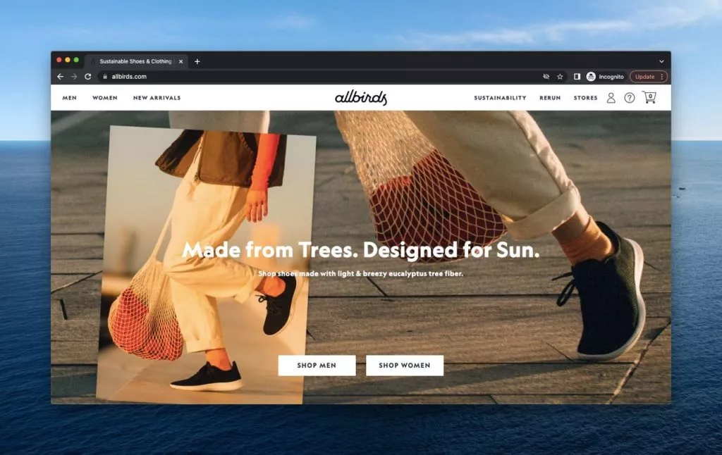
Allbirds, a sustainable shoe and clothing brand, uses its above-the-fold space effectively to showcase its commitment to natural materials.Key Features:
- Compelling Visual Content: Engaging imagery of walking legs with a focus on naturally made shoes creates an immediate connection with the brand’s ethos.
- User-Friendly Navigation: Clear category buttons in the header simplify the navigation process for visitors.
- Gender Selection: Providing gender options beneath the slogan allows visitors to tailor their experience based on their preferences.
- Seasonal Clues: Subtle hints about seasonal collections are strategically placed on the left side of the header, enticing users to explore further.
3. Apple: Innovating with Purpose
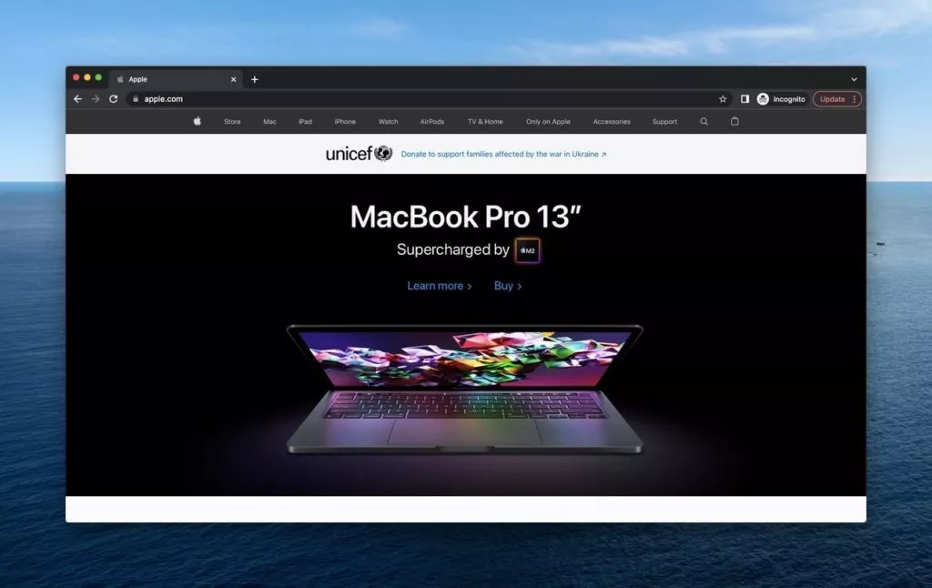
Apple, a global technology giant, leverages its above-the-fold space to introduce new products and emphasize its commitment to social responsibility.Key Features:
- Striking Visuals: A captivating image of the MacBook Pro 13 on a black background serves as the focal point, promoting the latest product.
- Action-Promoting Buttons: Clearly visible ‘Learn More’ and ‘Buy’ buttons encourage users to explore product details or make a purchase.
- Feature-Oriented Header: Multiple options related to Apple’s features in the header facilitate user navigation.
- Social Impact Emphasis: Collaborative efforts with UNICEF for war victims are highlighted under the header, showcasing Apple’s commitment to social causes.
4. Bobo’s: Wholesome and Vibrant Nutrition
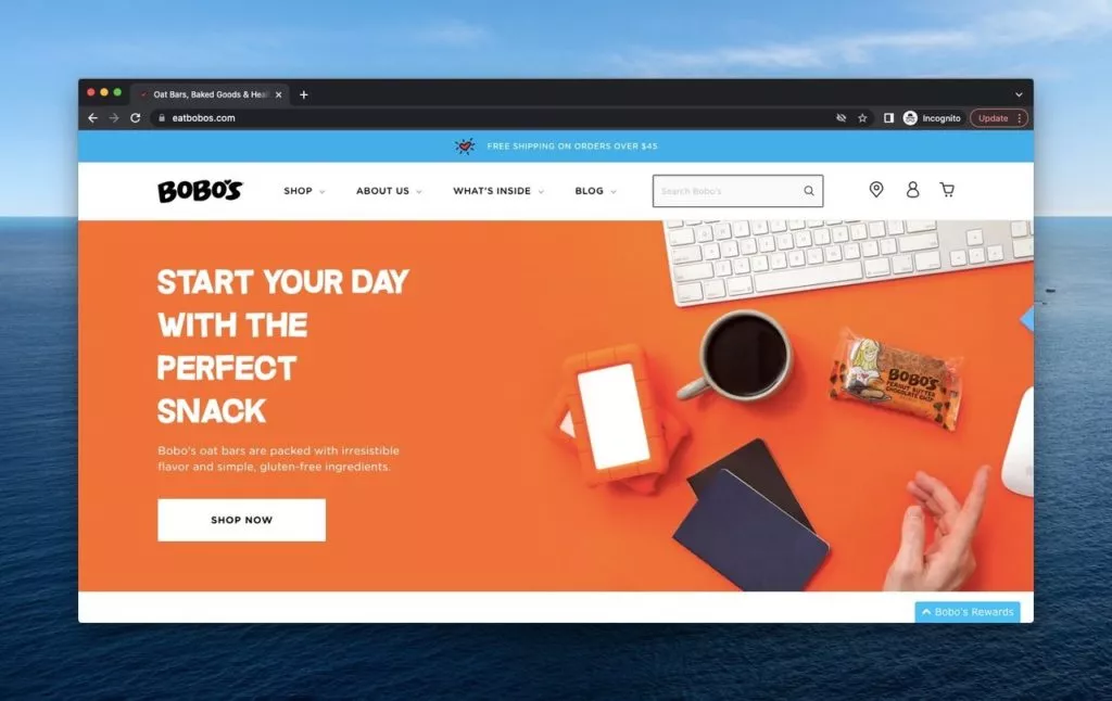
Bobo’s, a health-oriented food brand, infuses liveliness into its above-the-fold design, emphasizing the organic and gluten-free nature of its products.Key Features:
- Energetic Orange Palette: The use of vibrant orange colors infuses energy, aligning with the brand’s emphasis on health.
- Informative Articles: Articles next to the products provide information, creating an interactive user experience.
- Strategic ‘Shop Now’ Button: A strategically placed ‘Shop Now’ button encourages immediate action.
- Accessible Categories: Clearly defined categories (‘Shop,’ ‘About Us,’ ‘What’s Inside,’ and ‘Blog’) enhance user navigation.
- Shipping Campaign: A prominent campaign promoting free shipping adds a persuasive element for potential customers.
- Rewards Program: The ‘Bobo’s Rewards’ button provides additional incentives for customer loyalty, contributing to a comprehensive and strategic approach.
5. Calvin Klein: Contemporary Fashion with a Splash of Orange
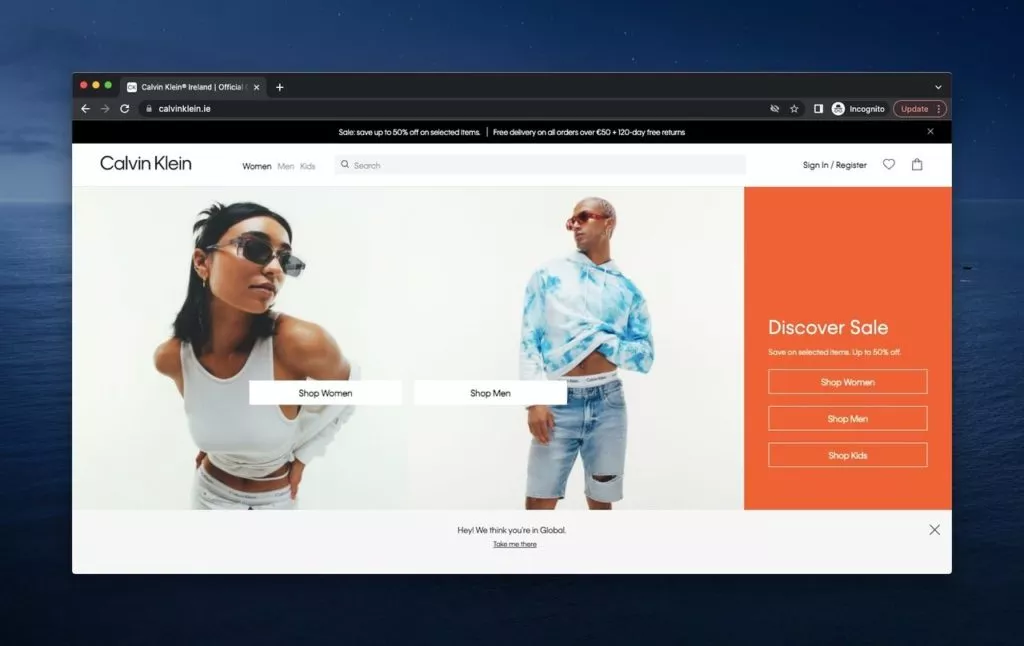
Calvin Klein, renowned for its contemporary fashion, especially in underwear, handbags, clothing, and home furnishings, employs a distinctive and direct approach in its above-the-fold design.Key Features:
- Striking Orange Background: The use of a vibrant orange background immediately captures attention, creating a visually appealing contrast.
- Sale Announcement: Calvin Klein strategically places a sale announcement at the top, enticing visitors with immediate savings.
- User-Friendly Header: The header, situated alongside the logo, offers categories, a search bar, and user customization options.
- Figures Promoting Products: Centered figures wearing Calvin Klein products serve as a focal point, promoting the brand’s offerings effectively.
- Shopping Options: Cleverly positioned shopping options next to the figures provide visitors with a seamless shopping experience.
- Interactive Bar: The interactive bar leading to another page serves as an engaging element, utilizing the power of the above-the-fold space to leave a lasting impression.
Learn about menu design here.
6. Dyson: Innovating in Darkness
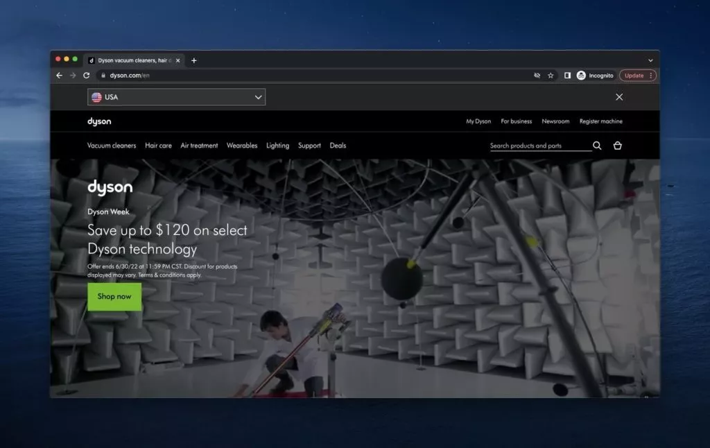
Dyson, a multinational company specializing in technological housing devices and innovations, embraces an assertive above-the-fold page with a dark atmosphere.Key Features:
- Assertive Black Design: Utilizing black as a dominant color, Dyson’s header and titles exude assertiveness and intrigue.
- Animated Visual Content: Products arranged based on location are presented through animated visual content, showcasing the brand’s progress.
- Search Bar and CTA: The above-the-fold page includes a search bar and a CTA button, enticing customers with opportunities in line with Dyson’s crowd-pulling reputation.
7. EyeBuyDirect: Visionary Glasses with a Personal Touch
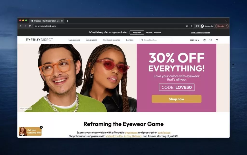
EyeBuyDirect, a glasses company offering various types of eyewear, prioritizes fast delivery and customer engagement in its above-the-fold design.Key Features:
- Engaging Visuals: Figures wearing EyeBuyDirect glasses add a personal touch, conveying different moods and styles available.
- CTA and Campaign Code: A strategically placed CTA button complements the visual appeal, encouraging immediate action. A campaign code adds an incentive for time-limited discounts.
- Welcome Offer: A welcome offer for first-time visitors, coupled with a statement about the brand’s products, provides a quick overview for newcomers.
- User-Friendly Header: The user-friendly header ensures easy navigation and reinforces the brand’s commitment to customer satisfaction.
8. FOMO: Harnessing the Power of Social Proof
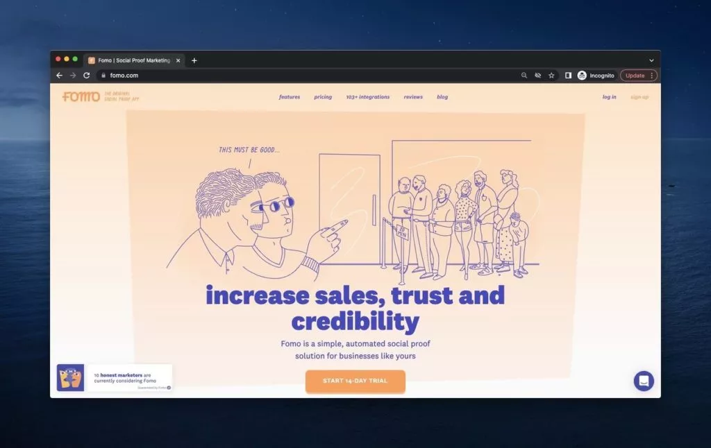
FOMO, a leading social proof tool, maximizes its above-the-fold space with a clear and casual design that resonates with its brand essence.Key Features:
- Meaningful Logo Placement: Placing the FOMO logo strategically, coupled with an explanatory tagline, adds precision and clarity.
- Category-Focused Header: Clear headers guide visitors to important categories, streamlining the user experience.
- Casual and Cool Style: FOMO’s casual and cool style, reflected in fonts and design, communicates approachability and ease of use.
- Social Proof Image: A central image effectively explains the concept of social proof, accompanied by a call to action for a free trial.
9. Fossil: Timeless Elegance and Interactive Engagement
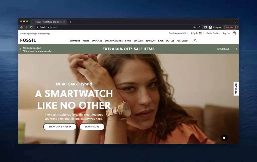
Fossil, a fashion brand with a diverse range of accessories and sub-brands, creates an interactive above-the-fold experience that encapsulates the brand’s liveliness.Key Features:
- Commercial Shoot Imagery: An interactive commercial shoot provides a lively introduction to the brand, emphasizing the newly launched Gen 6 Hybrid.
- Campaign Highlights: Fossil strategically showcases ongoing campaigns, leveraging seasonal themes to offer diverse choices to visitors.
- Interactive Header: A user-friendly header presents options before clicking, allowing visitors to choose their preferred path seamlessly.
- Above-Header Information: Above the header, Fossil displays crucial information such as order status, customer profiles, and shipping locations, enhancing user convenience and showcasing the brand’s commitment to responsibility.
10. HubSpot: Mastering Business Growth with Vibrancy
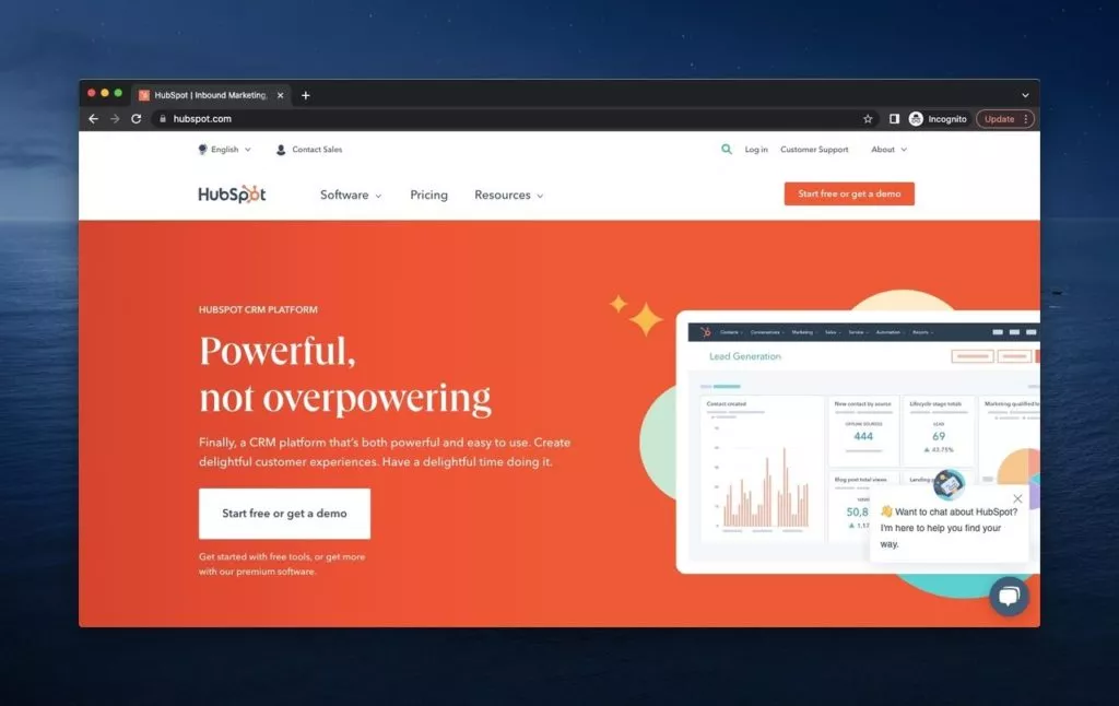
HubSpot, a leading software company specializing in inbound marketing, sales, and service software, presents a vibrant and dynamic above-the-fold experience.Key Features:
- Orange Background: The page features an engaging orange background, emphasizing energy and action.
- Chat Box Welcome: Visitors are greeted by a helpful chat box offering assistance, setting a user-friendly tone.
- Red Theme: The dominant red color throughout the page inspires users to take action for their businesses.
- Free and Premium Options: HubSpot provides details about its free and premium options, inviting visitors to explore more.
- Comprehensive Header: The header offers numerous choices, including language options, sales and customer support contacts, profile, and about pages.
- Easy Access to Details: Detailed information about the software and pricing options is easily accessible, enhancing the overall user experience.
11. Instatus: User-Friendly Status Page Excellence
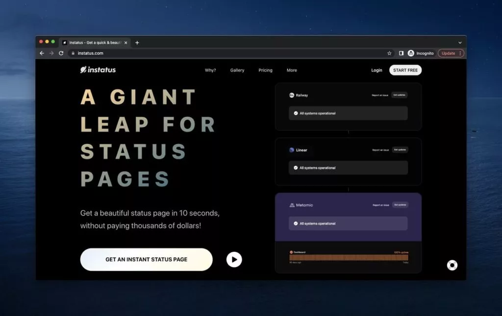
Instatus, a robust status page tool designed to prevent downtime, boasts a distinctive above-the-fold design that may appear dark but prioritizes user-friendliness.Key Features:
- Dark Theme: The dark theme doesn’t diminish user-friendliness; instead, it prioritizes essential information on the screen.
- Interactive Boxes: Interactive boxes offer insights into the company’s features, encouraging users to consider an instant status page at an affordable price.
- Informative Header: The header provides insights into why users should choose Instatus, how it works, pricing details, and more.
- Start Free CTA: Instatus actively engages visitors by inviting them to start for free, indicating a commitment to user inclusivity.
12. Kylie Cosmetics: Glamorous Collaboration Spotlight
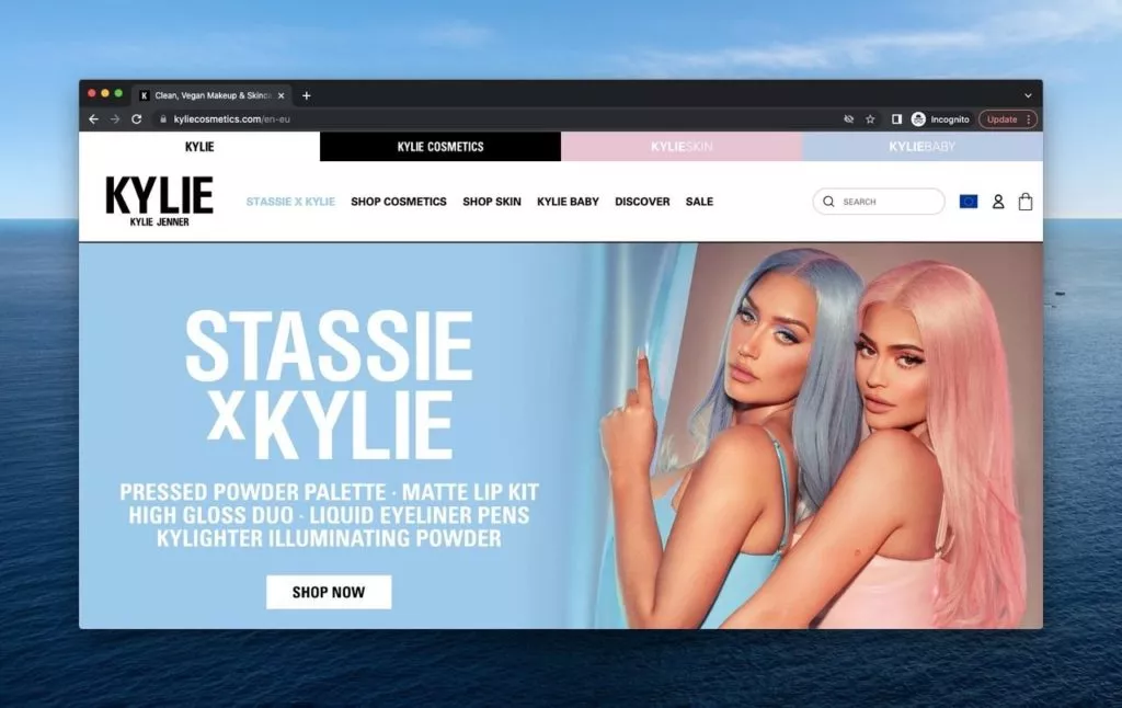
Kylie Cosmetics, the cosmetic brand founded by the iconic Kylie Jenner, showcases clean and vegan makeup and skincare products with a focus on a recent collaboration.Key Features:
- Interest-Based Sections: Visitors can choose areas of interest, altering sub-sections accordingly, maintaining a personalized experience.
- Collaboration Focus: The current collaboration with Stassie Karanikolaou takes center stage, with a substantial part of the page dedicated to its features and a prominent CTA button.
- Owner’s Presence: Kylie Jenner and her collaboration partner, Stassie, grace the above-the-fold section as the faces of the brand.
13. Little Caesars: Simple and Savory Pizza Pleasures
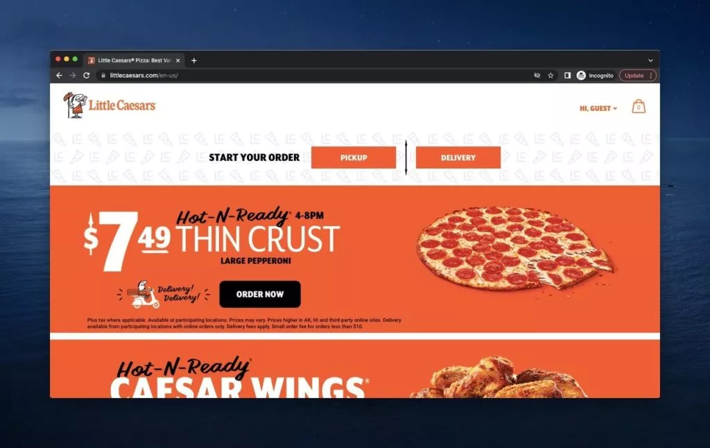
Little Caesars, a renowned pizza brand, adopts a simplistic yet effective approach in its above-the-fold design, catering to the urgency of hunger.Key Features:
- Guest Greeting: The page welcomes visitors with a friendly ‘Hi, Guest’ message, creating a personalized touch.
- Order Details: A clear display of the shopping bag contents keeps users informed about their selections.
- Prominent Campaigns: Featured campaigns, highlighting affordable and appealing options, take center stage to capture attention.
- User-Friendly Order Start: Initiating an order is straightforward, allowing users to choose between pickup or delivery for immediate satisfaction.
14. Melula: Capturing Childhood Innocence in Colors
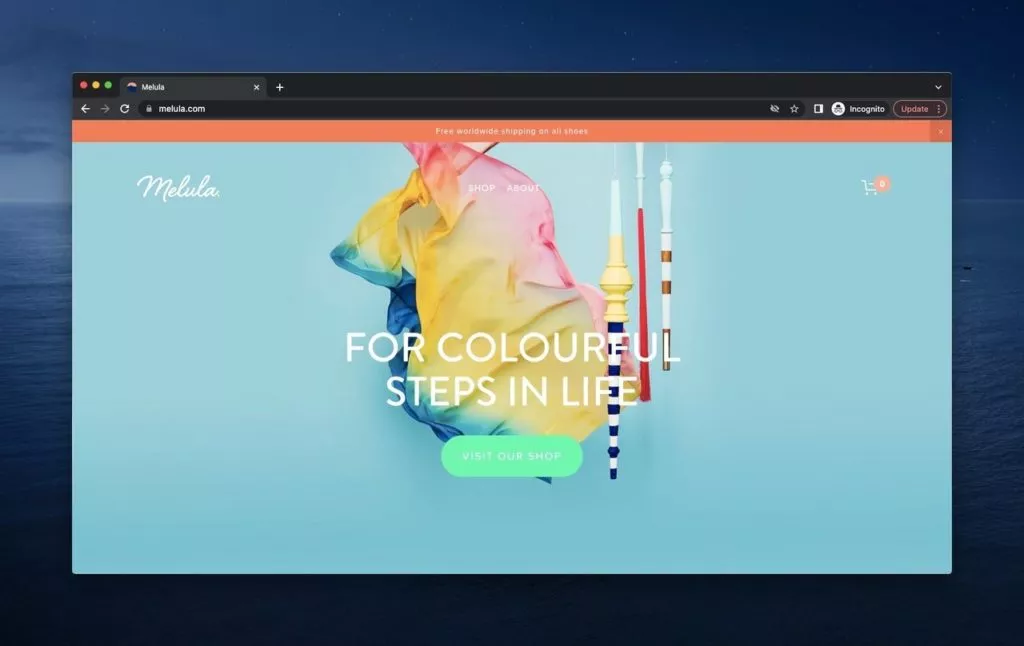
Melula, a children’s fashion brand specializing in shoes and accessories, presents a simple yet vibrant above-the-fold experience, reminiscent of the innocence of childhood.Key Features:
- Colorful Imagery: The use of mild tones and colorful items creates a visually appealing representation of childhood innocence.
- Explicit Message: Melula’s message is straightforward, inviting visitors to take a step on the page through a concise CTA button.
- Free Worldwide Shipping: The enticing offer of free worldwide shipping is prominently emphasized at the top of the shop and about pages.
15. Oskar Gydell: Handcrafted Elegance with a Summer Touch
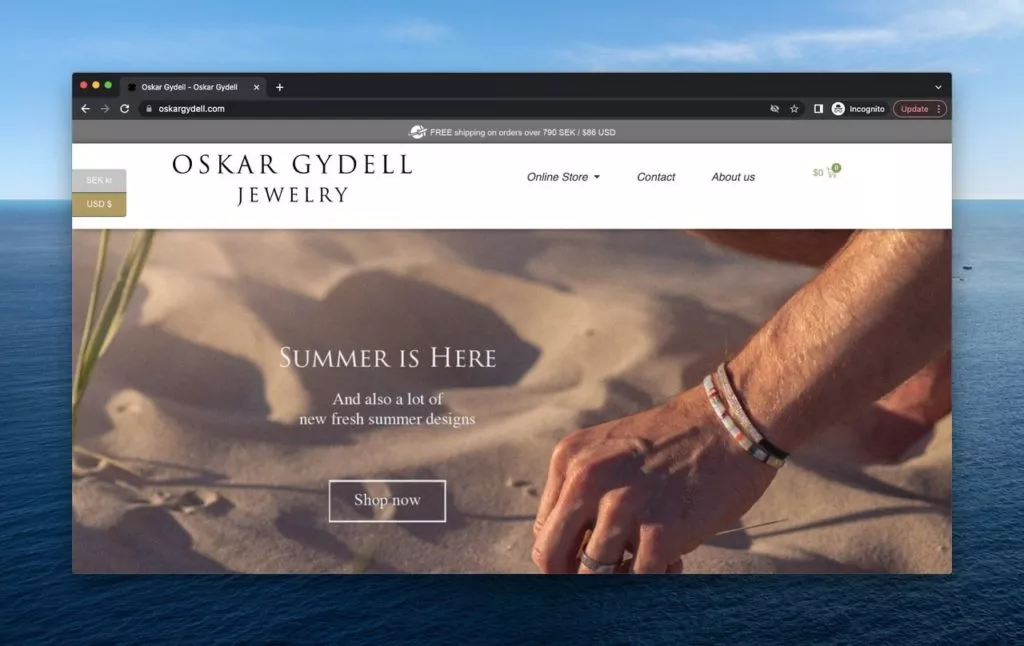
Oskar Gydell, a Swedish jewelry business crafting handmade and unique jewels, takes a distinctive approach in its above-the-fold design, offering currency options based on location and promoting summer-themed jewels.Key Features:
- Currency Options: Oskar Gydell provides currency options based on the user’s location, enhancing user experience.
- Free Shipping Promotion: The brand highlights free shipping for orders over $86 USD, encouraging visitors to explore more.
- Seasonal Promotion: The summer-themed promotion captures attention with a purist image and a compelling call to action.
16. Walmart: A Comprehensive Retail Experience at Your Fingertips
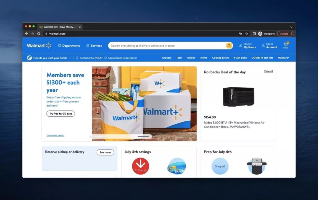
Walmart, a retail giant with diverse stores, presents a bustling yet user-friendly above-the-fold design, offering interactive features, categories, and timely opportunities for consumers.Key Features:
- Interactive Sections: Walmart’s above-the-fold features interactive elements, showcasing new opportunities, sales, and discounts.
- User-Friendly Navigation: Despite its crowdedness, the design ensures everything is intuitively placed, providing a user-friendly retail experience.
- Header Categories: Categories on the header allow users to navigate based on location, needs, and dates, enhancing personalization.
Wrap Up:
Though we deal with the whole page, the above the fold is the first thing that attracts attention. Therefore, it is really important to give importance to having an effective above the fold page.
We hope that you enjoy the examples, and they might be the inspiration you are searching for your website.
FAQs on Above the Fold Websites:
How Should an Above the Fold Example Be?
There are some criteria you should be careful about as follows:
- Simplicity is the best, do not create any complexity.
- Be crystal clear, do not beat about the bush.
- Avoid using long quotes and texts.
- Use images and visual help.
- CTA will help your visitors take action and arrange your buttons accordingly.
- Create a user-friendly and engaging above the fold.
Why Do You Need a Good Above the Fold?
Because if you do not care about above the fold, you will have to increase your conversion rate and user engagement.
It also gives the idea of how much you care about your product and its promotion to the visitors.
It would be best if you remembered that the visitors want to feel fascinated and valuable. If you skip this detail in the above the fold, that will create a wrong impression about you.
Why is the Above the Fold More Important than the Below the Fold?
Because above the fold firstly greets the visitors and creates the actual impact. Below the fold, which refers to the later part of the page, is the second step during the surfing process. That is, below the fold is the second rank in importance, and you see it when you scroll down. You can also say that below the fold is not a causal factor for the visitors after they are convinced that you are professional.


