Every 404 HTML template is a potential touchpoint—an opportunity to demonstrate your brand’s creativity while guiding the users back on track.
In the fast-paced digital landscape, the 404 error page represents more than just a technical glitch—it’s a powerful opportunity to enhance user engagement and fortify your brand’s presence. Rather than merely signaling a “page not found” error, a well-crafted 404 page can transform user frustration into a chance for meaningful interaction and brand reinforcement.
Consider this: 404 errors account for approximately 2-5% of all website errors, affecting millions of user experiences daily. This statistic underscores the importance of not letting these moments slip by unnoticed. Instead, website owners must view this as an invaluable opportunity to captivate the audience and guide them back to the heart of the content.
Creating a custom 404 page is a great way to do so, and to make things easy on yourself, you can use a 404 page not-found template.
HTTP Status Codes: Unveiling the Origins and Evolution of the 404 Error Page
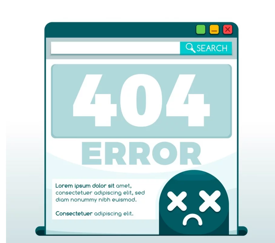
The designation “404” for error pages carries a fascinating history rooted in the early days of the internet, dating back to around 1990. Contrary to popular myths suggesting that 404 might reference an old server room or Tim Berners-Lee’s office, this code was chosen arbitrarily to represent client-side errors, including the “Page Not Found” status.
This error occurs when a user tries to access a page or file that does not exist on the server. The presentation of this error can vary, but each format communicates the same essential message.
Philosophies of 404 Page Design
There are primarily two schools of thought regarding designing 404 error page templates: the minimalist approach and the more elaborate, user-centric designs. The minimalist philosophy advocates for a straightforward, no-frills error page, merely informing users of the error and providing a link to the homepage. Google’s own 404 page exemplifies this practical style.
However, we advocate for a more nuanced approach, a sentiment echoed in Google’s guidelines for crafting effective 404 pages. A well-designed 404 page should acknowledge the error and reassure, delight, and guide users toward engaging content.
Read more about “Template Hierarchy” in WordPress here.
Benefits of Using 404 HTML Templates:
1. Enhanced User Experience:
Users can find encountering a broken or non-existent page frustrating, often leading them to abandon your site. A thoughtfully designed 404 error template can transform this potential setback into an opportunity, providing an engaging, user-friendly experience that encourages visitors to stay and navigate to relevant content.
2. Retain Visitor Engagement:
A well-crafted 404 error page is instrumental in retaining visitor engagement. You significantly reduce the likelihood of users leaving your site by offering alternative navigation options—such as links to the homepage, popular pages, or a search bar.
This strategic approach ensures that even when encountering an error, visitors remain connected and engaged with your content.
3. Brand Consistency:
A personalized 404 error page serves as a reflection of your brand’s tone, personality, and aesthetics, ensuring brand consistency even in unexpected scenarios. It provides an opportunity to reinforce your brand message or inject a touch of humor, aligning with your overall brand identity and enhancing user connection.
4. SEO and Site Crawlability:
Implementing a custom 404 error page is crucial for maintaining SEO health and crawlability. It signals to search engine crawlers that your website is well-maintained, helping to mitigate the negative impact of broken links on SEO efforts. This thoughtful approach contributes to a more robust and accessible website.
5. Opportunity for Communication:
A custom 404 page is not just an error message; it’s a chance to engage directly with your visitors. Use this space to apologize for the inconvenience, offer useful navigation tips, provide contact information, or direct users to popular or related content.
This proactive communication can significantly enhance the user experience and maintain a positive impression of your brand.
Suggested Read: How to Fix WordPress 404 Error “Page Not Found” in 7 Easy Steps
Common Causes of 404 Errors and How to Address Them
Reason #1 – The Page Was Deleted
A 404 error occurs when a page, which was once available on your website, has been deleted. This can result from intentional website maintenance or an accidental removal of content. Regardless of the reason, the absence of the page from the server triggers the 404 error.
Before deleting any page, check for existing links. If such links are found, update them to direct users to a relevant, existing page or remove the links altogether.
Reason #2 – The Page Was Moved
Pages might be relocated within your site or have their URL slugs (permalinks) altered. For example, reorganizing your website’s structure could involve moving a page to a different folder, or updating a page’s URL slug could change its address.
If a user attempts to access the page using its previous URL, and the server still needs to be updated with the new location, he/she will encounter a 404 error.
When moving or renaming pages, implement 301 redirects from the old URL to the new one. This informs users and search engines of the page’s new location and prevents 404 errors.
Reason #3 – Incorrect URL Entry
A 404 error can also result from users entering URLs incorrectly. Minor typographical errors can include:
- Using uppercase letters instead of lowercase (or vice versa)
- Adding unnecessary spaces
- Omitting or adding a trailing slash
- Using underscores instead of dashes
To reduce errors caused by incorrect URL entries, design URLs to be user-friendly by following these guidelines:
- Keep URLs concise, ideally one to five words.
- Use only lowercase letters to avoid case sensitivity issues.
- Employ dashes to separate words for better readability.
- Ensure URLs are memorable and descriptive.
Reason #4 – The Domain Name No Longer Exists
If the domain name associated with the page has expired or the website has been moved to a new domain, the server cannot locate the page. This situation often occurs when a domain name lapses or during a domain transition.
When moving to a new domain, use 301 redirects to guide both users and search engines to the new site.
Reason #5 – Server Errors
Server errors may arise when the server hosting your website is down or during the transition to a new hosting provider. Issues can also occur if DNS settings have not fully propagated, causing some users to be directed to an outdated server.
Best Practice: To minimize downtime during a hosting migration, perform the transition during periods of low traffic. Utilize tools like Google Analytics to identify this trend.
Learn more about the Soft 404 Errors here.
Top 404 Page Not Found Templates:
1. Error Page 404 Vampire
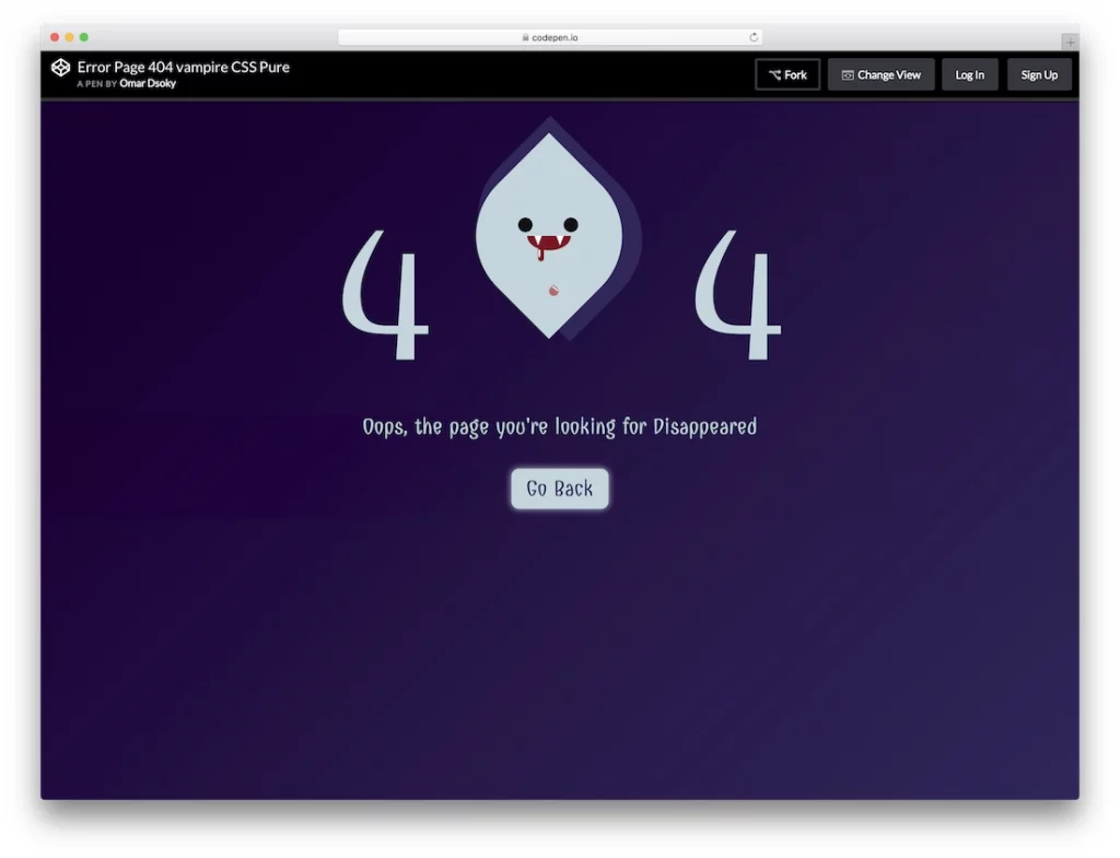
Picture this: a 404 error page template adorned with a captivating vampire animation—a head with blood dripping theatrically from its mouth, nestled between the digits ‘4’ and ‘4’. This striking visual transforms an otherwise frustrating encounter into a whimsical experience. Complemented by customizable text and an interactive call-to-action button, this template addresses the error and invites personalization and engagement.
When utilizing this free error page template, it’s essential to integrate its design seamlessly with your brand’s identity. Don’t shy away from infusing your brand’s personality into the error page—creativity here can turn a potential inconvenience into an engaging and memorable experience, keeping users connected and interested.
2. 404 Error – Delete Animation
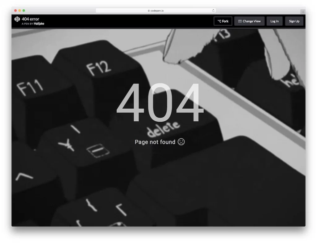
Imagine a 404 error page website template featuring an animated sequence where a black-and-white hand repeatedly presses the delete button on a keyboard. This dynamic animation not only grabs attention but also encourages user interaction, making visitors more inclined to click or explore further.
While the default design lacks a direct call-to-action button, the underlying HTML and CSS animation structure is fully customizable, allowing you to add prompts or redirect visitors to the homepage.
This engaging animation captivates users and piques their curiosity, transforming a standard error page into a unique opportunity for interaction. By providing an entertaining and visually stimulating experience, it helps maintain user interest and offers an alternative route for visitors who encounter errors on your site.
3. Under Maintenance
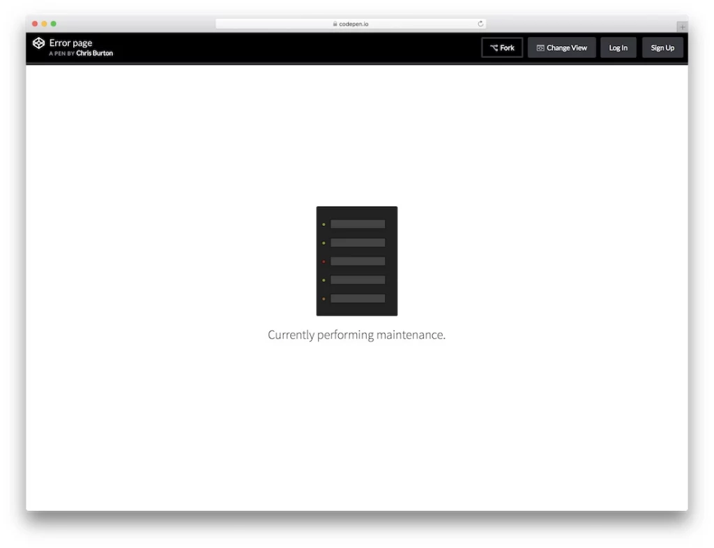
Perfect for times when your website is undergoing scheduled maintenance, this error page template combines simplicity with efficiency. Its minimalist design, featuring straightforward animation and concise text, ensures clarity while keeping the page uncluttered.
Customization is straightforward, allowing users to adjust the template to their needs. For larger websites that continue to offer partial functionality, this website template supports the inclusion of links to active sections, ensuring visitors remain engaged even when other parts of the site are temporarily unavailable.
4. 404 Crying Baby
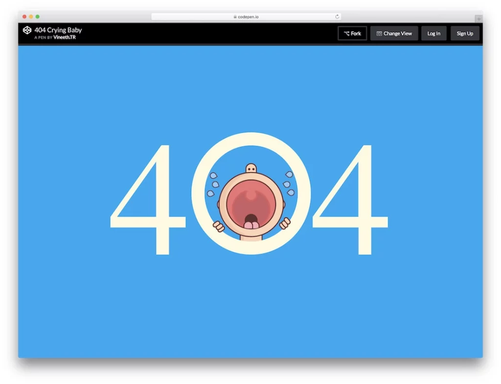
The “404 Crying Baby” error page template delivers a clean, pixel-perfect design with a touch of whimsy. Featuring smooth animation and bold white ‘404’ text against a vivid blue background, it ensures readability and impact.
Although it offers limited space for additional messaging or interactive elements like call-to-action buttons, its use of HTML and CSS animation frameworks guarantees a clear, engaging presentation. This template focuses on delivering an effective error message with a playful touch.
5. Bill Error Page
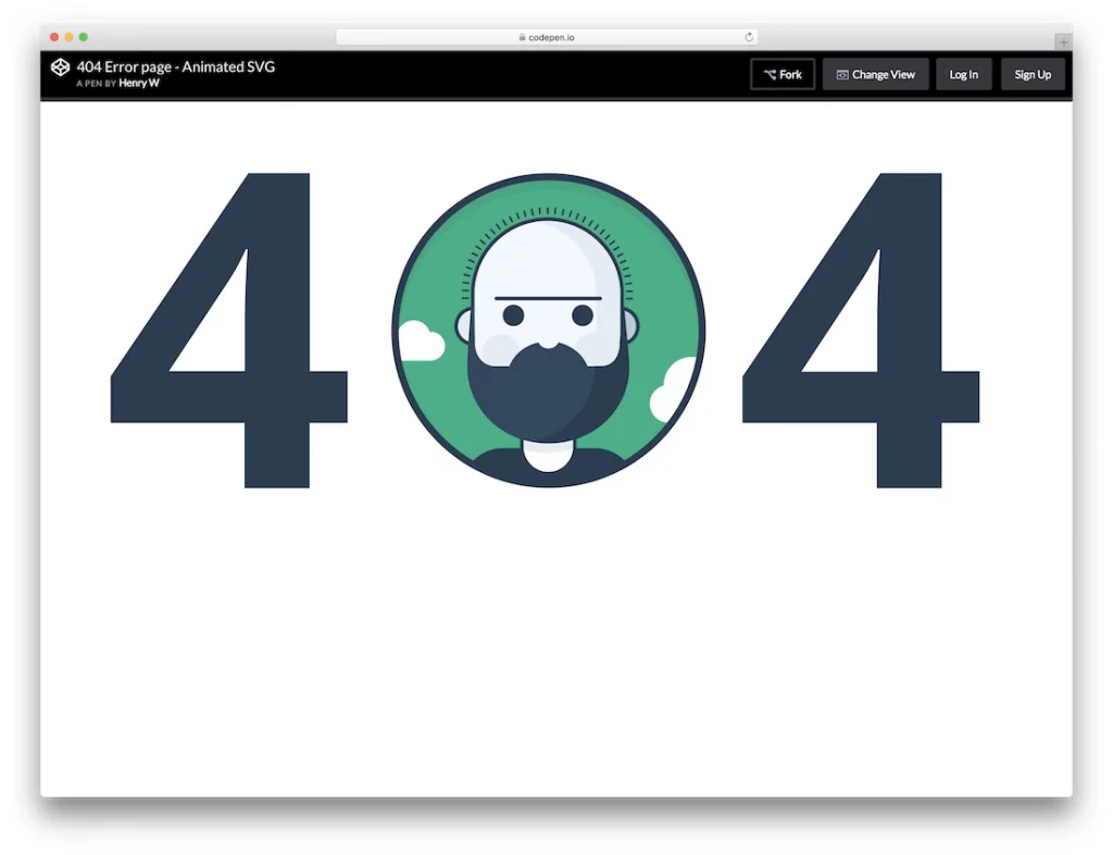
Designed to captivate both personal and business website visitors, the “Bill Error Page” template masterfully blends bold visuals with interactive elements. The centerpiece is a prominent ‘404’ display, where the numerals are seamlessly integrated with a dynamic, full-width animated character.
The template’s standout feature is the interactive hover text, which reveals the character’s name when users mouse over it.
This surprising touch adds an element of fun and curiosity to the otherwise frustrating experience of encountering an error page. Furthermore, the template provides ample space for additional text links and the search bar, allowing website administrators to guide visitors to other important pages or sections.
6. Lost in Space
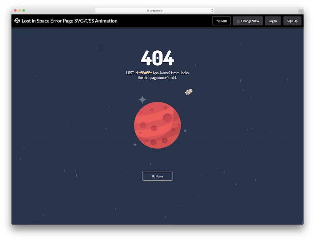
The “Lost in Space” error page template offers a sophisticated and immersive solution for handling errors. Utilizing advanced HTML, CSS3, and JavaScript frameworks, this template boasts a full-width layout that optimizes screen real estate and enhances visual appeal with animated cosmic backgrounds. The space-themed design infuses a sense of wonder and creativity into the user’s experience.
This website template is highly customizable, facilitating the adjustment of error codes and personalized messages to fit your brand’s needs. It also includes a strategically placed call-to-action button at the bottom, directing users back to the homepage or other key areas of your site.
By offering a seamless transition from the error page, the “Lost in Space” error page template ensures that visitors can easily continue exploring your website despite encountering an error.
7. 404 Gradient
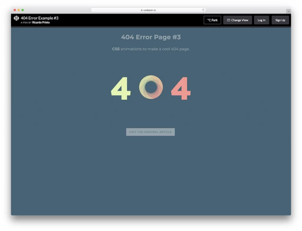
The “404 Gradient” website template epitomizes modern elegance with its minimalist and refined design. Unlike the conventional HTML error page templates, this option distinguishes itself with a creative gradient background that provides a visually pleasing contrast to the clear error notification. The gradient design enhances the aesthetic appeal and maintains clarity and readability.
This template is designed with user-friendliness in mind. It features dedicated space for personalized messages, allowing you to provide a tailored explanation or additional context for the error. Additionally, the inclusion of a call-to-action button facilitates easy navigation back to the homepage or previous pages, ensuring that users can quickly find their way despite encountering an error.
8. Photo Error
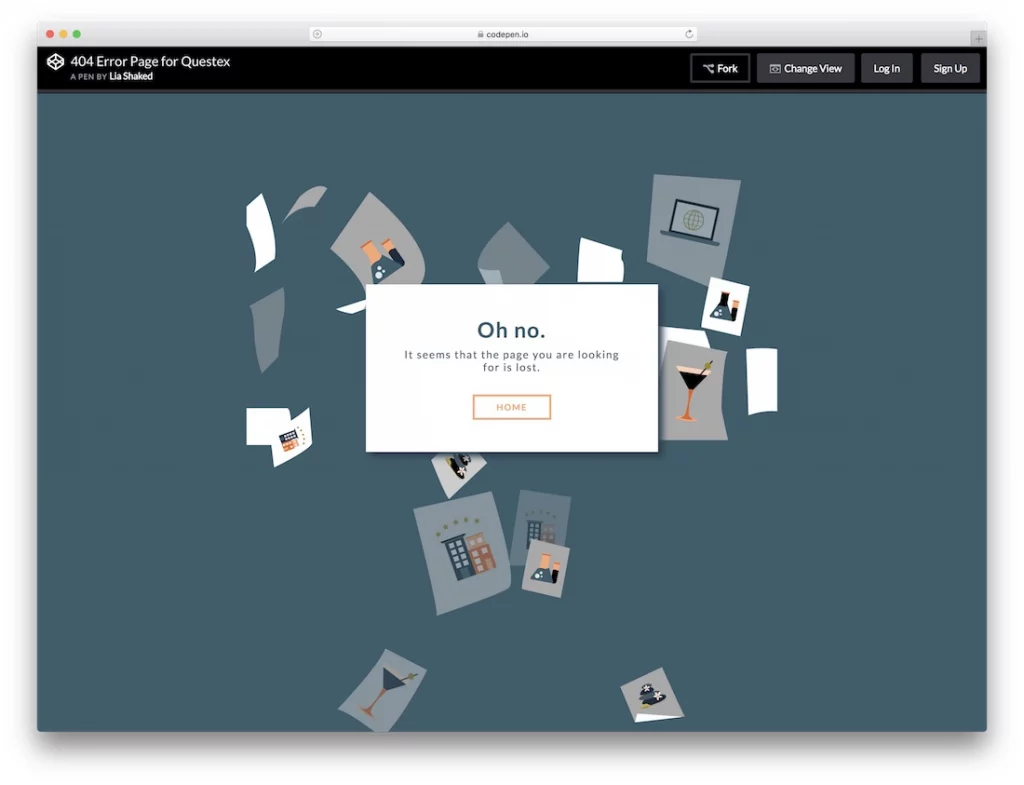
Perfectly suited for photography and directory websites, the “Photo Error” template distinguishes itself with a dynamic animated feature: falling photos that cascade across the screen. This engaging animation not only captures attention but also showcases your best visual content, even when users encounter an error page.
While the template’s default setup offers a visually compelling presentation, personalizing it to align with your brand’s identity will enhance its impact. Customize the falling photos with your own images and adjust the design elements to ensure the error page reflects your unique style.
The template also includes a functional call-to-action button, directing users seamlessly back to the homepage, and interactive hover effects to increase engagement. Balancing aesthetic appeal with practical navigation, the “Photo Error” template delivers both a visually stimulating experience and effective user guidance.
Best Practices to Implement 404 Error Page Template:
1. Craft a Clear and Concise Error Message
The cornerstone of an effective 404 error page is a crystal-clear message. Avoid technical jargon such as “HTTP 404” that can bewilder users. Instead, opt for straightforward, user-friendly language:
“Oops! The page you were looking for doesn’t seem to exist.”
To soften the blow and provide context, consider gently suggesting why the error might have occurred. Avoid placing blame; instead, use phrases like:
“You might have been redirected here due to a URL error” or “The page may have been moved or deleted.”
2. Embrace Brand Consistency
Your 404 page should seamlessly blend with your website’s look and feel. Ensure that:
- Brand Logo: Prominently features your logo.
- Color Palette: Mirrors your site’s color scheme.
- Typography and Design: Maintains your established fonts and design style.
3. Guide Users Back to the Homepage
A strategic link or button directing users to your homepage can be a lifesaver. This serves as a navigational beacon, inviting users back to familiar territory. Use a compelling call-to-action like “Return to Home” to entice users to explore further.
4. Highlight Your Best Content
Don’t let a lost visitor slip away without exploring other valuable content. Provide links to your top-performing pages or posts. Leverage insights from your analytics to highlight content that resonates most with your audience.
5. Integrate a Search Function
Help users find what they’re looking for by embedding a search functionality in the website template. This feature is crucial for users who might not find what they need through the provided links. Most CMS platforms, like WordPress or Shopify, offer built-in search capabilities.
6. Opt for a Clean and Streamlined Design
While cramming your 404 page with links is tempting, simplicity is key. Overloading the page with options can overwhelm and frustrate users. Instead, focus on a clean design with a few well-chosen links to guide them.
7. Make Contact Information Easily Accessible
Provide clear contact details to turn frustration into opportunity. Display your phone number or a link to live chat prominently on the 404 page. Personal interaction can convert frustration into engagement and drive conversions.
8. Include Familiar Navigation
Ensure that your 404 error page incorporates the same header and footer navigation as the rest of your site. This consistency aids in user orientation and reinforces your site’s branding.
9. Offer Multilingual Support
For a global audience, translate your 404 page into multiple languages. This enhances user experience by presenting the error message in their preferred language, fostering a stronger connection with your brand.
10. Leverage Exit-Intent Technology
Implement exit-intent technology to capture users on the brink of leaving your 404 page. Tools like OptinMonster or Sumo can trigger a popup offering a special deal, a search box, or a discount code, potentially converting those who might otherwise leave.
11. Infuse Humor and Creativity
A dash of humor can transform a frustrating experience into a memorable one. Incorporate a witty message or engaging animation to lighten the mood and make your 404 page stand out.
404 HTML Template: An Opportunity for Webmasters
In conclusion, a well-crafted 404 page not found template is more than just a placeholder for missing content; it’s an opportunity to maintain user engagement and showcase your brand’s dedication to quality.
By combining a creatively designed error page with the dependable hosting services of Nestify, you ensure that the website not only meets but exceeds user expectations. The robust and scalable hosting solution supports the seamless integration of custom error pages, guaranteeing optimal performance and reliability. This strategic approach not only mitigates the impact of errors but also reinforces your brand’s commitment to delivering an exceptional user experience. Sign up for our free trail now!
FAQs on 404 Error Pages
How can I track 404 errors on my website?
To monitor 404 errors, use web analytics tools such as Google Analytics or server logs. Set up custom reports/alerts to identify and analyze broken links or missing pages. Review this data regularly to address and resolve issues promptly.
How should a 404 error be managed when moving to a new domain?
During a domain transition, it’s essential to implement 301 redirects to seamlessly direct both users and search engines from the old URLs to the latest ones. This method not only preserves SEO value but also prevents visitors from encountering 404 errors during the transition.
Is it important to translate a 404 error page into multiple languages?
For sites that cater to a multi-lingual audience, translating the 404 error page into various languages is advisable. This ensures that all visitors receive a clear and understandable message, thus enhancing their overall experience.
Use a 404 page not-found template to create your 404 page in the default language, then translate that page into all the languages you offer on your website.

