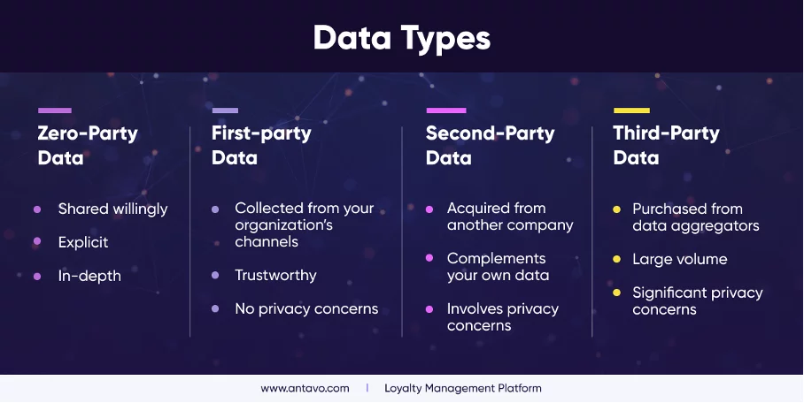
Employing popups to gather zero-party data is considered one of the most potent strategies, although numerous approaches exist to obtain this valuable information. Astonishingly, using popups can significantly transform how your business engages with online customers.
Popups, being interactive and easily customizable, grant you the freedom to communicate with your customers in the manner that suits your business best. To explore how popups can be harnessed for zero-party data collection, along with 20 examples we’ve compiled, buckle up for an insightful journey!
Five Effective Strategies for Leveraging Popups to Collect Zero-Party Data

We have curated the five most impactful answers to the question: “How can popups be effectively used for collecting zero-party data?” Before delving into the methods, it’s essential to highlight the importance of employing a user-friendly popup builder such as Popupsmart for seamless operations.
1. Grow Your Email List
If expanding your email list is a priority, popups are your ally. Offering incentives in exchange for zero-party data is a common practice. For instance, the example below entices visitors with “exclusive offers” upon entering their email addresses. The popup builder’s flexibility allows you to tailor information boxes based on your business needs.
2. Increase Phone Calls
Boosting phone calls can also be achieved through popups. You create an engagement opportunity by offering support in return for the visitor’s phone number. Like those provided by Popupsmart, customizable popups enhance creativity and attractiveness, increasing the chances of obtaining valuable zero-party data.
3. Collect Form Submissions
Utilizing sidebar popups is an effective method for collecting form submissions. The example below demonstrates a full-screen newsletter popup that is impossible to ignore, enticing users to provide the necessary information. Popupsmart’s versatility ensures adaptability for optimal data collection.
4. Gamify Your Campaign
Enhance visitor interaction by gamifying your campaign with elements like wheel popups. After the game, prompt users to share their contact information. This enjoyable experience encourages users to willingly provide zero-party data, ultimately converting them into engaged customers.
5. Bonus: Don’t Forget About Teasers
Teaser popups, smaller versions of main popups, can be enticing and increase zero-party data collection rates when used strategically. Customization is critical, aligning each element with your brand for maximum impact. Embrace the diversity of methods to collect zero-party data and observe the varied outcomes.
Learn about e-commerce popups here.
Types of Popups:
- Light Popup:
- Purpose: Ideal for quick and non-intrusive data collection.
- Design: Pops up on the screen without obstructing the main content, ensuring a seamless user experience.
- Use Cases: Often used for single-field forms or surveys requiring minimal information. Suitable for capturing basic contact details or preferences without disrupting the visitor’s interaction with the site.
2. Floating Bar Popup:
- Purpose: A persistent bar that stays at the top or bottom of the screen.
- Design: Provides a subtle and continuous reminder to users without blocking significant portions of the content.
- Use Cases: Effective for promoting ongoing offers, encouraging newsletter sign-ups, or gathering feedback. The constant visibility makes it a great choice to maintain awareness of promotions or encourage specific actions without being overly intrusive.
3. Sidebar Popup:
- Purpose: Appears on the side of the screen without covering the entire content.
- Design: Designed to be non-disruptive, allowing users to engage with the main content while the popup collects necessary information.
- Use Cases: Often used for newsletter sign-ups or quick surveys. This type of popup is suitable for scenarios where you want to capture data without interrupting the overall user experience, making it a less obtrusive option for data collection.
4. Full-Screen Popup:
- Purpose: Covers the entire screen, ensuring maximum visibility.
- Design: Useful for impactful announcements or important calls to action that demand the user’s attention.
- Use Cases: Effective for displaying time-sensitive offers, announcements, or important messages. However, caution should be exercised to use it judiciously to avoid frustrating users with too frequent or intrusive full-screen popups.
5. Exit-Intent Popup:
- Purpose: Triggered when a user is about to leave the website.
- Design: Offers a last-minute incentive to capture information before departure, aiming to recover potential leads.
- Use Cases: Effective in retaining users who might otherwise leave without taking any action. This popup often provides special discounts, exclusive offers, or additional content to encourage users to stay engaged and share their information.
Popup Use Cases to Collect Zero-Party Data:
1. Jomashop
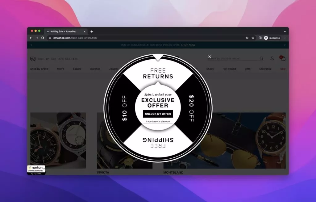
Jomashop, a premier fashion retailer specializing in watches, handbags, and sunglasses, employs an engaging gamified popup on its website. The popup, adorned with a captivating black and white pinwheel, tempts users with exclusive offers. By clicking “Unlock My Offer,” users initiate a game, vying for prizes. Jomashop requests the user’s email to redeem their discount code, seamlessly acquiring desired zero-party data. This interactive approach ensures a win-win, where users secure exclusive offers while Jomashop obtains valuable customer information.
Key Features:
- Gamified Experience: Engages users with an interactive game to enhance the popup’s appeal.
- Exclusive Offers: Incentivizes users with exclusive deals, encouraging participation.
2. FOSSIL
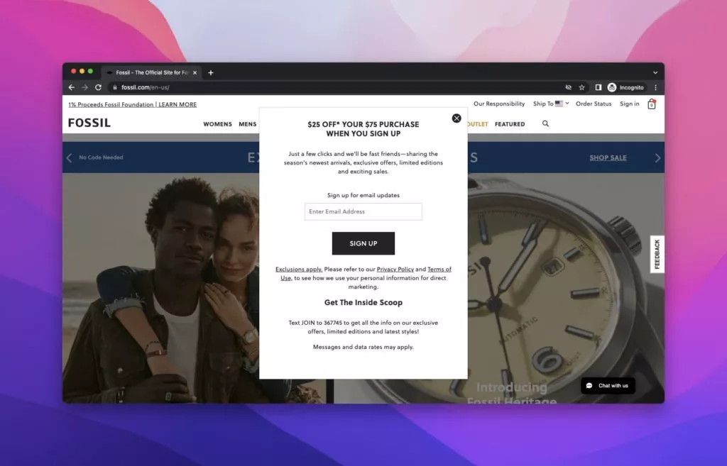
FOSSIL, a renowned watch brand, strategically employs a popup on its homepage, offering a $25 discount in exchange for the user’s email address. Accompanied by an enticing background image showcasing a woman and her watch, the popup encourages users to become “fast friends” by signing up for email update. Notably, FOSSIL smartly incorporates SMS signup within the popup, simplifying obtaining phone numbers. This multifaceted popup targets email addresses and phone numbers, exemplifying a practical dual-target approach.
Key Features:
- Cross-Platform Engagement: Integrates SMS signup within the popup for efficient phone number collection.
- Persuasive Messaging: Encourages users to become “fast friends” for a personalized connection.
3. DSW
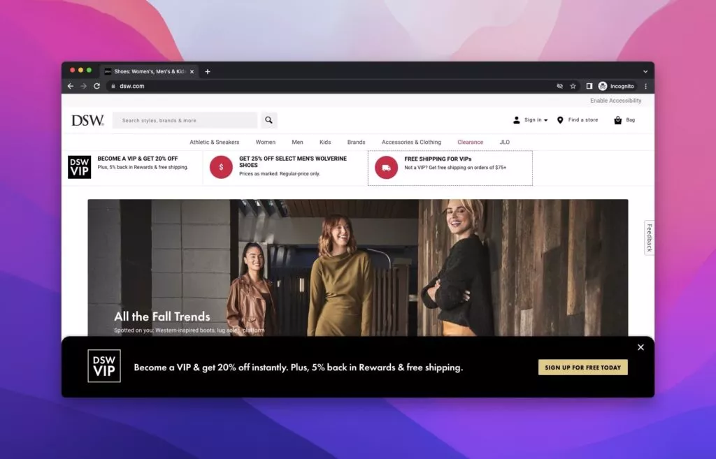
Designer Shoe Warehouse (DSW), specializing in designer and name-brand shoes and accessories, utilizes a floating bar popup at the bottom of the screen. This popup invites users to sign up for free, offering VIP membership with a 20% discount after the first purchase. Clicking the signup button gives users a comprehensive submission form with various fields. DSW’s approach aims to efficiently gather all necessary zero-party data in a single interaction, optimizing the user experience.
Key Features:
- Floating Bar Popup: Positioned strategically at the bottom for hidden engagement.
- VIP Membership Incentive: Offers a 20% discount as part of the VIP membership.
4. Laura Geller
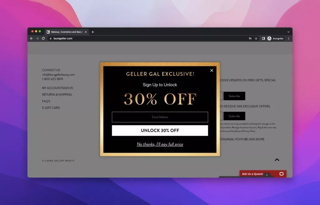
Laura Geller New York, a modern cosmetics brand, entices users with a popup offering a 30% discount in exchange for their email address. The black popup with a golden frame not only lures visitors with the value but also cleverly dissuades them from selecting the “No” option by playfully stating, “No thanks, I’ll pay full price.” Laura Geller’s approach combines allure and persuasion to effectively capture zero-party data while enhancing the user’s engagement with the brand.
Key Features:
- Playful Messaging: Dissuades users from opting out with a humorous “No thanks, I’ll pay full price” option.
- Aesthetic Appeal: Combines a black popup with a golden frame for an attractive and memorable design.
5. Maya Brenner
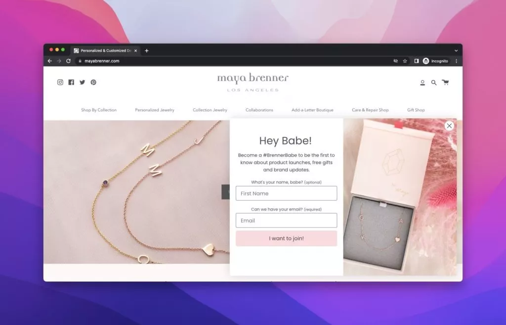
Maya Brenner, a distinguished jewelry design brand, strategically deploys a visible popup upon entering its website. The elegantly designed popup requests visitors to provide their names and email addresses. In exchange, users are invited to become a #BrennerBabe, enjoying exclusive updates on product launches, gifts, and brand news before others. Maya Brenner’s simplistic yet cohesive design captures attention and establishes a personalized connection with each visitor.
Key Features:
- Exclusive Membership: Invites users to become a #BrennerBabe for exclusive updates.
- Personalization Concept: Creates a personalized experience for every visitor, enhancing user engagement.
6. Myntra
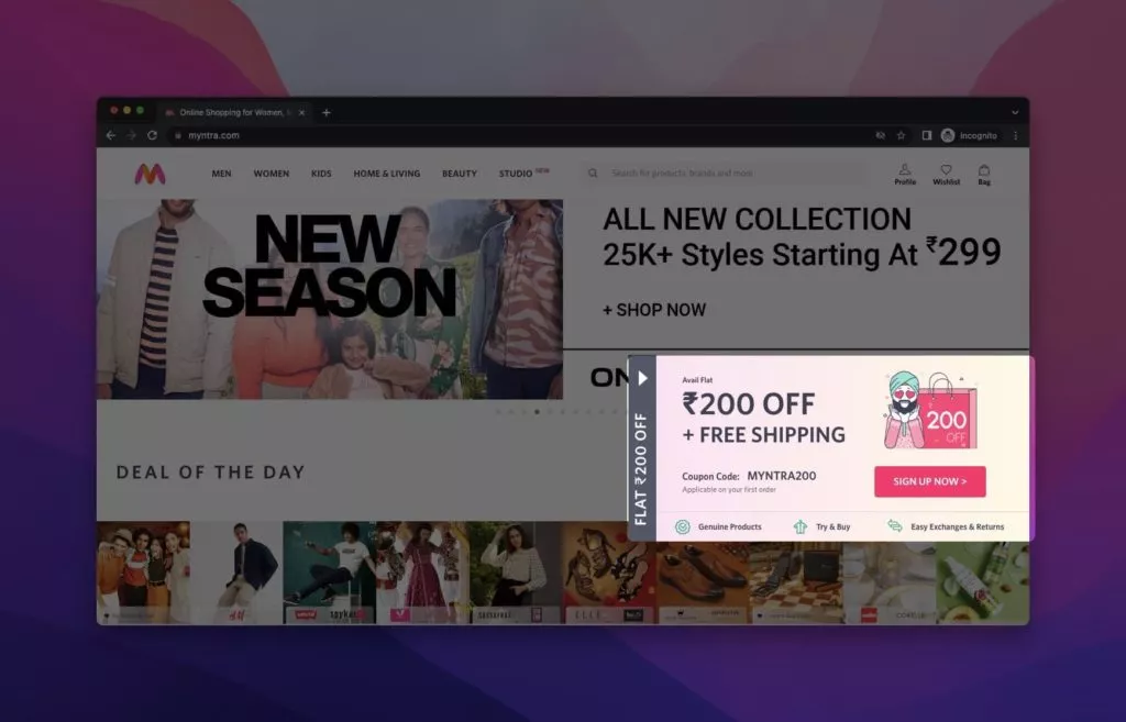
Myntra employs a teaser popup on the right side of its homepage, enticing visitors with a discount offer. The strategic placement of the teaser sparks curiosity among visitors, prompting them to explore the enticing offer. Clicking on the teaser reveals a popup presenting a coupon code as a reward for sign up. Myntra effectively leverages the teaser concept to pique curiosity and encourage user interaction.
Key Features:
- Teaser Placement: Strategically positioned on the right side of the page for heightened visibility.
- Curiosity-Driven Interaction: Sparks curiosity about the offer, leading to increased clicks.
7. PUPA Milano
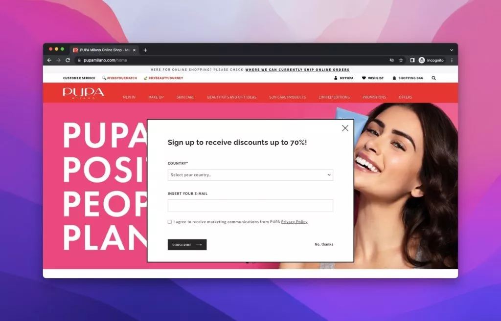
PUPA Milano, an Italian cosmetics powerhouse, employs a straightforward popup on its website. This popup, featuring simple designs, requests visitors to enter their country and email addresses. PUPA Milano embraces simplicity in collecting zero-party data, aligning with their brand image while ensuring an efficient data-gathering process.
Key Features:
- Straightforward Design: Utilizes a simple popup design for seamless zero-party data collection.
- Brand Image Alignment: Ensures the design aligns with the brand’s image and values.
8. Redbubble
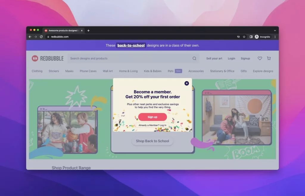
Redbubble, a global online marketplace for print-on-demand merchandise, welcomes visitors with a popup offering discounts and perks upon signing up. The popup, set against a vibrant green background, entices users to take advantage of a 20% discount by clicking the sign-up button. Redbubble exemplifies the effectiveness of collecting zero-party data through a simple and user-friendly approach.
Key Features:
- Incentive-Oriented Popup: Offers discounts and perks as incentives for signing up.
- Simple Steps: Illustrates a straightforward process for users to follow and engage with.
9. Camper
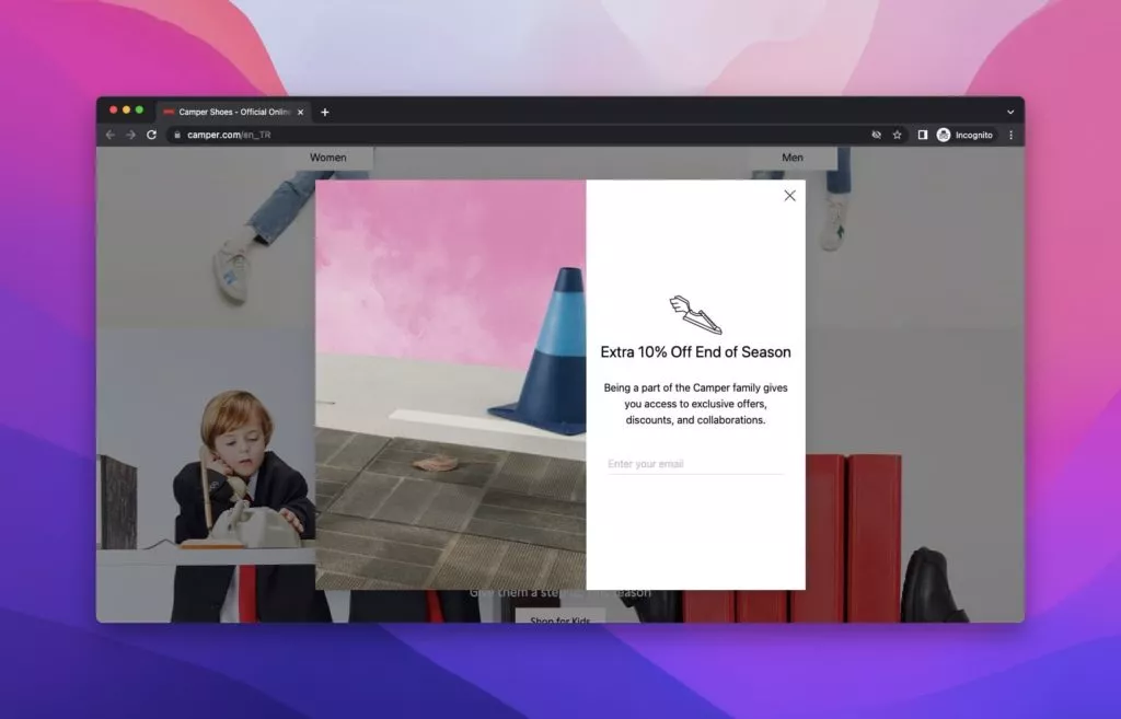
Camper, a footwear company headquartered in Mallorca, Spain, adeptly collects zero-party data with a modern and visually appealing popup. The popup, set against a pink background, offers a discount in exchange for the visitor’s email address. Camper’s straightforward approach simplifies the process for visitors, increasing the likelihood of obtaining the desired data.
Key Features:
- Modern Design: Presents a contemporary look for a visually appealing user experience.
- Easy Interaction: Simplifies the process by asking for an email address in exchange for a 10% discount.
10. RateHawk
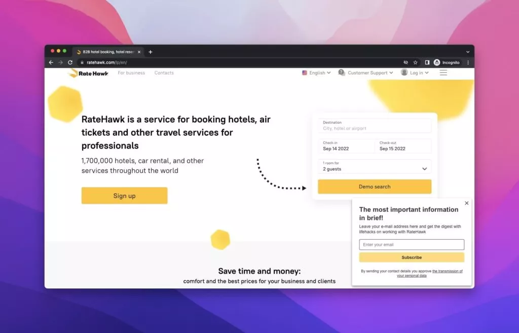
RateHawk, an innovative B2B online booking engine offering hotels, air tickets, transfers, and car hire, showcases a yellow and white homepage. Positioned on the right is a trip plan calendar, with a subscribe popup below that seamlessly integrates with the page’s color scheme. The popup boasts a consistent design that complements the overall aesthetic. With an attention-grabbing headline, “The most important information in brief!” RateHawk demonstrates that a simple yet striking design and headline are key elements in effectively capturing zero-party data.
Key Features:
- Consistent Design: Seamlessly integrates with the overall webpage layout.
- Striking Headline: Grabs attention with the phrase “the most important information in brief.”
11. HubSpot
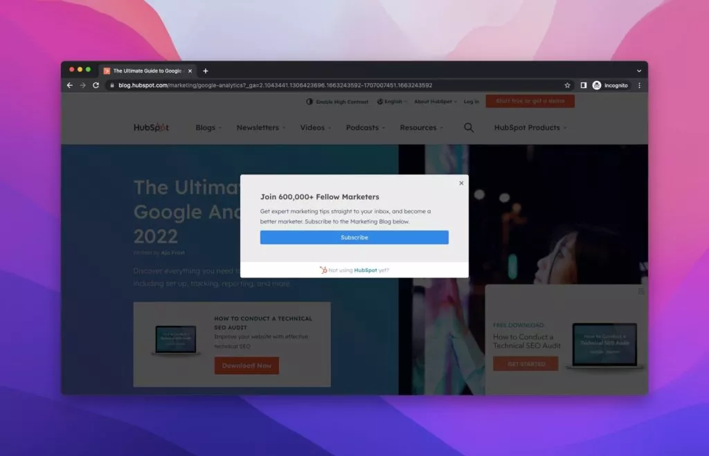
HubSpot, a versatile CRM platform for business and marketing tips, features popups with a dark background and a subscription button. HubSpot’s popups, while infrequent, follow a direct approach to collecting zero-party data. The initial popup inquires if visitors wish to subscribe, and upon agreement, another popup prompts for the email address. This straightforward method aligns with best practices for effective data collection.
Key Features:
- Direct Approach: Ask visitors if they want to subscribe.
- Minimalistic Design: Utilizes a dark background for a focused and clean appearance.
12. Movado
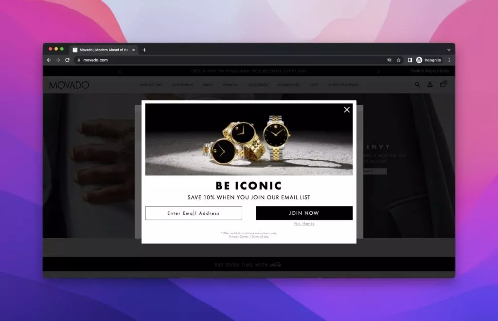
Movado, a renowned accessory brand celebrated for its watches, boasts a swift and efficient website. Upon entering, a popup about location appears, followed by another prompt asking for the visitor’s email address. While not insistent, Movado’s rapid approach demonstrates a keen understanding of their customers and their commitment to efficient zero-party data collection.
Key Features:
- Swift Appearance: Welcomes visitors with a location popup for a personalized experience.
- Efficient Data Collection: Rapidly prompts for the visitor’s email address without being intrusive.
13. Murray’s Cheese
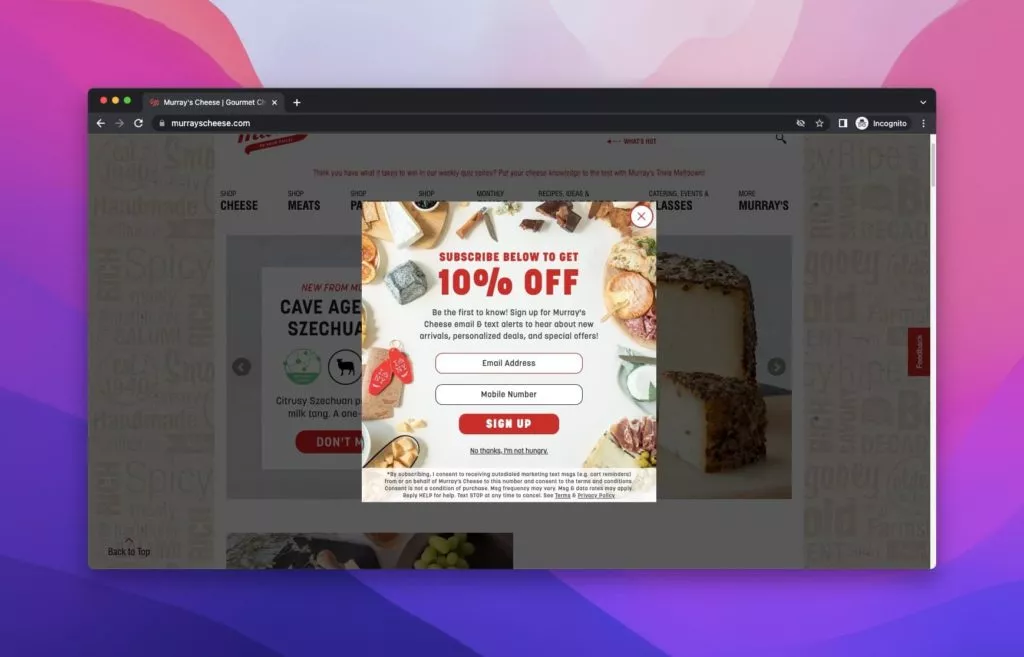
Murray’s Cheese, an artisanal cheese and specialty foods retailer in New York City, employs a visually appealing popup offering a “yummy” deal for a 10% discount. The popup features images of various cheese types, enhancing the visual experience. Murray’s Cheese demonstrates the effectiveness of using relevant images to create engaging popups for successful zero-party data collection.
Key Features:
- Visual Appeal: Incorporates images of cheese types for an engaging visual experience.
- Relevant Design: Align the popup with the brand’s artisanal and specialty foods theme.
14. Nordic Expat Shop
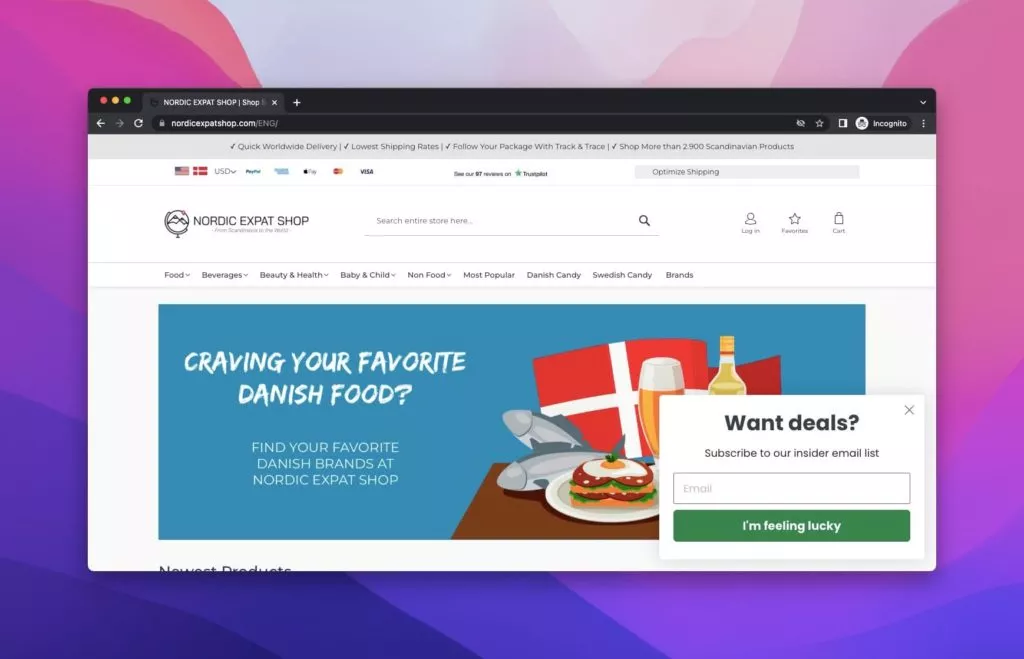
Nordic Expat Shop, a platform selling Scandinavian products, prioritizes a smooth user experience on its simple shop website. The popup seamlessly avoids a jump-scare effect, offering a deal in exchange for visitors’ email addresses. The submit button creatively reads “I’m feeling lucky” to maintain visitor interest, showcasing a thoughtful and user-friendly approach to zero-party data collection.
Key Features:
- Smooth Integration: Appears seamlessly to enhance the user experience.
- Creative Button Text: Uses “I’m feeling lucky” for a playful and engaging touch.
15. Bulgari
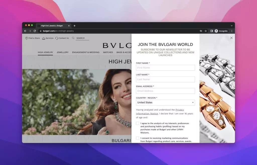
Bulgari, the Italian luxury brand renowned for jewelry, watches, fragrances, accessories, and leather goods, implements an extensive sidebar popup on its homepage. This sizable popup, featuring the actress Anne Hathaway, aims to collect qualified leads and extensive zero-party data. The modern design aligns seamlessly with the brand image, requesting multiple pieces of information, including title, first name, last name, and email address.
Key Features:
- Extensive Data Collection: Asks for multiple details to gather qualified leads.
- Modern Design: Aligns with the brand image and portrays a luxurious aesthetic.
Best Practices for Using Popups Using Zero-Party Data:
- Choose a User-Friendly Popup Builder: An intuitive popup builder is crucial for a seamless and efficient data collection process. Look for a tool with easy customization options, drag-and-drop features, and a user-friendly interface. This ensures that even those without advanced technical skills can create effective popups.
- Design Consistency: Maintain a cohesive visual identity by ensuring your popups align with your brand style. Consistent design elements, like colors, fonts, and imagery, help reinforce brand recognition and build trust. Users should instantly recognize that the popup is an extension of your brand.
- Incentivize Participation: Encourage active engagement by offering visitors compelling incentives. This could include discounts, exclusive access to content, free trials, or downloadable resources. Communicate the value visitors will receive in exchange for providing their data. This boosts participation and enhances the perceived value of your offerings.
- FOMO Marketing: Leverage Fear of Missing Out (FOMO) strategies to create a sense of urgency and drive action. Use persuasive language and time-sensitive offers to motivate visitors to share their information. Limited-time promotions or exclusive deals for those participating in the data collection process can significantly increase conversion rates.
Conclusion:
Popups are experiencing a surge in popularity as an effective tool for gathering zero-party data. However, strategic and thoughtful implementation is crucial—enticing your visitors with pertinent offers can significantly enhance their appeal. Streamlining the process of collecting the necessary information is equally vital, ensuring ease for users and data collectors.
Since popups are lightweight and need no software installation, they present an opportunity to swiftly capture user data without necessitating them to leave your page. Embracing this approach facilitates seamless data collection and promotes user engagement.
Don’t hesitate to leverage popups for zero-party data; their versatility and convenience can lead to high conversion rates. It’s always possible to explore the potential of popups and optimize their use for effective data acquisition.
FAQs on Zero-Party Data Collection:
What Strategies Can Help Mitigate User Disruption Concerns Related to Popups?
To address concerns about user disruption, consider employing non-intrusive popups with strategic timing, such as exit-intent popups or those triggered after a specific period. Additionally, providing an easy option to dismiss popups and ensuring mobile responsiveness contribute to a positive user experience.
Are Popups Effective Across Various Industries?
Yes, popups can be adapted and effectively utilized across diverse industries, including e-commerce, travel, technology, and more. Tailoring popup content to align with industry-specific trends and user expectations enhances their effectiveness in capturing zero-party data.
What is the Most Common Mistake While Collecting Zero-Party Data with Popups?
The most common mistake is asking for excessive information, which can overwhelm visitors and have a negative impact. Striking a balance by requesting only essential information is crucial for a positive user experience.

