
Are you seeking inspiration to craft a compelling website? We’re here to assist you in this endeavor. Eleken is a design agency dedicated to creating websites that not only add value to the customer experience but also drive revenue for businesses.
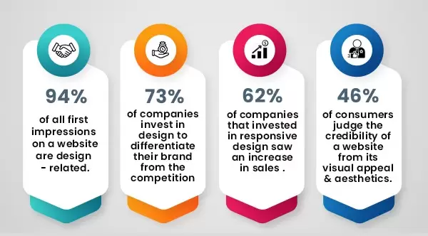
When embarking on website design, numerous factors contribute to its effectiveness. Foremost among these is the imperative for a seamless user experience across all devices, coupled with the ability to prompt valuable actions from your site’s visitors. Essentially, a successful web design must prioritize usability, responsiveness, and conversion optimization.
In this article, we’ll delve into the significance of these three pivotal aspects of web design and examine exemplary instances that exemplify usability, responsiveness, and high conversion rates.
What Constitutes as a Responsive Website?
When users navigate to your website, they arrive with specific objectives in mind — whether it’s reading a blog, purchasing a service, or seeking information on a particular topic. A user-friendly website ensures that visitors can effortlessly fulfill their intended goals. Conversely, if the website proves cumbersome and unintuitive, visitors are likely to abandon it. Essential aspects of website usability include:
- Clear Structure and Intuitive Navigation: Upon entering the site, users should intuitively discern where to click and anticipate the outcome of each action. A well-structured website minimizes aimless browsing and expedites information retrieval.
- Relevant Content: Crucial information should be prominently displayed, easily readable, and readily comprehensible to visitors seeking answers to their queries.
- Appealing Design: An aesthetically pleasing interface enhances usability, with a clean and uncluttered layout facilitating the prioritization of essential information.
- Fast Page Load: With an increasing number of users expecting swift page loading times, optimizing your website’s loading speed is paramount to retaining visitor engagement and minimizing bounce rates.
Key elements of responsive web design include:
- Fluid Grids: Columns adjust dynamically to accommodate varying screen sizes, ensuring optimal display across devices.
- Fluid Images and Videos: Visual content adapts seamlessly to container size, preventing distortion or oversizing on larger screens.
- Media Queries: These dynamic CSS rules adjust the website’s layout based on device characteristics such as screen width, height, and orientation, ensuring an optimal viewing experience.
By embracing responsive design, websites can cater to users’ diverse device preferences, thereby enhancing user satisfaction and retention.
Real Life Examples of Respinsive Website Design:
1. GitHub
GitHub’s responsive website design exemplifies usability, responsiveness, and conversion optimization, making it a standout platform for developers. Here’s a breakdown of what sets GitHub apart:
Usability:
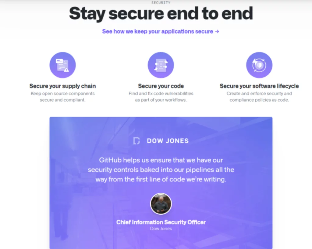
GitHub’s design is human-centered, prioritizing clarity and simplicity. The website’s clean layout, abundant white space, and logical structuring enable users to access important information swiftly. For instance, the “Compare plans” page is intuitively organized, with essential details readily accessible at the top while scrolling reveals more in-depth data. Additionally, the persistent display of plan names and prices ensures user-friendly navigation.
Responsiveness:
GitHub ensures a seamless user experience across all devices, whether desktop or smartphone. The menu bar transforms into a hamburger menu on mobile devices, optimizing space without compromising functionality. Moreover, the website employs responsive animations and visuals that maintain page load speed, even on slower connections. The transition from a two-column to a one-column layout on mobile devices further enhances usability.
Conversion Optimization:
GitHub excels in converting visitors into users through its clear value proposition and strategically placed call-to-action (CTA) buttons. As users scroll down the page, they encounter compelling points highlighting the service’s value, accompanied by CTAs to prompt further action. The prominent green “Sign up” button, positioned prominently at the center of the page, ensures immediate visibility upon landing. Moreover, the persistent display of the CTA button, coupled with a clever design element of an astronaut directing attention towards it, maximizes conversion potential.
2. Shopify
Shopify’s website design stands out in 2023 for its usability, responsiveness, and conversion-focused approach, making it a prime example of effective e-commerce platform design. Here’s an overview of what makes Shopify’s website design exemplary:
Usability:
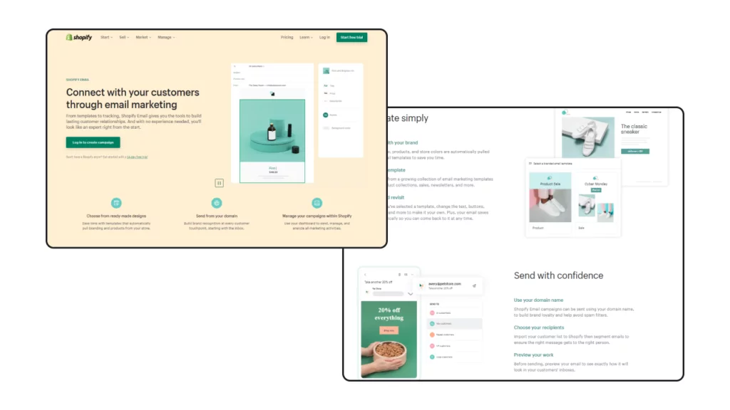
Shopify boasts a user-friendly design characterized by a clean and modern layout, ensuring easy navigation and information accessibility. The concise presentation of app features avoids overwhelming users with lengthy blocks of text, enabling them to quickly identify relevant information. Clear navigation options guide users seamlessly through the website, with distinct menu sections for basic operations and essential buttons like pricing, learning resources, and account login. Furthermore, Shopify prioritizes fast loading times, with pages loading in less than five seconds for enhanced usability.
Responsiveness:
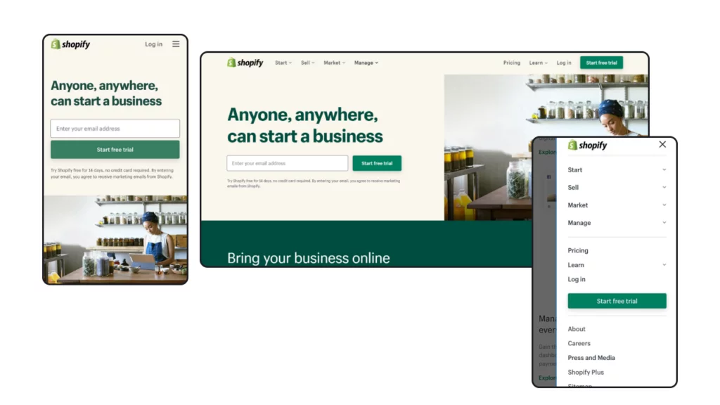
The website ensures a consistent user experience across various devices, including desktops, tablets, and smartphones. Responsive design elements, such as the hamburger menu icon on mobile devices, prevent clutter while maintaining intuitive navigation. Additionally, illustrations are strategically positioned above or below text content, optimizing readability on smaller screens without sacrificing visual appeal.
Conversion Optimization:
Shopify employs conversion-focused design features to drive user engagement and prompt action. Vibrant call-to-action (CTA) buttons, prominently displayed throughout the website against a pale background, attract attention and encourage user interaction. The simplified free trial sign-up process, requiring only an email address, streamlines the conversion funnel and prompts users to take immediate action. Moreover, the alignment of textual content with visuals reinforces the platform’s value proposition, ensuring clarity and consistency in messaging.
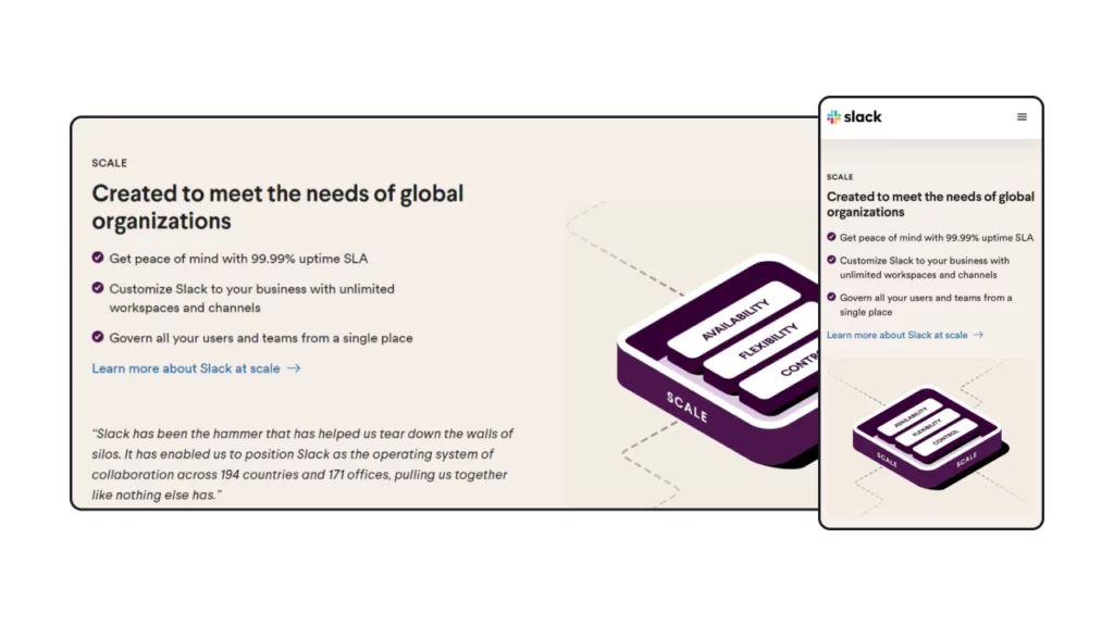
3. Slack
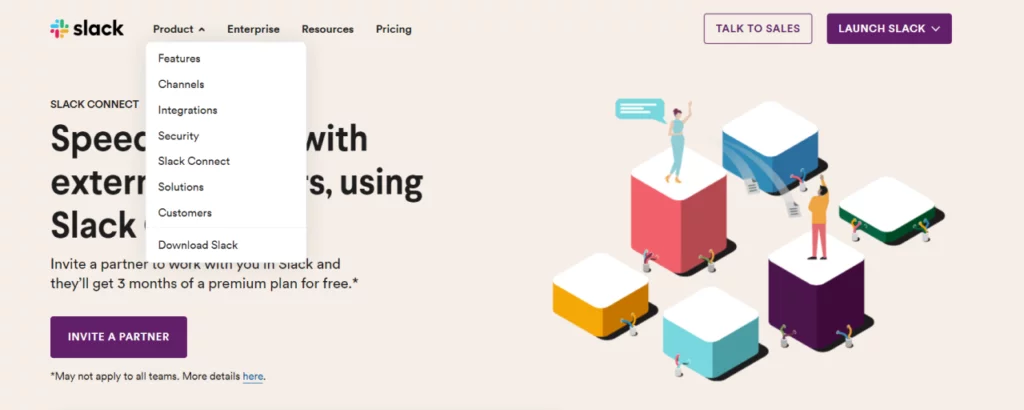
Slack’s website design in 2021 exemplifies usability, responsiveness, and conversion optimization, making it a standout example of effective business communication platforms. Here’s an overview of what sets Slack’s website apart:
Usability:
Slack’s website features a user-centered design that prioritizes ease of use and navigation.
- Clear and intuitive navigation in the header ensures effortless exploration of the website.
- Relevant content paired with visually appealing graphics enhances readability and comprehension for visitors.
- Engaging animations, such as interactive screenshots demonstrating app functionality, provide users with a hands-on experience, further enhancing usability.
- Fast loading times contribute to a seamless browsing experience, ensuring users can access information quickly and efficiently.
Responsiveness:
Slack’s website is optimized for both desktop and mobile devices, ensuring a consistent user experience across platforms.
- Fluid grids dynamically adjust the layout from a two-column format on desktops to a single-column layout on smartphones, maintaining usability and readability.
- Carousels are utilized to present visuals efficiently, preventing page lengthiness and optimizing space utilization.
- The homepage adapts to the device used, displaying relevant examples of the Slack app tailored to desktop or mobile users.
Conversion Optimization:
Slack’s website incorporates elements designed to drive user engagement and prompt action.
- Prominent call-to-action buttons guide users towards key actions, such as signing up for the platform, providing clear direction and encouraging conversion.
- Each section highlights the value proposition of Slack, demonstrating the benefits it offers to customers and reinforcing its appeal.
- By prioritizing simplicity and clarity, Slack’s website effectively communicates its value proposition and encourages visitors to take the next step.
Learn about design portfolios here.
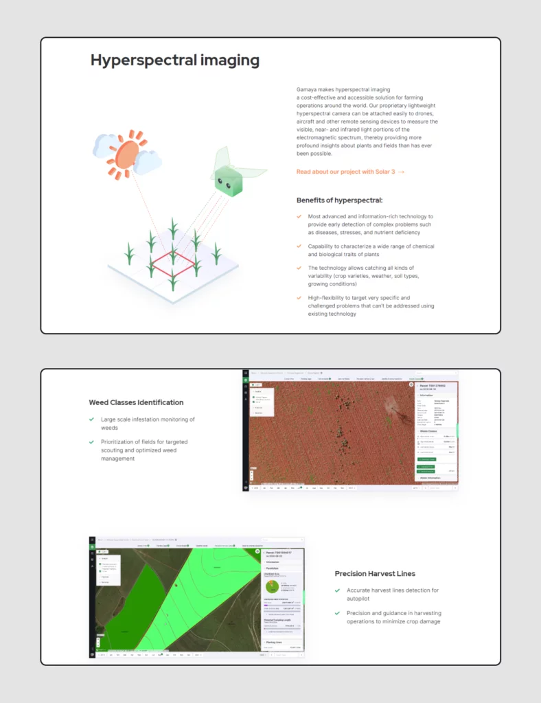
4. Gamaya
Gamaya’s website serves as a prime example of a usable, responsive, and conversion-optimized platform designed to meet the needs of farmers seeking data analysis solutions. Here’s an overview of what sets Gamaya’s website apart:
Usability:
Gamaya’s website boasts a clean and straightforward design, characterized by ample white space and captivating illustrations that enhance readability and highlight key features of the service.
- The clean web design ensures that information is easily digestible and prioritizes the presentation of essential service features.
- Navigation is intuitive and user-friendly, with a concise header menu offering easy access to four main points, complemented by dropdown menus for additional guidance.
- Fast page loading times, averaging around three seconds on a 4G connection, contribute to a seamless browsing experience, ensuring visitors can access information promptly.
Responsiveness:
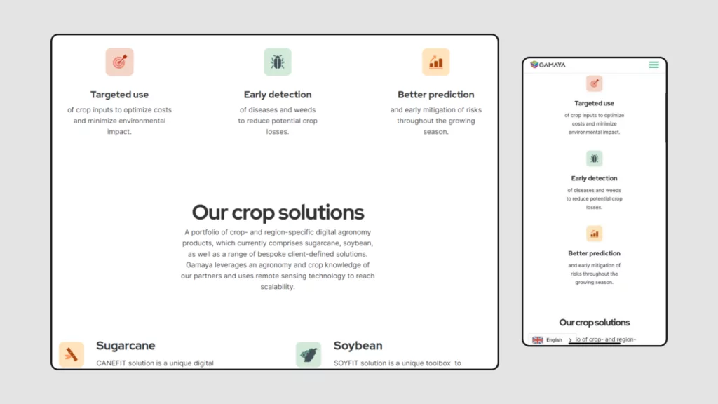
Gamaya’s website is optimized for various devices, ensuring consistent performance and usability across desktops, tablets, and mobile phones.
- The webpage layout seamlessly adjusts from a three-column format on desktops to a single-column layout on tablets and mobile phones, optimizing space and readability.
- The menu bar is streamlined into a hamburger menu icon on smaller screens, preserving functionality while decluttering the design and maximizing usability.
Conversion Optimization:
Gamaya’s website incorporates elements designed to drive user engagement and encourage action.
- Visually striking and contrasting calls-to-action (CTAs) grab visitors’ attention, leaving no ambiguity about the desired next steps and prompting action.
- Each page on the website aligns with the overall concept and effectively communicates the value proposition, ensuring consistency and clarity throughout the user journey.
5. Discord

Discord’s website serves as an exemplary case study of effective web design, particularly in terms of conversion optimization. Let’s delve into what sets Discord apart:
Usability:
Discord demonstrates a deep understanding of its target audience, particularly gamers and streamers, through its engaging and intuitive website design.
- Engaging animations and playful illustrations throughout the website cater specifically to gamers and streamers, enhancing user engagement.
- The website boasts an intuitive navigation system, featuring a streamlined menu bar with essential points, minimizing confusion for visitors.
- Utilization of ample white space ensures easy readability and comprehension of information, contributing to a seamless user experience.
- Fast loading times on both desktop and mobile devices ensure visitors can access content promptly, enhancing usability across platforms.
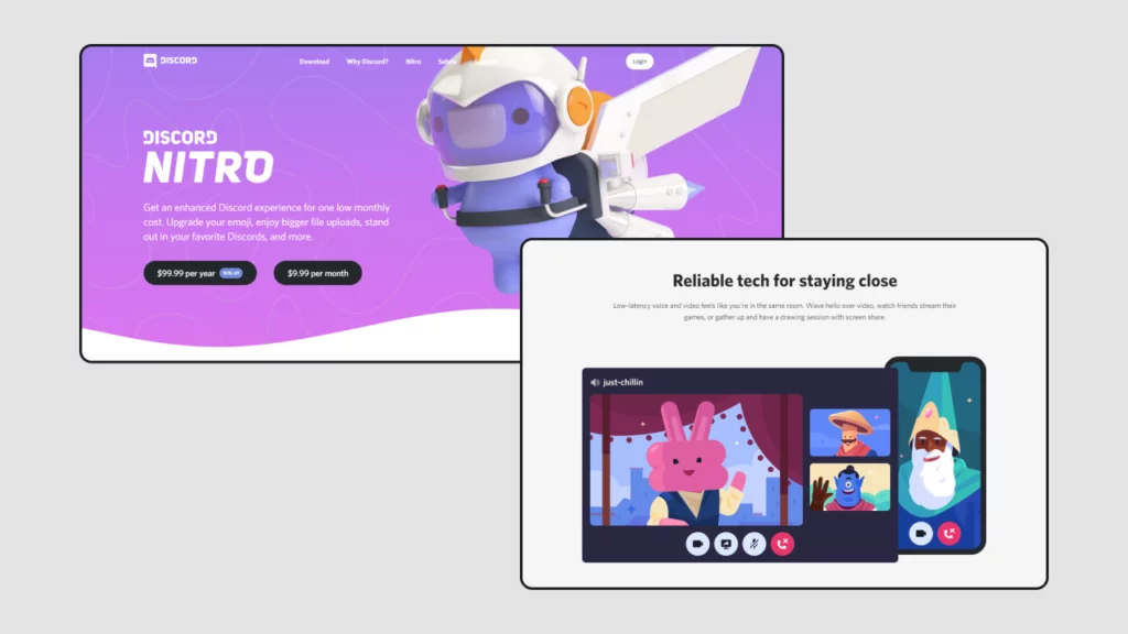
Responsiveness:
Discord’s website seamlessly adapts to various screen sizes, ensuring consistent performance and usability across desktops, tablets, and smartphones.
- The layout transitions from a three-column format on desktops to a two-column layout for tablets and a single-column format for mobile devices, optimizing space and readability.
- Visual elements such as animations and illustrations are adjusted for smaller screens to maintain focus on the value proposition and calls-to-action (CTAs).
- The full desktop menu bar is condensed into a hamburger menu icon on smartphones, preserving functionality while maximizing screen space on mobile devices.
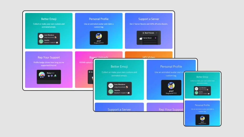
Conversion Optimization:
Discord effectively drives user engagement and encourages action through strategic design elements and messaging.
- Clear and concise headers, such as “Your place to talk,” effectively communicate the value proposition of the application, enticing visitors to explore further.
- Offering both free and premium versions of the app caters to different user preferences and encourages conversion.
- Contrasting CTAs stand out against the background, guiding visitors towards desired actions and facilitating conversion.
Conclusion:
Investing in high-quality web design is a crucial aspect of promoting your service. A well-designed website not only enhances the aesthetic appeal but also plays a vital role in engaging visitors, facilitating usability, and ultimately driving conversions. By prioritizing elements such as user experience, responsiveness, and conversion optimization, businesses can create a digital presence that effectively communicates their brand message, captivates their target audience, and generates tangible results.
FAQs on Responsive Websites:
Do responsive websites load slower than non-responsive ones?
Responsive websites may load slightly slower than non-responsive ones due to the additional code and resources required for responsiveness. However, the difference in loading speed is often negligible, especially with optimized coding practices and efficient content delivery methods.
Can I convert my existing website into a responsive design?
Yes, existing websites can be converted into responsive designs through a process called retrofitting or redesigning. This involves restructuring the layout, modifying the CSS stylesheets, and implementing responsive design techniques to ensure compatibility across devices.
What are the common challenges in responsive website design?
- Ensuring consistent user experience across different browsers and devices
- Optimizing performance and loading speed on mobile devices
- Handling complex layouts and interactive elements
- Testing and debugging across various screen sizes and resolutions
How often should I update my responsive website design?
Responsive websites should be regularly updated to adapt to evolving user needs, new devices, and changes in web standards. It’s essential to monitor user feedback, analytics data, and industry trends to identify areas for improvement and implement updates accordingly.
