In the fast-paced world of e-commerce, capturing the attention of online visitors is a delicate art. At the forefront of this challenge lies the product headline – a concise, impactful snippet that can either engage a potential customer or contribute to their swift departure. Understanding the critical role of product headlines in retaining visitors is paramount, as they serve as the initial gateway to a brand’s offerings.
Understanding Product Headlines:

A product headline is a brief descriptor that outlines a product’s advantages and captivates potential visitors’ interest. These headlines play a pivotal role in communicating a product’s reliability, quality, and functionality, offering visitors insights into what the development entails.
Importance of Descriptive Headlines:
- Time-Efficiency for Decision-Making: The desire for quick decision-making drives online consumers. A well-crafted, descriptive headline alleviates the burden on visitors, enabling them to discern the essence of a product swiftly.
- Eliciting Visitor Curiosity: A balance between informativeness and intrigue is crucial. The headline should convey key details and leave room for curiosity, prompting visitors to explore further.
- Differentiation in a Sea of Options: With countless brands vying for attention, product headlines act as a brand’s unique voice. Standing out necessitates a blend of conventional practices and innovative approaches.
Learn how to create product pages here.
Top Product Headlines in 2024:
1. NYX Cosmetics: A Symphony of Colors and Collaboration
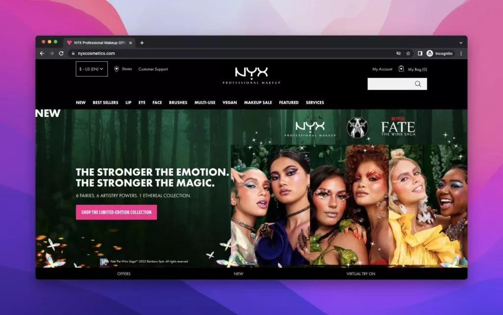
NYX Cosmetics, a proud subsidiary of L’Oréal, is a dynamic cosmetics company celebrated for its sought-after makeup products. The product headlines above the fold feature six models flaunting vibrant and diverse makeup, setting the tone for the brand’s commitment to creativity and inclusivity.
Renowned for its constant evolution and strategic collaborations, NYX recently partnered with the Netflix show Fate: The Winx Saga. The product headlines cleverly draw inspiration from the magical world of Winx, employing a captivating motto that resonates with customers. The accompanying descriptions effectively convey the novelty the brand seeks to introduce, piquing the curiosity of potential customers.
As visitors peruse NYX’s meticulously arranged product lineup, which includes promotional product headlines, concise descriptions, and captivating images, the brand ensures a seamless shopping experience. The detailed yet succinct product descriptions inspire anticipation, encouraging customers to explore further. Conveniently placed Call-to-Action (CTA) buttons guide customers through purchasing, enhancing the overall user journey.
2. Revlon: Timeless Elegance and Product Variety
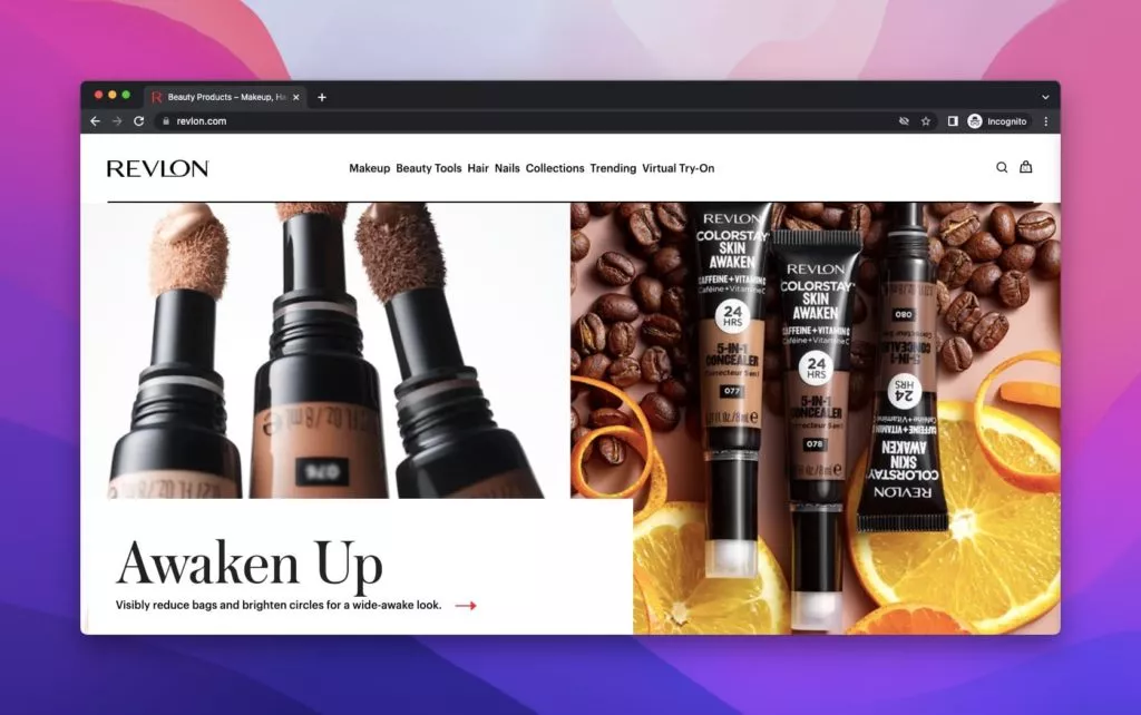
With a rich history dating back to 1910, Revlon has maintained its status as a trend-tracking brand. It has evolved over the years and boasts collaborations with various renowned figures. Revlon’s product headlines are strategically crafted to capture attention, and each product category receives a unique and engaging motto.
For instance, Revlon’s concealer commercial, boldly displayed above the fold, introduces the “Awaken Up” line, emphasizing the product’s purpose of concealing imperfections. Revlon promotes its colorful crayons in another vibrant display with the playful and catchy headline, “Wanna Play?” The brand effectively showcases its diverse product range through compelling visuals, creating an impact that aligns with its innovative image.
3. Lotus Bakeries: A Legacy of Biscuit Mastery
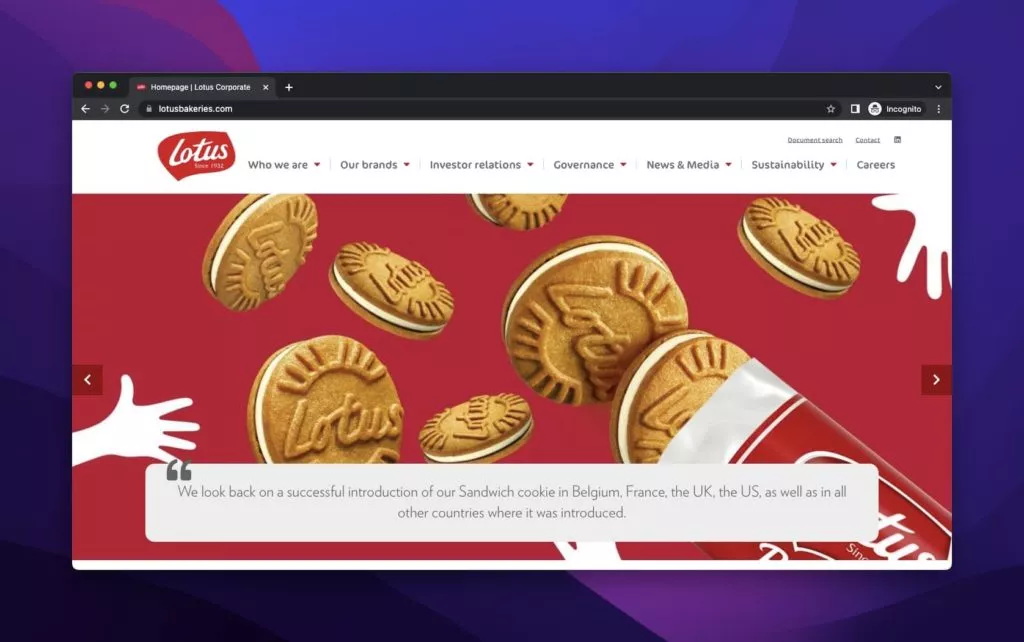
Lotus Bakeries, a Belgian powerhouse in biscuit production since 1932, takes a unique approach to product headlines. The brand’s emphasis on intensity, showcased through a striking red background, positions its biscuits as the show’s star. Lotus cleverly narrates its brand story not through its name but through vivid descriptions, allowing the products to speak for themselves.
Lotus employs a minimalist strategy in showcasing new products, providing simple explanations without explicitly naming them. This deliberate omission aligns with the brand’s overarching strategy – focusing on the products’ improvements and letting their reputation precede them. The website prioritizes images, allowing the visual impact to surpass the brand name’s prominence.
4. Pernod Ricard: Elevating Spirits with Elegance
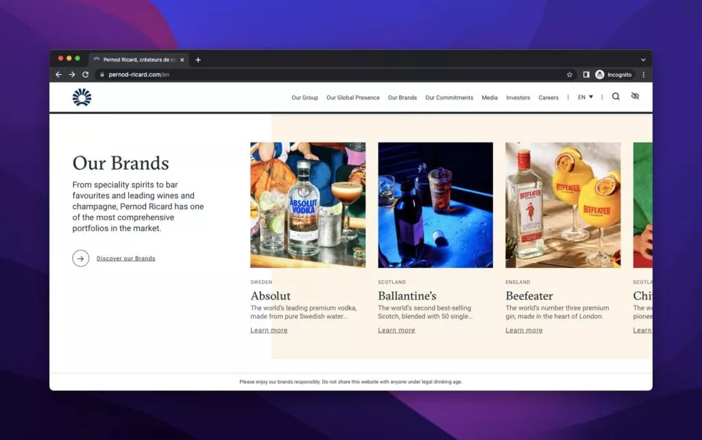
Pernod Ricard, the distinguished French beverage company renowned for its anise-flavored spirits, presents its product lineup with sophistication. Under “Our Brands,” the products are meticulously displayed with names, images, and clear descriptions, allowing visitors to delve into their unique characteristics with a simple “Learn More” click.
For a more in-depth exploration, Pernod Ricard provides dedicated product pages offering additional details, including original locations and dates. The brand seamlessly guides customers to specific product websites with well-placed CTAs, creating a comprehensive and informative journey for those interested in discovering more about its exceptional offerings.
5. Everlane: Elevating Fashion with Ethical Principles
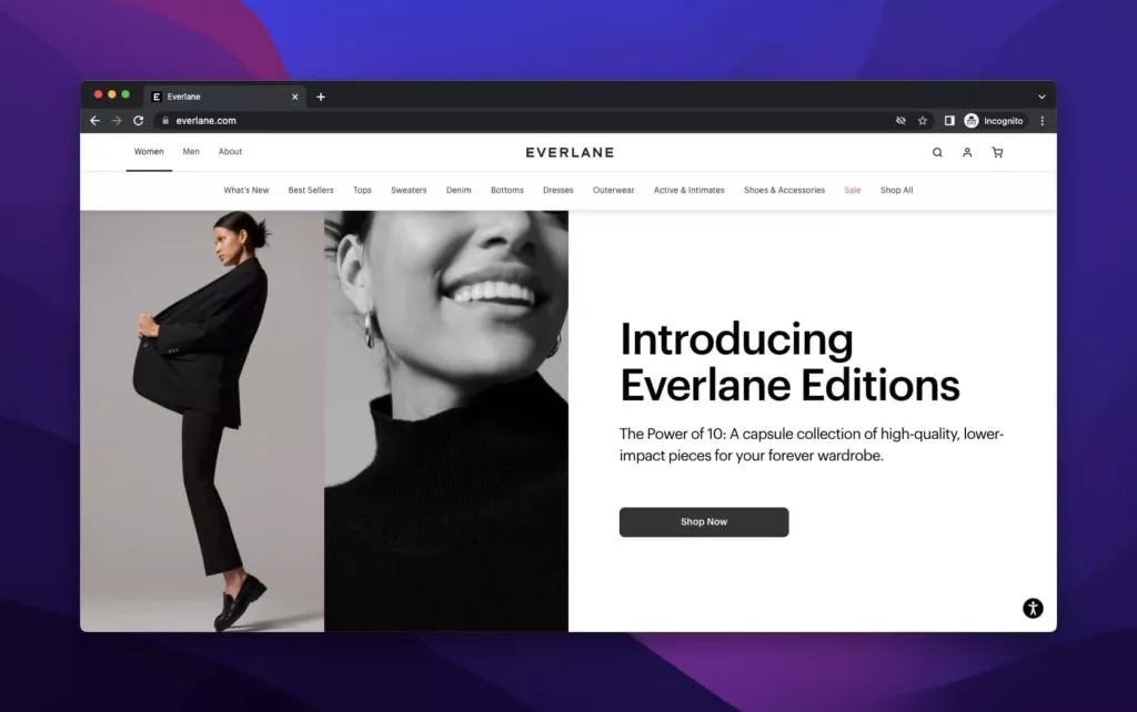
Everlane, a clothing retail company guided by ethical principles and a commitment to transparency, stands out for its succinct yet impactful product headlines. Displayed with black and white tones, Everlane introduces new editions directly on the above-the-fold homepage, captivating visitors with a charming image that aligns seamlessly with the brand’s identity.
The product headlines are characterized by clarity and relevance, presenting concise descriptions that echo the brand’s expectations. This assertive approach in product headlines highlights Everlane’s commitment to straightforward communication, aiming to draw attention to new collections and foster customer engagement.
In another showcase, Everlane presents the Cactus spring series with a promotion of bags, opting for a background of spring-inspired images. While the visibility of the product headline may be subjective, its effectiveness is undeniable, leveraging essential details like product names, explanations, and strategically placed CTA buttons for seamless navigation.
6. Apple: A Pinnacle of Technological Innovation
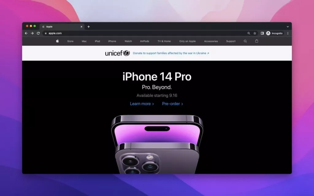
A multinational technological powerhouse, Apple consistently dazzles its customers with new products, emphasizing limited availability and prestige through pre-orders. Recognized for its distinctive style, Apple employs brief yet intriguing descriptions, sparking curiosity familiarly and astutely.
The pre-order example for the new iPhone 14 Pro showcases Apple’s attention to detail in product headlines. Apple crafts a comprehensive and compelling product headline that caters to its global audience by providing information on colors, highlighting phone sizes, and presenting pricing details.
7. Polaroid: Embracing Exclusivity with Visual Storytelling
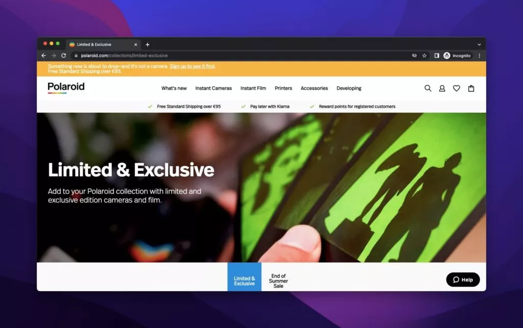
Polaroid, renowned for its contributions to photography, takes a unique approach in its limited and exclusive product headline. Featuring an image of a hand-holding film, the brand opts for a title and description without a traditional CTA. This departure from convention is complemented by the seamless integration of purchasable items, prices, and “Add to Cart” buttons as visitors scroll through the page.
Differentiating itself, Polaroid assumes a level of familiarity from its audience, addressing photography enthusiasts directly and relying on an unconventional yet effective presentation.
8. Mucinex: A Playful Approach to Medicinal Relief
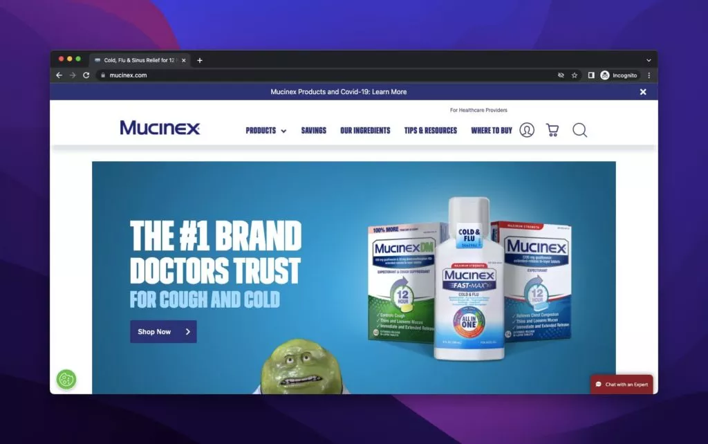
Mucinex, a trusted medication brand for coughs and flu-related issues, employs a distinct product headline strategy. Animated images of bacteria create a visually engaging narrative, emphasizing the discomfort of coughing and sneezing. The brand supports its claim with doctors’ reviews and completes the product headline frame with a strategically placed CTA button, guiding customers to explore Mucinex’s range of products.
This playful approach differentiates Mucinex in medicinal product headlines, combining humor and medical credibility.
9. Dickinson’s: Purity in Skincare Solutions
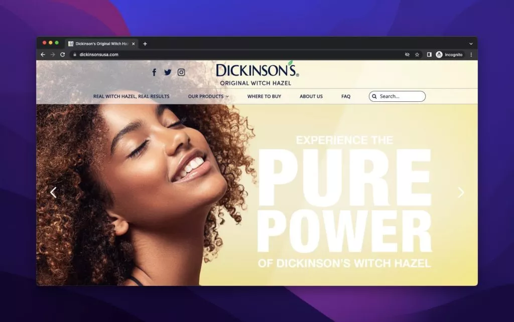
Dickinson’s, a skincare brand collaborating with renowned firms, welcomes visitors with an above-the-fold featuring a woman smiling with closed eyes against a vibrant yellow background. The large headline and slogan convey the brand’s primary aim of providing a pure solution. As the page unfolds, Dickinson’s product headlines for witch hazel toners take center stage, accompanied by traditional descriptions and a compelling CTA for those eager to explore further.
The page also features an animated circle highlighting the toners’ features, adding an interactive and engaging element to the skincare product headline. Dickinson combines visual appeal with informative content to create a captivating user experience.
10. Lancome: Radiance in Every Drop
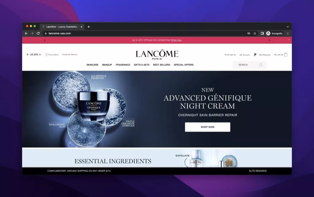
Lancome, the esteemed cosmetics and perfume brand affiliated with L’Oréal, strategically showcases its latest products above the fold with captivating imagery. The product headline, presented against a dark background, stands out for its size and intensity, making it a prime example on our list. Including the right Call-to-Action (CTA) button enhances user interaction and ensures a seamless journey through Lancome’s offerings.
In contrast, another product headline by Lancome, featuring cream and serum on a lustrous gold background, concludes the page with a dazzling visual impact. The description, adorned with vibrant language and product imagery, entices users to explore further. The juxtaposition of these two Lancome product headlines highlights the brand’s versatility and strategic promotional prowess.
11. Nine West: Chic Elegance Beyond Closure
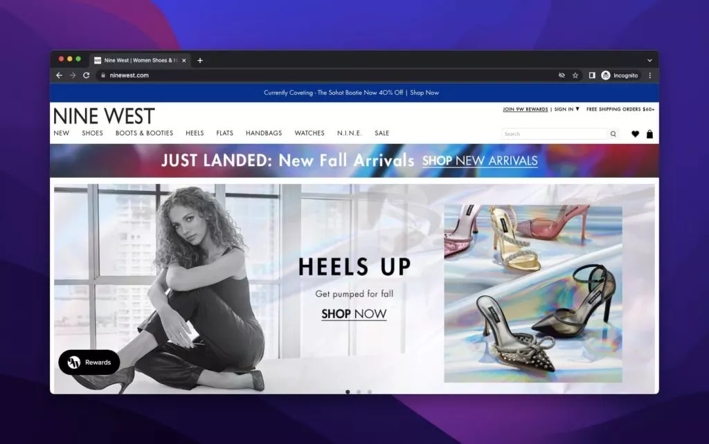
Nine West, the renowned fashion retailer, may have closed its doors in 2018, but its products continue to make a statement through various retailers. The product headline examples from Nine West exude chic elegance and fascination. The first instance showcases a woman modeling the new “Heels Up” series, with direct and ornamented descriptions complemented by a fitting CTA.
In the above-the-fold section, the spotlight shifts to “Bold Booties” as the fall season approaches, emphasizing the importance of seasonal campaigns. The consistent use of the ‘Shop Now’ CTA aligns with Nine West’s favored approach, encouraging users to explore and shop the latest trends. These product headlines emphasize not just style but also the enduring influence of a brand even after its closure.
12. Follow Your Heart: Nourishing Sustainability
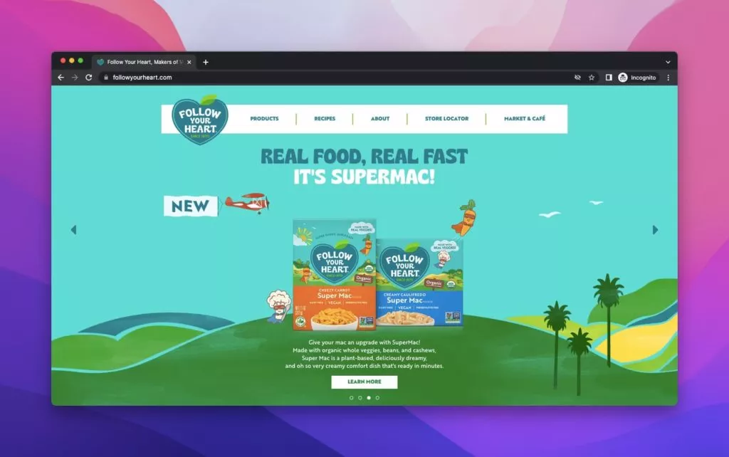
Follow Your Heart, a dedicated vegan product brand committed to sustainability and positive change employs product headlines that echo its ethos. An animated above-the-fold presentation introduces an advanced product under the motto “Real Food, Real Fast. It’s Supermac!” A detailed explanation accompanies the image, and the strategically placed CTA enhances the overall user experience.
In another example, Follow Your Heart creates a distinctive style with animated figures, emphasizing a green-oriented world. A new product is showcased on a green background with clear features, usage examples, and an enticing CTA that provides a recipe after a thorough description. Follow Your Heart’s product headlines go beyond promotion; they tell a story of a brand deeply committed to its values and vision.
What Should a Product Headline Have?
A well-crafted product headline is more than just a title; it’s a gateway to capturing your audience’s attention. Here are the key elements that a compelling product headline should incorporate:
- Great Headline or Main Title: The primary focus is on a captivating headline that succinctly communicates the essence of the product. It should be memorable and align with your brand’s identity.
- Descriptive and Informative Description: Beyond the headline, a detailed description follows. This section gives customers additional insights, helping them understand the product’s features, benefits, and uniqueness. A clear description is crucial for customers to make informed decisions.
- Persuasive and Evocative Language: To truly engage your audience, your product headline should use language that persuades and evokes emotions. Whether it’s highlighting the product’s advantages, quality, or impact, the language should resonate with your target audience.
- Call-to-Action (CTA) Button: An effective product headline is complete with a Call-to-Action button. This button is a directive tool, guiding customers on the next steps to explore or purchase the product. It enhances user experience and drives engagement.
- Visual Appeal through Images: While not explicitly mentioned, including visually appealing images is essential. Images visually represent the product, offering customers a closer look. High-quality visuals attract attention and significantly contribute to the overall impact of the product headline.
How do you decide which catchy words to use in product headlines?
Choosing the right words for your product headlines is an art that requires an understanding of your audience and strategic decision-making. Here’s a guide to deciding catchy phrases:
- Know Your Audience: Understand your target audience’s preferences, concerns, and priorities. Tailor your words to resonate with their needs and desires.
- Highlight Unique Selling Points (USPs): Identify the distinctive features of your product that set it apart. If cost-effectiveness is a key USP, emphasize it. For functionality-focused products, showcase their capabilities.
- Material and Quality: If your product’s material is a standout feature, incorporate related words into your headlines. Highlighting quality materials can be a persuasive factor.
- Align with Brand Principles: Ensure your chosen words align with your brand’s principles and values. Consistency in messaging is crucial for brand identity.
Conclusion:
While many product headlines may appear similar, each is a unique creation tailored to represent a brand’s essence. Crafting impactful product headlines requires a balance of creativity, clarity, and strategic thinking. The key is striking and charming, delivering your message directly to persuade and captivate your audience.
FAQs on Product Headlines:
Is A/B testing important for product headlines?
A/B testing is valuable for optimizing product headlines. It allows you to experiment with different variations to determine which headline resonates best with your target audience.
How do I know if my product headline is effective?
Monitoring key performance indicators (KPIs) such as click-through rates, conversion rates, and user engagement can help assess the effectiveness of your product headline.
Are there any common mistakes to avoid in product headlines?
Avoid being too vague, misleading, or using jargon that your target audience may not understand. Additionally, steer clear of headlines that may come across as overly salesy or pushy.

