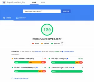
A poorly designed PPC landing page can undo all the hard work you’ve invested in attracting initial visitors from your digital ad campaigns. When visitors arrive at your landing page, they expect a seamless and engaging experience. If the landing page fails to impress, they may lose interest and leave, leading to wasted advertising spend and missed conversion opportunities.
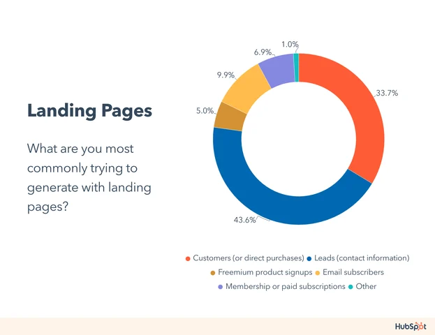
To prevent visitors from hitting the back button on your landing page, this guide will explore some of the best examples of successful PPC landing pages. We’ll also demonstrate how easy it is to create a successful landing page using Landingi’s extensive template library. We’ll also discuss what a PPC landing page is and the key elements contributing to its effectiveness.
Let’s dive in!
What is A PPC Landing Page?
A PPC landing page, also known as a pay-per-click landing page, is a webpage where a user “lands” after clicking on the PPC advertisement. The primary goal of a PPC landing page is to familiarize users with the promoted product/service and encourage them to take a specific action, such as making a purchase or filling out a lead form.
Key components of a PPC landing page include:
- Catchy Headline with Tagline: A compelling headline grabs the visitor’s attention and communicates the product’s or service’s main benefit. A supportive tagline provides additional context or reinforcement.
- Explanation of Benefits: A clear and concise explanation of the product or service’s benefits helps visitors understand its value proposition and why they should take action.
- Social Proof/Trust Badges: Testimonials from satisfied customers, security badges, or industry awards help build trust and credibility with visitors.
- Clear Call-to-Action (CTA): A prominent CTA button prompts visitors to take the desired action, like making a purchase or signing up for a newsletter.
- Lead Capture Form: If the goal is lead generation, a short and simple lead capture form collects visitor information for follow-up.
- Supportive Visuals: High-quality images or videos that evoke emotions or provide additional context can enhance the overall appeal and effectiveness of the landing page.
Top PPC Landing Page Examples from Real Life:
1. Monday.com

Monday.com is a leading project management platform designed to streamline collaboration and improve productivity for teams of all sizes. With its intuitive interface and customizable workflows, Monday.com empowers teams to organize tasks, track progress, and communicate effectively in one centralized platform.
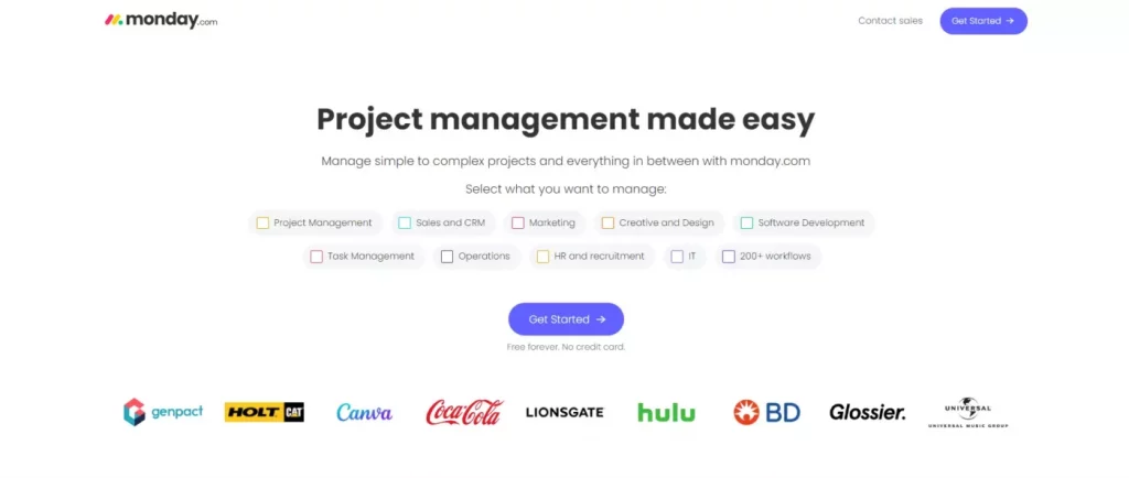
Key Features:
- Flexibility Highlighted: Monday.com emphasizes its tool’s flexibility, showcasing its adaptability to various project management needs and workflows.
- Centralized Headline, Tagline, and CTA: The landing page strategically positions the headline, tagline, and call-to-action (CTA) in the central part of the screen for clear visibility and alignment.
- Incentivized Copy: Compelling copy below the primary CTA provides visitors with additional incentive to explore the platform, highlighting key benefits and features.
- Secondary CTA for Alternative Conversion: A secondary CTA offers users an alternative conversion option, minimizing friction and providing flexibility in the signup process.
- Email Entry Process: Users are presented with options for signup, with the primary CTA leading to a separate webpage for email entry and the secondary CTA triggering a less obtrusive pop-up.
- Trust Badges for Credibility: Trust badges, such as logos from renowned companies, enhance credibility and professionalism, instilling trust in visitors.
2. KlientBoost

Introduction to KlientBoost: KlientBoost is a premier digital marketing agency specializing in PPC advertising, conversion rate optimization (CRO), and landing page design. With a focus on data-driven strategies and client success, KlientBoost helps businesses maximize their online presence and drive measurable results.
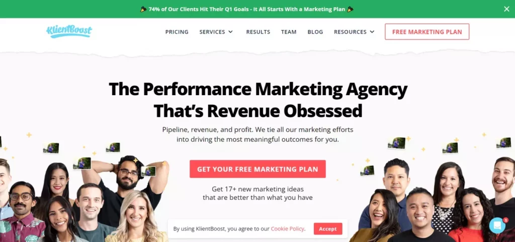
Key Features:
- Effective Ad Description: KlientBoost’s ad description effectively communicates the benefits of working with the agency and establishes trust by highlighting its extensive client base.
- Mention of Free Marketing Plan: The ad description captures users’ attention by mentioning the offer of a free marketing plan, enticing them to learn more about the services.
- Consistent Ad-Landing Page Match: The landing page aligns with the ad copy, reinforcing the message presented in the ad and maintaining consistency throughout the user journey.
- Contrasting CTA for Visibility: A prominently displayed call-to-action (CTA) stands out with contrasting colors, encouraging user interaction and conversion.
- Reinforcement of Free Marketing Plan: The free marketing plan offer is reiterated in the CTA copy, reinforcing the value proposition presented in the ad and incentivizing users to take action.
3. Williams-Sonoma, Inc

Williams-Sonoma, Inc. is a renowned retailer specializing in high-quality home furnishings, kitchenware, and gourmet cookware. With a commitment to prviding premium products and exceptional customer service, Williams-Sonoma has become a trusted destination for individuals seeking to elevate their living spaces and culinary experiences.
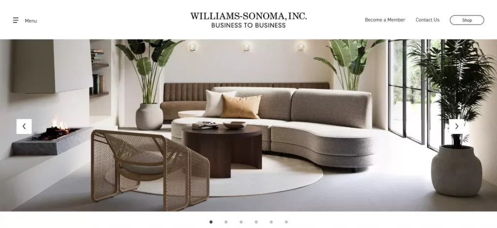
Key Features:
- Sleek and Minimalist Design: The landing page boasts a sleek and minimalist design, focusing on showcasing the company’s products and creating an aspirational vision for visitors’ office spaces.
- Above-the-Fold Visibility: Above-the-fold space is maximized to provide visitors with an immediate glimpse of Williams-Sonoma’s product offerings, enticing them to explore further.
- Informational Scroll: As visitors scroll down the page, they are presented with additional details about the company and its product collections, enhancing engagement and providing valuable information.
- Strategic CTAs: Various strategically placed call-to-action (CTA) buttons prompt users to explore product collections and sign up for membership, effectively guiding them through the conversion funnel.
- Highlighted Membership Program: The ad copy emphasizes the benefits of joining the membership program, such as potential discounts, incentivizing visitors to sign up, and providing Williams-Sonoma with valuable contact details for future marketing efforts.
4. Liberty Mutual Insurance

Liberty Mutual Insurance is a leading provider of auto, home, and life insurance products, committed to offering comprehensive coverage and personalized service to its customers. With a focus on transparency and reliability, Liberty Mutual aims to protect what matters most to individuals and families.
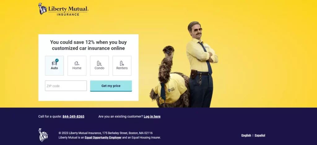
Key Features:
- Minimalist Approach: Liberty Mutual’s landing page adopts a minimalist approach, placing emphasis on simplicity and ease of use to streamline the conversion process.
- Limited Copy: The landing page features minimal copy, with the ad description providing additional details about the company’s offerings and benefits.
- Single-Field Form: The focal point of the landing page is the single-field form, designed to capture visitor information efficiently and expedite the signup process.
- Clear Call to Action: The ad headline includes a clear call to action, prompting users to click through and engage with Liberty Mutual’s insurance services.
- Streamlined Conversion Path: By minimizing distractions and focusing on the form, Liberty Mutual creates a streamlined conversion path, making it easy for visitors to take action and request insurance quotes.
5. Triple P

Triple P is a leading provider of coaching and consulting services specializing in personal and professional development. With a team of experienced coaches and a commitment to empowering individuals to reach their full potential, Triple P helps clients achieve lasting growth and success in various aspects of their lives.
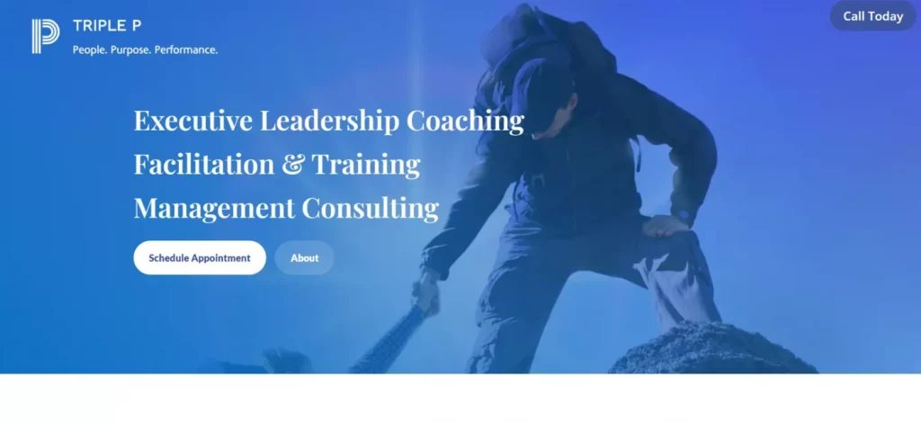
Key Features:
- Concise Ad Copy: Triple P’s ad copy is concise and impactful, clearly conveying the company’s offerings and the benefits visitors can expect.
- Consistent Messaging: The landing page headline aligns with the ad description, ensuring consistency in messaging and reinforcing the value proposition.
- Clear and Contrasting CTA: The call-to-action (CTA) button stands out with contrasting colors, making it easy for visitors to identify and take action.
- Trust-Inducing Design: The use of blue in the background evokes feelings of trust, loyalty, and security, enhancing the credibility of Triple P’s coaching services.
- Relevant Hero Image: The hero image complements the messaging by visually reinforcing the concept of personal and professional growth, resonating with visitors seeking coaching solutions.
Learn about more PPC trends here.
6. Smart Cleaners

Smart Cleaners is a reputable housekeeping company dedicated to providing top-notch cleaning services for homes and businesses. With a commitment to transparency and quality, Smart Cleaners ensures that customers receive thorough cleaning without any hidden fees or surprises.
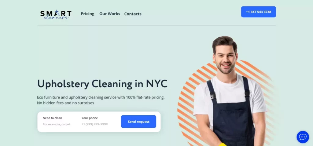
Key Features:
- Straightforward Messaging: Similar to Corpo Kinetic, Smart Cleaners delivers a clear and concise message in its ad copy, highlighting the company’s services and benefits.
- Minimal Distractions: The landing page is designed with minimal distractions, allowing visitors to focus on the essential information without any unnecessary clutter.
- Keyword Alignment: The headline on the landing page aligns with the keywords used in the ad meta description, ensuring consistency and relevance for visitors.
- Transparency on Pricing: The copy beneath the headline emphasizes Smart Cleaners’ commitment to transparency by explicitly stating the absence of hidden fees, addressing potential visitor concerns.
- Streamlined Conversion Path: With a small number of form fields, the landing page prompts users to provide their information efficiently, leading them to a highly visible call-to-action (CTA) button to initiate the conversion process.
- Proof of Effectiveness: Further down the landing page, before/after photos of Smart Cleaners’ projects serve as tangible proof of the company’s effectiveness, instilling confidence in potential customers.
7. Cedars

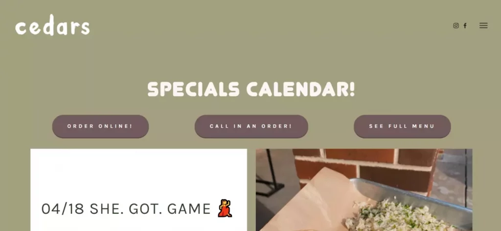
Cedars is a renowned restaurant offering delectable cuisine and exceptional dining experiences. With years of culinary expertise, Cedars prides itself on delivering delicious meals and impeccable service to its patrons.
Key Features:
- Direct and Informative Ad Copy: Cedars’ ad title and description provide clear information about the restaurant’s offerings, benefits, and dining options, setting expectations for potential customers.
- Trust-Building Statement: The ad adds a sense of trust by mentioning Cedars’ years of experience, reassuring visitors of the restaurant’s credibility and reliability.
- Immediate Call to Action: Although the landing page may not directly match the ad’s headline or keywords, prominent call-to-action (CTA) buttons encourage visitors to take action, either by placing an order or viewing the menu, as soon as they enter the page.
- Focus on User Experience: The landing page prioritizes user experience by making essential information readily accessible and guiding visitors toward desired actions without unnecessary distractions.
- Seamless Navigation: With intuitive navigation and clear CTA buttons, the landing page ensures a seamless transition for visitors, facilitating easy exploration of Cedars’ offerings and driving conversions.
8. Steven Cohen Team

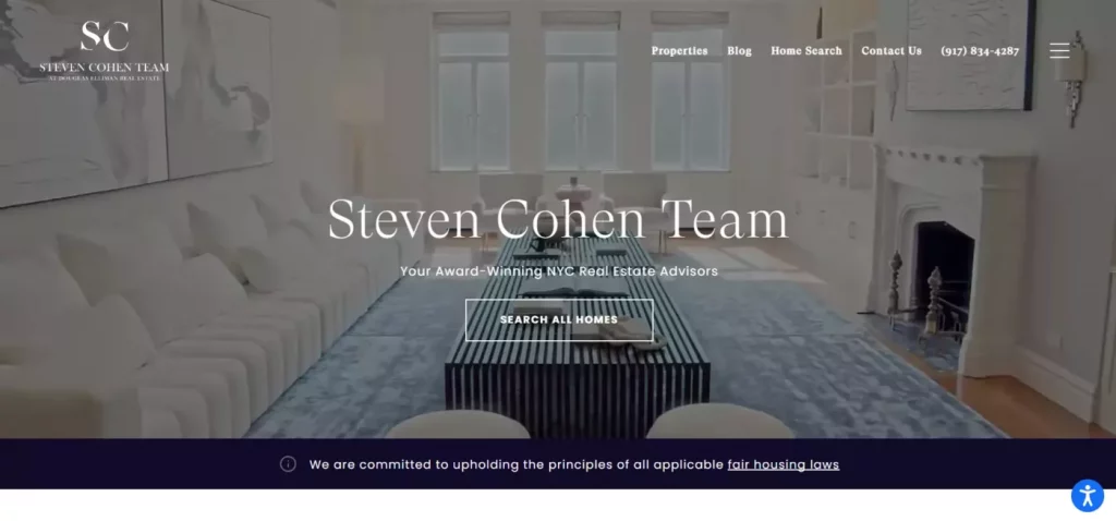
The Steven Cohen Team is a leading real estate agency renowned for its extensive market expertise, proven track record, and trusted reputation. With its commitment to excellence and client satisfaction, the Steven Cohen Team strives to provide unparalleled service in the real estate industry.
Key Features:
- Trust-Building Ad Copy: The ad description utilizes powerful phrases such as “extensive market expertise,” “track record,” and “trusted” to establish credibility and earn visitors’ trust from the outset. The title directs attention to the company’s area of service, setting clear expectations.
- Engaging Video Background: The landing page incorporates a dynamic video background to captivate visitors and maintain their interest. The headline on the landing page aligns with the ad title, reinforcing the message of credibility. Power words like “award-winning” and “committed” further enhance the team’s reputation.
- Visible CTA: A highly visible call-to-action (CTA) prompts visitors to take action without disrupting the flow of the landing page. The transparent background of the CTA button ensures seamless integration with the page design, encouraging conversions.
9. TikTok
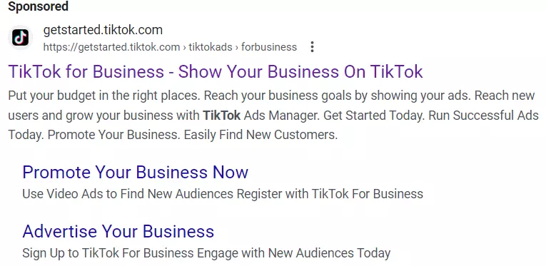
Introduction to TikTok: TikTok is a popular social media platform known for its engaging content and viral videos. With TikTok, users can create and share short-form videos to express themselves, connect with others, and grow their online presence.

Key Features:
- Persuasive Ad Copy: TikTok’s ad description paints a compelling picture of the platform’s benefits, using second-person language and positive adjectives to evoke excitement and enthusiasm. This approach encourages users to envision themselves using TikTok and drives click-throughs.
- Striking Layout: The landing page utilizes a white-on-black layout to make the text stand out and create visual contrast. The persuasive copy follows a similar pattern to the ad, reinforcing the platform’s appeal and value proposition.
- Engaging Animation: An animated sequence on the landing page adds dynamism and liveliness, enhancing the overall user experience. The prominent call-to-action (CTA) button stands out against the background, prompting visitors to take action and explore TikTok further.
PPC Landing Page Best Practices To Follow
- Keyword Matching
Ensuring that your PPC landing page aligns with the keywords you bid on is crucial for maximizing relevance and minimizing bounce rates. Incorporate the targeted keyword into the page title and throughout the copy to signal relevance to visitors.
- Message Matching
PPC message matching entails synchronizing the message conveyed in your ad with that of the landing page. Consistency in phrases, colors, logos, and offers fosters a seamless transition for users. Research indicates that effective message matching can significantly boost conversion rates and reduce ad costs per conversion.
To achieve successful message matching:
- Include keywords in meta titles and descriptions.
- Align the headline on the landing page with the ad’s pitch.
- Ensure graphics on the landing page correspond with the visual elements in the ad.
- Maintain consistency in the call-to-action (CTA) across both the ad and landing page.
- Fulfill a Single Purpose
A landing page must have a singular focus: driving conversions. Avoid distractions that may divert users from completing the desired action, such as extraneous navigation bars or links to other pages.
- Use Minimal Form Fields
Minimize the number of form fields on your landing page to streamline the user experience and increase conversion rates. Research indicates that reducing form fields can significantly enhance conversion rates. Only request essential information, such as first name, last name, and email address, to keep the process quick and straightforward.
- Align Headlines, Offers, and CTAs
Ensure consistency and alignment between the headline, offer, and CTA to guide users seamlessly toward conversion. A cohesive flow from attention-grabbing headline to clear CTA facilitates a logical conversion path. Optimize placement to coincide with natural reading patterns and ensure all critical elements are easily visible to visitors.
Conclusion:
PPC landing pages are essential components of successful pay-per-click advertising campaigns. They serve as the first point of contact between users and advertisers, playing a critical role in converting clicks into conversions. By optimizing landing pages for relevance, clarity, and persuasive content, businesses can maximize the effectiveness of their PPC campaigns and achieve their marketing objectives. Regular testing, analysis, and refinement of landing pages are key to improving performance and driving better ROI from PPC advertising efforts.
FAQs on PPC Landing Pages:
How can I track the performance of PPC landing pages?
Performance of PPC landing pages can be tracked using web analytics tools such as Google Analytics or the tracking features provided by PPC advertising platforms like Google Ads or Microsoft Advertising. Key metrics to track include conversion rate, bounce rate, time on page, and the number of leads or sales generated.
What role do PPC landing pages play in the overall PPC strategy?
PPC landing pages play a critical role in the overall PPC strategy by serving as the destination for users who click on PPC ads. They are responsible for converting clicks into conversions and directly impact the success and ROI of PPC campaigns.
How often should PPC landing pages be updated or refreshed?
PPC landing pages should be regularly monitored and updated to maintain relevance, improve performance, and adapt to changes in user behavior or market conditions. Depending on the level of traffic and campaign objectives, landing pages may be updated monthly, quarterly, or as needed.


