Embarking on the journey of creating or refining your online presence, particularly through an opt-in page, is a pivotal moment in the ever-evolving landscape of digital engagement. As the digital realm becomes increasingly saturated with information, products, and services, the significance of a well-crafted opt-in page cannot be overstated. The digital ecosystem thrives on effective communication, and your opt-in page serves as a gateway to establish a meaningful connection with your audience. It is a dynamic canvas where design, content, and functionality converge to create an immersive experience for visitors.
What is an Opt-In Page?
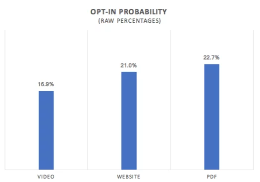
An opt-in page functions as a specialized landing page designed to offer value in exchange for the visitor’s email or contact information. This value can range from free shipping or newsletter sign-ups to the opportunity to attend a webinar. These pages serve as high-converting lead magnets, establishing lasting connections with visitors and transforming them into customers through continuous value delivery.
Difference Between Opt-In Page and Landing Page
While an opt-in page falls under the umbrella of landing pages, not all are opt in pages. The primary distinction lies in the focus:
- A landing page provides general information about products or services featuring multiple CTAs.
- An opt-in page collects the visitor’s email or contact information.
Benefits of Opt-in Pages:
- Attention-Grabbing Design:
- Why it Matters: The visual appeal of your opt-in page is the first impression users get. A well-designed page can significantly impact user engagement.
- Statistics: According to a study by Adobe, 38% of people will stop engaging with a website if the content or layout is unattractive.
- Precision in Targeting Settings:
- Why it Matters: Tailoring your opt-in form to specific audiences ensures relevance, making users more likely to subscribe.
- Statistics: Personalized calls-to-action perform 202% better than basic, generic ones (Source: HubSpot).
- Compelling Popup Copy:
- Why it Matters: The text on your opt-in page should clearly convey the value of subscribing, addressing user needs or pain points.
- Statistics: Pages with more than 1,000 words get 3x more traffic and 3.5x more backlinks (Source: QuickSprout).
- Effective Call-to-Action (CTA):
- Why it Matters: A strong and clear CTA prompts users to take the desired action, boosting conversion rates.
- Statistics: Using first-person CTA copy can increase conversion rates by over 90% (Source: Unbounce).
- Utilizing a Popup Builder with Advanced Features:
- Why it Matters: A user-friendly tool with advanced targeting and design options streamlines the creation process.
- Statistics: Websites using popup forms experience an average conversion rate increase of 50% (Source: Sumo).
Elements of a Successful Opt-In Page
Before creating an opt-in page, it’s crucial to acknowledge that visitors are hesitant to share their contact details. The key lies in crafting a user-friendly experience and delivering high-quality value. Essential elements for a successful opt-in page include:
- Captivating Headline: The first impression matters. Craft a headline that engages and aligns directly with your audience’s interests.
- Examples: “Join our cooking class for a delicious experience. Reserve your spot!” or “Explore your financial goals with us – grab your free ebook now!”
- Unique Selling Proposition (USP): Communicate the value, whether it’s access to a newsletter, a free ebook, or exclusive offers.
- Minimalistic Design: Avoid information overload by opting for a clean design with a single, compelling Call to Action (CTA).
- Strong CTA: Make your button exciting and promising. Instead of a generic “Submit,” use phrases like “Get My Free Ebook.”
- Concise Form: Keep the form fields to a minimum. The fewer fields, the higher the likelihood of user completion.
- Mobile Responsiveness: Ensure your opt-in page is fully responsive for optimal viewing on mobile devices, catering to the substantial portion of web traffic from mobile users.
Successful Opt-in Page Examples:
1. Backlinko’s Newsletter Opt-In Page
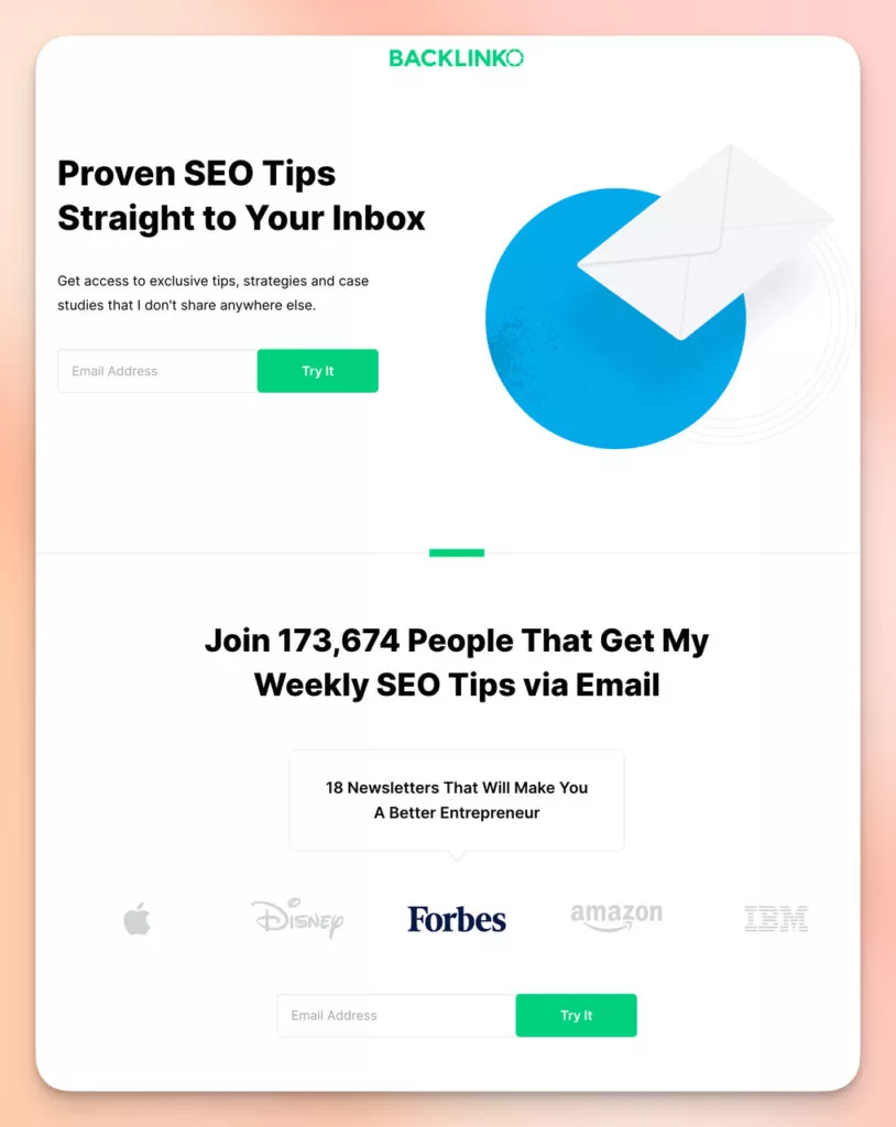
Backlinko, a specialized platform offering comprehensive SEO training and resources, boasts a highly effective opt-in page that requires only two scrolls to view.
Why it Stands Out:
- Social Proof: The optin page leverages an impressive subscriber count, creating a compelling “join the club” appeal.
- Brand Logos: Endorsement from well-known brands enhances brand credibility and authority, instilling confidence in potential subscribers.
2. Dorie Clark’s Ebook Opt-In Page
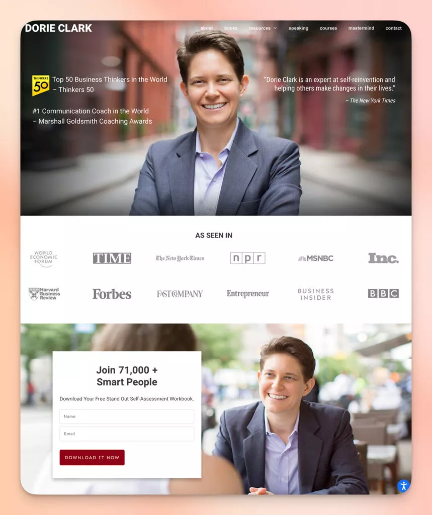
Dorie Clark, a renowned author, speaker, and business educator specializing in marketing and personal branding, presents a standout opt-in page that unlocks a free self-assessment workbook.
Why it Stands Out:
- Trustworthy Signs: The page strategically features renowned names like “The New York Times” and prominent award titles, fostering trust and credibility.
- Big Wins: Highlighting Dorie as one of the top business thinkers and an expert in teaching communication establishes her expertise and proficiency.
- Abundant Followers: The statement “Join 71,000+ Smart People” signifies a substantial following, portraying widespread appreciation for Dorie’s work and encouraging new visitors to join the community.
3. Make Webinar Opt-In Page
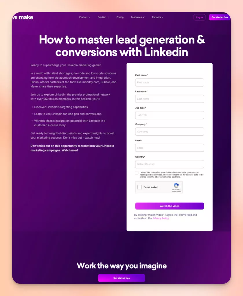
For simplicity, we’ve included Make’s webinar opt-in page, which effectively divides the page into two sections: one presenting clear value to the user and the other featuring a basic form.
Why it Stands Out:
- Subtext: Including additional context sets expectations for the visitor regarding what they will learn. Social proof is emphasized with a focus on 950 million members.
- Intentional Simplicity: While the absence of imagery may be intentional to emphasize purpose, incorporating relevant visuals could enhance user engagement.
4. Wyser Download Report Opt-In Page
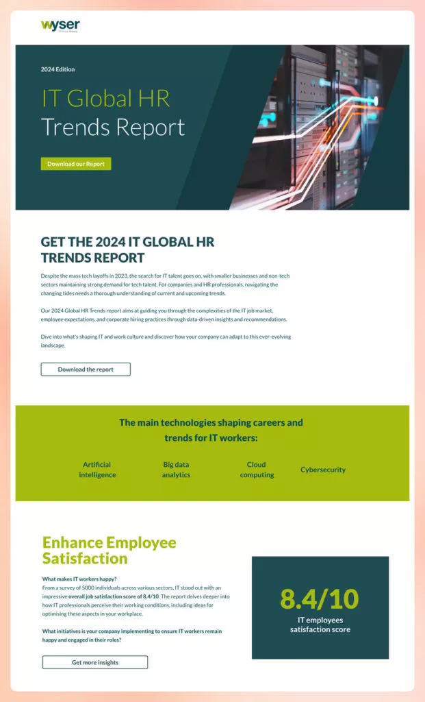
Wyser’s opt in page effectively utilizes multiple CTAs, all directing users to the same point on the page—the form.
Users can access the form instantly with a single click, whether they read the top of the page and submit it or scroll to the end for additional persuasion.
Why it Stands Out:
- Content Description: A concise description outlines the report’s value, explicitly addressing IT talent search and HR trends.
- Form Fields: The form strategically requests detailed contact information, aligning with standard B2B lead generation strategies.
Learn about off-page SEO here.
5. Adjust Ebook Opt-In Page
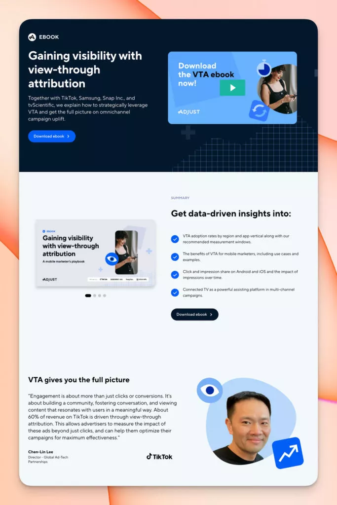
The Adjust ebook opt-in page distinguishes itself by seamlessly integrating a video, offering a dynamic method to engage visitors without inundating them with excessive text.
Why it Stands Out:
- Video Element: The incorporation of a video providing a swift overview or introduction to the content offers visitors a more engaging experience, potentially increasing their willingness to provide information.
- Testimonial: Inclusion of a quote from a reputable source enhances credibility and provides real-world context, fostering trust.
- Opt-In Form and Trust Signals: The intentional placement of well-known brand names alongside the modestly designed form builds trust and encourages sign-ups.
6. CoSchedule Marketing Plan Course Opt-In Page
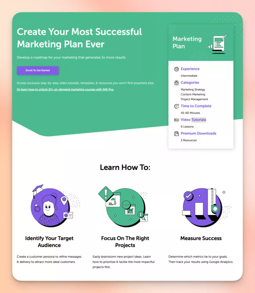
CoSchedule sets itself apart by providing an upgraded paid option on the opt-in page, allowing visitors to choose based on their needs.
Why it Stands Out:
- Text and Copywriting: The headline directly addresses the visitor’s desire to enhance marketing results, with alt text emphasizing the potential for increased outcomes.
- CTAs: Two distinct CTAs—one for free course enrollment and another for accessing premium resources.
- Social Proof: Incorporates a testimonial for added credibility.
- Placement of the Upper Deal: By presenting a free course and a premium deal on the page, visitors can choose based on their needs, creating more sign-up opportunities.
7. Yoga Journal Subscription Opt-In Page
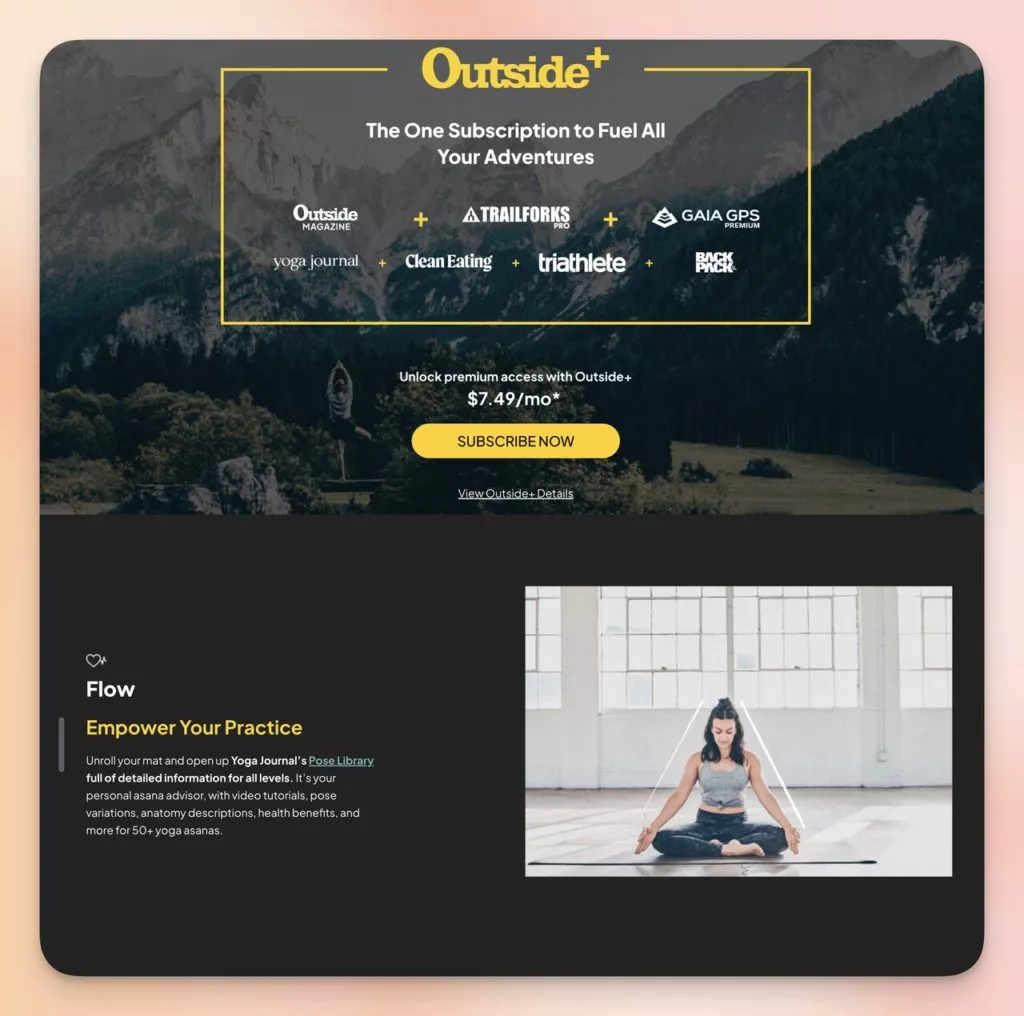
Yoga Journal’s Outside Plus, a comprehensive subscription package for wellness enthusiasts, presents a compelling opt-in page with clear benefits and a straightforward subscription process.
Why it Stands Out:
- Design & Layout: The natural landscape background sets the tone for the outdoor and wellness lifestyle subscription, with a clear layout emphasizing social proof.
- Benefits of Membership: The page features six benefits, smoothly transitioning with a fade effect upon scrolling. One of them is highlighted here.
- Membership List View: Concise benefit descriptions maintain simplicity while including actual prices to ensure tangible value.
8. Blue Apron Subscription Opt-In Page
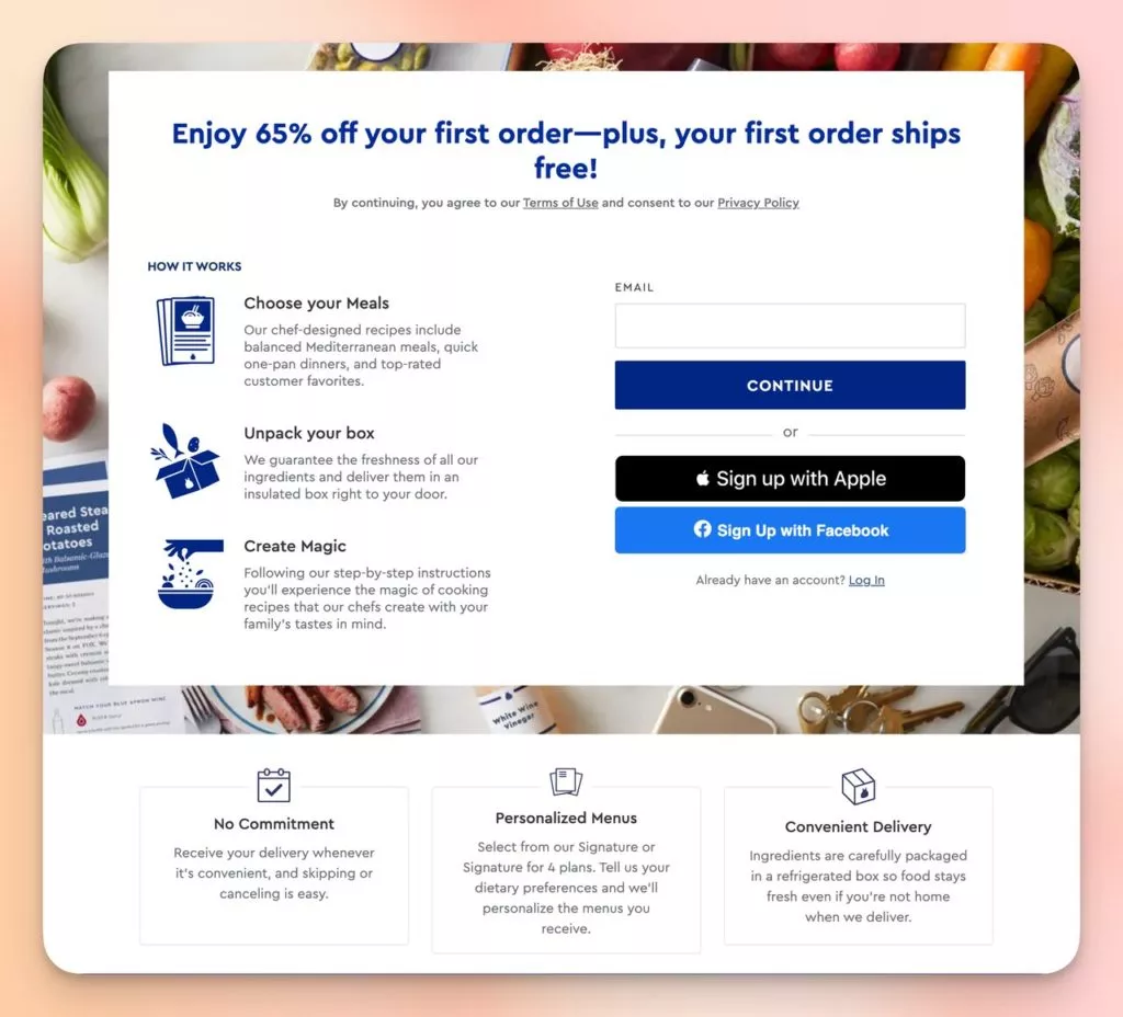
Blue Apron’s optin page distinguishes itself with a clear headline that offers a substantial discount, effectively incentivizing immediate action.
Why it Stands Out:
- Clarity of Offer: The direct headline presents a compelling discount, one of the most effective ways to prompt sign-ups.
- Layout & User Flow: The clean layout presents information in a logical order, guiding users seamlessly from the offer to benefits and sign-up options.
- Benefits: Key benefits such as “No Commitment,” “Personalized Menus,” and “Convenient Delivery” are prominently displayed.
9. Restream Product Promotion Opt-In Page
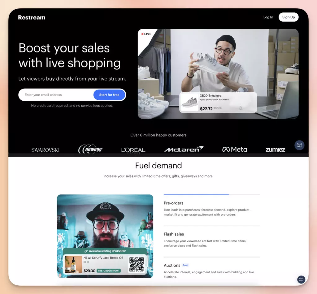
Restream’s opt-in page, organized into five sections for this product promotion, effectively engages potential users.
- Opt-In Form Section: The page starts with a bold, engaging headline and a straightforward opt-in form, encouraging immediate action.
- Benefits Section: This section lists key service features using concise, easy-to-understand language.
- Analytics Section: Focused on measurable outcomes, this section showcases the service’s tangible benefits, such as tracking viewer engagement.
10. Quip Free Routine Opt-In Page
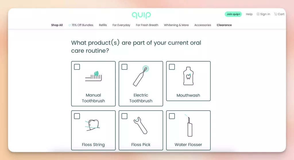
Quip’s opt-in page stands out for its engaging and interactive approach. It incorporates a quiz to determine the user’s oral care routine, creating a personalized experience.
Why it Stands Out:
- Value Proposition: It promises a personalized routine, suggesting a customized solution for the user.
- Engagement through Quizzes: The quiz makes the opt-in process interactive and personalized, engaging potential customers.
- Incentive: Provides an example of personalized product recommendations, adding value to the engagement process.
- Subtext: This paragraph addresses the common concern of email frequency, stating, “We’re sending emails less frequently,” easing potential hesitations about sharing information.
How to Access Opt in Pages:
1. Search Engine Optimization (SEO): Effective SEO is crucial for maximizing the visibility of your optin page in search engine results. Begin by conducting thorough keyword research to identify relevant terms and phrases related to your content. Incorporate these keywords naturally into your page’s content, meta tags, and headers. Optimize the page’s structure and format to align with SEO best practices, making it more likely to rank higher on search engine results pages (SERPs). Regularly update and refresh your content to maintain relevance and appeal to search algorithms.
2. Paid Advertising: Investing in paid advertising provides a targeted and immediate avenue to drive traffic to your opt-in page. Platforms like Google, Instagram, and Facebook offer robust advertising capabilities. Design visually compelling ads with attention-grabbing copy that clearly communicates the value of subscribing. Utilize the targeting options provided by these platforms to reach specific demographics aligned with your target audience. Regularly monitor and adjust your ad campaigns based on performance metrics to optimize results.
3. Email Marketing: Leverage your existing subscriber base and nurture new leads through strategic email marketing. Include a prominent link to your opt-in page in your email campaigns, encouraging recipients to explore the additional value offered through subscription. Craft engaging and personalized emails with clear calls-to-action (CTAs) that highlight the benefits of subscribing. Segment your email lists to tailor messages to specific audience segments, increasing the relevance and impact of your opt-in invitations.
4. Backlinking: Enhance the visibility and credibility of your opt-in page by securing backlinks from external websites. Develop a backlinking strategy that involves reaching out to relevant websites, blogs, or industry partners. Offer guest posts, collaborate on content, or provide testimonials to secure quality backlinks. Backlinks not only drive direct traffic but also contribute to your page’s authority in the eyes of search engines, positively influencing its search rankings.
5. Influencer Partnerships: Tap into the audience of influencers within your niche to amplify your opt in page’s reach. Identify influencers whose followers align with your target demographic. Collaborate with influencers for shoutouts, sponsored posts, or co-created content that promotes your opt-in page. Influencers bring authenticity and trust, making their endorsement a powerful driver of subscriber growth. Establish clear communication and mutually beneficial partnerships to maximize the impact of influencer collaborations.
6. Internal Site Links: Optimize your website’s structure to guide visitors seamlessly to your opt-in page. Strategically place internal links on key pages, emphasizing the value of subscribing. Incorporate compelling calls-to-action (CTAs) and visually appealing banners that capture visitors’ attention. Consider the user journey and place links at points where visitors are most likely to be receptive to subscription offers. Continuously monitor user behavior and adjust the placement of internal links based on analytics data to enhance effectiveness.
Conclusion:
In conclusion, we’ve explored top-notch examples of opt-in pages that can significantly enhance sign-up conversions. A combination of compelling incentives, a personal touch, and a seamless user experience can turn visitors into a loyal subscriber base.
As you craft or refine your opt-in page, keep these examples in mind, remembering that a simple and authentic offer fosters a stronger connection with your audience. Apply these insights, and witness your sign-up conversions flourish!
**Frequently Asked Questions**
**1. What Tools Can I Use to Create an Opt-In Page?**
Various tools efficiently facilitate the creation of opt-in pages. Popular options include Unbounce, Leadpages, and Instapage, user-friendly landing page builders offering templates and customization options. Email automation tools like Mailchimp, ConvertKit, or Constant Contact often feature built-in functionalities for creating and managing opt-in forms.
**2. How to Create an Opt-In Page Right Now?**
When establishing an opt-in page, clarify its primary purpose. Is it for collecting emails or sharing ebooks? Utilize tools like Unbounce or Mailchimp for simplicity. Keep the page straightforward with a compelling headline, request essential information in your form, and ensure your call to action is bold and enticing. Please spread the word through social media or ads, monitor its effectiveness, and adjust as needed.
**3. Are Popup Opt-In Pages Effective?**
Certainly, popup opt-ins are effective for grabbing attention and securing sign-ups. Creating them without technical skills is effortless with a no-code popup builder like Popupsmart. Customize them to fit your style and communicate effectively with your visitors like any other opt-in page.


