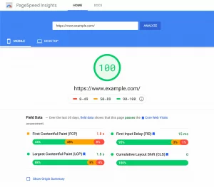
In the ever-evolving landscape of web design, content creation has taken a transformative leap with the advent of Block Editors, particularly prominent in platforms like WordPress. These powerful tools empower creators with intuitive ways to structure, format, and present their content. However, as with any dynamic technology, there are nuances to master and pitfalls to avoid.
Let us uncover the best practices that elevate your content creation process and illuminate the potential pitfalls that might hinder your digital journey. Whether you’re a tech-savvy enthusiast or someone new to the world of content creation, this exploration promises to be a valuable companion in your quest for a captivating and user-friendly online presence.
Do’s and Dont’s of Block Editor:
1. Do: Choose Third-Party Block Plugins Thoughtfully
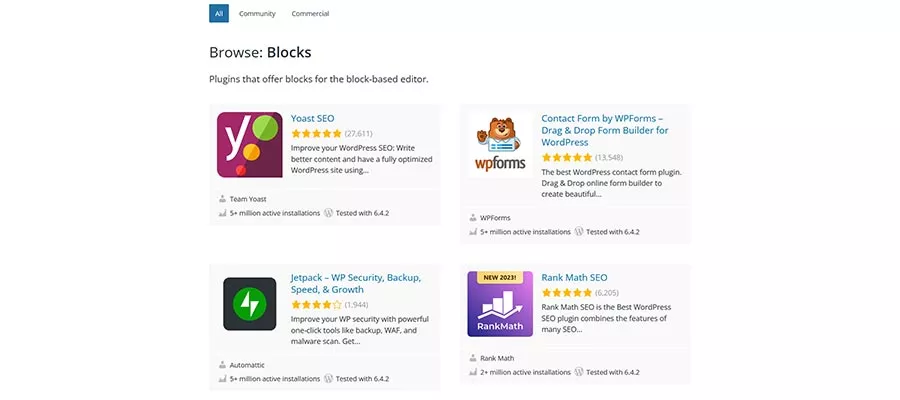
The availability of numerous plugins for extending the Block Editor is beneficial, especially those offering a variety of custom blocks. While WordPress’s core blocks may lack flexibility, custom blocks can fill the gap. However, it’s crucial to carefully evaluate them before installation.
Since custom blocks function as plugins, their features and quality can vary. Similar considerations for choosing plugins apply here. Only install the blocks you genuinely need, scrutinize plugin reviews and changelogs, and promptly remove any unused block plugins. This cautionary approach helps mitigate the potential risks associated with poorly developed or unnecessary plugins, such as bugs, performance issues, and security concerns.
Remember, choosing third-party blocks demands commitment, so ensure you are prepared for this step. Approach the selection of custom blocks with the same diligence as you would with other plugins.
2. Do: Utilize the Block Editor’s List View Feature
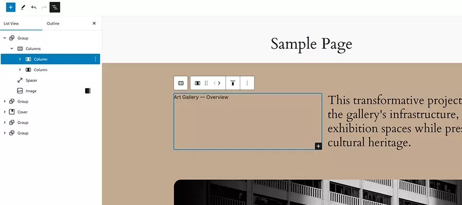
WordPress’s block nesting and portability offer flexibility but can lead to challenges when rearranging blocks on the screen. The List View feature emerges as a solution to potential difficulties, providing a visual outline of each block on the page, even accommodating nested blocks.
List View simplifies the process of repositioning blocks, allowing users to click and drag blocks directly within the List View interface. Whether adjusting a single block or multiple blocks simultaneously, List View enhances the user experience, offering improved navigation and facilitating smoother edits. Utilize List View to maintain control over and edit your page layouts efficiently.
3. Do: Keep Experimenting with the Block Editor
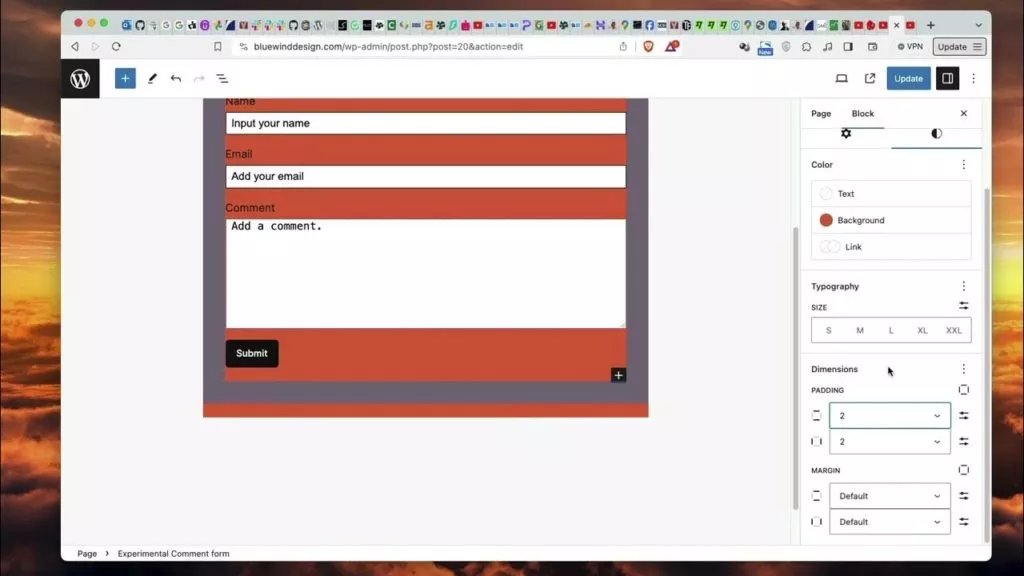
While the Block Editor may have its quirks and imperfections, continuous experimentation is key to discovering its full potential. Despite any initial challenges, the evolving user experience and ongoing improvements make it worthwhile to push the editor’s boundaries.
Create a local website for experimentation, testing different techniques to identify what works and what doesn’t. Don’t limit yourself to a single test; embrace the learning process. As the user experience evolves, techniques that previously failed may now be viable. Consider installing the Gutenberg plugin to preview upcoming features in future releases.
By staying curious and experimenting, you’ll develop the skills to build layouts that stand the test of time. Embrace the possibilities of the Block Editor and be pleasantly surprised by what you can achieve using blocks.
4. Do: Create Reusable Blocks for Efficiency
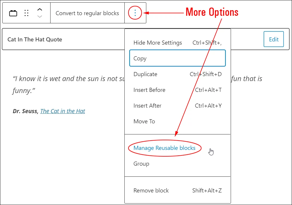
Take advantage of the Block Editor’s ability to create reusable blocks. If you find yourself using certain configurations or layouts frequently, save them as reusable blocks. This feature streamlines the process, allowing you to insert complex structures with a single click. It’s a time-saving strategy for consistent and efficient content creation.
5. Do: Explore Theme Styles and Block Patterns
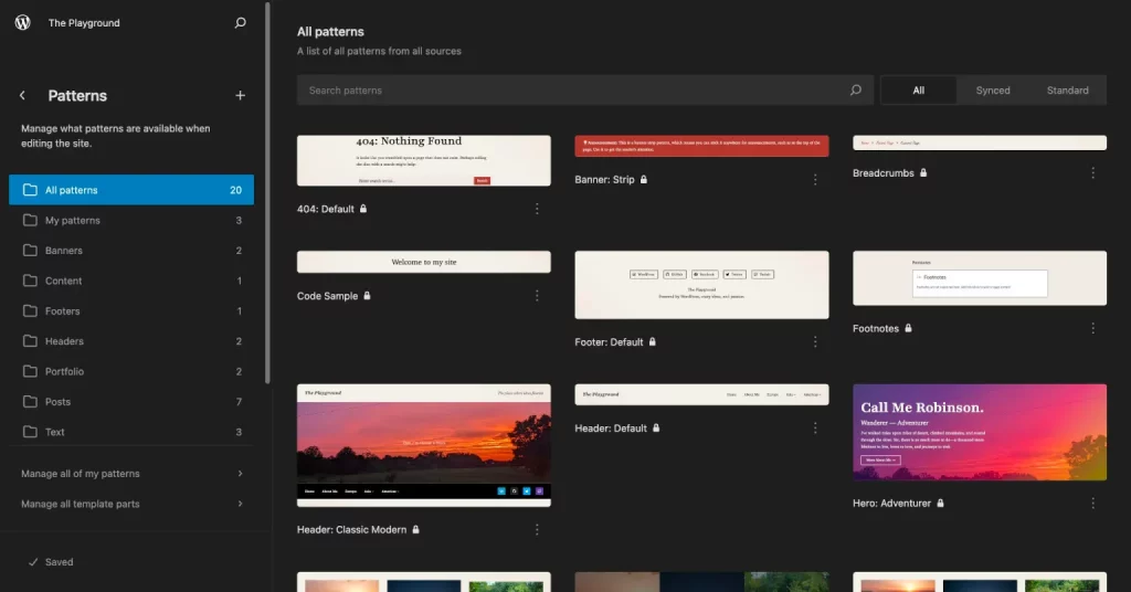
When delving into the WordPress landscape, it’s crucial to not only choose a theme that suits your content but to also explore the theme’s built-in styles for different blocks. Many contemporary WordPress themes are equipped with predefined styles tailored for various content blocks. This functionality ensures a seamless and cohesive design throughout your entire website.
Dive into these theme styles to maintain a consistent visual identity. This approach not only streamlines the design process but also adds a professional touch to your site. Furthermore, leverage the power of block patterns within the Block Editor. Whether provided by your chosen theme or inherent in the editor itself, block patterns are pre-designed combinations of blocks that not only serve as a source of inspiration but can also be directly applied to elevate the visual appeal of your content.
6. Don’t: Ignore Mobile Responsiveness: Catering to the Mobile Audience
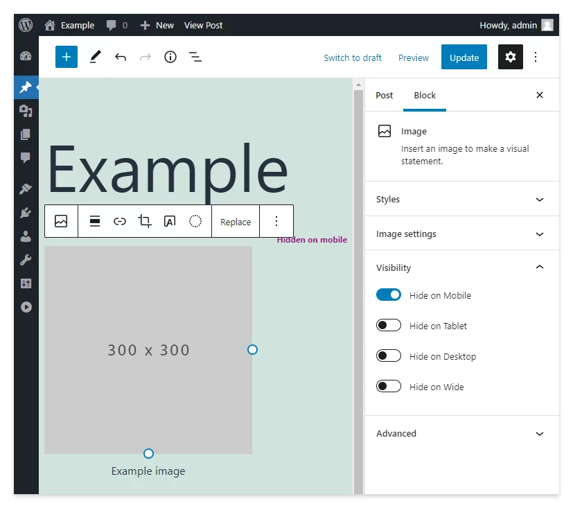
In an era where a significant portion of web users accesses content through mobile devices, neglecting mobile responsiveness is a critical mistake. A seamless and enjoyable user experience on smartphones and tablets is paramount. Always take the time to preview and test your content on various screen sizes, ensuring that your design translates effectively across the spectrum of devices.
Adjust block settings and leverage responsive design features to guarantee that your content looks exceptional on screens of all sizes. This not only caters to the preferences of mobile users but also contributes to better search engine rankings, as search engines increasingly prioritize mobile-friendly websites.
7. Don’t: Overlook Accessibility
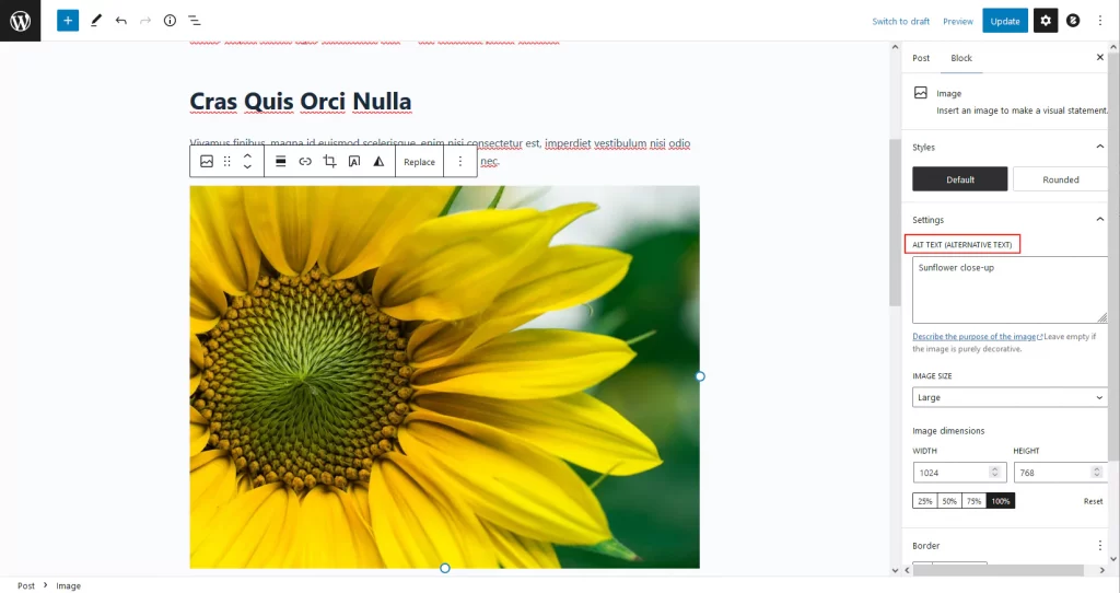
Web design should prioritize accessibility to ensure that your website is usable by everyone, regardless of ability. Ignoring accessibility best practices can exclude users with disabilities from accessing your content. Fortunately, the Block Editor offers specific tools and settings designed to enhance accessibility, such as the ability to add alternative text to images.
Take the time to understand and implement these features, contributing to a more inclusive online space. This not only aligns with ethical considerations but also broadens your potential audience. As accessibility becomes a more significant focus in web design, implementing these features positions your website as forward-thinking and considerate.
8. Do: Regularly Update Plugins and Blocks
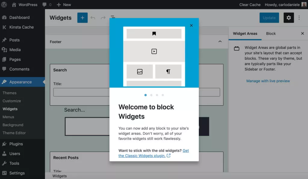
The WordPress ecosystem is dynamic, with continuous updates to plugins and blocks. To ensure the longevity and optimal performance of your website, adopt a proactive approach by regularly updating your installed plugins and blocks. These updates bring the latest features, security patches, and performance improvements.
Consistent updates not only enhance the overall stability of your WordPress site but also ensure compatibility with the latest technologies. This practice is vital for security reasons, as outdated plugins can expose your site to vulnerabilities. By staying current with updates, you not only protect your website but also enhance its functionality and user experience.
9. Don’t: Rely Solely on Plugins for Complex Functionality
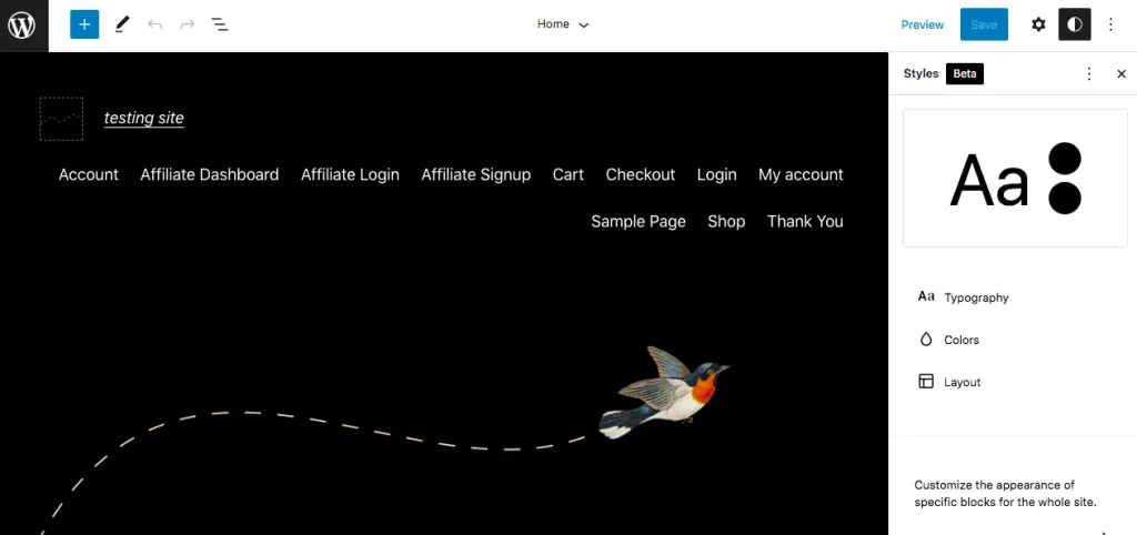
While plugins can be powerful tools for extending the functionality of the Block Editor, a balanced approach is crucial. Avoid overloading your site with plugins, especially for complex tasks that might be achievable through the native capabilities of the Block Editor.
Relying solely on plugins can lead to performance issues, conflicts, and potential security vulnerabilities. Whenever possible, leverage the native capabilities of the Block Editor. Reserve the use of plugins for situations where they are essential to meet specific requirements that cannot be fulfilled by the core functionality.
10. Don’t: Forget Alt Text for Images
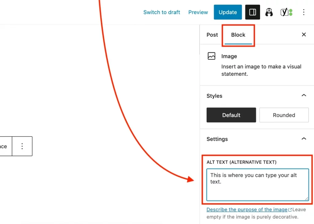
In web design, each element contributes to the overall user experience, and one crucial aspect often overlooked is the alt text for images. Neglecting to provide descriptive alternative text not only hinders accessibility but also diminishes the inclusivity of your content. Alt text serves as a textual description of an image, providing context for those with visual impairments who rely on screen readers to navigate the digital landscape.
For visually impaired users, alt text is not merely a nicety but a vital component that allows them to comprehend the content and context of images on a webpage. Including alt text is an act of consideration that goes beyond aesthetics; it’s a commitment to creating a more accessible online environment. Whether your images are informative, decorative, or serve a specific function, adding descriptive alt text ensures that all users, regardless of their abilities, can engage with and understand the visual elements of your content.
By consistently incorporating meaningful alt text, you contribute to a more inclusive online space, demonstrating your dedication to providing a seamless and enriching experience for every visitor.
11. Don’t: Rely on Default Settings Alone
Default settings offer a convenient starting point, but true creative prowess lies in the customization of block settings. While default settings provide a standardized appearance, don’t shy away from the vast potential that lies in tailoring each block to align with your unique design preferences.
Customization allows you to transcend the ordinary and create a digital space that reflects your brand identity and individual aesthetic. From adjusting typography and color schemes to fine-tuning spacing and alignments, the possibilities are endless. Each block can be a canvas waiting for your creative strokes, enabling you to maintain a cohesive and visually striking website.
Default settings are a foundation, but customization elevates your content to a level of distinction. It ensures that your website stands out in the digital crowd, leaving a lasting impression on your audience. A visually appealing and well-designed website not only captures attention but also communicates professionalism and attention to detail.
Learn about more best practices here.
Conclusion:
In digital content creation, mastering the dos and steering clear of common pitfalls with Block Editors is not merely a task—it’s an art. By delving into the recommended practices and avoiding the pitfalls, content creators embark on a transformative journey, optimizing their content creation process and setting the stage for a seamless, engaging online presence. It’s an art that blends creativity with strategic acumen, resulting in a website that not only stands out visually but also offers a user experience that resonates with a diverse and discerning audience.
FAQs on Block Editors:
Why is regularly updating plugins and blocks important?
Regular updates to plugins and blocks bring the latest features, security patches, and performance improvements. This proactive approach not only enhances the overall stability of your site but also ensures compatibility with the latest technologies.
What’s the balance between native capabilities and plugins in Block Editors?
While plugins can extend functionality, it’s essential to strike a balance. Relying solely on plugins can lead to performance issues and conflicts. Whenever possible, leverage the native capabilities of the Block Editor and use plugins for specific, essential requirements.
Are there specific best practices for creating Call-to-Action (CTA) blocks in a Block Editor?
Yes, when creating CTA blocks, focus on clarity and conciseness. Use compelling language, contrasting colors, and appropriate styling to make CTAs stand out. Ensure that the CTA is easily clickable and leads users to the intended action.
How does the Block Editor handle SEO (Search Engine Optimization)?
The Block Editor itself doesn’t directly handle SEO, but it facilitates the creation of SEO-friendly content. Ensure your content includes relevant keywords, uses proper heading structures, and provides valuable information. Additionally, consider using SEO plugins for more advanced optimization.
What role do block patterns play, and how can I create my own?
Block patterns are pre-designed combinations of blocks that simplify complex layouts. Many themes and plugins offer built-in block patterns. You can also create your own by designing a layout, selecting the blocks, and saving the combination as a reusable pattern for future use.


