
No matter where you find yourself within the realm of digital marketing, whether you’re an in-house SEO specialist, a freelance consultant, or part of an agency, one inevitability looms on the horizon: the request for a comprehensive enterprise SEO dashboard report that provides a snapshot of your SEO program’s performance.
The anticipation, the gathering of data, and the crafting of insights all go into creating this valuable tool. Yet, nothing is more disheartening than putting in the effort to build a meticulously detailed dashboard, eagerly sharing it with a range of stakeholders, only to discover that it languishes in digital obscurity, virtually untouched and unexamined.
This common scenario can be particularly frustrating because most of the widely-used SEO tools at our disposal come equipped with a repertoire of standard and customizable reports. These reports offer a tantalizing shortcut, promising to streamline the reporting process and minimize the upfront workload for the user.
What is an SEO dashboard?
An SEO dashboard serves as a centralized command center, aggregating data from various sources. Its primary function is to offer a comprehensive and profound overview of the performance of your website’s SEO efforts.
However, its true power lies in its ability to weave narratives that resonate with stakeholders. These narratives are designed to be comprehensible and significant to those invested in the website’s success. Simultaneously, the dashboard aims to equip SEO practitioners with practical and implementable insights that can drive tangible improvements.
By synthesizing complex data into intelligible visualizations and meaningful trends, the dashboard serves as a bridge between technical analytics and strategic decision-making. It empowers stakeholders to understand the impact of SEO initiatives on the website’s overall performance, and it empowers practitioners by providing clear guidance on what actions to take next.
Benefits of Using SEO Dashboard
- Centralized Data Compilation: An SEO dashboard serves as a central hub for aggregating data from various sources, such as Google Analytics, Google Search Console, rank tracking tools, and more. This consolidation saves time and effort by providing a single location for accessing essential SEO metrics.
- Holistic Performance Assessment: With data from diverse sources available in one place, an SEO dashboard provides a comprehensive view of your website’s performance. This comprehensive perspective helps you better understand the impact of your SEO efforts on various aspects of your online presence.
- Visual Representation: Dashboards use visualizations such as graphs, charts, and tables to represent complex data in an understandable and visually appealing manner. This visual representation makes it easier to interpret data trends, patterns, and anomalies at a glance.
- Real-Time Monitoring: An SEO dashboard provides real-time or near-real-time data updates, allowing you to monitor changes and trends as they happen. This real-time monitoring enables you to respond quickly to any shifts in performance or traffic.
- Performance Tracking: With the ability to track key metrics such as organic search traffic, keyword rankings, click-through rates, and conversion rates, an SEO dashboard helps you monitor the effectiveness of your SEO strategies over time. This tracking aids in measuring progress toward your goals.
- Data-Driven Decision-Making: Data-backed decisions are crucial for effective SEO. An SEO dashboard provides insights that guide your decision-making process. It helps you identify successful tactics, areas needing improvement, and opportunities for growth.
- Customization: Most dashboard tools allow you to customize the data and metrics displayed according to your specific goals and business needs. You can choose which metrics to prioritize and how to visualize them.
- Collaboration and Communication: An SEO dashboard facilitates collaboration among team members, departments, and stakeholders. Sharing the dashboard ensures that everyone is on the same page and working towards common objectives.
- Performance Benchmarking: By comparing current performance with historical data, benchmarks, or industry standards, an SEO dashboard helps you gauge the effectiveness of your strategies and identify areas that need attention.
- Identification of Trends: A dashboard helps you spot trends, anomalies, and correlations in your data. For example, you can identify seasonal spikes in traffic or shifts in user behavior.
- Transparent Reporting: For businesses working with clients or stakeholders, an SEO dashboard offers a transparent way to report progress. It demonstrates the value of your efforts by showcasing tangible results.
- Continuous Improvement: Regularly reviewing and analyzing data through an SEO dashboard supports a cycle of continuous improvement. You can adjust strategies based on the insights gained, leading to iterative enhancements in your SEO initiatives.
How To Categorize KPIs:
- Linkbuilding Performance: In the “Linkbuilding Performance” section, you’ll find a comprehensive overview of the links that LSG has successfully acquired for the client’s website. This data provides valuable insights into the effectiveness of the link-building strategies employed. By detailing the source, quality, and relevance of each link, this section showcases the positive impact that these acquired links have on the client’s overall search engine optimization efforts. The report may include metrics such as domain authority of linking sites, anchor text distribution, and the number of new backlinks gained over a specific time period. This helps the client and stakeholders understand the progress made in building a strong backlink profile.
- Content Performance: Within the “Content Performance” segment, the focus is on analyzing the traffic generated by the pages that have been either newly created or strategically updated to enhance SEO performance. The report highlights the increase in organic traffic to these optimized pages, emphasizing the effectiveness of content optimization efforts. Metrics such as pageviews, time on page, bounce rate, and conversions associated with these pages provide a comprehensive picture of how well the content is resonating with the target audience. This data enables data-driven decision-making for further content creation and optimization strategies.
- Striking Distance Report: The “Striking Distance Report” is a strategic tool that identifies pages within the website that are on the brink of achieving high rankings for keywords with substantial search volume. By assessing pages that are just a step away from reaching the coveted top positions, this report offers a quick and efficient way to pinpoint opportunities for optimization. It allows SEO professionals to prioritize efforts on pages that have the potential to make a significant impact on search visibility with relatively less effort. This data empowers SEO teams to focus their energies where they are most likely to achieve significant results.
- Date Range Comparison Report: The “Date Range Comparison Report” offers a comprehensive analysis of performance metrics at both the page and keyword levels. By comparing data from the current time period with the data from a previous period (such as the previous month or year), this report enables a thorough understanding of progress and trends. It highlights shifts in rankings, traffic, and engagement metrics, aiding in the identification of successful strategies and areas needing improvement. This data-driven comparison empowers SEO professionals to adapt their strategies based on historical performance and trends.
- SERP Market Share Report: The “SERP Market Share Report” provides a holistic view of how the client’s website is performing in the Search Engine Results Pages (SERPs) for a specified group of keywords. By comparing the client’s visibility and rankings with those of their competitors, this report reveals their position in the market. Metrics such as average rank, click-through rates, and impression share offer insights into the client’s share of voice within the search landscape. This report aids in competitive analysis and guides strategic decisions to improve the client’s position in the SERPs.
- Google Business Profile Insights: The “Google Business Profile Insights” section aggregates and dissects data related to the client’s Google Business Profiles across different locations. The report provides a breakdown of key metrics, such as search queries, views, clicks, and user interactions. This data can be further filtered based on specific criteria, allowing for a detailed analysis of performance at the address, state, city, or other customized segments. This information helps the client understand their online visibility and engagement through Google Business Profiles, enabling them to optimize their local search strategy.
- Cannibalization Report: The “Cannibalization Report” serves as a diagnostic tool to identify instances where multiple pages on the website are competing for the same keyword. By highlighting such occurrences, the report assists in recognizing content overlap and potential keyword cannibalization issues. This analysis enables SEO professionals to strategize content differentiation, ensuring that each page targets unique keywords and user intents. Addressing cannibalization enhances the overall search engine visibility of individual pages and prevents internal competition that might hinder organic rankings.
Diverse Array of Data Sources:

An SEO dashboard functions as a dynamic observatory, collating information from an eclectic assortment of data sources to construct a panoramic view of SEO performance. These data sources encompass:
- Google Search Console: Google’s versatile toolset that serves as a gateway to understanding how your website appears and performs in search results. It furnishes an array of data, including search queries, click-through rates, and more.
- Analytics Tools (e.g., Google Analytics, Adobe Analytics): These comprehensive platforms are invaluable for tracking user behavior, website interactions, and performance metrics. They offer deep insights into user demographics, engagement patterns, and conversion rates.
- Google Business Profile Insights: Vital for local businesses, this tool provides insights into how users engage with your Google Business Profile. It delivers data on actions such as clicks, phone calls, and direction requests.
- Third-Party Rank Tracking Data (e.g., Ahrefs, Traject, Semrush, Stat): These external tools offer meticulous tracking of your website’s ranking on search engine results pages (SERPs). They provide data on keyword positions, search volumes, and competitive analysis.
- Proprietary Data: This entails bespoke datasets created specifically for your business needs. For example, integrating backlink data via Google Sheets to offer a comprehensive backlink analysis.
- Other Custom Datasets: These are tailor-made datasets aligned with specific SEO metrics that matter to your business. They could encompass proprietary customer data, campaign performance data, or industry-specific insights.
Centralizing much of this data, including Google Search Console, Traject, and Semrush data, within Google BigQuery: This powerful data warehouse solution enhances data agility and speed, enabling efficient analysis, complex queries, and scalable storage.
Advanced Data Visualization and Dashboarding:
The meticulous representation of this amalgamated data becomes paramount in the creation of an impactful SEO dashboard. For this precise purpose, we employ Looker Studio (formerly known as Google Data Studio). The tool’s merits encompass:
- Adaptive Flexibility: Looker Studio adapts adeptly to the multifaceted requirements of our data representation needs. Its customizable nature enables tailored visualizations and layout arrangements, catering to diverse stakeholder preferences.
- Free Availability: A noteworthy advantage is its cost-free accessibility, amplifying its allure as a resource-efficient solution. This empowers us to allocate resources judiciously while ensuring the delivery of high-quality insights.
9 Examples of SEO Dashboard Reports Use Cases:
1. Monitor Local Pack Appearances And Performance Over Time
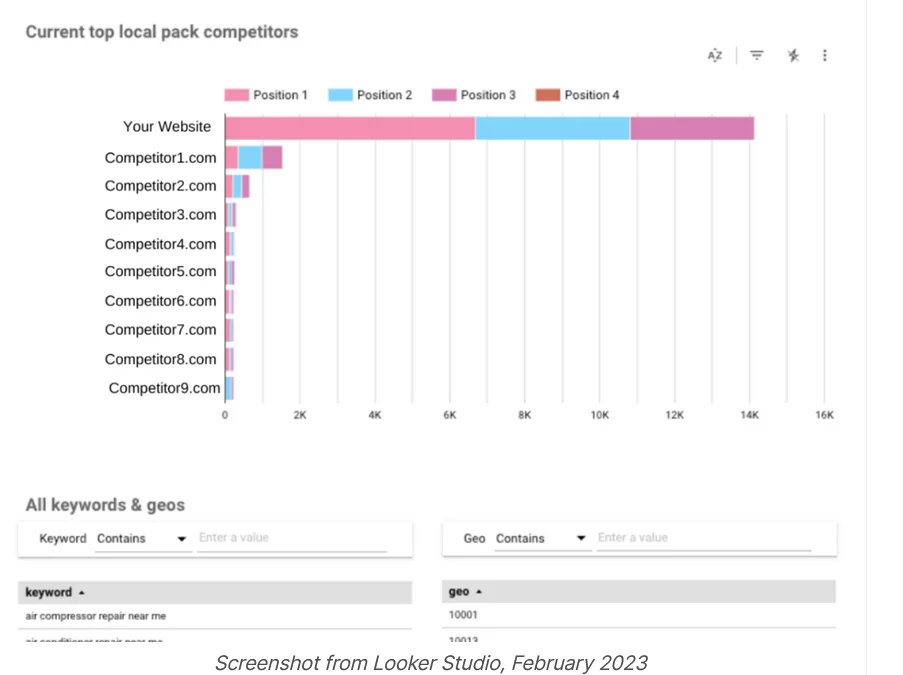
This feature empowers businesses to meticulously oversee their Local Pack visibility and effectiveness within a designated timeframe. By systematically tracking these fluctuations, organizations can gain valuable insights into how their presence impacts local search outcomes.
For instance, consider a restaurant chain with multiple branches across a city. By utilizing this function, the brand can consistently monitor how often each restaurant is featured in the Local Pack for relevant searches like “top Italian restaurants nearby.” This continuous monitoring assists the brand in evaluating whether their optimization endeavors yield consistent results or if their visibility experiences fluctuations.
Furthermore, observing performance trends over time presents a longitudinal view. Businesses can spot trends, spikes, or drops in their Local Pack appearances. This proves particularly advantageous during special events, holidays, or promotions when search behavior might vary. By correlating these appearances with business events, brands can tailor optimization strategies to maximize their presence during pivotal moments.
Additionally, monitoring performance over time offers the opportunity to gauge the effectiveness of optimization efforts. For instance, a local bakery making specific updates to their business details and optimizing their Google My Business listing can assess whether these changes lead to heightened Local Pack appearances and subsequently increased foot traffic to their establishment.
Consider the real-life example of “Urban Bites,” a popular restaurant chain operating across multiple locations in a bustling city. Urban Bites harnesses the power of monitoring Local Pack appearances and performance over time to ensure its continuous visibility and optimize its local search presence.
Pros:
- Strategic Local Visibility: Urban Bites utilizes this capability to closely observe how frequently each of its restaurant outlets appears in the Local Pack for relevant searches like “top restaurants nearby.” This empowers them to strategically position their outlets for maximum visibility within local search results.
- Performance Insights: By tracking Local Pack appearances over time, Urban Bites gains valuable insights into trends and changes in visibility. This enables them to identify patterns related to special events, holidays, or promotional periods, allowing them to tailor their optimization efforts accordingly.
- Optimization Effectiveness: Urban Bites leverages this data to assess the effectiveness of their optimization initiatives. For instance, after enhancing their Google My Business listing and updating business information, they can measure if these changes lead to increased Local Pack appearances and, ultimately, higher foot
2. Segregate Traffic Based on Branded vs. Unbranded Keywords
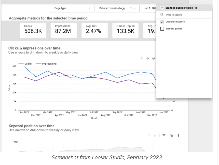
Among the repertoire of report types, this one stands out as a favorite, and for good reason. The ability to classify incoming traffic into either branded or unbranded keyword categories is a feature that holds significant value. This functionality is a staple across a wide array of dashboard systems, precisely due to its universal applicability.
The distinction between branded and unbranded keywords has far-reaching implications. Non-branded traffic, in particular, assumes a role of heightened importance, contributing significantly to bolstering brand visibility and expanding the customer base. This stream of visitors holds the potential to introduce new clientele to a product or service, laying the foundation for brand growth and recognition. On the other hand, branded traffic takes on a different role, serving as a potent channel for driving conversions and sales. These visitors are already acquainted with the brand, making them more inclined to engage in transactional activities.
By selectively removing brand-related queries from the equation, a clearer image emerges of the actual impact of the SEO program. This unobscured perspective allows for a genuine assessment of the program’s efficacy in driving organic traffic and engagement. To underscore the importance of this insight, reports are typically configured to default to non-branded queries. This decision ensures that the assessment of SEO performance begins with a focus on the core essence of search optimization—expanding reach and visibility beyond brand associations.
AdventureX Gear, a prominent retailer of outdoor adventure equipment, embarked on a journey to enhance its online presence and drive more organic traffic to its e-commerce platform. Recognizing the need for a robust SEO strategy, they employed a data-driven approach to refine their efforts and achieve meaningful results. It implemented an advanced SEO dashboard that included a distinct report type – the “Branded vs. Unbranded Keyword Analysis.” This feature allowed them to categorize incoming search traffic into two categories: those using keywords directly related to their brand (branded) and those using more generic keywords (unbranded). The capability to perform this categorization was a standard feature across various dashboard systems, which contributed to its universal applicability.
- Increased Brand Reach: The insights from non-branded keywords highlighted the expansion of their customer base, introducing their brand to new potential buyers.
- Conversion Optimization: The focus on branded keywords underscored the power of their existing brand recognition, leading to higher conversion rates and sales.
- Tailored Strategy: The distinction between the two types of keywords informed a more precise SEO strategy, allowing them to optimize for both brand awareness and transactional activities.
- Data-Driven Decision-Making: AdventureX Gear’s SEO team had a clear, unbiased view of their SEO program’s effectiveness, enabling informed decisions and continuous improvement.
3. Reporting Customized Keyword Categories
Gaining a holistic understanding of your website’s performance across broader themes rather than fixating on individual keywords can be exceptionally enlightening. Achieving this requires the meticulous task of tagging the keywords under your tracking umbrella, either manually or through automated processes.
This particular genre of report holds tremendous value in shedding light on how search engines perceive your online presence within distinct thematic realms. The underlying principle involves grouping keywords into meaningful categories that encapsulate related subjects, thereby offering a bird’s-eye view of your performance in each thematic arena.
To illustrate, consider a scenario where a client’s website experienced upward mobility in rankings and increased traffic for keywords that pertain to their primary service category (e.g., hardware store). Conversely, this positive momentum was counteracted by a decline in rankings and traffic for queries related to “reviews” (e.g., tool reviews). This dichotomy came to life vividly within our Category report, serving as a visual aid that promptly flagged this intriguing pattern. Armed with this insight, we swiftly pinpointed the anomaly and devised strategies to revert the downward trajectory.
Furthermore, these meticulously curated Category buckets play an instrumental role in our Share of Voice reporting. This function enables us to provide a comparative analysis of how a website’s performance stacks up against its competitors within specific thematic landscapes. By juxtaposing performance metrics across categories, we deliver a comprehensive perspective on the website’s standing in relation to others, thereby facilitating strategic decisions.
Imagine you’re part of Amazon‘s digital marketing team, and your responsibility is to monitor and optimize the performance of their vast product listings. Amazon, being the retail juggernaut it is, has an incredibly diverse product catalog, spanning electronics, clothing, books, and everything in between.
As part of your SEO strategy, you’ve decided to implement customized keyword categories. Instead of just tracking individual keywords for each product, you’ve grouped them into meaningful categories based on product type. For instance, you’ve categorized smartphones, tablets, and laptops under “Electronics” and books, magazines, and e-readers under “Reading Materials.”
By doing so, you can generate reports that provide insights not just at the keyword level, but also at the thematic category level. This approach offers a more comprehensive view of how different product segments are performing within Amazon’s vast online marketplace.
In your reports, you’ve noticed an interesting trend. The “Electronics” category consistently performs well, with high rankings and traffic. This reflects the strong demand for electronic devices on Amazon’s platform.
Moreover, your Category buckets also play a crucial role in Share of Voice reporting. This function allows you to compare Amazon’s performance in various product categories with that of its competitors. By presenting performance metrics across these categories, you provide Amazon’s leadership with a holistic view of how they stack up against other e-commerce players in specific thematic areas. This, in turn, informs strategic decisions about where to allocate resources and marketing efforts for maximum impact.
4. Report On Market Share By Location
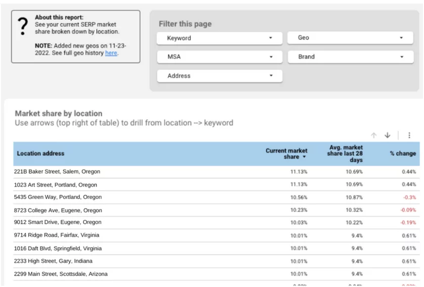
This reporting functionality empowers you with the capability to showcase the extent to which growth is being realized within an established or emerging market. This could encompass a localized scope, targeting specific regions like cities or states, or it could extend to a national level.
Effectively gauging growth dynamics within a market is a critical aspect of demonstrating the efficacy of your strategies. Whether you’re expanding your reach within an existing market or making inroads into a new one, this reporting approach becomes instrumental in conveying the progress achieved. It provides stakeholders with a tangible visual representation of the strides made, which is particularly valuable in contexts where growth might not be immediately evident.
The geographical orientation of this growth can vary widely. It could entail showcasing the increase in market share, web traffic, or customer engagement within a specific city, spotlighting the local impact of your efforts. Alternatively, it might encompass a more expansive view, illustrating how your strategies are translating to growth at a national scale, capturing a broader market share and higher visibility across the entire country.
In essence, this reporting not only serves as a performance indicator but also doubles as a persuasive tool for illustrating the direct outcomes of your actions in a given market. Whether the focus is on regional dominance or establishing a nationwide presence, this reporting approach offers a comprehensive understanding of growth trajectory while simultaneously providing a compelling narrative that underscores the value of your efforts.
Enter “EcoFresh,” a leading sustainable cleaning product company that’s committed to making a positive environmental impact. Let’s explore how EcoFresh uses comprehensive market share reports to strategically navigate their geographical presence and drive sustainable growth.
Pros:
- Precise Geographical Insights: EcoFresh leverages these insightful reports to meticulously assess their market share across various locations. This analysis sheds light on the geographic distribution of their presence, allowing them to gauge their standing accurately.
- Strategic Decision-Making: By delving into location-specific market share data, EcoFresh uncovers pockets of success and growth opportunities. This knowledge guides their decision-making, highlighting areas where their brand is thriving and where they can focus efforts to expand.
5. Report from Google Analytics Goals
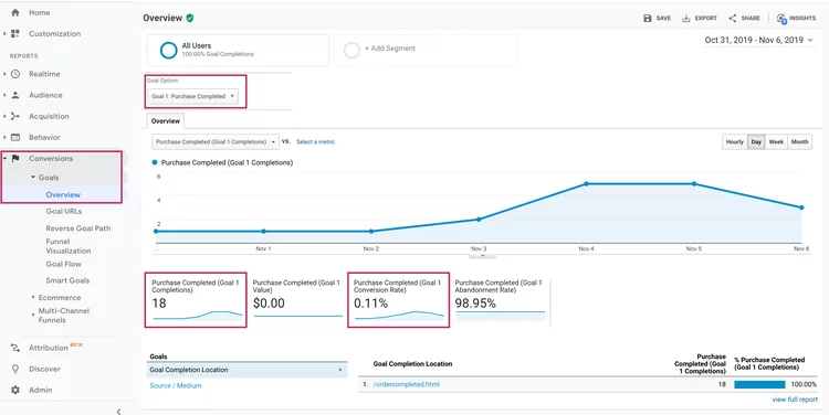
Creating a “Report on Google Analytics Goals” involves harnessing the wealth of data from Google Analytics to offer a comprehensive view of the performance of custom-defined goals, thereby elevating the quality of reporting and insights. These goals serve as vital benchmarks that measure the accomplishment of specific user actions on your website. Examples of such actions could range from a user completing a purchase to submitting a contact form, booking appointments, or even quantifying the time users spend engaging with your site.
The versatility of goals spans various dimensions of user engagement. Whether it’s tracking conversions that directly impact your bottom line or gauging user engagement and site stickiness through time-based metrics, these custom goals provide a multifaceted understanding of user behavior.
TechGear Co., a prominent electronics and gadgets online retailer, places a premium on understanding user behavior to enhance their digital marketing efforts. Leveraging Google Analytics goals, they track vital user interactions and conversions on their website.
The focal point of their endeavors is the tracking of completed purchases – a core goal in Google Analytics. When users successfully finalize transactions, the achievement is recorded as a goal completion. Additionally, they monitor other pivotal actions, such as newsletter sign-ups and product review exploration.
However, TechGear Co. realizes that mere tracking is insufficient to optimize their strategy. To gain deeper insights, they introduce a comprehensive “Report on Google Analytics Goals.” This report ingeniously compiles data from Google Analytics and arranges it in an insightful format. Among the metrics, the conversion rates of each goal shine – indicating the percentage of visitors who successfully complete a designated action.
For instance, a 10% conversion rate for newsletter sign-ups implies that 10 out of every 100 visitors subscribe. Similarly, a 3% conversion rate for completed purchases signifies that 3 out of every 100 visitors make a purchase.
These metrics unveil crucial insights for TechGear Co. With this knowledge, they discern which goals drive substantial user actions, enabling them to allocate resources strategically. Moreover, it unveils improvement prospects. A lower-than-expected conversion rate for purchases prompts an investigation into potential checkout barriers or product visibility issues.
Intriguingly, the report also unveils user engagement trends. The discovery that users spending over 5 minutes on the site are more likely to complete purchases guides content and design adaptations to encourage extended exploration.
Goals Tracked:
- Completed Purchases
- Newsletter Sign-ups
- Product Review Exploration
Challenges Addressed:
- Understanding User Behavior
- Enhancing Digital Marketing Strategy
Solution: “Report on Google Analytics Goals”
- Comprehensive Compilation of Google Analytics Data
- Structured Presentation of Key Metrics
Metrics Highlighted:
- Conversion Rates for Each Goal
- Indicates Percentage of Successful User Actions
- 10% for Newsletter Sign-ups
- 3% for Completed Purchases
Benefits Realized:
- Informed Decision-Making
- Resource Allocation Optimization
- Barriers Identification for Goal Completion
- Improved Checkout Process
- Enhanced Product Visibility
User Engagement Insights:
- Visitors Spending >5 Minutes More Likely to Purchase
- Guiding Content and Design Adaptations
- Encouraging Extended Site Exploration
Competitive Advantage:
- Refined Strategy through Insights
- Higher Conversions
- Superior User Engagement
- Positioning as a Leader in Tech Retail
6. Segmenting Data Based on Geographic Location (Country)
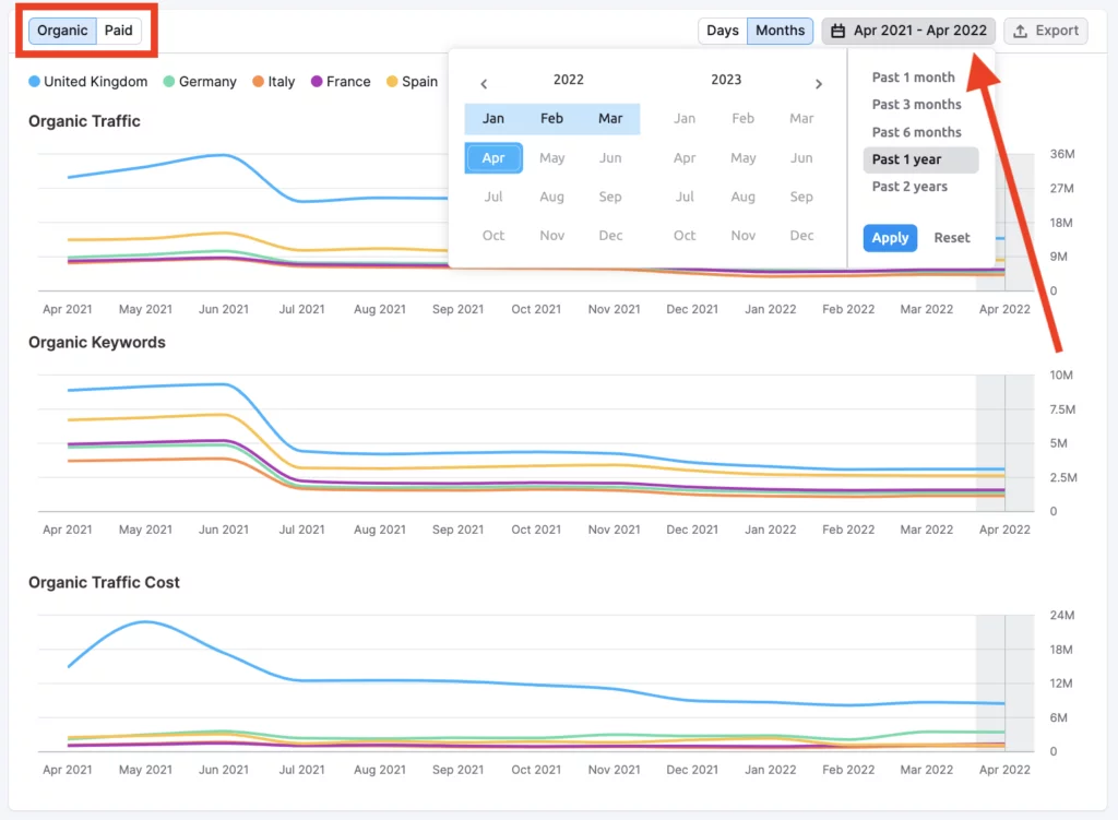
The implementation of this reporting feature revolves around the meticulous task of dissecting data based on geographical location, specifically by country. This strategic approach to data analysis serves as a potent tool for brands aiming to broaden their horizons, extend their reach, and amplify their online visibility.
By segregating data according to individual countries, businesses can unravel profound insights into their performance on a global scale. This becomes particularly pertinent as brands venture into new markets, seeking to establish their presence and connect with diverse audiences. The act of layering and filtering data from these various markets facilitates a clear comparative assessment. It provides a bird’s-eye view of how different countries fare in terms of metrics, engagement, and user behavior.
Furthermore, the comparative analysis enabled by this reporting type isn’t limited to standalone market evaluations. It also provides the means to evaluate the collective performance of initiatives across multiple countries. This aggregated perspective aids in understanding the global impact of strategies and campaigns. Brands can ascertain how each market contributes to the overall success, identify patterns, and determine which initiatives resonate most effectively with different regions.
In the dynamic landscape of global retail, Starbucks, the renowned coffeehouse chain, stands as a prime example of harnessing geographic data segmentation to drive impactful marketing strategies. As the company expands its footprint to new countries and regions, it leverages localized marketing insights to resonate with diverse audiences effectively.
The Starbucks Story:
As Starbucks enters new markets, it understands that a uniform approach won’t suffice. To thrive in diverse environments, the company embraces geographic data segmentation to tailor its strategies.
Understanding Cultural Nuances:
- Localized Offerings: Starbucks identifies the types of beverages and flavors that resonate with local tastes. In Japan, for instance, matcha-based drinks find immense popularity, while in Italy, espresso-based beverages are key.
- Festivals and Holidays: Starbucks tailors its seasonal offerings to align with local festivals and holidays, showing cultural sensitivity and resonating with customers.
Driving Engagement Through Data:
- Store Design: Store layouts and decor are adapted to align with local aesthetics and cultural themes.
- Promotions: Starbucks designs promotions and loyalty programs that align with local preferences and occasions.
Efficient Resource Allocation:
- Marketing Campaigns: Rather than using a blanket approach, Starbucks allocates marketing resources to initiatives that have the highest potential for success in each region.
Results Achieved:
- Starbucks’ localized approach enhances customer engagement and loyalty, making each store feel like a unique community hub.
- The company’s willingness to adapt its offerings to local preferences has earned it a strong following in diverse markets.
- Starbucks’ revenue growth and continued expansion to new countries are testament to the success of its localized marketing insights.
7. Striking Distance Reporting: Unlocking Opportunities with Precision
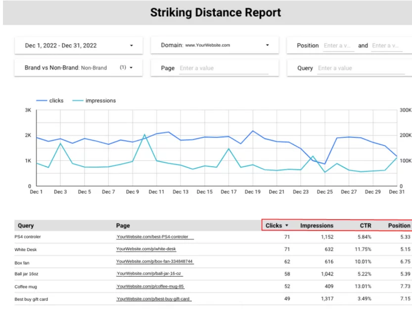
The “Striking Distance Reporting” is a powerful tool designed to swiftly unveil pages that stand on the cusp of achieving high rankings for queries or topics with significant potential. This reporting approach offers a streamlined method for pinpointing pages that warrant focused attention due to their proximity to gaining favorable search engine positions.
Central to this feature is the flexibility it affords users in defining their unique criteria for what constitutes the “striking distance.” This customization can take various forms, such as stipulating a minimum number of impressions or a certain click-through rate (CTR). These personalized filters cater to your specific objectives, allowing you to zero in on pages that are poised for success.
This report’s efficacy is amplified by supplementary filters, such as conversions, revenue, and average order value. These additional dimensions provide a well-rounded perspective, helping you prioritize pages that not only have the potential to climb the rankings but also to generate meaningful business outcomes.
Incorporating data from Google Search Console (GSC) forms the foundation of this reporting mechanism. This data is further enriched with monthly search volume estimates from Semrush, creating a comprehensive view that spans real-world data and industry insights. The synergy between these data sources paints a comprehensive picture, empowering you to make informed decisions.
Given the nature of these reports, updates are typically executed periodically. The rationale behind this approach is twofold: it conserves API costs and aligns with the inherent stability of these reports. Changes in rankings within the striking distance tend to occur at a relatively slower pace, making periodic updates more efficient and cost-effective.
FashionFusion, an online fashion retailer, strives to maintain high search engine rankings in the competitive market. Their strategic tool of choice is the “Striking Distance Reporting” feature.
Pros:
- Precise Opportunity Identification: FashionFusion’s SEO team efficiently identifies pages on the verge of high rankings by customizing “striking distance” criteria, aligning with business goals.
- Conversion-Centric Approach: The tool’s supplementary filters help prioritize pages not just for rankings but also for conversions, revenue, and average order value, ensuring holistic growth.
- Data Fusion: Integrating Google Search Console data as a foundation and enhancing it with Semrush’s monthly search volume estimates offers a comprehensive view of SEO performance.
- Cost-Efficiency: Periodic updates of reports conserve API costs, as changes in rankings within striking distance occur at a measured pace, while maintaining data accuracy and relevance.
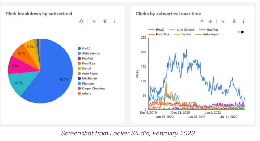
8. Reporting and Monitoring Domain Migrations: A Glimpse into Domain Evolution
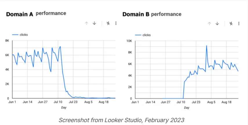
Incorporating the narrative of Domain A versus Domain B, this reporting feature stands as a safeguard against the nerve-wracking process of migrating from an old domain to a new one. Visualized through a snapshot from Looker Studio in February 2023, this reporting capability offers an invaluable window into the aftereffects of such migrations, bringing a sense of clarity to a typically anxious period.
The act of transitioning from one domain to another carries profound implications for SEO. It’s akin to navigating a labyrinth, replete with uncertainties and potential pitfalls. The success of such a migration hinges on its ability to preserve, if not enhance, search visibility, ranking positions, and overall site performance.
This reporting feature is meticulously designed to address these uncertainties head-on. It enables you to swiftly discern where the old domain stood in terms of metrics and how the new domain’s performance measures up in comparison. This comparative analysis plays a pivotal role in gauging the impact of the migration and whether it has yielded the desired outcomes.
Beyond the overarching comparison, the flexibility of this reporting tool comes to the fore. The ability to filter the report by factors such as page type, category type, or region adds layers of granularity to the analysis. This dimensionality offers insights into specific areas of the website that might have been impacted differently by the migration. It helps to pinpoint any disparities, whether positive or negative, and aids in crafting targeted strategies to optimize the performance of the new domain further.
On May 5th, the transition from oDesk to Upwork.com was officially executed. Following the launch of the new website, the SEO team commenced their diligent efforts, meticulously crawling, interacting, and closely monitoring Google’s responses. Additionally, Change of Address requests were duly submitted through Google Search Console and Bing Webmaster Tools to facilitate the seamless transition.The expeditious nature of the complete audit of a multi-million URL domain was truly remarkable, owing to the concerted efforts of three distinct SEO teams and their dedicated members spread across various time zones, all of whom collectively engaged in this endeavor from the early hours of the morning.
Challenges Faced:
- SEO Impact: The migration could potentially disrupt SEO efforts.
- Uncertainty: The team needed clarity on the migration’s effects.
Solution: Domain Migration Reporting
Benefits Realized:
- Comparative SEO Analysis
- Granular Insights for Targeted Strategies
- Risk Mitigation and Improved Outcomes
9. Benchmark Reporting: Evaluating Pre and Post Site Changes
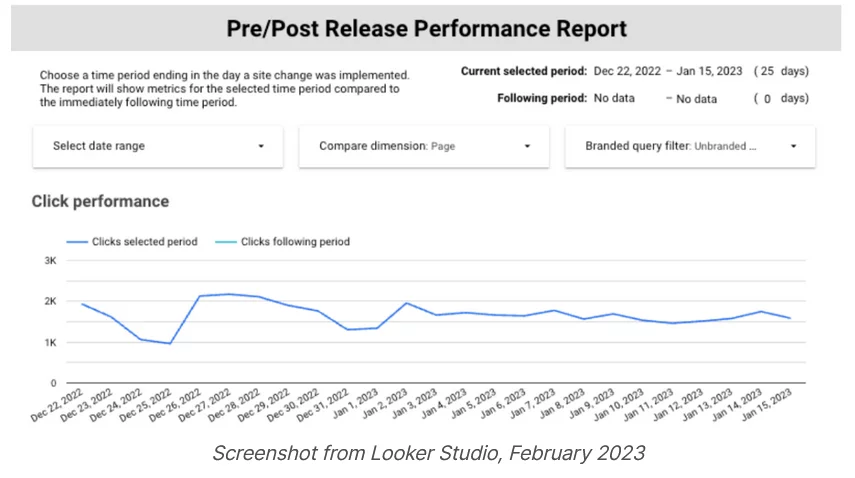
The functionality of benchmark reporting involves a straightforward yet profoundly impactful concept: the ability to demarcate moments when site alterations were implemented and reflect these changes in your reports. This seemingly simple feature carries substantial significance, serving as a vital compass in ascertaining the impact of updates on your website’s SEO performance.
The premise is clear: by marking the deployment of site releases on your reports, you unlock the capacity to discern whether these changes have had a positive or negative influence on your SEO endeavors. This mechanism becomes an indispensable tool in your toolkit, enabling you to trace correlations between site adjustments and fluctuations in performance metrics.
If a post-release performance shift lacks statistical significance, it implies that the site’s traffic variation falls within the realm of normal fluctuations. This rapid discernment serves as a salve for situations where stakeholders are perturbed by fluctuations prompted by factors like Google algorithm updates. By promptly identifying the context of a traffic dip, stakeholders can be reassured and guided through a clearer understanding of performance dynamics.
Apptega, a prominent cybersecurity and compliance platform, embarked on a journey to elevate their business presence and lead generation capabilities. Recognizing the limitations of their existing WordPress website, they sought a solution that aligned with their growth objectives. The answer lay in HubSpot’s CMS Hub, a comprehensive platform offering the optimization and tools they needed.
Joelle Palmer, Apptega’s Digital Marketing Manager, candidly described their WordPress experience, stating, “We had built a Frankenstein monster in WordPress. Our dev team would constantly have to drop what they were doing and fix our website.” This realization prompted the decision to migrate their website to CMS Hub.
The impact of this migration was swift and remarkable. Apptega’s engagement with HubSpot’s SEO tools yielded almost instant success. Palmer shared, “We saw one of our core pages move from a number 100+ ranking on Google to position number three in two weeks. SEO usually takes three to six months to work…that was truly amazing for us as a company to experience.”
Within Marketing Hub, Apptega harnessed a suite of tools to drive their growth further. Notably, the on-page SEO recommendations emerged as a game-changer. These guided users toward pages in need of attention and provided insights on optimizing content effectively. This comprehensive approach allowed Apptega to not only enhance their website but also make informed decisions based on data-driven insights.
Conclusion:
When preparing your dashboard, striking the right balance is paramount: marry the precision of detailed reports showcasing the trajectory of your SEO endeavors with the art of weaving a narrative that resonates with key stakeholders. Recognize that, in reality, these stakeholders may not routinely peruse your reports. To overcome this, curate the front page of your dashboard with the most valuable and easily digestible information.
The essence of this approach is twofold. Firstly, it serves as a strategic engagement tactic. By presenting pertinent information upfront in a succinct manner, you seize the opportunity to communicate the essence of your SEO performance effectively. This ensures that stakeholders, who may have limited time or inclination for in-depth reports, glean essential insights swiftly.
Moreover, it’s essential to align the depth of your reports with the actual user’s needs. Often, the end-user isn’t the Chief Marketing Officer (CMO) but someone immersed in the day-to-day operational intricacies. As such, the depth and complexity of reports should cater to their comprehension level and responsibilities.
FAQs on SEO Dashboards:
Are there tools to create SEO Dashboards?
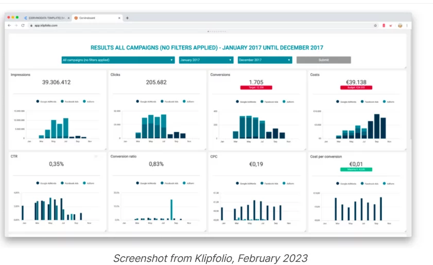
Yes, there are various tools available to create SEO dashboards, including Google Data Studio, Tableau, Looker, and Klipfolio. These tools allow you to connect data sources, design visualizations, and share the dashboard with stakeholders.
How can I interpret the data on an SEO Dashboard?
Interpreting data on an SEO dashboard involves understanding the context of each metric. Look for trends, anomalies, and correlations between metrics. For example, an increase in organic search traffic might correlate with improved keyword rankings.
Can I customize an SEO Dashboard for my specific needs?
Yes, most dashboard tools allow for customization. You can choose which metrics to display, how to visualize the data, and even set up alerts for specific thresholds or changes in metrics.
How often should I review my SEO Dashboard?
The frequency of reviewing your SEO dashboard depends on your goals and the pace of changes in your industry. Regular reviews, such as weekly or monthly, are common to track progress and adjust strategies accordingly.
What should I do if I notice negative trends on my SEO Dashboard?
If you identify negative trends or drops in key metrics on your dashboard, it’s essential to investigate the root causes. It could be due to algorithm changes, technical issues, or changes in user behavior. Address these issues promptly to prevent further negative impact on your website’s performance.
