Do visitors to your site quickly leave without purchasing anything? What strategies can be used to captivate listeners? The solution is a friendly hello bar. A well-thought-out “hello bar” is an excellent way to interact with clients and prospects as they enter your organization. You can promote your goods, announce ongoing deals, or direct people to articles they might find useful.
Visitors to your website shouldn’t have to dig around for the latest and greatest specials, sales, announcements, and so on. Customers are more likely to return if they don’t have to put in a lot of “work” to receive what they came for. Bounce rates, engagement, and revenue can all take a nosedive if you don’t have a popup or hello bar.
What does it mean to have a “welcome bar” on your website, and where should you put it?
What Is a Hello Bar?
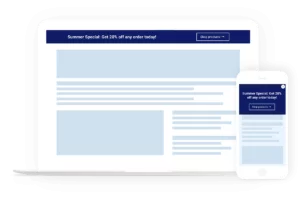
A hello bar, also referred to as a floating or banner bar, is a marketing tool that appears at the top or bottom of a website and remains in place as the user scrolls. It is commonly utilized to greet new or returning visitors and to offer various forms of content, such as lead magnets, event announcements, company updates, sales promotions, and recommended articles. The hello bar is an effective way to capture visitors’ attention and encourage engagement. It typically appears as a narrow strip or rectangular box at the top or bottom of a webpage, containing a short and concise message with a call-to-action button.
Best Practices to Use Hello Bar Effectively:
1. Positive Hello Bar Example
Hello bars are a great way to grab visitors’ attention as soon as they land on your website. It is important to ensure that your website visitors leave feeling happy and satisfied. A study has shown that visitors form their first impression of a website in less than two-tenths of a second. Therefore, it is crucial to make a positive impact on them as quickly as possible.
One way to do this is by incorporating a positive message or an eye-catching design in your hello bar. Using bright colors such as yellow and adding a smiley can have a positive psychological effect on visitors, instantly putting them in a good mood. By doing this, you can alter visitors’ perceptions of your brand or product and leave a lasting positive impression.
Example: ProProfs.com
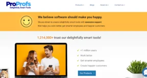
ProProfs, a pioneering software company, is dedicated to delivering delightful experiences to all its users. Their repertoire includes a diverse range of customer service and learning tools, such as help desk software, live chat, training maker, and more. The moment a visitor lands on their website, they are welcomed with a vibrant, attention-grabbing yellow announcement bar that exudes positivity. The message emanating from it is crystal-clear, resonating with the company’s core values of providing awesome support and bringing joy to its users.
What sets ProProfs apart is their unique approach of associating software with “happiness.” By challenging the conventional perception of software as a daunting and complicated entity, ProProfs has successfully altered the narrative and established itself as a refreshing and optimistic brand.
2. Educate Customers About Your Product
Another way to utilize hello bars is by educating visitors about your product or service. While some visitors may have heard about your brand or products, they may not have a complete understanding of how your products work or what problems they can solve. By providing links to product guides, videos, or tours, you can educate your visitors and answer their potential questions. This will help visitors make an informed decision about whether to purchase your products or not.
Example: ProofHub
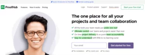
ProofHub is the ultimate collaboration tool that allows you to keep all your projects organized and streamlined. From assigning tasks to team members to sharing files and leaving comments, this tool makes teamwork a breeze. What’s even more impressive is how ProofHub uses their hello bar to educate visitors about their product and provide helpful resources. By including links to a quick intro and a guide on remote working, ProofHub is showing that they care about their customers and want to provide them with the tools they need to succeed. This level of commitment to customer satisfaction sets ProofHub apart from the competition.
3. Share Special Discounts
Don’t let your customers miss out on amazing deals and discounts! Studies show that a whopping 88% of US consumers use coupons for online shopping. So, why not use a hello bar to highlight your holiday or festive season sales? With a clear and concise message, display your coupon code and any terms and conditions to get your target audience excited and ready to shop. Don’t leave money on the table – use a hello bar to showcase your best offers!
Example: Pepperfry.com
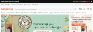
Pepperfry is an online furniture and home decor brand that allows customers to shop for furniture items from the comfort of their homes. In addition to a robust e-commerce platform, they have more than 70+ stores across India. When you visit Pepperfry, you will see their ongoing offers displayed right at the top of the website. For example, during the Mother’s Day week, the company organized Super Mom Sale, offering a 50% discount on selected items. The company even added a link to its terms and conditions page to avoid any future conflicts.
4. Give Reward Points to Customers
Brands that offer loyalty programs are often the preferred choice for customers. A study shows that 81 percent of customers are more likely to remain loyal to businesses that provide loyalty programs. To effectively promote your loyalty program, consider adding it to your hello bar. This way, you can retain current customers and attract new ones. Additionally, using the right typography – such as font type, size, and color – can make your message stand out.
Example: Sephora
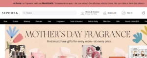
Take Sephora, for example. Sephora is a French brand known for selling beauty and personal care products. The company features over 350 brands for makeup, skincare, hair, fragrance, and other beauty products. Sephora’s loyalty program, called Beauty Insider, allows customers to earn reward points on every purchase. Their hello bar design clearly displays the message that customers can earn 4X points when they shop from the Fragrance category. Sephora has effectively highlighted important points in bold to catch visitors’ attention.
5. Share Important Business Announcements
The hello bar is not just a design element, it can also be used to share important business updates with your audience. This can include anything from mergers, partnerships, website changes, new store hours, COVID-19 guidelines, and more. By using a hello bar to communicate these changes, you can build trust with customers and ensure that everyone is on the same page.
Example: TrustRadius
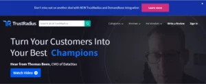
TrustRadius, a platform that helps individuals and businesses find and compare software products, recently used their hello bar to announce a new integration with Demandbase. By including a “Learn More” button, the company made it easy for interested visitors to access more information about the integration and stay informed about the latest updates. This approach can be a great way to keep customers engaged and up-to-date with important news and developments related to your business.
6. Allow Customers to Choose Their Language
If your website receives traffic from people all over the world and you have a customer base that spans multiple countries, it’s important to provide them with the option to browse and shop in their preferred language. One effective way to offer this option is by using a hello bar with a drop-down menu that allows customers to select their desired language. When they choose their preferred language, the page will automatically refresh and display the website content in that language. By creating a multilingual website, you can provide a personalized and seamless experience to your customers, regardless of their location or language preferences.
Example: Shopify.com
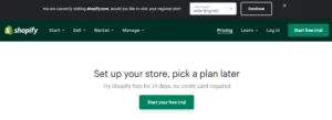
Shopify is an all-in-one e-commerce platform that simplifies the process of starting, managing, and expanding your online business. You can easily handle your marketing, shipping, and payments all in one place with Shopify. If you go to Shopify’s pricing page, you’ll notice a hello bar at the top. It offers visitors the ability to view the pricing page in their preferred language based on their location. You can choose your region from the dropdown menu and then click continue. This simple hello bar is a powerful tool that enables Shopify customers to view pricing details in their preferred language, ultimately leading to increased sales for the business.
7. Talk About Top Deals of the Day
If you have ever shopped on an e-commerce store, you must be familiar with terms like “flash sale,” “limited time offer,” “happy hours,” or “50% off until midnight!” These are called “daily deals,” and they create a sense of urgency among e-commerce customers. However, the question remains, how do you inform customers about the best deals of the day?
While there are several ways to do it, including email marketing, website popups, live chat notifications, etc., hello bars are the most effective. When used correctly, daily deal hello bars can attract attention and drive more visitors to purchase your products.
Example: Target
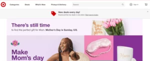
Target is a well-known department store chain that has a presence in all 50 US states. Although Target is widely known for its big physical stores offering everything from clothing to household and electronics items, the company’s digital sales reached an impressive $20.03 billion in 2021. It owes a great deal of its digital success to the daily deal offers displayed prominently on its website. Customers are presented with all the top deals in one convenient location as soon as they visit the website. This feature allows customers to easily check for the latest offers, save money, and enjoy a seamless shopping experience.
8. Give Product Tours
In-app product tours are a valuable tool for both your business and potential customers. These tours serve as tutorials to help new users navigate your app or SaaS product. Without proper guidance, users can become frustrated and may even stop using your product altogether. To combat this issue, promoting your well-designed and informative product guide through a hello bar on your website can greatly increase engagement, product adoption, and user retention.
Example: Workable
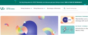
Workable is a recruitment software powerhouse that knows how to make a lasting first impression. Its game-changing hiring solution helps organizations across the globe in getting the right people on board. From scheduling job postings to collaborating with hiring managers, and creating stunning career pages, Workable does it all with ease. The icing on the cake? Workable’s irresistible hello bar, beckoning curious visitors to take a tour of its incredible recruitment software product. Fueled by a mission to help users get their hiring process back on track, Workable’s hello bar is like a magic wand for HR teams worldwide. Trust us, it’s a promise they keep!
9. Create an Urgency
The key to triggering a sale isn’t just offering a discount or a special offer, but making the potential buyer feel like they’re about to miss out on an opportunity of a lifetime. By creating a sense of urgency, you can tap into that natural human tendency to want what we might lose.
A great way to create urgency is to tell your website visitors that if they don’t act quickly, they might miss out on an amazing deal. After all, if customers see they can get a deal anytime they want, they will be in no rush and put off the purchase until later. Let’s look at a hello bar example by Udemy to see how you can rush visitors to take the desired action.
Example: Udemy

Udemy is a an online course platform that targets students as well as professional adults. The learning platform offers thousands of free and paid courses across multiple categories: design, marketing, health & fitness, IT, finance, web development, and more. Udemy does an excellent job of creating a sense of urgency among students and working professionals. For example, it uses a receding timer on its hello bar to indicate the amount of time left to grab a limited-time deal. This is a great way to stir your audience to take action and grow sales. professionals. With thousands of courses across various categories, such as design, marketing, IT, finance, and more, Udemy has something for everyone.
10. “Book a Call” Hello Bar
Sometimes, rather than asking for customers’ email addresses, it may be more effective to prompt them to take direct action on your website. One way to do this is by encouraging them to book a call with your team and discuss business matters. By using bottom-of-the-funnel calls to action like “Book a Call Now” or “Schedule a Free Consultation,” you can accelerate your business growth. You can include relevant calls to action on your hello or sticky bar, motivating prospective customers to make purchases from your company.
Example: Studio Grow
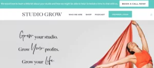
Studio Grow is a fitness consulting firm that specializes in optimizing operations and increasing profits for fitness studios. With a track record of assisting thousands of fitness entrepreneurs in 34 different countries, Studio Grow has established itself as a leader in the industry. As a B2B service provider, Studio Grow features a prominent “Book a Call Now!” call-to-action on its hello bar. This allows studio business owners seeking to grow their businesses rapidly to easily schedule a call and get right down to business.
11. Capture High-Quality Leads
Your website may receive a significant amount of traffic every day, but if visitors aren’t converting into buyers, your efforts may be in vain. Luckily, a hello bar can help you capture high-quality leads and boost sales. Not all visitors are interested in purchasing a product right away, but they may be intrigued by a product demo or additional information. This is where a well-placed call-to-action button on your hello or top bar can make a difference. CTAs such as “Sign Up Today and Get 50% Off” or “Want to Skyrocket Your Sales? Register Now” can effectively target these visitors and encourage them to take the next step. With these persuasive CTAs, you can turn interested visitors into paying customers and grow your business.
Example: Neilpatel.com

Neil Patel, the renowned New York Times bestselling author and esteemed marketing influencer, has solidified his position as a leader in the digital marketing world with his informative blog. Offering a plethora of resources on digital marketing tips, trends, and tools, Neil is a go-to source for businesses looking to enhance their online presence.
As a savvy marketer, Neil understands the power of personal branding. This is why he has strategically placed his own portrait on his blog’s hello bar, accompanied by a compelling question: “Do you want me to do your marketing for you?” This simple yet effective query captures the attention of anyone seeking marketing tips or solutions. Upon clicking the link, visitors are directed to a small form that allows Neil’s team to generate valuable leads. By leveraging his personal brand and expertise, Neil continues to inspire and guide businesses towards achieving marketing success.
12. Stand By Your Corporate Social Responsibility
Corporate social responsibility, or CSR, is a powerful way to demonstrate your company’s dedication to society and the environment. But beyond its positive impact on the world, CSR can also bring significant benefits to your business. By embracing CSR, your business can establish a positive brand reputation and attract like-minded prospects who share your values. In fact, studies show that around 70% of Americans consider it important for businesses to contribute to making the world a better place.
Therefore, if your company supports a social or environmental cause, you can leverage a hello bar to promote it and connect with potential customers who align with your mission. With the help of CSR, your business can make a positive impact while simultaneously building a loyal customer base and driving growth.
Example: Wix

In a powerful display of its values, Wix used its hello bar to bring attention to the crisis in Ukraine following the Russian invasion in 2022. By encouraging customers to show support, Wix helped raise awareness and provide aid to the millions of Ukrainians affected by the conflict. Wix users were able to display Ukrainian flags or badges on their websites, sending a clear message of solidarity and support. This initiative not only demonstrated Wix’s dedication to making a positive impact but also provided an opportunity for its customers to participate in a meaningful cause. Through actions like these, Wix is building a community of socially conscious individuals who use their platforms to make a difference in the world.
13. Ignite Excitement with Event Promotion
Are you planning to host a fantastic sales event or an engaging online webinar? Don’t keep it a secret! Share the buzz with your website visitors through a captivating hello bar. Events and webinars are an excellent way to market your products, services, and connect with potential customers. By promoting your events on your website with a hello bar, you can generate excitement and entice your visitors to participate. You can also use the hello bar to request visitors to share their email addresses for exclusive invites.
Example: BigContacts
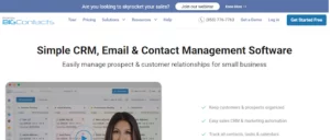
BigContacts, a CRM tool for small to mid-sized businesses, used their hello bar to promote an upcoming sales webinar. With a click on the “Know More” button, visitors could learn about the webinar and register their email addresses for the official invite.
14. Multi-Purpose Hello Bars
Don’t limit your hello bar to a single function. Design it to serve multiple purposes and meet your company’s diverse marketing and communication needs. By creating a multi-purpose hello bar, you can provide all the essential information in one place, making it easily accessible to your visitors. This will eliminate the need for visitors to scroll endlessly or contact your team, ensuring a hassle-free experience.
Example: Levi’s

Levi Strauss & Co., a world-renowned apparel brand, uses its hello bar on its website to serve multiple purposes. With the hello bar, visitors can learn about the Levi Strauss app, ongoing discounts, trending apparel, and the Levi Warehouse Event. This provides visitors with an immersive and interactive experience, making them feel valued and appreciated.
Conclusion:
In the quest for improving website conversions and engaging with customers, Hello Bar can be a handy tool for businesses. However, its effectiveness hinges on strategic usage and avoidance of excessive pop-ups or notifications that could irritate visitors and send them packing.
Learn about how to use your website footer effectively here.
FAQs on Hello Bars:
How can Hello Bar help increase website conversions?
Hello Bar can help increase website conversions by capturing visitors’ attention and encouraging them to take a specific action. By providing a clear and compelling call-to-action, businesses can increase the likelihood that visitors will take the desired action.
Can Hello Bar be customized to match a website’s branding?
Yes, Hello Bar provides users with various customization options, including the ability to customize the messaging, design, and placement of the pop-up or notification bar to match their website’s branding.
Is Hello Bar easy to use for beginners?
Yes, Hello Bar is designed to be user-friendly and easy to use, even for beginners with limited technical expertise. The platform provides users with intuitive tools and templates that can be customized with just a few clicks.
Is Hello Bar effective in improving website conversions?
A: Yes, Hello Bar can be effective in improving website conversions when used strategically and with proper implementation. However, its effectiveness also depends on various factors, such as the website’s design, messaging, audience, and industry.

