
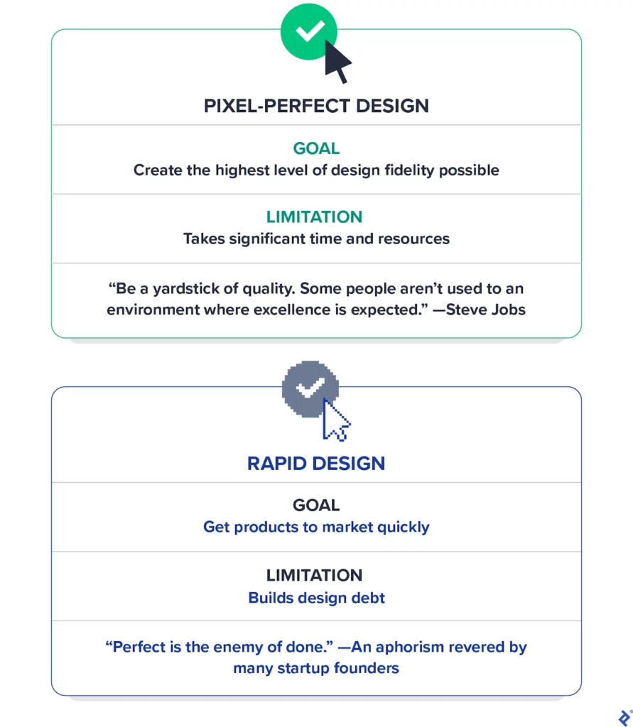
Finding the right balance between the quality and speed performance is easier said than done, as both are subjective concepts. However, I believe achieving this balance is possible based on my experience working on design projects for many startups. I call it pragmatic pixel perfection.
This approach dives into the nitty-gritty of UI design, where the tension between speed and quality is most pronounced. While the following guidance is tailored to help startup product teams maintain balance and focus, any UI designer, product team, or organization striving to create exceptional products quickly can use these 10 principles to achieve pragmatic pixel perfection.
Strategies for Pragmatic Perfection in Web Performance:
A. Prioritize Website Performance
Most entrepreneurs I’ve collaborated with don’t prioritize web performance highly. They typically concentrate on product and business growth, often overlooking critical aspects like performance, accessibility, and SEO. However, these factors are crucial for the company’s success.
Page speed, in particular, has a significant impact on conversions. Google includes page speed in its rankings, so poor performance can lower your site’s search ranking and reduce page views. Studies have shown that e-commerce websites loading in one second have conversion rates more than twice as high as those loading in five seconds.
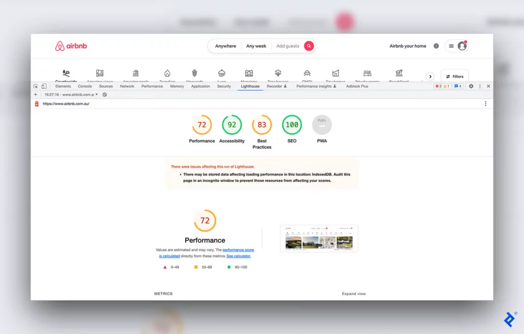
You can evaluate your website for free using Google’s Lighthouse, which assesses websites on performance, accessibility, SEO, and other essential criteria. It also provides recommendations for improving weaker areas. For example, to enhance accessibility, the tool might suggest increasing the contrast between background and foreground colors for better readability. Meeting Google Lighthouse’s standards is adequate for most websites, but if you’re designing for a government agency or a large corporation, you may need to meet more stringent requirements.
Site Speed Mistakes to Avoid: Bloggers’ Edition for 2024
2. Use an Off-the-Shelf Design System
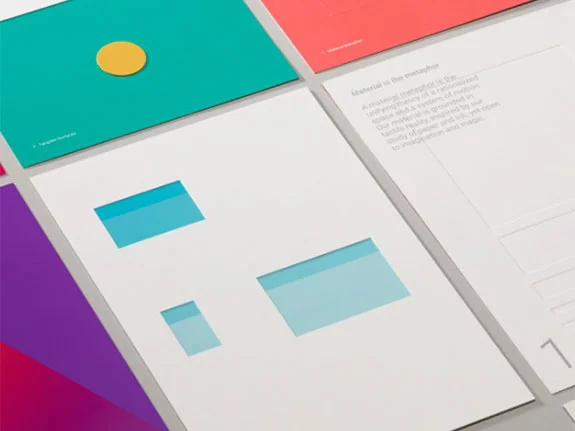
Design systems foster a common language between designers and developers, promoting consistency across products and saving companies time and money. Despite this, startups—and even many established organizations—don’t need a custom design system. Instead, they can adopt a pre-existing system as Google’s Material Design, IBM’s Carbon, or Ant Group’s Ant Design. These systems represent thousands of hours of work by designers and developers, making it inefficient to reinvent industry-standard atomic UI components.
I’ve often heard the argument that using off-the-shelf design systems will make all websites look alike. This argument assumes that users will avoid a product that adds real value to their lives just because its UI elements look and function intuitively. Confusing visual differentiation with product differentiation can lead companies astray. Creating a product that genuinely improves users’ lives is a better approach to delivering value. If distinctiveness is a concern, designers can tailor design systems with brand-specific colors and typography. However, original content and functionality are likely to give startups a competitive edge.
Slow Site Speed: Who to Blame-Hosting or Website? (2024 Edition)
3. Obsess Over UI Details
One critical area where compromising should never occur is in the quality and consistency of visual elements. Adhering strictly to content standards not only prevents confusion but also enhances the user-friendliness of your product. Consistently maintaining imagery, layout, forms, and content across your website greatly aids in efficient user navigation.
As a guiding principle, every detail of a Figma component—such as spacing, padding, margins, alignment, font styles, color schemes, shadows, and effects—should be meticulously applied across various states and screen sizes, down to the finest pixel.
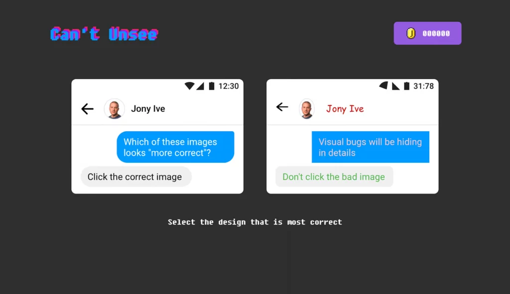
While some may view this level of attention as excessive, particularly non-designers or junior designers, I’ve found the design game “Can’t Unsee” to be invaluable for illustrating UI nuances to clients and team members. This game challenges participants to select which of two designs is more correct from a UI perspective, underscoring the importance of these meticulous details.
Performance Analysis Unlocked: Harnessing Tools for Excellence
4. Error and Empty States: Cater, Don’t Fret
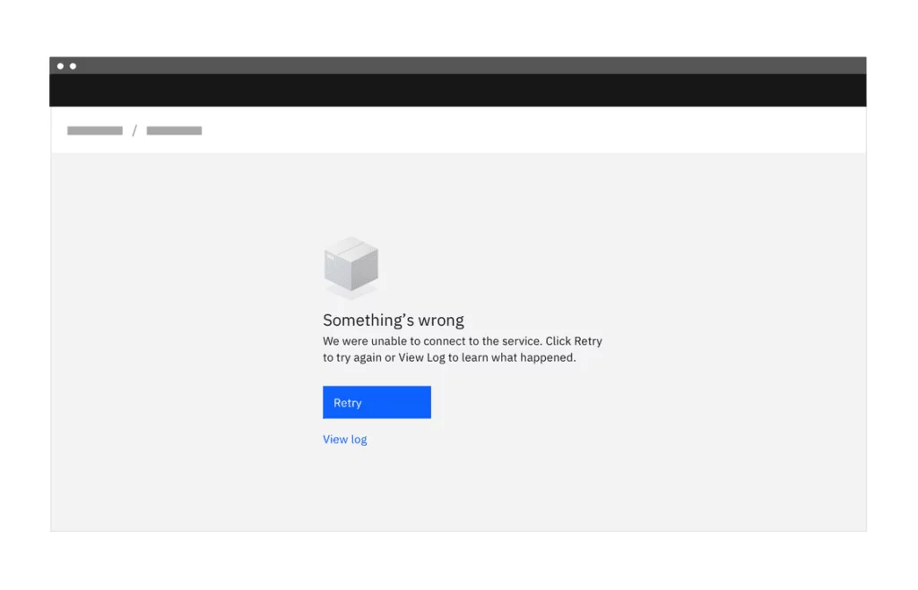
States within a user interface communicate the condition of UI elements. Designing for a range of states, from errors to successes, helps users navigate smoothly through their interactions.
While startups often prioritize the ideal user journey without obstacles, it’s crucial to address potential challenges. Therefore, it’s advisable to accommodate these fundamental states:
- Default
- Progress
- Error
- Success
- Empty
- Interactive (hover, active, pressed, disabled)
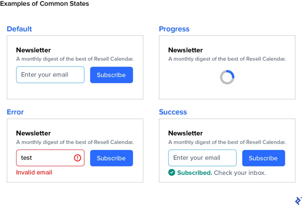
Effective UI design ensures these states convey essential information for a seamless user experience. Even within these categories, emphasizing critical actions enhances usability. For instance, showing a generic error message might suffice for non-critical errors like favoriting a search result. However, for significant actions such as a failed purchase on a ticketing website, it’s essential to inform users about specifics like network issues or declined payment methods. The severity of the action dictates the need for investing in contextual messages to resolve issues.
Depending on your website’s content, additional states such as imperfect states may be considered. It’s important not to over-optimize; focus on states that serve a clear purpose.
5. Strive for “Good Enough” Image Quality
Fix blurry images without compromise. However, when deliberating over higher-end image quality—such as choosing between medium, high, or very high settings in Photoshop, or deciding on 70% versus 80% compression—opt for a smaller file size. If you can’t discern an immediate difference between two image qualities, neither will your users.
Larger images can significantly slow down page loading, which directly impacts user experience, conversions, and Google rankings. While your product should inform decisions about image quality—larger images may be more suitable for a luxury brand than a government website—in general, prioritize using the smallest file size possible.
6. Use a Pre-Made Icon Set
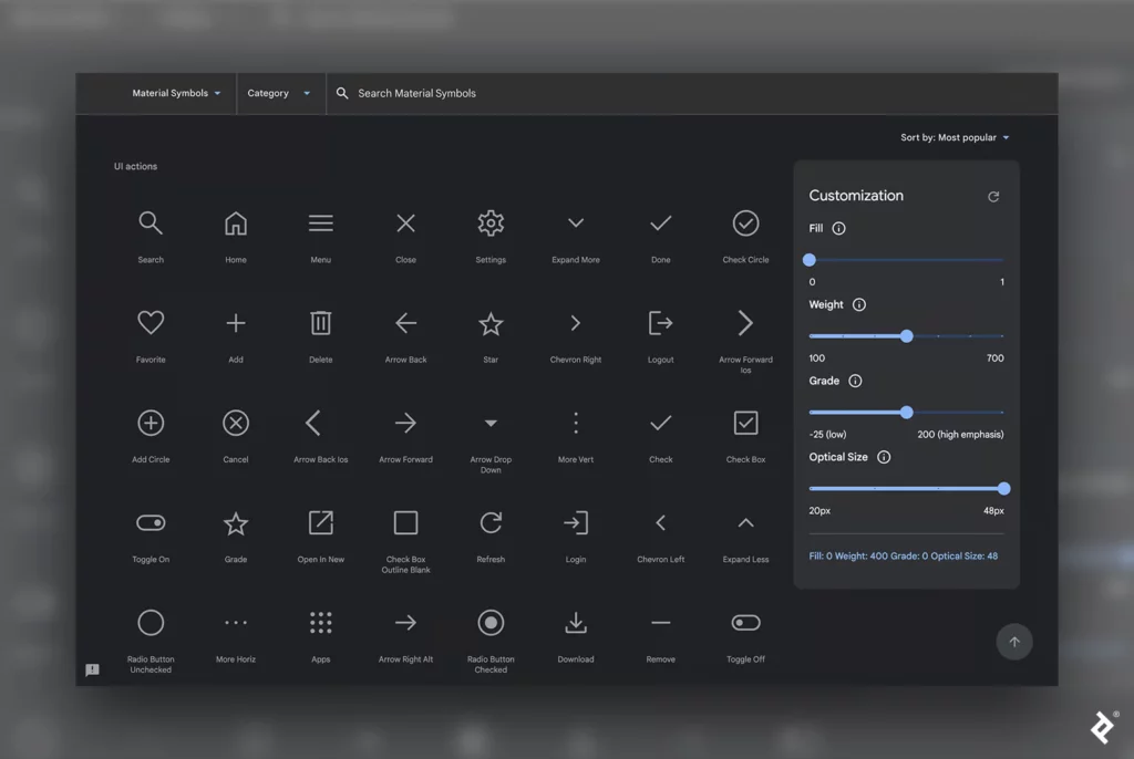
There are numerous ways to distinguish a new product, but custom iconography isn’t necessarily one of them. Investing in a custom icon set is often an inefficient use of resources for any startup, whether they’re bootstrapped or funded. Instead, opt for an icon library like Google’s Material Symbols. While you may occasionally require a specific icon not found in a ready-made set, augmenting an existing library proves more effective than starting from scratch.
Users and businesses derive greater value from a startup’s investment in additional features and improved usability than from unique icons alone. It’s puzzling to encounter a startup website that seemingly had the budget for a custom icon set but neglected essential improvements like bug fixes, enhanced accessibility, and better overall performance.
7. For Animations, Simple Does It
Digital design animation can capture and direct attention, improve usability, increase understanding of data, and add moments of delight, such as reaching a new level in a game or completing a purchase.
However, in web UIs, complex animations often become time-consuming and can significantly increase the scope of a UI component. Moreover, scroll-triggered animations like parallax effects or fade-ins can frustrate rather than delight users.
Any animation in the UI should have a clear purpose. Luxury brands, where visual appeal is crucial, might use carefully crafted motion graphics and animations to meet brand expectations, as seen on Rolex’s homepage. However, for most brands, minimal or no animations are preferable to avoid usability issues and reduce jank.
The Business Case for Investing in Web Performance Optimization: Real-Life Business Cases
8. Don’t Worry About Subtle Browser Irregularities
Web browsers interpret the font weights and assign vertical spacing differently, various operating systems render fonts uniquely with their anti-aliasing methods. Consequently, depending on the user’s browser and operating system, the same page can appear slightly different. Typically, these irregularities are negligible, and making the page perfectly consistent across all browsers is not worth the effort.
For example, a product listing page on Amazon may look slightly different on a PC than on a Mac, but these differences are hardly noticeable. Trying to match browser renderings exactly to mockups can lead to endless iterations with little benefit for the user.
Spending countless hours optimizing every small detail won’t result in a perfect match with the original mockup. Instead of pursuing this unattainable goal, focus on delivering value more meaningfully, especially for startups.
9. Don’t Optimize for Every Possible Screen Size
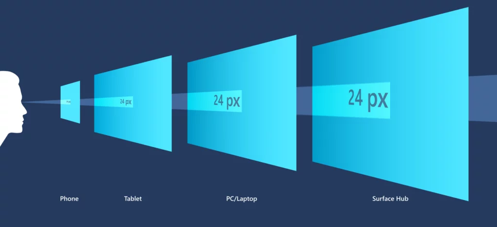
Countless combinations of device sizes, screen resolutions, and pixel densities exist. Responsive design adjusts content based on the user’s screen size, but optimizing for every possible combination of viewport pixel resolutions isn’t practical.
A pragmatic approach involves creating a fluid design and optimizing for three to six breakpoints, where the website will adjust for specific screen sizes. These breakpoints can range from the smallest phone to a large monitor.
There may be minor discrepancies in the UI for devices that fall between breakpoints. For instance, space utilization might need improvement at the far end of one breakpoint before reaching the next one, or some elements might look more expansive than ideal. The UI must be usable on all the breakpoints, but fine-tuning for every phone, tablet, and computer size would take substantial time and effort with little benefit.
To determine the right breakpoints for your website, consult Google Analytics, specific project requirements, and stats on typical screen resolutions. For example, a tech brand might choose not to cater to the smallest phone size (320px) and instead focus on 360px based on their audience’s preferred devices. Alternatively, suppose web analytics show that traffic from large monitors is less than one percent of all visits. In that case, it might not be worth the additional design and development time to cater to that breakpoint.
How is Speed Index Considered an Important Metric for Page Speed?
10. Meta Tags Matter

A user’s experience with your product starts even before they land on your website. How your content appears in Google search results, on social media, or in direct messages can influence whether users click through.
Startups often neglect optimizing a website for social media sharing, but it’s worthwhile. The difference between an article optimized for sharing and one that isn’t is significant.
For example, an article with proper meta tags will have bare-bones link previews on Google and Twitter, which could be more enticing. On the other hand, an article with meta tags will display a preview image and a description, providing a clearer idea of the content and encouraging clicks.
HubSpot data shows that high-ranking sites in search results optimize their content for search intent. One of the top strategies for this is writing effective title tags and meta descriptions. Key meta tags include the title, content type, description, image, and URL.
What is Cookie Syncing? Why Is It So Important?
The Balancing Act: Pragmatic Pixel-perfect Design
Design speed is crucial, but if your product is mediocre, it will be outshone by competitors. Conversely, even an excellent product will struggle if you delay its launch to perfect it.
Startups often prioritize speed and lower costs over quality. While speed is essential when entering a new niche market, most markets are already crowded, and new markets quickly become saturated. For instance, after ChatGPT gained popularity, over 150 AI chatbot apps launched in the first quarter of 2023.
Designers who adopt a pragmatic pixel-perfect approach balance quality and speed by focusing on what actually adds value to a product and disregarding what doesn’t. They understand that rushing production can diminish quality, ultimately reducing value. These designers help startups validate their product-market fit by delivering high-quality user experiences quickly.
FAQs on Pragmatic Website Performance:
What are the implications of third-party scripts and integrations on website performance?
Third-party scripts, such as analytics tools, social media widgets, and advertising scripts, can increase page load times and affect overall performance. Optimizing their implementation (e.g., asynchronous loading) and minimizing their number can mitigate these impacts.
How does browser caching work, and how can it be optimized for maximum performance benefits?
Browser caching allows browsers to store static resources locally, reducing the need to re-download them on subsequent visits. Optimizing caching headers, specifying cache lifetimes, and using versioned filenames for resources are key strategies to maximize caching benefits.
What role does content delivery networks (CDNs) play in improving website speed and global accessibility?
CDNs distribute website content across multiple servers worldwide, reducing latency and improving load times for users across different geographical locations. Implementing a CDN can enhance both speed and reliability.
