Have you ever needed clarification or been disoriented while attempting to complete a form on a website? Were the form field labels and the fields
Was the form poorly positioned, leaving you bewildered? Did the form’s title and submission button seem elusive, making locating them challenging?
These elements, among others, constitute critical aspects of a web form’s layout that can significantly impact the user experience (UX), either enhancing or diminishing it. A well-executed design ensures a positive experience for visitors and establishes a favorable and potentially enduring relationship between them and your brand.
What is a Web Form?
A web form is a dynamic and interactive website element that users fill out within their browser. It allows users to enter information into input fields, select options from drop-down menus, click radio buttons, perform interactive actions, and submit information. These forms collect user data and deliver it to others to fulfill specific purposes, from purchasing products to providing feedback or signing up for services.
Technically, a web form is built on three core technologies: HTML, CSS, and JavaScript. However, modern web forms often leverage popular front-end frameworks, libraries, and page builders to enhance features and streamline development. These technologies include CSS front-end frameworks like Bootstrap or Tailwind, CSS preprocessors like Sass or Less, JavaScript libraries like React JS, Vue JS, or Angular JS, and content management system (CMS) page/form builders such as Elementor or SP Page. Additionally, programming languages like PHP or Ruby may be employed.
Why Does Web Form Layout Matter?
Nearly every website features some form of a web form, and its layout significantly influences conversion rates. A practical form layout facilitates seamless completion, streamlining the submission process for visitors. A well-crafted web form, devoid of complications, instills a sense of professionalism and thoughtfulness, contributing to easy conversions.
Conversely, a more adequately planned layout results in a clearer and more manageable form, potentially causing visitors to become frustrated and abandon their sites. This, in turn, diminishes conversion rates and jeopardizes the overall success of your site.
Why Are Web Forms Essential?
Web forms play a crucial role on the web for several reasons:
- Data Collection: Web forms allow the collection, storage, and management of essential and sensitive user information.
- User Engagement: They establish a two-way communication method between users and websites, actively engaging users.
- User Registration and Login: Forms facilitate user registration, login, account creation, update, and maintenance.
- Real-Time Feedback: Web forms provide real-time feedback and guidance, reducing errors and speeding up online transactions.
- Feedback and Surveys: They enable feedback collection from visitors and customers and serve as a survey tool.
- Data Processing: Web forms streamline data collection and processing automatically.
- Lead Generation: Forms serve as tools for lead generation and marketing methods.
- Personalization: They allow the creation of personalized content, offers, and recommendations based on collected information or insights.
Fundamental Principles for Designing Effective Web Forms:
Web form design principles are essential guidelines for creating optimized and user-friendly forms. These principles articulate the core objectives of web forms, aiding web developers in crafting practical, aesthetically pleasing designs that enhance completion rates and improve overall user experiences.
- Simplicity: Users need more time and attention span when interacting with a form. Keeping the form layout clean and straightforward expedites the completion process. Eliminate irrelevant input fields and use concise labels, instructions, and error messages to guide users efficiently through the form.
- Consistency: Web forms act as a bridge in the conversation between users and websites. Maintaining consistency ensures a cohesive look and harmonious functionality across all web elements. Utilize consistent fonts, colors, and visual cues in form fields for a seamless user experience.
- Alignment and Spacing: Beyond simplicity, readability and organization are crucial. Proper alignment and spacing create a visual structure between input fields, enhancing overall readability and facilitating efficient navigation.
- Visual Hierarchy: Logical and strategic layout elements are vital for a positive user experience. Highlight required input fields, labels, and calls to action (CTAs) to direct users’ attention. This provides easy navigation and enhances the overall filling-out experience.
- Context: Web forms exist within broader contexts, influencing their design, purpose, and usage. To maintain a logical flow of questions for a particular context, group related information cohesively, placing it in the context where it belongs.
- Validation and Error Prevention: Anticipate user errors and design the form to minimize frustration. Implement real-time validation to catch errors as users enter data and provide clear error messages to guide them in correcting mistakes.
- Progressive Illumination: Optimize the form-filling goal by presenting a single-column layout for short forms to avoid confusion. For complex and lengthy forms, consider converting them into multiple steps (stepped forms) to prevent overwhelming users. Implement a progress bar to guide users through the process flow easily.
- Accessibility: Integrating accessibility features ensures an inclusive and seamless user experience across diverse users and screen sizes. Use correct labels, ARIA attributes, and form elements compatible with assistive technologies. Make the form responsive or adaptable to various devices, especially mobile users.
- Privacy and Security: Communicate how user data will be protected and secured, particularly when collecting personal and sensitive information. Integrate privacy measures to comply with regulations (e.g., GDPR in the European Union) and display trust badges or security symbols to instill user confidence in submitting information on your website forms.
Top Web Form Examples:
1. Bed, Bath & Beyond Checkout Form
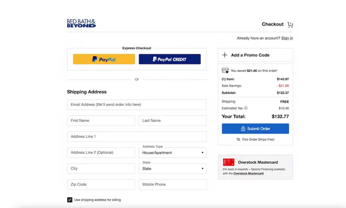
Bed Bath & Beyond, a global homeware brand, showcases a clean, straightforward, and intuitive checkout process. Amidst a vast array of products spanning bedding, bathroom, kitchen, and home décor, their checkout form adheres to user-friendly principles. Bed Bath & Beyond minimizes checkout friction by focusing on essential information and form fields, ensuring a seamless transaction for users.
2. Duolingo
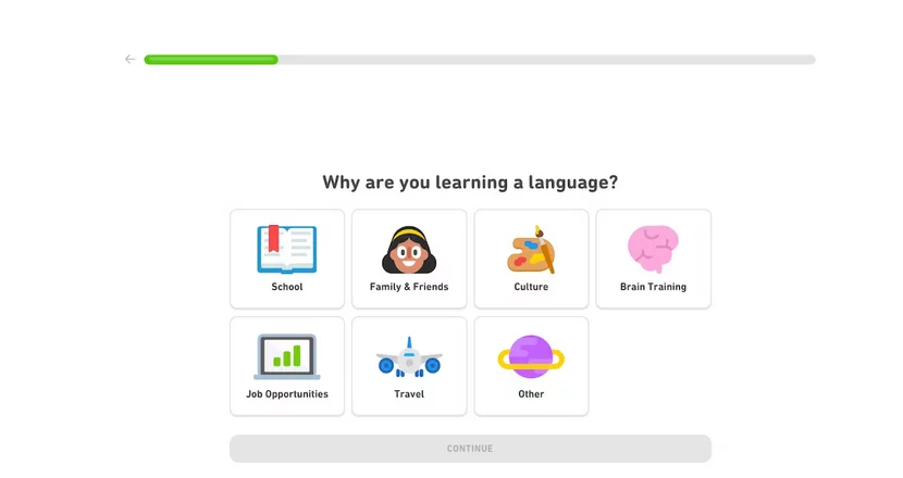
Duolingo’s onboarding process exemplifies a personalized and smooth approach to user engagement. As a language-learning platform, Duolingo’s onboarding form assists users in articulating their language-learning goals. The flat design-inspired multistep form allows users to select their preferred language and identify their learning path. Duolingo’s commitment to personalized forms establishes a benchmark for creating seamless onboarding experiences in language learning.
3. GetResponse
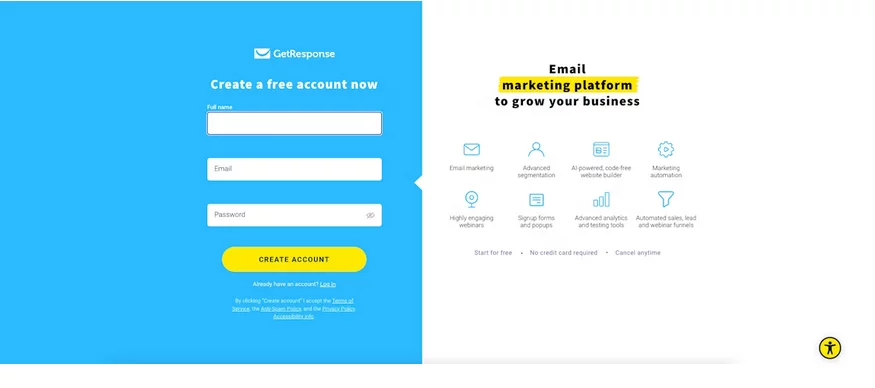
GetResponse, a leading email marketing and lead generation software provider, has masterfully blended design aesthetics with impactful communication on its signup page.
The signup page is a testament to seamless integration. It features a cohesive blue background theme for the form alongside a strategically positioned pitch for its services in the right column. The form’s layout exemplifies a meticulous equilibrium, providing potential users with comprehensive information about the software’s capabilities while upholding a visually appealing and user-friendly interface.
4. Kickstarter
Kickstarter’s sign-up form exemplifies a minimalist and user-centric approach. With a clean white background, the form directs the user’s attention to the essential form fields. This simplicity ensures that users can easily focus on providing the necessary information without distractions. Furthermore, Kickstarter recognizes the value of users’ time by requesting only essential information, a crucial aspect when catering to a busy audience. By balancing clarity and brevity, Kickstarter’s sign-up form enhances user engagement and encourages a seamless onboarding process.
5. House of Fraser
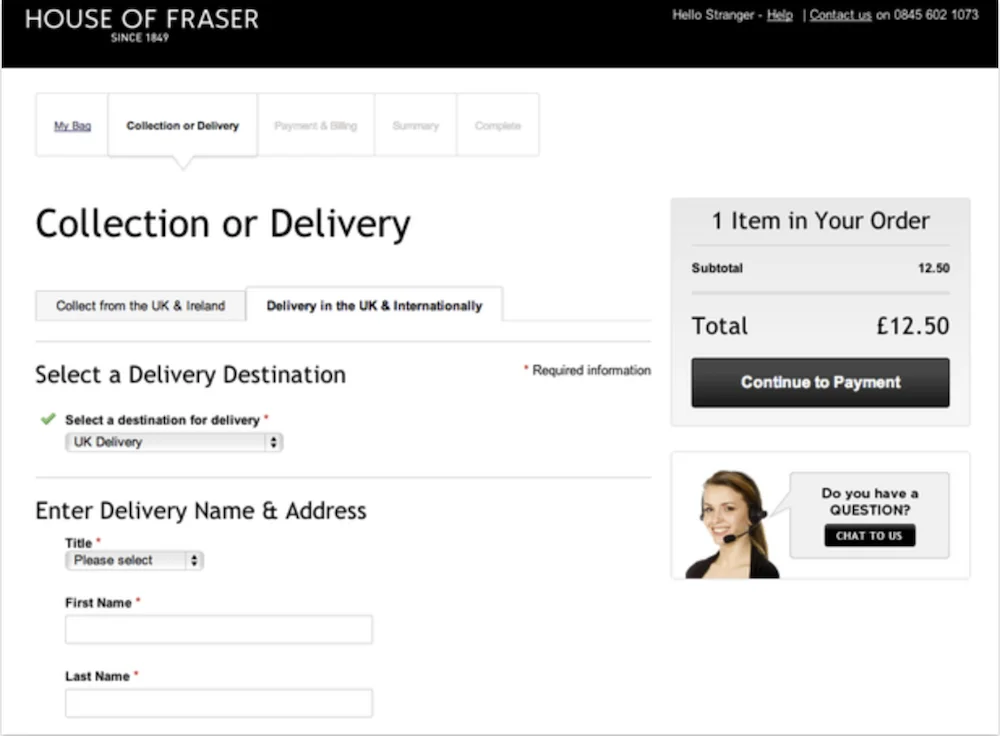
House of Fraser’s form design prioritizes user-friendly interactions. Including a pull-down menu for delivery methods and clear columns such as “collection or delivery” and “payment and billing” enhances the user experience by providing a visual roadmap of the process. The standout feature is the incorporation of a live chat option directly within the form. This strategic addition allows users to seek clarification or assistance without leaving the page, ensuring a smoother and more informed customer journey. House of Fraser’s form facilitates easy navigation and prioritizes user support within the state, fostering customer satisfaction.
6. Staples
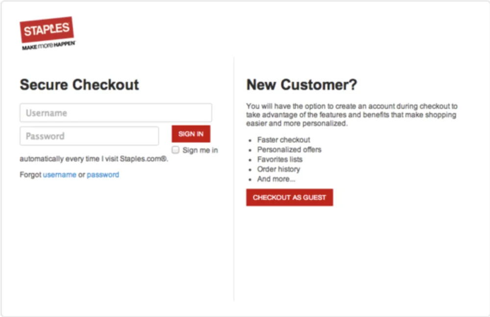
Staples recognizes the diverse preferences of its users by implementing a thoughtful approach to the sign-up process. Understanding that a lengthy “Create Account” form might deter users in a rush, Staples prominently introduces a guest checkout option. Staples caters to users seeking a quick and hassle-free experience by offering the option to check out as a guest. Simultaneously, the form encourages new customer sign-ups by outlining the benefits of creating an account directly beneath the “New Customer” field. This dual strategy ensures flexibility and caters to a broader audience, effectively converting more users into account owners by simplifying the new customer sign-up process.
7. Leadformly
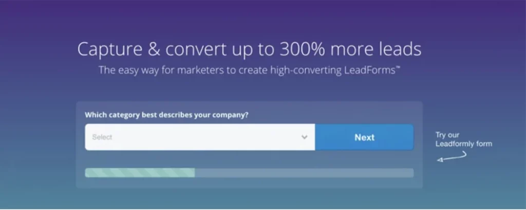
Leadformly employs a strategic approach to form design by capitalizing on the psychology of user willingness. By presenting only one question at a time and incorporating a progress icon at the bottom, Leadformly aims to reduce user attrition rates, making individuals more likely to complete the form. This deliberate choice to reveal one field box at a time fosters a sense of simplicity and ease, enhancing the user experience. The progress icon serves as a visual cue, signaling users about the completion stages and encouraging them to continue, optimizing the overall form completion rate.
8. ClassPass
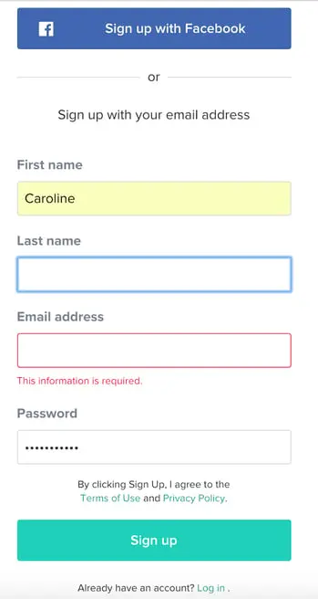
ClassPass leverages the psychology of colors, specifically the calming effect associated with blue, to create a visually appealing landing page. Including a prominent blue free trial button strategically caters to user preferences. The form is streamlined, requiring only essential information such as name, email, and password, with the option for quick sign-in via Facebook. Notably, upon form completion, users are instantly rewarded with a specified amount of credit and information on the average number of classes they can attend in their city using those credits. ClassPass prioritizes ease, quick rewards, and a user-centric approach, making the form-filling process a seamless and gratifying experience.
9. Toptal
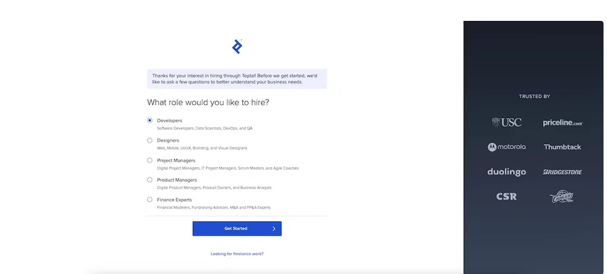
Toptal exemplifies the importance of maintaining quality customer service in form design. The form’s progress indicator informs users about their completion status, motivating them to proceed. Toptal’s distinctive approach involves seamlessly integrating a phone conversation into the form submission process. After answering a few questions, users are asked when they would prefer to receive a call. The option to schedule the call immediately or later is offered, and once selected, the form even proposes to automatically integrate the scheduled phone call into the user’s Google Calendar or iCalendar. This user-centric approach emphasizes Toptal’s commitment to efficient communication and respect for users’ time, showcasing a form that serves as a gateway to a personalized and valuable service.
10. UX Passion
UX Passion recognizes the need to gather more than just basic user information. They incorporate a humanizing message into their form design to alleviate potential user frustration: “The more we know, the more we can help.” This message adds a personalized touch, reassuring users that the form fields are selected not to waste time but to enhance their experience and provide tailored assistance. By acknowledging the user’s perspective and the mutual benefit of sharing information, UX Passion fosters a positive perception of the form and encourages more comprehensive user responses.
Conclusion:
In conclusion, the showcased web forms exemplify the power of thoughtful design in enhancing user experience and encouraging seamless interactions. These examples underscore key principles that contribute to the success of web forms, ranging from strategic simplicity and clear communication to user-friendly engagement and reinforcement of value propositions. By addressing user concerns, incorporating visual appeal, and streamlining the information-gathering process, these forms set benchmarks for creating interfaces that prioritize user needs and preferences.
FAQs on Web Forms:
How can web forms contribute to a positive user experience?
Web forms contribute to a positive user experience by being user-friendly, intuitive, and visually appealing. Clear communication, strategic layout, and the inclusion of features such as live chat or progress indicators enhance user satisfaction and encourage successful form completions.
What is the significance of A/B testing in web form optimization?
A/B testing involves comparing two versions of a web form to determine which performs better in terms of user engagement and conversion rates. This iterative process helps identify optimal design elements, leading to continuous improvement and refinement of web forms based on user preferences and behaviors.
What is the impact of load times on web form completion rates?
Load times significantly influence user experience and can impact form completion rates. Slow-loading forms may lead to user frustration and abandonment. Optimizing form elements and reducing unnecessary scripts contribute to faster load times, fostering a smoother and more efficient form submission process.
