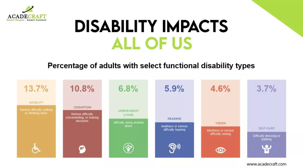
Globally, there are over 1 billion individuals living with disabilities, and within the United States alone, the number stands at 53 million. As the largest minority community worldwide, people with disabilities both, seek and deserve an equally accessible online experience, often referred to as surfing the accessible web.
This brings web accessibility into focus, aiming to provide a critically inclusive user experience (UX). The goal is to ensure that every online space becomes an equal and fair playing field, eliminating barriers for anyone navigating the web.
What Exactly Is Web Accessibility?
Regardless of limitations, impairments, or disabilities, everyone has the right to enjoy the online world. Web accessibility is about empowering everyone to surf the web seamlessly, free of obstacles, confusion, frustration, or difficulties in navigating digital experiences. It is centered around creating an inclusive, smooth, and enhanced UX for all.
Embracing web accessibility best practices in digital design and content creation expands your online reach to a broader audience. This, in turn, leads to better quality sales, increased traffic from improved SEO, and a more satisfied user base. In simple terms, web accessibility is about making it easier and more satisfying for anyone to engage with your digital space.
Is it illegal for a website to not be accessible?
Absolutely. While the WCAG sets universal standards for creating an accessible website, digital accessibility is also a legal requirement. The Americans with Disabilities Act (ADA) mandates that any publicly available online space promoting or selling products and/or services must be accessible. Web accessibility is indeed, a legal necessity for the greater good of your brand, online presence, audience, sales, and legal standing.
To ensure ADA web compliance, the WCAG provides comprehensive lists and guidelines for website owners to follow. Neglecting web accessibility can have significant consequences, making it imperative for businesses to prioritize accessibility in their digital spaces.
How do I make my website more accessible?
Many of us have encountered poor user experiences, such as clunky navigation, broken links, and user-unfriendly content. To maintain ADA compliance and inclusivity, adopting specific design and development principles before launching your website is crucial. This proactive approach reduces the need for retroactive fixes.
This comprehensive blog post provides winning tips, best practices, and a checklist to guide you in creating an ADA-compliant and inclusive digital experience. By integrating web accessibility tools and widgets, such as cost-effective AI-powered solutions, you can streamline the process and ensure near-instant access to multiple disability profiles. Remember, prioritizing the needs of all users, including those with disabilities, not only fulfills legal obligations but also benefits everyone involved.
Understanding Disability Categories: Crafting an Accessible Website
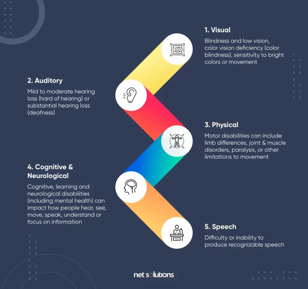
Source: Netsolutions
Individuals with disabilities encompass a diverse range of needs, affecting their daily activities, including web browsing. Familiarizing yourself with distinct disability categories is key to developing an inclusive website that places accessibility at the forefront of your digital space.
Visual Icon: Visual
- Encompasses conditions ranging from total vision loss to lower levels of vision and color-related impairments.
Hearing Icon: Hearing
- Encompasses a broad spectrum of ear-related conditions, including total hearing loss and impaired hearing capacity.
Read also: Top 8 Video Transcribing Tools: Unlocking Efficiency and Accessibility
Neurological Icon: Neurological
- Encompasses conditions related to the central and peripheral nervous systems, affecting standard functions requiring neurological processing.
Cognitive Icon: Cognitive
- Pertains to attention-related deficiencies, comprehension disorders, and deduction-based issues.
Motor Icon: Motor
- Relates to limitations in motor control, low-speed muscles, and inoperable hands.
Imagine the challenge of tying shoelaces for someone with any of these conditions. Now, envision them attempting to use an app, website, or platform that lacks inclusivity—rendering them unable to see, hear, speak, understand, or navigate with ease.
The positive news is that solutions for these web accessibility problems exist. Making digital experiences more navigable for people with disabilities not only addresses their challenges but transforms the interaction into an enjoyable, seamless, and satisfying experience.
Establishing Universal Web Accessibility Standards: Decoding the WCAG
In 2008, the World Wide Web Consortium (W3C) introduced the Web Content Accessibility Guidelines (WCAG). This set of guidelines was created to provide universal rules, ensuring that websites, digital devices, and content are accessible to individuals with disabilities.
The W3C guidelines encompass textual, image-based, and sound-based elements, as well as the programming language (code) governing website accessibility functions and user interface (UI) elements.
How can I verify WCAG compliance on my website?
To guarantee inclusivity in digital content, the W3C introduced the Web Content Accessibility Guidelines (WCAG). The following details and conformance levels can assist you in confirming your website’s WCAG compliance.
The WCAG has undergone several updates:
- WCAG 2.0 (2008): Established the initial accessibility benchmarks.
- WCAG 2.1 (2018): Expanded upon 2.0, incorporating additional guidelines to address the needs of mobile users and individuals with cognitive and low vision challenges.
- WCAG 2.2 (2023): The latest iteration refines guidelines, with a specific focus on catering to individuals with cognitive disabilities and ensuring compatibility with newer assistive technologies.
It is essential to note that, while striving for higher WCAG standards is commendable, many legal requirements mandate at least Level AA compliance.
The three WCAG Success and Conformance Levels are:
- Level A: The baseline level of accessibility compliance, with any site not achieving Level A considered 100% inaccessible.
- Level AA: Requires the removal of common obstacles for individuals with various disabilities. AA represents the top compliance tier needed to eliminate significant accessibility challenges.
- Level AAA: The pinnacle of WCAG’s accessibility standards, more challenging for most company websites to achieve. While it sets the gold standard for accessibility, it is not necessarily a mandatory requirement.
Learn about other legal compliances as GDPR here.
Benefits of Web Accessibility:
- Expands Your Audience: By proactively considering and addressing a diverse range of needs, you’ll make your website accessible to a broader audience. It also ensures that people with various abilities and disabilities can easily navigate and engage with the web content without facing the obvious accessiblilty issues.
- Enhances Usability: An accessible website directly translates to improved usability. Visitors will find it more straightforward to comprehend and interact with your site, resulting in a positive user experience. Considerate design and functionality cater to a wider user base.
- Boosts SEO Performance: Prioritizing correct code implementation and providing text alternatives for multimedia not only pleases your visitors but also search engines. Improved SEO performance is a natural byproduct of creating a well-structured and accessible website.
- Mitigates Legal Risks: Taking steps to ensure accessibility safeguards your website against potential legal risks and liabilities. An accessible site aligns with legal standards, reducing the likelihood of legal challenges related to discrimination or non-compliance.
- Fosters Positive Public Relations: Embracing web accessibility is a demonstration of social responsibility. By creating an inclusive online environment, people can contribute to positive public relations. Users appreciate businesses and organizations that prioritize accessibility, and this in turn enhances your brand image.
Fundamental Principles of Web Accessibility:
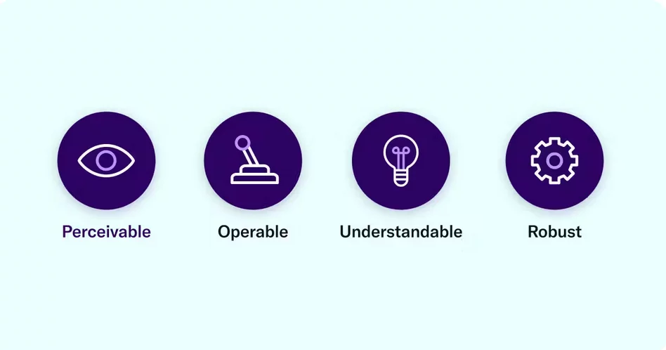
The core principles for maintaining WCAG compliance can be encapsulated in the acronym POUR – Perceivable, Operable, Understandable, and Robust. Grasping these principles provides a comprehensive understanding of how to align with web accessibility standards and legal requirements.
- Perceivable: Website information should be easily perceivable by at least one of the user’s senses. Ensuring content is presented in a straightforward manner is crucial for perceivable web accessibility. This extends beyond individuals with impaired vision to include even those relying on screen readers, text-to-speech, or braille technologies. The goal is universal comprehension, allowing all users, regardless of abilities, to navigate and understand your online space effortlessly.
- Operable: An operable website enables users to interact seamlessly through various means – clicking, touching, swiping, or using voice and keyboard commands. The user experience (UX) should be frictionless. Functional elements, such as form submissions, links, and multimedia controls, should be pretty straightforward and easy to use. Accessibility includes ensuring that assistive technologies can integrate seamlessly, allowing users with disabilities to access all facets of digital spaces without hindrance.
- Understandable: Simplify and clarify – this is the guiding principle for online UX. Messages should provide clear instructions, alt text for images must be concise and descriptive, and users should easily grasp the content’s value. Adhering to web accessibility guidelines means making text and image-based content universally clear, legible, and in easily understandable language. This approach accommodates individuals with cognitive and learning disabilities, ensuring that everyone gains value from the site.
- Robust: In the 21st century, with technological advancements, there’s no excuse for a digital space that cannot integrate with assistive technology. Website content should be easily digestible and navigable, accommodating various technologies like screen readers, voice commands, speech-to-text, or braille displays. The robust principle emphasizes that your content must be interpretable and consumable by every user, irrespective of their chosen assistive technology. If challenges arise, revisiting and refining the content is essential to ensure broad accessibility.
Best Practices to Enhance Web Accessibility:
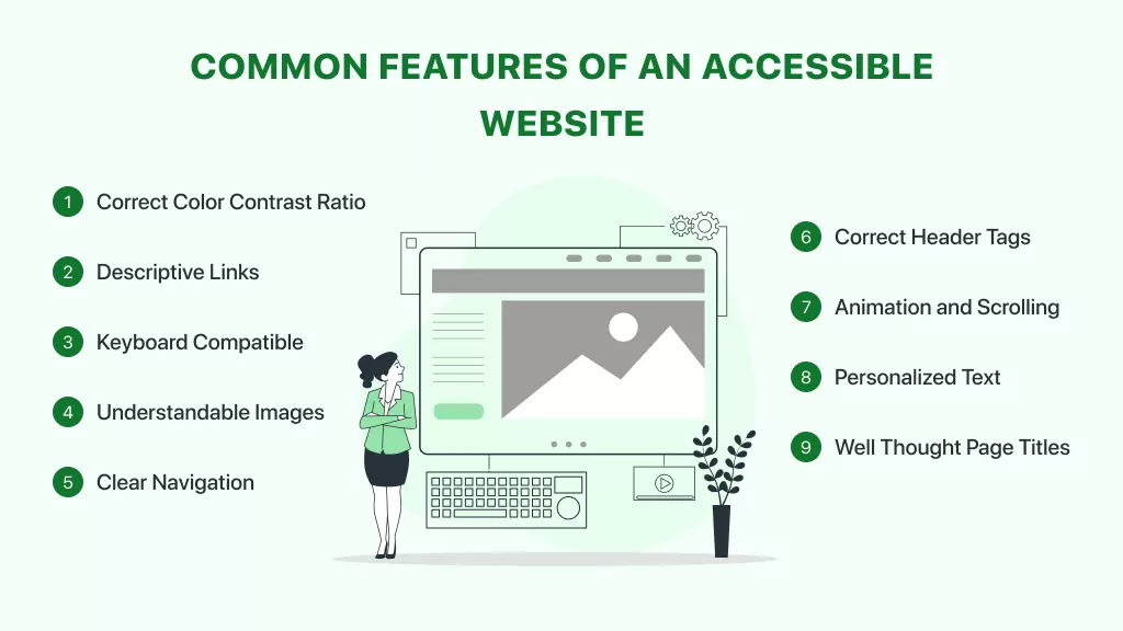
1. Offer Substitutes for Non-Text Content.
In accordance with WCAG Guideline 1.1, ensure that non-text content is accompanied by text alternatives allowing transformation into various formats, such as large print, braille, speech, symbols, or simplified language. All non-text elements, including images, CAPTCHAS, ASCII art, and emoticons, require textual descriptions to convey meaning to users with visual impairments.
The primary method for describing images is through alternative text, commonly referred to as image alt text. This brief description, added to the HTML code, communicates the image’s representation.
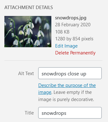
Most content management systems provide a mechanism to include alt text during image uploads.
Adding alt text to an uploaded image in WordPress. When crafting alt text, envision explaining the image to someone over the phone. Omit unnecessary phrases like “image of” or “graphic of.”
Screen reader software, used by people with visual impairments, alerts users to the presence of an image. While it’s acceptable to incorporate relevant keywords for SEO, avoid overloading every image on a page with the same keywords.
GIF with subtitle needs descriptive alt text like: Zuko from Avatar, the Last Airbender. If an image serves a purely decorative purpose, it should have a null alt attribute (alt=””). Platforms like WordPress automatically recognize images as decorative when the alt text is left blank.

Linked images require alt text that specifies their URL destination, focusing on the destination rather than describing the image.
For instance, if the linked image is of a house and directs users to a home page, the alt text should be alt=”Home,” rather than providing a detailed description of the image.
If uncertain about crafting alt text, refer to resources such as the Alt Decision Tree or HubSpot’s guide to image alt text.
2. Offer Diverse Viewing Options for Media Content.
Following WCAG Guideline 1.2, ensure that alternatives are provided for time-based media, specifically audio and video content. When uploading pre-recorded audio or video, supply alternative formats to facilitate access for visitors with hearing or visual impairments.
- Guidelines for Audio Media
For audio content, the most common method of providing an alternative format is by offering a transcript. Transcripts should encompass a comprehensive record of speech, describing any relevant sounds in the recording, such as sound effects or music.
Consider the following example from the Founders Unfound podcast:

- Video Media Guidelines:
To fulfill the captions requirement, videos should feature synchronized captions corresponding to the audio. Captions can be open (embedded into the video) or closed (toggleable on and off).
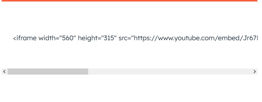
A commonly used closed caption format is a .SRT file, a text file containing the dialogue and timings for a video. Uploading a .SRT file alongside your video enables visitors to activate closed captions when needed. It’s advisable to avoid relying on auto-captioning, as it may inaccurately represent certain dialogues. For silent videos or segments without audio, consider adding an audio description that narrates the video’s content, especially useful for instructional videos like furniture assembly guides.
Providing transcripts for videos is good practice, offering the added advantage of being indexed by search engines like Google, contributing to improved SEO.
3. Develop Content for Versatile Presentation

Following WCAG Guideline 1.3, ensure that content can be presented in multiple ways, such as a simpler layout, without compromising information or structure. This guideline pertains to the page’s structure and the relationships between its elements, with solutions often involving the use of correct HTML code. Utilizing a WYSIWYG editor simplifies the process of incorporating such code into web pages. Here are three examples of using code to enhance accessibility:
- Heading Structure
Incorporating headings improves page scannability, benefiting users with vision loss who rely on screen readers for navigation. Properly structured headings enable screen reader users to navigate directly to specific sections of the page. Start with Heading 1 for the page title, followed by Heading 2 for the first subheading, Heading 3 for subsequent subheadings, and so forth. It’s crucial to use appropriate headings, as text styled with bold or enlarged fonts may not be recognized as a heading by screen readers.
The heading structure in a HubSpot post on creating a sales plan exemplifies this practice, with Heading 1 for the page title, Heading 2 for main sections, and Heading 3 for subsections, many of which are numbered for clarity.
- Lists
Opt for bulleted or numbered lists when presenting groups of items. Screen reader software informs users about the number of list items and identifies the one being read. This practice ensures that screen reader users receive crucial information. Additionally, using lists may enhance the visibility of your content in Google’s featured snippets.
- Emphasis
Emphasize text using bold or italic formatting to make it stand out, with bold being the preferable option.
4. Enhance Content Accessibility for Optimal Perception
In accordance with WCAG Guideline 1.4, prioritize making content more perceptible and audible, emphasizing the separation of foreground and background elements.
- Utilization of Color
Avoid relying solely on color to convey information, as individuals with color blindness may struggle to discern differences. For instance, the UK Government Digital Service presented an illustration revealing the potential consequences of inconsiderate color use, especially for colorblind individuals.

Link underlining aids colorblind users. Alternatively, link text should exhibit a minimum 3:1 contrast with surrounding text, confirmed through WebAIM’s Link Contrast Checker. Links should also feature a non-color indicator, typically underlining, upon mouse hover or keyboard focus. Failure to implement these measures may render links indistinguishable to colorblind users.
- Audio Control
For sites with background audio, ensure visitors can control or mute it. Autoplaying speech or music without user control poses challenges for screen reader users navigating web content.
- Minimum Contrast
Mitigate poor color contrast, which can particularly impact individuals with low vision. Test color combinations for background and foreground text using tools like Chrome DevTools’ Emulate vision deficiencies and WebAIM’s Contrast Checker. To comply with WCAG AA standards, aim for a contrast ratio of 4.5:1 for regular text and 3:1 for large text.
5. Enable Full Keyboard Accessibility

Per WCAG Guideline 2.1, guarantee that all functionalities are accessible via a keyboard to accommodate users who cannot use a mouse. This includes individuals with fine motor control issues (e.g., Parkinson’s disease), muscle spasms (e.g., multiple sclerosis), or hand/arm pain (e.g., repetitive strain injury). Verify that every site function is reachable and operable using only keyboard inputs, ensuring that tab navigation aligns with the page’s visual layout.
6. Grant Users Control Over Timing Adjustments.
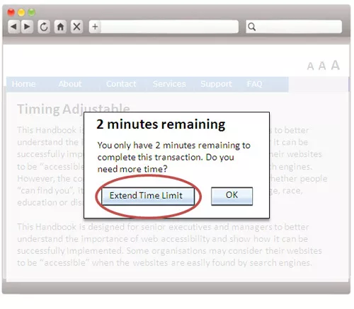
Aligned with WCAG Guideline 2.2, empower users to customize timing preferences, offering sufficient time to read and engage with content. This feature is crucial for elderly users, those with motor impairments, and individuals who may need more time for navigation. For instance, in scenarios involving time-sensitive actions like bookings, users should have the option to extend time limits. Similarly, users must be able to manage alert messages, allowing them to disable alerts that may disrupt their browsing experience, except for critical emergency messages.
7. Eliminate Excessive Blinking or Flashing Content.
In adherence to WCAG Guideline 2.3, refrain from designing content that can induce seizures or physical reactions, particularly among individuals with seizure disorders. It is advised to avoid content that blinks or flashes more than three times per second, as this rapid visual stimulation may trigger seizures. Additionally, exercise caution with parallax scrolling, as some users may be sensitive to its motion effects.
8. Facilitate Intuitive Website Navigation
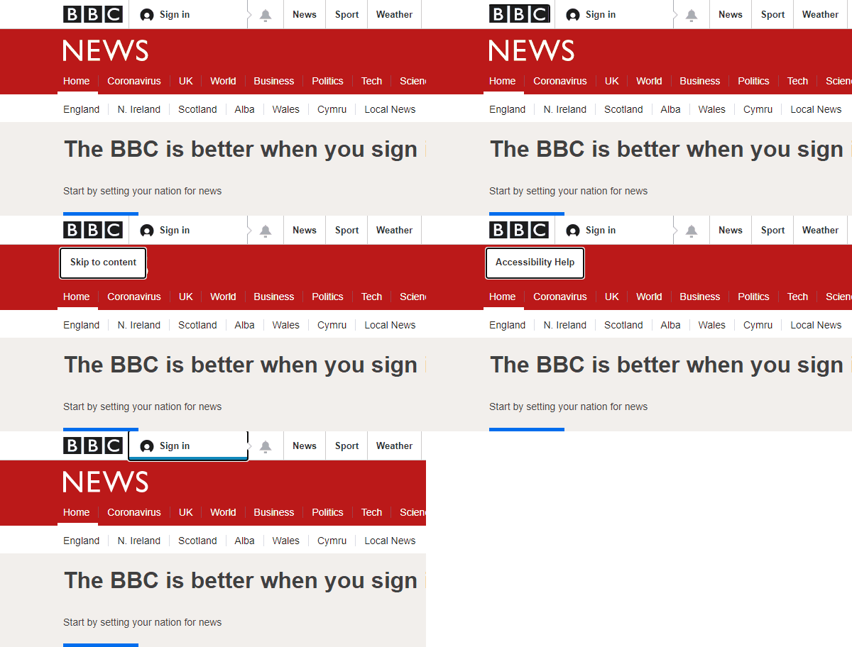
Following WCAG Guideline 2.4, enhance user navigation, content discovery, and location awareness on your website through the implementation of the following strategies.
- Clear Page Title Definition
Ensure each web page features a descriptive title within the title tag, making it evident to users and search engines regarding the page’s content. A well-crafted title aids in search engine optimization and assists visitors in identifying the page when multiple tabs are open.
- Descriptive Linking
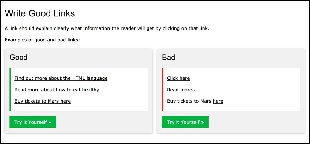
Optimize links for screen reader users by avoiding generic labels such as “Click here.” Instead, employ descriptive text that conveys the destination or purpose of the link. For instance, rather than a button stating “Learn More,” include screen reader text like “Find out more about the HTML language.”
- Wayfinding Solutions
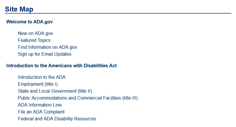
For larger websites, offer diverse navigation options to cater to varied user preferences. Implement search facilities for users who find it more convenient than complex menus. Utilize site maps that group pages by section, facilitating quick content discovery. Breadcrumb navigation provides a “You are here” sign, aiding users in tracking their navigation path.
- Keyboard Focus Indication
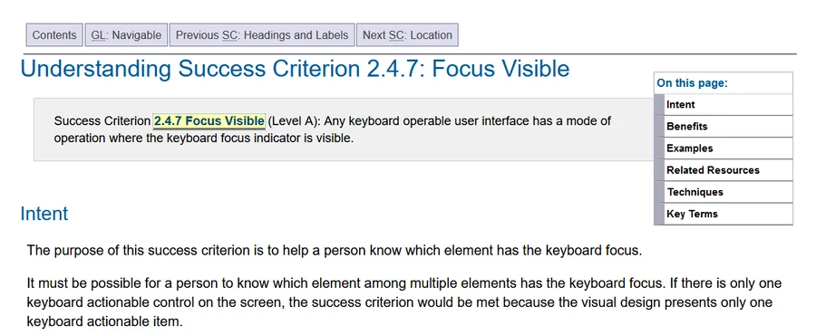
Incorporate a focus indicator, like a visible ring or highlight, on links, buttons, and form fields to guide sighted keyboard users. This indicator becomes visible when users navigate through the tab key. Ensure high-contrast focus indicators for effectiveness.
- Section Headings for Readability
Adopt section headings, aligning with WCAG Guideline 1.3, to enhance page readability and organization. Section headings contribute to breaking up lengthy text, promoting user-friendly content consumption.
9. Support Diverse Input Methods
Guideline 2.5 of WCAG emphasizes the importance of facilitating user interaction through various input methods beyond the conventional keyboard. This guideline, introduced in WCAG 2.1, extends consideration to inputs such as tapping and gestures on touch devices, along with speech input. The success criteria associated with this guideline are particularly relevant for developers.
10. Ensure Textual Clarity and Coherence
In accordance with WCAG Guideline 3.1, prioritize readability and comprehension in your textual content. Strive to make all text easily readable and understandable for your audience. Here are several suggestions to achieve this:
- Page Language Specification

Set the language of each page to enhance accurate rendering by assistive technologies and user agents. This setting aids in providing more precise text, captions, and pronunciation rules for both users with disabilities and conventional users. Ensure alignment between the declared language and the actual content.
- Use of Plain Language
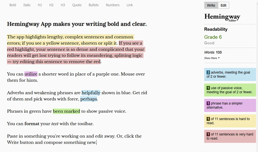
Opt for plain language in your writing to enhance accessibility. Tools like the Hemingway App can assist in identifying complex sentences or recommending simpler word choices. Embrace clear and straightforward language to improve overall comprehension.
11. Design Consistently Predictable Website Features
Guideline 3.2 of WCAG underscores the need to establish predictability in the appearance and operation of web pages. Users anticipate consistent behavior from websites, and unpredictable changes can be disorienting, especially for individuals with low vision, blindness, or cognitive disabilities. Consider the following points:
- Consistent Navigation
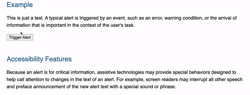
Maintain a consistent order and position of navigation elements across web pages to avoid confusion. Unpredictable shifts in navigation can be particularly challenging for users with visual or cognitive impairments.
- ARIA Roles Implementation
You as a user can also leverage the ARIA roles (Accessible Rich Internet Applications) to standardize and predict interactions with common website features such as tabbers or toggles. ARIA roles contribute to uniform keyboard interactions and content predictability which ultimately benefits the users and in turn your webiste itself.
12. Provide Guidance for Error Prevention and Correction
Guideline 3.3 of WCAG highlights the importance of assisting users in avoiding and rectifying mistakes when interacting with forms on websites. Filling out forms can be error-prone, and incorporating tips and descriptive error messages can enhance accessibility. Consider the following best practices:
- Avoid Placeholder-Only Labels
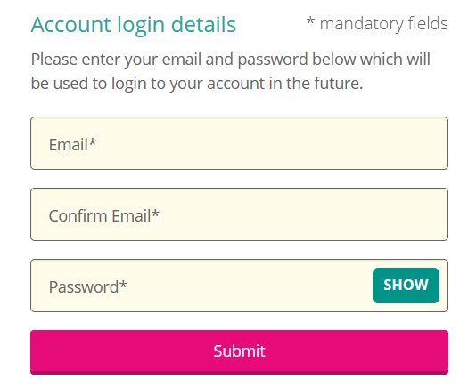
Steer clear of relying solely on placeholders for form labels, as they disappear once users start typing. This approach may cause confusion, particularly for users with memory issues who may forget the information they were meant to provide.
- Reveal Key Information Promptly
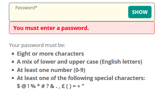
Provide essential information, such as password creation requirements, before users submit a form. This ensures that users are aware of the required format and prevents frustration caused by repeated input attempts.
- Clearly Mark Required Fields
Clearly indicate required form fields to prevent user frustration during form submission. Make it evident which fields are mandatory and which are optional to enhance user experience.
- Offer Informative Error Messages
Present error messages that guide users on how to rectify mistakes. Avoid vague error messages and provide specific feedback on the nature of the error and steps to correct it. This approach fosters a more inclusive user experience.
Web Accessibility Examples: Noteworthy Websites
We’ve scoured the web to highlight a few examples of outstanding web accessibility regardless of industry or niche.
- Eventbrite: Inclusive Event Planning
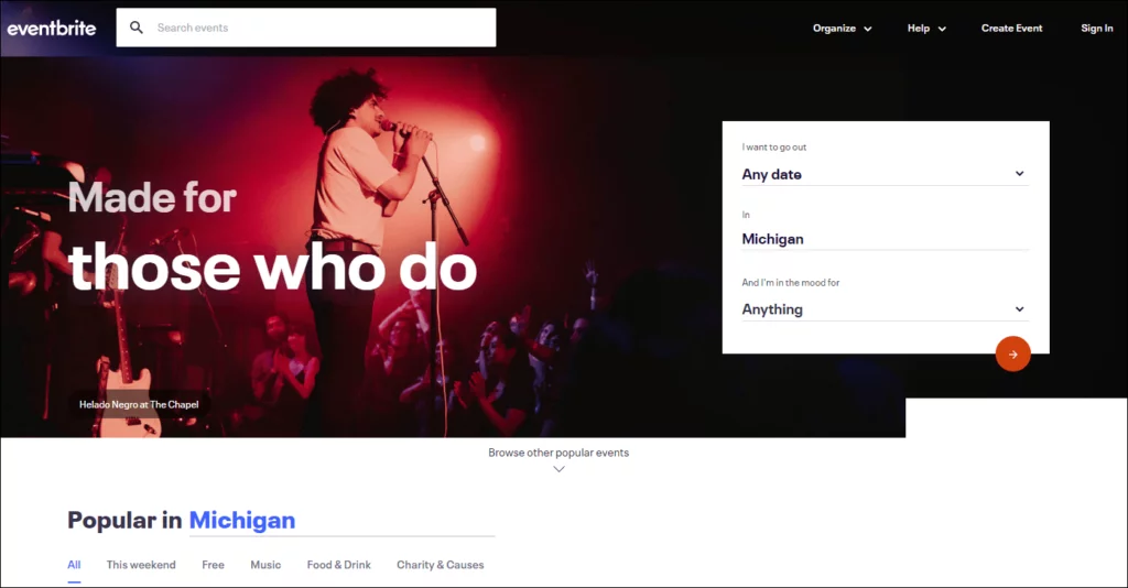
- Eventbrite simplifies the digital planning and RSVP process, ensuring it is inclusive and easy to navigate.
- Customizable options accommodate users with visual or cognitive disabilities, enhancing the overall user experience.
2. Patagonia: Nature-Inspired Inclusivity
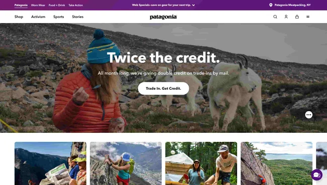
- Patagonia’s website stands out for its easy navigation, clear structure, and logical layout.
- Features like geographical zones and distinct categories improve accessibility, and the site includes an accessibility statement in the footer.
3. BMW: Driving Inclusive Web Experiences
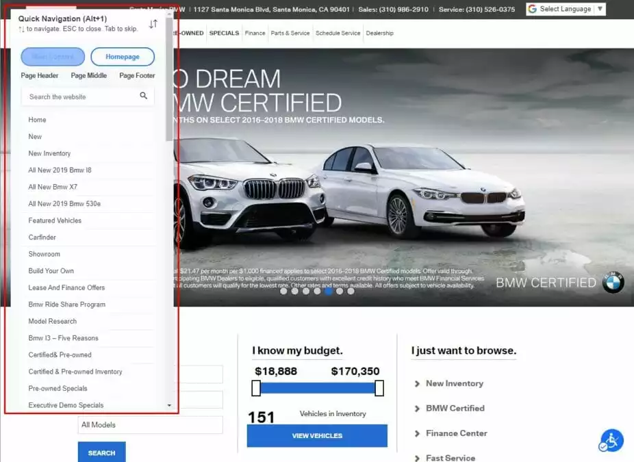
- BMW’s homepage empowers users to control scrolling content, minimizing distractions for those with vision or cognitive impairments.
- Adherence to WCAG guidelines, such as the ability to pause, stop, or hide animations, contributes to an inclusive online experience.
Conclusion:
Web accessibility is not just about user inclusion; it is a business strategy that contributes to overall success. ADA web compliance enhances sales across all online products and services, particularly for eCommerce platforms. Consider the following statistics:
- E-commerce sales in the US reached around $5.2 trillion in 2021 and are projected to reach $8.1 trillion by 2026.
- 93% of users prefer eCommerce shopping experiences over in-store buying.
- 52% are willing to pay more for a streamlined online shopping experience.
Enhancing website accessibility with cost-effective technology is achievable and offers benefits to users and businesses alike. Quick, automated fixes using AI can create a website that is modern, engaging, and user-friendly for everyone.
FAQs on Web Accessibility:
How does web accessibility impact SEO?
Web accessibility positively influences SEO by improving the structure of your site, making it more understandable for both visitors and search engines. Using correct code and providing text alternatives enhances search engine visibility.
What legal risks are associated with an inaccessible website?
An inaccessible website may expose you to legal risks and liabilities, especially if it violates anti-discrimination laws. Ensuring accessibility helps mitigate these risks and ensures compliance with legal standards.
How do I test the accessibility of my website?
Accessibility testing involves using tools like WAVE, Axe, or Lighthouse, conducting user testing with people of diverse abilities, and ensuring compliance with WCAG guidelines. Regular assessments and updates are key to maintaining accessibility.


