In the fast-paced digital landscape, where online interactions shape consumer decisions, the user experience (UX) of a website plays a pivotal role in determining its success. Businesses are increasingly recognizing the correlation between a seamless, user-friendly interface and heightened conversion rates. As we delve into the realm of UX and conversion optimization, the statistics underscore the undeniable impact of a well-crafted user experience on driving desired customer actions.
Statistical Insights:
- According to a study by Adobe, websites with a compelling design that prioritizes user experience can witness conversion rates as much as 400% higher than those with less effective design.
- A report from Forrester Research reveals that a user-centric approach to design can result in a substantial increase in conversion rates, with a potential revenue boost of up to 200%.
- The Baymard Institute suggests that optimizing the user experience can mitigate cart abandonment rates, which currently average around 69.57% across various industries.
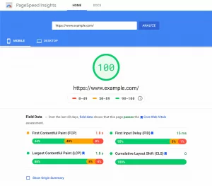
- Google research indicates that 53% of mobile users abandon a website if it takes more than three seconds to load. This underlines the critical role of performance optimization in fostering a positive user experience and, consequently, improving conversion rates.
- A study by Econsultancy found that businesses that invest in understanding customer journeys and enhancing user experience witness a 44% increase in repeat business and customer loyalty.
The Significance of UX in E-commerce Conversion:
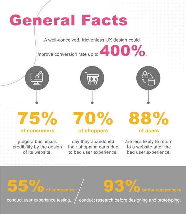
UX emerges as a cornerstone factor for businesses, wielding considerable influence over various facets:
- Conversion Rate Optimization: A seamless UX is intricately linked to improving conversion rates.
- Boosting Customer Satisfaction: Satisfied customers are more likely to convert and become repeat buyers.
- Creating Customer Loyalty: Positive UX experiences contribute significantly to customer loyalty.
- Reducing Cart Abandonment Rate: A well-crafted UX diminishes the likelihood of customers abandoning their carts.
- Enhancing Brand Image: A positive UX contributes to an improved brand image and perception.
- Mobile Compliance: Ensuring that the website is mobile-friendly is an integral part of a positive UX.
Must Have Features to Optimize UX in Conversion:
1. Have an Effective Homepage and Category with Enhanced Features:
Your homepage is the gateway to your online store, and Adidas sets a benchmark with a compelling design scoring 68.7 performance points, as revealed by the Baymard Institute. An engaging homepage is crucial for making a lasting impression on visitors and enticing them to explore further.

Adidas employs simplicity as a cornerstone of their design, showcasing newly launched and popular products without clutter. This simplicity not only enhances the visual appeal but also contributes to increased usability. Incorporate a dynamic element by featuring up-to-date content, ensuring that your homepage always captures the attention of visitors.
The inclusion of a well-organized drop-down menu for easy category access enhances the user experience (UX) and navigation. A functional category section further streamlines the customer journey, making it effortless for users to discover and access the products they seek, ultimately boosting the conversion rate.
2. Make On-Site Search Simpler with Intelligent Features:
The on-site search functionality plays a pivotal role in customer satisfaction and conversion rates. Amazon, with a remarkable on-site search performance of 84.0, provides valuable insights into best practices.

Enhance your on-site search by enabling autocorrect and autocomplete features, ensuring users find what they need effortlessly. Implement a simple dropdown menu, mirroring Amazon’s approach, to help customers specify their searches accurately. Introduce auto-suggest and recommendation features, along with a typo-tolerant search box, to optimize the search experience. Additionally, make sure your on-site search is compatible with mobile devices, accommodating users across various platforms and devices.
3. Improve Product Listing & Filtering Performance with Comprehensive Features:
Elevate your product listing and filtering performance to create an effective and conversion-driven product search. Adidas, with a current performance score of 37, emphasizes comprehensive specifications in filtering products.
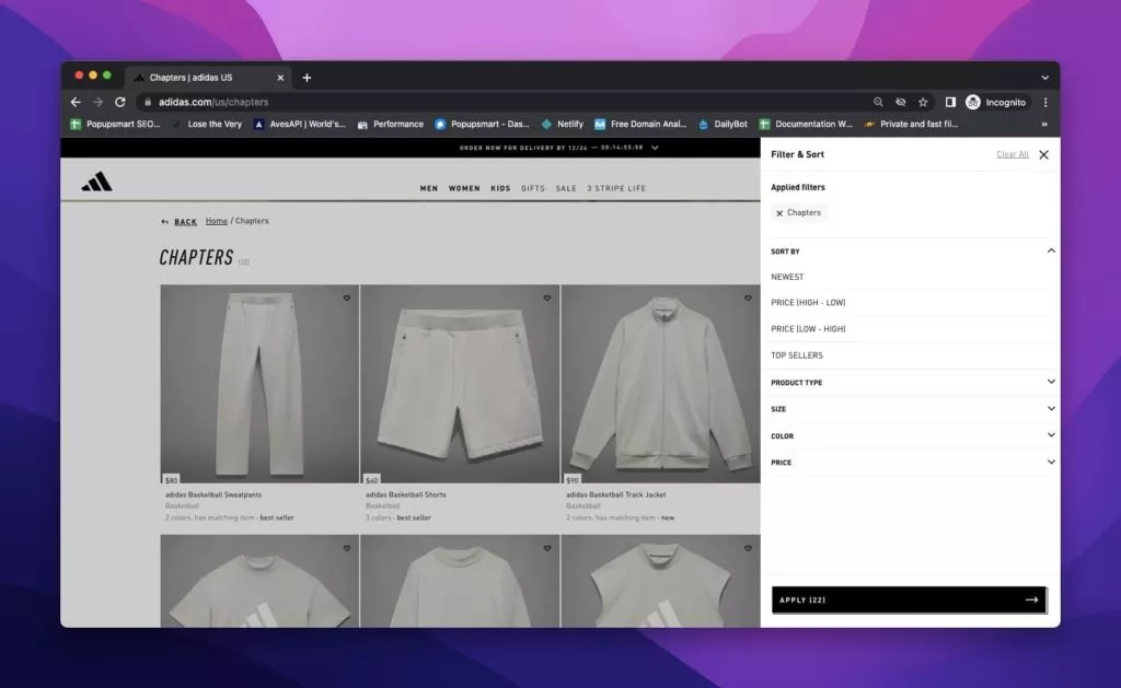
Implement a robust filtering system that includes key criteria such as gender, product type, category, color, size, material, brand, and price range. Provide users with an intuitive and visually appealing interface to refine their search based on specific attributes. Optimize the filtering process for a seamless user experience, enhancing the likelihood of users finding and purchasing the products that align with their preferences.
4. Allow Product Comparison for Informed Decisions:
Acknowledge the innate behavior of online shoppers to compare products, and leverage it to convert visitors into customers. Best Buy, a top-ranking e-commerce site with high acclaim from Baymard.com, excels in providing a product comparison feature.
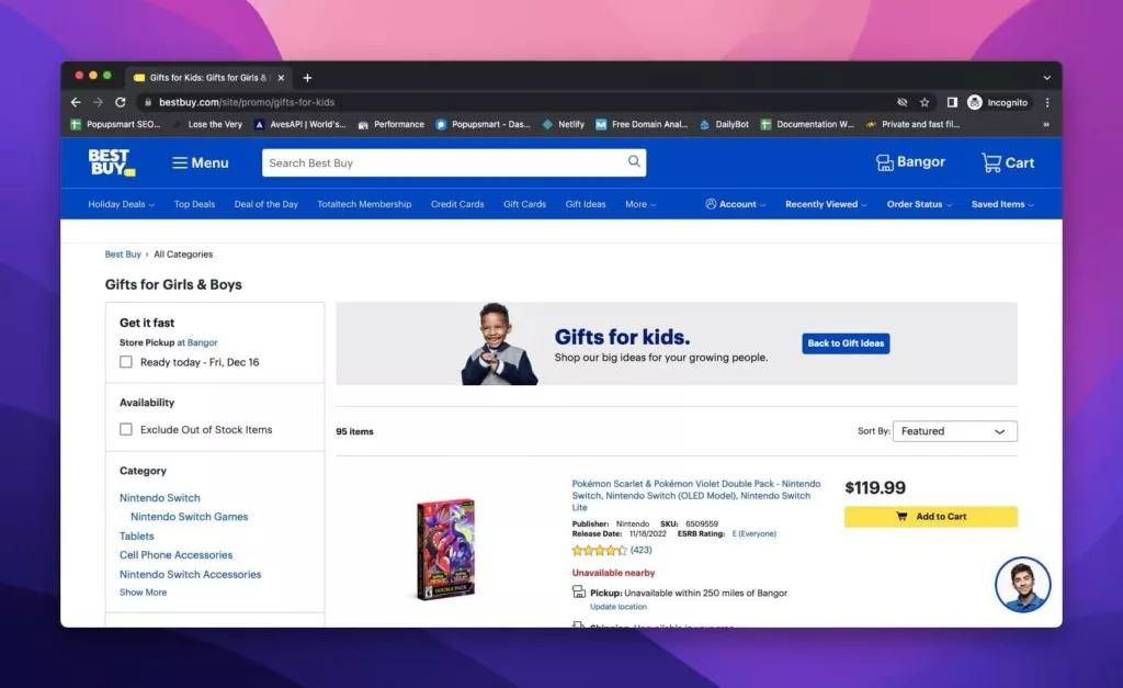
Implement a user-friendly product comparison tool that enables customers to assess features and prices side by side. Understand your customers’ decision criteria to tailor the comparison feature effectively. By facilitating informed decision-making, you enhance the overall shopping experience and contribute to successful conversion rate optimization.
5. Optimize Your Product Page Layout with Advanced Features:
A well-optimized product page layout is pivotal for conversion rate optimization, and Apple stands as a prime example with a commendable performance in e-commerce benchmarks. Apple’s product pages exhibit a clear and effective layout, avoiding clutter and complexity, which can deter conversions. Implement a streamlined product page design that presents product information, options, and comparison features in a straightforward manner.

Take a cue from Apple by integrating video tutorials to enhance customer understanding, particularly catering to those who may be indecisive. Elevate user engagement and foster a seamless shopping experience by ensuring your product page layout is user-friendly and visually appealing.
6. Define Your Products Efficiently with Enhanced Features:
Apple, known for its meticulous approach, excels in defining products efficiently, setting a benchmark for e-commerce standards. Enrich your product pages by providing detailed product information and incorporating high-quality images or videos.
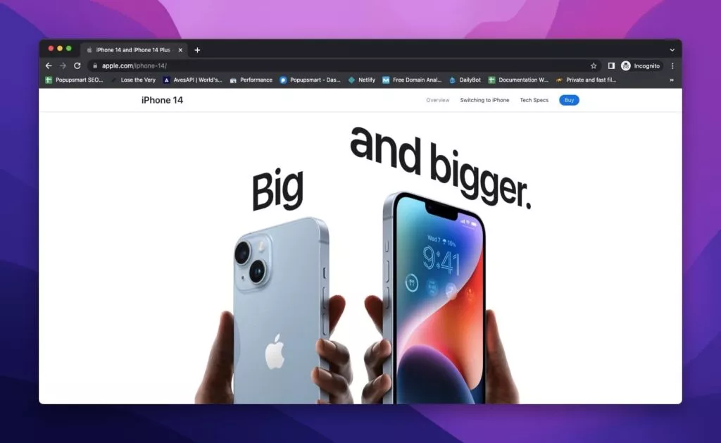
Apple’s image gallery UI showcases the importance of visual appeal. Optimize your product pages by incorporating engaging visual content that highlights your product’s features. Follow the lead of Home Depot, who boasts perfect product description performance with extensive and detailed product information, ensuring customers are well-informed and confident in their purchase decisions.
7. Use Clear CTAs with Innovative Features:
IKEA shines in the realm of clear calls-to-action (CTAs), enhancing the user experience and increasing website usability. Incorporate universally recognizable icons, such as a cart icon for adding products to the cart and a heart icon for saving products, to simplify the shopping process.
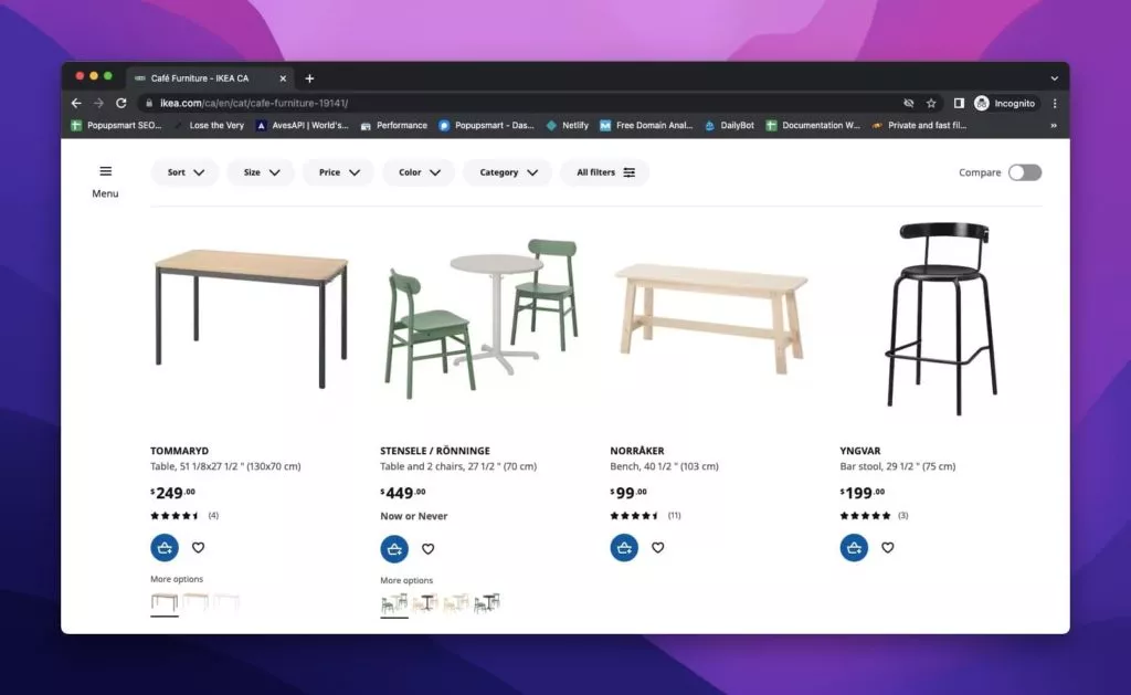
Optimize your CTAs with striking designs, including on popups, to prompt action. Consider integrating user-friendly popup services like Popupsmart, providing modern designs that not only catch attention but also contribute to improved conversion rates.
8. Include Social Proof with Impactful Features:
Best Buy understands the significance of social proof in the decision-making process and excels in incorporating user reviews with an impressive performance rating of 88.1. Leverage social proof on your website by prominently displaying product reviews and ratings, enhancing overall user experience (UX). Employ popups strategically to showcase social proof, building customer trust and increasing conversions. Explore innovative approaches to display social proof through popups for added inspiration.
9. Allow Guest Checkout and Account Selection with Streamlined Features:
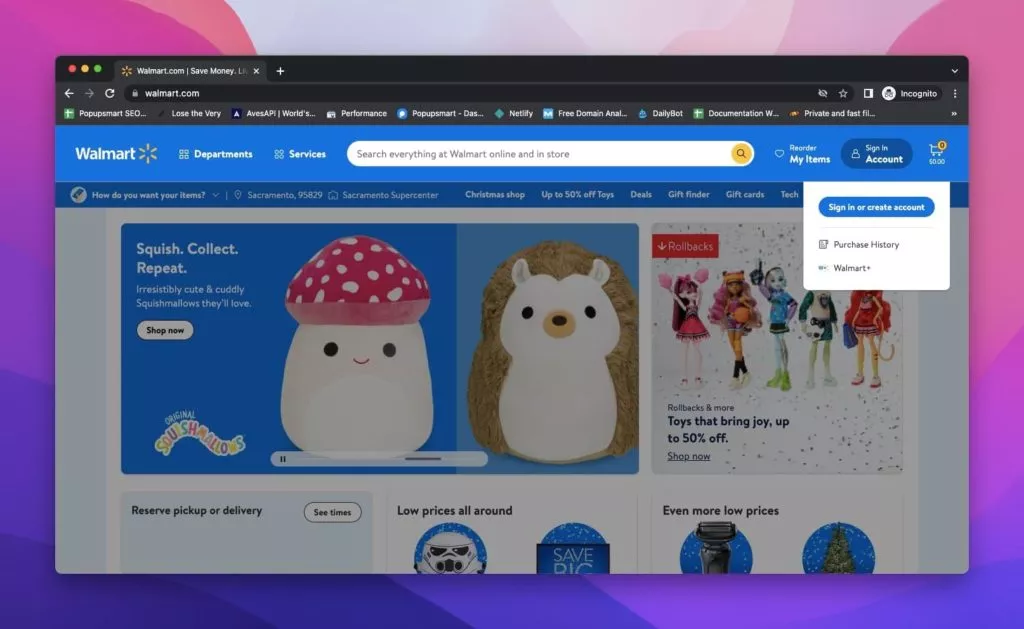
Walmart demonstrates excellence in account selection and creation with a performance rating of 76.9. Recognize that not all visitors have the patience to create an account, and therefore, prioritize guest checkout options. Simplify the account creation process with a shortlist of required input fields to encourage visitors to engage without feeling overwhelmed. Implement a seamless account selection and creation experience, ensuring a successful conversion rate optimization strategy.
10. Get Rid of Complex Password Creation with User-Friendly Features:
Amazon, a leader in the e-commerce space, emphasizes customer account performance with a rating of 37.8. Optimize your website by simplifying the account creation process, starting with eliminating complex password requirements. Streamline the process to enhance customer engagement and brand loyalty. Simplify account creation by focusing on user-friendly input fields, reducing friction, and encouraging customers, both new and repeat, to seamlessly manage their shopping experience and interaction with your brand.

11. Offer Free Shipping and Shipping Options with Strategic Features:
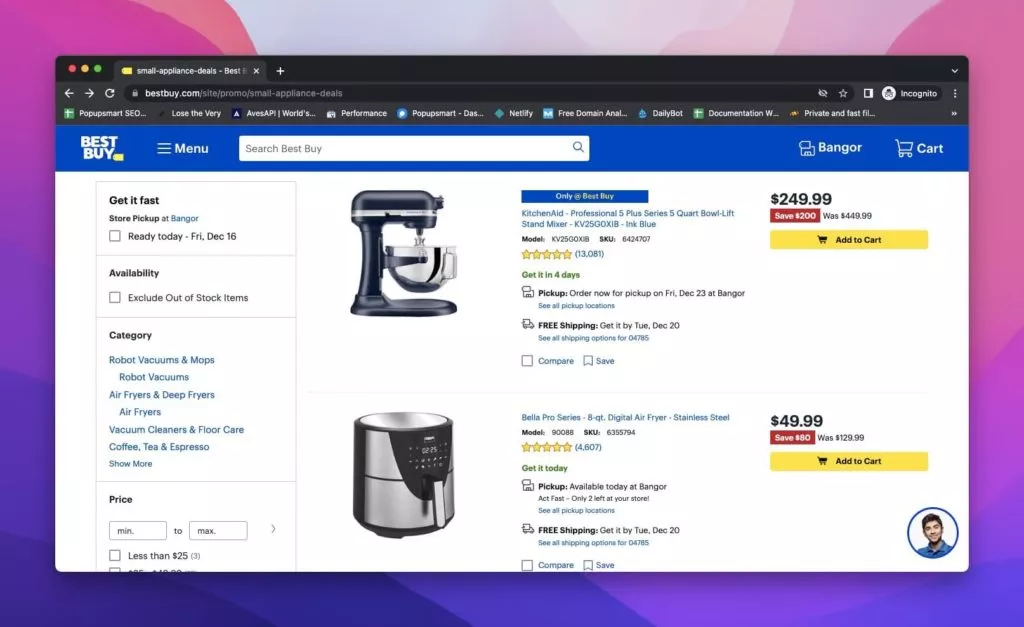
Embrace the allure of free shipping to captivate customers and significantly boost conversions. Highlight the free shipping offering prominently, as Best Buy does, utilizing a clear sign that acts as a conversion magnet. Shipping options play a pivotal role, and Best Buy’s stellar performance rating of 95.6 for shipping and store pickup underscores the importance of providing diverse options. Offer not just free shipping but also the convenience of store pickup, accompanied by transparent information on estimated delivery times and available shipping choices, ensuring a satisfied and engaged customer base.
12. Keep the Required Forms Simpler with Streamlined Features:
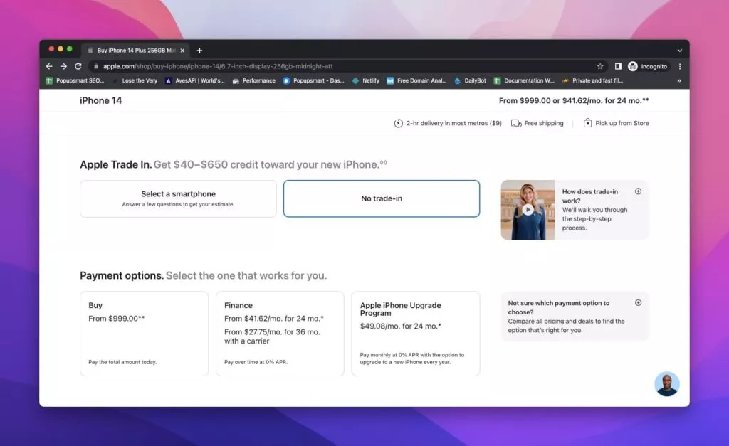
Simplify the checkout process by minimizing the complexity of required forms. Apple leads by example with a customer and address information performance rating of 52.7. Trim unnecessary input fields and focus on collecting essential data to understand your customers and their preferences. Prioritize simplicity, ensuring that the checkout process is streamlined and does not burden users with excessive or irrelevant information, ultimately contributing to improved user experience and conversion rates.
13. Use Drop-Down Correctly with Optimized Features:

Employ drop-down menus strategically to guide users through your website, exemplified by H&M’s approach. Test your drop-down menus for usability to ensure they enhance rather than hinder the user experience. Beyond category drop-downs, recognize the significance of ‘my account’ drop-downs in improving UX. Benchmark insights from H&M suggest that while their drop-down usability is mediocre, refining and optimizing drop-downs in terms of design and functionality can positively impact the overall user experience and conversion rates.
14. Effective Customer Accounts with User-Centric Features:
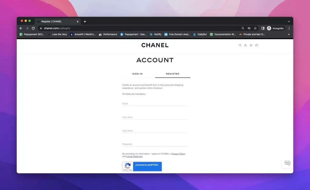
Leverage customer accounts as a powerful tool for customer interaction, product reviews, community engagement, and personalized recommendations. Chanel’s stellar customer accounts UX performance, rated at 62.1, attests to the impact of creating user-friendly and efficient customer accounts. Optimize your website by ensuring seamless registration processes and interactive customer accounts that enhance brand engagement, contributing positively to conversion rates.
Conclusion:
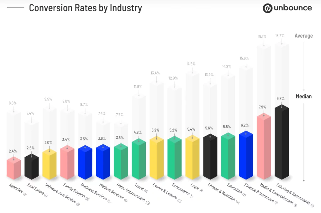
Conversion rate optimization is a nuanced process that varies across businesses and industries. These tips for conversion rate optimization, complemented by benchmarks from top e-commerce sites, serve as a comprehensive guide. By prioritizing user experience and diligently implementing these strategies, you can enhance your website’s conversion rates, ultimately driving more successful conversions and fostering customer satisfaction.
FAQs on UX and Conversion Rate:
What is UX in E-commerce?
UX, or User Experience, encompasses how visitors interact with your website throughout their entire journey. From initial awareness to customer satisfaction post-purchase, UX reflects the holistic experience that visitors have on your website.
What are the Phases That Affect UX?
Various phases significantly impact user experience, shaping perceptions about the brand and its products. Key phases include discovering the website, learning and finding the product, exploring product details, the cart for collecting goods, the payment and checkout process, and the confirmation stage to finalize the decision.
Is UX More Important Than UI for E-commerce?
The importance of UX versus UI (User Interface) is subjective and open to discussion. Both aspects contribute to increased conversion rates and time spent on the website. UX focuses on the overall user experience, while UI deals primarily with the visual design of the website. Research suggests that a strong UX can have a more significant impact on the conversion rate compared to UI when both are well-executed.


