The shopping cart page in any e-commerce platform isn’t just a transactional space; it’s a critical juncture where a potential sale transforms into a successful conversion. An optimized and well-crafted shopping cart page isn’t merely about aesthetics; it’s a culmination of strategic design, persuasive elements, and a deep understanding of user behavior. This comprehensive guide aims to delve into the intricacies of crafting a high-converting shopping cart page that not only simplifies the buying process but also maximizes conversions and enhances user satisfaction.
The Crucial Role of Shopping Carts:

Source: Storeya
- Conversion Gateway: Serving as the pivotal bridge between exploration and final purchase, the shopping cart transforms intent into action. It’s the moment where users transition from contemplating products to initiating a buying decision.
- Decision Stage: At this pivotal juncture, users deliberate and review their selections before committing to a purchase. The cart page acts as the final checkpoint where users make critical judgments on their chosen products and quantities.
- User Expectations: Users have high expectations for the shopping cart—a desire for an intuitive, secure, and easily navigable experience. Meeting these expectations is crucial to facilitate a seamless transition from product selection to the checkout process.
Additional Elements:
- Personalization Options: Incorporate features that allow users to modify quantities, sizes, or colors directly from the cart. Providing customization options enhances user control and satisfaction.
- Prominent Product Images: Display high-quality product images within the cart for quick identification and reassurance. Visual reinforcement reaffirms users’ selections before checkout.
- Inventory Status: Indicate the availability or stock status of items within the cart. Real-time inventory updates mitigate disappointments due to out-of-stock items.
- Estimated Costs: Provide estimated shipping costs or taxes to ensure transparency and avoid surprises at checkout. Clear cost breakdowns help users assess their total expenses beforehand.
- Social Proof Elements: Integrate social sharing or reviews of selected items. Social validation enhances confidence in the chosen products and encourages sharing or feedback.
- Persistent Cart Across Devices: Enable a seamless shopping experience by allowing users to access their carts across different devices. Persistent carts ensure continuity and convenience for users returning to complete their purchase.
The Psychology of Cart Abandonment: Unveiling User Behavior
Cart abandonment remains a prevalent issue in e-commerce, with numerous factors influencing users’ decisions to abandon their carts before completing a purchase. Common reasons include:
- Unexpected Costs: Additional charges like shipping fees, taxes, or hidden costs revealed at the checkout stage can deter users from proceeding with the purchase.
- Complicated Checkout Process: Lengthy and convoluted checkout processes, including mandatory account creation or too many form fields, can frustrate users, prompting them to abandon their carts.
- Lack of Trust or Security Concerns: Users may hesitate to complete a purchase if they have doubts about the website’s security, payment options, or the legitimacy of the business.
- Comparison Shopping: Users often add items to their cart for comparison or as a wishlist without immediate intent to purchase, leading to abandonment.
Real Example: According to Baymard Institute’s research, unexpected costs account for about 55% of cart abandonment instances, highlighting the significant impact of transparency in pricing.
Designing for Conversion on Shopping Cart:
1. Visual Elements and Intuitive Design: Creating a Seamless Checkout Experience
The visual elements and design of the shopping cart page play a pivotal role in guiding users towards completing their purchase. Here’s why:
- Clear and Prominent CTAs: Well-designed, conspicuous Call-to-Action (CTA) buttons prompt users to proceed to checkout, ensuring they are easily visible and intuitively guide users to the next step.
- Simplified Forms: Minimizing form fields and using smart defaults streamline the checkout process, reducing friction and making it easier for users to complete their purchase swiftly.
- Visual Hierarchy: Structuring the page with a clear visual hierarchy ensures that essential elements like the cart summary, subtotal, and checkout buttons stand out, guiding users’ attention effectively.
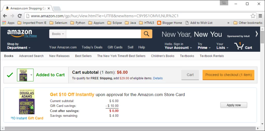
Real Example: Amazon‘s shopping cart page maintains a clean and straightforward design, with a clearly outlined checkout button and an itemized summary, simplifying the checkout process for users.
2. Optimizing for Mobile: Crafting a Responsive and Functional Mobile Cart
As mobile commerce continues to grow, optimizing the shopping cart for mobile devices is critical. Considerations include:
- Responsive Design: Ensuring the shopping cart page adapts seamlessly to various screen sizes, providing a consistent and intuitive experience across devices.
- Streamlined Navigation: Mobile carts should have easy-to-tap buttons, minimal scrolling, and intuitive gestures for navigation to prevent user frustration.
- Fast Loading Speed: Mobile users expect quick load times; optimizing images and minimizing unnecessary elements is crucial for a smooth mobile experience.
Real Example: The mobile shopping cart of Shopify‘s platform maintains a responsive design, prioritizing essential information and minimizing unnecessary elements for an efficient mobile checkout process.
3. Trust Signals and Security Assurance: Building Customer Confidence
- Trust Badges and Seals: Websites like Best Buy prominently display trust badges from security companies like VeriSign and McAfee, assuring customers of secure transactions.
- Secure Payment Icons: PayPal and other trusted payment icons featured on eBay’s shopping cart page reassure users of safe payment processing.
- Transparent Policies: ASOS provides clear and easily accessible links to their return, refund, and privacy policies, fostering transparency and trust.
Real Example: Walmart‘s shopping cart page features clear links to detailed return, refund, and privacy policies, ensuring transparency and building trust by communicating clear terms to customers.

4. User-Friendly Error Handling: Minimizing Friction and Reducing Errors
- Error Prevention: Airbnb’s checkout process anticipates errors by guiding users with visual cues and providing real-time validation, preventing mistakes before submission.
- Clear Error Messages: Booking.com uses highlighted fields and concise error messages directly next to the problematic entry, aiding users in quickly rectifying mistakes.
- Intuitive Prompts and Assistance: Target’s shopping cart employs tooltips and hover effects to offer contextual assistance, ensuring smoother navigation during checkout.
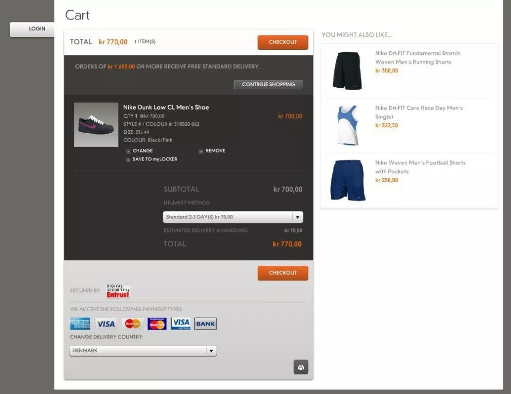
Real Example: Nike‘s shopping cart employs tooltips and inline hints to assist users in completing fields correctly, reducing errors during the checkout process.
Learn about shopping cart abandonment rates here.
5. Effective Copywriting and Persuasive Messaging: Influencing Purchase Decisions
The power of words can significantly influence a user’s decision to complete a purchase. Effective copywriting on the shopping cart page involves:
- Compelling Product Descriptions: Crafting engaging and descriptive product content that highlights unique selling points, benefits, and emotional triggers that resonate with the audience.
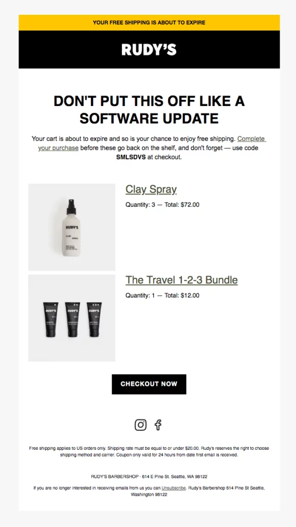
- Urgency-Building Techniques: Implementing urgency-inducing phrases, limited-time offers, or countdowns that create a sense of scarcity and encourage immediate action.
Real Example: Rudy‘s provides vivid and emotionally engaging product descriptions for their handmade cosmetics. Their descriptions focus on the ingredients, fragrance details, and the luxurious experience of using their products.
6. Cross-Selling and Up-Selling Strategies: Maximizing Cart Value
Strategic product placements and personalized recommendations can significantly impact the average order value by encouraging customers to add more to their carts:
- Strategic Product Placements: Showcasing complementary or related products on the cart page can encourage customers to add more items to their purchase.
- Bundle Offers and Discounts: Offering bundled products or suggesting add-ons at discounted rates can entice customers to increase their cart value.
Real Example: McDonald‘s often offers bundled meal deals or combo offers at discounted rates, enticing customers to increase their cart value. Their combo meals, which include a burger, fries, and a drink at a reduced price compared to individual purchases, encourage customers to opt for a more comprehensive meal option, boosting the average order value.

7. Responsive Design:
Creating a shopping cart page that seamlessly adapts to various screen sizes ensures a consistent and user-friendly experience across devices. This involves:
- Flexible Layouts: Designing the cart page using fluid grids and flexible elements that adjust proportionally to different screen sizes, ensuring content remains readable and accessible.
- Media Queries: Implementing CSS media queries to apply different styles or layouts based on the device’s screen size, optimizing the cart’s appearance for mobile screens.
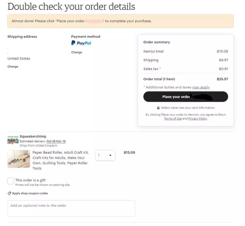
Real Example: Etsy‘s mobile cart implements responsive design principles effectively, adjusting layout and content to fit various screen sizes seamlessly. The cart ensures readability and accessibility across devices, enhancing the overall shopping experience.
8. Streamlined Navigation:
Efficient navigation is crucial for a mobile shopping cart, ensuring ease of use and minimal user frustration. Key navigation strategies include:
- Easy-to-Tap Buttons: Enlarging buttons and interactive elements to accommodate finger taps, minimizing accidental clicks and enhancing user interaction.
- Minimal Scrolling: Condensing content and information to reduce excessive scrolling, allowing users to access essential cart details without extensive swiping.
Real Example: Zara‘s mobile cart implements intuitive navigation, featuring easily accessible buttons and a concise layout. The cart minimizes scrolling and offers clear options for users to modify items swiftly.

9. Fast Loading Speed:
Mobile users expect swift load times to facilitate a smooth shopping journey. Optimizing the cart page for fast loading involves:
- Image Optimization: Compressing images without compromising quality to reduce file sizes and enhance loading speed, ensuring quick visual content delivery.
- Minimizing Unnecessary Elements: Removing non-essential elements, scripts, or heavy animations that might slow down the loading process on mobile devices.
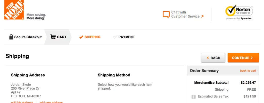
Real Example: Home Depot‘s mobile cart focuses on fast loading by optimizing images and prioritizing essential content. This optimization strategy ensures a rapid loading experience for mobile users.
Conclusion:
Crafting a high-converting shopping cart page is an ongoing journey that harmonizes design aesthetics, user psychology, and strategic optimization. The fusion of these elements creates an environment where customer interactions seamlessly translate into successful conversions. By comprehending user behaviors, embedding persuasive design elements, establishing trust, and consistently refining strategies based on data insights, businesses can revolutionize their shopping cart pages. This transformation not only ensures a seamless and gratifying shopping experience for customers but also maximizes sales opportunities and fosters long-term loyalty.
FAQs on Shopping Cart Optimization:
Why is optimizing the shopping cart page crucial?
Optimizing the shopping cart page enhances user experience, reduces cart abandonment, and boosts conversions, ultimately increasing sales and revenue for businesses.
What are some common reasons for cart abandonment?
Unexpected costs, complex checkout processes, lack of trust signals, and unclear policies are among the leading causes of cart abandonment.
How can businesses reduce cart abandonment rates?
Businesses can reduce cart abandonment by simplifying the checkout process, displaying trust signals, providing clear and transparent policies, and optimizing for mobile devices.
How important is mobile optimization for the shopping cart?
Mobile optimization is critical as more users shop on mobile devices. Ensuring a responsive design, streamlined navigation, and fast loading speed on mobile carts significantly impacts user satisfaction and conversion rates.
What role does persuasion play in cart optimization?
Persuasive elements such as compelling copywriting, urgency-building techniques, and strategic cross-selling/up-selling encourage customers to make purchases and increase the average order value.


