Consider the last time you navigated through an e-commerce site, seeking information about ongoing discounts or sales campaigns. Now, envision if the store didn’t guide you in the right direction—how would you discover the promotions?
The functionality of promotional popups mirrors this scenario. These popups briefly disrupt the user experience, capturing their attention and transforming them into potential leads.
What is a Shopping Deals Popup?
A Shopping Deals Popup is strategically designed to enhance conversions and boost sales by presenting enticing incentives such as discounts, free shipping, coupon codes, or gathering customer emails for future marketing endeavors. These promotional popups play a pivotal role in achieving the fundamental objective of e-commerce – compelling customers to make purchases. They are instrumental in maximizing revenue and maintaining customer engagement.
Elevating your average order value (AOV) and converting a higher percentage of website visitors into actual customers is crucial to outperforming competitors.
Fortunately, popups are tailor-made for such purposes and offer even more benefits. However, the concern that often arises is the reluctance of some website owners to deploy these for promotional activities. Admittedly, there is a plethora of intrusive and visually displeasing ads circulating. No one appreciates those.
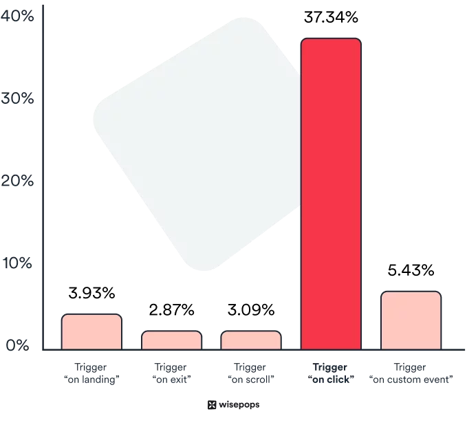
Yet, when crafted and targeted thoughtfully, popups have the potential to achieve an average conversion rate of 3.09%! Shopping deals are one of the most prevalent methods for onsite retargeting and conversion optimization. They are frequently employed for:
- Curtailing cart abandonment
- Providing free shipping or discounts
- Implementing upselling and cross-selling strategies
Key Elements of Popups:
- Attention to Popup Design:
- Visual Appeal: Craft visually appealing popups that align with your brand identity.
- Responsiveness: Ensure your design is responsive across various devices for a seamless user experience.
- Minimalistic Approach: Keep it simple yet eye-catching, avoiding clutter that may overwhelm visitors.
- Precision in Targeting Settings:
- Audience Segmentation: Leverage targeting options to segment your audience based on demographics, behavior, or other relevant factors.
- Timing: Set triggers such as exit intent, timed delays, or scroll depth to display when they are most likely to capture attention.
- Device-Specific Targeting: Tailor your popups for different devices to enhance user experience.
- Compelling Popup Copy:
- Clarity: Communicate your message clearly and concisely to avoid confusion.
- Persuasion: Craft persuasive and compelling copy that addresses visitor pain points and offers solutions.
- Consistency: Ensure your copy aligns with the overall tone and messaging of your website.
- Effective Call-to-Action (CTA):
- Visibility: Make your CTA prominent and easily noticeable within the popup.
- Actionable Language: Use actionable and enticing language to prompt users to take the desired action.
- Limited Choices: Keep the number of choices minimal to avoid decision fatigue and encourage quick responses.
Learn about email pop ups here.
Captivating Discounts and Offers Popups Worth Adopting:
1. Provide Discounts & Coupon Codes
Implementing coupon and discount popups can significantly boost short-term sales for your e-commerce store, especially with a sense of urgency. One effective strategy is to emphasize the expiration date of a coupon code, encouraging users to utilize it within a specified timeframe.
To enhance the impact of your offer, consider displaying a coupon immediately upon a user landing on your page. This can motivate them to utilize the coupon or discount for their initial purchase. However, ensuring these are presented only once to the same user is crucial, avoiding any potential annoyance.
Utilizing advanced builder tools like Popupsmart allows you to configure the targeting options of your popup campaign easily. Here are some valuable tips for more intelligent targeting:
– Set up the popup to appear a few seconds after landing, avoiding immediate annoyance.
– Show your offer on a bar-type across related pages after the initial homepage popup. Sticky bars are less intrusive yet effective in catching the eye.
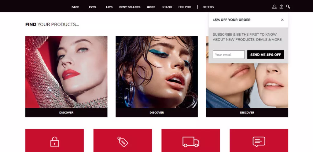
The image above illustrates the homepage of Makeup Forever, a makeup brand utilizing a top sidebar popup to offer a discount in exchange for the user’s email address. Building email lists is a crucial asset for effective email marketing and retargeting.
What this popup does well:
– Creates contrast with vibrant colors on the landing page
– Grabs attention effectively
– Features an optimal call-to-action (CTA)
Potential optimizations:
– Opt for more brand-related and vibrant colors to align with the brand image
– Conduct A/B testing on different fonts, exploring less alarming and more casual options to avoid resembling a Windows alert box. Striking the right balance is essential.
2. Welcome New Users with a First-Time Purchase Offer
Enticing first-time customers with offers such as discounts and free shipping is a widely adopted strategy for securing their email addresses and transforming them into loyal customers.
Even renowned brands incorporate this approach into their marketing initiatives, as exemplified by Kate Spade. The brand presents a 10% discount on the initial purchase and encourages new users to subscribe to their newsletter.
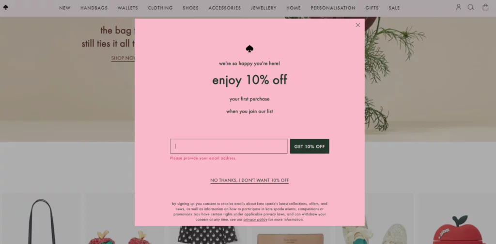
Attributes of the well-executed popup:
– Clean design featuring a dual-color palette
– Clear and compelling call-to-action (CTA)
– Well-crafted text to communicate the offer rejection option
– Easily visible exit button
Potential optimizations:
– Consider incorporating an eye-catching image to enhance visual appeal.
– Conduct A/B testing by exploring a sidebar instead of a lightbox, leveraging the available white space in the design. Testing different formats can help determine the most effective presentation.
3. Recommend Related Products with Cross-Sell Popups
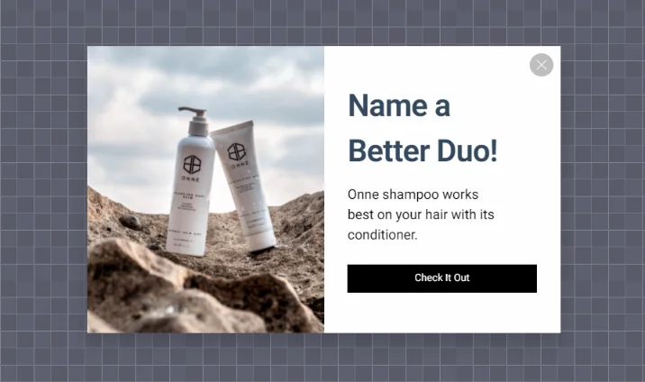
Are you looking to enhance your sales strategy by promoting multiple products instead of just one? Utilize promotional popups to suggest complementary items to your customers. Cross-selling is a powerful technique, especially for encouraging customers who have added a product to their cart to consider additional purchases. Whether displayed on the product page or within the shopping cart, opting for the latter is preferable since users already have the product in their cart.
Consider the following cross-sell popup example created with Popupsmart:
4. Capture Email Addresses Before Departure
Every savvy marketer understands the value of email leads. Not only does it enable you to maintain brand connection and engagement, but it also empowers you to nurture relationships through welcome and apology emails. Most importantly, you can implement effective follow-up strategies, particularly when users abandon products in their carts.
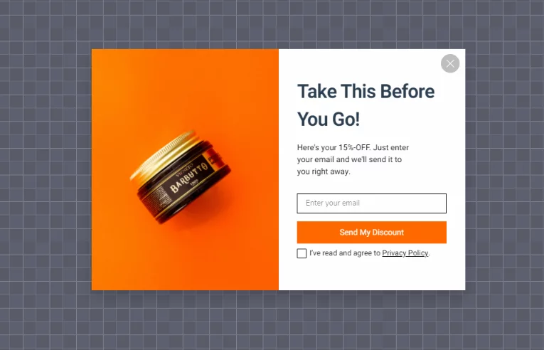
Pro tip: Boost your lead generation efforts by offering a special incentive in exchange for your customer’s email addresses. This approach is bound to attract more leads and foster customer retention.
5. Enhance Sales with Upselling Strategies
Why settle for selling just one product when you can sell more? Upselling presents a lucrative opportunity for boosting your bottom line. Employ these upselling tactics to drive increased sales:
– Encourage customers to buy the product in larger quantities.
– Suggest a higher-tier, more premium product with enhanced features.
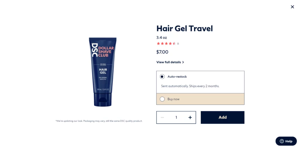
Take a cue from Dollar Shave Club’s shopping deals pop up above, where they skillfully upsell their hair gel through a full-screen popup. Users are enticed to choose the auto-restock option, set for delivery every two months, strategically highlighted over the “buy now” option. This subtle technique influences users to opt for the auto-restock, and they even have the opportunity to increase the quantity directly on the display.
6. Combat Cart Abandonment with Exit Popups
Statistics on shopping cart abandonment reveal an average abandonment rate of 69.80% among consumers. To minimize losses from abandoned carts, leverage irresistible offers through exit popups displayed just before users attempt to leave, compelling them to complete their purchase.
Consider an alternative approach by extending an offer in exchange for their email address. This paves the way for follow-up emails to remind users of the items awaiting them in their abandoned cart.
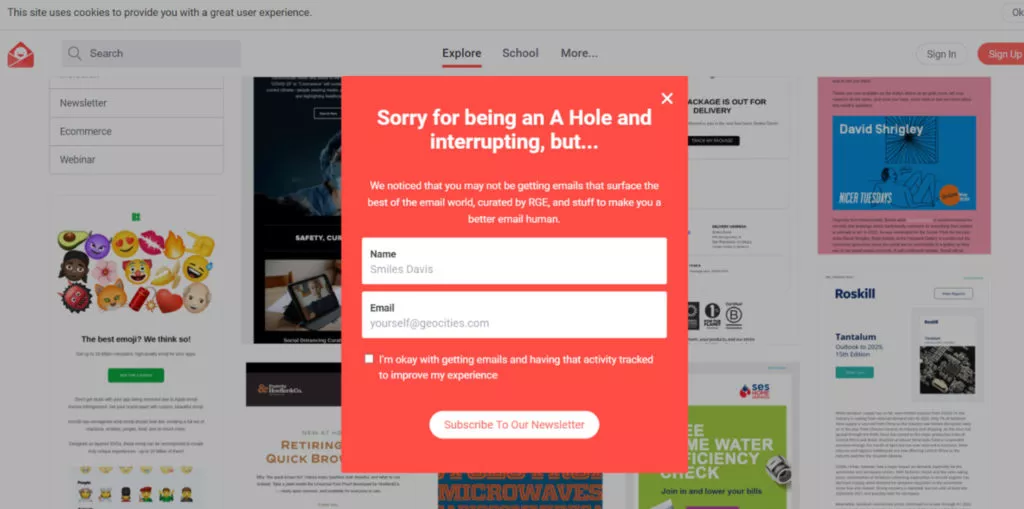
An example from Really Good Emails showcases an exit popup that is not specifically aimed at combating cart abandonment but cleverly adopts a humorous tone to collect email addresses before users leave their site.
7. Boost Sales with a Time-Limited Offer
Leverage the potency of FOMO (fear of missing out) in consumer behavior, a force well-acknowledged by marketers. Offering special offers with a limited timeframe motivates online shoppers to purchase before the enticing deal expires.
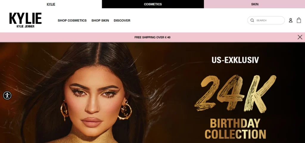
Consider offering free shipping, a strategic move that positions you ahead, as shipping costs often contribute to cart abandonment. To expedite user conversions, emphasize the limited-time nature of this offer on your popup or sticky bar. Enhance the urgency by incorporating a countdown timer.
Apply the same principle to discount offers. Utilize phrases such as “limited time only,” “for limited stock,” and “for orders until X” to instill a sense of urgency and witness revenue growth.
8. Elevate Revenue through Gamified Incentives
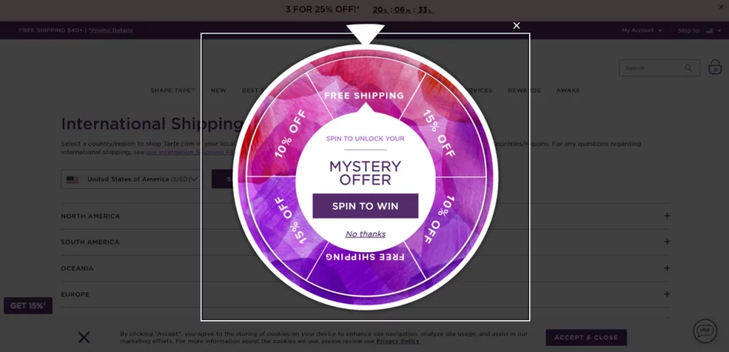
Engage your audience with a challenge through gamified popups, infusing an element of fun into their shopping experience. Set clear parameters for rewards and frequency to enhance the thrill of winning. An example is Tarte’s shopping deals, adopting a spin-to-wheel format.
Benefits of Gamification Campaigns:
– Fun and interactive.
– Encourage visitors to make a purchase driven by the allure of a reward.
– Heighten user engagement.
Shopping deals offer versatile opportunities beyond the ones outlined here. Explore options like:
– Providing free content.
– Advertising sale campaigns.
– Conducting competitions.
– Encouraging social engagement.
– Offering free e-books and more.
Conclusion:
To enhance your conversion rates, focusing on specific components is crucial. Pay close attention to your popup design, targeting settings, popup copy, and call-to-action (CTA). To expedite this process without compromising quality, we suggest employing a simple builder equipped with advanced targeting features and a wide array of design options.
By carefully crafting these elements, you’ll create an optimal popup that engages your audience and significantly boosts your conversions.
FAQs on Shopping Deal Popups:
How do targeting settings affect popups?
Targeting settings ensure that your popups reach the right audience at the right time. Tailoring settings based on user behavior, demographics, or website interactions enhances the relevance, thereby increasing the likelihood of conversions.
Why is compelling popup copy essential?
Effective copy communicates your message concisely and persuasively. It should resonate with your audience, convey value, and prompt users to respond positively, driving conversions.
What role does the CTA play in popups?
A well-crafted CTA guides users on the desired action, such as making a purchase, subscribing, or accessing exclusive content. Ensuring clarity and relevance in your CTA maximizes conversion potential.
Why choose a simple popup builder?
A simple popup builder streamlines the design process while providing advanced targeting features and diverse design options. It ensures a user-friendly experience, enabling quick creation of effective presentations for optimal results.


