In the ecosystem of brands, the user onboarding process takes on a heightened significance, acting as the initial touchpoint that molds the user’s perception of the brand. It’s a strategic undertaking that extends beyond mere functionality, aiming to immerse users in the brand’s identity and value proposition from the very beginning. This distinctive approach not only ensures a seamless user experience but also establishes a strong brand connection, fostering loyalty and advocacy.
What is User Onboarding & Why It Matters?
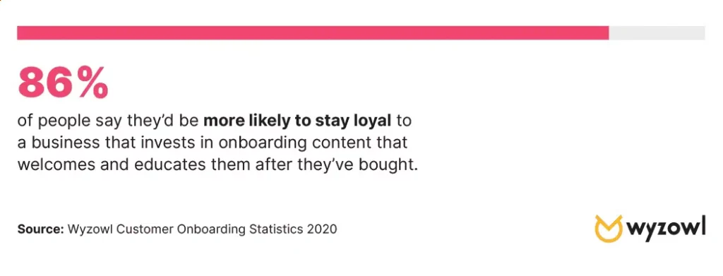
User onboarding is a pivotal facet of user experience design. It involves introducing new users to a product or service’s key features and benefits. This process guides users through the initial setup and usage, which is crucial in shaping their interaction with the offering.
A substantial 63% acknowledge onboarding as the deciding factor for subscription choices. A practical onboarding experience can significantly impact customers initiating their journey with a product. Research indicates that well-executed user onboarding can amplify user retention by up to 50%, highlighting its instrumental role.
Providing users with clear and concise introductions fosters optimal product utilization and concurrently establishes trust and loyalty with the brand. The importance of user onboarding is underscored by its potential to enhance the customer experience.
Why It Matters for Brands:
- Brand Impression: User onboarding is the brand’s opening statement. A well-crafted onboarding experience creates a memorable brand impression, setting the stage for a positive relationship between the user and the brand.
- Aligning with Brand Values: Effective onboarding goes beyond teaching users how to use a product; it conveys the brand’s ethos. Integrating brand values into onboarding reinforces the brand’s identity and establishes an emotional connection with users.
- Consistent Brand Experience: Onboarding ensures a consistent brand experience by aligning the user’s first interactions with the brand’s overall aesthetics, tone, and messaging. Consistency across touchpoints strengthens brand recognition and recall.
- Brand Storytelling: Onboarding serves as a platform for brand storytelling. It’s an opportunity to narrate the brand’s journey, mission, and the problem it aims to solve. Storytelling adds depth to the brand, making it more relatable and engaging.
- User Retention as Brand Loyalty: A positive onboarding experience contributes to brand loyalty. Users who find value in the onboarding process are more likely to remain loyal to the brand, becoming advocates who share their positive experiences with others.
- Showcasing Brand Features: Onboarding is a chance to showcase not just product features but also the unique features that make the brand stand out. Highlighting these distinctive elements reinforces the brand’s value proposition and differentiates it from competitors.
- Brand Engagement: An engaging onboarding experience is synonymous with brand engagement. Incorporating brand elements, such as visuals, messaging, and interactive content, makes the onboarding journey more captivating and strengthens the user’s connection with the brand.
- Adaptable Brand Evolution: Brands evolve, and so should onboarding experiences. By ensuring onboarding processes reflect the latest brand updates and offerings, brands can communicate their commitment to growth and innovation, keeping users informed and engaged.
Stages of an Effective Onboarding Email Campaign:
Stages of Onboarding Process:
A successful onboarding email campaign typically encompasses multiple stages designed to effectively educate and engage new users.
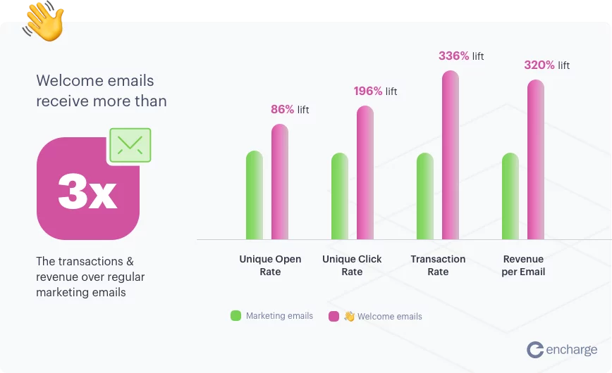
- Confirmation/Welcome Email: This initial email is more than just a transactional message. It’s an opportunity to set the tone for the user’s journey with your brand. Begin by expressing genuine appreciation for the user’s decision to sign up. Reinforce the value they’ve just gained access to and provide a brief overview of what they can expect. Include a friendly call-to-action, inviting them to explore the product or complete their profile. Personalize the email with the user’s name and, if applicable, incorporate on-brand visuals or a welcoming video to create a memorable first impression.
- Product Feature Emails: Subsequent emails should strategically introduce users to the key features of your product or service. Break down complex features into digestible content, using visuals or step-by-step guides to enhance understanding. Consider a series of emails, each focusing on a specific feature. Include practical tips on how users can integrate these features into their workflow. This not only educates users but also showcases the depth and versatility of your offering.
- Case Study Email: Leverage the power of social proof by sharing a case study that illustrates the positive impact of your product or service on other businesses. Highlight key challenges faced by the featured company, the solutions your product provided, and the measurable outcomes. Use real data, testimonials, and compelling visuals to build credibility. This email serves as a persuasive tool, demonstrating the tangible benefits that others have experienced, encouraging users to envision similar success for their own endeavors.
- Check-Up Email: A follow-up email is a proactive way to ensure users are deriving value from your product or service. Express genuine interest in their experience, asking for feedback or providing helpful resources. Include tips on optimizing product usage or introduce any recent updates that might enhance their experience. This communication emphasizes your commitment to customer success and can address any potential concerns before they escalate.
- Halfway Through the Trial Email: Remind users of their halfway point in the trial period with a friendly and encouraging email. Recap the value they’ve experienced so far and offer additional guidance on maximizing their trial experience. Consider including success stories or highlighting features they may not have explored yet. Provide a seamless pathway to support or resources, reinforcing the idea that their success is a priority for your brand.
- Upgrade Email: Target users who may still be on a free or trial plan with personalized emails emphasizing the benefits of upgrading to a paid plan. Highlight premium features, enhanced support, or exclusive perks. Use persuasive language and, if applicable, provide a limited-time offer or incentive to prompt action. Make the upgrade process seamless with clear calls-to-action and a user-friendly pathway to the upgrade page.
- Trial Expires Reminder: As the trial period concludes, send a reminder email to prompt users to make a decision regarding their subscription. Emphasize the impending expiration date and clearly outline the steps to upgrade or renew. Include any last-minute incentives, such as discounts or exclusive offers, to encourage a timely decision. Personalize the message by summarizing the user’s journey so far and expressing anticipation for their continued partnership with your brand.
Examples of Effective Onboarding Emails:
1. Teleprompter’s Exemplary Welcome Email:
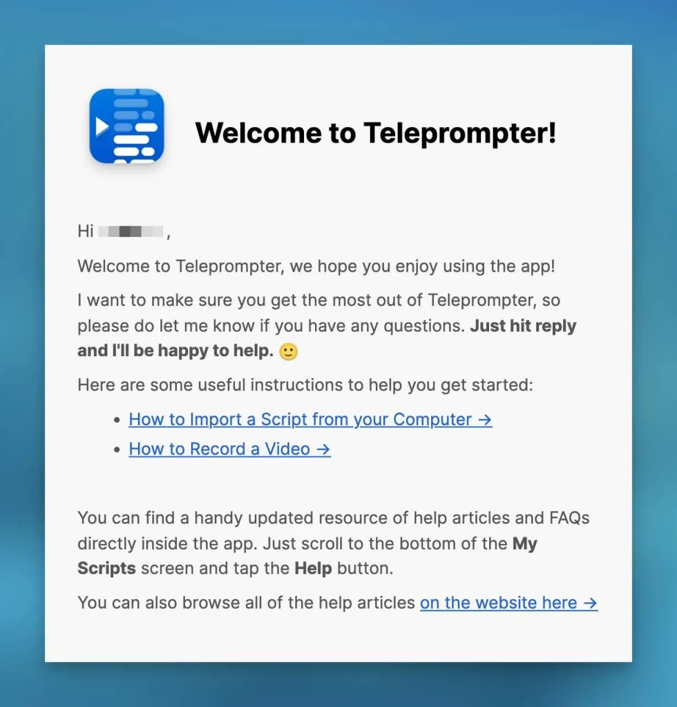
Teleprompter’s approach to the welcome email is nothing short of exemplary, emphasizing the significance of making a compelling first impression. The friendly tone, marked by the use of “I” instead of the more formal “we,” instantly creates a sense of closeness and approachability with recipients. This personal touch lays the foundation for a positive and engaging user experience.
Crucially, the email adheres to a principle of transparency, avoiding the temptation to overwhelm users with promotional content. Instead, it subtly showcases the product’s value, allowing users to discover its benefits organically.
Furthermore, Teleprompter wisely refrains from introducing cross-selling opportunities in the initial welcome email. By prioritizing user guidance and product exploration, the brand recognizes the importance of nurturing a positive onboarding experience before introducing additional offerings. The email concludes with an expression of gratitude, reinforcing the positive experience from start to finish. This final touch serves not only to thank the user for choosing Teleprompter but also to leave a lasting positive impression, setting the stage for a continued positive relationship.
2. iCloud’s Clear and Concise Welcome Email:
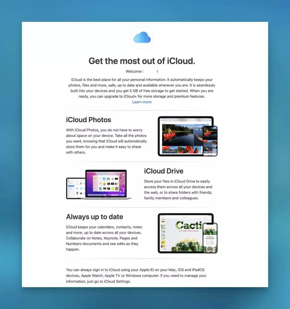
iCloud’s welcome email takes a different yet effective approach, opting for clarity and simplicity. Recognizing that overwhelming users during the onboarding process can deter them, iCloud strategically introduces features concisely. Instead of bombarding users with numerous links, it offers a single “learn more” link within the email.
The emphasis on simplicity aligns with the understanding that 74% of users may switch if the onboarding process appears too complicated. iCloud acknowledges that effective onboarding is about creating a delightful, supportive experience. To achieve this, the email refrains from overwhelming users with excessive information or external links.
By presenting essential details directly within the email, iCloud ensures that users can quickly grasp the key features and functionalities. This streamlined approach contributes to a smoother onboarding process, reducing the likelihood of user frustration.
3. Statista’s Platform Tour Onboarding Email:
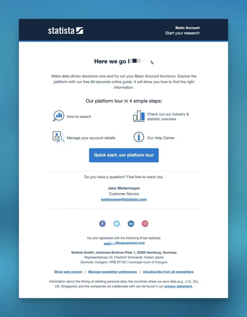
Statista’s platform tour onboarding email sets a high standard by combining simplicity, navigability, and clear guidance. The design is user-friendly, employing a simple layout that facilitates easy navigation. The email takes users on a four-step platform tour, ensuring they understand the key features and functionalities. Each step is accompanied by a clear call to action, guiding users seamlessly through the onboarding process.
The inclusion of support at the end of the email is a thoughtful touch that fosters confidence in Statista’s customer service. By providing a clear avenue for users to seek assistance, the brand emphasizes its commitment to customer support and user success. Additionally, including social media links in the footer enhances engagement, enabling users to connect with Statista on other platforms. This not only contributes to social media growth but also provides users with alternative channels for staying informed about updates and news.
In essence, Statista’s onboarding email excels by adhering to the essentials of simplicity, clear CTAs, support provision, and social media engagement. This approach ensures a positive and informative onboarding experience for new subscribers.
4. Customer.io’s Personalized Onboarding Email:
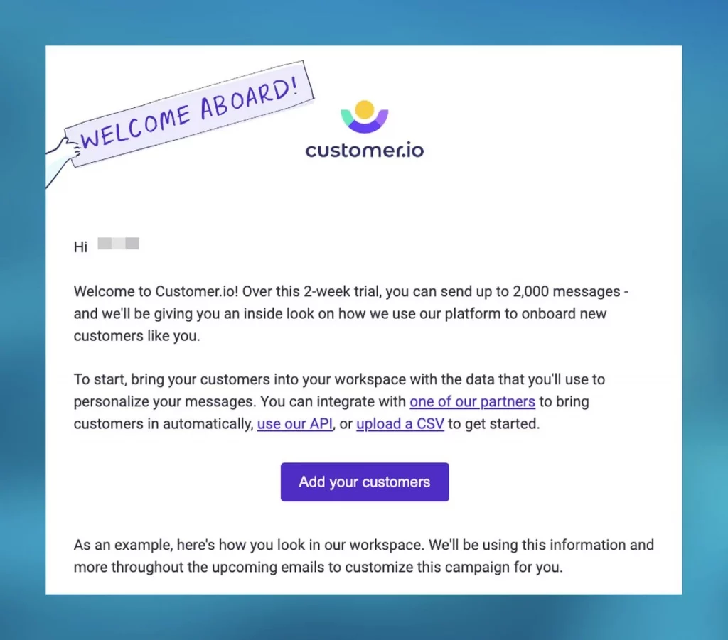
Customer.io, a website personalization tool, prioritizes making users feel valued from the outset. The onboarding email welcomes new users with a personalized touch, providing essential information such as API and partner integration links. By incorporating details like the user’s ID, sign-up reason, and chosen plan, Customer.io emphasizes the user’s importance and tailors the onboarding process to their specific needs.
The customized approach and support offered at the end of the email set a positive tone for user engagement and retention. Recognizing and addressing individual user needs enhances the overall user experience, fostering a stronger connection between the user and the brand.
In summary, Customer.io’s onboarding email showcases the power of personalization, emphasizing user value and providing tailored support. This approach contributes to a positive onboarding experience, setting the stage for continued engagement and satisfaction.
5. Mailer’s One-Month Follow-Up Email:
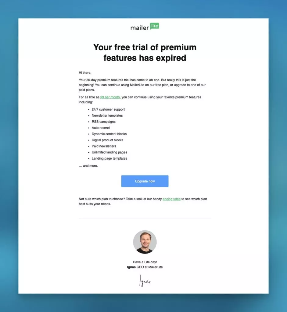
Mailer’s one-month follow-up email, strategically sent post a free trial, is designed to remind users of the advanced features available with a paid plan. The email begins by emphasizing the product’s value, showcasing an array of features accessible for just $9 per month.
Starting with the price and listing premium features enhances the perceived value of the product, compelling users to take action. The strategic use of language and visuals ensures that users are not only reminded of the benefits but also encouraged to upgrade to a paid plan. This type of follow-up communication is crucial in prompting users to make decisions and continue their journey with the product.
In essence, Mailer’s follow-up email exemplifies how well-timed and value-focused communication can drive user actions and conversions, contributing to the product’s overall success.
6. Grammarly’s Clarity and Concise Onboarding Email:
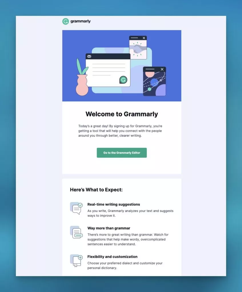
Grammarly’s onboarding email stands out for its clarity and concise communication of the tool’s benefits to new users. Using the brand’s distinctive style, the email provides users with a list of the tool’s offerings, introducing product tours and feature promotions.
A singular, clear call to action directing users to the editor ensures a seamless initiation, exemplifying simplicity while delivering value to new users. By focusing on the core benefits and functionalities, Grammarly effectively communicates the immediate value users can derive from the tool.
7. Descript’s Goal-Oriented Onboarding Email:
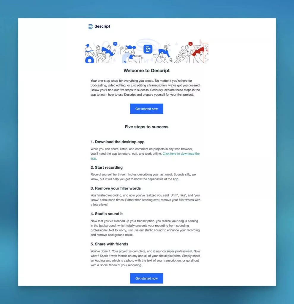
Descript’s onboarding email stands out as a goal-oriented guide for new users, presenting a clear and concise approach to using the software. The email’s focus is on providing detailed information for each step, accompanied by clear instructions to ensure a solid foundation for users. The simplicity of the email aids in maintaining focus on key information and actions, preventing overload with excessive content or visual elements.
This onboarding email serves as an effective tool for guiding users into their Descript journey. By aligning the content with the user’s goals, Descript communicates a commitment to helping users achieve success with the software. The email not only educates but also motivates users to take the necessary steps, setting a positive tone for their overall experience.
8. Scribe’s Personalized Onboarding Email:
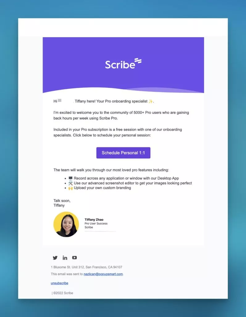
Scribe takes a strategic approach with a personalized onboarding email, assigning an onboarding specialist to guide users through premium features. This move is designed for a successful start, emphasizing a clear call-to-action and a personalized touch that increases the likelihood of users benefiting from the 1:1 meeting.
The inclusion of the specialist’s image subtly adds a personal touch, fostering a connection with the user. Scribe’s dedication to tailored onboarding sets a commendable example, showing a commitment to individual user needs and ensuring a positive introduction to their platform. This personalization not only enhances the user experience but also contributes to building a stronger relationship between the user and the brand.
9. Power Thesaurus’ Feature-Highlighting Onboarding Email:
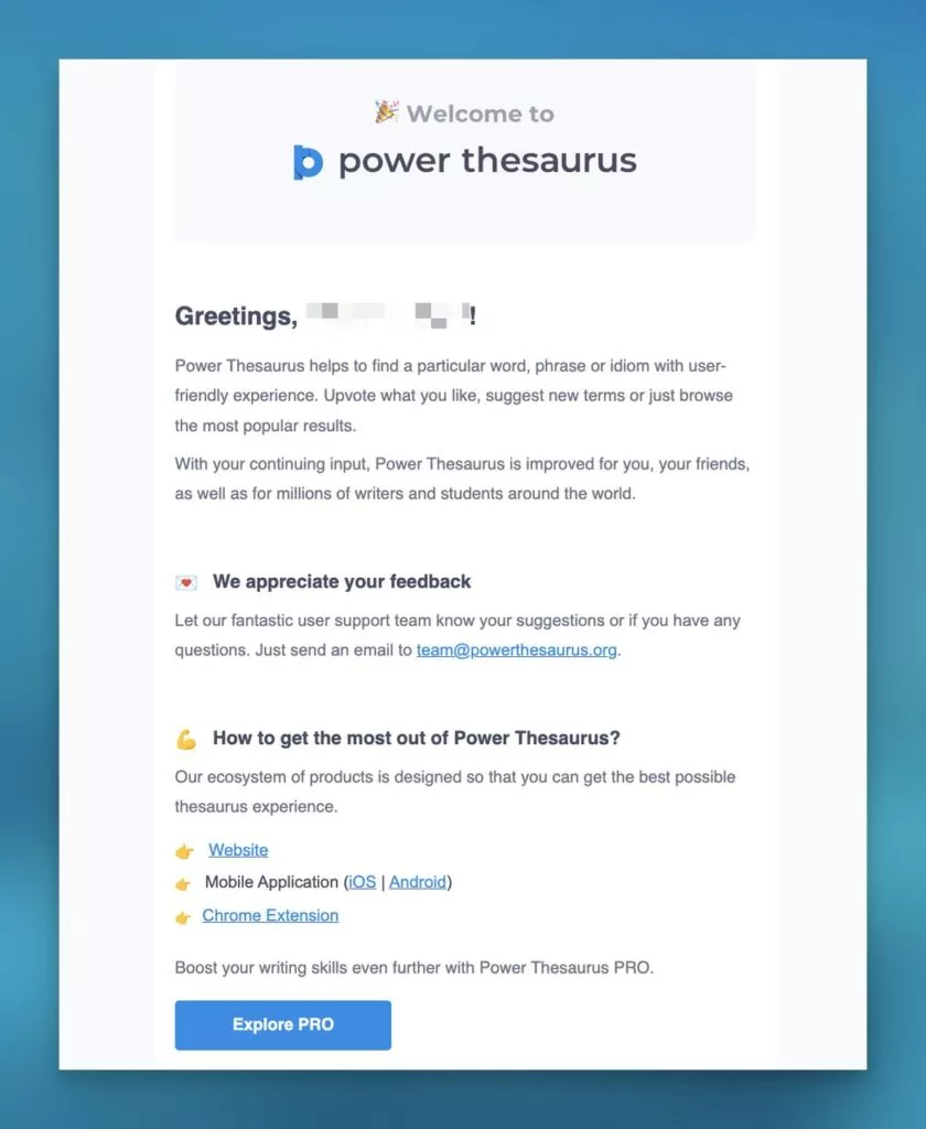
Power Thesaurus takes a well-structured approach in its onboarding email by effectively highlighting features using engaging language. The email encourages user feedback and provides tips for platform optimization, enhancing the onboarding process.
The simple structure of the email, concluding with an invitation to explore the pro plan, adheres to a proven pattern of emphasizing value before presenting pricing options. This strategic approach is known to boost conversion rates by ensuring users understand the benefits of the platform before considering premium plans. Power Thesaurus’ onboarding email is a balance of informative content and a call to action that guides users seamlessly.
10. Beast’s Visual-Centric Onboarding Email:

Beast’s onboarding email excels at using visuals to capture the reader’s attention and immediately convey the product’s essence. The header image showcasing the product in use engages readers, giving a clear idea of Beast’s purpose. The email articulates the value the blender can add to the reader’s life, creating a compelling narrative.
By effectively combining visual appeal with a clear value proposition, Beast’s onboarding email creates an immersive and memorable experience. The emphasis on the product’s benefits and how it fits into the user’s lifestyle contributes to a persuasive onboarding strategy, setting the stage for continued engagement with the brand.
11. Gusto:
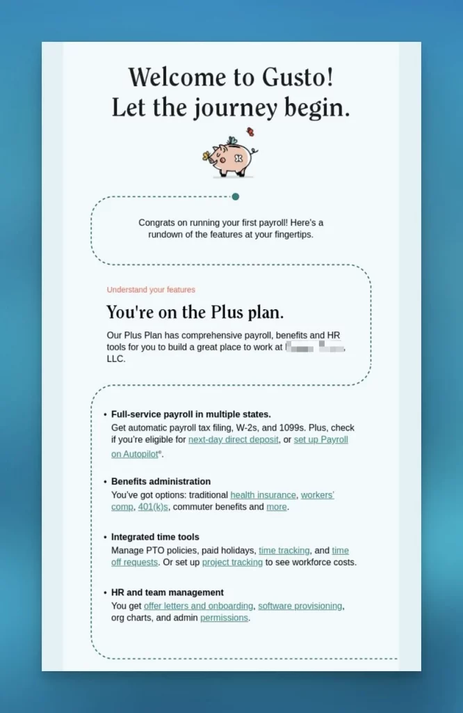
Gusto welcomes its new users through a personalized email that emphasizes the advanced features of their chosen plus plan.
This approach aids users in comprehending the value offered by the product. The email extends an invitation to a welcome webinar, providing a detailed product tour and addressing user queries. Gusto further supports user familiarity by sharing links to documentation and blog posts for additional insights and tips. Offering such resources is an excellent way to empower users to maximize the product’s potential. This onboarding strategy underscores the significance of customization, value proposition, and resourcefulness in making new users feel at home with your product.
12. Flock:
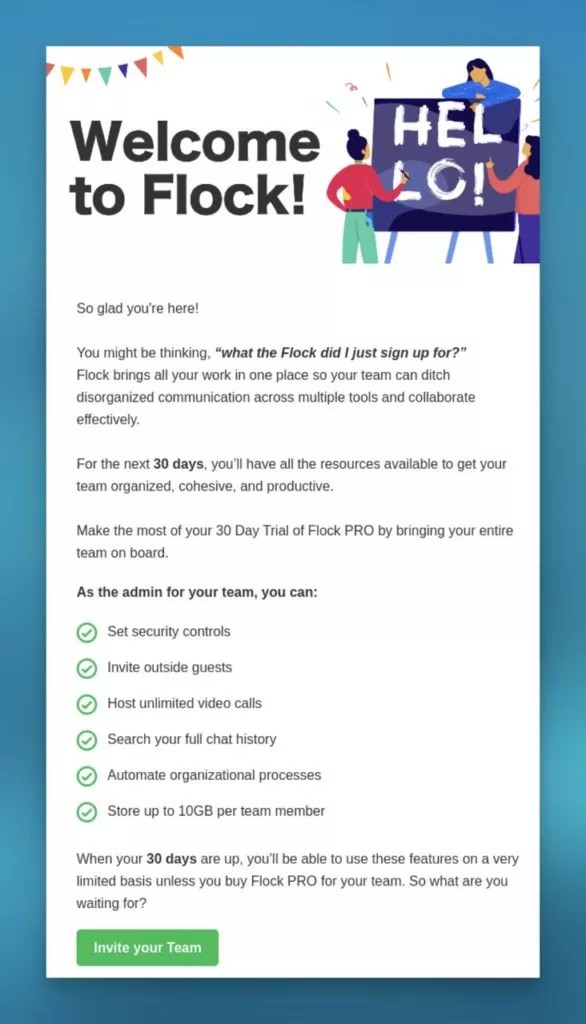
Flock’s onboarding email expertly balances informative content with an entertaining touch, incorporating humor to engage users.
Maintaining a consistent brand image, Flock highlights the 30-day free trial and accessible features during this period. This is a compelling enticement for users to explore the product and experience its value firsthand. Setting clear expectations and reminding users of the limited availability of features during the initial 30-day trial helps manage potential misunderstandings or disappointments.
13. CampaignMonitor:
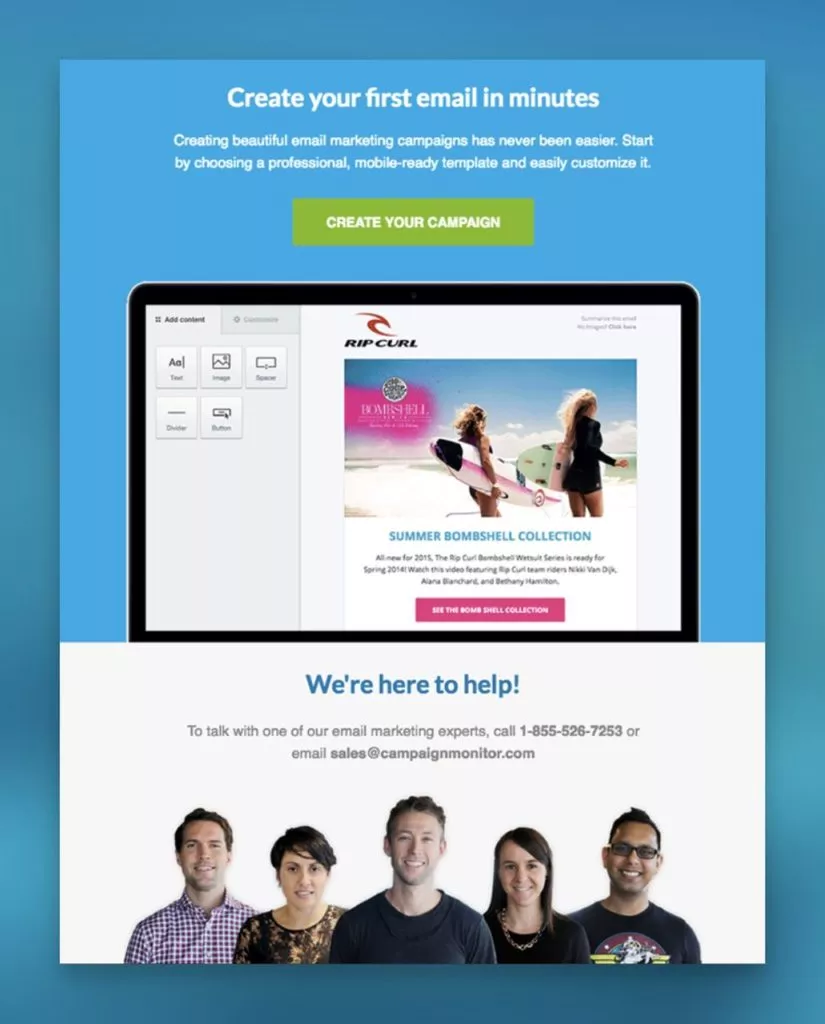
CampaignMonitor’s welcome email features a compelling call-to-action, encouraging users to create their first campaign.
The email goes beyond information delivery by showcasing the company’s support team and conveying a reassuring message of constant assistance. This personal touch establishes an emotional connection between the user and the brand. Additionally, including a video provides users with inspiration and ideas, elevating the onboarding experience. This example emphasizes that effective onboarding is about imparting information and forging an emotional connection with the user. Utilizing relevant visuals and personal touches contributes to a meaningful onboarding journey.
Conclusion:
User onboarding emails play a crucial role in creating a positive first impression and guiding users through the initial stages of their interaction with a product or service. A well-crafted onboarding email sequence can significantly impact user engagement, retention, and overall satisfaction. By providing valuable information, clear instructions, and personalized touches, businesses can enhance the user experience and increase the likelihood of users becoming active, long-term customers.
FAQs on Onboarding Emails:
How can businesses measure the effectiveness of their onboarding emails?
Key performance indicators (KPIs) for onboarding emails include open rates, click-through rates, conversion rates (e.g., completing a sign-up or trial), and user engagement metrics. Regularly analyzing these metrics can help businesses understand the impact of their onboarding email campaigns.
What are common mistakes to avoid in user onboarding emails?
Common mistakes include overwhelming users with too much information, neglecting to personalize content, sending too many emails too quickly, and lacking a clear call to action. It’s essential to strike a balance between providing useful information and not overwhelming users.
How can businesses improve user onboarding email effectiveness over time?
Continuously gather feedback from users, analyze performance metrics, and iterate on the onboarding email sequence based on insights. A/B testing, user surveys, and monitoring user behavior can help identify areas for improvement and optimize the onboarding process.


