
Email marketing is the most effective marketing strategy you can use for your business, online store, and blog. New deals, new content, and tips delivered right to your customer’s inbox can have a crucial role in converting casual visitors into loyal customers. That being the case, you can understand how important it is to take care of the minute details of email marketing. The font that you use for email marketing plays a significant role in the presentation of your emails. In this article, we will discuss how to choose the best fonts for email marketing.
In the intricate realm of email marketing, the devil is in the details, and these details have the power to make or break your campaigns. While marketers often invest substantial effort in crafting compelling subject lines, engaging content, and enticing visuals, there’s one often underestimated detail that wields a profound and statistically backed influence: the choice of fonts. It’s not merely an aesthetic consideration; it’s a strategic decision that can dramatically shape the perception of your brand, significantly enhance readability, and ultimately supercharge user engagement.
- Brand Perception: Fonts are more than just characters on a screen; they are powerful conveyors of brand identity. A study by McKinsey & Company revealed that 70% of buying experiences are influenced by how customers feel they are being treated. When applied to email marketing, this means that fonts have the potential to shape how recipients perceive your brand. Serif fonts can evoke a sense of tradition and reliability, while modern sans-serif fonts may convey innovation and simplicity. The strategic choice of fonts can align your email campaigns with your brand’s personality and values, establishing a deeper connection with your audience.
- Enhanced Readability: Readability is the cornerstone of effective communication, and fonts play a pivotal role. It’s not just about whether your audience can read your message; it’s about whether they want to. According to a study by the Nielsen Norman Group, 79% of web users scan content rather than reading it in detail. This behavior underscores the importance of fonts that are visually appealing and effortless to read. Sans-serif fonts like Arial or Helvetica, for instance, are known to be more readable on screens, leading to increased comprehension and engagement. The right font choice ensures that your message is seen and absorbed.
- User Engagement: User engagement is the lifeblood of email marketing success. Personalization is a proven strategy to boost engagement, as evidenced by a report from Campaign Monitor stating that emails with personalized subject lines are 26% more likely to be opened. Similarly, fonts can be personalized to convey the right tone and emotion in your emails. The strategic use of fonts that align with your brand’s voice can emotionally resonate with your audience, making them more receptive to your message. Fonts are not just letters but instruments of persuasion, helping you establish a meaningful connection with your readers.
- Cross-Platform Consistency: Emails are viewed on many devices and email clients, each with its way of rendering fonts. Ensuring that your emails appear consistently across this diverse landscape is paramount. Fonts can behave differently on various platforms, making choosing fonts that maintain their integrity across the email ecosystem is crucial. When fonts display consistently, it enhances the user experience and reinforces your brand’s professionalism.
- Emotional Impact: Fonts have the power to evoke emotions. The psychology of fonts is a well-researched field, and studies have shown that different fonts can trigger specific emotional responses. For instance, a handwritten script font might convey a sense of intimacy and personalization, while bold, sans-serif fonts can exude confidence and modernity. Understanding the emotional impact of fonts allows you to align your email content with the feelings you want to evoke in your audience.
- Content Hierarchy: Effective email marketing often involves presenting information in a hierarchical order. Fonts play a vital role in establishing this hierarchy. For instance, larger, bolder fonts can be used for headings to draw attention to key points, while smaller fonts for body text can provide detailed information. Creating a clear content hierarchy with fonts ensures that recipients can quickly grasp the most important news in your emails.
- Testing and Optimization: A/B testing is common in email marketing, and fonts can be a variable worth testing. Different font choices can influence click-through, conversion, and overall engagement. You can continually refine your email campaigns to maximize their effectiveness by systematically testing different fonts and analyzing the results.
- Accessibility and Inclusivity: Inclusivity in email marketing is essential. Selecting fonts that are accessible to individuals with visual impairments is not only ethical but also ensures a broader reach for your campaigns. Using alt text for images and choosing fonts that are compatible with screen readers are steps in the direction of accessibility.
- Consistency Across Campaigns: Consistency is a hallmark of solid branding. Once you’ve chosen fonts for your brand, it’s crucial to maintain consistency across all your email campaigns. This consistency builds trust and familiarity with your subscribers, reinforcing your brand’s identity and values.
Strategies to Use Fonts for Email Marketing:
1. Prioritize Readability: Making Your Content Shine

In email marketing, where every word counts, ensuring that your message is easily digestible is paramount. Readability is the cornerstone of effective communication, and your choice of fonts plays a pivotal role in achieving it. This section will explore why prioritizing readability matters and provide practical tips to enhance it.
Why Prioritize Readability?
The primary goal of an email is to convey information effectively. Whether you’re sharing product updates, delivering news, or nurturing leads, your message must be easily understandable to your audience. Poor readability can lead to frustration, reduced engagement, and even a decline in trust in your brand. Conversely, when your content is a breeze to read, your audience will likely stay engaged and take the desired actions.
Example: Medium‘s Readability-First Approach

Let’s draw inspiration from a prime example: Medium, a renowned content-sharing platform. They’ve built their reputation on delivering high-quality articles, and readability is at the core of their strategy. Here’s how they achieve it:
- Clean and Spacious Layout: Medium prioritizes a clean and spacious layout. White space is abundant, allowing content to breathe. This minimalist approach creates a visually inviting environment that encourages reading without distractions.
- Simple, Sans-Serif Font: Their font choice is a simple, sans-serif typeface. Sans-serif fonts are known for their legibility, especially on screens. They lack the decorative flourishes of serif fonts, making them ideal for body text. This font choice ensures that readers can focus on the content itself.
- Font Size: The Medium team understands the importance of font size. They ensure that their font size is large enough for readers to consume content on various devices comfortably. A font size ranging from 14 to 16 pixels for the body text provides an optimal reading experience.
- Line Spacing (Line Height): Adequate line spacing or height is another crucial factor in readability. Medium employs a line height of 1.5 to 2 times the font size. This spacing prevents text from appearing cramped and allows readers to follow the text effortlessly.
- Contrast: The text should stand out from the background for easy reading. Medium employs a high-contrast approach, using dark text on a light background. This combination enhances legibility and reduces eye strain for their readers.
Practical Tips for Enhancing Readability
To prioritize readability in your email marketing campaigns, consider the following tips:
- Choose the Right Font: Opt for a font that balances aesthetics and readability. Sans-serif fonts like Arial, Helvetica, or Calibri are often safe choices for body text.
- Adjust Font Size: Ensure your font size is large enough for easy reading. Experiment with sizes between 14 and 16 pixels to find the sweet spot.
- Mind the Line Height: Maintain adequate line spacing, typically 1.5 to 2 times the font size, to prevent text from feeling crowded.
- Embrace Whitespace: Don’t overcrowd your content. Allow for ample whitespace, both between lines and around content elements.
- Contrast is Key: Ensure sufficient contrast between text and background colors to make your content pop.
- Mobile Optimization: Test your email’s readability on mobile devices, as many users access emails on smartphones.
2. Stick to Web-Safe Fonts: Ensuring Consistency Across Devices
In the dynamic landscape of email marketing, where your messages are viewed on various devices and email clients, ensuring consistency is paramount. Among the various factors influencing consistency, your choice of fonts is a critical one. By adhering to web-safe fonts that are widely supported across platforms and less likely to be replaced, you can maintain the integrity of your email’s design and effectively communicate your message. In this section, we’ll delve into the importance of using web-safe fonts and examine a real-world example of a brand that gets it right: Groupon.
Why Stick to Web-Safe Fonts?
Emails are a versatile medium, but they also pose unique challenges, primarily due to the diversity of devices and email clients used by your audience. When you send an email, you want to ensure that it looks as intended, regardless of whether it is viewed on a desktop computer, a smartphone, or a tablet. Font rendering inconsistencies can jeopardize your message’s impact and the user experience.
Various devices and email clients broadly support web-safe fonts. These fonts are included with most operating systems and are less likely to be substituted with alternative, potentially less appealing, fonts when your email is displayed. Sticking to web-safe fonts minimizes the risk of your carefully crafted email design going awry.
Example: Groupon‘s Embrace of Web-Safe Fonts

Groupon, a global leader in online deals and discounts, greatly values consistently rendering its emails across platforms. They recognize that maintaining a uniform visual identity is essential for brand recognition and trust-building. Here’s how they make it happen:
- Font Selection: Groupon wisely opts for web-safe fonts in their email campaigns. Two of their preferred choices are Arial and Helvetica. These fonts are considered safe bets for email marketing because they are widely supported and maintain their appearance across various devices and email clients.
- Consistency Across Platforms: Using web-safe fonts like Arial and Helvetica, Groupon ensures that their email messages display consistently, whether opened on a Windows PC, a Mac, an iPhone, or an Android device. This uniformity preserves the brand’s visual integrity, reinforcing its identity in its subscribers’ minds.
- Branding Cohesion: Groupon understands that consistent font rendering is not just a matter of technicality; it’s also about reinforcing its brand’s identity. Their choice of web-safe fonts aligns with their brand’s personality and the expectations of their audience.
Practical Tips for Utilizing Web-Safe Fonts
Here are some practical tips for making the most of web-safe fonts in your email marketing campaigns:
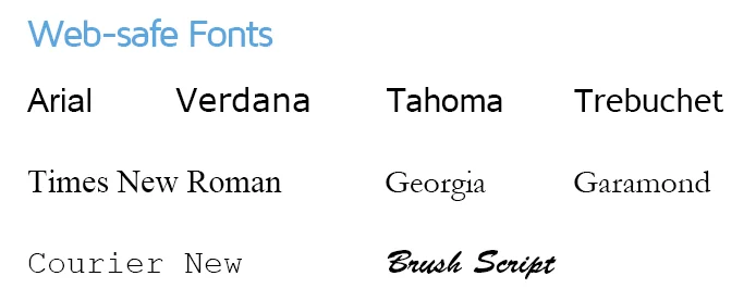
- Know Your Web-Safe Fonts: Familiarize yourself with commonly accepted web-safe fonts like Arial, Helvetica, Times New Roman, Georgia, and Verdana.
- Font Stacks: Create font stacks in your CSS that include web-safe fonts as the preferred choice, followed by alternative fonts for added flexibility. This ensures that your email will still look good if a web-safe font isn’t available.
- Testing: Always test your emails on various devices and email clients to confirm that your web-safe fonts render consistently.
- Balancing Act: While web-safe fonts are reliable, you can still introduce creativity and personalization by sparingly using custom or non-web-safe fonts for headings or specific design elements.
3. Use a Maximum of Two Fonts: The Power of Simplicity

In the intricate world of email design, less is often more. When it comes to fonts, simplicity and clarity reign supreme. To create cohesive and visually pleasing emails, it’s advisable to limit yourself to a maximum of two fonts—one for headings and another for body text. This principle of font consistency reflects professionalism and enhances the overall email experience for your recipients. Let’s delve deeper into the significance of this approach, with a shining example from the tech giant Apple.
Why Limit Fonts to Two?
In email design, simplicity and clarity are virtues that can’t be overstated. Employing a profusion of fonts can lead to visual chaos and detract from the core message you’re trying to convey. Here’s why it’s prudent to stick to a maximum of two fonts:
- Cohesion and Consistency: A consistent font scheme creates a cohesive look and feel throughout your email. It unifies the design elements and ensures that your message flows seamlessly. Consistency in font usage helps your audience navigate your email effortlessly.
- Visual Pleasure: Too many fonts can overwhelm the eye and create a cluttered appearance. Simplicity in font choices, on the other hand, is aesthetically pleasing and makes for a cleaner and more enjoyable reading experience.
- Brand Reinforcement: A consistent font scheme is an extension of your brand identity. It reinforces your brand’s aesthetics and helps subscribers recognize your emails instantly. Over time, this recognition fosters trust and loyalty.
Example: Apple’s Two-Font Rule
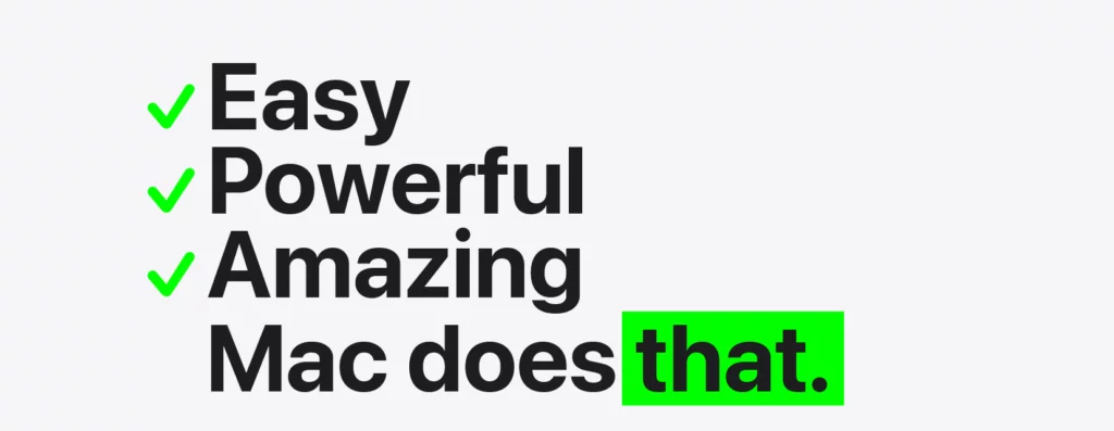
One exemplary illustration of the “two-font rule” in action is Apple, known for its meticulous design standards. In their email communications, Apple adheres to this principle, typically using just two fonts:

- San Francisco for Headings:
Apple’s choice of San Francisco, a clean and modern sans-serif font for headings, exudes a sense of sophistication and aligns with their brand’s sleek image. This font choice draws attention to key information in their emails, making it easy for readers to scan and engage with their content.
2. Serif Font for Body Text:
For the body text, Apple often employs a highly readable serif font. Serif fonts, characterized by small lines or “serifs” at the ends of characters, are known for their legibility in longer blocks of text. This choice enhances the overall email experience, ensuring the content is effortlessly consumed.
By maintaining this two-font consistency, Apple reflects its brand’s aesthetic and ensures that its emails are user-friendly and engaging.
Practical Tips for Font Consistency
Here are some practical tips for implementing the two-font rule in your email marketing campaigns:
- Select Fonts Thoughtfully: Choose fonts that align with your brand’s identity and values while considering readability and visual appeal.
- Create Font Guidelines: Establish clear guidelines for font usage within your organization or email campaigns. This helps maintain consistency.
- Balance Headings and Body Text: Ensure that your chosen headings and body text fonts complement each other. They should create a harmonious visual hierarchy.
- Test for Consistency: Before sending your emails, test them on different devices and email clients to confirm that your fonts render consistently.
3. Consider Branding: Unifying Fonts with Your Brand

In email marketing, your emails should serve as a seamless extension of your brand. One effective way to achieve this is by considering branding in font choices. If your brand has specific fonts associated with it, leveraging these fonts in your emails maintains consistency and reinforces brand recognition. To illustrate the power of branding through fonts, we’ll explore the example of Coca-Cola, a globally iconic brand known for its distinctive font choice.
Why Consider Branding in Fonts?
Branding is more than just a logo or color scheme; it encompasses your entire experience and perception of your brand. Fonts play a pivotal role in shaping this perception. Here’s why considering branding in fonts is essential:
- Consistency and Recognition: Using brand-specific fonts ensures consistency across all your marketing materials, including emails. This uniformity helps your audience recognize your brand instantly, fostering trust and familiarity.
- Reinforcing Identity: Fonts are a fundamental element of visual identity. By consistently applying your brand fonts, you reinforce your brand’s personality, values, and aesthetic.
- Professionalism: Custom or unique fonts convey professionalism and attention to detail. They show that your brand is committed to a distinct identity and a high design standard.
Example: Coca-Cola‘s Brand-First Fonts
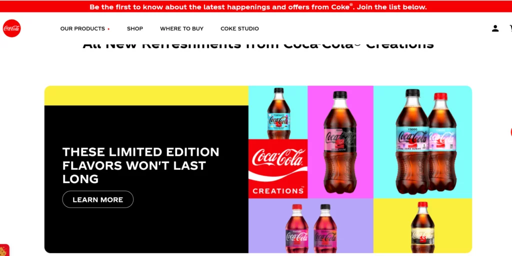
Coca-Cola, one of the world’s most iconic brands, demonstrates the power of fonts in branding. The Coca-Cola brand is instantly recognizable, thanks partly to its distinctive font choice. They use a custom-designed Coca-Cola font in their marketing materials, including emails. Here’s how this exemplifies the principle of considering branding in fonts:
- Consistent Brand Font:
Coca-Cola consistently uses its custom font in emails and across various marketing channels. This font is unique to the brand and instantly associates any content bearing it with Coca-Cola.
2. Instant Recognition:
You don’t need to see the logo when you see Coca-Cola’s custom font to know which brand it represents. The font alone triggers immediate brand recognition and reinforces the brand’s identity.
3. Reinforcing Brand Image:
Coca-Cola’s font choice aligns with its brand image—a classic, timeless, and refreshing blend. The font encapsulates the brand’s values and appeals to its diverse audience.
Practical Tips for Branding with Fonts
Here are some practical tips for incorporating branding into your font choices in email marketing:
- Identify Brand Fonts: If your brand doesn’t have specific fonts associated with it, consider selecting fonts that align with your brand’s personality, values, and target audience.
- Create a Font Style Guide: Establish clear guidelines for font usage in your brand’s marketing materials, including emails. Specify which fonts should be used for headings, body text, and other design elements.
- Test for Consistency: Ensure your chosen brand fonts render consistently across various devices and email clients. Consistency is key to effective branding.
- Balance with Readability: While brand fonts are essential for consistency, ensure they don’t compromise readability. The chosen fonts should be easy to read to convey your message effectively.
4. Test Across Devices and Email Clients: Ensuring Font Consistency

In the intricate world of email marketing, where every pixel matters, thorough testing is indispensable. One critical aspect of testing is ensuring that your chosen fonts appear consistently and as intended across various devices and email clients. Different email clients may render fonts differently, and testing is the key to guaranteeing that your fonts remain readable and visually appealing to most of your audience. To illustrate the significance of testing fonts, we’ll look at Litmus, a renowned email testing tool known for its expertise in ensuring consistent font rendering.
Why Test Across Devices and Email Clients?
Email clients come in various flavors, from Gmail and Outlook to Apple Mail and mobile apps. Each client has its own way of rendering fonts and interpreting HTML and CSS. Therefore, testing your emails across a spectrum of devices and email clients is vital for several reasons:
- Font Consistency: Email clients may interpret fonts differently or not support certain ones. Testing helps ensure that your chosen fonts remain consistent, maintaining your email’s visual integrity.
- Readability Assurance: Testing across devices allows you to confirm that your fonts are easily readable on screens of varying sizes, from desktop monitors to mobile phones. This assures that your message is accessible to your entire audience.
- Enhanced User Experience: A well-tested email ensures a seamless and enjoyable user experience. Emails that display correctly across devices and clients are more likely to engage recipients and yield positive results.
Example: Litmus‘ Testing Expertise

Litmus, a leading email testing tool, exemplifies the importance of rigorous testing. Here’s how they leverage their expertise to ensure font consistency and overall email quality
- Comprehensive Previewing:
Litmus provides a comprehensive preview of how your email will appear across multiple email clients, devices, and screen sizes. This includes popular clients like Gmail, Outlook, and Apple Mail, as well as various mobile devices. This thorough testing allows you to spot font rendering discrepancies and make necessary adjustments.
- Font Testing:
Litmus specifically checks how fonts render in different email clients. This helps marketers identify font-related issues and fine-tune font choices or styles to ensure optimal readability and appearance.
- Interactive Testing:
Litmus allows you to interact with your email previews, enabling you to assess how fonts look and behave across different platforms. Interactive testing is invaluable for identifying any usability issues related to fonts.
Practical Tips for Effective Font Testing
Here are some practical tips for ensuring font consistency through thorough testing in your email marketing campaigns:
- Use Testing Tools: Consider using email testing tools like Litmus, Email on Acid, or BrowserStack to preview your emails across various devices and email clients.
- Responsive Design: Implement responsive design principles to ensure that your email adapts gracefully to various screen sizes, which includes font resizing for readability.
- Alt Text for Images: Include descriptive alt text for images to maintain the integrity of your message, even if images fail to load in certain clients.
- Font Fallbacks: Specify font fallbacks in your CSS to ensure that a suitable alternative is displayed if a particular font isn’t supported.
- Regular Testing: Make font testing a routine part of your email marketing process, especially when introducing new fonts or design elements.
5. Avoid Overly Decorative Fonts: Prioritizing Readability and Elegance

In email marketing, the choice of fonts is a delicate balance between aesthetics and readability. While decorative fonts can be visually striking, they often need help for lengthy text sections. To maintain the clarity and effectiveness of your email content, it’s advisable to avoid overly decorative fonts for body text. Instead, reserve them for special occasions, such as headlines or logos. In this section, we’ll explore the rationale behind this approach and draw inspiration from Tiffany & Co., a brand known for its elegant simplicity.
Why Avoid Overly Decorative Fonts for Body Text?
Emails are primarily a medium for conveying information, and readability is paramount. Overly decorative fonts can hinder readability in several ways:
- Legibility Issues: Decorative fonts are often ornate and complex, with intricate design elements. These details can make characters difficult to distinguish, particularly in small font sizes, common in email body text.
- Reader Fatigue: Extended reading of text in decorative fonts can be fatiguing for the eyes. Readers may need help maintaining focus and engagement, leading to less effective message delivery.
- Inconsistent Rendering: Different devices and email clients may interpret decorative fonts differently, potentially resulting in inconsistent rendering and unintended variations in appearance.
Example: Tiffany & Co.’s Elegant Simplicity

Tiffany & Co., an iconic brand renowned for its luxury jewelry and timeless elegance, embodies the principle of avoiding overly decorative fonts for body text. Here’s how they leverage a classic and simple font choice to align with their brand’s sophistication and readability:

Serif Font for Body Text:
Tiffany & Co. opts for a serif font in their email communications. Serif fonts are characterized by the small lines or “serifs” at the ends of characters. These fonts are known for their readability, particularly in longer blocks of text.
Elegant Simplicity:
Using a simple serif font reflects Tiffany & Co.’s brand identity, synonymous with elegance and simplicity. This font choice enhances the email experience, ensuring their content is effortlessly consumed.
Brand Consistency:
Consistency in font usage across their emails reinforces their brand’s recognition and identity. Recipients instantly associate the font with Tiffany & Co.’s luxury and sophistication.
Practical Tips for Font Selection
Here are some practical tips for selecting fonts in your email marketing campaigns:
- Prioritize Readability: Choose fonts that prioritize readability, especially for body text. Sans-serif and serif fonts are generally safer choices.
- Use Decorative Fonts Sparingly: Reserve decorative fonts for special elements like headlines, logos, or specific design accents where readability is less concerned.
- Consider the Audience: Think about your target audience and their preferences. Fonts should resonate with your audience’s expectations and preferences.
- Test for Readability: Always test your font choices on various devices and email clients to ensure they remain readable and visually appealing.
6. Pay Attention to Hierarchy: Guiding the Reader’s Journey
The information hierarchy plays a pivotal role in the intricate email marketing landscape, where every word and element must contribute to the overall impact. Effective email marketing often involves presenting information in a clear and structured manner, akin to storytelling. Font sizes and styles, such as bold and italics, are powerful tools to establish a hierarchy within your email. This hierarchy ensures that headings are more prominent than subheadings, which, in turn, are more prominent than body text. To delve deeper into this concept, let’s explore the example of HubSpot, a marketing automation platform that demonstrates mastery in font hierarchy for guiding readers through their emails.
Why Pay Attention to Hierarchy?
Hierarchy in email content serves several essential purposes:
- Guiding the Reader: Hierarchy helps guide the reader’s journey through your email. It provides a visual roadmap, allowing them to quickly discern the most critical information and navigate to sections of interest.
- Emphasis on Key Points: You can draw attention to key points, messages, or calls to action within your email using varying font sizes and styles. This ensures that important information stands out prominently.
- Enhancing Readability: Hierarchy enhances the overall readability of your email. Clear distinctions between headings, subheadings, and body text make it easier for readers to consume your content.
Example: HubSpot‘s Hierarchy Mastery

HubSpot, a leading marketing automation platform, demonstrates how effectively font hierarchy can guide readers through their emails. Here’s how they skillfully employ font hierarchy:
- Larger, Bold Headings:
HubSpot uses larger, bold headings to introduce different sections of their emails. These headings serve as signposts, grabbing the reader’s attention and guiding them to specific content areas.
2. Subheadings for Segmentation:
Within each section, HubSpot employs subheadings with slightly smaller font sizes. These subheadings segment the content, making it more scannable and helping readers identify subsections of interest.
3. Emphasis with Italics:
To emphasize specific points or phrases, HubSpot uses italics. This stylistic choice draws the reader’s eye to particular content, whether it’s a statistic, a quote, or a notable insight.
4. Consistency in Style:
Consistency is key to effective hierarchy. HubSpot maintains a consistent style throughout its emails, ensuring that readers can easily follow the visual cues provided by the font hierarchy.
Practical Tips for Establishing Font Hierarchy
Here are some practical tips for creating a clear font hierarchy in your email marketing campaigns:
- Choose Readable Fonts: Ensure that the fonts you select for headings, subheadings, and body text are highly readable.
- Use Font Size Variations: Experiment with different font sizes to create distinctions between headings, subheadings, and body text. Larger sizes naturally draw more attention.
- Employ Bold and Italics Sparingly: Use bold and italics to emphasize specific words or phrases, but avoid overdoing them, as excessive styling can diminish its impact.
- Maintain Consistency: Consistency in font choices and hierarchy style helps establish a coherent visual language throughout your email.
- Mobile Optimization: Test your email’s hierarchy on mobile devices to ensure the hierarchy remains effective on smaller screens.
7. Test for Accessibility: Ensuring Inclusivity and Readability

In email marketing, where reaching a diverse audience is paramount, accessibility is a core consideration. This extends to your font choices, as fonts play a significant role in the readability of your emails for individuals with visual impairments. To ensure your emails are inclusive and can be read by everyone, including those using screen readers, it’s crucial to test the accessibility of your chosen fonts. In this section, we’ll delve into why testing for accessibility matters and introduce Accessibility Insights as a valuable resource.
Why Test for Accessibility?
Accessibility ensures that your content is available and usable by as many people as possible, regardless of their abilities. In the context of email marketing and fonts, testing for accessibility is essential for several reasons:
- Inclusivity: Accessible fonts make your emails inclusive, allowing individuals with visual impairments to access and understand your content. This broadens your reach and demonstrates a commitment to inclusivity.
- Compliance with Standards: Many countries and regions have legal requirements and standards regarding web and email accessibility. Ensuring your emails meet these standards helps you avoid potential legal issues.
- Enhanced User Experience: Accessible fonts contribute to a better overall user experience. Even for those without visual impairments, readable fonts improve the readability and engagement of your emails.
Example: Accessibility Insights for Inclusivity
Accessibility Insights is a valuable resource for testing the accessibility of your emails. This tool helps you identify potential issues and ensures that your font choices align with accessibility standards. Here’s how it can assist you in achieving inclusivity and accessibility in your email marketing:
Identifying Accessibility Issues:
Accessibility Insights scans your emails for accessibility issues related to fonts, images, and other elements. It flags potential problems that could hinder accessibility for individuals with disabilities.
Alt Text for Images:
The tool encourages using descriptive alt text for images, a crucial aspect of email accessibility. Proper alt text ensures that screen readers can convey the content and context of images to users who can’t see them.
Font Accessibility:
Accessibility Insights also evaluates the accessibility of fonts used in your emails. It checks font size, contrast, and readability to ensure that your chosen fonts are accessible to all.
Practical Tips for Font Accessibility
Here are some practical tips for ensuring font accessibility in your email marketing campaigns:
- Use Readable Fonts: Choose highly readable fonts, even at smaller sizes. Sans-serif and serif fonts are generally good choices.
- Adequate Font Size: Ensure that your font size is large enough for most people to read comfortably. A font size of 14-16 pixels for the body text is a good starting point.
- Contrast Considerations: Consider the contrast between your font color and background. Ensure that text is easily distinguishable, especially for individuals with low vision.
- Alt Text for Images: Always include descriptive alt text for images to provide context and meaning to users who rely on screen readers.
- Test with Screen Readers: Test your emails using screen reader software to identify any accessibility issues and ensure your content is conveyed accurately.
8. Be Consistent Across Campaigns: Building Trust Through Uniformity

In the dynamic world of email marketing, consistency is not just a suggestion; it’s a fundamental principle that can significantly impact the relationship you build with your audience. This consistency extends to your font choices. Once you’ve established a set of fonts for your brand, it’s essential to adhere to them across all your email campaigns. This uniformity fosters trust and familiarity among your subscribers, solidifying your brand identity. To delve deeper into the importance of consistency, let’s examine how Starbucks, a global coffeehouse brand, maintains brand continuity through font consistency in its email campaigns.
Why Be Consistent Across Campaigns?
Consistency in font usage across campaigns carries several important advantages:
- Brand Recognition: Consistency reinforces your brand identity. When subscribers encounter the same fonts in every email, they associate those fonts with your brand, fostering brand recognition.
- Trust Building: Consistency builds trust. When subscribers see a consistent visual identity in your emails, they are more likely to trust your brand and your messages.
- Familiarity and Predictability: Familiarity breeds comfort. Subscribers become accustomed to your email layout and font choices, making navigating and engaging with your content easier. Predictability can also enhance the user experience.
Example: Starbucks‘ Brand Continuity

Starbucks, a global coffeehouse brand known for its distinctive identity, provides a prime example of maintaining font consistency across email campaigns. Here’s how Starbucks achieves brand continuity through font consistency:
- Brand Fonts and Colors:
Starbucks has carefully selected specific fonts and colors that represent its brand identity. These fonts and colors remain constant across all their email campaigns.
2. Familiar and Cohesive Experience:
Subscribers receive emails from Starbucks with an unmistakable look and feel. Whether it’s the font used in headings or the typography in the body text, Starbucks emails provide a familiar and cohesive experience.
3. Brand Loyalty:
Consistency in font choices helps Starbucks build brand loyalty. Subscribers who consistently receive well-branded emails are likelier to identify with Starbucks and remain loyal.
Practical Tips for Font Consistency
Here are some practical tips for maintaining font consistency across your email marketing campaigns:
- Create a Font Style Guide: Establish clear guidelines for font usage within your organization. Specify which fonts should be used for headings, subheadings, body text, and other design elements.
- Communicate Internally: Ensure that everyone involved in creating email campaigns understands the importance of font consistency and adheres to the guidelines.
- Regular Audits: Periodically audit your email campaigns to ensure that fonts remain consistent. This is especially important when new team members join or when templates are updated.
- Test for Uniformity: Before sending out campaigns, test them on different devices and email clients to verify that your fonts render consistently.
Conclusion:
Choosing the best fonts for your email marketing campaigns is a critical step in creating visually appealing and engaging emails. Prioritize readability, stick to web-safe fonts, and consider your brand’s personality. Test your emails thoroughly to ensure consistency across various devices and email clients. Remember that consistency across campaigns is essential.
With the right font choices, your emails will not only look great but also effectively deliver your message to your audience, driving engagement and conversions. In the ever-evolving landscape of email marketing, mastering fonts is an art that can set your campaigns apart and leave a lasting impression on your subscribers.
FAQs on Font Choices for Email:
What is the significance of accessibility in font choices for emails?
Ensuring that your fonts are accessible to individuals with visual impairments is essential for inclusivity. It broadens your reach and helps you comply with accessibility standards, creating a more user-friendly experience.
How can I create a font style guide for my email campaigns?
To create a font style guide, specify which fonts to use for headings, subheadings, body text, and other design elements. Communicate these guidelines within your organization to maintain font consistency.
What is the role of hierarchy in font choices for email marketing?
Font hierarchy helps guide readers through your emails by establishing distinctions between headings, subheadings, and body text. It emphasizes key points, enhances readability, and improves overall engagement.
Where can I find resources for testing the accessibility of my email fonts?
You can use tools like Accessibility Insights to test the accessibility of your email fonts. These tools help identify potential issues and ensure your font choices are inclusive and compliant with accessibility standards.
